3 1 Scatterplots and Correlation HW P 158


 relationships")

 in each setting.")


 Direction: Students who")


, the Starnes")


 The correlation is about 0. 9. There is a strong, positive linear")
 contains an outlier: the disastrous 2005 season, which")

- Slides: 27
3. 1 Scatterplots and Correlation HW: P. 158 (1, 5, 7, 11, 13, 14 -18, 21, 26 -32)
Chapter 3 Overview We have explored single quantitative and categorical variables. We have also learned ways to explore more than one categorical variables. In this chapter, we will learn how to describe the relationship between two quantitative variables. We will: ◦ Learn how to analyze patterns in “bivariate” relationships by plotting them and calculating summary statistics about them. ◦ Learn how to describe them using mathematical models that an be used to make predictions based on the relationship between the variables. This is the final topic necessary for out data exploration toolbox. Make sure to master it!
Explanatory vs. Response Variables The purpose of many studies of bivariate (two variable) relationships is to develop a model so that we can use one variable to make a prediction for the other. Therefore, we need to identify which variable is explanatory and which is the response. The explanatory variable is the one we think explains the relationship or “predicts” changes in the response variable. The response variable measures an outcome of a study. *These have been referred to as independent and dependent variables in previous math classes.
Examples: Explanatory: amount of rain Response: weed growth Explanatory: amount of daily exercise Response: resting pulse rate Explanatory: winning percentage of a baseball team Response: attendance at games
Check Your Understanding, p. 144 Identify the explanatory and response variable(s) in each setting. 1. How does drinking beer affect the level of alcohol in our blood? The legal limit for driving in all states is 0. 08%. In a study, adult volunteers drank different numbers of cans of beer. Thirty minutes later, a police officer measured their blood alcohol levels. Explanatory variable: number of cans of beer Response variable: blood alcohol level 2. The National Student Loan Survey provides data on the amount of debt for recent college graduates, their current income, and how stressed they feel about college debt. A sociologist looks at the data with the goal of using amount of debt and income to explain the stress caused by college debt. Explanatory variables: amount of debt and income. Response variable: stress caused by college debt.
Scatterplots To display the relationship between two quantitative variables, use a scatterplot. To make a scatterplot: 1. Determine which variable goes on which axis. (hint: e. Xplanatory goes on the x-axis!) 2. Label and scale your axes. ◦ Pick “nice” values and cover the range of each variable. ◦ Axes do not usually start at 0 and may have different scales. ◦ Make sure the scales on each axis are consistent. LABEL YOUR AXES! 3. Plot individual data values.
Example: Track and Field Day! The table below shows data for 13 students in a statistics class. Each member of the class ran a 40 -yard sprint and then did a long jump (with a running start). Sprint Time (s) 5. 41 5. 05 9. 49 8. 09 7. 01 7. 17 6. 83 6. 73 8. 01 5. 68 5. 78 6. 31 6. 04 Long Jump Distance (in) 171 184 48 151 90 65 94 78 71 130 173 141 Make a scatterplot of the relationship between sprint time (in seconds) and long jump distance (in inches).
Describe it! Once you construct a scatterplot, you need to describe what you see. What is the overall form of the relationship? ◦ linear or nonlinear What direction does it take? ◦ positive or negative How strong is the relationship? ◦ are the points following the pattern closely, or widely scattered? Are there any outliers? Remember: DOFS! Direction Outliers Form Shape
Example: Track and Field Day! Interpret the scatterplot (from previous example) Direction: Students who take longer to run the sprint typically have shorter jumps. This means there is a negative association between sprint time and distance jumped. Form: There is a somewhat linear pattern in the scatterplot. Strength: Since the points do not closely conform to a linear pattern, the association is not strong. Outliers: There is one possible outlier—the student who took 8. 09 seconds for the sprint but jumped 151 inches.
Scatterplots On Your Calculator 1. Enter your data into L 1 and L 2 (We’ll use the data from the Track and Field Day! Example) Sprint Time (s) 5. 41 5. 05 9. 49 8. 09 7. 01 7. 17 6. 83 6. 73 8. 01 5. 68 5. 78 6. 31 6. 04 Long Jump Distance (in) 171 184 48 151 90 65 94 78 71 130 173 141 2. Define scatterplot in the Stats plot menu. ◦ 2 nd ◦ Stats Plot 3. Use Zoom. Stat to obtain a graph. ◦ Press Trace to see data values
Association Two variables have a positive association when above-average values of one tend to accompany above-average values of the other, and when below-average values also tend to occur together. Two variables have a negative association when above-average values of one tend to accompany below-average values of the other.
Association does not imply causation! Just because there is a strong association between two variables, we can’t conclude that one causes the other. As ice cream sale increase, so do sunburn occurrences. Are ice cream sales causing more sunburns? No! Always look for lurking variables causing the association.
Check Your Understanding, p. 149 In the chapter-opening Case Study (p. 141), the Starnes family arrived at Old Faithful after it had erupted. They wondered how long it would be until the next eruption. Here is a scatterplot that plots the interval between consecutive eruptions of Old Faithful against the duration of the previous eruption, for the month prior to their visit. 1. Describe the direction of the relationship. Explain why this makes sense. The relationship is positive. The longer the duration of the eruption, the longer the wait between eruptions. One reason for this may be that if the geyser erupted for longer, it expended more energy and it will take longer to build up the energy needed to erupt again.
Check Your Understanding, p. 149 2. What form does the relationship take? Why are there two clusters of points? The form is roughly linear with two clusters. The clusters indicate that in general there are two types of eruptions: one shorter, the other somewhat longer. 3. How strong is the relationship? Justify your answer. The relationship is fairly strong. Two points define a line, and in this case we could think of each cluster as a point, so the two clusters seem to define a line.
Check Your Understanding, p. 149 4. Are there any outliers? There a few outliers around the clusters, but not many and not very distant from the main grouping of points. 5. What information does the Starnes family need to predict when the next eruption will occur? The Starnes family needs to know how long the last eruption lasted in order to predict how long until the next one.
Measuring Correlation
Measuring Linear Association: Correlation A scatterplot displays the direction, form, and strength of the relationship between two quantitative variables. Often, we will want to know whether or not the relationship is linear, and if so, how strong that linear relationship is. Since our eyes aren’t always an accurate judge of the strength of linear relationships, we use the correlation r to measure their direction and strength. The linear relationship is strong if the points lie close to a straight line, and weak if they are widely scattered about a line.
Correlation Key Points:
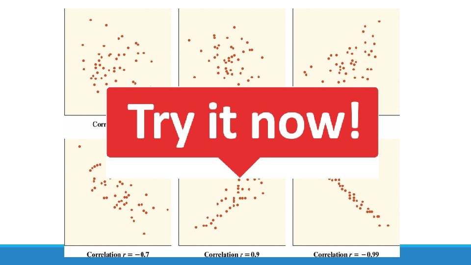
Correlation Strength
Calculating the correlation r
Example: Back to the track! Here is a scatterplot of the sprint time and long-jump distance data from earlier: 1. The correlation is r = -0. 75. Explain what this value means. There is a strong, negative association between sprint times and long-jump distances. 2. What effect would removing the student at (8. 09, 151) have on the correlation? It would be closer to -1 (-0. 88) since it’s outside the pattern of the rest of the data. 3. What effect would removing the student at (9. 49, 48) have on the correlation? It would be closer to 0 (-0. 676) since it’s in line with the rest of the data.
Check Your Understanding, p. 154 The scatterplots below show four sets of real data: (a) plots the number of manatees killed by boats and the number of boats registered in Florida (1000 s) (b) shows the number of named tropical storms and the number predicted before the start of hurricane season each year between 1984 and 2007 by William Gray of Colorado State University; (c) plots the healing rate in micrometers (millionths of a meter) per hour for the two front limbs of several newts in an experiment; and (d) shows stock market performance in consecutive years over a 56 -year period.
Continued… 1. For each graph, estimate the correlation r. Then interpret the value of r in context.
Continued… a) The correlation is about 0. 9. There is a strong, positive linear relationship between the number of boats registered in Florida and the number of manatees killed. b) The correlation is about 0. 5. There is a moderate, positive linear relationship between the number of named storms predicted and the actual number of named storms. c) The correlation is about 0. 3. There is a weak, positive linear relationship between the healing rate of the two front limbs of the newts. d) The correlation is about − 0. 1. There is a weak, negative linear relationship between last year’s percent return and this year’s percent return in the stock market.
Continued… 2. The scatterplot in (b) contains an outlier: the disastrous 2005 season, which had 27 named storms, including Hurricane Katrina. What effect would removing this point have on the correlation? Explain. The correlation would decrease. This point has the effect of strengthening the observed linear relationship that we see.
Facts About Correlation 1. Correlation makes no distinction between explanatory and response variables. 2. Because r uses the standardized values of the observation, it does not change when we change the units of measurement of x, y, or both. 3. The correlation r itself has no unit of measurement. 4. Correlation requires that both variables be quantitative. 5. Correlation measure the strength of only the linear relationship between two variable, not curved relationships. 6. The correlation is not a resistant measure.