Designing user interface Widgets and Controls 1 Overview
![UI Elements [Widgets] • Button – A push-button that can be pressed, or clicked, UI Elements [Widgets] • Button – A push-button that can be pressed, or clicked,](https://slidetodoc.com/presentation_image_h2/b35b63ccd56aedae181be1651c342451/image-17.jpg)
![Con’t • Radio button [ Radio. Group, Radio. Button ] – Similar to checkboxes, Con’t • Radio button [ Radio. Group, Radio. Button ] – Similar to checkboxes,](https://slidetodoc.com/presentation_image_h2/b35b63ccd56aedae181be1651c342451/image-18.jpg)
- Slides: 52

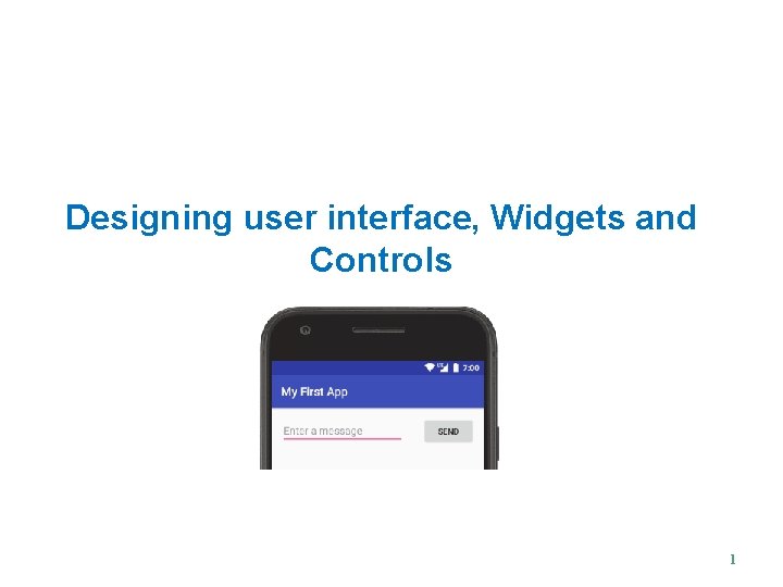
Designing user interface, Widgets and Controls 1

Overview • All user interface elements in an Android app are built using View and View. Group objects. • View is an object that draws something on the screen that the user can interact with. • View. Group is an object that holds other View (and View. Group) objects in order to define the layout of the interface. • Android provides a collection of both View and View. Group subclasses that offer you common input controls (such as buttons and text fields) and various layout models (such as a linear or relative layout) 2

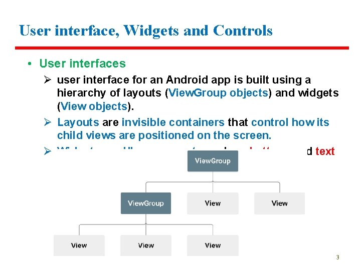
User interface, Widgets and Controls • User interfaces Ø user interface for an Android app is built using a hierarchy of layouts (View. Group objects) and widgets (View objects). Ø Layouts are invisible containers that control how its child views are positioned on the screen. Ø Widgets are UI components such as buttons and text boxes. 3

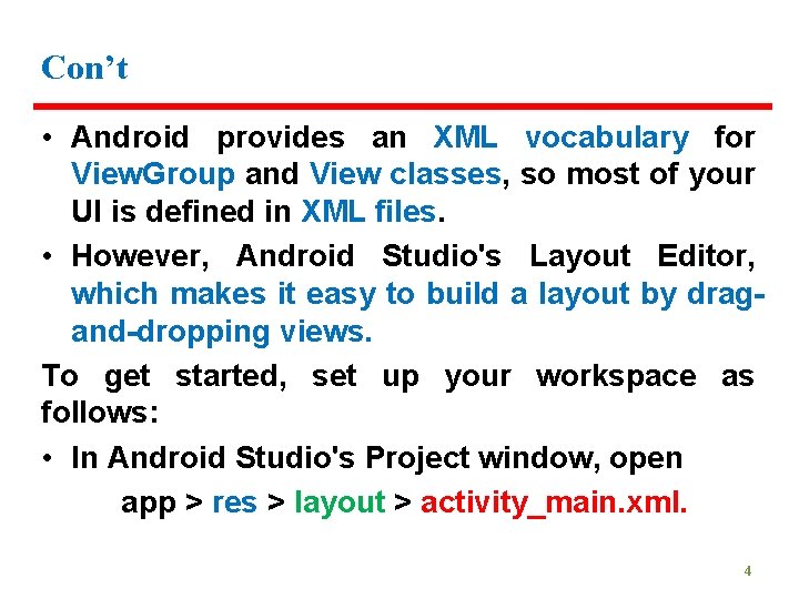
Con’t • Android provides an XML vocabulary for View. Group and View classes, so most of your UI is defined in XML files. • However, Android Studio's Layout Editor, which makes it easy to build a layout by dragand-dropping views. To get started, set up your workspace as follows: • In Android Studio's Project window, open app > res > layout > activity_main. xml. 4

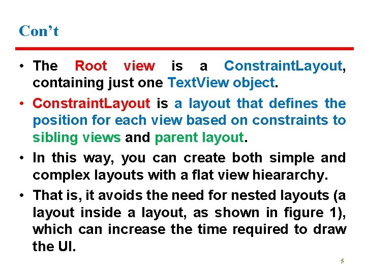
Con’t • The Root view is a Constraint. Layout, containing just one Text. View object. • Constraint. Layout is a layout that defines the position for each view based on constraints to sibling views and parent layout. • In this way, you can create both simple and complex layouts with a flat view hieararchy. • That is, it avoids the need for nested layouts (a layout inside a layout, as shown in figure 1), which can increase the time required to draw the UI. 5

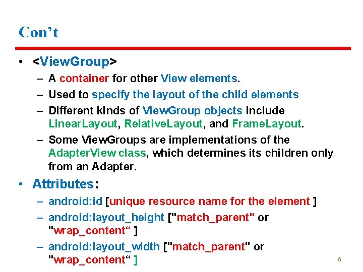
Con’t • <View. Group> – A container for other View elements. – Used to specify the layout of the child elements – Different kinds of View. Group objects include Linear. Layout, Relative. Layout, and Frame. Layout. – Some View. Groups are implementations of the Adapter. View class, which determines its children only from an Adapter. • Attributes: – android: id [unique resource name for the element ] – android: layout_height ["match_parent" or "wrap_content“ ] – android: layout_width ["match_parent" or "wrap_content“ ] 6

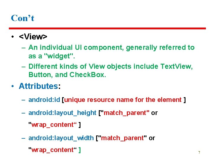
Con’t • <View> – An individual UI component, generally referred to as a "widget". – Different kinds of View objects include Text. View, Button, and Check. Box. • Attributes: – android: id [unique resource name for the element ] – android: layout_height ["match_parent" or "wrap_content“ ] – android: layout_width ["match_parent" or "wrap_content“ ] 7

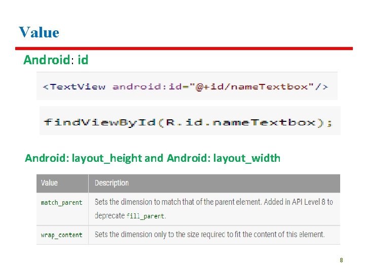
Value Android: id Android: layout_height and Android: layout_width 8

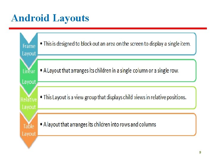
Android Layouts 9

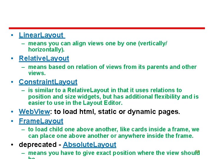
• Linear. Layout – means you can align views one by one (vertically/ horizontally). • Relative. Layout – means based on relation of views from its parents and other views. • Constraint. Layout – is similar to a Relative. Layout in that it uses relations to position and size widgets, but has additional flexibility and is easier to use in the Layout Editor. • Web. View: to load html, static or dynamic pages. • Frame. Layout – to load child one above another, like cards inside a frame, we can place one above another or anywhere inside the frame. • deprecated - Absolute. Layout 10 – means you have to give exact position where the view should

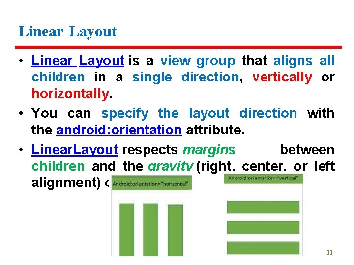
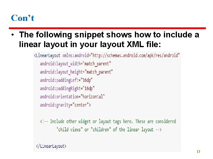
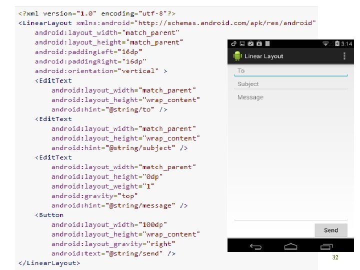
Linear Layout • Linear Layout is a view group that aligns all children in a single direction, vertically or horizontally. • You can specify the layout direction with the android: orientation attribute. • Linear. Layout respects margins between children and the gravity (right, center, or left alignment) of each child. 11

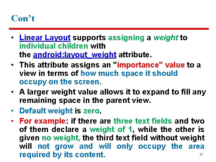
Con’t • Linear Layout supports assigning a weight to individual children with the android: layout_weight attribute. • This attribute assigns an "importance" value to a view in terms of how much space it should occupy on the screen. • A larger weight value allows it to expand to fill any remaining space in the parent view. • Default weight is zero. • For example: if there are three text fields and two of them declare a weight of 1, while the other is given no weight, the third text field without weight will not grow and will only occupy the area 12 required by its content.

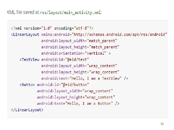
Con’t • The following snippet shows how to include a linear layout in your layout XML file: 13

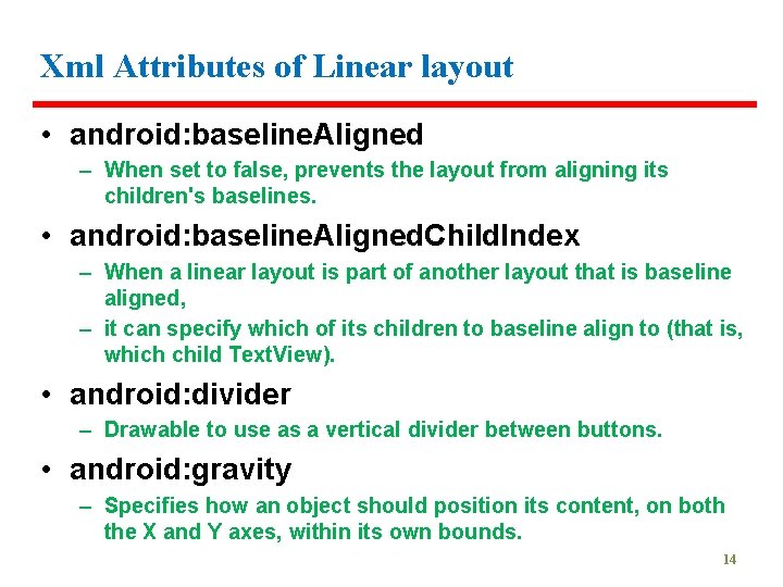
Xml Attributes of Linear layout • android: baseline. Aligned – When set to false, prevents the layout from aligning its children's baselines. • android: baseline. Aligned. Child. Index – When a linear layout is part of another layout that is baseline aligned, – it can specify which of its children to baseline align to (that is, which child Text. View). • android: divider – Drawable to use as a vertical divider between buttons. • android: gravity – Specifies how an object should position its content, on both the X and Y axes, within its own bounds. 14

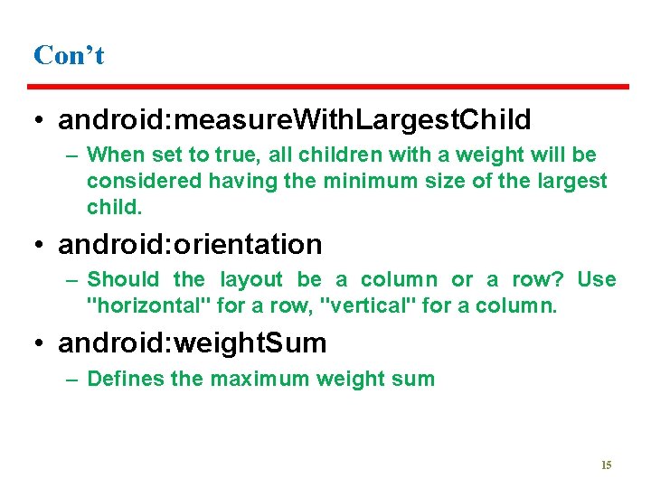
Con’t • android: measure. With. Largest. Child – When set to true, all children with a weight will be considered having the minimum size of the largest child. • android: orientation – Should the layout be a column or a row? Use "horizontal" for a row, "vertical" for a column. • android: weight. Sum – Defines the maximum weight sum 15

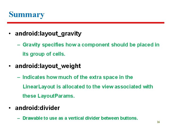
Summary • android: layout_gravity – Gravity specifies how a component should be placed in its group of cells. • android: layout_weight – Indicates how much of the extra space in the Linear. Layout is allocated to the view associated with these Layout. Params. • android: divider – Drawable to use as a vertical divider between buttons. 16
![UI Elements Widgets Button A pushbutton that can be pressed or clicked UI Elements [Widgets] • Button – A push-button that can be pressed, or clicked,](https://slidetodoc.com/presentation_image_h2/b35b63ccd56aedae181be1651c342451/image-17.jpg)
UI Elements [Widgets] • Button – A push-button that can be pressed, or clicked, by the user to perform an action. • Text field [Edit Text, Auto. Complete. Text. View ] – An editable text field. – You can use the Auto. Complete. Text. View widget to create a text entry widget that provides autocomplete suggestions • Check box – An on/off switch that can be toggled by the user. – You should use checkboxes when presenting users with a group of selectable options that are not mutually exclusive. 17
![Cont Radio button Radio Group Radio Button Similar to checkboxes Con’t • Radio button [ Radio. Group, Radio. Button ] – Similar to checkboxes,](https://slidetodoc.com/presentation_image_h2/b35b63ccd56aedae181be1651c342451/image-18.jpg)
Con’t • Radio button [ Radio. Group, Radio. Button ] – Similar to checkboxes, except that only one option can be selected in the group. • Toggle button – An on/off button with a light indicator. • Spinner – A drop-down list that allows users to select one value from a set. • Pickers [ Date. Picker, Time. Picker ] – A dialog for users to select a single value for a set by using up/down buttons or via a swipe gesture. – Use a <Date. Pickercode> widget to enter the values for the date (month, day, year) or a Time. Picker widget to enter the values for a time (hour, minute, AM/PM). 18

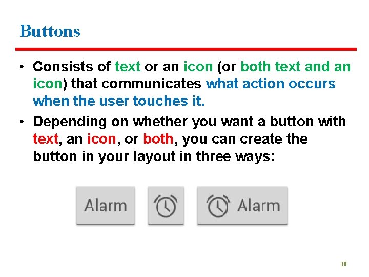
Buttons • Consists of text or an icon (or both text and an icon) that communicates what action occurs when the user touches it. • Depending on whether you want a button with text, an icon, or both, you can create the button in your layout in three ways: 19

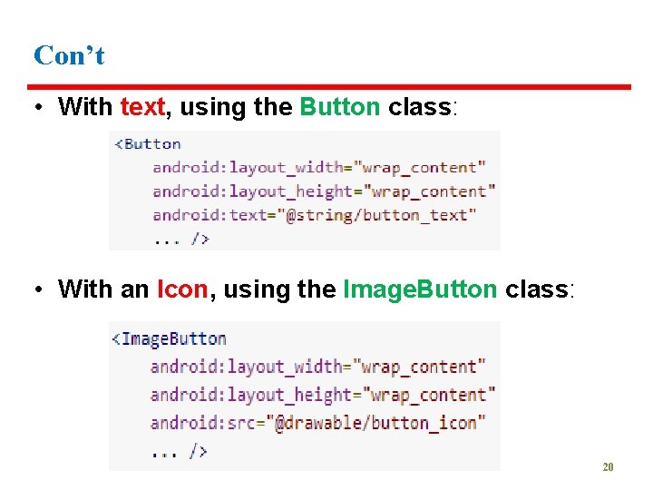
Con’t • With text, using the Button class: • With an Icon, using the Image. Button class: 20

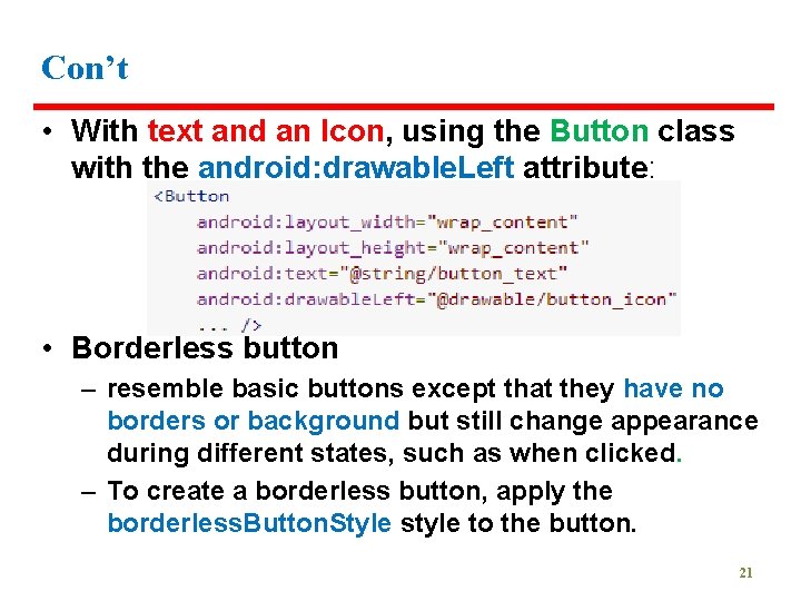
Con’t • With text and an Icon, using the Button class with the android: drawable. Left attribute: • Borderless button – resemble basic buttons except that they have no borders or background but still change appearance during different states, such as when clicked. – To create a borderless button, apply the borderless. Button. Style style to the button. 21

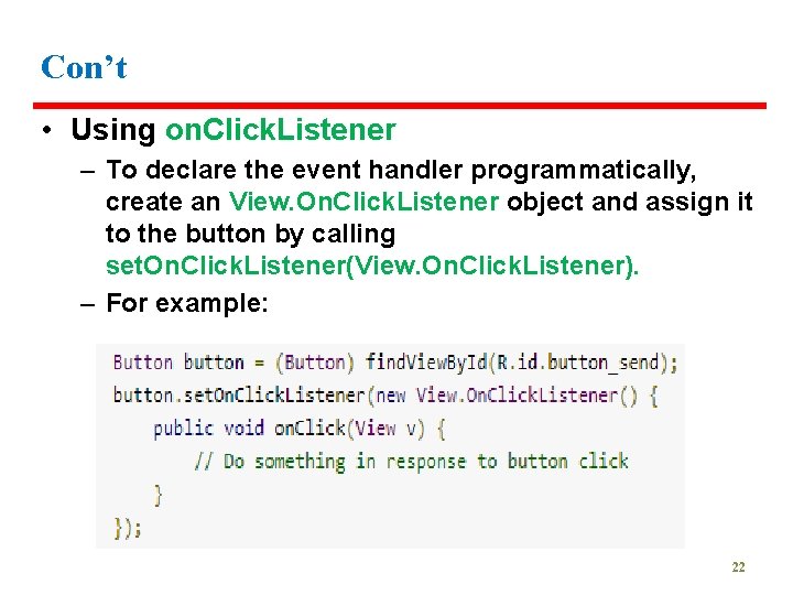
Con’t • Using on. Click. Listener – To declare the event handler programmatically, create an View. On. Click. Listener object and assign it to the button by calling set. On. Click. Listener(View. On. Click. Listener). – For example: 22

23

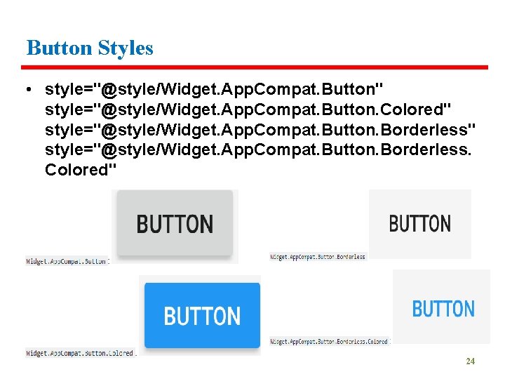
Button Styles • style="@style/Widget. App. Compat. Button" style="@style/Widget. App. Compat. Button. Colored" style="@style/Widget. App. Compat. Button. Borderless. Colored" 24

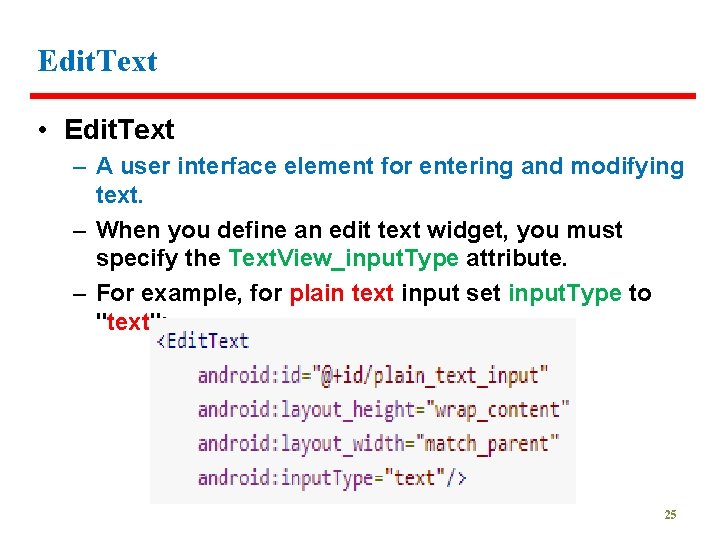
Edit. Text • Edit. Text – A user interface element for entering and modifying text. – When you define an edit text widget, you must specify the Text. View_input. Type attribute. – For example, for plain text input set input. Type to "text": 25

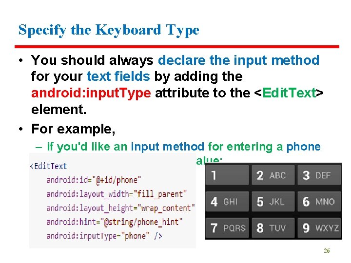
Specify the Keyboard Type • You should always declare the input method for your text fields by adding the android: input. Type attribute to the <Edit. Text> element. • For example, – if you'd like an input method for entering a phone number, use the "phone" value: 26

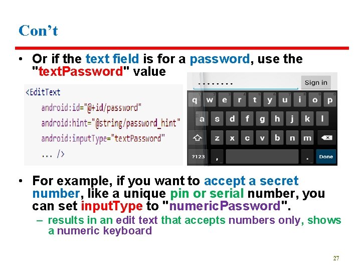
Con’t • Or if the text field is for a password, use the "text. Password" value • For example, if you want to accept a secret number, like a unique pin or serial number, you can set input. Type to "numeric. Password". – results in an edit text that accepts numbers only, shows a numeric keyboard 27

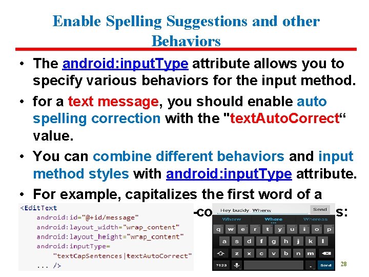
Enable Spelling Suggestions and other Behaviors • The android: input. Type attribute allows you to specify various behaviors for the input method. • for a text message, you should enable auto spelling correction with the "text. Auto. Correct“ value. • You can combine different behaviors and input method styles with android: input. Type attribute. • For example, capitalizes the first word of a sentence and also auto-corrects misspellings: 28

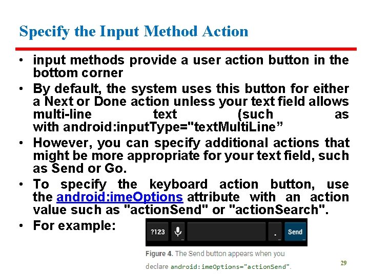
Specify the Input Method Action • input methods provide a user action button in the bottom corner • By default, the system uses this button for either a Next or Done action unless your text field allows multi-line text (such as with android: input. Type="text. Multi. Line” • However, you can specify additional actions that might be more appropriate for your text field, such as Send or Go. • To specify the keyboard action button, use the android: ime. Options attribute with an action value such as "action. Send" or "action. Search". • For example: 29

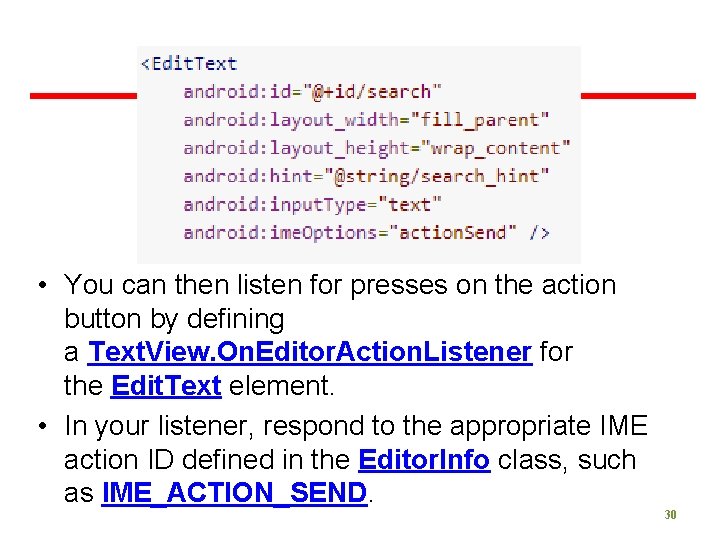
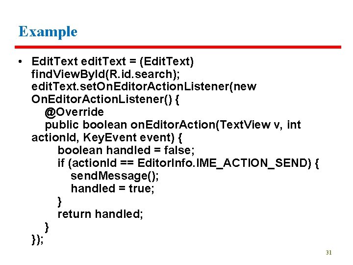
• You can then listen for presses on the action button by defining a Text. View. On. Editor. Action. Listener for the Edit. Text element. • In your listener, respond to the appropriate IME action ID defined in the Editor. Info class, such as IME_ACTION_SEND. 30

Example • Edit. Text edit. Text = (Edit. Text) find. View. By. Id(R. id. search); edit. Text. set. On. Editor. Action. Listener(new On. Editor. Action. Listener() { @Override public boolean on. Editor. Action(Text. View v, int action. Id, Key. Event event) { boolean handled = false; if (action. Id == Editor. Info. IME_ACTION_SEND) { send. Message(); handled = true; } return handled; } }); 31

32

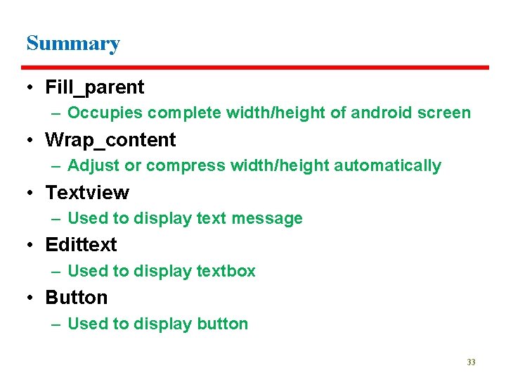
Summary • Fill_parent – Occupies complete width/height of android screen • Wrap_content – Adjust or compress width/height automatically • Textview – Used to display text message • Edittext – Used to display textbox • Button – Used to display button 33

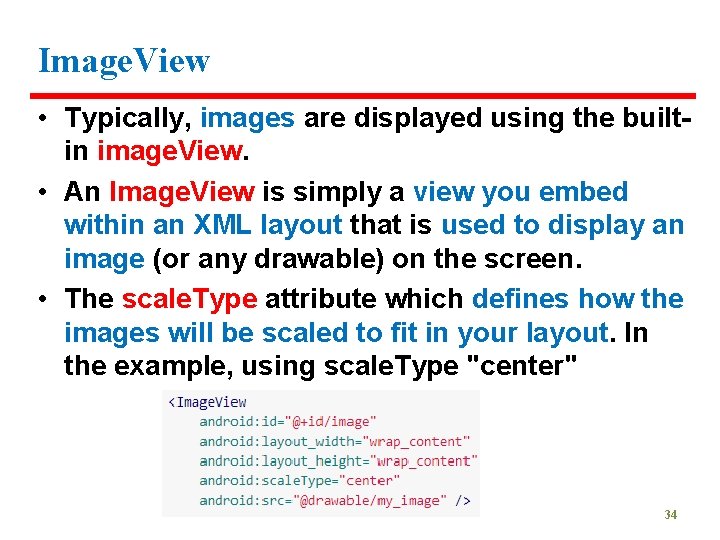
Image. View • Typically, images are displayed using the builtin image. View. • An Image. View is simply a view you embed within an XML layout that is used to display an image (or any drawable) on the screen. • The scale. Type attribute which defines how the images will be scaled to fit in your layout. In the example, using scale. Type "center" 34

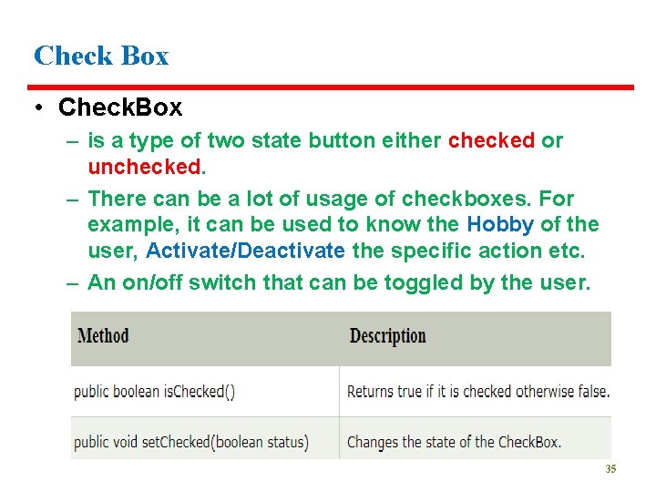
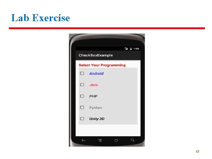
Check Box • Check. Box – is a type of two state button either checked or unchecked. – There can be a lot of usage of checkboxes. For example, it can be used to know the Hobby of the user, Activate/Deactivate the specific action etc. – An on/off switch that can be toggled by the user. 35

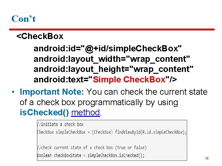
Con’t <Check. Box android: id="@+id/simple. Check. Box" android: layout_width="wrap_content" android: layout_height="wrap_content" android: text="Simple Check. Box"/> • Important Note: You can check the current state of a check box programmatically by using is. Checked() method. 36

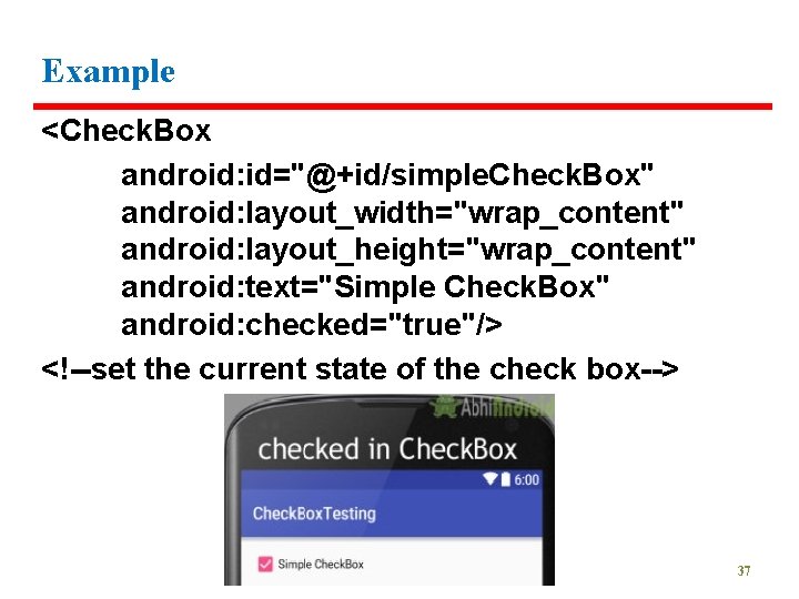
Example <Check. Box android: id="@+id/simple. Check. Box" android: layout_width="wrap_content" android: layout_height="wrap_content" android: text="Simple Check. Box" android: checked="true"/> <!--set the current state of the check box--> 37

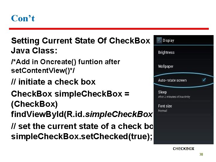
Con’t Setting Current State Of Check. Box In Java Class: /*Add in Oncreate() funtion after set. Content. View()*/ // initiate a check box Check. Box simple. Check. Box = (Check. Box) find. View. By. Id(R. id. simple. Check. Box); // set the current state of a check box simple. Check. Box. set. Checked(true); 38

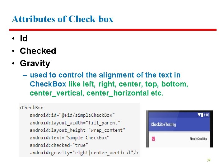
Attributes of Check box • Id • Checked • Gravity – used to control the alignment of the text in Check. Box like left, right, center, top, bottom, center_vertical, center_horizontal etc. 39

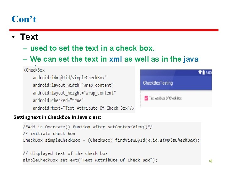
Con’t • Text – used to set the text in a check box. – We can set the text in xml as well as in the java class. Setting text in Check. Box In Java class: 40

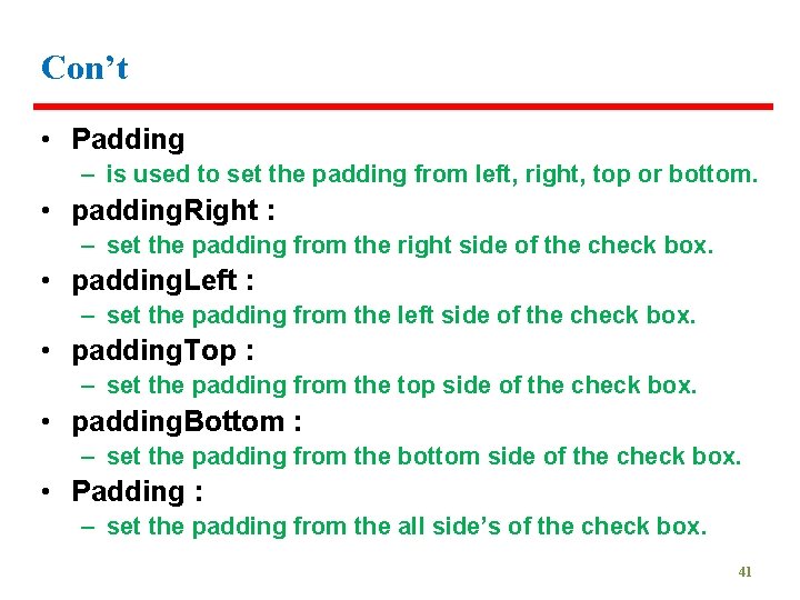
Con’t • Padding – is used to set the padding from left, right, top or bottom. • padding. Right : – set the padding from the right side of the check box. • padding. Left : – set the padding from the left side of the check box. • padding. Top : – set the padding from the top side of the check box. • padding. Bottom : – set the padding from the bottom side of the check box. • Padding : – set the padding from the all side’s of the check box. 41

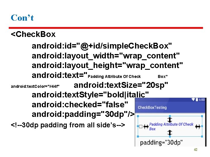
Con’t <Check. Box android: id="@+id/simple. Check. Box" android: layout_width="wrap_content" android: layout_height="wrap_content" android: text="Padding Attribute Of Check Box" android: text. Color="#44 f" android: text. Size="20 sp" android: text. Style="bold|italic" android: checked="false" android: padding="30 dp"/> <!--30 dp padding from all side’s--> 42

Lab Exercise 43

Toggle Button • is used to display checked and unchecked state of a button. • basically an off/on button with a light indicator which indicate the current state of toggle button. • Example : – on/off in sound, Bluetooth, wifi, hotspot etc. • It is a subclass of compound. Button. 44

Switch • is a two-state toggle switch widget that can select between two options. • It is used to display checked and unchecked state of a button providing slider control to user. • Switch is a subclass of Compound. Button. • It is basically an off/on button which indicate the current state of Switch. • It is commonly used in selecting on/off in Sound, Bluetooth, Wi. Fi etc. • As compared to Toggle. Button Switch provides user slider control. The user can simply tap on a switch to change its current state. 45

Radio Button • Similar to checkboxes, except that only one option can be selected in the group. • Allows the user to select one option from a set • To create each radio button option, create a Radio. Button in your layout • Group the Radio. Button inside a Radio. Group, the system ensures that only one radio button can be selected at a time 46

Spinner • Spinners provide a quick way to select one value from a set. • Used to display the multiple options to the user in which only one item can be selected by the user. • Associated with Adapter view • In the default state, a spinner shows its currently selected value. • Touching the spinner displays a dropdown menu with all other available values, from which the user can select a new one 47

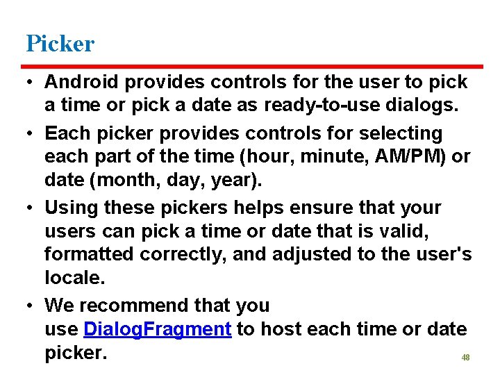
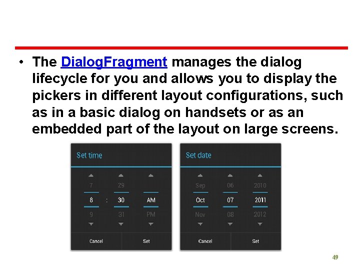
Picker • Android provides controls for the user to pick a time or pick a date as ready-to-use dialogs. • Each picker provides controls for selecting each part of the time (hour, minute, AM/PM) or date (month, day, year). • Using these pickers helps ensure that your users can pick a time or date that is valid, formatted correctly, and adjusted to the user's locale. • We recommend that you use Dialog. Fragment to host each time or date picker. 48

• The Dialog. Fragment manages the dialog lifecycle for you and allows you to display the pickers in different layout configurations, such as in a basic dialog on handsets or as an embedded part of the layout on large screens. 49

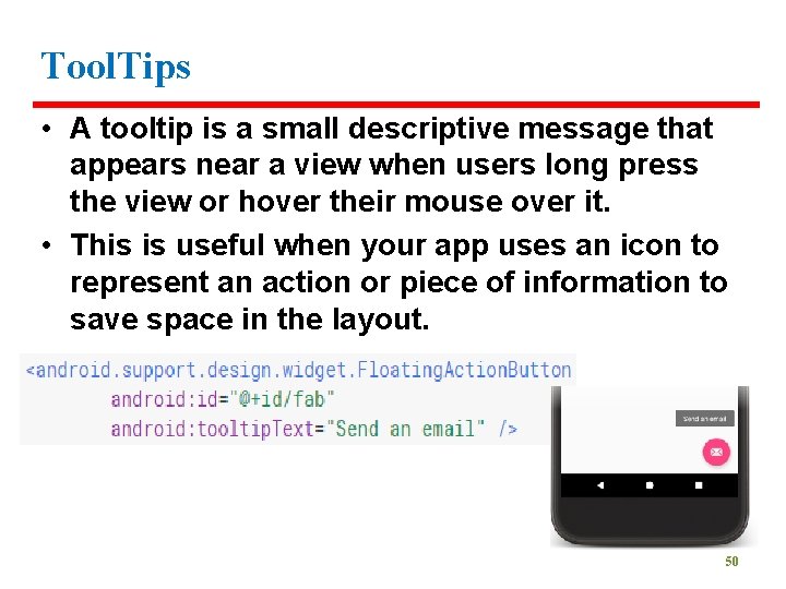
Tool. Tips • A tooltip is a small descriptive message that appears near a view when users long press the view or hover their mouse over it. • This is useful when your app uses an icon to represent an action or piece of information to save space in the layout. 50

Android Progress Bar • A user interface element that indicates the progress of an operation. • Progress bar supports two modes to represent progress: determinate, and indeterminate. • For a visual overview of the difference between determinate and indeterminate progress modes, see Progress & activity. • Display progress bars to a user in a noninterruptive way. • Show the progress bar in your app's user interface or in a notification instead of within a dialog. 51

Thank You ? 52