cs 414 principles of user interface design implementation


![• Helps identify usability problems in UI – [Nielsen and Mohlich, 1990] •](https://slidetodoc.com/presentation_image_h/ca3798e852bc33312bf6e0d6cb18866d/image-11.jpg "• Helps identify usability problems in UI – [Nielsen and Mohlich, 1990] •")


- Slides: 51
cs 414 principles of user interface design, implementation and evaluation
1. Heuristic Evaluation 2. Cognitive Walkthrough 3. Discuss Wednesday Homework 4. Discuss Projects
Heuristic evaluation is a usability inspection technique developed by Jakob Nielsen. The original set of heuristics was derived empirically from an analysis of 249 usability problems (Nielsen, 1994). -Preece et al
Context of TCUID - Task Centered User Interface Design
1. Validity of system status - Are users kept informed about what is going on? - Is appropriate feedback provided within reasonable time about a user’s action? 2. Match between system and the real world - Is the language used at the interface simple? - Are the words, phrases and concepts used familiar to the user? 3. User control and freedom - Are there ways of allowing users to easily escape from places they unexpectedly find themselves in? 4. Consistency and standards - Are the ways of performing similar actions consistent? 5. Help users recognize, diagnose, and recover from errors - Are user messages helpful? - Do they use plain language to describe the nature of the problem and suggest a way of solving it?
6. Error prevention - Is it easy to make errors? - If so, where and why? 7. Recognition rather than recall - Are objects, actions and options always visible? 8. Flexibility and efficiency of use - Have accelerators (i. e. shortcuts) been provided that allow more experience users to carry out tasks more quickly? 9. Aesthetic and minimalist design? - Is any unnecessary and irrelevant information provided? 10. Help and documentation - Is help information provided that can be easily searched and easily followed?
These heuristics are too general in some cases What about web pages? Ambient displays? Ubiquitous computing applications? Strong need for heuristics that are tailored to specific products. • High quality content • Often updated • Minimal download time • Ease of use • Relevant to users’ needs • Unique to the online medium • Netcentric corporate culture - Nielsen 1999 for commercial websites
• Heuristic evaluation enables designers to evaluate an interface without users – inspection, guided by a set of guidelines • Economical technique to identify usability issues early in the design process – no implementation or users required – can be performed on existing interfaces
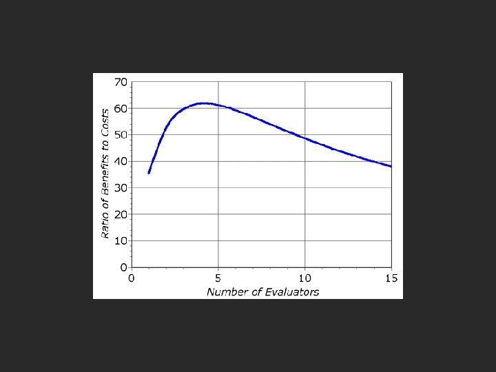
How many users? Empirical evidence suggests that five evaluators usually identify around 75% of total usability problems.
• Helps identify usability problems in UI – [Nielsen and Mohlich, 1990] • HE = heuristics + procedure – – – about 5 evaluators each evaluates UI against heuristics rate severity of each issue aggregate results devise design solutions
Phases of Evaluation • Briefing – teach to evaluators; ensure each person receives same briefing. – become familiar with the UI and domain • Evaluation period – compare UI against heuristics – spend 1 -2 hours with interface; minimal 2 interface passes – take notes • Debriefing session – Prioritize problems; rate severity – aggregate results – discuss outcomes with design/development team
Severity Ratings 0 – this is not a usability problem 1 – cosmetic problem only 2 – minor usability problem 3 – major usability problem 4 – usability catastrophe; imperative to fix Combination of frequency and impact
Examples
Simple and Natural Dialog • Derive from user’s conceptual model • No irrelevant or rarely relevant info. – “less is more” attitude • Order of dialog should match logical order of the task
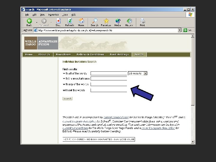
Does navigation reflect logical order of tasks? Is flier necessary on the home page?
Task: Set scan properties Effective order? Simple dialog? Natural dialog?
Speak the User’s Language • Words and concepts from user’s world • Don’t use specific engineering terms • Focus on user’s point of view
Minimize User Memory Load • Show range or sample inputs • Use generic actions across application • Don’t make user remember things between actions • Leave information on screen until not needed
Be Consistent • • • Consistent with user’s mental model Consistent with tasks Consistent with experience/expectations Consistent within and between apps Similar information in similar locations Use the same action sequence in different parts of the interface to get similar results
Provide Feedback • User should clearly see effects of action – – – Obvious: do not hide or make results subtle Immediate: within a few seconds Valid: convey the right information Persistent: show as long as it is needed Speak the user’s language • Response times – want less than 500 ms – otherwise, use “reassurance” displays
Dialog box moves out of the way But… How many more changes and where?
Provide Clearly Marked Exits • Don’t trap users in a certain location • Allow users to get back quickly and easily – support exploration – support undo consistently – support interruption of long-lived events
Provide Shortcuts • Help experienced users avoid long dialogs or messages that they don’t need • Strategies include: – – – type- and click-ahead keyboard shortcuts good default values macros and scripting reuse/edit history
Provide Good Error Messages • Clear and in simple language – user can dig deeper to get obscure details • State the problem / suggest solutions – give links to the solutions, if possible • Use a positive, non-accusatory tone • Graceful error behavior
UIECU - server error Negative tone Useless error codes
Printer error - what’s wrong?
Prevent Errors • Scrutinize every error message • Can the error be prevented? – – allow recognition over recall when possible confirm risky operations avoid use of modes as much as possible use clear status indicators • Detect when error occurs • Allow user to recover from the error
What happened to JPEG?
Help and Documentation • Best if system can be used w/o manuals – but may not be possible • Documentation should be – easy to search – focused on the user's task – list concrete steps to be carried out
HE – Pros and Cons • Pros – Very cost effective – Identifies many usability issues • Cons – relies on interpretation of guidelines – guidelines may be too generic – needs more than one evaluator to be effective
Cognitive walkthrough involve simulating a user’s problem-solving process at each step in the humancomputer dialog, checking to see if the user’s goals and memory for actions can be assumed to lead to the next correct action. –Nielsen and Mack, 1994
Why we use it • Cognitive walkthrough enables a designer to evaluate an interface without users – a designer attempts to see the interface from the perspective of a user • Low-investment technique to identify task-related usability issues early on – no implementation or users required – can be performed on existing interfaces
• Identify task-related problems before implementation – invest a little now, save a lot later • Enables rapid iteration early in design – can do several evaluations of trouble points • Evaluations are only effective if your team – has the right skill set – wants to improve the design, not defend it
Walkthrough Basics • Imagine how well a user could perform tasks with your low-fidelity prototype • Manipulate prototype as you go – evaluate choice-points in the interface – evaluate labels or options – evaluate likely user navigation errors • Revise prototype and perform again
When to do the Walkthrough • • Have a low-fidelity prototype of the interface Know who the users are Have task descriptions Have scenarios designed to complete the task – you have a “functional” paper prototype • Viable once the scenario and paper prototype are complete
What You Need • Task descriptions • Low-fidelity prototype with enough “functionality” for several tasks • Evaluation team: – design team and users together – design team and other skilled designers
For Each Action in a Task: • Tell a story of why a user would perform it • Critique the story by asking critical questions – is the control for the desired action visible? – will a user see that the control produces the desired effect? – will a user select a different control instead? – will the action have the effect that the user intends? – will a user understand the feedback and proceed correctly?
More on Questions • Some extra questions can help – what happens if the user is wrong? Is there feedback to correct the error? – how would a user of <interface> react here? • Questions help you see problems – they are a focus, not a blindfold
Walkthrough Pros • Easy to learn • Can perform early in the design process • Questions assumptions about what a user may be thinking • Helps identify controls obvious to the designer but not a user • Helps identify difficulties with labels and prompts • Helps identify inadequate feedback
Walkthrough Cons • • • Is diagnostic, not prescriptive Focuses mostly on novice users Designers must put themselves in users mind Focus specifically on task-related issues The interactions are slower and not real Does not provide quantitative results • A useful tool in conjunction with others
Walkthrough Example • I have a library book that needs to be returned today. To help me remember, I want to set a reminder on my PDA. The reminder should display and beep at 5: 00 pm to remind me to return the book. • Let’s walkthrough this task on my PDA and identify usability issues, if any
Walkthrough Example, cont. • Will a user try to produce the effect that the action has? • Will a user see the control for the action? • Will a user see that the control produces the desired effect? • Will a user select a different control instead? • Will a user understand the feedback to proceed correctly?
Exercises • Compare and contrast a cognitive walkthrough with a heuristic evaluation • Apply Heuristic Evaluation to an existing electronic voting interface http: //www. vtintl. com/new/demo/