GO with Microsoft Excel 2016 Comprehensive First Edition


- Slides: 28

GO! with Microsoft Excel 2016 Comprehensive First Edition Chapter 3 Analyzing Data with Pie Charts, Line Charts, and What-If Analysis Tools

Learning Objectives • Chart Data with a Pie Chart • Format a Pie Chart • Edit a Workbook and Update a Chart • Use Goal Seek to Perform What-If Analysis • Design a Worksheet for What-If Analysis • Answer What-If Questions by Changing Values in a Worksheet • Chart Data with a Line Chart 2

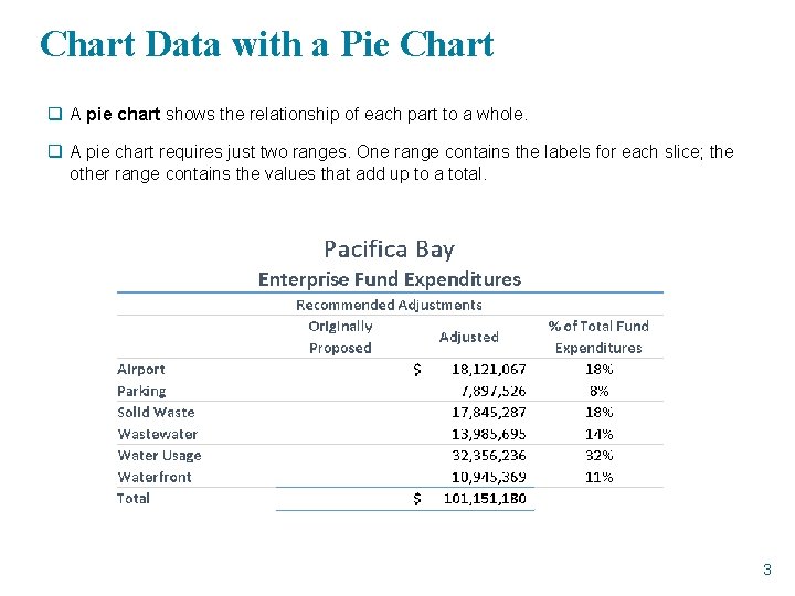
Chart Data with a Pie Chart q A pie chart shows the relationship of each part to a whole. q A pie chart requires just two ranges. One range contains the labels for each slice; the other range contains the values that add up to a total. 3

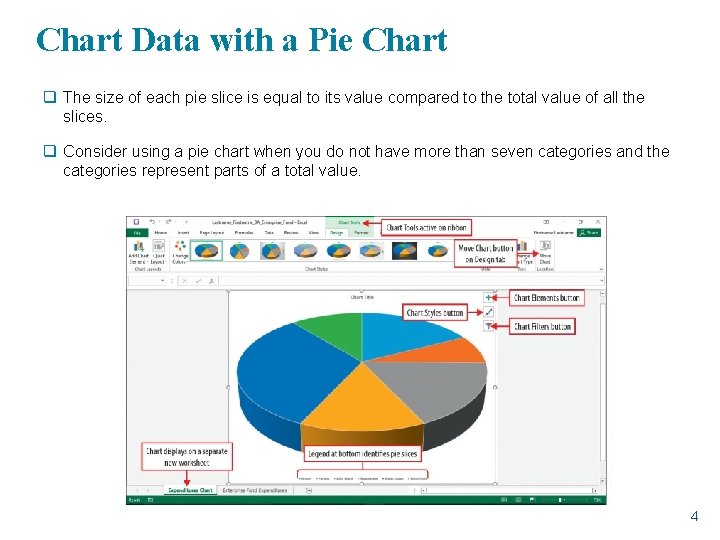
Chart Data with a Pie Chart q The size of each pie slice is equal to its value compared to the total value of all the slices. q Consider using a pie chart when you do not have more than seven categories and the categories represent parts of a total value. 4

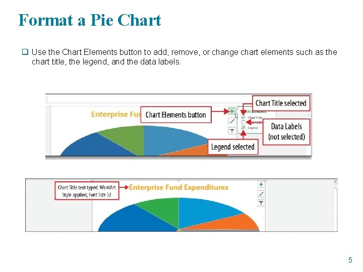
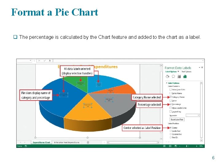
Format a Pie Chart q Use the Chart Elements button to add, remove, or change chart elements such as the chart title, the legend, and the data labels. 5

Format a Pie Chart q The percentage is calculated by the Chart feature and added to the chart as a label. 6

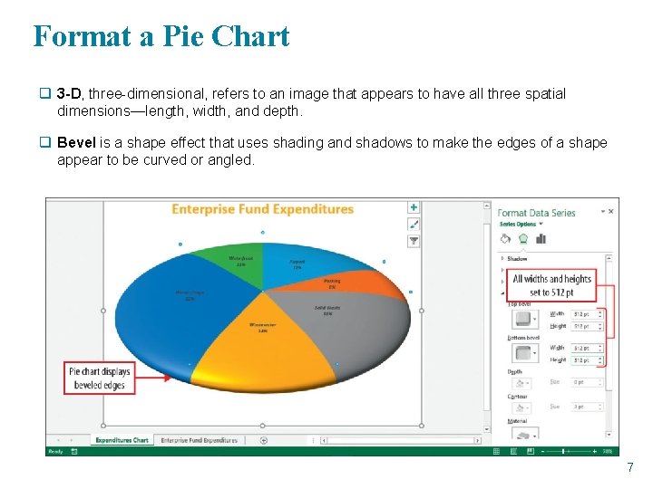
Format a Pie Chart q 3 -D, three-dimensional, refers to an image that appears to have all three spatial dimensions—length, width, and depth. q Bevel is a shape effect that uses shading and shadows to make the edges of a shape appear to be curved or angled. 7

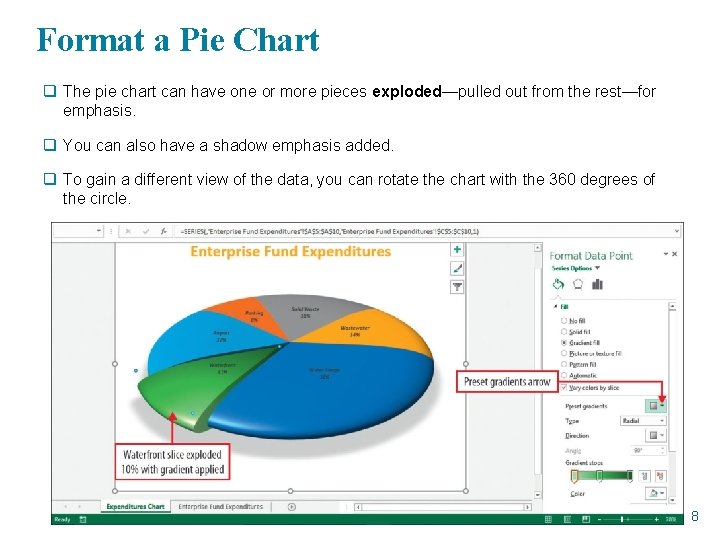
Format a Pie Chart q The pie chart can have one or more pieces exploded—pulled out from the rest—for emphasis. q You can also have a shadow emphasis added. q To gain a different view of the data, you can rotate the chart with the 360 degrees of the circle. 8

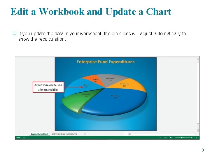
Edit a Workbook and Update a Chart q If you update the data in your worksheet, the pie slices will adjust automatically to show the recalculation. 9

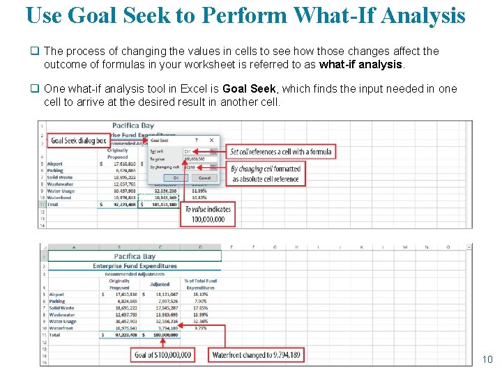
Use Goal Seek to Perform What-If Analysis q The process of changing the values in cells to see how those changes affect the outcome of formulas in your worksheet is referred to as what-if analysis. q One what-if analysis tool in Excel is Goal Seek, which finds the input needed in one cell to arrive at the desired result in another cell. 10

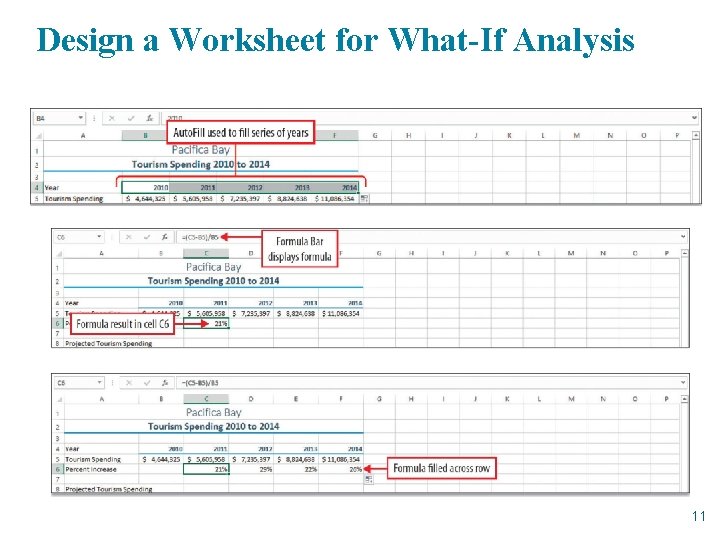
Design a Worksheet for What-If Analysis 11

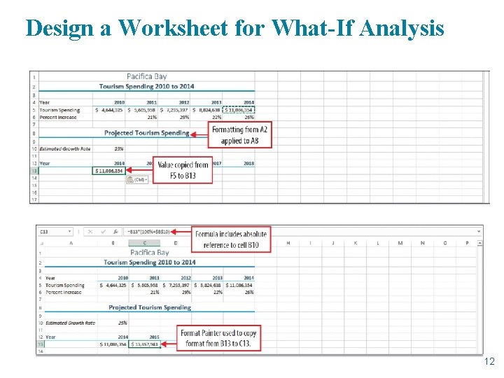
Design a Worksheet for What-If Analysis 12

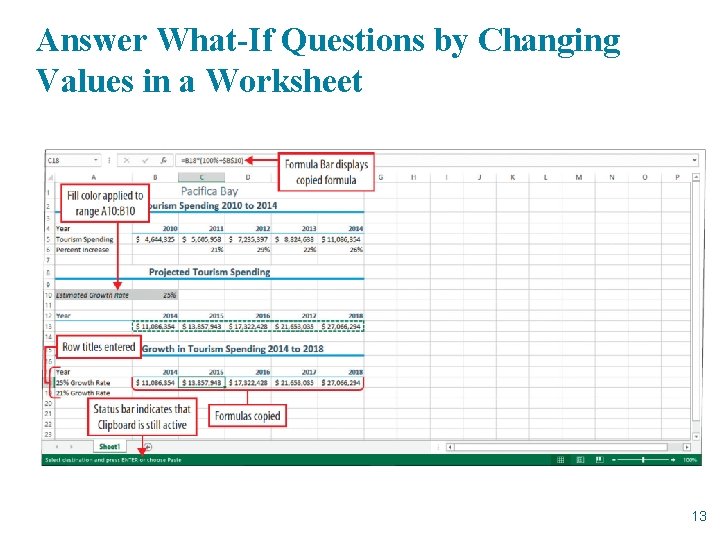
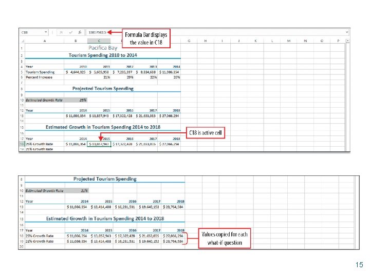
Answer What-If Questions by Changing Values in a Worksheet 13

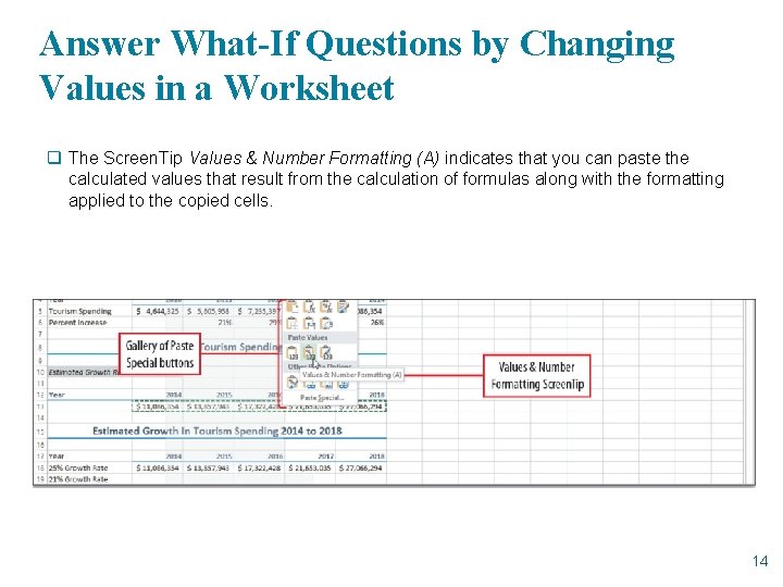
Answer What-If Questions by Changing Values in a Worksheet q The Screen. Tip Values & Number Formatting (A) indicates that you can paste the calculated values that result from the calculation of formulas along with the formatting applied to the copied cells. 14

15

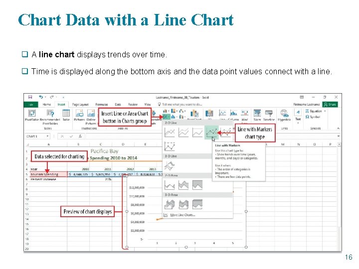
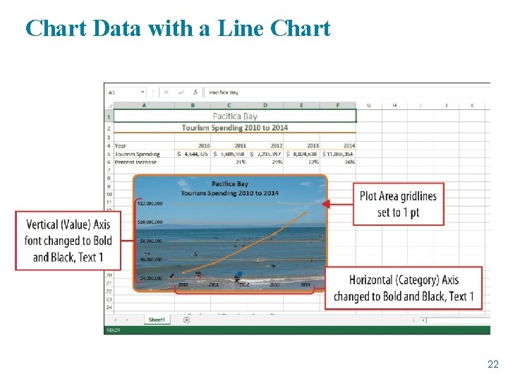
Chart Data with a Line Chart q A line chart displays trends over time. q Time is displayed along the bottom axis and the data point values connect with a line. 16

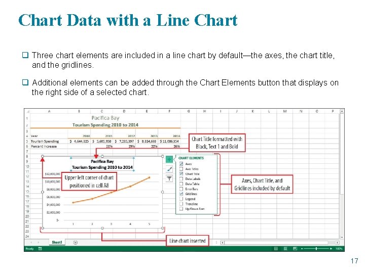
Chart Data with a Line Chart q Three chart elements are included in a line chart by default—the axes, the chart title, and the gridlines. q Additional elements can be added through the Chart Elements button that displays on the right side of a selected chart. 17

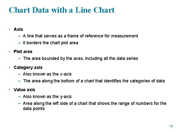
Chart Data with a Line Chart • Axis – A line that serves as a frame of reference for measurement – It borders the chart plot area • Plot area – The area bounded by the axes, including all the data series • Category axis – Also known as the x-axis – The area along the bottom of a chart that identifies the categories of data • Value axis – Also known as the y-axis – Area along the left side of a chart that shows the range of numbers for the data points 18

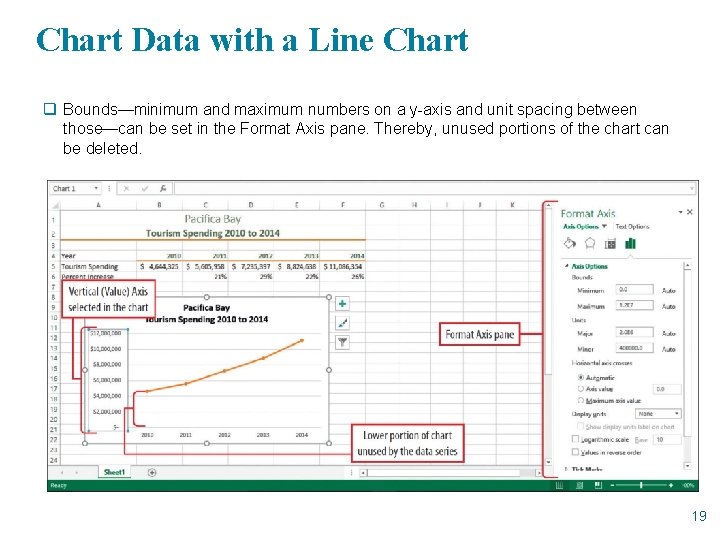
Chart Data with a Line Chart q Bounds—minimum and maximum numbers on a y-axis and unit spacing between those—can be set in the Format Axis pane. Thereby, unused portions of the chart can be deleted. 19

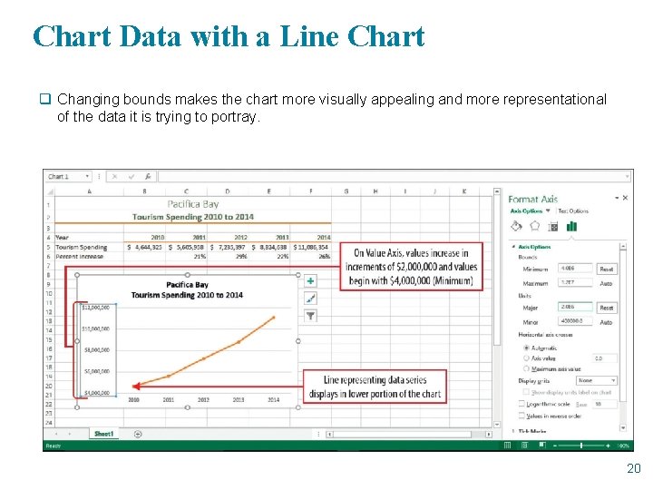
Chart Data with a Line Chart q Changing bounds makes the chart more visually appealing and more representational of the data it is trying to portray. 20

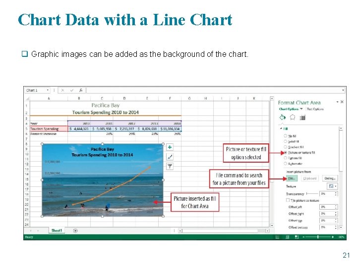
Chart Data with a Line Chart q Graphic images can be added as the background of the chart. 21

Chart Data with a Line Chart 22

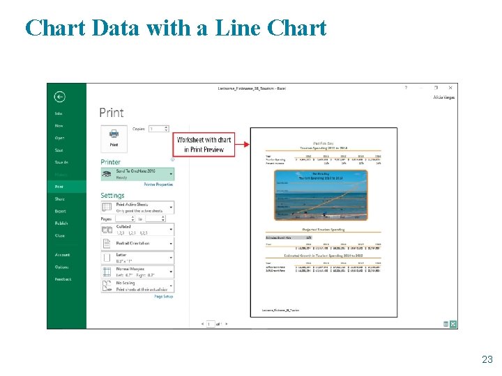
Chart Data with a Line Chart 23

Glossary

§ 3 -D: The shortened term for three-dimensional, which refers to an image that appears to have all three spatial dimensions—length, width, and depth. § Absolute cell reference: A cell reference that refers to cells by their fixed position in a worksheet; an absolute cell reference remains the same when the formula is copied. § Axis: A line that serves as a frame of reference for measurement and which borders the chart plot area. § Base: The starting point when you divide the amount of increase by it to calculate the rate of increase. § Bevel: A shape effect that uses shading and shadows to make the edges of a shape appear to be curved or angled. § Category axis: The area along the bottom of a chart that identifies the categories of data; also referred to as the x-axis. § Chart area: The entire chart and all of its elements. § Chart sheet: A workbook sheet that contains only a chart. § Data marker: A column, bar, area, dot, pie slice, or other symbol in a chart that represents a single data point; related data points form a data series. § Data point: A value that originates in a worksheet cell and that is represented in a chart by a data marker. 25

§ Data series: Related data points represented by data markers; each data series has a unique color or pattern represented in the chart legend. § Enterprise fund: A municipal government fund that reports income and expenditures related to municipal services for which a fee is charged in exchange for goods or services. § Explode: The action of pulling out one or more pie slices from a pie chart for emphasis. § Formula Auto. Complete: An Excel feature which, after typing an = (equal sign) and the beginning letter or letters of a function name, displays a list of function names that match the typed letter(s). § Fund: A sum of money set aside for a specific purpose. § General fund: The term used to describe money set aside for the normal operating activities of a government entity such as a city. § Goal Seek: A what-if analysis tool that finds the input needed in one cell to arrive at the desired result in another cell. § Legend: A chart element that identifies the patterns or colors that are assigned to the categories in the chart. § Line chart: A chart type that displays trends over time; time displays along the bottom axis and the data point values are connected with a line. 26

§ Major unit: The value in a chart’s value axis that determines the spacing between tick marks and between the gridlines in the plot area. § Order of operations: The mathematical rules for performing multiple calculations within a formula. § Percent for new value = base percent + percent of increase: The formula for calculating a percentage by which a value increases by adding the base percentage— usually 100%—to the percent increase. § Percentage rate of increase: The percent by which one number increases over another number. § Pie chart: A chart that shows the relationship of each part to a whole. § Plot area: The area bounded by the axes of a chart, including all the data series. § Rate = amount of increase/base: The mathematical formula to calculate a rate of increase. § Relative cell reference: In a formula, the address of a cell based on the relative positions of the cell that contains the formula and the cell referred to in the formula. § Value after increase = base x percent for new value: The formula for calculating the value after an increase by multiplying the original value—the base—by the percent for new value (see the Percent for new value formula). 27

§ Value axis: A numerical scale on the left side of a chart that shows the range of numbers for the data points; also referred to as the y-axis. § what-if analysis: The process of changing the values in cells to see how those changes affect the outcome of formulas in a worksheet. § x-axis: Another name for the category axis. § y-axis: Another name for the value axis 28