Exploratory Data Analysis and Data Visualization Credits Chris
- Slides: 49

Exploratory Data Analysis and Data Visualization Credits: Chris. Volinsky - Columbia University 1

Outline • EDA • Visualization – – – One variable Two variables More than two variables Other types of data Dimension reduction 2

EDA and Visualization • Exploratory Data Analysis (EDA) and Visualization are very important steps in any analysis task. • get to know your data! – – – distributions (symmetric, normal, skewed) data quality problems outliers correlations and inter-relationships subsets of interest suggest functional relationships • Sometimes EDA or viz might be the goal! 3

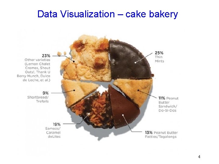
Data Visualization – cake bakery 4

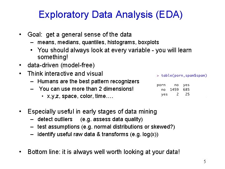
Exploratory Data Analysis (EDA) • Goal: get a general sense of the data – means, medians, quantiles, histograms, boxplots • You should always look at every variable - you will learn something! • data-driven (model-free) • Think interactive and visual – Humans are the best pattern recognizers – You can use more than 2 dimensions! • x, y, z, space, color, time…. • Especially useful in early stages of data mining – detect outliers (e. g. assess data quality) – test assumptions (e. g. normal distributions or skewed? ) – identify useful raw data & transforms (e. g. log(x)) • Bottom line: it is always well worth looking at your data! 5

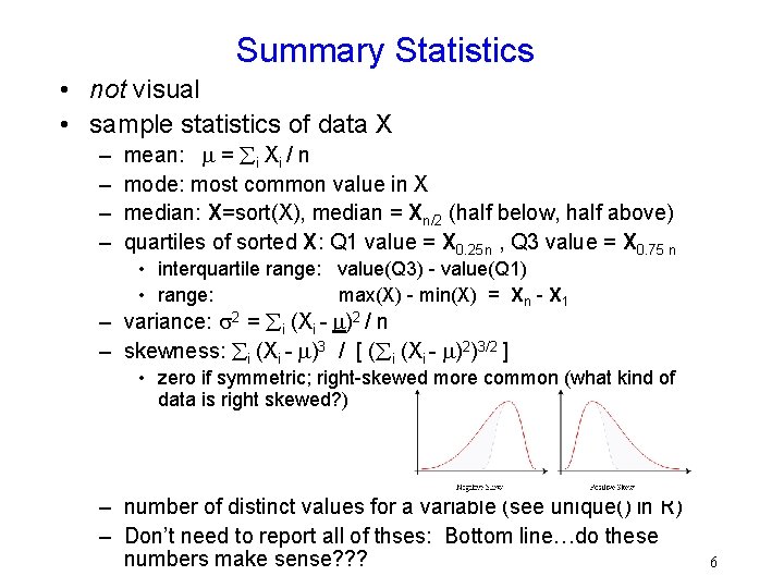
Summary Statistics • not visual • sample statistics of data X – – mean: = i Xi / n mode: most common value in X median: X=sort(X), median = Xn/2 (half below, half above) quartiles of sorted X: Q 1 value = X 0. 25 n , Q 3 value = X 0. 75 n • interquartile range: value(Q 3) - value(Q 1) • range: max(X) - min(X) = Xn - X 1 – variance: 2 = i (Xi - )2 / n – skewness: i (Xi - )3 / [ ( i (Xi - )2)3/2 ] • zero if symmetric; right-skewed more common (what kind of data is right skewed? ) – number of distinct values for a variable (see unique() in R) – Don’t need to report all of thses: Bottom line…do these numbers make sense? ? ? 6

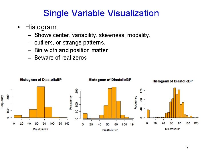
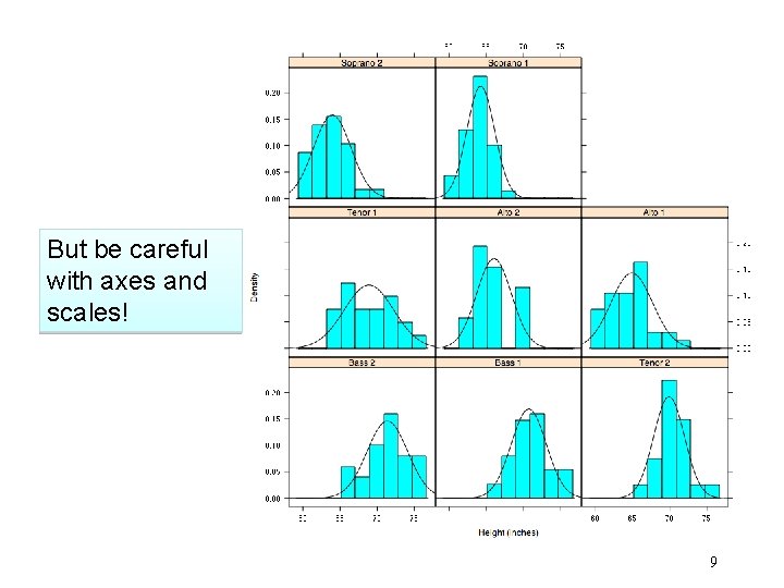
Single Variable Visualization • Histogram: – – Shows center, variability, skewness, modality, outliers, or strange patterns. Bin width and position matter Beware of real zeros 7

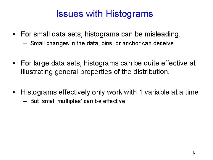
Issues with Histograms • For small data sets, histograms can be misleading. – Small changes in the data, bins, or anchor can deceive • For large data sets, histograms can be quite effective at illustrating general properties of the distribution. • Histograms effectively only work with 1 variable at a time – But ‘small multiples’ can be effective 8

But be careful with axes and scales! 9

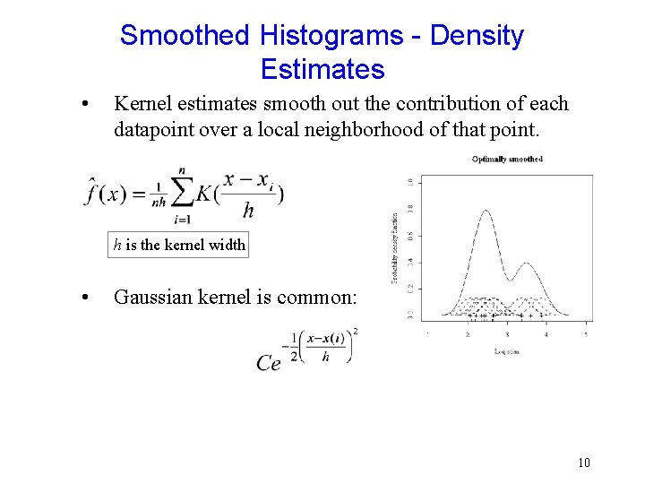
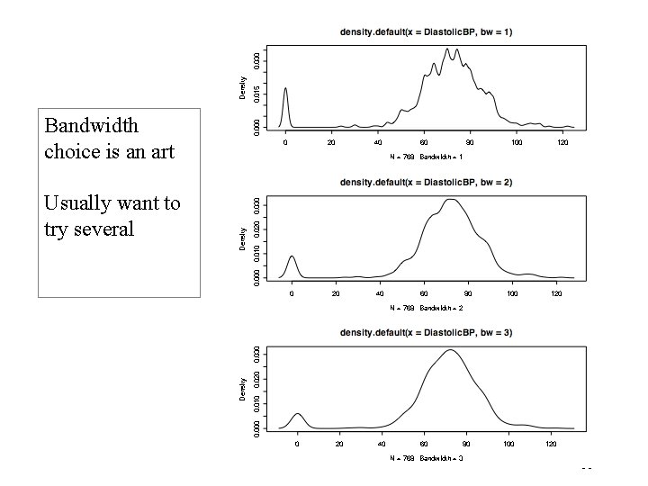
Smoothed Histograms - Density Estimates • Kernel estimates smooth out the contribution of each datapoint over a local neighborhood of that point. h is the kernel width • Gaussian kernel is common: 10

Bandwidth choice is an art Usually want to try several 11

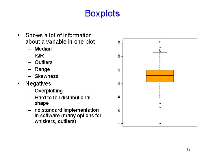
Boxplots • Shows a lot of information about a variable in one plot – – – Median IQR Outliers Range Skewness • Negatives – Overplotting – Hard to tell distributional shape – no standard implementation in software (many options for whiskers, outliers) 12

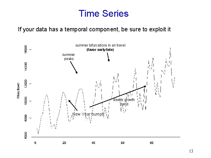
Time Series If your data has a temporal component, be sure to exploit it summer bifurcations in air travel (favor early/late) summer peaks steady growth trend New Year bumps 13

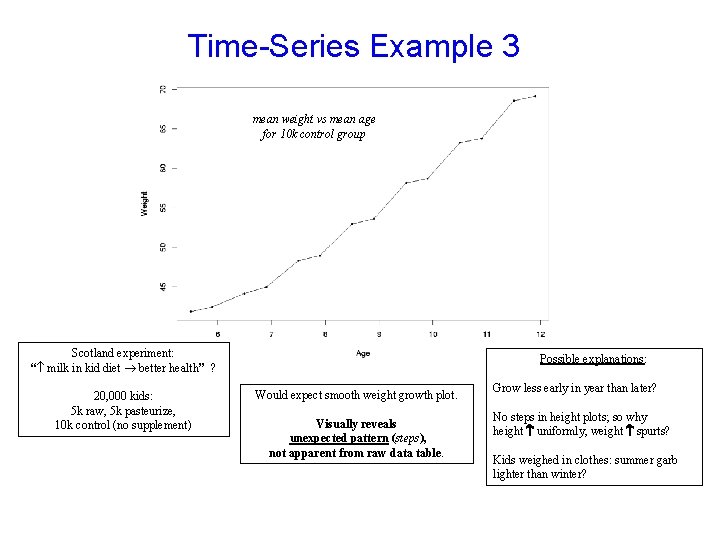
Time-Series Example 3 mean weight vs mean age for 10 k control group Scotland experiment: “ milk in kid diet better health” ? 20, 000 kids: 5 k raw, 5 k pasteurize, 10 k control (no supplement) Possible explanations: Would expect smooth weight growth plot. Visually reveals unexpected pattern (steps), not apparent from raw data table. Grow less early in year than later? No steps in height plots; so why height uniformly, weight spurts? Kids weighed in clothes: summer garb lighter than winter?

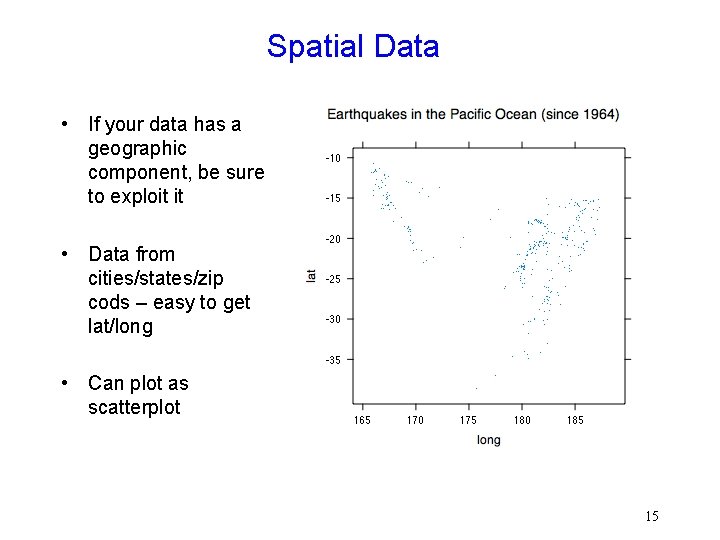
Spatial Data • If your data has a geographic component, be sure to exploit it • Data from cities/states/zip cods – easy to get lat/long • Can plot as scatterplot 15

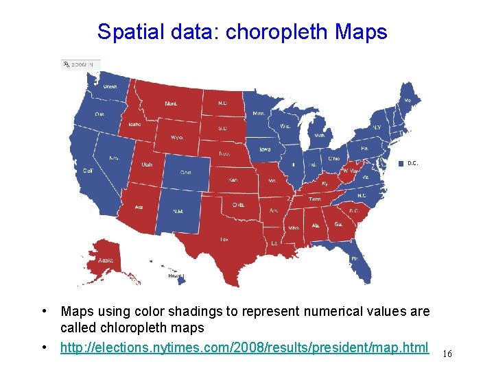
Spatial data: choropleth Maps • Maps using color shadings to represent numerical values are called chloropleth maps • http: //elections. nytimes. com/2008/results/president/map. html 16

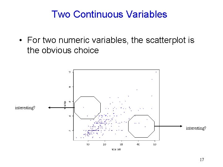
Two Continuous Variables • For two numeric variables, the scatterplot is the obvious choice interesting? 17

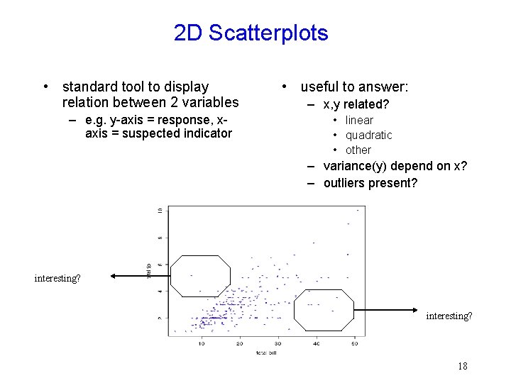
2 D Scatterplots • standard tool to display relation between 2 variables – e. g. y-axis = response, xaxis = suspected indicator • useful to answer: – x, y related? • linear • quadratic • other – variance(y) depend on x? – outliers present? interesting? 18

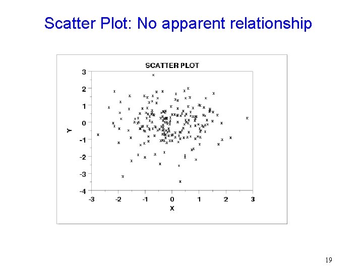
Scatter Plot: No apparent relationship 19

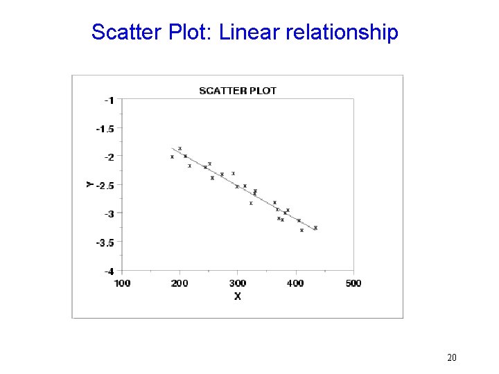
Scatter Plot: Linear relationship 20

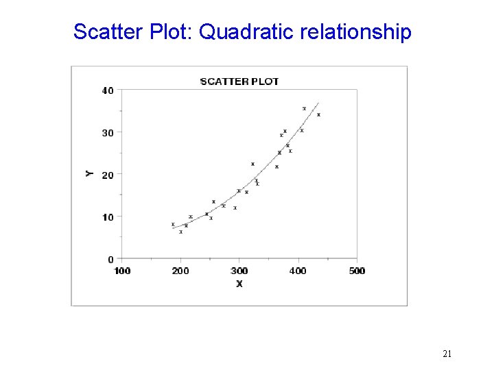
Scatter Plot: Quadratic relationship 21

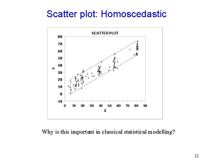
Scatter plot: Homoscedastic Why is this important in classical statistical modelling? 22

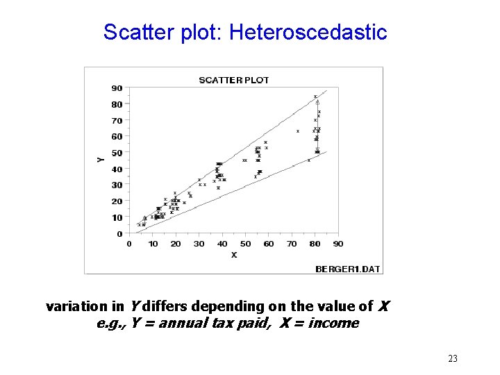
Scatter plot: Heteroscedastic variation in Y differs depending on the value of X e. g. , Y = annual tax paid, X = income 23

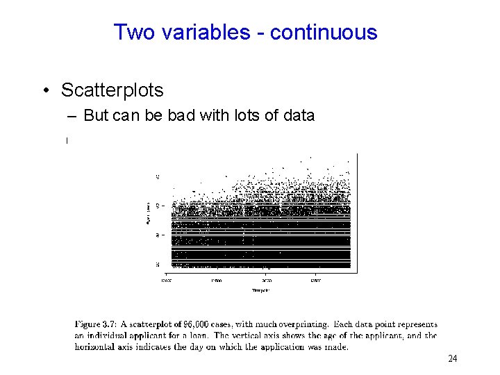
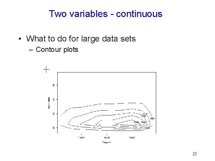
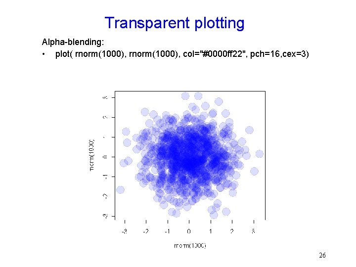
Two variables - continuous • Scatterplots – But can be bad with lots of data 24

Two variables - continuous • What to do for large data sets – Contour plots 25

Transparent plotting Alpha-blending: • plot( rnorm(1000), col="#0000 ff 22", pch=16, cex=3) 26

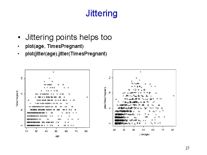
Jittering • Jittering points helps too • • plot(age, Times. Pregnant) plot(jitter(age), jitter(Times. Pregnant) 27

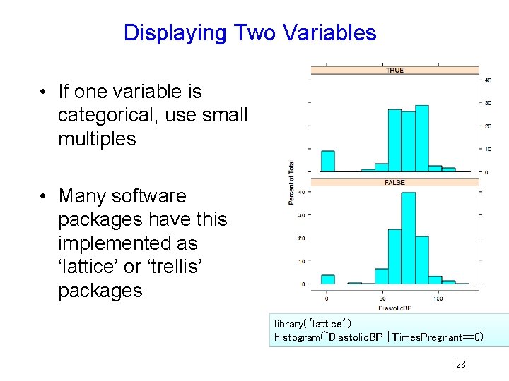
Displaying Two Variables • If one variable is categorical, use small multiples • Many software packages have this implemented as ‘lattice’ or ‘trellis’ packages library(‘lattice’) histogram(~Diastolic. BP | Times. Pregnant==0) 28

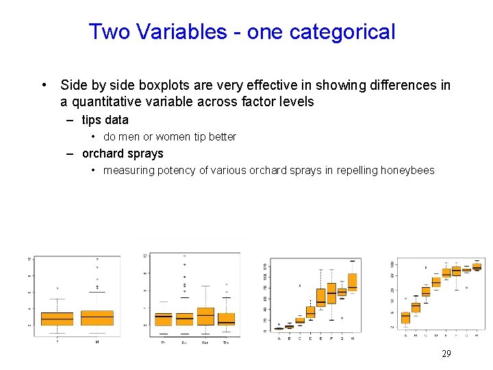
Two Variables - one categorical • Side by side boxplots are very effective in showing differences in a quantitative variable across factor levels – tips data • do men or women tip better – orchard sprays • measuring potency of various orchard sprays in repelling honeybees 29

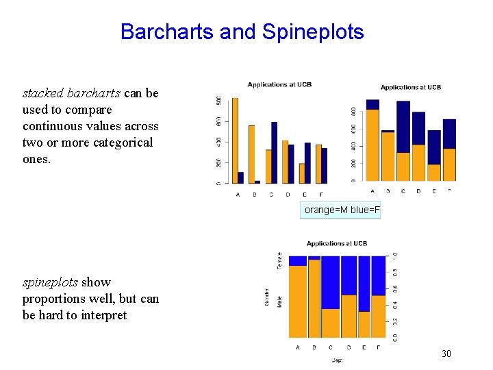
Barcharts and Spineplots stacked barcharts can be used to compare continuous values across two or more categorical ones. orange=M blue=F spineplots show proportions well, but can be hard to interpret 30

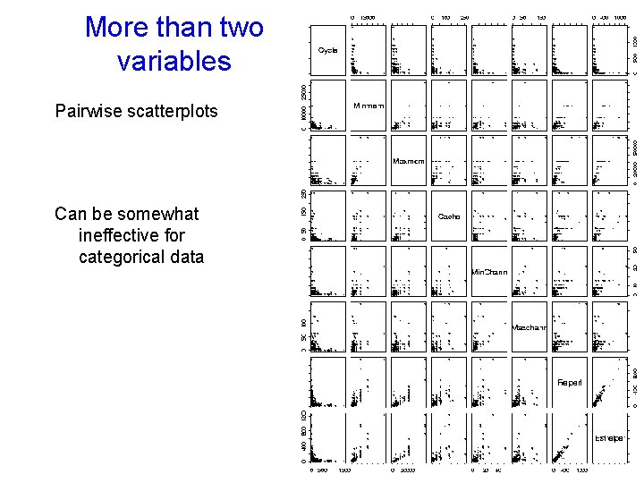
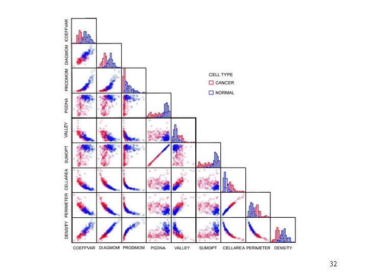
More than two variables Pairwise scatterplots Can be somewhat ineffective for categorical data 31

32

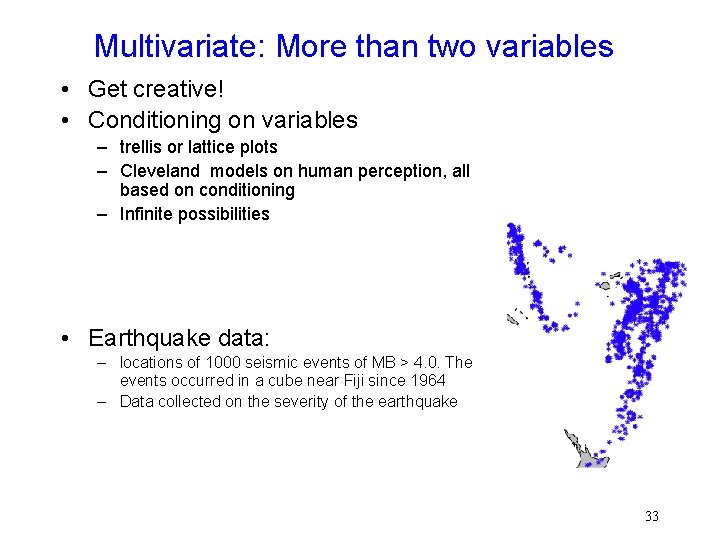
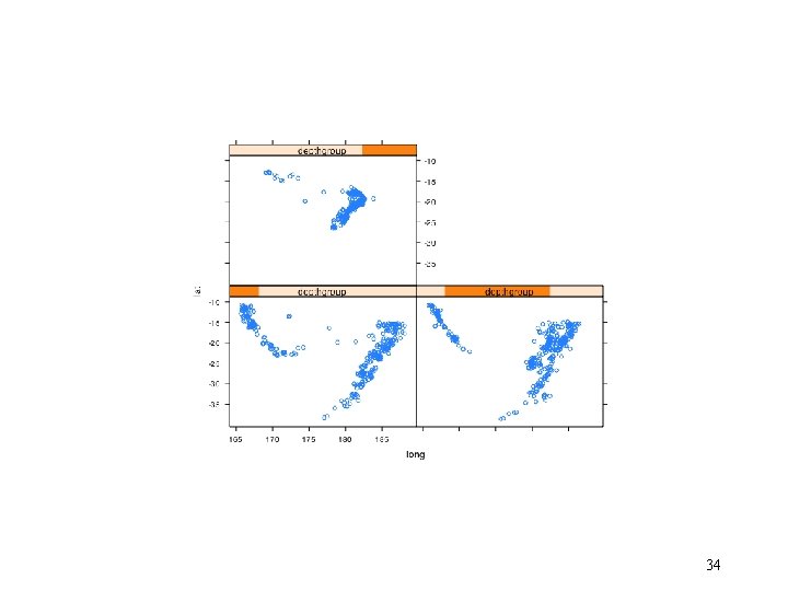
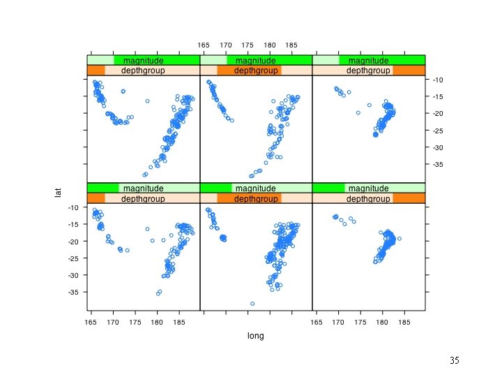
Multivariate: More than two variables • Get creative! • Conditioning on variables – trellis or lattice plots – Cleveland models on human perception, all based on conditioning – Infinite possibilities • Earthquake data: – locations of 1000 seismic events of MB > 4. 0. The events occurred in a cube near Fiji since 1964 – Data collected on the severity of the earthquake 33

34

35

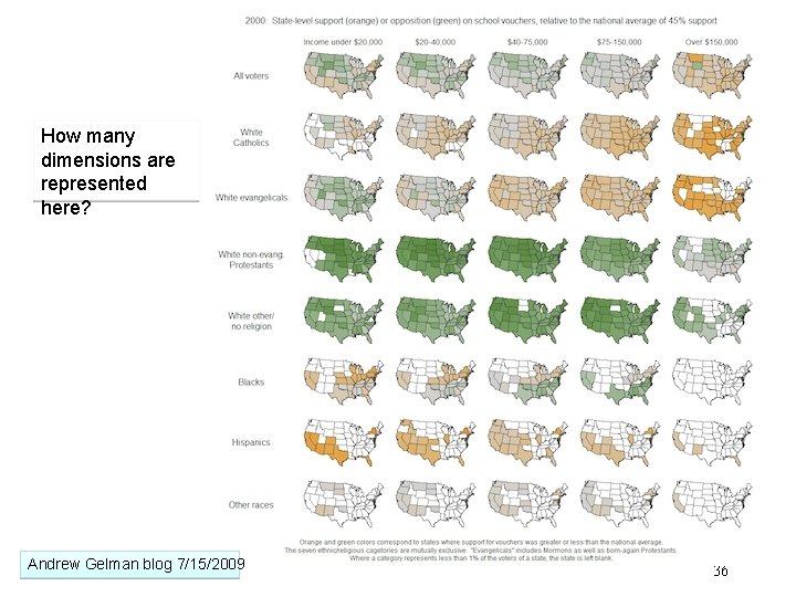
How many dimensions are represented here? Andrew Gelman blog 7/15/2009 36

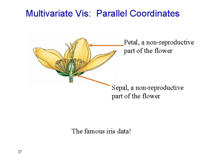
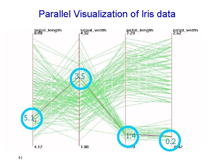
Multivariate Vis: Parallel Coordinates Petal, a non-reproductive part of the flower Sepal, a non-reproductive part of the flower The famous iris data! 37

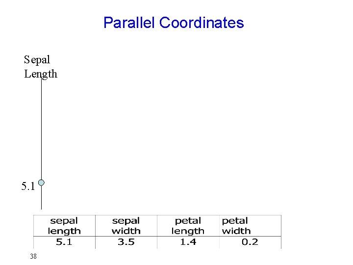
Parallel Coordinates Sepal Length 5. 1 38

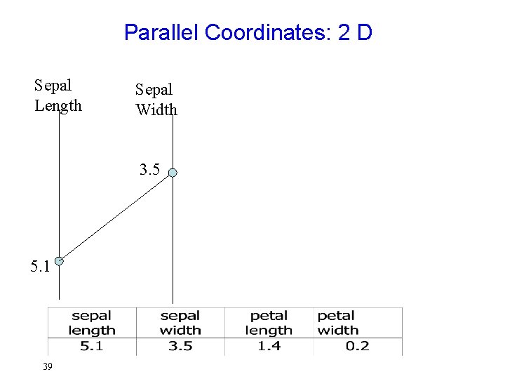
Parallel Coordinates: 2 D Sepal Length Sepal Width 3. 5 5. 1 39

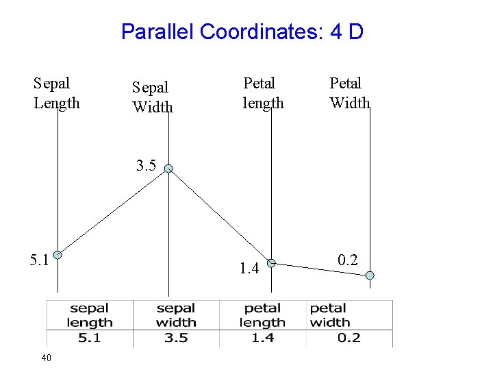
Parallel Coordinates: 4 D Sepal Length Sepal Width Petal length Petal Width 3. 5 5. 1 40 1. 4 0. 2

Parallel Visualization of Iris data 3. 5 5. 1 1. 4 41 0. 2

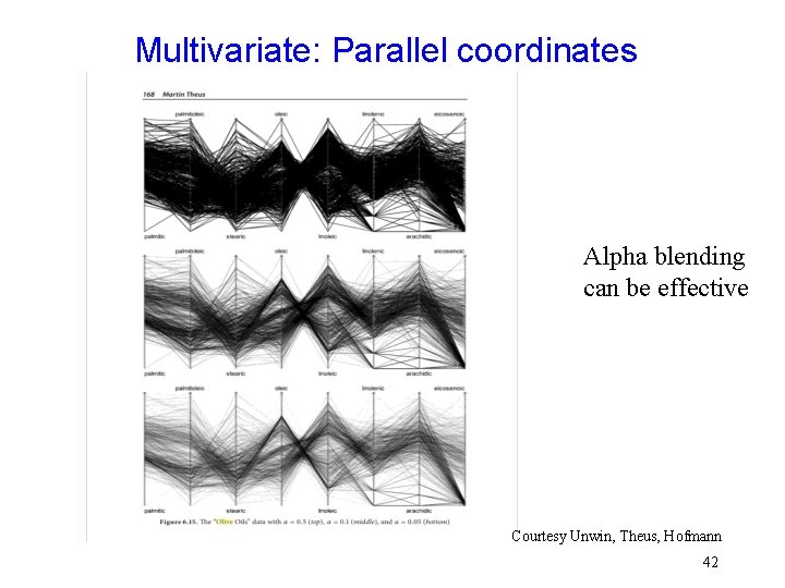
Multivariate: Parallel coordinates Alpha blending can be effective Courtesy Unwin, Theus, Hofmann 42

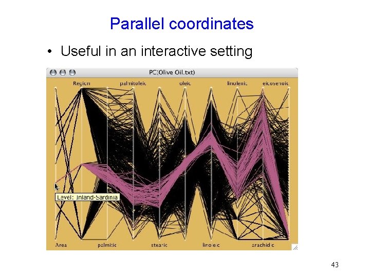
Parallel coordinates • Useful in an interactive setting 43

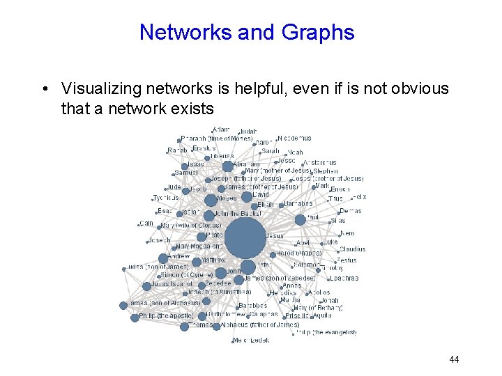
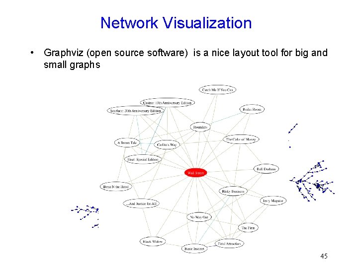
Networks and Graphs • Visualizing networks is helpful, even if is not obvious that a network exists 44

Network Visualization • Graphviz (open source software) is a nice layout tool for big and small graphs 45

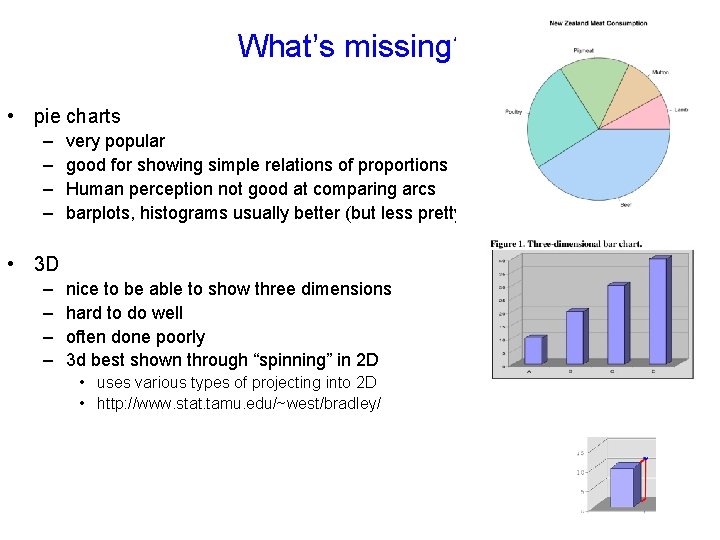
What’s missing? • pie charts – – very popular good for showing simple relations of proportions Human perception not good at comparing arcs barplots, histograms usually better (but less pretty) • 3 D – – nice to be able to show three dimensions hard to do well often done poorly 3 d best shown through “spinning” in 2 D • uses various types of projecting into 2 D • http: //www. stat. tamu. edu/~west/bradley/ 46

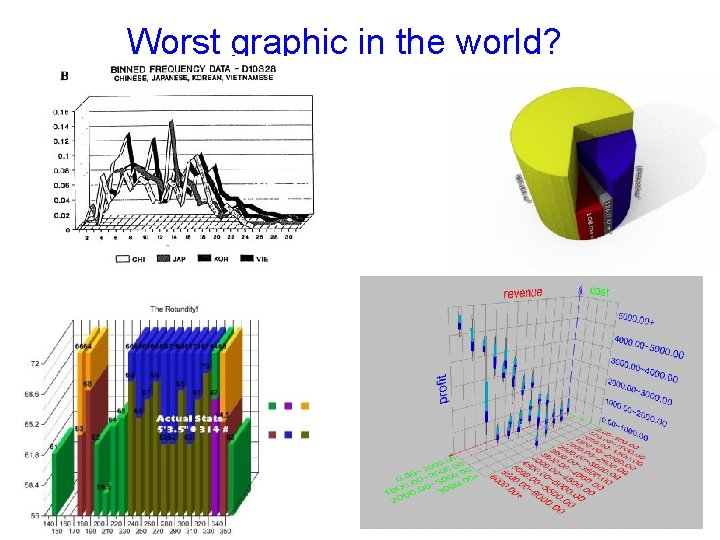
Worst graphic in the world? 47

Dimension Reduction • One way to visualize high dimensional data is to reduce it to 2 or 3 dimensions – Variable selection • e. g. stepwise – Principle Components • find linear projection onto p-space with maximal variance – Multi-dimensional scaling • takes a matrix of (dis)similarities and embeds the points in p-dimensional space to retain those similarities More on this in next Topic 48

Visualization done right • Hans Rosling @ TED • http: //www. youtube. com/watch? v=jbk. SRLYSo jo 49