CSS position and float Properties Positioning what is

- Slides: 28

CSS : position and float Properties

Positioning – what is it? Positioning refers to the layout of the items on your page. It also refers to the “position” descriptor in CSS rules (more on this in a minute) http: //www. intensivstation. ch/en/templates/ http: //www. solucija. com/home/css-templates/

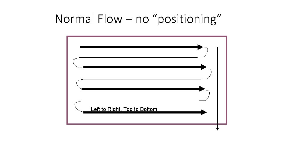
Normal Flow – no “positioning” Left to Right, Top to Bottom

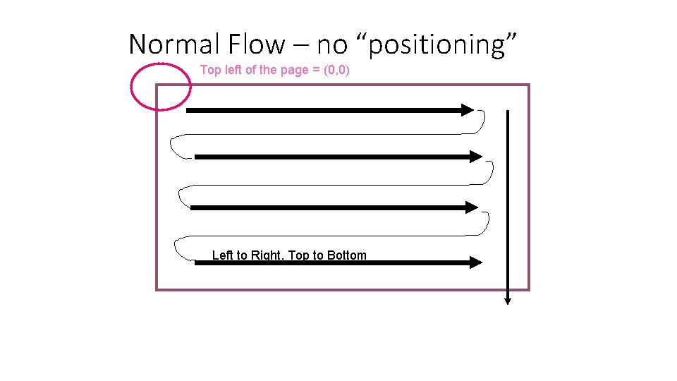
Normal Flow – no “positioning” Top left of the page = (0, 0) Left to Right, Top to Bottom

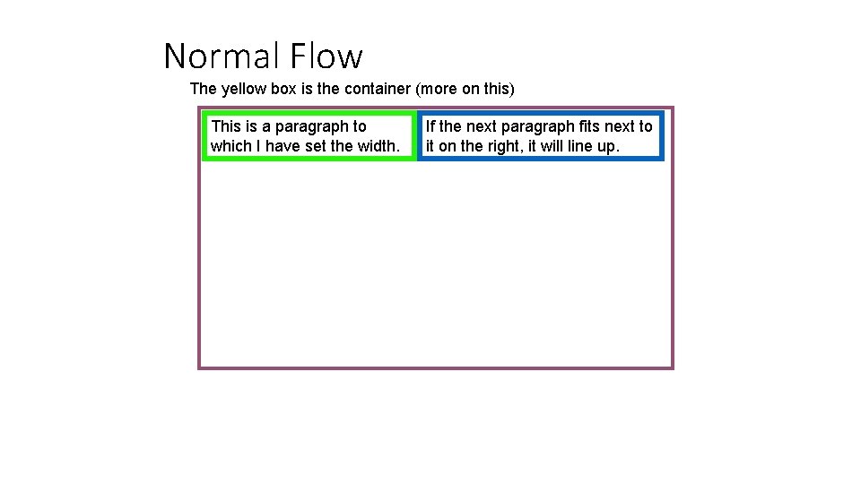
Normal Flow The yellow box is the container (more on this) This is a paragraph to which I have set the width. If the next paragraph fits next to it on the right, it will line up.

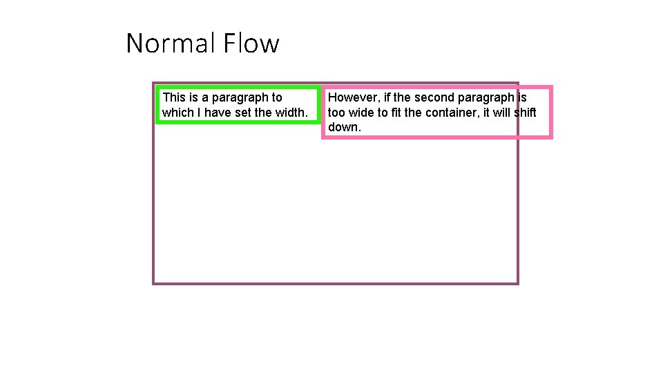
Normal Flow This is a paragraph to which I have set the width. However, if the second paragraph is too wide to fit the container, it will shift down.

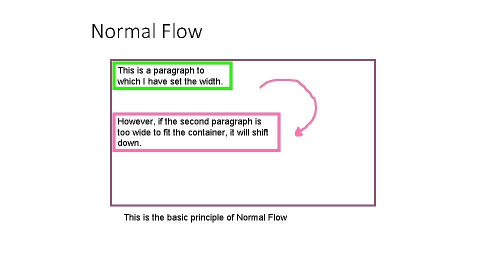
Normal Flow This is a paragraph to which I have set the width. However, if the second paragraph is too wide to fit the container, it will shift down. This is the basic principle of Normal Flow

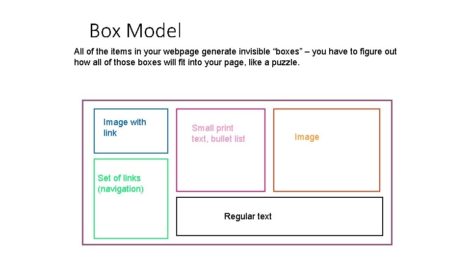
Box Model All of the items in your webpage generate invisible “boxes” – you have to figure out how all of those boxes will fit into your page, like a puzzle. Image with link Small print text, bullet list Set of links (navigation) Regular text Image

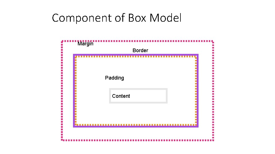
Component of Box Model Margin Border Padding Content

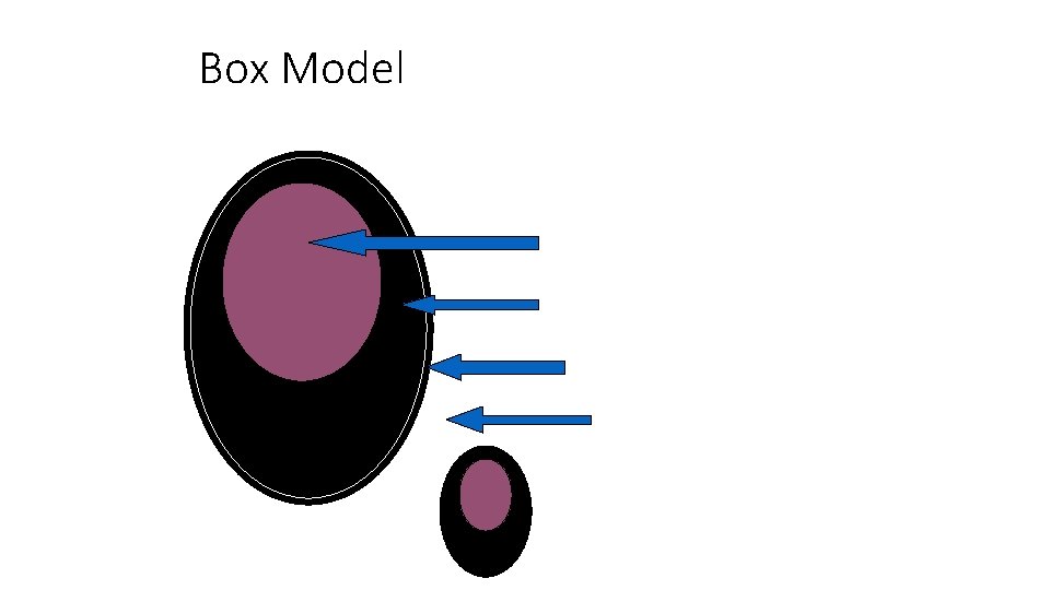
Box Model Think of it like an egg: The yolk is the content The albumen is the padding The shell is the border The margin is how far the egg is from anything else (another tiny egg, perhaps)

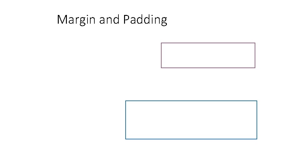
Margin and Padding style. X { TRBL margin: 10 px; padding: 5 px 5 px; } top – right – bottom - left OR style. X { margin: 10 px; padding: 10 px; } OR Shorthand: Just one number = all 4 sides Two numbers = top/bottom, left/right style. X { margin: 10 px 15 px; padding: 5 px 10 px; }

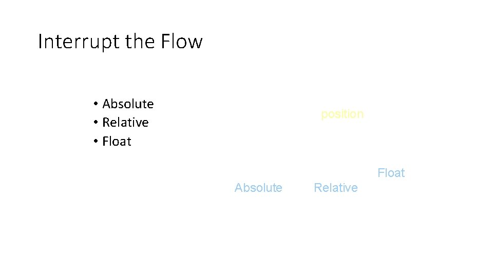
Interrupt the Flow • Absolute • Relative • Float When you want to do fancier layout, you can position “boxes” or “containers. ” By doing this, you interrupt the normal (top to bottom, left to right) flow. You can do this in three ways; Float, Absolute, and Relative.

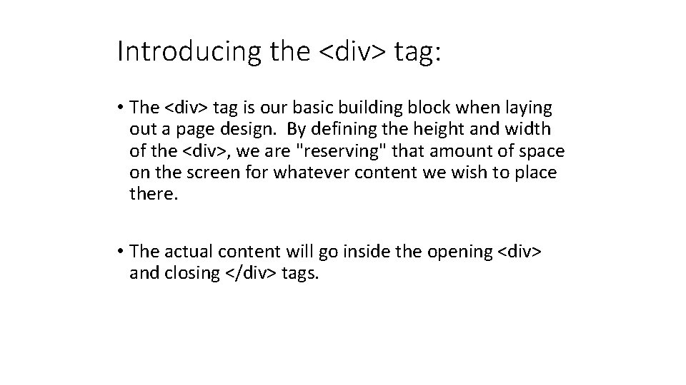
Introducing the <div> tag: • The <div> tag is our basic building block when laying out a page design. By defining the height and width of the <div>, we are "reserving" that amount of space on the screen for whatever content we wish to place there. • The actual content will go inside the opening <div> and closing </div> tags.

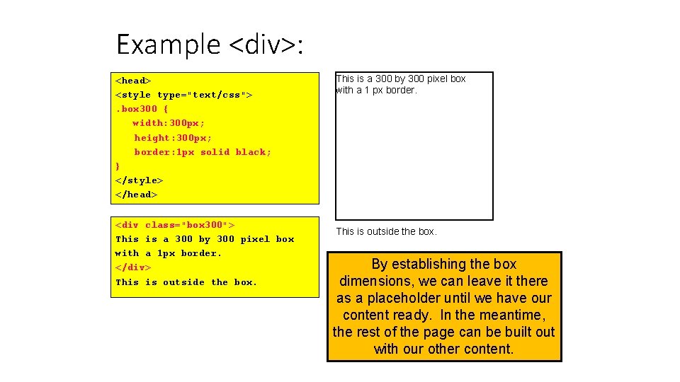
Example <div>: <head> <style type="text/css">. box 300 { width: 300 px; height: 300 px; border: 1 px solid black; } </style> </head> <div class="box 300"> This is a 300 by 300 pixel box with a 1 px border. </div> This is outside the box. This is a 300 by 300 pixel box with a 1 px border. This is outside the box. By establishing the box dimensions, we can leave it there as a placeholder until we have our content ready. In the meantime, the rest of the page can be built out with our other content.

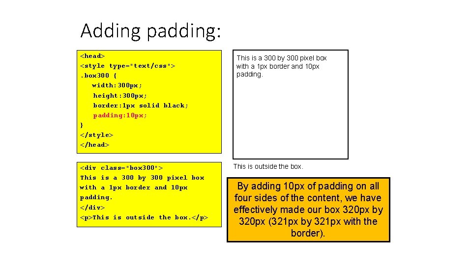
Adding padding: <head> <style type="text/css">. box 300 { width: 300 px; height: 300 px; border: 1 px solid black; padding: 10 px; } </style> </head> <div class="box 300"> This is a 300 by 300 pixel box with a 1 px border and 10 px padding. </div> <p>This is outside the box. </p> This is a 300 by 300 pixel box with a 1 px border and 10 px padding. This is outside the box. By adding 10 px of padding on all four sides of the content, we have effectively made our box 320 px by 320 px (321 px by 321 px with the border).

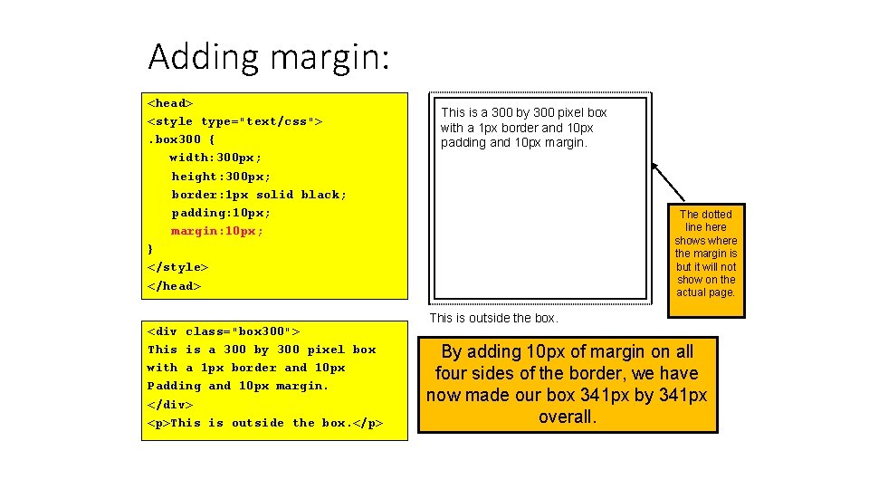
Adding margin: <head> <style type="text/css">. box 300 { width: 300 px; height: 300 px; border: 1 px solid black; padding: 10 px; margin: 10 px; } </style> </head> <div class="box 300"> This is a 300 by 300 pixel box with a 1 px border and 10 px Padding and 10 px margin. </div> <p>This is outside the box. </p> This is a 300 by 300 pixel box with a 1 px border and 10 px padding and 10 px margin. The dotted line here shows where the margin is but it will not show on the actual page. This is outside the box. By adding 10 px of margin on all four sides of the border, we have now made our box 341 px by 341 px overall.

Calculating overall dimensions: • When designing our page, we have to calculate how much size a <div> element will consume: • Total element width = defined width + left padding + right padding + left border + right border + left margin + right margin. • Total element height = defined height + top padding + bottom padding + top border + bottom border + top margin + bottom margin

Pixels vs. Percent: • The width property can be specified in pixels or in percent. By using "width: 50%", we are telling the browser to make the width of the element exactly 50% of the space available. • Using percent instead of pixels can make our page layout highly flexible. For example, we can use the entire screen real estate, no matter what size screen or resolution our web visitor has.

A technique to center a <div>: • Because we don't know what the screen resolution will be for our visitors, it can be challenging to get our pages to display attractively for all viewers. • A useful technique is to set the right and left margins of a <div> to the value "auto". This tells the browser to maintain an equal distance on the right and left, effectively centering the <div> no matter how wide the available area is: . centerme { margin: 0 auto; } • This same technique can be used on a <div> element that contains all your page content in order to center your page on the screen, no matter what the screen resolution of your web visitor.

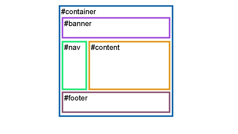
#container #banner #nav #footer #content

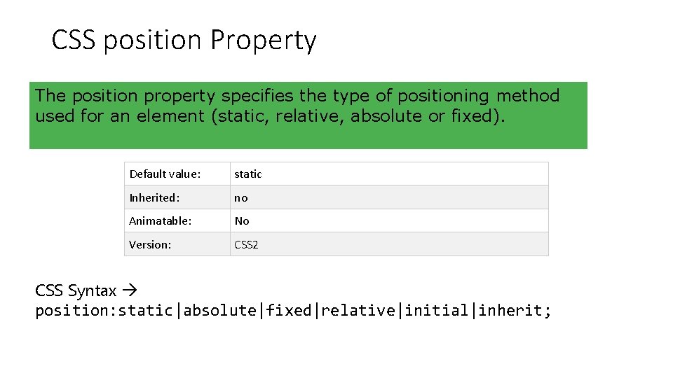
CSS position Property The position property specifies the type of positioning method used for an element (static, relative, absolute or fixed). Default value: static Inherited: no Animatable: No Version: CSS 2 CSS Syntax position: static|absolute|fixed|relative|initial|inherit;

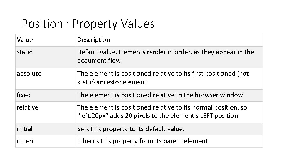
Position : Property Values Value Description static Default value. Elements render in order, as they appear in the document flow absolute The element is positioned relative to its first positioned (not static) ancestor element fixed The element is positioned relative to the browser window relative The element is positioned relative to its normal position, so "left: 20 px" adds 20 pixels to the element's LEFT position initial Sets this property to its default value. inherit Inherits this property from its parent element.

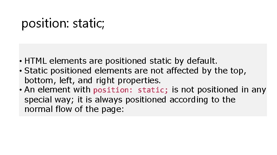
position: static; • HTML elements are positioned static by default. • Static positioned elements are not affected by the top, bottom, left, and right properties. • An element with position: static; is not positioned in any special way; it is always positioned according to the normal flow of the page:

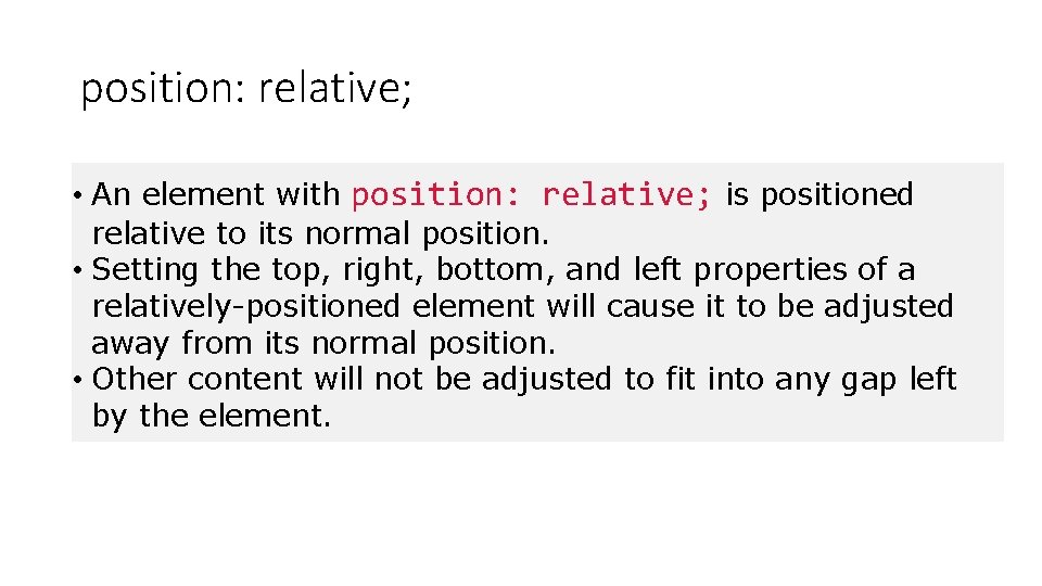
position: relative; • An element with position: relative; is positioned relative to its normal position. • Setting the top, right, bottom, and left properties of a relatively-positioned element will cause it to be adjusted away from its normal position. • Other content will not be adjusted to fit into any gap left by the element.

Position : absolute; • An element with position: absolute; is positioned relative to the nearest positioned ancestor (instead of positioned relative to the viewport, like fixed). • However; if an absolute positioned element has no positioned ancestors, it uses the document body, and moves along with page scrolling.

position: fixed; • An element with position: fixed; is positioned relative to the viewport, which means it always stays in the same place even if the page is scrolled. • It stays where it is, even if the document is scrolled. For media="print" a fixed element will be repeated on each printed page • The top, right, bottom, and left properties are used to position the element. • A fixed element does not leave a gap in the page where it would normally have been located. • Notice the fixed element in the lower-right corner of the page.

CSS float Property The float property specifies whether or not a box (an element) should float. Note: Absolutely positioned elements ignores the float property! Default value: none Inherited: no Animatable: no. Version: CSS 1 CSS Syntax float: none|left|right|initial|inherit;
