Heuristic Evaluation What is Heuristic Evaluation Heuristic is

- Slides: 28

Heuristic Evaluation

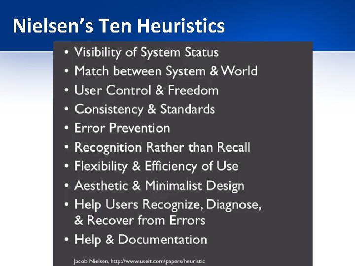
What is Heuristic Evaluation • Heuristic is a guideline that can guide a design decision or be used to critique a decision that has already been made. • Heuristics developed by: Jakob Nielsen (based on work with Rolf Molich) • Several evaluators independently critique a system to come up with potential usability problems.

Heuristic Evaluation • You can get these peer critiques – Before User Testing – Before redesigning – If you know something is wrong it can help you articulate the problem. – Before a release it can smooth out rough edges. • Provide people with a set of heuristics that they’ll use to look for problems. • You can get quick feedback.

Heuristic Evaluation, cont. • Heuristics vs. User Testing: – Heuristic evaluation is faster, and they’ll tell you exactly what you need to fix. – User testing though is more accurate. • Benefits to both – but you don’t waste your users this way.

Heuristic Evaluation: 3 -5 Evaluators • How many evaluators? • Nielsen’s experience indicates that between 3 -5 evaluators is sufficient with 5 usually resulting in about 75% of the overall usability problems being discovered. – One person won’t find everything. Some will find more than others. • Nielsen provides a set of 10 heuristics to aid the evaluators in discovering usability problems. • These can be modified based on your system. Scott Klemmor hci-class. org

Nielsen’s Ten Heuristics

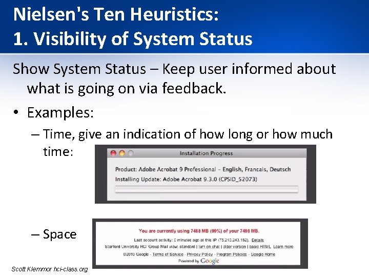
Nielsen's Ten Heuristics: 1. Visibility of System Status Show System Status – Keep user informed about what is going on via feedback. • Examples: – Time, give an indication of how long or how much time: – Space Scott Klemmor hci-class. org

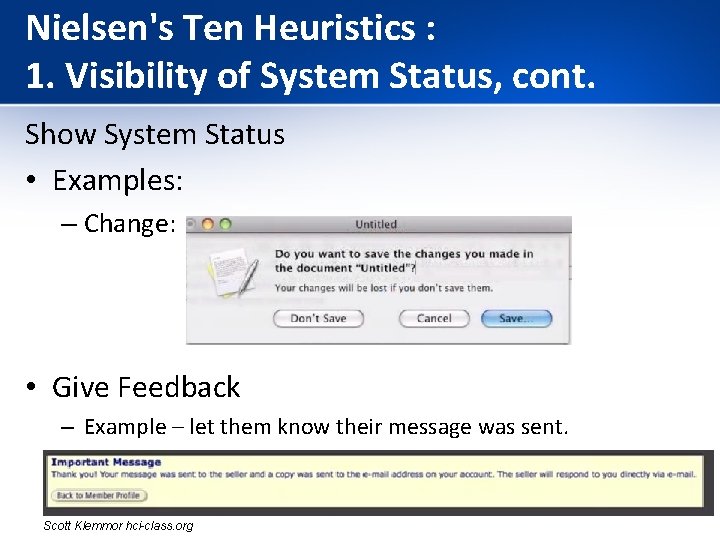
Nielsen's Ten Heuristics : 1. Visibility of System Status, cont. Show System Status • Examples: – Change: • Give Feedback – Example – let them know their message was sent. Scott Klemmor hci-class. org

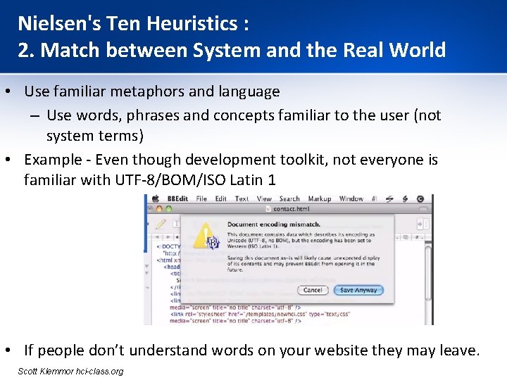
Nielsen's Ten Heuristics : 2. Match between System and the Real World • Use familiar metaphors and language – Use words, phrases and concepts familiar to the user (not system terms) • Example - Even though development toolkit, not everyone is familiar with UTF-8/BOM/ISO Latin 1 • If people don’t understand words on your website they may leave. Scott Klemmor hci-class. org

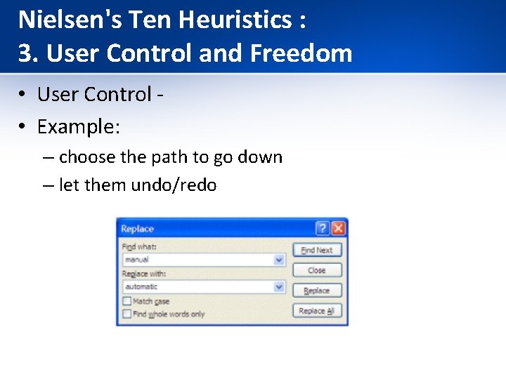
Nielsen's Ten Heuristics : 3. User Control and Freedom • User Control • Example: – choose the path to go down – let them undo/redo

Nielsen's Ten Heuristics : 4. Consistency and Standards • Consistency: – Have same buttons in the same locations. Use consistent names. – User should not have to wonder whether words, situations, or actions mean the same thing in different contexts. • Example: Google Plus launched “+1” to counter Facebook’s “Like” without much success. Facebook’s “Like” already became a standard and sites like Linked. In adopted it without contesting. https: //blog. prototypr. io/10 -usability-heuristics-with-examples-4 a 81 ada 920 c

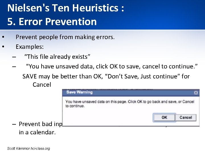
Nielsen's Ten Heuristics : 5. Error Prevention • • Prevent people from making errors. Examples: – “This file already exists” – “You have unsaved data, click OK to save, cancel to continue. ” SAVE may be better than OK, “Don’t Save, Just continue” for Cancel – Prevent bad input. Ex. Can’t enter a date that already occurred in a calendar. Scott Klemmor hci-class. org

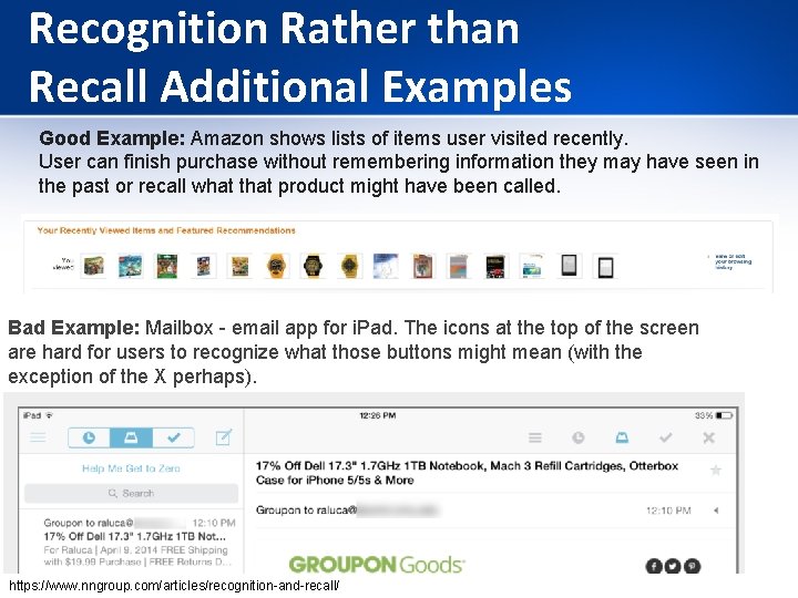
Nielsen's Ten Heuristics : 6. Recognition Rather than Recall User should not have to remember information from one part of the dialogue to another. • Instructions for use of the system should be visible or easily retrievable whenever appropriate. • Example: • – Many mobile apps have tutorials which are hard to later remember. Tips on the page may be better than earlier tutorials on everything.

Recognition Rather than Recall Additional Examples Good Example: Amazon shows lists of items user visited recently. User can finish purchase without remembering information they may have seen in the past or recall what that product might have been called. Bad Example: Mailbox - email app for i. Pad. The icons at the top of the screen are hard for users to recognize what those buttons might mean (with the exception of the X perhaps). https: //www. nngroup. com/articles/recognition-and-recall/

Nielsen's Ten Heuristics : 7. Flexibility & Efficiency of Use • • Flexibility and Efficiency – Example: – keyboard shortcuts • Unseen by novice users, but can speed up interactions for expert users – Example: Ctrl + C, Ctrl + V, Ctrl + P

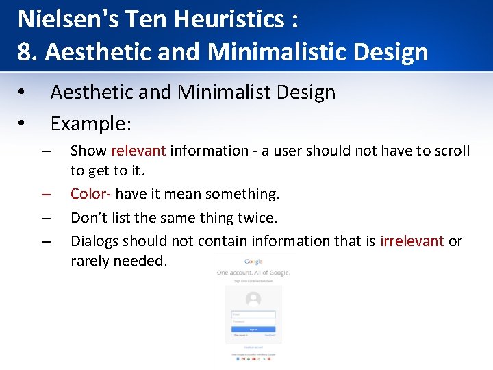
Nielsen's Ten Heuristics : 8. Aesthetic and Minimalistic Design • • Aesthetic and Minimalist Design Example: – – Show relevant information - a user should not have to scroll to get to it. Color- have it mean something. Don’t list the same thing twice. Dialogs should not contain information that is irrelevant or rarely needed.

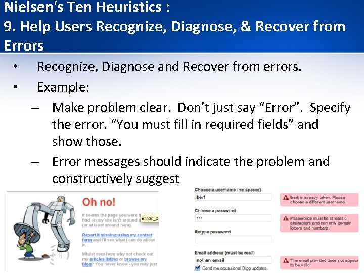
Nielsen's Ten Heuristics : 9. Help Users Recognize, Diagnose, & Recover from Errors • • Recognize, Diagnose and Recover from errors. Example: – Make problem clear. Don’t just say “Error”. Specify the error. “You must fill in required fields” and show those. – Error messages should indicate the problem and constructively suggest a solution.

Nielsen's Ten Heuristics : 10. Help & Documentation • • Better Help and Documentation Help and documentation should be: – – easy to search focused on the user’s task list concrete steps to be carried out not too large

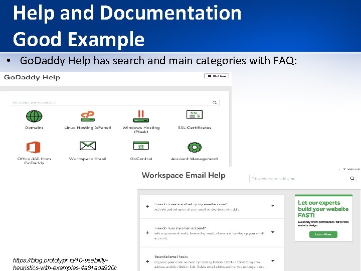
Help and Documentation Good Example • Go. Daddy Help has search and main categories with FAQ: https: //blog. prototypr. io/10 -usabilityheuristics-with-examples-4 a 81 ada 920 c

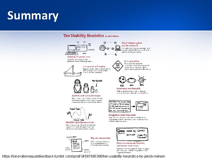
Summary https: //innovationequalsfeedback. tumblr. com/post/34587880366/ten-usability-heuristics-by-jakob-nielsen

Severity • Each evaluator assesses the system and notes violations of any of these heuristics. • The evaluators assess the severity of each usability problem based on 4 factors: – How common is the problem? – How easy is it for the user to overcome? – Will it be a one-off problem or a persistent one? – How seriously will the problem be perceived? • These are combined into an overall severity rating on a scale of 0 -4.

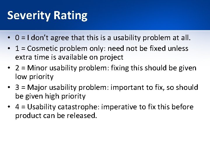
Severity Rating • 0 = I don’t agree that this is a usability problem at all. • 1 = Cosmetic problem only: need not be fixed unless extra time is available on project • 2 = Minor usability problem: fixing this should be given low priority • 3 = Major usability problem: important to fix, so should be given high priority • 4 = Usability catastrophe: imperative to fix this before product can be released.

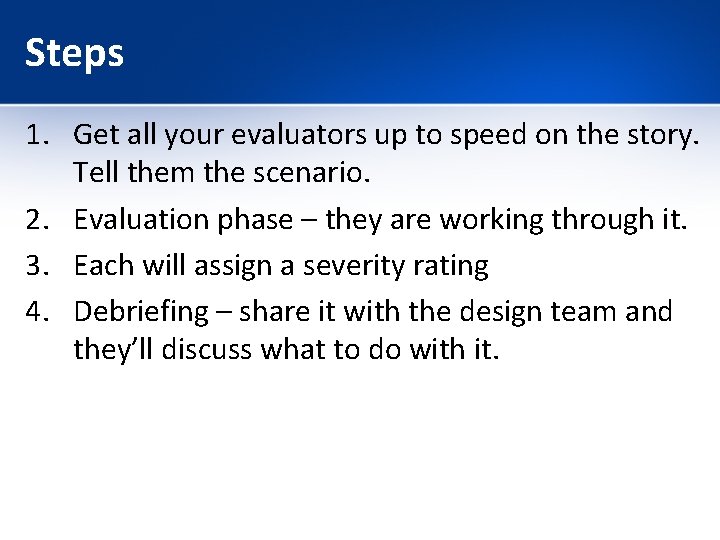
Steps 1. Get all your evaluators up to speed on the story. Tell them the scenario. 2. Evaluation phase – they are working through it. 3. Each will assign a severity rating 4. Debriefing – share it with the design team and they’ll discuss what to do with it.

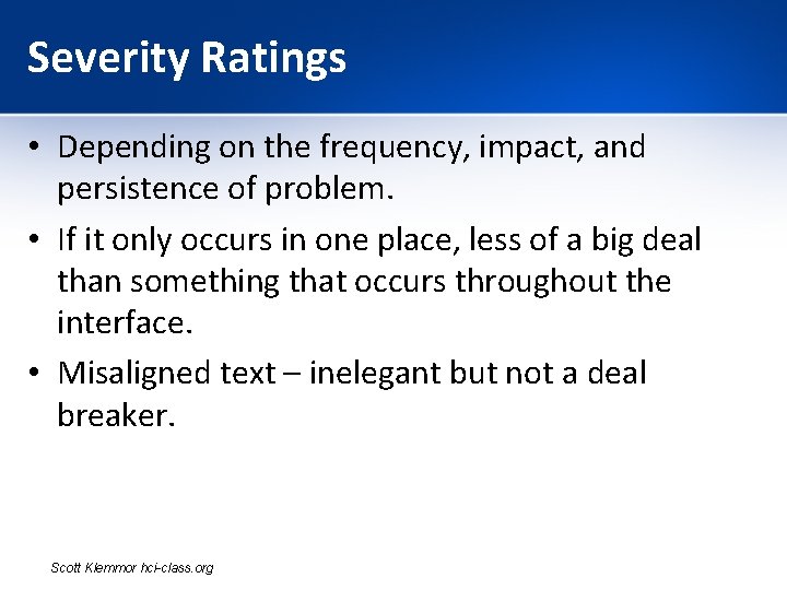
Severity Ratings • Depending on the frequency, impact, and persistence of problem. • If it only occurs in one place, less of a big deal than something that occurs throughout the interface. • Misaligned text – inelegant but not a deal breaker. Scott Klemmor hci-class. org

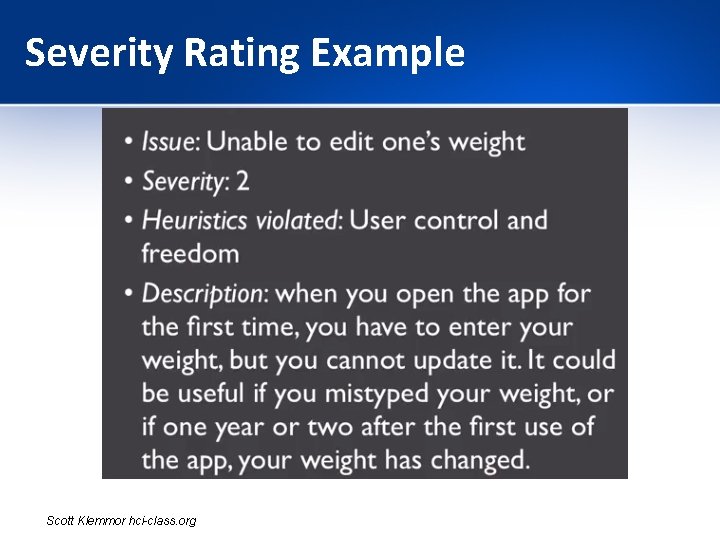
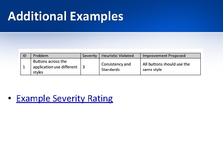
Severity Rating Example Scott Klemmor hci-class. org

Debriefing • Debrief with design team – discuss issues with user interface. • Go through and suggest improvements to problems. Discuss amount of effort to fix a problem. • A 1 on severity – easy to fix – Go ahead a fix. • Catastrophe – takes a lot of effort – important to fix – so fix. • But if something is not important and has a lot of cost to fix, may not be worth it. Scott Klemmor hci-class. org

Additional Examples • Example Severity Rating

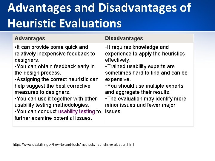
Advantages and Disadvantages of Heuristic Evaluations Advantages Disadvantages • It can provide some quick and relatively inexpensive feedback to designers. • You can obtain feedback early in the design process. • Assigning the correct heuristic can help suggest the best corrective measures to designers. • You can use it together with other usability testing methodologies. • You can conduct usability testing to further examine potential issues. • It requires knowledge and experience to apply the heuristics effectively. • Trained usability experts are sometimes hard to find and can be expensive. • You should use multiple experts and aggregate their results. • The evaluation may identify more minor issues and fewer major issues. https: //www. usability. gov/how-to-and-tools/methods/heuristic-evaluation. html