Exploring Data with Graphs Prof Andy Field Aims


: – Show the data.")


) scatter + geom_point() + geom_smooth() labs(x")

) scatter + geom_point()")

) scatter + geom_point()")

 – The frequency")


 • Boxplots are made up of a box and two whiskers.")
 • To make a boxplot of the day 1 hygiene scores")


 shows the mean score • The error")

 for")


)")

)")


 it")


- Slides: 46
Exploring Data with Graphs Prof. Andy Field
Aims • How to present data clearly • Introduce ggplot 2 • Graphs – Scatterplots – Histograms – Boxplots – Error bar charts – Line graphs
The Art of Presenting Data • Graphs should (Tufte, 2001): – Show the data. – Induce the reader to think about the data being presented (rather than some other aspect of the graph). – Avoid distorting the data. – Present many numbers with minimum ink. – Make large data sets (assuming you have one) coherent. – Encourage the reader to compare different pieces of data. – Reveal data.
Why Is This Graph Bad?
Why Is This Graph Better?
Deceiving the Reader Two graphs about cheese
ggplot 2 In ggplot 2 a plot is made up of layers.
The anatomy of a graph
Specifying aesthetics in ggplot 2
Scatterplots: Example • Anxiety and exam performance • Participants: – 103 students • Measures – Time spent revising (hours) – Exam performance (%) – Exam Anxiety (the EAQ, score out of 100) – Gender
Simple Scatterplot scatter <- ggplot(exam. Data, aes(Anxiety, Exam)) scatter + geom_point() + geom_smooth() labs(x = "Exam Anxiety", y = "Exam Performance %")
Simple Scatterplot of exam anxiety against exam performance with a smoother added
Simple Scatterplot With Regression Line scatter <- ggplot(exam. Data, aes(Anxiety, Exam)) scatter + geom_point() + geom_smooth(method = "lm", colour = "Red")+ labs(x = "Exam Anxiety", y = "Exam Performance %")
Simple Scatterplot A simple scatterplot with a regression line added
Grouped Scatterplot scatter <- ggplot(exam. Data, aes(Anxiety, Exam, colour = Gender)) scatter + geom_point() + geom_smooth(method = "lm", aes(fill = Gender), alpha = 0. 1) + labs(x = "Exam Anxiety", y = "Exam Performance %", colour = "Gender")
Grouped Scatterplot of exam anxiety and exam performance split by gender
Histograms: Spotting Obvious Mistakes • Histograms plot: – The score (x-axis) – The frequency (y-axis) • Histograms help us to identify: – The shape of the distribution • Skew • Kurtosis • Spread or variation in scores – Unusual scores
Histograms: Example • A biologist was worried about the potential health effects of music festivals. • Download Music Festival • Measured the hygiene of 810 concert-goers over the three days of the festival. • Hygiene was measured using a standardized technique : – Score ranged from 0 to 4 • 0 = you smell like a corpse rotting up a skunk’s arse • 4 = you smell of sweet roses on a fresh spring day
Histogram of Hygiene Scores for Day 1 • Create the plot object: festival. Histogram <- ggplot(festival. Data, aes(day 1)) + opts(legend. position = "none") • Add the graphical layer: festival. Histogram + geom_histogram(binwidth = 0. 4 ) + labs(x = "Hygiene (Day 1 of Festival)", y = "Frequency")
The Resulting Histogram
Boxplots (Box-Whisker Diagrams) • Boxplots are made up of a box and two whiskers. • The box shows: – The median – The upper and lower quartile – The limits within which the middle 50% of scores lie. • The whiskers show – The range of scores – The limits within which the top and bottom 25% of scores lie
Boxplots (Box-Whisker Diagrams) • To make a boxplot of the day 1 hygiene scores for males and females, set the variable Gender as an aesthetic. • Specify Gender to be plotted on the x-axis, and hygiene scores (day 1) to be the variable plotted on the y-axis: festival. Boxplot <- ggplot(festival. Data, aes(gender, day 1)) festival. Boxplot + geom_boxplot() + labs(x = "Gender", y = "Hygiene (Day 1 of Festival)")
The Boxplot
What Does The Boxplot Show?
Error Bar Charts • The bar (usually) shows the mean score • The error bar sticks out from the bar like a whisker. • The error bar displays the precision of the mean in one of three ways: – The confidence interval (usually 95%) – The standard deviation – The standard error of the mean
Bar Chart: One Independent Variable • Is there such a thing as a ‘chick flick’? • Participants: – 20 men – 20 women • Half of each sample saw one of two films: – A ‘chick flick’ (Bridget Jones’s Diary), – Control (Memento). • Outcome measure – Physiological arousal as an indicator of how much they enjoyed the film.
Bar Chart: One Independent Variable • To plot the mean arousal score (y-axis) for each film (x-axis) first create the plot object: bar <- ggplot(chick. Flick, aes(film, arousal)) • To add the mean, displayed as bars, we can add this as a layer to bar using the stat_summary() function: bar + stat_summary(fun. y = mean, geom = "bar", fill = "White", colour = "Black"
Bar Chart: One Independent Variable • To add error bars, add these as a layer using stat_summary(): + stat_summary(fun. data = mean_cl_normal, geom = "pointrange") • Finally, let’s add some nice labels to the graph using lab(): + labs(x = "Film", y = "Mean Arousal")
Bar Chart: One Independent Variable • If we put all of these commands together we can create the graph by executing the following command: bar + stat_summary(fun. y = mean, geom = "bar", fill = "White", colour = "Black") + stat_summary(fun. data = mean_cl_normal, geom = "pointrange") + labs(x = "Film", y = "Mean Arousal")
Bar Chart: One Independent Variable
Bar Chart: Two Independent Variables bar <- ggplot(chick. Flick, aes(film, arousal, fill = gender)) bar + stat_summary(fun. y = mean, geom = "bar", position="dodge") + stat_summary(fun. data = mean_cl_normal, geom = "errorbar", position = position_dodge(width = 0. 90), width = 0. 2) + labs(x = "Film", y = "Mean Arousal", fill = "Gender")
Bar Chart: Two Independent Variables
Bar Chart: Two Independent Variables bar <- ggplot(chick. Flick, aes(film, arousal, fill = film)) bar + stat_summary(fun. y = mean, geom = "bar") + stat_summary(fun. data = mean_cl_normal, geom = "errorbar", width = 0. 2) + facet_wrap( ~ gender) + labs(x = "Film", y = "Mean Arousal") + opts(legend. position = "none")
Bar Chart: Two Independent Variables
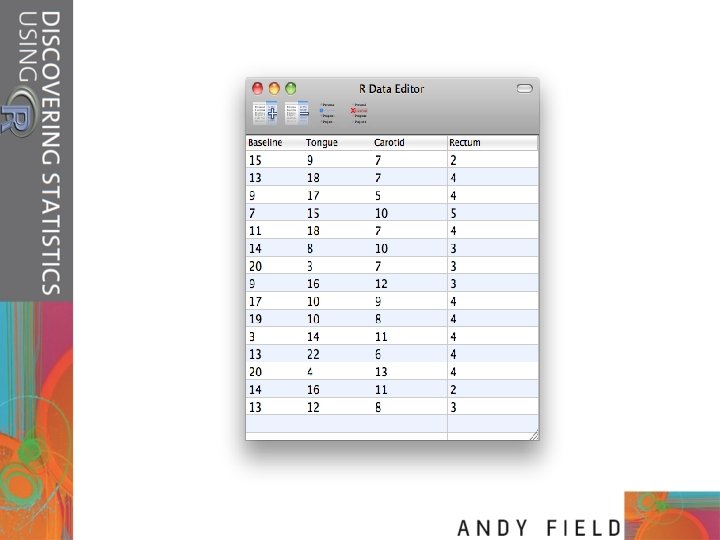
Line Graphs: One Independent Variable • How to cure hiccups? • Participants: – 15 hiccup sufferers • Each tries four interventions (in random order): – – Baseline Tongue-pulling manoeuvres Massage of the carotid artery Digital rectal massage • Outcome measure – The number of hiccups in the minute after each procedure
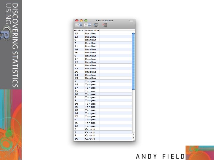
Line Graphs: One Independent Variable • These data are in the wrong format for ggplot 2 to use. • We need all of the scores stacked up in a single column and then another variable that specifies the type of intervention. • We can rearrange the data as follows: hiccups<-stack(hiccups. Data) names(hiccups)<-c("Hiccups", "Intervention")
Line Graphs: One Independent Variable • To plot a categorical variable in ggplot() it needs to be recognized as a factor: Hiccups$Intervention_Factor <factor(hiccups$Intervention, levels = hiccups$Intervention)
Line Graphs: One Independent Variable • We can then create the line graph by executing the following commands: line <- ggplot(hiccups, aes(Intervention_Factor, Hiccups)) line + stat_summary(fun. y = mean, geom = "point") + stat_summary(fun. y = mean, geom = "line", aes(group = 1), colour = "Red", linetype = "dashed") + stat_summary(fun. data = mean_cl_boot, geom = "errorbar", width = 0. 2) + labs(x = "Intervention", y = "Mean Number of Hiccups")
Line chart with error bars of the mean number of hiccups at baseline and after various interventions
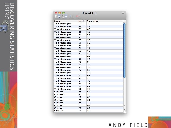
Line Graphs for Several Independent Variables • Is text-messaging bad for your grammar? • Participants: – 50 children • Children split into two groups: – Text-messaging allowed – Text-messaging forbidden • Each child measures at two points in time: – Baseline – 6 months later • Outcome measure – Percentage score on a grammar test
Line Graphs for Several Independent Variables • These data are again in ‘wide’ format but we need the data to be in ‘long’ format: text. Messages<- melt(text. Data, id = "Group”, measured = c("Baseline", "Six_months”)) names(text. Messages)<-c( “Group”, “Time”, "Grammar_Score”) • We can now change the newly created variable Time so that it is treated as a factor, and provide labels for the two levels of this variable: text. Messages$Time<-factor(text. Messages$Time, labels = c("Baseline", "6 Months"))
Line Graphs for Several Independent Variables line <- ggplot(text. Messages, aes(Time, Grammar_Score, colour = Group)) line + stat_summary(fun. y = mean, geom = "point") + stat_summary(fun. y = mean, geom = "line", aes(group = Group)) + stat_summary(fun. data = mean_cl_boot, geom = "errorbar", width = 0. 2) + labs(x = "Time", y = "Mean Grammar Score", colour = "Group")
Error line graph of the mean grammar score over six months in children who were allowed to text-message versus those who were forbidden