Chapter 3 Visualizing and Exploring Data Business Analytics
Chapter 3: Visualizing and Exploring Data Business Analytics: Methods, Models, and Decisions, 1 st edition James R. Evans Copyright © 2013 Pearson Education, Inc. publishing as Prentice Hall 3 -1
Copyright © 2013 Pearson Education, Inc. publishing as Prentice Hall 3 -2
Chapter 3 Topics Data Visualization Data Queries: Using Sorting and Filtering Statistical Methods for Summarizing Data Exploring Data Using Pivot. Tables Copyright © 2013 Pearson Education, Inc. publishing as Prentice Hall 3 -3
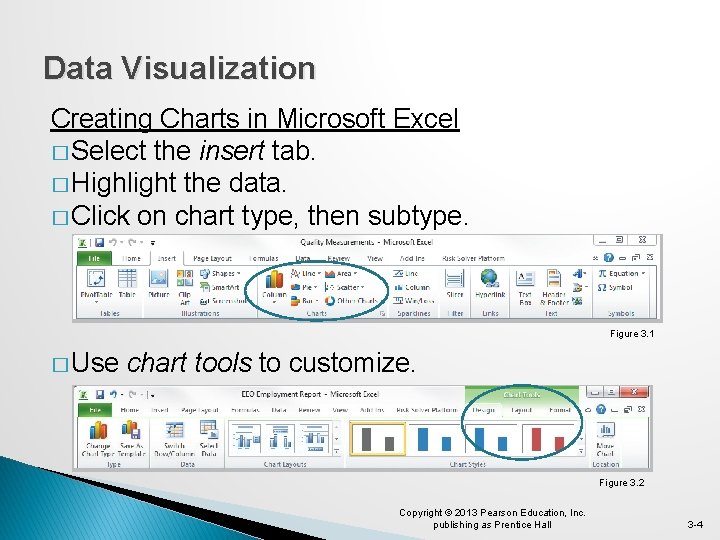
Data Visualization Creating Charts in Microsoft Excel � Select the insert tab. � Highlight the data. � Click on chart type, then subtype. Figure 3. 1 � Use chart tools to customize. Figure 3. 2 Copyright © 2013 Pearson Education, Inc. publishing as Prentice Hall 3 -4
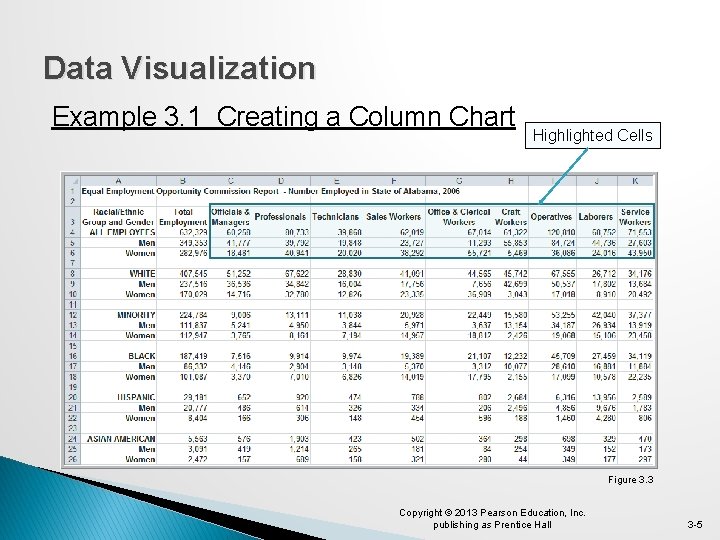
Data Visualization Example 3. 1 Creating a Column Chart Highlighted Cells Figure 3. 3 Copyright © 2013 Pearson Education, Inc. publishing as Prentice Hall 3 -5
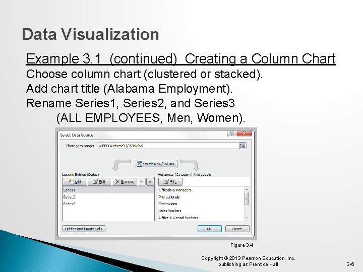
Data Visualization Example 3. 1 (continued) Creating a Column Chart Choose column chart (clustered or stacked). Add chart title (Alabama Employment). Rename Series 1, Series 2, and Series 3 (ALL EMPLOYEES, Men, Women). Figure 3. 4 Copyright © 2013 Pearson Education, Inc. publishing as Prentice Hall 3 -6
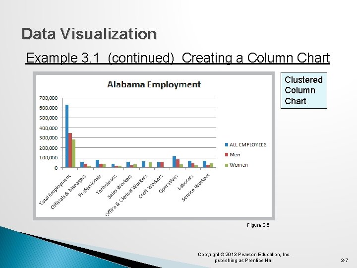
Data Visualization Example 3. 1 (continued) Creating a Column Chart Clustered Column Chart Figure 3. 5 Copyright © 2013 Pearson Education, Inc. publishing as Prentice Hall 3 -7
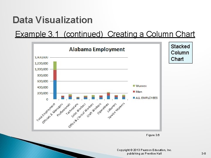
Data Visualization Example 3. 1 (continued) Creating a Column Chart Stacked Column Chart Figure 3. 6 Copyright © 2013 Pearson Education, Inc. publishing as Prentice Hall 3 -8
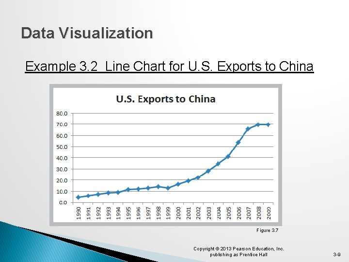
Data Visualization Example 3. 2 Line Chart for U. S. Exports to China Figure 3. 7 Copyright © 2013 Pearson Education, Inc. publishing as Prentice Hall 3 -9

Data Visualization Example 3. 3 Pie Chart for Census Data Figure 3. 8 Figure 3. 9 Copyright © 2013 Pearson Education, Inc. publishing as Prentice Hall 3 -10

Data Visualization Example 3. 4 Area Chart for Energy Consumption Figure 3. 10 Copyright © 2013 Pearson Education, Inc. publishing as Prentice Hall 3 -11
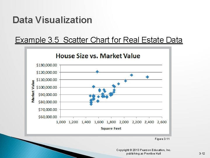
Data Visualization Example 3. 5 Scatter Chart for Real Estate Data Figure 3. 11 Copyright © 2013 Pearson Education, Inc. publishing as Prentice Hall 3 -12

Data Visualization Example 3. 6 Bubble Chart for Comparing Stock Characteristics Figure 3. 12 Copyright © 2013 Pearson Education, Inc. publishing as Prentice Hall 3 -13

Data Visualization Miscellaneous Excel Charts Stock chart Surface chart Doughnut chart Radar chart Geographic mapping Copyright © 2013 Pearson Education, Inc. publishing as Prentice Hall 3 -14
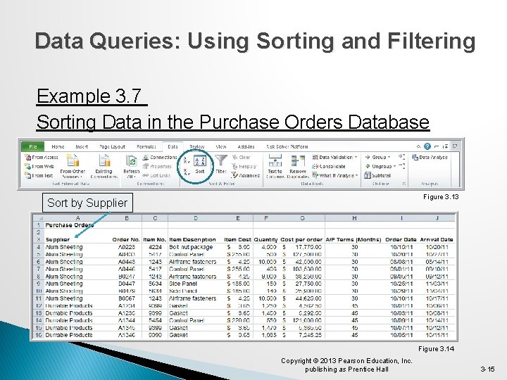
Data Queries: Using Sorting and Filtering Example 3. 7 Sorting Data in the Purchase Orders Database Figure 3. 13 Sort by Supplier Figure 3. 14 Copyright © 2013 Pearson Education, Inc. publishing as Prentice Hall 3 -15
Data Queries: Using Sorting and Filtering Pareto Analysis � An Italian economist, Vilfredo Pareto, observed in 1906 that a large proportion of the wealth in Italy was owned by a small proportion of the people. � Similarly, businesses often find that a large proportion of sales come from a small proportion of customers. � A Pareto analysis involves sorting data and calculating cumulative proportions. Copyright © 2013 Pearson Education, Inc. publishing as Prentice Hall 3 -16

Data Queries: Using Sorting and Filtering Example 3. 8 Applying the Pareto Principle 75% of the bicycle inventory value comes from 40% (9/24) of items. Copyright © 2013 Pearson Education, Inc. publishing as Prentice Hall Sort by Figure 3. 15 3 -17
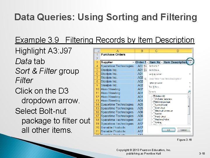
Data Queries: Using Sorting and Filtering Example 3. 9 Filtering Records by Item Description Highlight A 3: J 97 Data tab Sort & Filter group Filter Click on the D 3 dropdown arrow. Select Bolt-nut package to filter out all other items. Figure 3. 16 Copyright © 2013 Pearson Education, Inc. publishing as Prentice Hall 3 -18

Data Queries: Using Sorting and Filtering Example 3. 9 (continued) Filtering Records by Item Description Filter results for the bolt-nut package Figure 3. 17 Copyright © 2013 Pearson Education, Inc. publishing as Prentice Hall 3 -19
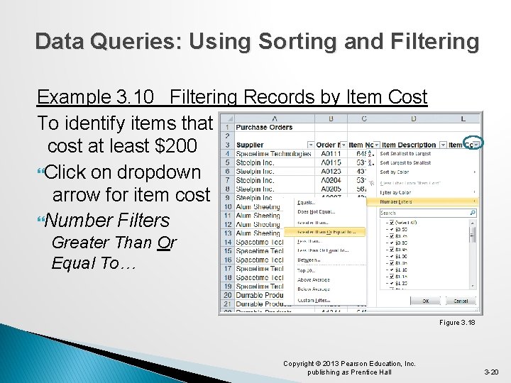
Data Queries: Using Sorting and Filtering Example 3. 10 Filtering Records by Item Cost To identify items that cost at least $200 Click on dropdown arrow for item cost Number Filters Greater Than Or Equal To… Figure 3. 18 Copyright © 2013 Pearson Education, Inc. publishing as Prentice Hall 3 -20

Data Queries: Using Sorting and Filtering Example 3. 10 (continued) Filtering by Item Cost Custom Auto. Filter dialog box � Click OK � Only items costing at least $200 is then displayed. Figure 3. 19 Copyright © 2013 Pearson Education, Inc. publishing as Prentice Hall 3 -21
Data Queries: Using Sorting and Filtering Auto. Filter criteria is based on the data type. � Number Filters includes numerical criteria. � Date Filters include tomorrow, next week, etc. Auto. Filter can be used sequentially. � First filter by one variable. � Then filter those data by another variable. Copyright © 2013 Pearson Education, Inc. publishing as Prentice Hall 3 -22
Data Queries: Using Sorting and Filtering Analytics in Practice: Discovering Value of Data Analysis at Alders International � Duty free operations at airports, seaports, etc. � Maintain a data warehouse to track point-of-sale information and inventory levels. � Pareto analysis revealed that 80% of profits were generated from 20% of their product lines. � Allows selective elimination of less profitable items. Copyright © 2013 Pearson Education, Inc. publishing as Prentice Hall 3 -23

Statistical Methods for Summarizing Data �A statistic is a summary measure of data. � Descriptive statistics are methods that describe and summarize data. � Microsoft Excel supports statistical analysis in two ways: 1. Statistical functions 2. Analysis Toolpak add-in for PCs (for Macs, Stat. Plus is similar) Statistical methods are essential to Business Analytics Copyright © 2013 Pearson Education, Inc. publishing as Prentice Hall 3 -24

Statistical Methods for Summarizing Data Example 3. 11 Constructing a Frequency Distribution for Items in the Purchase Order Database Copy Column D (Item Description) to Column A in a new worksheet Figure 3. 20 Copyright © 2013 Pearson Education, Inc. publishing as Prentice Hall 3 -25

Statistical Methods for Summarizing Data Example 3. 11 (continued) Constructing a Frequency Distribution for Items in the Purchase Order Database Figure 3. 21 Figure 3. 22 Copyright © 2013 Pearson Education, Inc. publishing as Prentice Hall 3 -26

Statistical Methods for Summarizing Data Example 3. 11 (continued) Constructing a Frequency Distribution for Items in the Purchase Order Database Figure 3. 23 Copyright © 2013 Pearson Education, Inc. publishing as Prentice Hall 3 -27
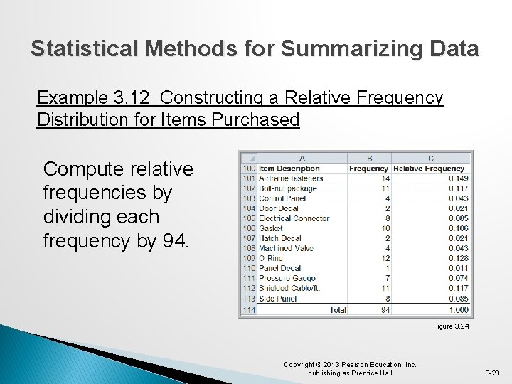
Statistical Methods for Summarizing Data Example 3. 12 Constructing a Relative Frequency Distribution for Items Purchased Compute relative frequencies by dividing each frequency by 94. Figure 3. 24 Copyright © 2013 Pearson Education, Inc. publishing as Prentice Hall 3 -28
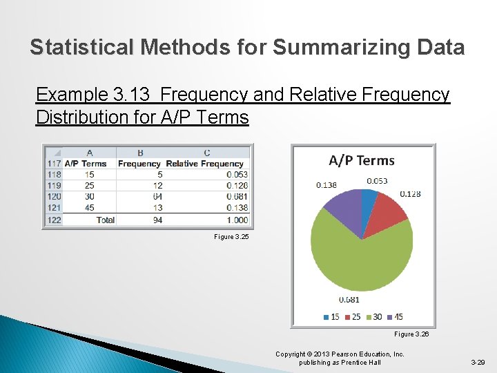
Statistical Methods for Summarizing Data Example 3. 13 Frequency and Relative Frequency Distribution for A/P Terms Figure 3. 25 Figure 3. 26 Copyright © 2013 Pearson Education, Inc. publishing as Prentice Hall 3 -29
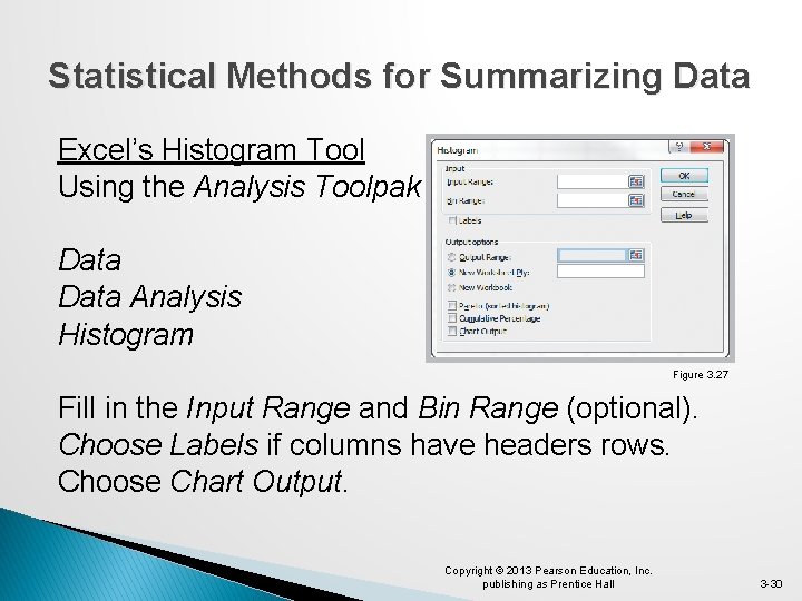
Statistical Methods for Summarizing Data Excel’s Histogram Tool Using the Analysis Toolpak Data Analysis Histogram Figure 3. 27 Fill in the Input Range and Bin Range (optional). Choose Labels if columns have headers rows. Choose Chart Output. Copyright © 2013 Pearson Education, Inc. publishing as Prentice Hall 3 -30

Statistical Methods for Summarizing Data Example 3. 14 Using the Histogram Tool for A/P Terms A/P data in H 3: H 97 Bins below in H 99: H 103 Month 15 25 30 45 Figure 3. 28 Copyright © 2013 Pearson Education, Inc. publishing as Prentice Hall 3 -31
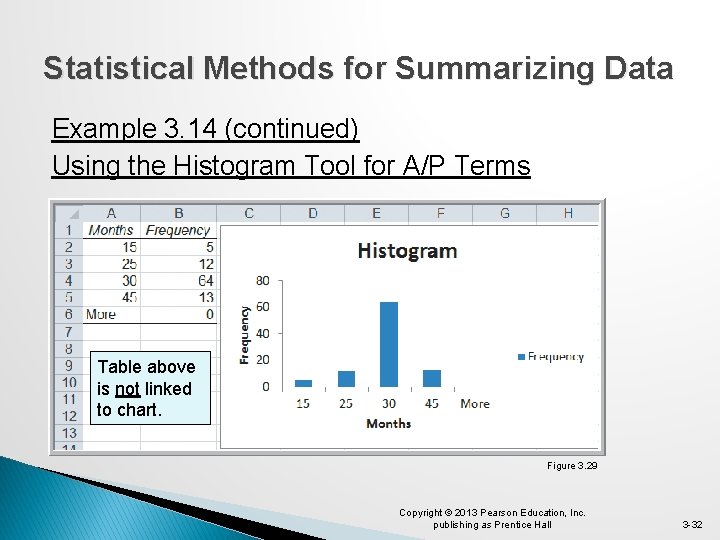
Statistical Methods for Summarizing Data Example 3. 14 (continued) Using the Histogram Tool for A/P Terms Table above is not linked to chart. Figure 3. 29 Copyright © 2013 Pearson Education, Inc. publishing as Prentice Hall 3 -32
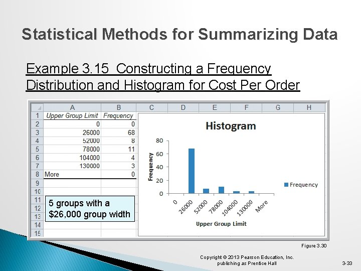
Statistical Methods for Summarizing Data Example 3. 15 Constructing a Frequency Distribution and Histogram for Cost Per Order 5 groups with a $26, 000 group width Figure 3. 30 Copyright © 2013 Pearson Education, Inc. publishing as Prentice Hall 3 -33

Statistical Methods for Summarizing Data Example 3. 15 (continued) Constructing a Frequency Distribution and Histogram for Cost Per Order 10 groups with a $13, 000 group width Figure 3. 31 Copyright © 2013 Pearson Education, Inc. publishing as Prentice Hall 3 -34
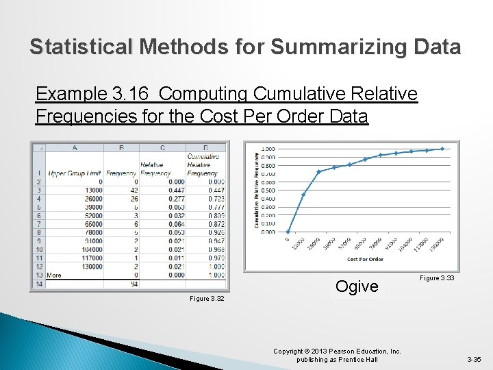
Statistical Methods for Summarizing Data Example 3. 16 Computing Cumulative Relative Frequencies for the Cost Per Order Data Figure 3. 32 Ogive Copyright © 2013 Pearson Education, Inc. publishing as Prentice Hall Figure 3. 33 3 -35
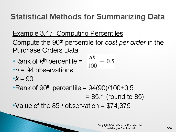
Statistical Methods for Summarizing Data Example 3. 17 Computing Percentiles Compute the 90 th percentile for cost per order in the Purchase Orders Data. Rank of kth percentile = n = 94 observations k = 90 Rank of 90 th percentile = 94(90)/100+0. 5 = 85. 1 (round to 85) Value of the 85 th observation = $74, 375 Copyright © 2013 Pearson Education, Inc. publishing as Prentice Hall 3 -36
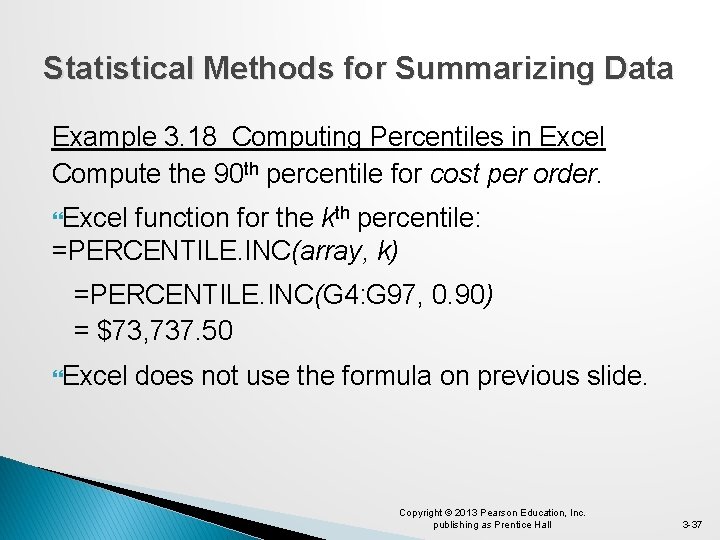
Statistical Methods for Summarizing Data Example 3. 18 Computing Percentiles in Excel Compute the 90 th percentile for cost per order. Excel function for the kth percentile: =PERCENTILE. INC(array, k) =PERCENTILE. INC(G 4: G 97, 0. 90) = $73, 737. 50 Excel does not use the formula on previous slide. Copyright © 2013 Pearson Education, Inc. publishing as Prentice Hall 3 -37
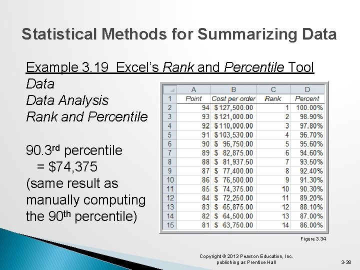
Statistical Methods for Summarizing Data Example 3. 19 Excel’s Rank and Percentile Tool Data Analysis Rank and Percentile 90. 3 rd percentile = $74, 375 (same result as manually computing the 90 th percentile) Figure 3. 34 Copyright © 2013 Pearson Education, Inc. publishing as Prentice Hall 3 -38

Statistical Methods for Summarizing Data Example 3. 20 Computing Quartiles in Excel Compute the Quartiles of the Cost per Order data � Excel function for quartiles: =QUARTILE. INC(array, quart) � =QUARTILE. INC(G 4: G 97, 1) = $6, 757. 81 � =QUARTILE. INC(G 4: G 97, 2) = $15, 656. 25 � =QUARTILE. INC(G 4: G 97, 3) = $27, 593. 75 � =QUARTILE. INC(G 4: G 97, 4) = $127, 500. 00 Copyright © 2013 Pearson Education, Inc. publishing as Prentice Hall 3 -39
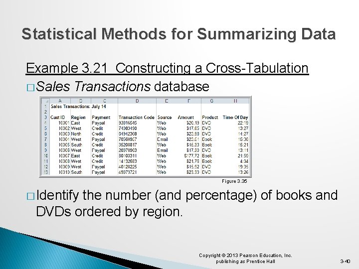
Statistical Methods for Summarizing Data Example 3. 21 Constructing a Cross-Tabulation � Sales Transactions database Figure 3. 35 � Identify the number (and percentage) of books and DVDs ordered by region. Copyright © 2013 Pearson Education, Inc. publishing as Prentice Hall 3 -40
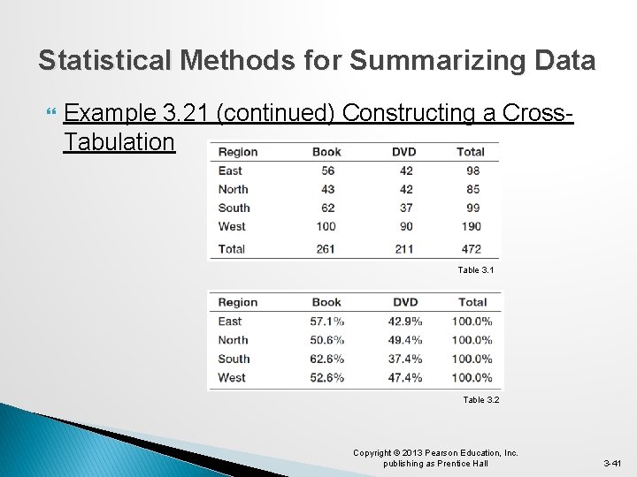
Statistical Methods for Summarizing Data Example 3. 21 (continued) Constructing a Cross. Tabulation Table 3. 1 Table 3. 2 Copyright © 2013 Pearson Education, Inc. publishing as Prentice Hall 3 -41
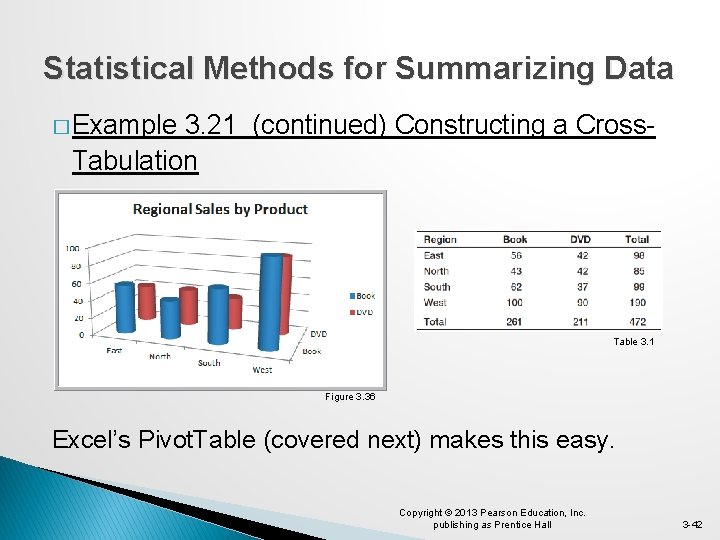
Statistical Methods for Summarizing Data � Example 3. 21 (continued) Constructing a Cross. Tabulation Table 3. 1 Figure 3. 36 Excel’s Pivot. Table (covered next) makes this easy. Copyright © 2013 Pearson Education, Inc. publishing as Prentice Hall 3 -42

Exploring Data Using Pivot. Tables Data Tables Pivot. Table Follow wizard steps. Pivot. Tables allow: � Quick creation of cross tabulations � Numerous custommade summary tables and charts Figure 3. 37 Copyright © 2013 Pearson Education, Inc. publishing as Prentice Hall 3 -43

Exploring Data Using Pivot. Tables Pivot. Table Field List Select the fields for: � Report Filter � Column Labels � Row Labels � Σ Values Or, before choosing Pivot. Table, you can select a cell in the data and let Excel prepare a default Pivot. Table. Figure 3. 37 Copyright © 2013 Pearson Education, Inc. publishing as Prentice Hall 3 -44
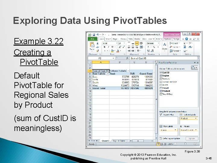
Exploring Data Using Pivot. Tables Example 3. 22 Creating a Pivot. Table Default Pivot. Table for Regional Sales by Product (sum of Cust. ID is meaningless) Copyright © 2013 Pearson Education, Inc. publishing as Prentice Hall Figure 3. 38 3 -45
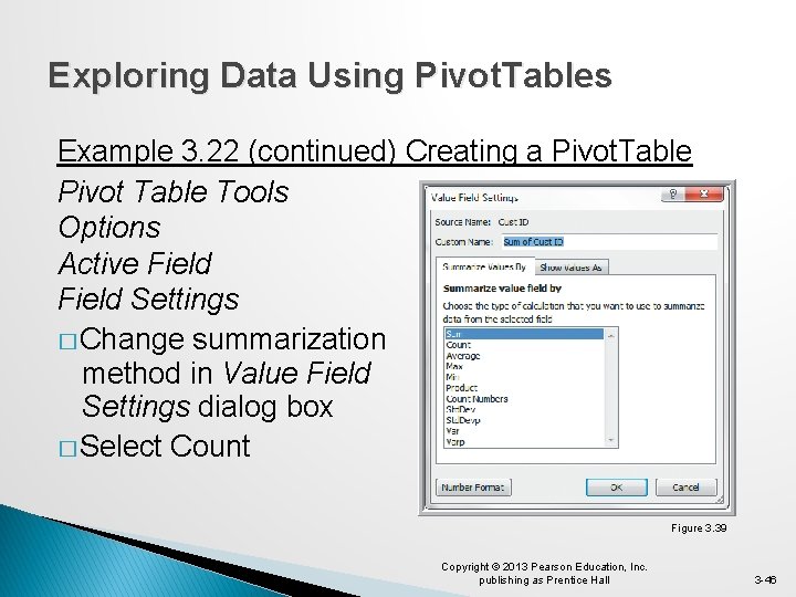
Exploring Data Using Pivot. Tables Example 3. 22 (continued) Creating a Pivot. Table Pivot Table Tools Options Active Field Settings � Change summarization method in Value Field Settings dialog box � Select Count Figure 3. 39 Copyright © 2013 Pearson Education, Inc. publishing as Prentice Hall 3 -46
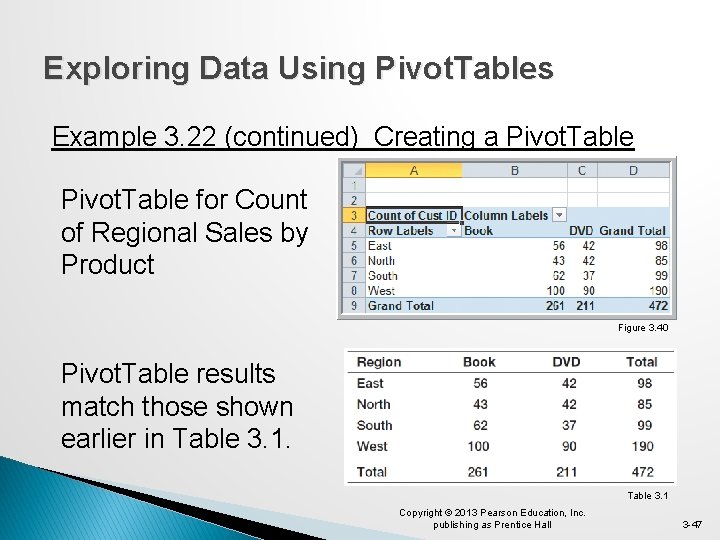
Exploring Data Using Pivot. Tables Example 3. 22 (continued) Creating a Pivot. Table for Count of Regional Sales by Product Figure 3. 40 Pivot. Table results match those shown earlier in Table 3. 1 Copyright © 2013 Pearson Education, Inc. publishing as Prentice Hall 3 -47
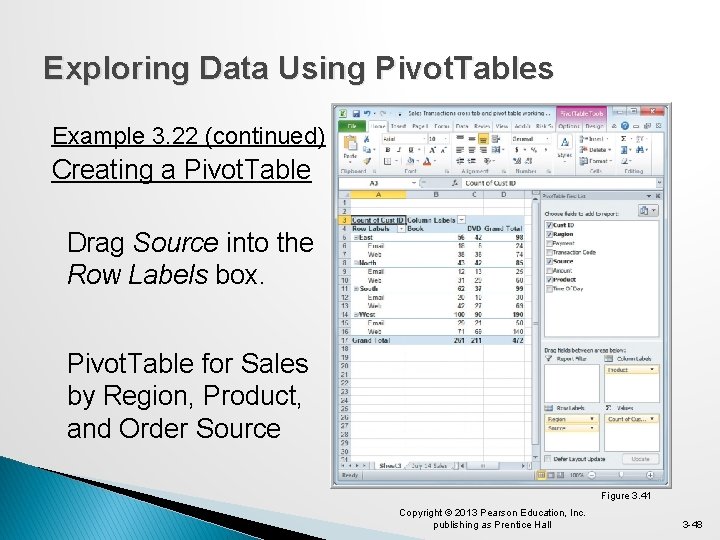
Exploring Data Using Pivot. Tables Example 3. 22 (continued) Creating a Pivot. Table Drag Source into the Row Labels box. Pivot. Table for Sales by Region, Product, and Order Source Figure 3. 41 Copyright © 2013 Pearson Education, Inc. publishing as Prentice Hall 3 -48
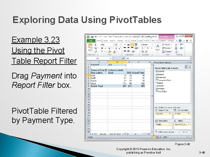
Exploring Data Using Pivot. Tables Example 3. 23 Using the Pivot Table Report Filter Drag Payment into Report Filter box. Pivot. Table Filtered by Payment Type. Figure 3. 42 Copyright © 2013 Pearson Education, Inc. publishing as Prentice Hall 3 -49

Exploring Data Using Pivot. Tables Example 3. 23 (continued) Using the Pivot. Table Report Filter Click on the drop-down arrow in row 1. Choose Credit-Card. Obtain this cross-tabulation Pivot. Table for credit card transactions. Figure 3. 43 Copyright © 2013 Pearson Education, Inc. publishing as Prentice Hall 3 -50

Exploring Data Using Pivot. Tables Example 3. 24 A Pivot. Chart for Sales Data Create a chart using the Pivot. Table for Sales by Region, Product, and Order Source. Insert Column Chart To display only Book data, click on the Product button and deselect DVD. Figure 3. 44 Copyright © 2013 Pearson Education, Inc. publishing as Prentice Hall 3 -51
Key Terms Area chart Bar chart Bubble chart Column chart Contingency table Cross-tabulation Cumulative relative frequency distribution Data profile (fractile) Descriptive statistics Doughnut chart Frequency distribution Histogram kth percentile Line chart Ogive Pareto analysis Pie chart Copyright © 2013 Pearson Education, Inc. publishing as Prentice Hall 3 -52
Chapter 3 - Key Terms (continued) Pivot. Chart Pivot. Table Quartile Radar chart Relative frequency distribution Scatter chart Statistics Stock chart Surface chart Copyright © 2013 Pearson Education, Inc. publishing as Prentice Hall 3 -53
Case Study Performance Lawn Equipment (3) Recall that PLE produces lawnmowers and a medium size diesel power lawn tractor. Create charts of the satisfaction data, sales data, delivery time data, and other variables of interest. Compare shipping costs for existing and proposed plant locations. Examine customer attributes by region and write a formal report summarizing your results. Copyright © 2013 Pearson Education, Inc. publishing as Prentice Hall 3 -54
Copyright © 2013 Pearson Education, Inc. publishing as Prentice Hall 3 -55
- Slides: 55