Elements and Principles of Design Elements of design


 A native")


- Slides: 65
Elements and Principles of Design
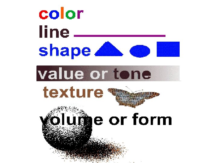
Elements of design Design elements are the basic units of a visual image.
Color • Color is seen either by the way light reflects off a surface, or in colored light sources. • Red colors seem to come forward while blue seems to recede into the distance • Color and particularly contrasting color is also used to draw the attention to a particular part of the image. • There are primary colors, secondary colors, and tertiary colors. • Complementary colors are colors that are opposite to each other on the color wheel. Complementary colors are used to create contrast. • Analogous colors are colors that are found side by side on the color wheel. These can be used to create color harmony. • Monochromatic colors are tints and shades of one color. • Warm colors are a group of colors that consist of reds, yellows, and oranges. • Cool colors are group of colors that consist of purples, greens, and blues.
Color - basic color theory • We respond to color on many levels. Color can be used simply to describe an object. It can also be used emotionally (blue for sadness, red for angry), symbolically (associated with a flag's color, sports team) and psychologically. • The painting by Phyllis Bramson (left) has intense, complimentary colors that equate to strong conflicting emotions. • The other work, by Alphonse Mucha, uses subdued, analogous color to create a very different feeling.
Line • Line is the basic element that refers to the continuous movement of a point along a surface, such as by a pencil or brush. The edges of shapes and forms also create lines. It is the basic component of a shape drawn on paper. Lines and curves are the basic building blocks of two dimensional shapes like a house's plan. Every line has length, thickness, and direction. There are curve, horizontal, vertical, diagonal, zigzag, wavy, parallel, dash, and dotted lines.
Line • A mark with greater length than width. Lines can be horizontal, vertical or diagonal, straight or curved, thick or thin
Line - the path of a point • In the first image, Leonardo da Vinci used a soft, sensitive soft line to create a graceful image. The center image has the same subject. However, the artist Willem De. Kooning has created a very different feeling by using a heavy, gestural line. The woman's face in the third image is created with a mechanical line creating an emotionallydetached feeling. Although the subject matter is the same in all three works, the differences in line quality have created works with very different impact. How you use line is one of the most important decisions to be made in creating a work of art - this is true whether you are using a pencil point or a cursor on a monitor.
Shape • A shape is defined as an area that stands out from the space next to or around it due to a defined or implied boundary • Shapes can also show perspective by overlapping. • They can be geometric or organic. • Shapes in house decor and interior design can be used to add interest, style, theme to a design like a door. • Shape in interior design depends on the function of the object like a kitchen cabinet door. Natural shapes forming patterns on wood or stone may help increase visual appeal in interior design. • In a landscape, natural shapes, such as trees contrast with geometric such as houses.
Shape • A closed line. Shapes can be geometric, like squares and circles; or organic, like free formed shapes or natural shapes. Shapes are flat and can express length and width.
Shape - perceivable area. • The shapes in the image on the left are clearly defined. By contrast, the ship's shape on the right is barely discernable. This difference in clarity of shape is part of the meaning of these works - one conveys a sense of orderliness and confidence, while the other communicates a sense of vulnerability and uncertainty. The shapes of the objects that you create or place in your images are positive shapes. The spaces around these shapes are the negative spaces. the negative space is just as important as the positive shapes.
Value • Value is an element of art that refers to the relationship between light and dark on a surface or object and also helps with Form. It gives objects depth and perception. Value is also referred to as tone.
Texture • Texture is perceived surface quality. In art, there are two types of texture: tactile and implied. Tactile texture (real texture) is the way the surface of an object actual feels. Examples of this include sandpaper, cotton balls, tree bark, puppy fur, etc. Implied texture is the way the surface on an object looks like it feels. The texture may look rough, fizzy, gritty, but cannot actually be felt. This type of texture is used by artist when drawing or painting.
Texture • Surface quality that can be seen and felt. • Textures can be rough or smooth, soft or hard. • Textures do not always feel the way they look; for example, a drawing of a porcupine may look prickly, but if you touch the drawing, the paper is still smooth.
Form • Form is any three dimensional object. • Form can be measured, from top to bottom (height), side to side (width), and from back to front (depth). • Form is also defined by light and dark. • There are two types of form, geometric (manmade) and natural (organic form). • Form may be created by the combining of two or more shapes. It may be enhanced by tone, texture and color. • It can be illustrated or constructed.
Form • Three-dimensional shapes, expressing length, width, and depth. Balls, cylinders, boxes and triangles are forms.
Space • Space is the area provided for a particular purpose. It may have two dimensions (length and width), such as a floor, or it may have three dimensions (length, width, and height). Space includes the background, foreground and middle ground. Space refers to the distances or areas around, between or within components of a piece. There are two type of space: positive and negative space. Positive space refers to the space of a shape representing the subject matter. Negative space refers to the space around and between the subject matter.
Space • is the area between and around objects. The space around objects is often called negative space; negative space has shape. Space can also refer to the feeling of depth. Real space is three-dimensional; in visual art when we can create the feeling or illusion of depth we call it space.
Balance • Balance can be either symmetrical or asymmetrical. • Balance also refers to a sense that dominant focal points don't give a feeling of being pulled too much to any specific part of the artwork. • Balance can be achieved by the location of objects, volume or sizes of objects, and by color. • It can also be achieved by balancing lighter colors with darker colors, or bold colors with light neutral colors.
The principles of design • Govern the relationships of the elements used and organize the composition as a whole. • Successful design incorporates the use of the principles and elements to serve the designer's purpose and visual goals. • There are no rules for their use. • The designer's purpose and intent drives the decisions made to achieve harmony between the elements.
Unity • Unity refers to a sense that everything in a piece of work belongs there, and makes a whole piece. • It is achieved by the use of balance, repetition and/or design harmony.
Unity • is the feeling of harmony between all parts of the artwork creating a sense of completeness.
Unity-Variety • Some artists, such as Andy Warhol, have emphasized repetition to make a statement about the prevalence of mass -production in our society. Most artists, however, seek a more equal balance between unity and variety in their work. For example, the three-tined shape of the pitchfork in Grant Wood's painting (left) in repeated exactly in the clothing. It is also repeated in the windows and vertical lines in the house. On the other hand, curved shapes surround the woman's head - in the broach, curved edge of her dress and background trees. This repetition of shape unifies the painting, while the differences between the vertical and curved shapes give the painting a balancing sense of variety.
Variety • The use of dissimilar elements, which creates interest and uniqueness. • Variety like a painting or some reflective wood panels added on a plain wall may be used to reduce monotony. • Helps infuse color to house decor to attempt to increase design beauty.
Variety • is the use of several elements of design to hold the viewer’s attention and to guide the viewer’s eye through the artwork.
Pattern • is the repeating of an object or symbol all over the artwork.
Contrast • Contrast is the occurrence of differing elements, such as color, value, size, etc. It creates interest and pulls the attention toward the focal point.
Balance • the distribution of the visual weight of objects, colors, texture, and space. • If the design was a scale these elements should be balanced to make a design feel stable. • In symmetrical balance, the elements used on one side of the design are similar to those on the other side; in asymmetrical balance, the sides are different but still look balanced. • In radial balance, the elements are arranged around a central point and may be similar.
Balance • a feeling of visual equality in shape, form, value, color, etc. • Balance can be symmetrical or evenly balanced or asymmetrical and un-evenly balanced. • Objects, values, colors, textures, shapes, forms, etc. , can be used in creating a balance in a composition.
Balance - equalizing the visual weight of elements • . The cross on the left is symmetrically (formally) balanced - one half mirrors the other. Religious and significant objects are often given a symmetrical balance. The painting by Mary Cassatt, (on the right) depicts an ordinary moment. Appropriately, it is asymmetrically balanced. • The two women on one side are balanced by the large silver service and fireplace on the other -with the area of highest value contrast (the woman in dark with the near-white saucer and cup) only slightly off-set from the center. Although asymmetrical balance may appear more casual and less planned, it usually take greater experience to utilize the psychological and felt nuances of balancing a few larger objects against many smaller objects, or large areas of muted color against smaller areas of intense color, nearly centered objects balanced against objects positioned near the picture's edge, etc.
Repetition • works with pattern to make the artwork seem active. The repetition of elements of design creates unity within the artwork.
Rhythm • The recurrence of forms within a work • Any element that occurs is generally echoed, often with some variation to maintain interest. • Rhythm in interior design also may be used to reduce randomness.
Rhythm • is created when one or more elements of design are used repeatedly to create a feeling of organized movement. • Variety is essential to keep rhythm exciting and active, and moving the viewer around the artwork. • Rhythm creates a mood like music or dancing.
Emphasis • Emphasis refers to areas of interest that guides the eye into and out of the image • May give direction and organization to a design, and avoid subconscious confusion to sometimes improve the design's visual appeal and style. • Emphasis hierarchy or focus is not giving each object in a project equal dominance within a piece of work. • Can be increased by making the object larger, more sophisticated, more ornate, by placing it in the foreground, or standout visually more than other objects in a project.
Emphasis • is the part of the design that catches the viewer’s attention. Usually the artist will make one area stand out by contrasting it with other areas. The area will be different in size, color, texture, shape, etc.
Direction and Emphasis. • Direction is the visual path our eye will follow. Emphasis refers to the object or element which first catches our attention. Unlike sequential or time-based art forms such as music or film, a painting such as The Moulin Rouge (above) is seen instantaneously. The whole work is revealed to us simultaneously. An artist needs to create an area of emphasis -a focal point that begins the path our eyes will follow as we take in the whole art work. In this painting, our eye is first drawn to the woman's face on the right edge. It isn't by chance that we see her first - the artist, Toulouse-Lautrec, has heighten the value contrast, color intensity, color contrast (orange hair and bright red lips contrast with the green of her forehead), and proportion (she is the largest person). In addition, she is staring directly at us. Basically, we are first drawn to the area of greatest contrast. Our eye then sweeps across the canvas, taking in the other figures (which include the artist).
Harmony • Achieved through the sensitive balance of variety and unity. • Color harmony may be achieved using complementary or analogous colors. • Harmony in design is similarity of components or objects looking like these belong together. • May be visually pleasing and harmony is when some of the objects share a common trait. A common trait between objects could be: color, shape, texture, pattern, material, theme, style, size, or functionality.
Proportion • The relationship of size between objects. • Proportion is also relative sizes of surface areas of different colors. • Depends on functionality of object. Art painting can be given the correct size in relation to room to make it an effective decorating component or source of color.
Proportion • is the feeling of unity created when all parts (sizes, amounts, or number) relate well with each other. When drawing the human figure, proportion can refer to the size of the head compared to the rest of the body
Proportion - relative size of objects within the work of art. • In his painting of a bedroom ( bottom left), Rene Magritte has created a surreal situation simply by manipulating the proportions of common objects. There are no clues that tell us if we are in a normalsized room or a dollhouse. In the other painting, Andrew Wyeth has used the proportion very differently - the small farmhouse against the largeness of the field created a sense of isolation.
Movement • is the path the viewer’s eye takes through the artwork, often to focal areas. Such movement can be directed along lines edges, shape and color within the artwork.
Functionality • Proper functionality is simply the best possible design and best possible location of this design that the occupant requires. • Great functionality and best possible materials for the function usually also increases visual appeal.
Proximity • Proximity is the placing of similar objects closer together physically, and unlike objects further apart. This aids in creating unity. • For example, different furniture styles with different colors compressed in a small bedroom does not look as nice as the same furniture placed further apart in a very large living room.
Color theory • Color theory in interior design includes the color wheel. • Involves the idea of how color affects human thoughts and emotions • A pleasing combination of colors and the amount of these colors in a design. • A visually pleasing color combination that enhances the style and character of a design like a home interior design. • Using a limited number of colors in a color palette usually seven or less initially to help preserve design unity. • A visually pleasing color combination may be chosen for the color palette of a room for a particular age group and gender.
P & E in Design Layout
Balance usually comes in two forms, symmetrical and asymmetrical, and provides a sense of (or lack of) equilibrium that can create tension and visual weight.
The “Manhattan Edition” design makes use of a regular rhythm in the upper part of the page as well as in the right-hand navigational elements of the design. This creates a sense of movement in the sky and adds a good amount of texture to the overall design. It is complemented by the texture in the buildings, and the texture created by the font chosen for the title of the page and major headings. It is contrasted with the overall smoothness of the black on the lower parts of the page, and the soft glow used for content areas.
“Museum” is a good example of how proportion can be used in a design to draw the eye to specific areas on the page, specifically through the use of small silhouettes standing in the environment in the design. The top image leads you into the setting by drawing your eye back towards the opening in the wall where the first silhouette is standing. Scrolling down you find that the content in the page follows more of these silhouettes, and you are drawn towards the tension created by their comparison with that of the content frames. You also get the sense that the silhouettes are looking at the frames on the wall, in an almost implied sense of continuance. The comparison of scale draws the eye in, and the implied continuance leads you to the content.
The “Pretty in Pink” design makes use of dominance to place emphasis on certain parts of the page. The right -most column, where the content is, is the dominant part of this design. It is the largest area of color and makes use of big, reversed out, text for major headings. The center navigation column is the subdominant part of the page. It still comes forward in space and calls attention to itself, but uses less color and smaller text in a slightly smaller space—relegating it to the second degree of dominance. Finally, the leftmost column with the logo and explanatory text is the subordinate object on the page. It falls farthest back in space, and importance.
“Subway Dream” uses line in a number of different ways. First, as a rigid element to help frame the page and separate the content areas from the background. Next, the illustrations that are used throughout the page rely heavily on line, and they have an organic quality about them that almost makes them feel like a sketch or drawing. The lighter elements in the middle-ground, drawings behind the woman, lines and navigational icons are entirely based on contour. The woman in the foreground has more form, yet still relies heavily on contour and line to help establish that form. Finally, the font chosen for the major headings is dominantly an organic line that helps to accent the overall design of the page.
There is a definite sense of three dimensions in “Hedges, ” despite the fact that we our frame of reference is two dimensional. There a couple of techniques used to create this illusion. First, the imagery is drawn in perspective using two points in space to establish the angles at which all of the elements are aligned. Second, a good amount of value differentiation is used to establish highlights and shadows and to make the title text appear to be sitting on the ground. Finally, the use of the small figures helps to establish a sense of environment, making the overall illusion more believable. The figures are interacting with the forms, standing on top of them or digging holes in them, which helps to extend the sense of space in the composition.
Color is the eye’s response to wavelengths of radiation in the visible spectrum. There are three main components of color: hue, value and saturation. Hue is where the color is positioned on the color wheel and what most people think of when they think of color. Value is the lightness or darkness of a color, how much black or white is mixed with it. Saturation is the intensity of a color.
P & E In Landscape Design • Simplicity is the essence of design. This is an objective that I have always tried to achieve in all of my previous residential, commercial, institutional and recreational projects. How a designer creatively combines plant material and other design components into a simple, unified scheme is always an exciting challenge.
Simplicity is the essence of design.
Effective use of circulinear line form. . Vancouver Parks Board.
Weak, scallopy edges leave a lot to be desired.
Linear / curvilinear lines at Sissinghurst.
Sculpture / maze garden in Japan. Elevated pieces of sculpture create emphasis in the landscape.
Ornamental grasses and herbs are complimentar y in texture. Ostrya virginiana (Ironwood) A native tree that exhibits excellent texture.
Vigorously use color in the landscape. Warm colors advance. . . Salt Lake City, Utah.
Informal balance. . . Niagara-on-the-Lake, Ontario
Repetition of diamond flagstones creates movement in paving pattern. The repetitious use of paving stone creates unity in the landscape.
A variety of forms creates significant landscape interest.
This moon gate is in perfect proportion to its setting.
Repetitious use of sculpture in landscape reduces monotony and results in the establishment of rhythm.