Principles of Design Layout The Six Principles of
- Slides: 12

Principles of Design Layout

The Six Principles of Design Alignment Balance Contrast Proximity/Unity Repetition/Consistency White space

Alignment of elements in a pattern or grid. Visual relationship between all of the elements in a layout, even if the elements are far apart. View an example at http: //desktoppub. about. com/od/d esignprinciples/l/aa_pod 2. htm

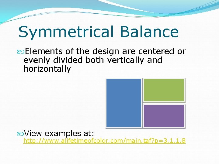
Symmetrical Balance Elements of the design are centered or evenly divided both vertically and horizontally View examples at: http: //www. alifetimeofcolor. com/main. taf? p=3, 1, 1, 8

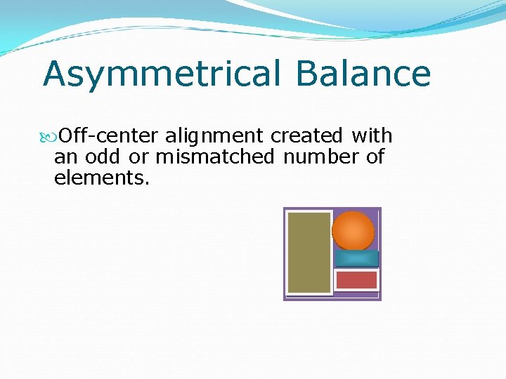
Asymmetrical Balance Off-center alignment created with an odd or mismatched number of elements.

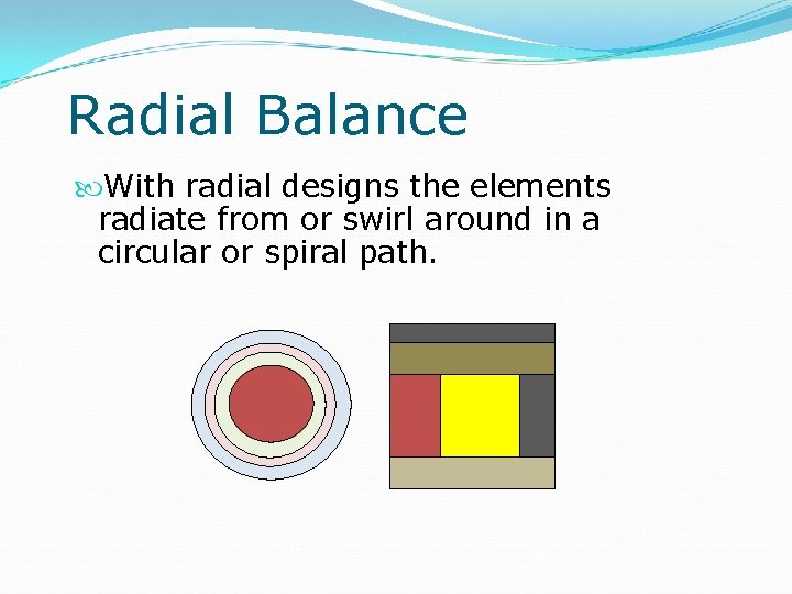
Radial Balance With radial designs the elements radiate from or swirl around in a circular or spiral path.

Contrast The use of big and small elements, black and white text, squares and circles Adds emphasis to important information Adds appeal View an example at http: //www. alifetimeofcolor. com/main. taf? p=3, 1, 1, 9

Proximity/Unity Grouping elements to demonstrate their relationship to each other. Makes it easier for the reader to understand the relationships between elements. Examples Captions placed with the pictures they describe. Images placed near the text they are depicting. View an example at http: //desktoppub. about. com/od/designprinc iples/l/aa_pod 2. htm

Repetition/Consistency Repeat some aspect of the design throughout the entire layout. Aids navigation Improves readability Examples Keying all side headings in the same typeface and color. Using the same formatting for all bulleted lists throughout the publication. View an example at http: //desktoppub. about. com/od/designprincipl es/l/aa_pod 2. htm

White Space Negative or space empty of any color Gives a design breathing room Smoothes transition between elements View an example at http: //desktoppub. about. com/od/desig nprinciples/l/aa_pod 2. htm

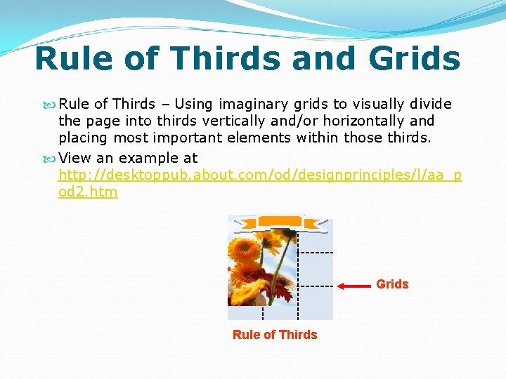
Rule of Thirds and Grids Rule of Thirds – Using imaginary grids to visually divide the page into thirds vertically and/or horizontally and placing most important elements within those thirds. View an example at http: //desktoppub. about. com/od/designprinciples/l/aa_p od 2. htm 1 2 3 Grids Rule of Thirds

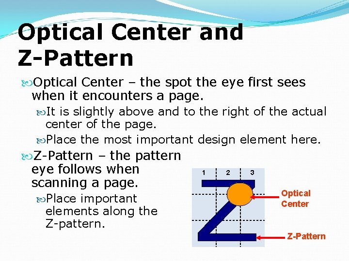
Optical Center and Z-Pattern Optical Center – the spot the eye first sees when it encounters a page. It is slightly above and to the right of the actual center of the page. Place the most important design element here. Z-Pattern – the pattern eye follows when 1 2 3 scanning a page. Optical Place important Center elements along the Z-pattern. Z-Pattern