The Elements and Principles of Design Elements of
- Slides: 78

The Elements and Principles of Design Elements of Design are the tools we use as artists and the Principles are what we do with them

Elements • • Line Shape Form Value Colour Space Texture

Principles • • • Balance Unity Contrast Emphasis Pattern Movement and Rhythm

Part One The elements of Design

1. Line Key words : Structural, Outline, Contour, Gesture, Sketch, Implied, Line of sight, Horizontal, Diagonal, Vertical

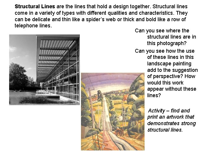
Structural Lines are the lines that hold a design together. Structural lines come in a variety of types with different qualities and characteristics. They can be delicate and thin like a spider’s web or thick and bold like a row of telephone lines. Can you see where the structural lines are in this photograph? Can you see how the use of these lines in this landscape painting add to the suggestion of perspective? How would this work appear without these lines? Activity – find and print an artwork that demonstrates strong structural lines.

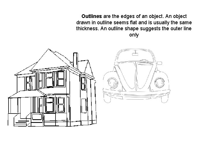
Outlines are the edges of an object. An object drawn in outline seems flat and is usually the same thickness. An outline shape suggests the outer line only

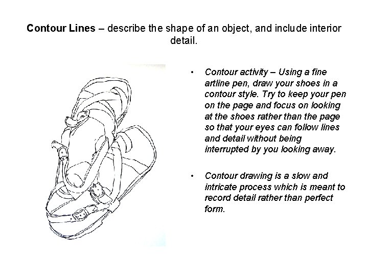
Contour Lines – describe the shape of an object, and include interior detail. • Contour activity – Using a fine artline pen, draw your shoes in a contour style. Try to keep your pen on the page and focus on looking at the shoes rather than the page so that your eyes can follow lines and detail without being interrupted by you looking away. • Contour drawing is a slow and intricate process which is meant to record detail rather than perfect form.

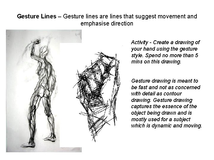
Gesture Lines – Gesture lines are lines that suggest movement and emphasise direction Activity - Create a drawing of your hand using the gesture style. Spend no more than 5 mins on this drawing. Gesture drawing is meant to be fast and not as concerned with detail as contour drawing. Gesture drawing captures the essence of the object being drawn and is mostly used for a subject which is dynamic and moving.

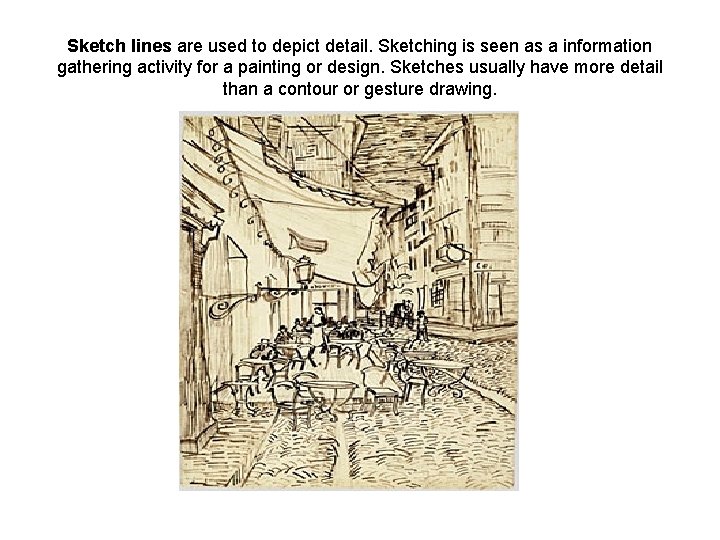
Sketch lines are used to depict detail. Sketching is seen as a information gathering activity for a painting or design. Sketches usually have more detail than a contour or gesture drawing.

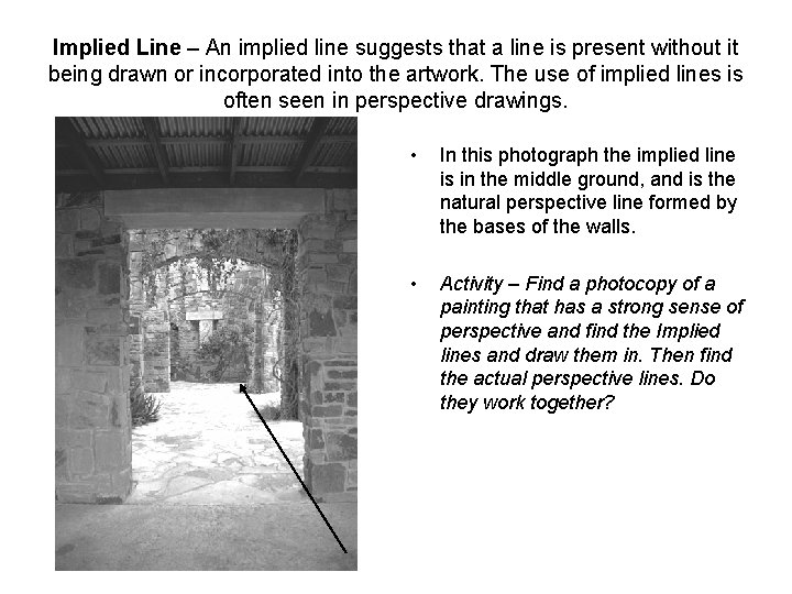
Implied Line – An implied line suggests that a line is present without it being drawn or incorporated into the artwork. The use of implied lines is often seen in perspective drawings. • In this photograph the implied line is in the middle ground, and is the natural perspective line formed by the bases of the walls. • Activity – Find a photocopy of a painting that has a strong sense of perspective and find the Implied lines and draw them in. Then find the actual perspective lines. Do they work together?

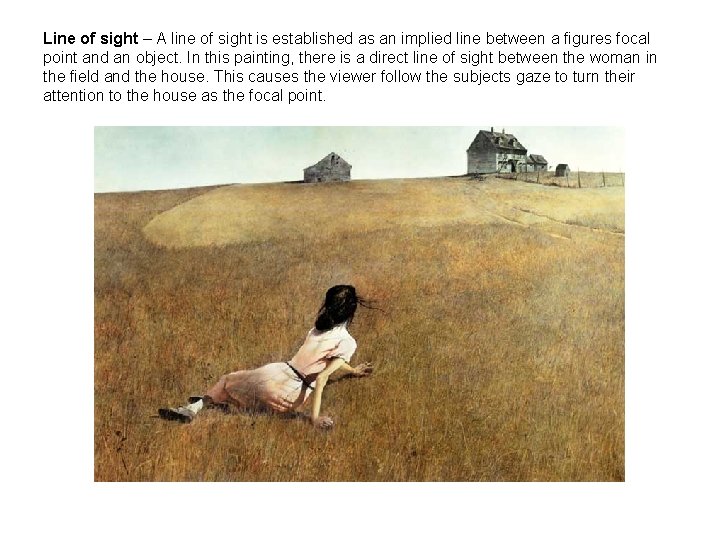
Line of sight – A line of sight is established as an implied line between a figures focal point and an object. In this painting, there is a direct line of sight between the woman in the field and the house. This causes the viewer follow the subjects gaze to turn their attention to the house as the focal point.

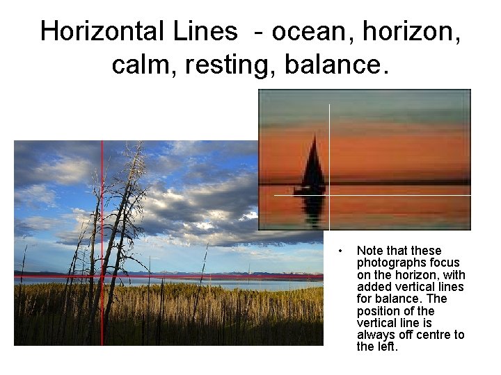
Horizontal Lines - ocean, horizon, calm, resting, balance. • Note that these photographs focus on the horizon, with added vertical lines for balance. The position of the vertical line is always off centre to the left.

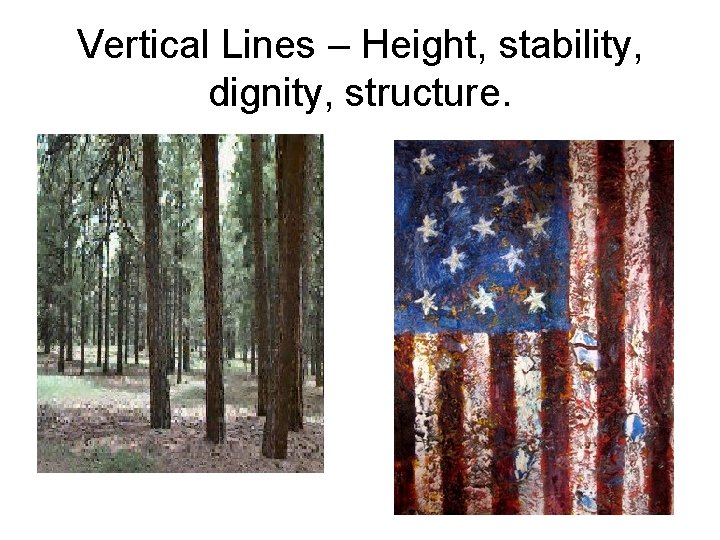
Vertical Lines – Height, stability, dignity, structure.

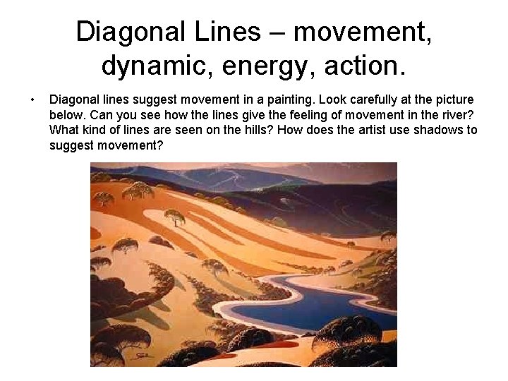
Diagonal Lines – movement, dynamic, energy, action. • Diagonal lines suggest movement in a painting. Look carefully at the picture below. Can you see how the lines give the feeling of movement in the river? What kind of lines are seen on the hills? How does the artist use shadows to suggest movement?

2. Shape and Form Key Words: shape, form, geometric, organic, static, dynamic, curved, angular, positive, negative.

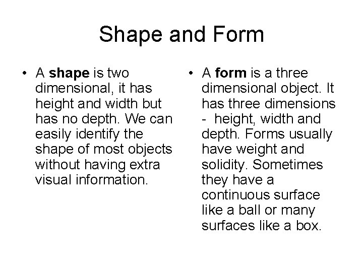
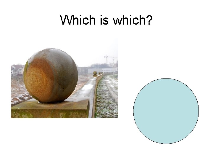
Shape and Form • A shape is two dimensional, it has height and width but has no depth. We can easily identify the shape of most objects without having extra visual information. • A form is a three dimensional object. It has three dimensions - height, width and depth. Forms usually have weight and solidity. Sometimes they have a continuous surface like a ball or many surfaces like a box.

Which is which?

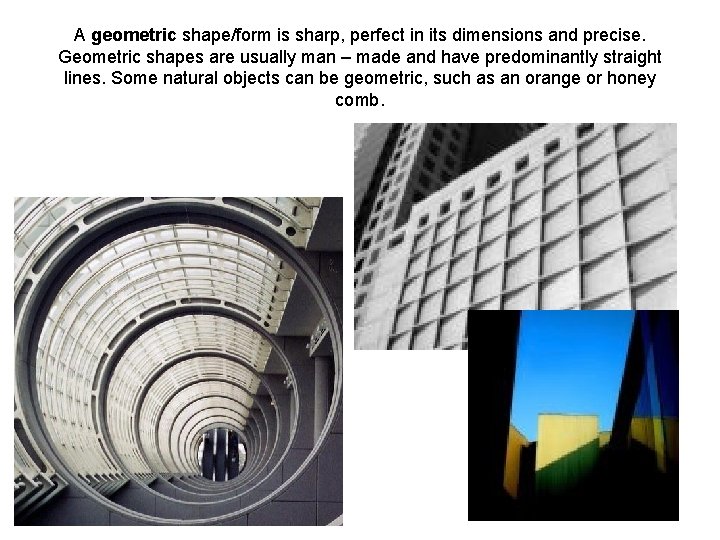
A geometric shape/form is sharp, perfect in its dimensions and precise. Geometric shapes are usually man – made and have predominantly straight lines. Some natural objects can be geometric, such as an orange or honey comb.

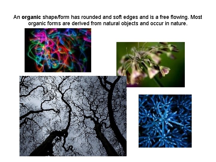
An organic shape/form has rounded and soft edges and is a free flowing. Most organic forms are derived from natural objects and occur in nature.

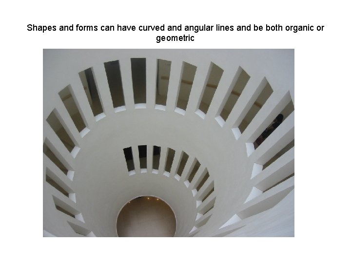
Shapes and forms can have curved angular lines and be both organic or geometric

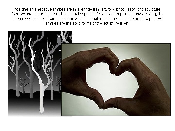
Positive and negative shapes are in every design, artwork, photograph and sculpture. Positive shapes are the tangible, actual aspects of a design. In painting and drawing, the often represent solid forms, such as a bowl of fruit in a still life. In sculpture, the positive shapes are the solid forms of the sculpture itself.

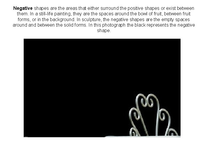
Negative shapes are the areas that either surround the positive shapes or exist between them. In a still-life painting, they are the spaces around the bowl of fruit, between fruit forms, or in the background. In sculpture, the negative shapes are the empty spaces around and between the solid forms. In this photograph the black represents the negative shape.

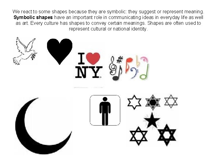
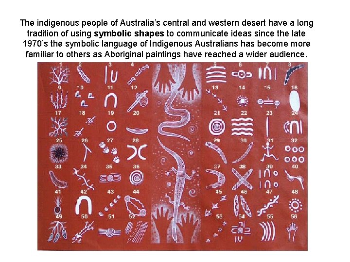
We react to some shapes because they are symbolic: they suggest or represent meaning. Symbolic shapes have an important role in communicating ideas in everyday life as well as art. Every culture has shapes to convey certain meanings. Shapes are often used to represent cultural or national identity.

The indigenous people of Australia’s central and western desert have a long tradition of using symbolic shapes to communicate ideas since the late 1970’s the symbolic language of Indigenous Australians has become more familiar to others as Aboriginal paintings have reached a wider audience.

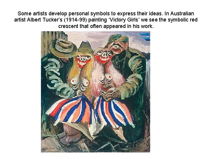
Some artists develop personal symbols to express their ideas. In Australian artist Albert Tucker’s (1914 -99) painting ‘Victory Girls’ we see the symbolic red crescent that often appeared in his work.

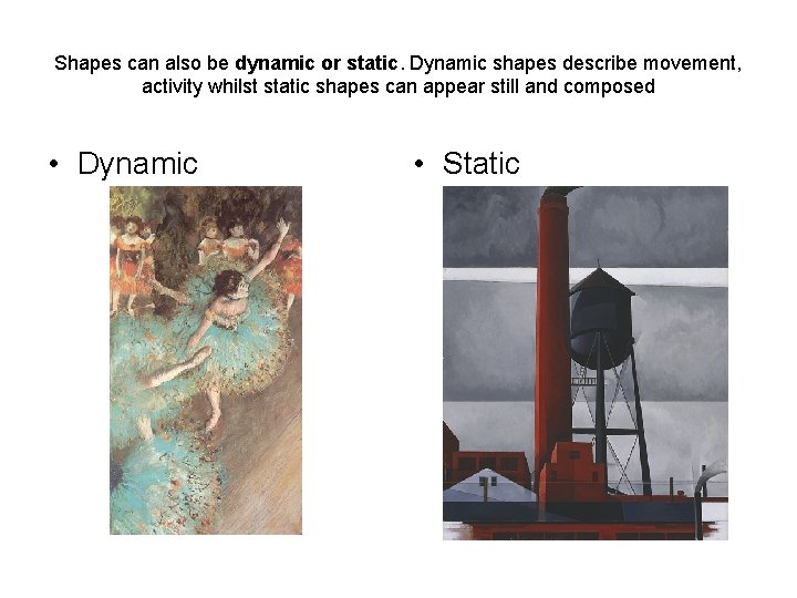
Shapes can also be dynamic or static. Dynamic shapes describe movement, activity whilst static shapes can appear still and composed • Dynamic • Static

3. Value (tone) Key Words: Tone, contrast, High Key, Low Key, tint, shade, chiaroscuro,

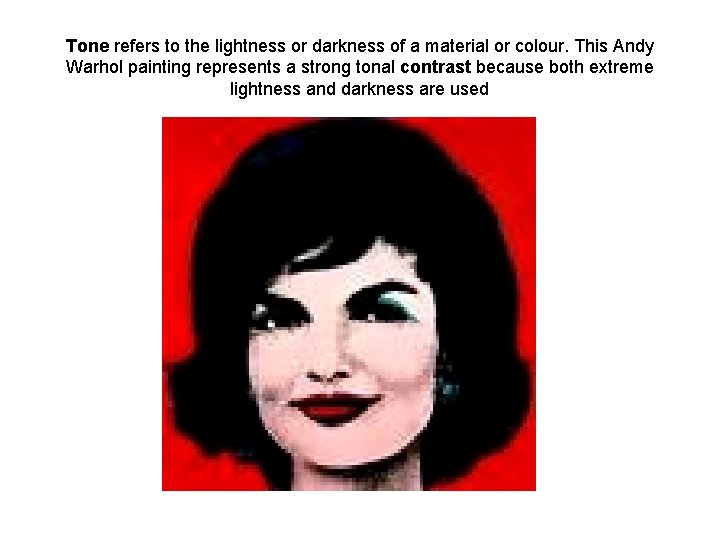
Tone refers to the lightness or darkness of a material or colour. This Andy Warhol painting represents a strong tonal contrast because both extreme lightness and darkness are used

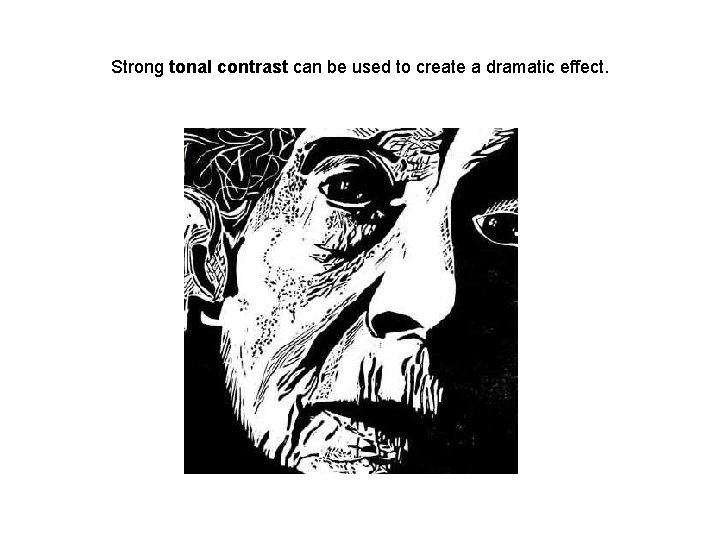
Strong tonal contrast can be used to create a dramatic effect.

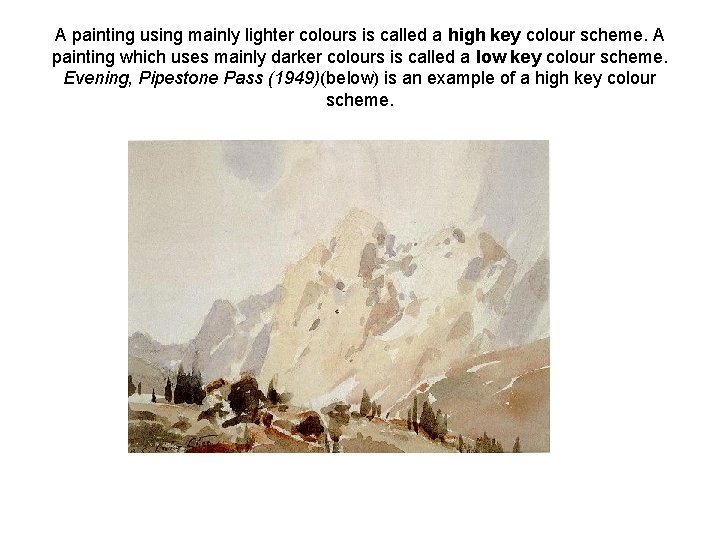
A painting using mainly lighter colours is called a high key colour scheme. A painting which uses mainly darker colours is called a low key colour scheme. Evening, Pipestone Pass (1949)(below) is an example of a high key colour scheme.

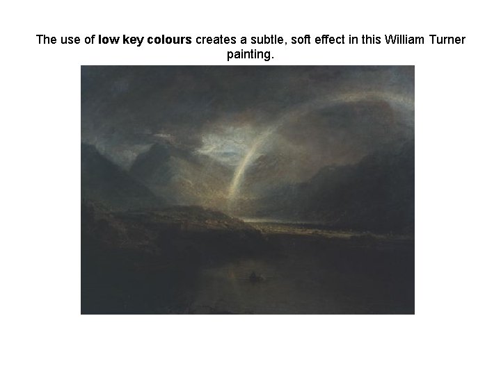
The use of low key colours creates a subtle, soft effect in this William Turner painting.

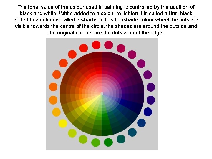
The tonal value of the colour used in painting is controlled by the addition of black and white. White added to a colour to lighten it is called a tint, black added to a colour is called a shade. In this tint/shade colour wheel the tints are visible towards the centre of the circle, the shades are around the outside and the original colours are the dots around the edge.

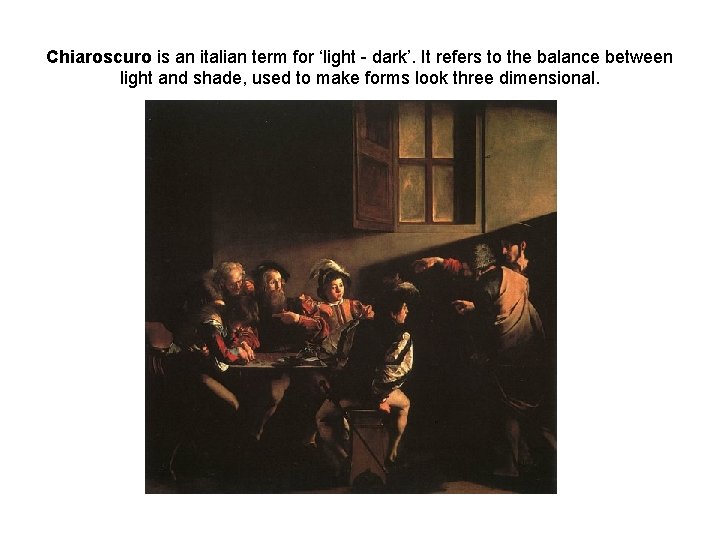
Chiaroscuro is an italian term for ‘light - dark’. It refers to the balance between light and shade, used to make forms look three dimensional.

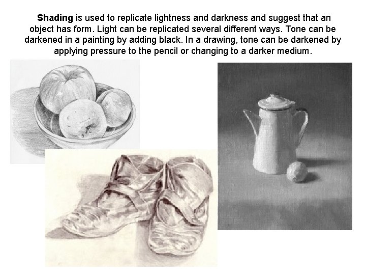
Shading is used to replicate lightness and darkness and suggest that an object has form. Light can be replicated several different ways. Tone can be darkened in a painting by adding black. In a drawing, tone can be darkened by applying pressure to the pencil or changing to a darker medium.

4. Colour Key Words: colour Wheel, primary, secondary, complementary, analogous, monochromatic, cool, warm, intensity, spectrum, value, hue , neutral.

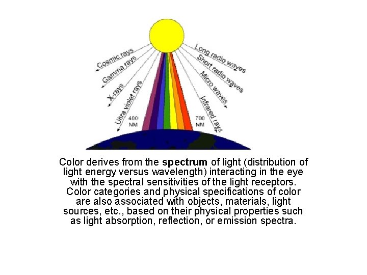
Color derives from the spectrum of light (distribution of light energy versus wavelength) interacting in the eye with the spectral sensitivities of the light receptors. Color categories and physical specifications of color are also associated with objects, materials, light sources, etc. , based on their physical properties such as light absorption, reflection, or emission spectra.

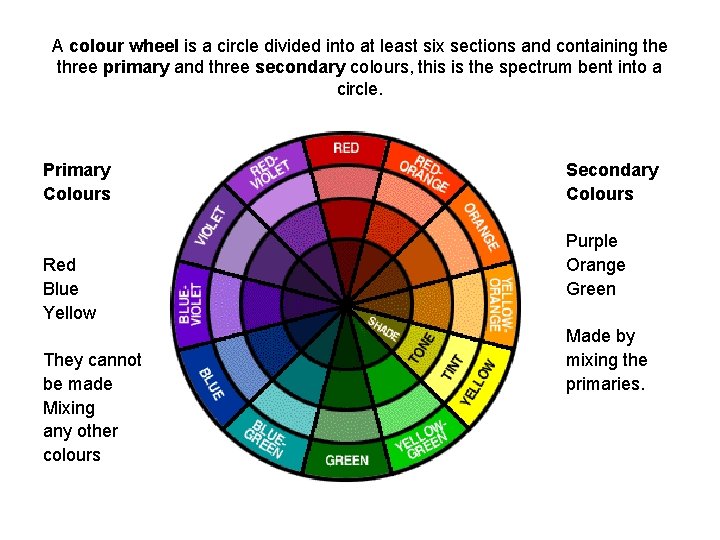
A colour wheel is a circle divided into at least six sections and containing the three primary and three secondary colours, this is the spectrum bent into a circle. Primary Colours Red Blue Yellow They cannot be made Mixing any other colours Secondary Colours Purple Orange Green Made by mixing the primaries.

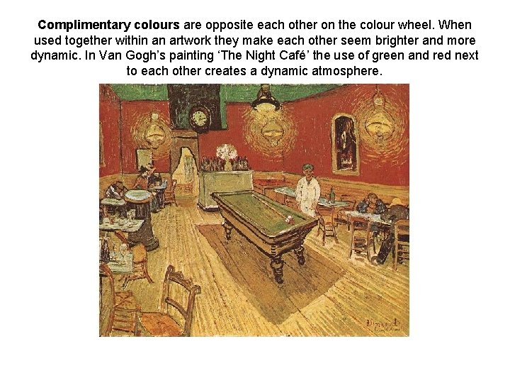
Complimentary colours are opposite each other on the colour wheel. When used together within an artwork they make each other seem brighter and more dynamic. In Van Gogh’s painting ‘The Night Café’ the use of green and red next to each other creates a dynamic atmosphere.

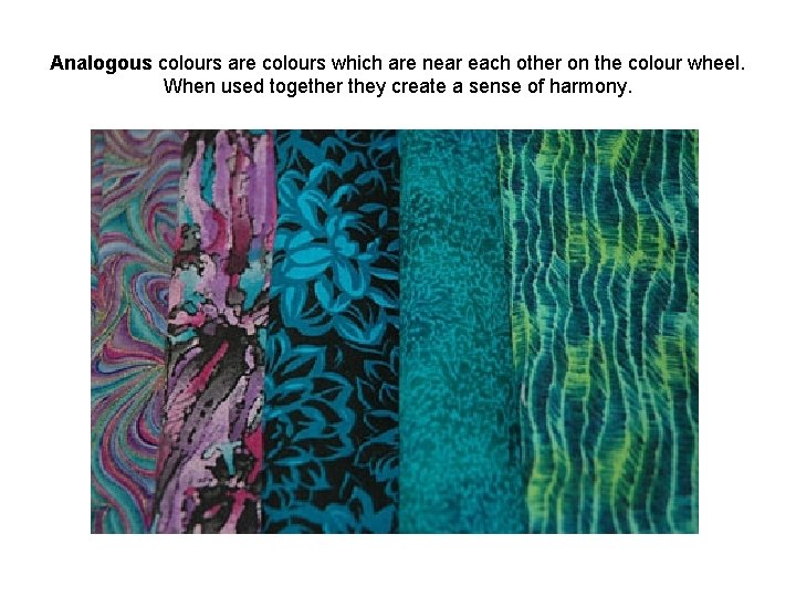
Analogous colours are colours which are near each other on the colour wheel. When used together they create a sense of harmony.

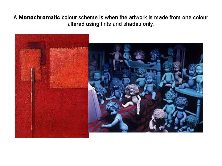
A Monochromatic colour scheme is when the artwork is made from one colour altered using tints and shades only.

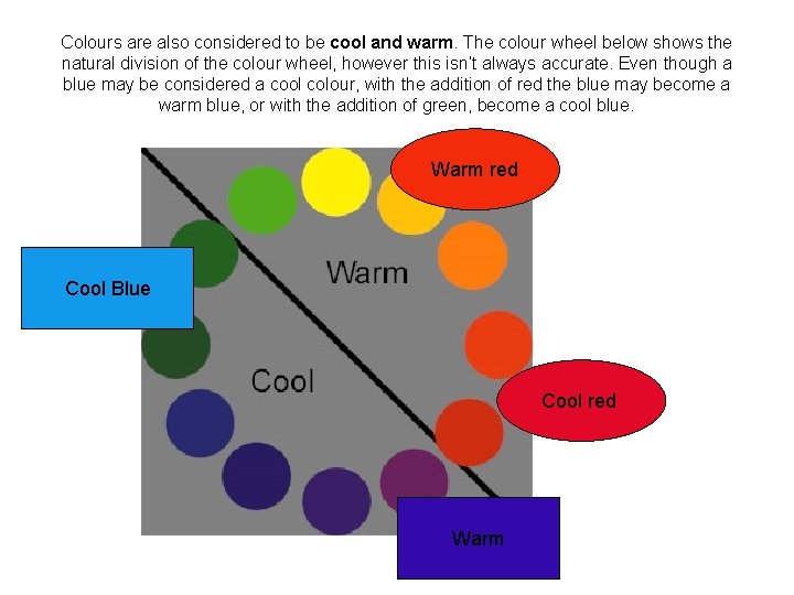
Colours are also considered to be cool and warm. The colour wheel below shows the natural division of the colour wheel, however this isn’t always accurate. Even though a blue may be considered a cool colour, with the addition of red the blue may become a warm blue, or with the addition of green, become a cool blue. Warm red Cool Blue Cool red Warm

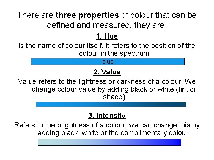
There are three properties of colour that can be defined and measured, they are; 1. Hue Is the name of colour itself, it refers to the position of the colour in the spectrum blue 2. Value refers to the lightness or darkness of a colour. We change colour value by adding black or white (tint or shade) 3. Intensity Refers to the brightness of a colour, we can change this by adding black, white or the complimentary colour.

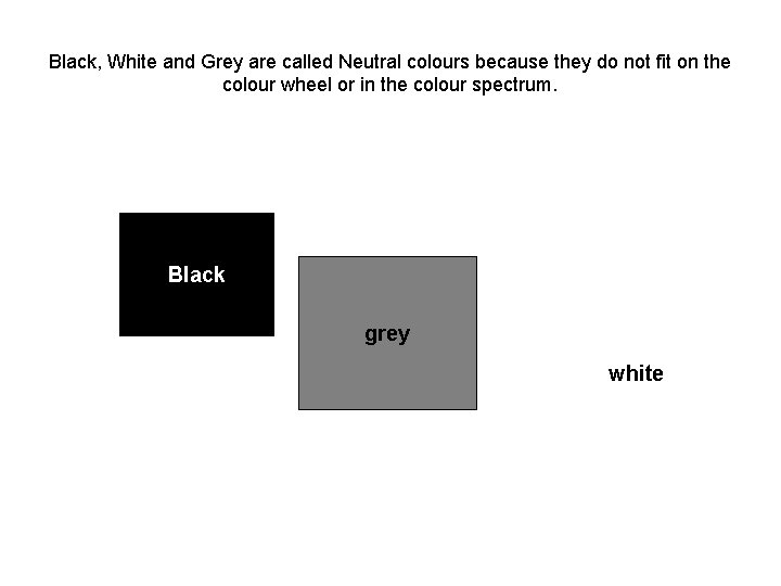
Black, White and Grey are called Neutral colours because they do not fit on the colour wheel or in the colour spectrum. Black grey white

5. Space Key Words: positive space, negative space, picture plane, composition, linear perspective, atmospheric perspective, abstract, non-representational.

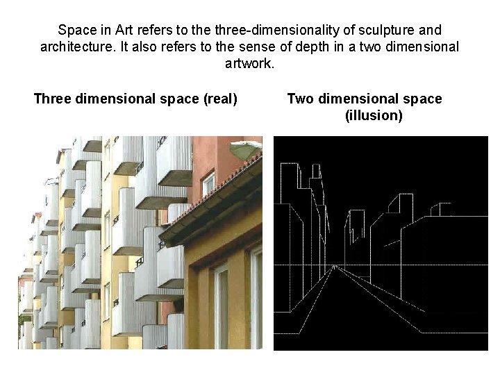
Space in Art refers to the three-dimensionality of sculpture and architecture. It also refers to the sense of depth in a two dimensional artwork. Three dimensional space (real) Two dimensional space (illusion)

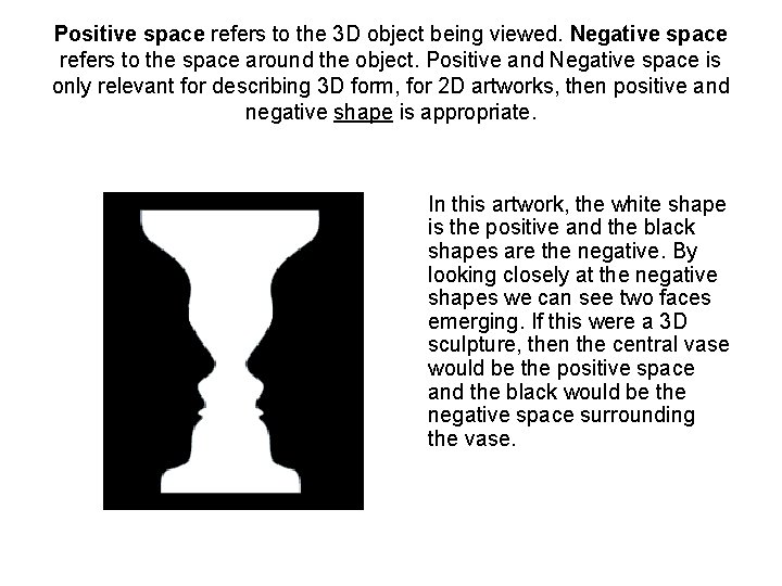
Positive space refers to the 3 D object being viewed. Negative space refers to the space around the object. Positive and Negative space is only relevant for describing 3 D form, for 2 D artworks, then positive and negative shape is appropriate. • In this artwork, the white shape is the positive and the black shapes are the negative. By looking closely at the negative shapes we can see two faces emerging. If this were a 3 D sculpture, then the central vase would be the positive space and the black would be the negative space surrounding the vase.

Two dimensional space When considering two dimensional space we discuss; 1. The picture plane 2. The illusion of space 3. Composition

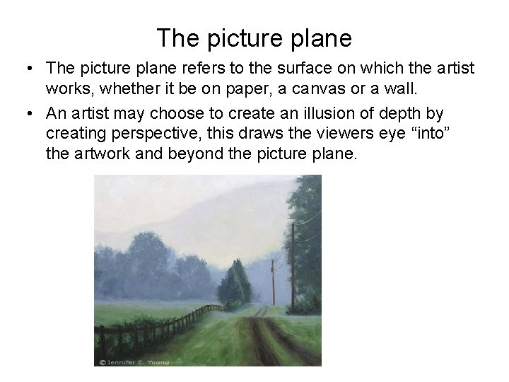
The picture plane • The picture plane refers to the surface on which the artist works, whether it be on paper, a canvas or a wall. • An artist may choose to create an illusion of depth by creating perspective, this draws the viewers eye “into” the artwork and beyond the picture plane.

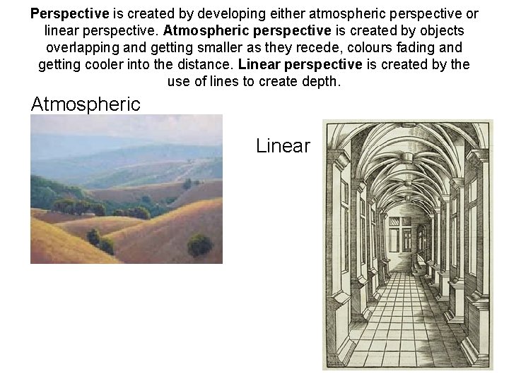
Perspective is created by developing either atmospheric perspective or linear perspective. Atmospheric perspective is created by objects overlapping and getting smaller as they recede, colours fading and getting cooler into the distance. Linear perspective is created by the use of lines to create depth. Atmospheric Linear

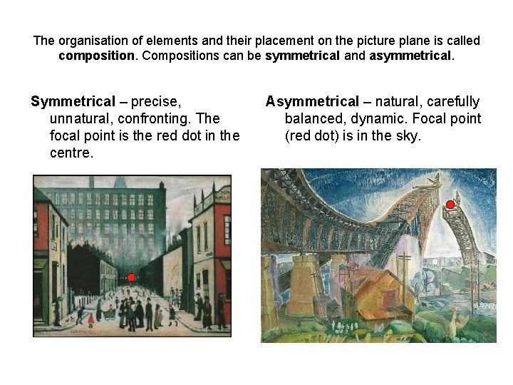
The organisation of elements and their placement on the picture plane is called composition. Compositions can be symmetrical and asymmetrical. Symmetrical – precise, unnatural, confronting. The focal point is the red dot in the centre. Asymmetrical – natural, carefully balanced, dynamic. Focal point (red dot) is in the sky.

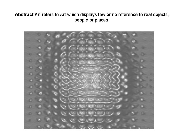
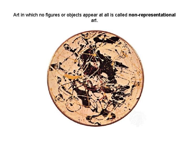
Abstract Art refers to Art which displays few or no reference to real objects, people or places.

Art in which no figures or objects appear at all is called non-representational art.

Texture Real texture, Implied Texture

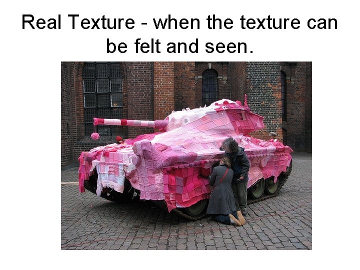
Real Texture - when the texture can be felt and seen.

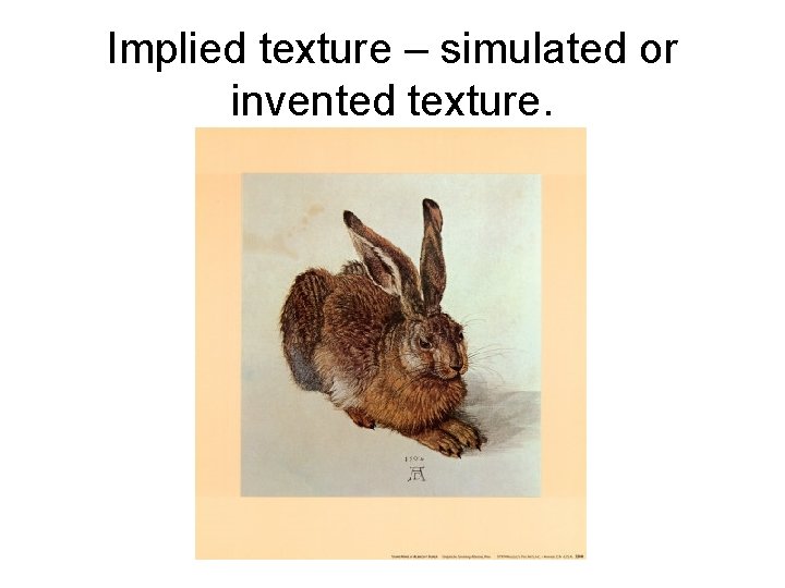
Implied texture – simulated or invented texture.

Part Two The Principles of Design

Visual balance is way that different elements of a composition relate to one another. The elements of art – line, shape, texture etc – work together to create balance within a composition. The four most important types of balance are 1. Symmetrical balance 2. Approximate symmetry 3. Asymmetrical balance 4. Radial balance

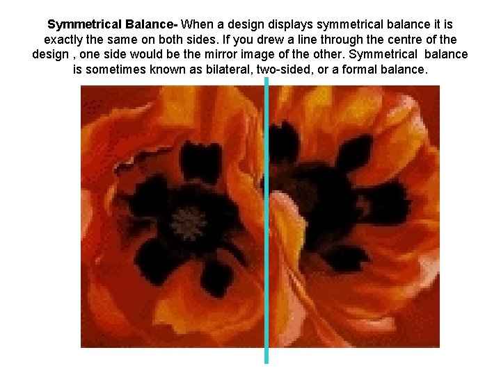
Symmetrical Balance- When a design displays symmetrical balance it is exactly the same on both sides. If you drew a line through the centre of the design , one side would be the mirror image of the other. Symmetrical balance is sometimes known as bilateral, two-sided, or a formal balance.

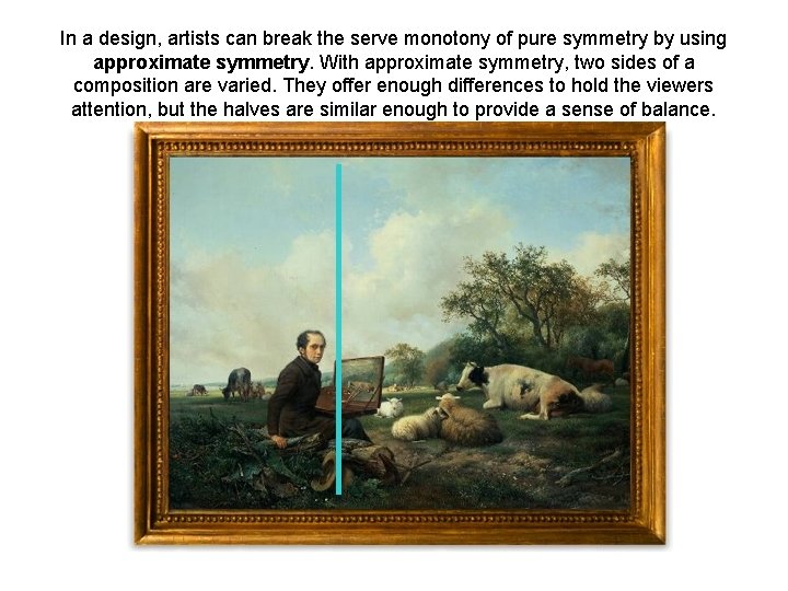
In a design, artists can break the serve monotony of pure symmetry by using approximate symmetry. With approximate symmetry, two sides of a composition are varied. They offer enough differences to hold the viewers attention, but the halves are similar enough to provide a sense of balance.

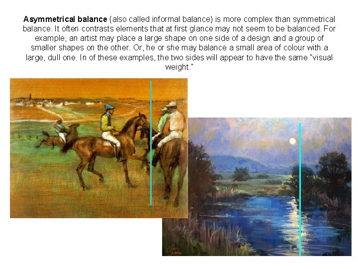
Asymmetrical balance (also called informal balance) is more complex than symmetrical balance. It often contrasts elements that at first glance may not seem to be balanced. For example, an artist may place a large shape on one side of a design and a group of smaller shapes on the other. Or, he or she may balance a small area of colour with a large, dull one. In of these examples, the two sides will appear to have the same “visual weight. ”

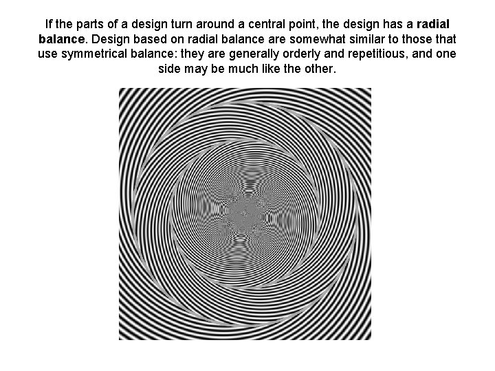
If the parts of a design turn around a central point, the design has a radial balance. Design based on radial balance are somewhat similar to those that use symmetrical balance: they are generally orderly and repetitious, and one side may be much like the other.

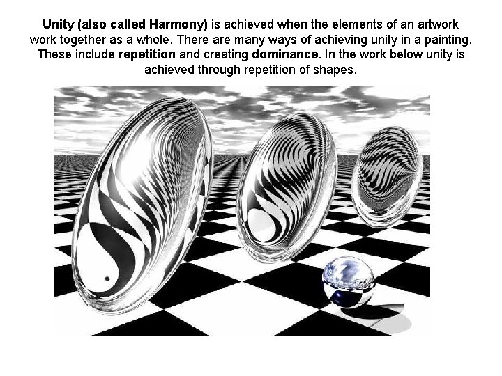
Unity (also called Harmony) is achieved when the elements of an artwork together as a whole. There are many ways of achieving unity in a painting. These include repetition and creating dominance. In the work below unity is achieved through repetition of shapes.

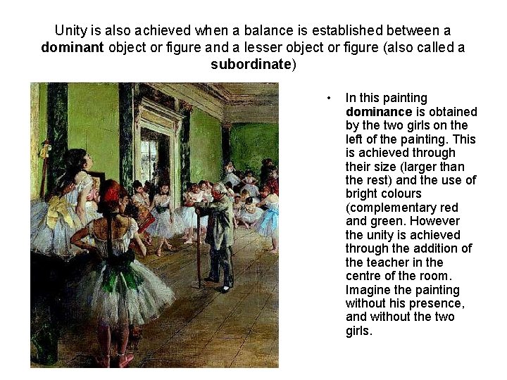
Unity is also achieved when a balance is established between a dominant object or figure and a lesser object or figure (also called a subordinate) • In this painting dominance is obtained by the two girls on the left of the painting. This is achieved through their size (larger than the rest) and the use of bright colours (complementary red and green. However the unity is achieved through the addition of the teacher in the centre of the room. Imagine the painting without his presence, and without the two girls.

Contrast is a principle that is used is different ways in Art. The purpose of contrast is to create a statement, to entice the viewer and to create attention. Contrast is achieved through • Materials • line • Shape, form and size • Value • Colour • Textures • Time and style • ideas

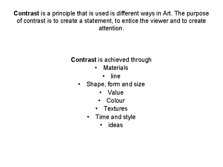
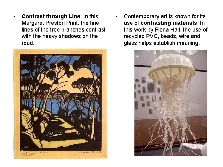
• Contrast through Line. In this Margaret Preston Print, the fine lines of the tree branches contrast with the heavy shadows on the road. • Contemporary art is known for its use of contrasting materials. In this work by Fiona Hall, the use of recycled PVC, beads, wire and glass helps establish meaning.

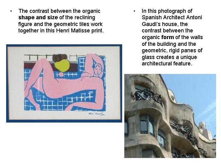
• The contrast between the organic shape and size of the reclining figure and the geometric tiles work together in this Henri Matisse print. • In this photograph of Spanish Architect Antoni Gaudi’s house, the contrast between the organic form of the walls of the building and the geometric, rigid panes of glass creates a unique architectural feature.

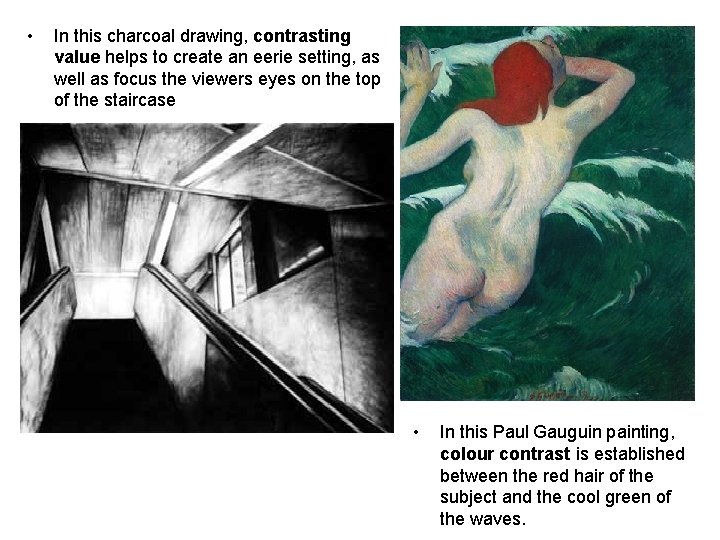
• In this charcoal drawing, contrasting value helps to create an eerie setting, as well as focus the viewers eyes on the top of the staircase • In this Paul Gauguin painting, colour contrast is established between the red hair of the subject and the cool green of the waves.

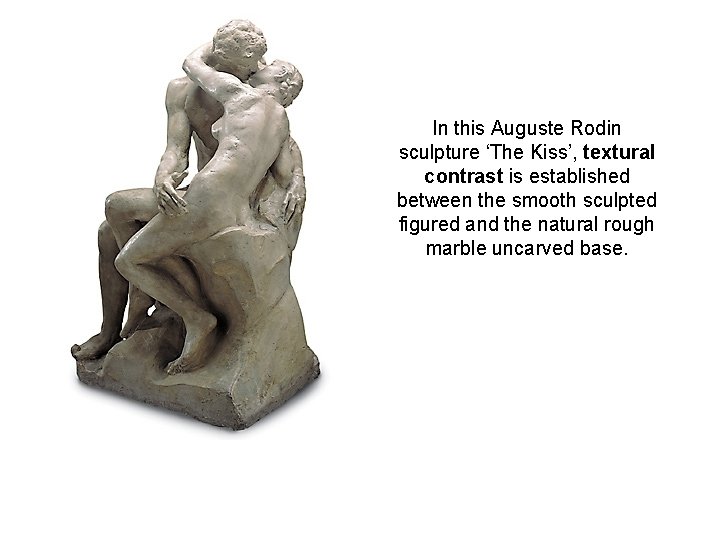
In this Auguste Rodin sculpture ‘The Kiss’, textural contrast is established between the smooth sculpted figured and the natural rough marble uncarved base.

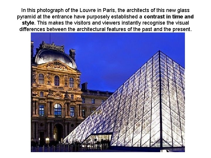
In this photograph of the Louvre in Paris, the architects of this new glass pyramid at the entrance have purposely established a contrast in time and style. This makes the visitors and viewers instantly recognise the visual differences between the architectural features of the past and the present.

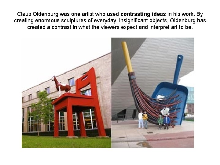
Claus Oldenburg was one artist who used contrasting ideas in his work. By creating enormous sculptures of everyday, insignificant objects, Oldenburg has created a contrast in what the viewers expect and interpret art to be.

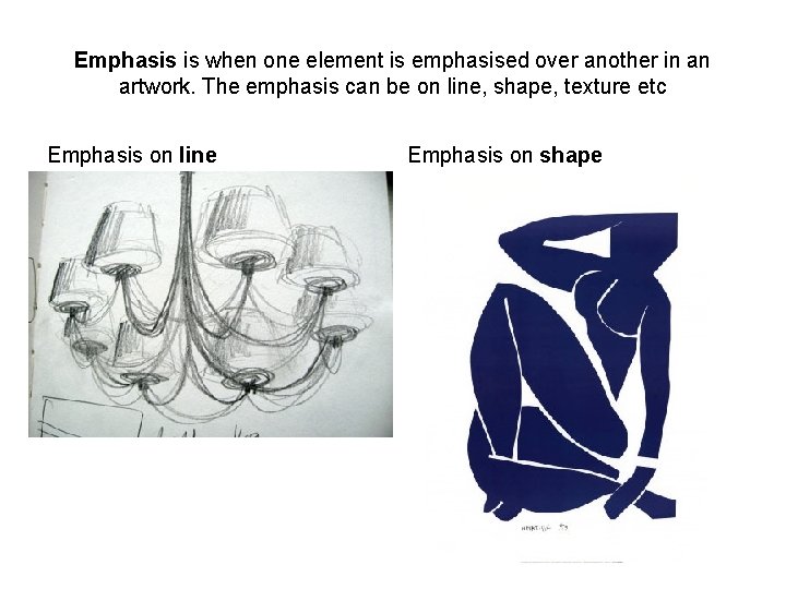
Emphasis is when one element is emphasised over another in an artwork. The emphasis can be on line, shape, texture etc Emphasis on line Emphasis on shape

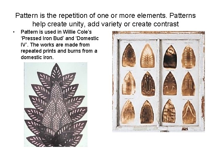
Pattern is the repetition of one or more elements. Patterns help create unity, add variety or create contrast • Pattern is used in Willie Cole’s ‘Pressed Iron Bud’ and ‘Domestic IV’. The works are made from repeated prints and burns from a domestic iron.

Movement and Rhythm is achieved in four ways • Visual rhythm • Kinetic art • Compositional movement • Progressive rhythm

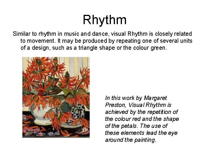
Rhythm Similar to rhythm in music and dance, visual Rhythm is closely related to movement. It may be produced by repeating one of several units of a design, such as a triangle shape or the colour green. In this work by Margaret Preston, Visual Rhythm is achieved by the repetition of the colour red and the shape of the petals. The use of these elements lead the eye around the painting.

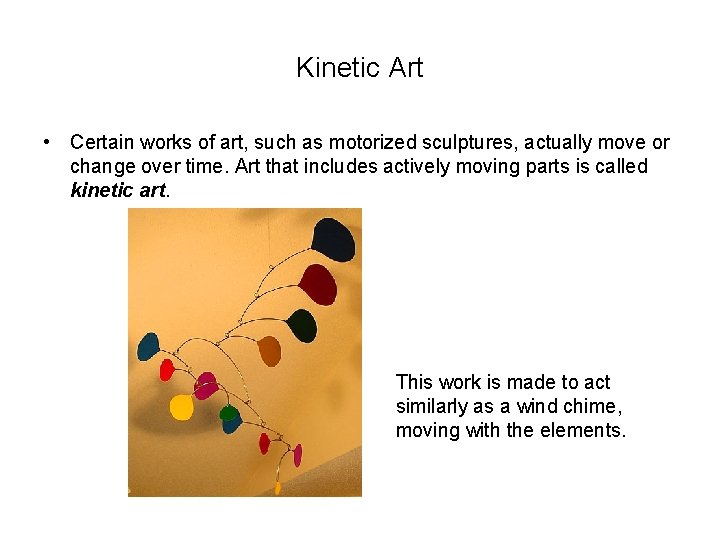
Kinetic Art • Certain works of art, such as motorized sculptures, actually move or change over time. Art that includes actively moving parts is called kinetic art. This work is made to act similarly as a wind chime, moving with the elements.

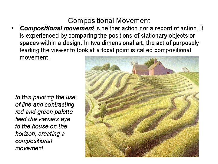
Compositional Movement • Compositional movement is neither action nor a record of action. It is experienced by comparing the positions of stationary objects or spaces within a design. In two dimensional art, the act of purposely leading the viewer to look at a focal point is called compositional movement. In this painting the use of line and contrasting red and green palette lead the viewers eye to the house on the horizon, creating a compositional movement.

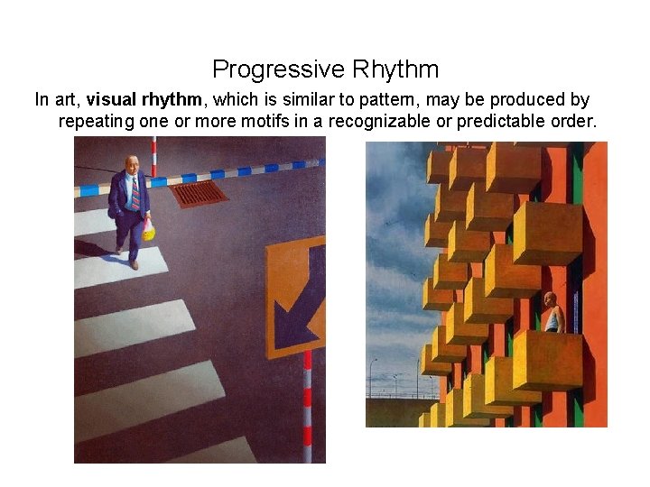
Progressive Rhythm In art, visual rhythm, which is similar to pattern, may be produced by repeating one or more motifs in a recognizable or predictable order.