Cartograms and Choropleth maps an investigation into communicative




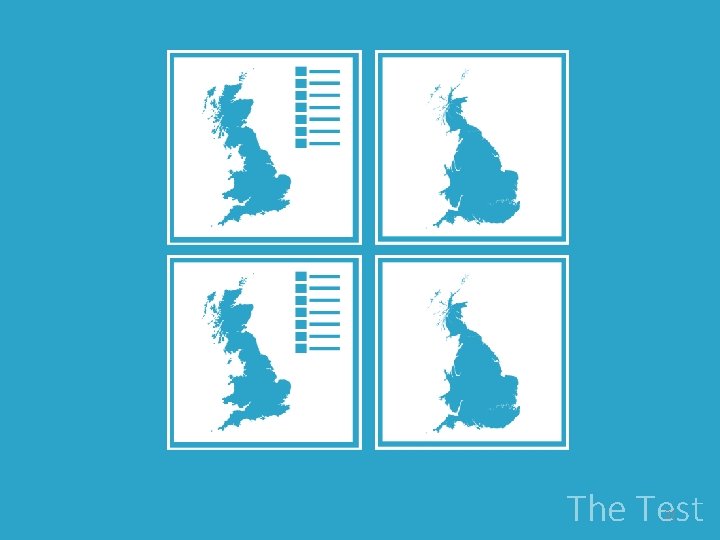
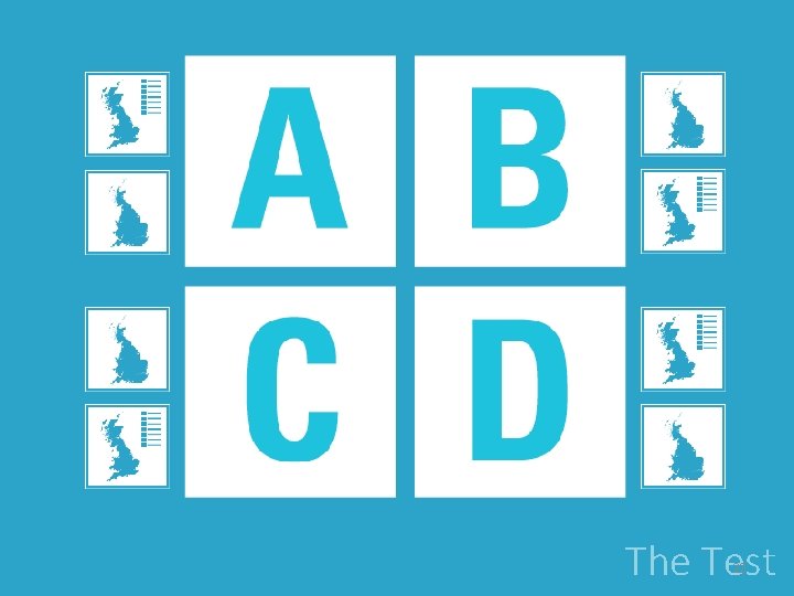
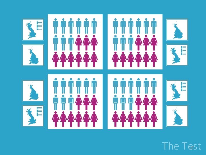
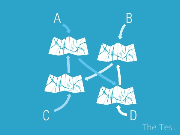






- Slides: 61

Cartograms and Choropleth maps: an investigation into communicative effectiveness using mobile app usage data. Henry Holbrook and Clive Cartwright © NERC All rights reserved BCS ‐ So. C Conference Mapping Together 8 th-10 th September 2015 · York

App Development Visualising The Test Effectiveness The Results Conclusion & Future Work 2

App development 3

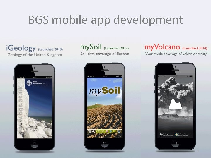
BGS mobile app development 4

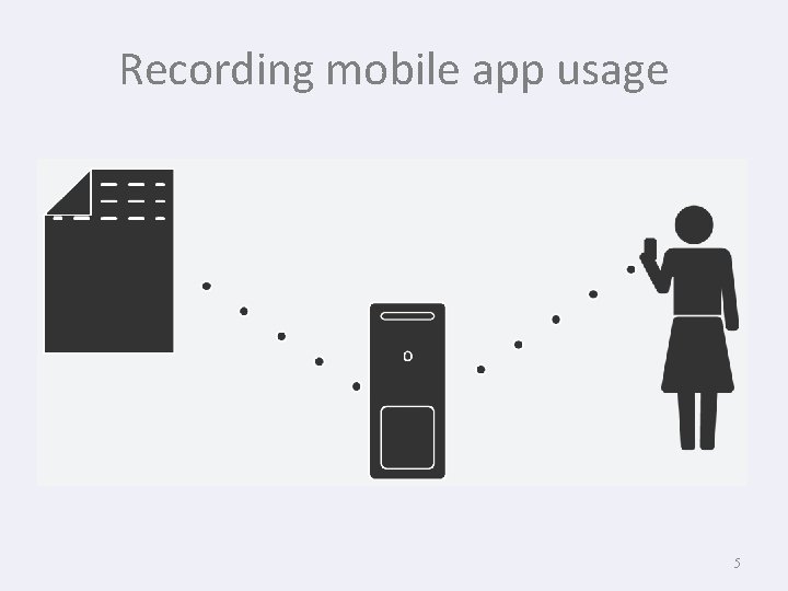
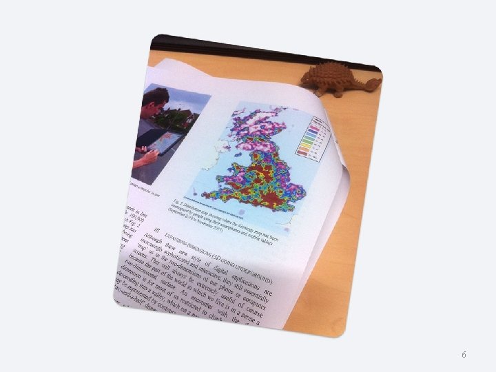
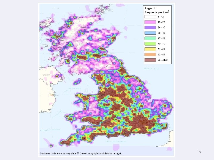
Recording mobile app usage 5

6

7

Visualising 8

Visualising depends on… communicating… Visualising 9

Visualising depends on… communicating… by appropriate means… Visualising 10

Visualising depends on… communicating… by appropriate means… in a suitable format for the story and the audience Visualising 11

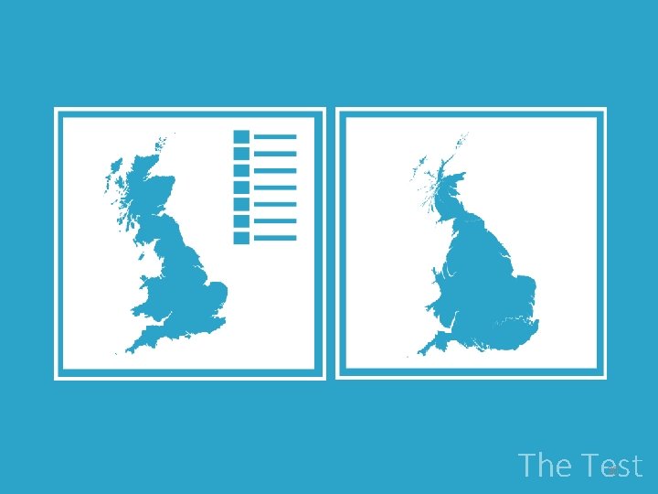
The alternatives Our research revealed that there were two other types of maps that would be capable of communicating this type of data. Visualising 12

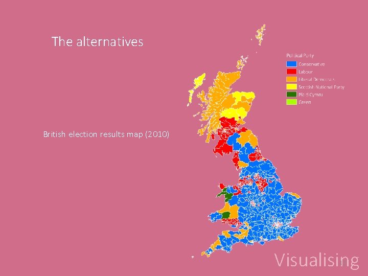
The alternatives British election results map (2010) Visualising 13

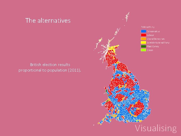
The alternatives British election results proportional to population (2011). Visualising 14

Why? • We need to understand how the data is being used • Identify areas of interest • But not just to highlight areas that are populated • Reveal how the data or app could be developed • Combined with other information that in context will help give the data meaning Visualising 15

How? • Identify data sources – o parliamentary constituencies o App usage zoom level o Population data • Decide how all of this information can be visualised in both map types • What types of questions would people ask from the data? • Create a usage to people ratio Visualising 16

The Test 17

The Test 18

The Test 19

The Test 20

The Test 21

The Test 22

The Test 23

The Test

The Test 25

The Test 26

Effectiveness 27

Test objective: 1) Establish if the maps communicate. Not interested in absolute answers as they bias cartograms. 2) Rationalizing usage data with population statistics. 3) Establish if the linking method reduces communicative effectiveness. Questions 28

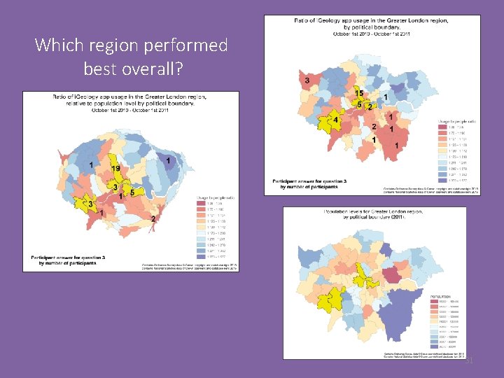
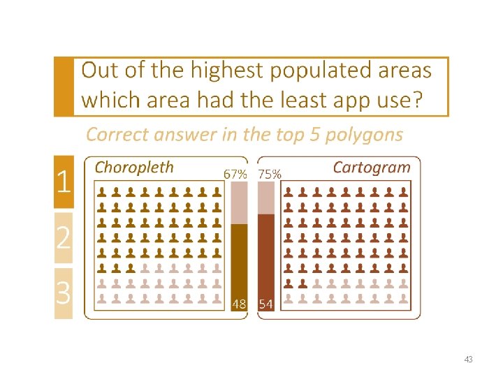
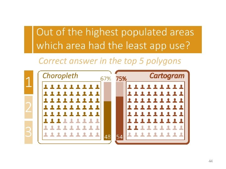
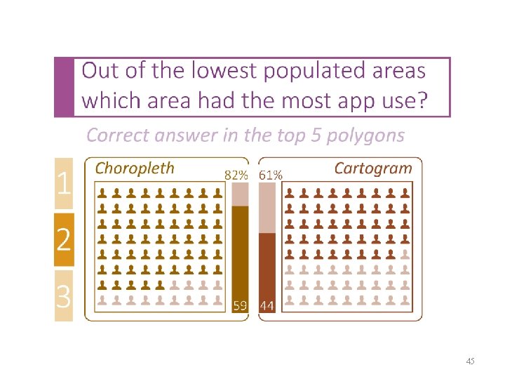
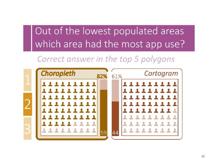
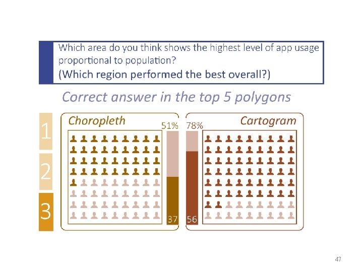
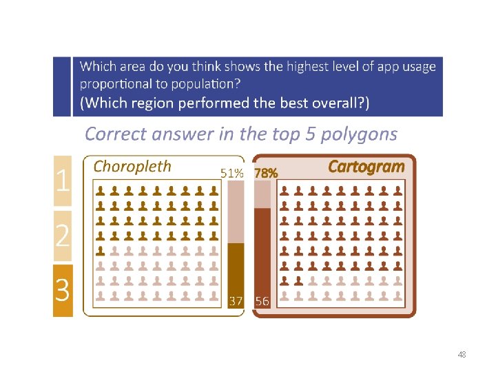
3 direct questions relating to the map: 1) Out of the highest populated areas which area had the least app use? 2) Out of the lowest populated areas which area had the most app use? 3) Which region performed best overall? Questions 29

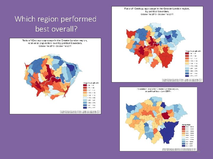
Which region performed best overall? 30

Which region performed best overall? 31

Other questions: 1) Gender 2) Age 3) Any visual impediments 4) Self assessment on map reading abilities and after the test 5) Map preference Questions kept to a minimum to reduce participant fatigue Questions 32

The Results 33

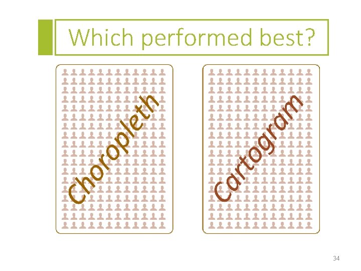
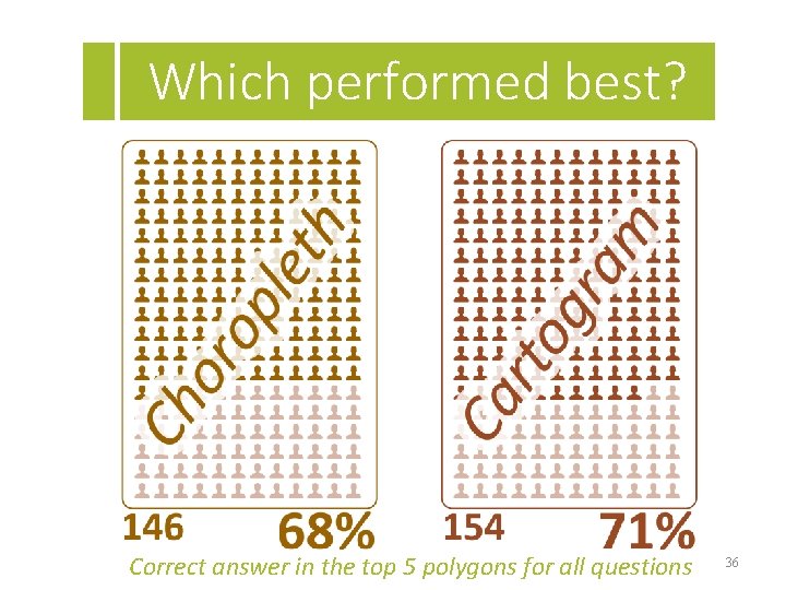
Which performed best? 34

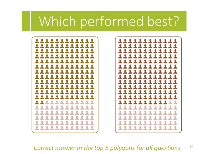
Which performed best? Correct answer in the top 5 polygons for all questions 35

Which performed best? Correct answer in the top 5 polygons for all questions 36

The Results Order of maps 37

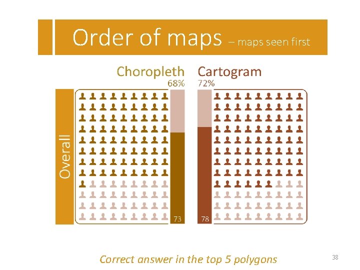
Order of maps – maps seen first Correct answer in the top 5 polygons 38

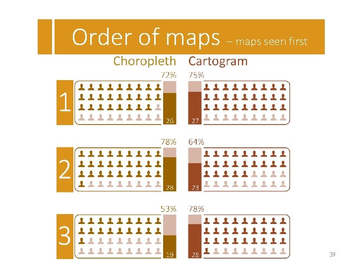
Order of maps – maps seen first 39

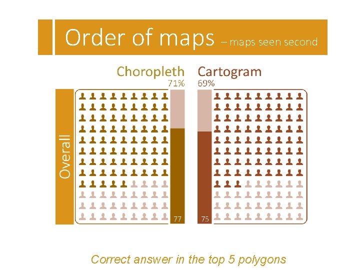
Order of maps – maps seen second Correct answer in the top 5 polygons

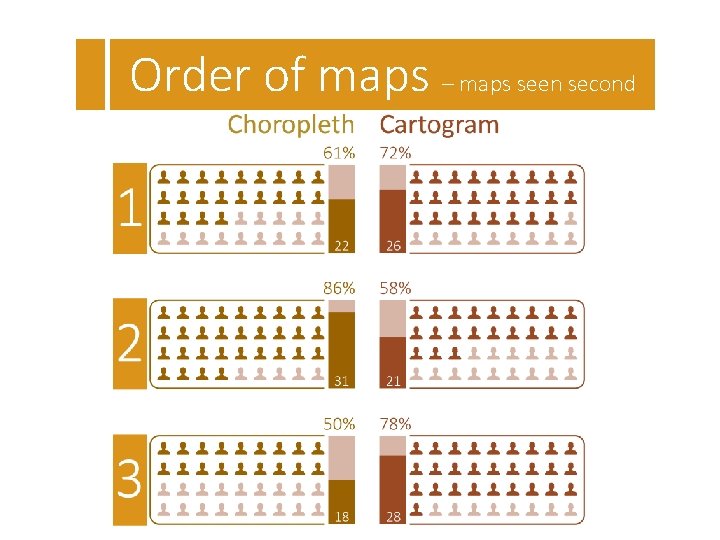
Order of maps – maps seen second

The Results The questions 42

43

44

45

46

47

48

The Results Age 49

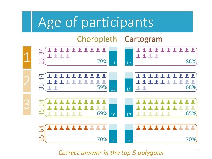
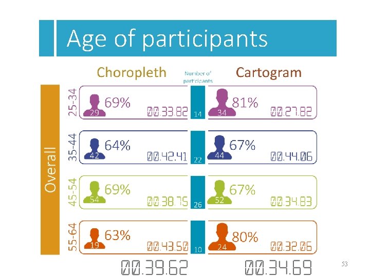
Age of participants Correct answer in the top 5 polygons 50

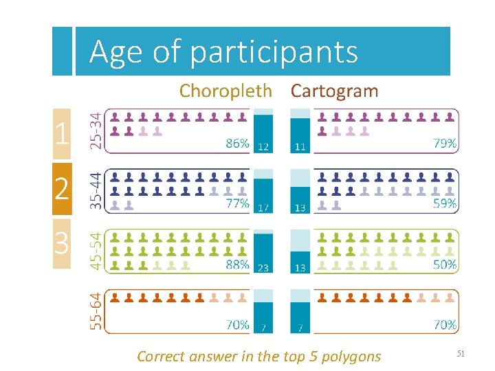
Age of participants Correct answer in the top 5 polygons 51

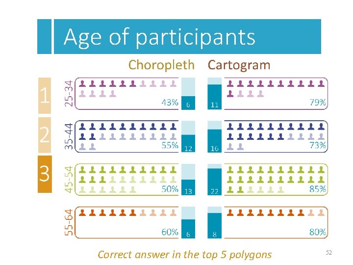
Age of participants Correct answer in the top 5 polygons 52

Age of participants 53

The Results Map preference 54

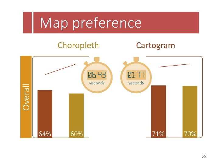
Map preference 55

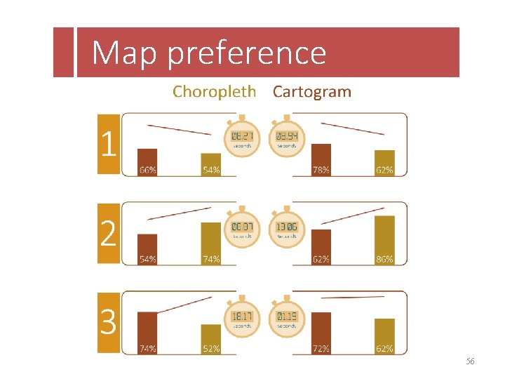
Map preference 56

Conclusion & Future Work 57

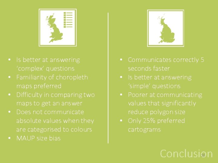
• Is better at answering ‘complex’ questions • Familiarity of choropleth maps preferred • Difficulty in comparing two maps to get an answer • Does not communicate absolute values when they are categorised to colours • MAUP size bias • Communicates correctly 5 seconds faster • Is better at answering ‘simple’ questions • Poorer at communicating values that significantly reduce polygon size • Only 25% preferred cartograms Conclusion 58

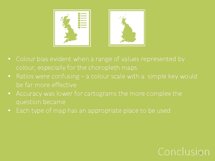
• Colour bias evident when a range of values represented by colour, especially for the choropleth maps • Ratios were confusing – a colour scale with a simple key would be far more effective • Accuracy was lower for cartograms the more complex the question became • Each type of map has an appropriate place to be used Conclusion 59

• Colour – how people interpret colour? • Attraction – what draws people’s attention? • Visualisations – what else can be used to communicate this information? • Cartograms – further research into other cartogram types including ‘hybrid’ cartograms • Interactive maps – how choropleth maps and cartograms are used in this context The Future 60

Thank-you Any questions? 61