PARETO DIAGRAM AND HISTOGRAM Definition Pareto Principle Pareto


 rfa")


- Slides: 35
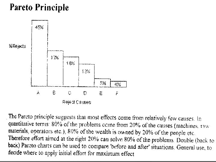
PARETO DIAGRAM AND HISTOGRAM Definition: Pareto Principle Pareto principle is a prediction that 80% of effects come from 20% of causes.
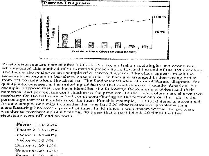
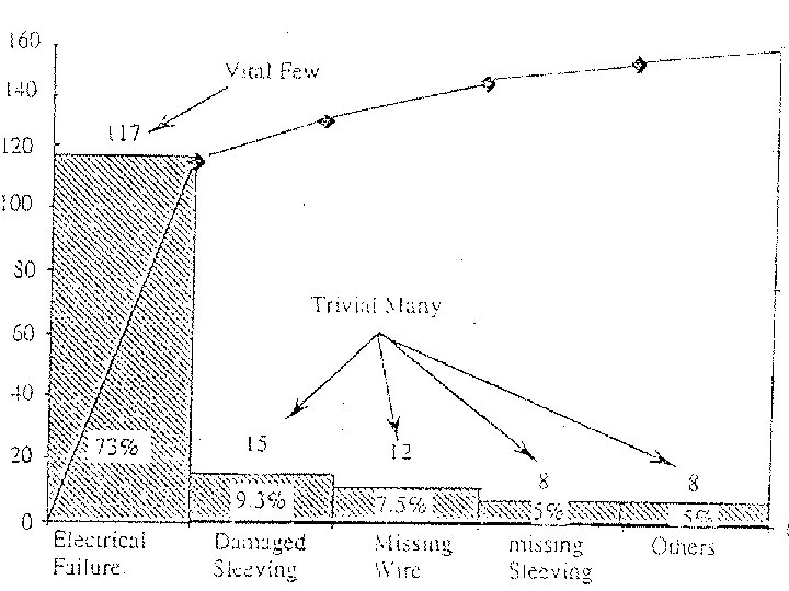
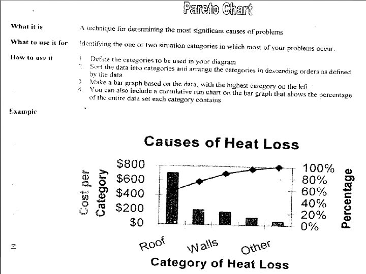
Pareto Diagram Named after Vilfredo Pareto – an Italian sociologist and economist He determined that 80% of the wealth is in the hands of 20% of the people. This theory proved true not just economics and wealth distribution but also true for industry Invented in 19 th century The chart much appears the same as histogram or bar chart, except that the bars are arranged in decreasing order from left to right.
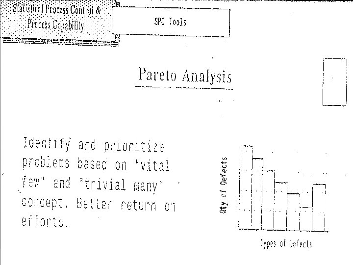
The basic purpose! Pareto Diagram identifies the largest contributors of process variation that result in poor performance such as defects. Once we know the biggest contributors of the problems. Gives us valuable information where to spend precious resources of the company to improve the quality of a product or process
The basic purpose! of using Pareto Diagram for quality improvement by ordering the process factors that causing variation to the process. To identify which of the problems identified should be worked on first and how much of the total problem will correcting one or more of the identified problems solve.
The Pareto diagram! is useful as a summary of information and predicting how much of a problem can be corrected by attacking any specific part of the problem.
PARETO CHART STEP 1 DECIDE WHAT DATA TO BE PLOTTED STEP 2 SELECT THE CLASSIFICATIONS FOR THE DATA STEP 3 COLLECT DATA OVER A SPECIFIED PERIOD STEP 4 ARRANGE DATA IN A SUITABLE FORM STEP 5 RECORD DATA IN DESCENDING ORDER STEP 6 CALCULATE THE CUMULATIVE FREQUENCY STEP 7 CALCULATE THE PERCENTAGE & THE CUMULATIVE PERCENTAGE EXAMPLE -----PARETO ANALYSIS
PARETO CHART - Learning Exercise
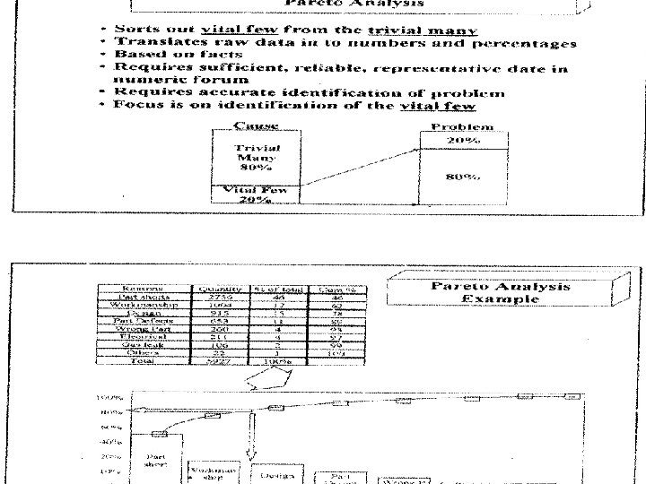
PARETO ANALYSIS CAUSE NUMBER OF DEFECTS Poor design Wrong part dimensions Defective parts Incorrect machine calibration Operator errors Defective material Surface abrasions 80 16 12 7 4 3 3 125
PARETO ANALYSIS CAUSE NUMBER OF DEFECTS Poor design Wrong part dimensions Defective parts Incorrect machine calibration Operator errors Defective material Surface abrasions PERCENTAGE 80 16 12 7 4 3 3 64 % 13 10 6 3 2 2 125 100 %
Causes of poor quality ce s on si ra ab ls ia (3) rfa m at er s (6) Su ct iv e or rr re ns ra tio 0 to pe ra lib ca (10) De fe O ne 10 hi (13) ac M pa rts ns 20 ct iv e en si o m di gn De si 70 De fe ng ro W or Po Percent from each cause PARETO CHART (64) 60 50 40 30 (2)
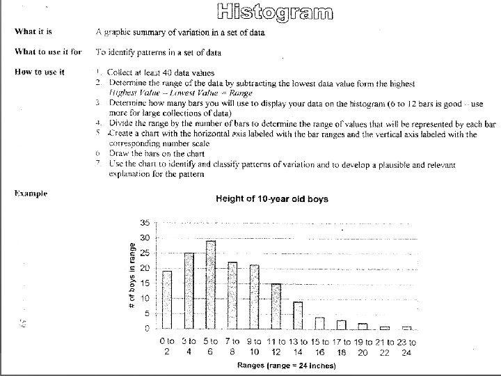
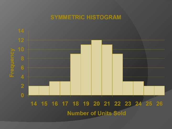
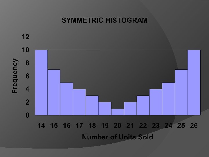
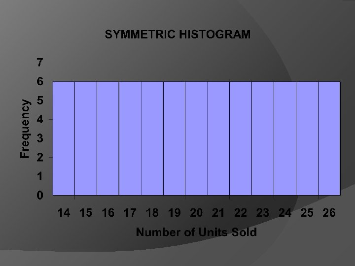
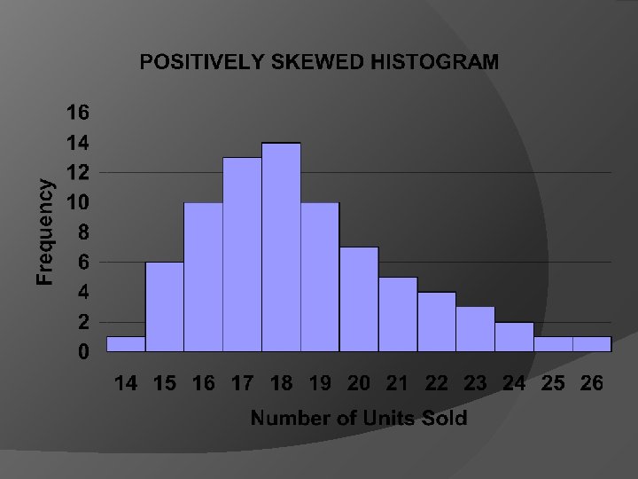
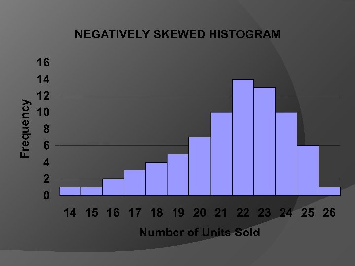
HISTOGRAMS! REVEAL THE AMOUNT OF VARIATION THAT ANY PROCESS HAS WITHIN IT. PICTURE THE DISTRIBUTION. EXAMPLE : FREQUENCY, THICKNESS
HISTOGRAM OR BAR GRAPH EXAMPLE: A GRAPHIC SUMMARY OF VARIATION IN A SET OF DATA ( A VISUALIZATION TOOL FOR VARYING DATA) ENABLE US TO SEE PATTERNS THAT ARE DIFFICULT TO SEE IN A SIMPLE TABLE OF NUMBERS. CAN BE ANALYSED TO DRAW CONCLUSIONS ABOUT THE DATA SET (E. G. SKEWED OR NOT SKEWED DISTRIBUTION), WITHIN SPECS OR OUT OF SPECS
A SET OF DATA COLLECTED FROM A MANUFACTURING PROCESS IN WHICH THE WIDTH OF A PARTICULAR COMPONENT IS REPEATEDLY MEASURED NUMBER MEASURED VALUE 1 6. 04 2 6. 07 3 5. 99 4 6. 01 5 6. 1 6 6. 00 AFTER TABULATION OF DATA THERE IS A NEED TO DEVELOP TALLY SHEET AND CALCULATE: CELL HIGHEST AND LOWEST BOUNDS, RANGE, CELL INTERVAL, CELL MIDPOINT, CUMULATIVE AND RELATIVE FREQUENCY
HOW TO CONSTRUCT A DIAGRAM! STEP 1 SET THE MEASUREMENT IN ASCENDING ORDER, FROM SMALLEST TO BIGGEST STEP 2 TALLEY THE MEASUREMENT STEP 3 COUNT THE NUMBERS OF TALLY MARKS AND ASSIGN A FREQUENCY VALUE FOR EACH MEASUREMENT
DIFFERENCE FROM PARETO DIAGRAM: CATEGORIES ARE USED FOR THE ABSCISSA (the value of a coordinate on the horizontal axis) abscissa. The coordinates for A are (4, 3); the abscissa is 4.
CATEGORIES ARE IN DESCENDING ORDER FROM THE HIGHEST FREQUENCY TO THE LOWEST ONE RATHER THAN IN NUMERICAL ORDER. LIMITATION! DATA FREQUENCY DISTRIBUTION DOES NOT SHOW THE ORDER IN WHICH THE DATA WERE PRODUCED. A TIME SERIES PLOT OR RUN CHART CAN BE USED FOR THIS PURPOSE. THESE CHARTS SHOW THE ORDER IN WHICH THE DATA WERE PRODUCED AND CAN AID IN THE ANALYSIS.
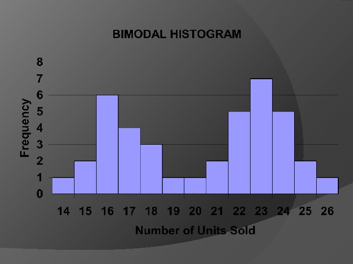
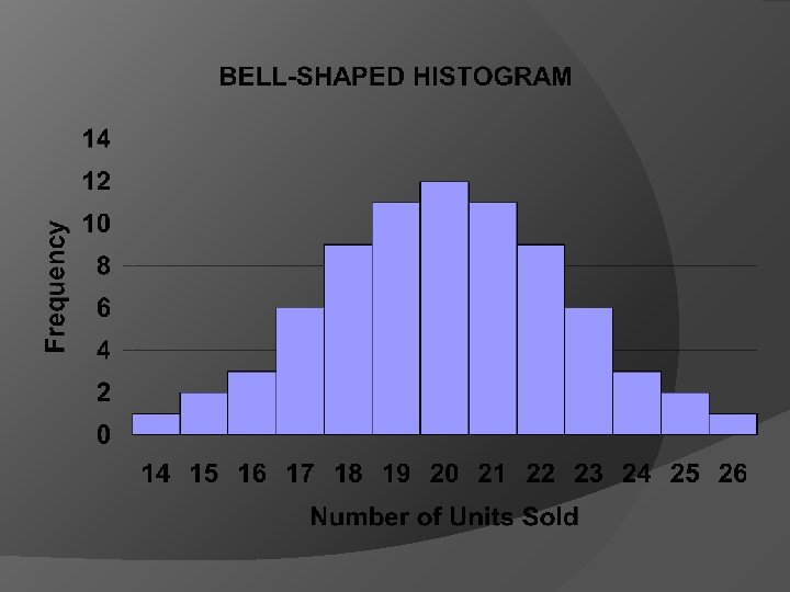
HISTOGRAM EXAMPLES