2 2 Graphs Histograms Frequency Polygons and Ogives
- Slides: 45

2 -2 Graphs Histograms, Frequency Polygons, and Ogives Instructor: Alaa saud Note: This Power. Point is only a summary and your main source should be the book.

• The three most commonly used graphs in research are as follows: 1. The histogram 2. The frequency polygon 3. The cumulative frequency graph, or ogive Note: This Power. Point is only a summary and your main source should be the book.

Graphical representation: why? • Purpose of graphs in statistics is to convey the data to the viewers in pictorial form • Easier for most people to understand the meaning of data in form of graphs • They can also be used to discover a trend or pattern in a situation over a period of time • Useful in getting the audience’s attention in a publication or a speaking presentation

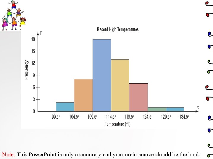
1. The histogram: The histogram is a graph that displays the data by using contiguous vertical bars (unless the frequency of a class is 0) of various heights to represent the frequencies of the classes ve i t a t i ant ble u Q ia r a v The class boundaries are represented on the horizontal axis Note: This Power. Point is only a summary and your main source should be the book.

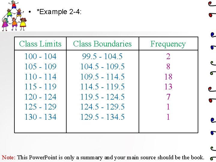
• *Example 2 -4: Class Limits Class Boundaries Frequency 100 - 104 105 - 109 110 - 114 115 - 119 120 - 124 125 - 129 130 - 134 99. 5 - 104. 5 - 109. 5 - 114. 5 - 119. 5 - 124. 5 - 129. 5 - 134. 5 2 8 18 13 7 1 1 Note: This Power. Point is only a summary and your main source should be the book.

Note: This Power. Point is only a summary and your main source should be the book.

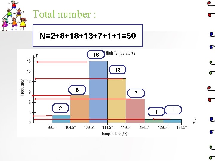
Total number : N=2+8+18+13+7+1+1=50 18 13 8 2 7 1 1

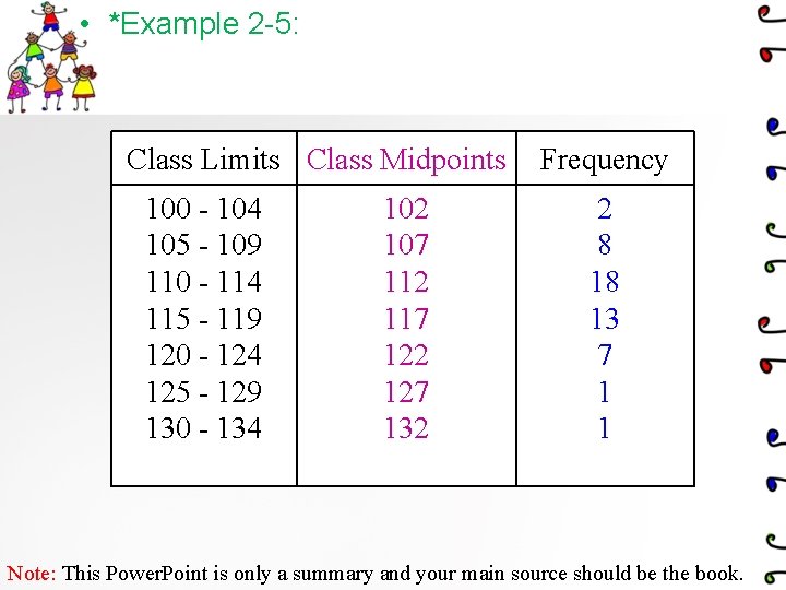
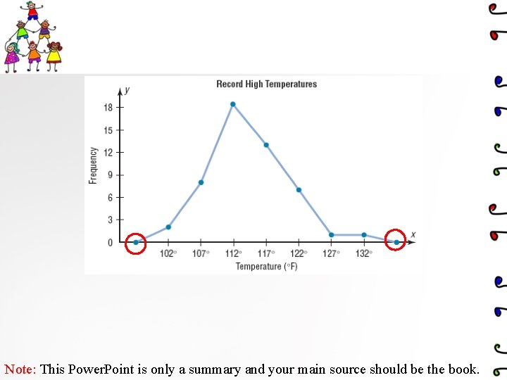
2. The frequency polygon: is a graph that displays the data by using lines that connect points plotted for the frequencies at the midpoints of the classes. The frequencies are represented by the heights of the points. ve i t a tit e n a Qu riabl va The class midpoints are represented on the horizontal axis. Note: This Power. Point is only a summary and your main source should be the book.

• *Example 2 -5: Class Limits Class Midpoints 100 - 104 105 - 109 110 - 114 115 - 119 120 - 124 125 - 129 130 - 134 102 107 112 117 122 127 132 Frequency 2 8 18 13 7 1 1 Note: This Power. Point is only a summary and your main source should be the book.

Note: This Power. Point is only a summary and your main source should be the book.

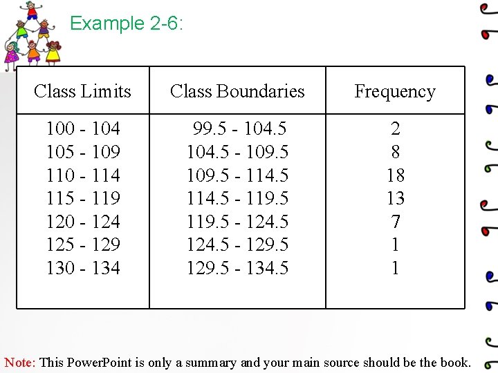
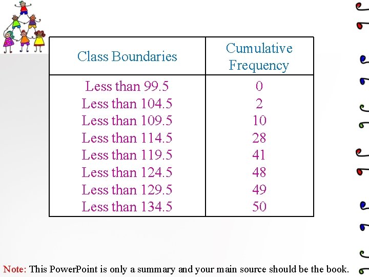
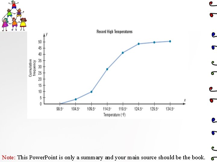
3. Cumulative Frequency Graphs Or Ogives The ogive is a graph that represents the cumulative frequencies for the classes in a frequency distribution. ive t a t i ant ble u Q ia var Cumulative frequency distribution is a distribution that shows the number of data values less than or equal t a specific value. The upper class boundaries are represented on the horizontal axis Note: This Power. Point is only a summary and your main source should be the book.

Example 2 -6: Class Limits Class Boundaries Frequency 100 - 104 105 - 109 110 - 114 115 - 119 120 - 124 125 - 129 130 - 134 99. 5 - 104. 5 - 109. 5 - 114. 5 - 119. 5 - 124. 5 - 129. 5 - 134. 5 2 8 18 13 7 1 1 Note: This Power. Point is only a summary and your main source should be the book.

Class Boundaries Less than 99. 5 Less than 104. 5 Less than 109. 5 Less than 114. 5 Less than 119. 5 Less than 124. 5 Less than 129. 5 Less than 134. 5 Cumulative Frequency 0 2 10 28 41 48 49 50 Note: This Power. Point is only a summary and your main source should be the book.

Note: This Power. Point is only a summary and your main source should be the book.

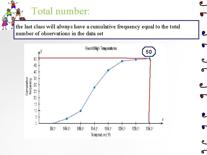
Total number: the last class will always have a cumulative frequency equal to the total number of observations in the data set 50

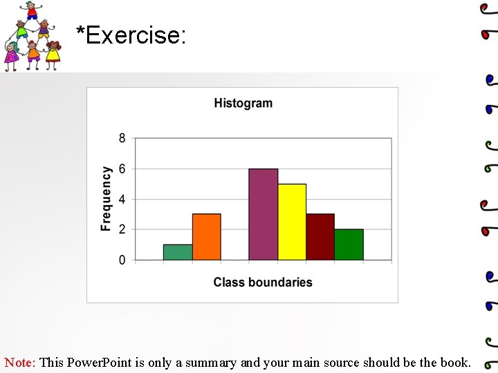
*Exercise: Note: This Power. Point is only a summary and your main source should be the book.

Relative Frequency Graphs • If proportions are used instead of frequencies, the graphs are called relative frequency graphs. • Relative frequency graphs are used when the proportion of data values that fall into a given class is more important than the actual number of data values that fall into that class Note: This Power. Point is only a summary and your main source should be the book.

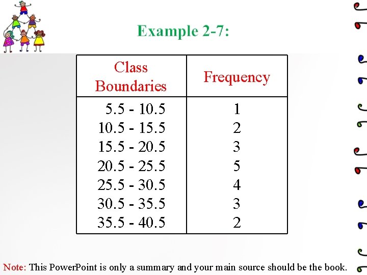
Class Boundaries 5. 5 - 10. 5 - 15. 5 - 20. 5 - 25. 5 - 30. 5 - 35. 5 - 40. 5 Frequency 1 2 3 5 4 3 2 Note: This Power. Point is only a summary and your main source should be the book.

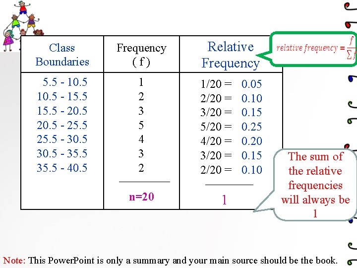
Class Boundaries Frequency (f) 5. 5 - 10. 5 - 15. 5 - 20. 5 - 25. 5 - 30. 5 - 35. 5 - 40. 5 1 2 3 5 4 3 2 n=20 Relative Frequency 1/20 = 2/20 = 3/20 = 5/20 = 4/20 = 3/20 = 2/20 = 1 0. 05 0. 10 0. 15 0. 20 0. 15 0. 10 The sum of the relative frequencies will always be 1 Note: This Power. Point is only a summary and your main source should be the book.

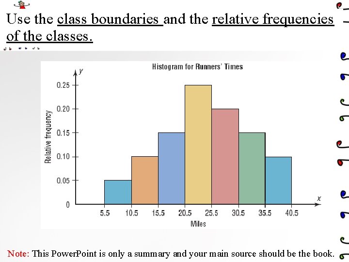
Use the class boundaries and the relative frequencies of the classes. Note: This Power. Point is only a summary and your main source should be the book.

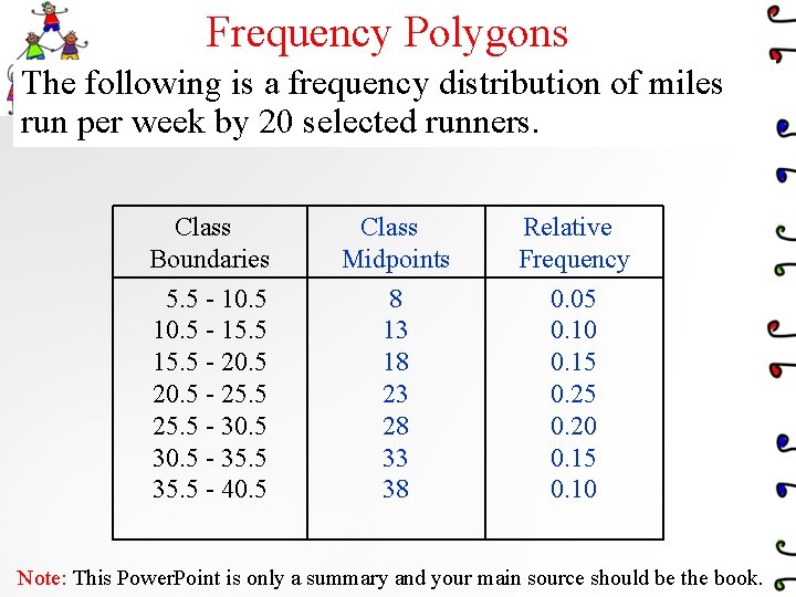
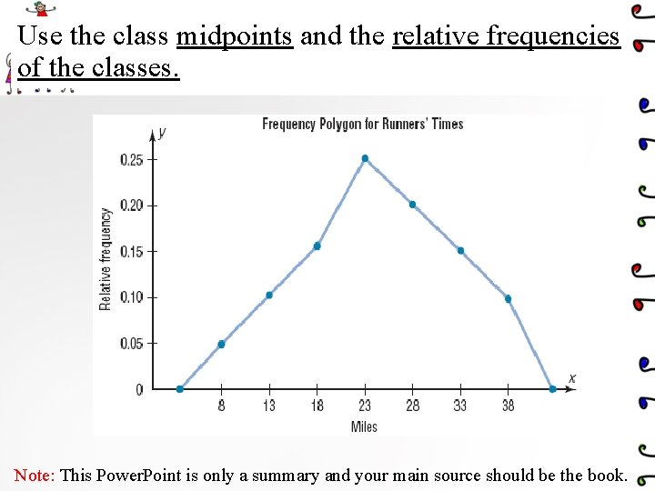
Frequency Polygons The following is a frequency distribution of miles run per week by 20 selected runners. Class Boundaries Class Midpoints Relative Frequency 5. 5 - 10. 5 - 15. 5 - 20. 5 - 25. 5 - 30. 5 - 35. 5 - 40. 5 8 13 18 23 28 33 38 0. 05 0. 10 0. 15 0. 20 0. 15 0. 10 Note: This Power. Point is only a summary and your main source should be the book.

Use the class midpoints and the relative frequencies of the classes. Note: This Power. Point is only a summary and your main source should be the book.

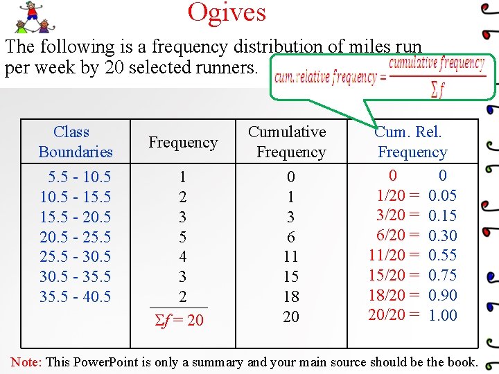
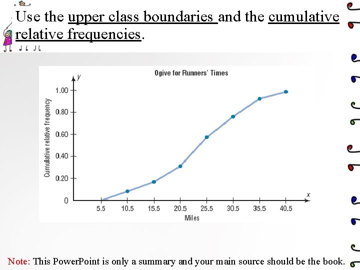
Ogives The following is a frequency distribution of miles run per week by 20 selected runners. Class Boundaries 5. 5 - 10. 5 - 15. 5 - 20. 5 - 25. 5 - 30. 5 - 35. 5 - 40. 5 Frequency Cumulative Frequency 1 2 3 5 4 3 2 f = 20 0 1 3 6 11 15 18 20 Cum. Rel. Frequency 0 0 1/20 = 0. 05 3/20 = 0. 15 6/20 = 0. 30 11/20 = 0. 55 15/20 = 0. 75 18/20 = 0. 90 20/20 = 1. 00 Note: This Power. Point is only a summary and your main source should be the book.

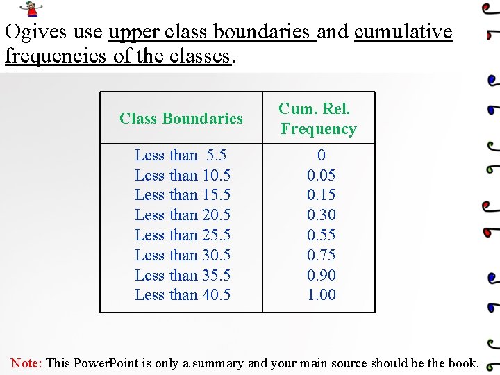
Ogives use upper class boundaries and cumulative frequencies of the classes. Class Boundaries Cum. Rel. Frequency Less than 5. 5 Less than 10. 5 Less than 15. 5 Less than 20. 5 Less than 25. 5 Less than 30. 5 Less than 35. 5 Less than 40. 5 0 0. 05 0. 15 0. 30 0. 55 0. 75 0. 90 1. 00 Note: This Power. Point is only a summary and your main source should be the book.

Use the upper class boundaries and the cumulative relative frequencies. Note: This Power. Point is only a summary and your main source should be the book.

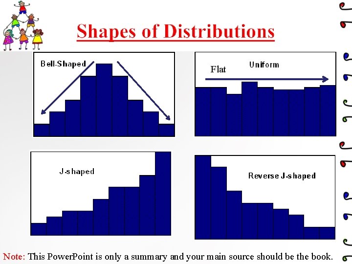
Flat Note: This Power. Point is only a summary and your main source should be the book.

Note: This Power. Point is only a summary and your main source should be the book.

2. 3 Other Types of Graphs Instructor: Alaa saud Note: This Power. Point is only a summary and your main source should be the book.

2. 3 Other Types of Graphs Several other types of graphs are often used in statistics. We will discuss three other types of graphs as follows: 1. A bar graph 2. A Pareto chart 3. The Time series graph 4. The Pie graph Note: This Power. Point is only a summary and your main source should be the book.

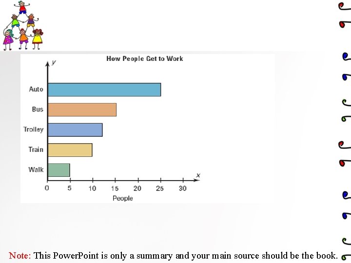
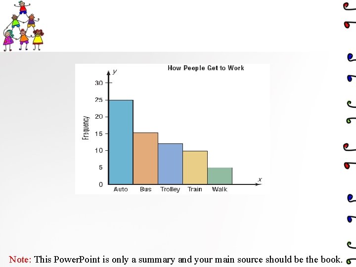
1. A bar graph represents the data by using vertical or horizontal bars whose heights or lengths represent the frequencies of the data. Ø When the data are qualitative or categorical , bar graphs can be used. or e v i t ta cal i l a qu egori cat Note: This Power. Point is only a summary and your main source should be the book.

Note: This Power. Point is only a summary and your main source should be the book.

2 -A Pareto chart is used to represent a frequency distribution for a categorical variable, and the frequencies are displayed by the heights of vertical bars, which are arranged in order from highest to lowest. Ø Pareto chart When the variable displayed on the horizontal axis is qualitative or categorical, a Pareto chart can be used

Note: This Power. Point is only a summary and your main source should be the book.

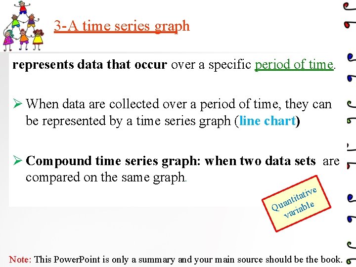
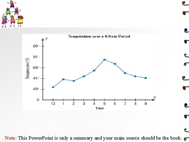
3 -A time series graph represents data that occur over a specific period of time. Ø When data are collected over a period of time, they can be represented by a time series graph (line chart) Ø Compound time series graph: when two data sets are compared on the same graph. ve i t a tit e n a Qu riabl va Note: This Power. Point is only a summary and your main source should be the book.

Note: This Power. Point is only a summary and your main source should be the book.

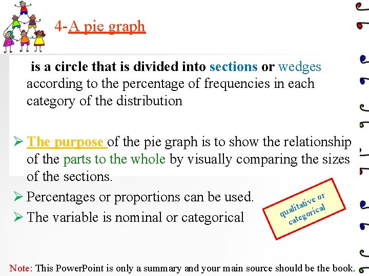
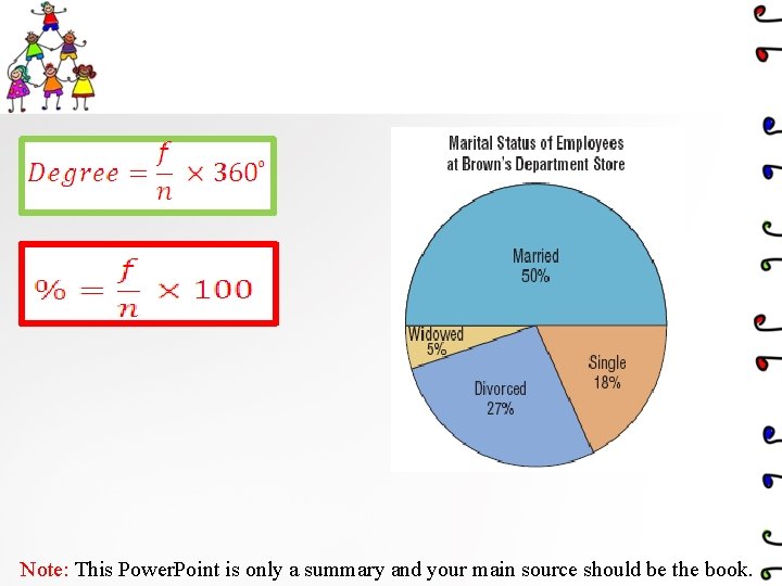
4 -A pie graph is a circle that is divided into sections or wedges according to the percentage of frequencies in each category of the distribution Ø The purpose of the pie graph is to show the relationship of the parts to the whole by visually comparing the sizes of the sections. or Ø Percentages or proportions can be used. e v i tat cal i l a qu egori Ø The variable is nominal or categorical cat Note: This Power. Point is only a summary and your main source should be the book.

Note: This Power. Point is only a summary and your main source should be the book.

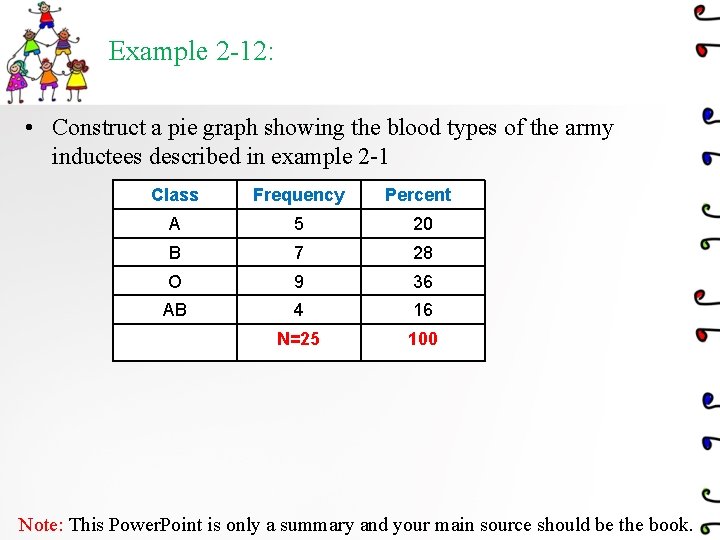
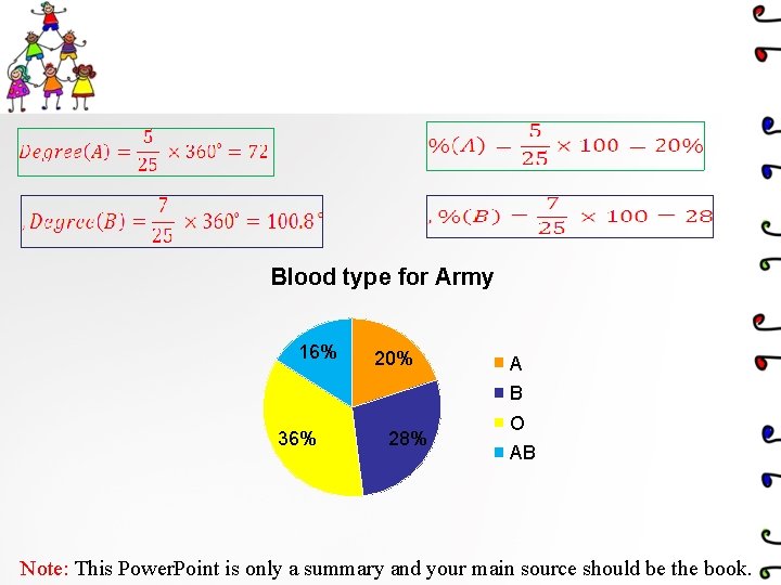
Example 2 -12: • Construct a pie graph showing the blood types of the army inductees described in example 2 -1 Class Frequency Percent A 5 20 B 7 28 O 9 36 AB 4 16 N=25 100 Note: This Power. Point is only a summary and your main source should be the book.

Blood type for Army 16% 20% A B 36% 28% O AB Note: This Power. Point is only a summary and your main source should be the book.

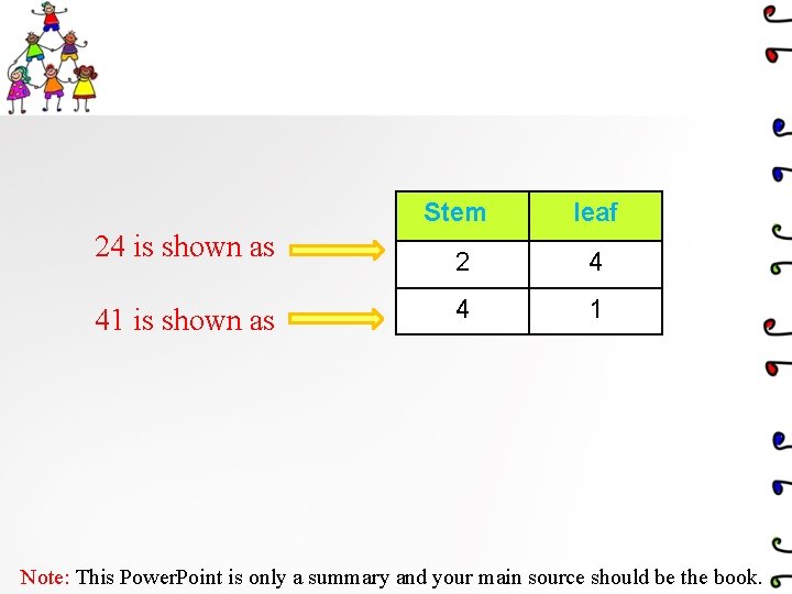
A stem and leaf plots q A stem and leaf plots is a data plot that uses part of a data value as the stem and part of the data value as the leaf to form groups or classes. ØThe stem and leaf plot is a method of organizing data and is a combination of sorting and graphing. . ive t a t nti le a u Q riab va Note: This Power. Point is only a summary and your main source should be the book.

24 is shown as 41 is shown as Stem leaf 2 4 4 1 Note: This Power. Point is only a summary and your main source should be the book.

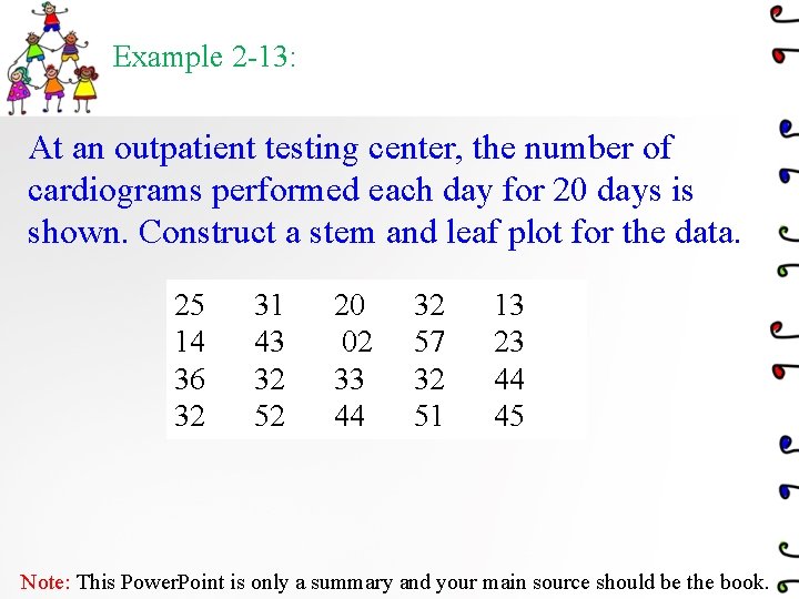
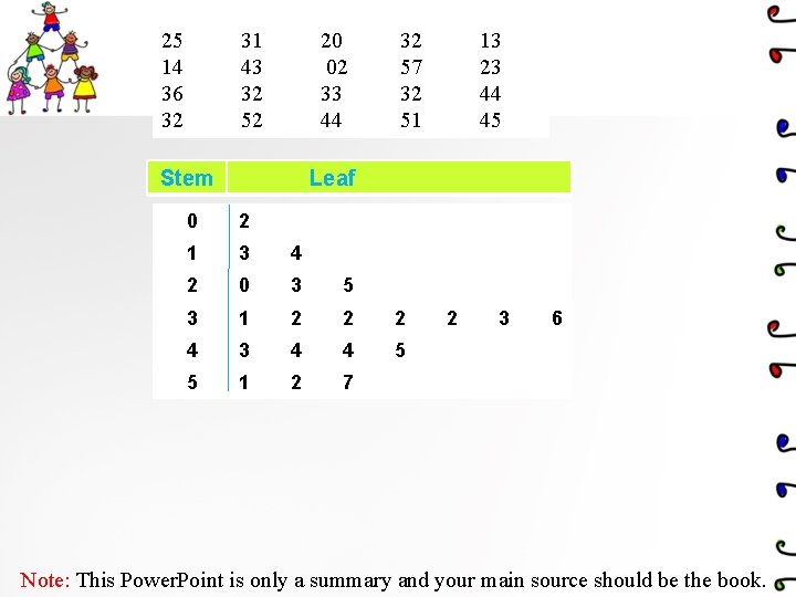
Example 2 -13: At an outpatient testing center, the number of cardiograms performed each day for 20 days is shown. Construct a stem and leaf plot for the data. 25 14 36 32 31 43 32 52 20 02 33 44 32 57 32 51 13 23 44 45 Note: This Power. Point is only a summary and your main source should be the book.

25 14 36 32 31 43 32 52 20 02 33 44 Stem 32 57 32 51 13 23 44 45 Leaf 0 2 1 3 4 2 0 3 5 3 1 2 2 2 4 3 4 4 5 5 1 2 7 2 3 6 Note: This Power. Point is only a summary and your main source should be the book.

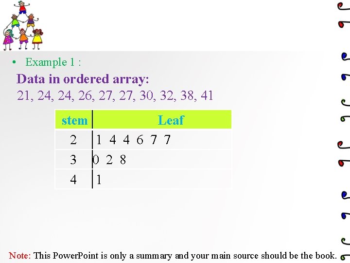
• Example 1 : Data in ordered array: 21, 24, 26, 27, 30, 32, 38, 41 stem Leaf 2 1 4 4 6 7 7 3 0 2 8 4 1 Note: This Power. Point is only a summary and your main source should be the book.

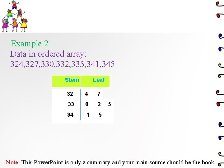
Example 2 : Data in ordered array: 324, 327, 330, 332, 335, 341, 345 Stem Leaf 32 4 7 33 0 2 34 1 5 5 Note: This Power. Point is only a summary and your main source should be the book.