The Pareto Principle Vilfredo Pareto was an economist


 จาก (lower inner and outer fence) lower inner fence")
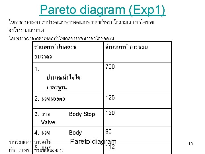
 Q 1 = Batch % Acetone Insoluble Q 2")
 The data set of N = 90 ordered observations")


 Materials Quality characteristic Equipment (Machine) Inspection (Measurement) cause )สงทสงผลกระ")

 27")
 28")
 Cause-and-effect diagram shows that how scarring occurs during steel tubing")


 and the severed length")


- Slides: 39
The Pareto Principle Vilfredo Pareto was an economist who is credited with establishing what is now widely known as the Pareto Principle or 80/20 rule. When he discovered the principle, it established that 80% of the land in Italy was owned by 20% of the population. Later, he discovered that the pareto principle was valid in other parts of his life, such as gardening: 80% of his garden peas were produced by 1 20% of the peapods.
The Pareto Principle Some Sample 80/20 Rule Applications • 80% of process defects arise from 20% of the process issues. • 20% of your sales force produces 80% of your company revenues. • 80% of delays in schedule arise from 20% of the possible causes of the delays. • 80% of customer complaints arise from 20% of your products or services. (The above examples are rough estimates. ) 2
The Pareto Diagram • Graph that ranks data classifications in descending order from left to right • Pareto diagrams are used to identify the most important problems • Advantage: Provide a visual impact of those vital few characteristics that need attention • Resources are then directed to take the necessary corrective action 3
The Pareto Diagram • Helps a team focus on causes that have the greatest impact • Displays the relative importance of problems in a simple visual format • Helps prevent “shifting the problem” where the solution removes some causes but worsens others 4
Constructing a Pareto Diagram Steps: 1. Determine the method of classifying the data: by problem, cause, type of nonconformity, etc 2. Decide if dollars (best), weighted frequency, or frequency is to be used to rank the characteristics 3. Collect data for an appropriate time interval 5
Constructing a Pareto Diagram Steps cont’d: 4. Summarize the data and rank order categories from largest to smallest 5. Compute the cumulative percentage if it is to be used 6. Construct the diagram and find the vital few 6
Percent of components Number of defects Pareto diagram 50% reduction Pareto diagram can be used to identify the degree of severity of quality problems. To eliminate defects and improve the operation, this tool can help us to make decision that which problems should be solved first. 7
Pareto diagram Before improvement After improvement 8
Pareto diagram No. of accidents 9
The Box Plot 13
Comparative Box Plots 14
The Box Plot หาคาขอบเขตลาง fence) จาก (lower inner and outer fence) lower inner fence (L 1): lower outer fence (L 2): upper inner fence (U 1): upper outer fence (U 2): ขอมลทอยระหวาง outlier ขอมลทอยระหวาง และ บน(upper inner and outer Q 1 - 1. 5*IQR Q 1 - 3*IQR Q 3 + 1. 5*IQR Q 3 + 3*IQR L 1 และL 2 หรอระหวาง U 1และ U 2 เรยกวา mild L 1 และL 2 U 1และ U 2 เรยกวา extreme หรอระหวาง outlier L 2 extreme outlier mild outlier L 1 Q 2 U 1 Q 3 U 2 * 1. 5*IQR 16
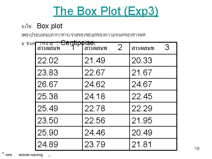
The Box Plot (Exp 2) Q 1 = Batch % Acetone Insoluble Q 2 = Q 3 = 1 9 IQR = Upper whisker Min (largest value, Q 3+IQR) = Max (smallest value, Q 1 -IQR) = 2 6 24 10 31 22 3 12 11 29 Lower whisker 4 11 12 58 Lower inner fence Q 1 - 1. 5 IQR = Lower outer fence Q 1 - 3 IQR = 5 34 13 15 Upper inner fence Q 3 + 1. 5 IQR = 6 32 14 5 Upper outer fence Q 3 + 3 IQR = low-mild outlier = 7 28 15 17 = 8 19 16 25 low-extreme outlier Up-mild outlier = Up-extreme outlier = 17
The Box Plot (HW 4) The data set of N = 90 ordered observations as shown below 1. Find the dispersion of data using a box plot (i. e. calculate Q 1, Q 2, Q 3, Outlier, find the skewness of the dispersion) 2. Compare the result obtained from (1) with histograms (find mean, SD, skewness of histograms) 30, 171, 184, 201, 212, 250, 265, 270, 272, 289, 305, 306, 322, 336, 346, 351, 370, 390, 404, 409, 411, 436, 437, 439, 441, 444, 448, 451, 453, 470, 482, 487, 494, 495, 499, 503, 514, 521, 522, 527, 548, 550, 559, 560, 572, 574, 578, 585, 592, 607, 616, 618, 621, 629, 637, 638, 640, 656, 668, 707, 709, 719, 737, 739, 752, 758, 766, 792, 794, 802, 818, 830, 832, 843, 858, 860, 869, 918, 925, 953, 991, 1000, 1005, 1068, 1441 19
Cause-and-Effect Diagram • It was developed by Dr. Kaoru Ishikawa in 1943 • Picture composed of lines and symbols designed to represent a meaningful relationship between an effect and its causes • Effect (characteristics that need improvement) on the right and causes on the left 20
Cause-and-Effect Diagram • Enables a team to focus on the content of a problem, not on the history of the problem or differing personal interests of team members • Creates a snapshot of collective knowledge and consensus of a team; builds support for solutions • Focuses the team on causes, not symptoms • Used to investigate either a “bad” effect and to take action to correct the causes or a “good” effect and to learn those causes responsible 21
Cause-and-Effect Diagram Advantages: 1. Analyzing actual conditions for the purpose of product or service quality improvement 2. Elimination of conditions causing nonconforming product or service and customer complaints 3. Standardization of existing and proposed operations 4. Education and training in decision-making 22
Cause-and-Effect Diagram Steps in the construction of a Cause-and-Effect Diagram: 1. Identify the effect or quality problem 2. Determine the major causes 3. Determine all the minor causes. Request a brainstorming session 4. Once the diagram is complete, evaluate it to determine the most likely causes 5. Develop solutions 24
Cause-and-effect diagram Work methods (Man/Methods) Materials Quality characteristic Equipment (Machine) Inspection (Measurement) cause )สงทสงผลกระ ทบตอคณภาพ และเปนสงทตองการ ปรบปรง ( effect 25
Cause-and-effect diagram 2. 6 Worker Size Materials G axle bearing Wobble Inspection Tools 26
Cause-and-effect diagram (dispersion analysis/ cause enumeration) 27
Cause-and-effect diagram (process classification) 28
Cause-and-effect diagram (process classification) Cause-and-effect diagram shows that how scarring occurs during steel tubing process. 29
Good and poor cause-and-effect diagram A B 30
Cause-and-effect diagram with possible causes Is the cause-and-effect diagram good enough for solving the problem? How can we profoundly analyze and quantify the relationship between causes 31 and effects?
Cause-and-effect diagram after further study 32
Scattering diagram The result of investigating the conveyer speed (cause) and the severed length (effect) as shown above 33
Scattering diagram 34
Scattering diagram B A D C E Matching game 35
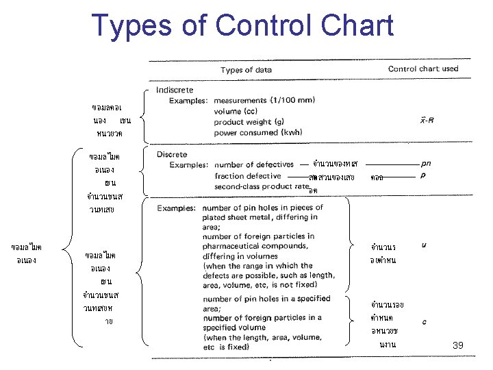
Control Chart day Static form Dynamic form 37
Control Chart 3 3 day Put the limit lines on the graph so that we can see if the data out of control or not! 38