Example Histogram c Interpret the following histogram that
![Interpreting the Histogram Bimodal, peaks at 27. 5 and 37. 5 [2. 5], one Interpreting the Histogram Bimodal, peaks at 27. 5 and 37. 5 [2. 5], one](https://slidetodoc.com/presentation_image_h/11112d7e7d2635a8e268d9c71816121d/image-3.jpg)
![Interpretation Supervised Scatter Plot The distribution of all three classes is unimodal [2] with Interpretation Supervised Scatter Plot The distribution of all three classes is unimodal [2] with](https://slidetodoc.com/presentation_image_h/11112d7e7d2635a8e268d9c71816121d/image-14.jpg)
- Slides: 15

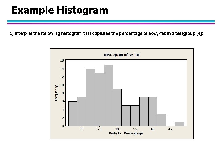
Example Histogram c) Interpret the following histogram that captures the percentage of body-fat in a testgroup [4]:

On Interpreting I l Interpreting Histograms, Density Functions, distributions of a single attribute – – What is the type of the attribute? – – – Is the distribution skewed (e. g. compare mean with median)? What is the mean value; what is the mode? Is the a lot of spread or not (compute the standard deviation) Is the distribution unimodal (one hill or no hill)) or multi-modal (multiple hills)? Are there any outliers? Are there any duplicate values? Are there any gaps in the attribute value distribution? Characterize the shape of the density function! When comparing 2 histograms, identify agreements and significant differences in the density, gaps, local maxima, and density function slope.
![Interpreting the Histogram Bimodal peaks at 27 5 and 37 5 2 5 one Interpreting the Histogram Bimodal, peaks at 27. 5 and 37. 5 [2. 5], one](https://slidetodoc.com/presentation_image_h/11112d7e7d2635a8e268d9c71816121d/image-3.jpg)
Interpreting the Histogram Bimodal, peaks at 27. 5 and 37. 5 [2. 5], one gap/outlier at 45/50[1], somewhat skewed [0. 5], somewhat continuous, no large jumps in the frequency[1]; Tri-modal is also correct distinguishing between hills at 20 and 25 is also fine!

On Interpreting II l Interpreting Supervised Scatter Plots and Similar Display – Characterize the distribution of each class in the attribute space; is it unimodal or multi-modal? – Characterize the overall distribution (including all examples); do you observe any correlation or other characteristics? – Analyze the separation of a single class from all the other classes. Analyze the separation between pairs of classes. – If classes overlap characterize the extend to which they overlap and where they overlap in the attribute space – If decision boundaries between classes can be inferred characterize those decision boundaries. – Describe the region(s) where instances of each particular class are concentrated. – Assess the difficulty of the classification based on your findings of looking at a set of scatter plots. – Assess the usefulness of the two attributes to predict the correct class.

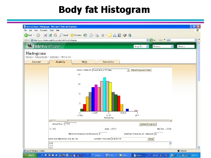
Body fat Histogram

On Interpreting I l Interpreting Histograms, Density Functions, distributions of a single attribute – What is the type of the attribute? Positive real numbers – What is the mean value; what is the mode? – Is the a lot of spread or not (compute the standard deviation)? Not much – Is the distribution unimodal (one hill or no hill)) or multi-modal (multiple hills)? One hill or two hills, depending on how you interpret the data. The second hill is not very well separated; therefore I would say unimodal. – Is the distribution skewed (e. g. compare mean with median)? – Are there any outliers? Yes values above 45…? – Are there any duplicate values? – Are there any gaps in the attribute value distribution? Yes two gaps: 1)… 2)… – Characterize the shape of the density function! Bell Curve

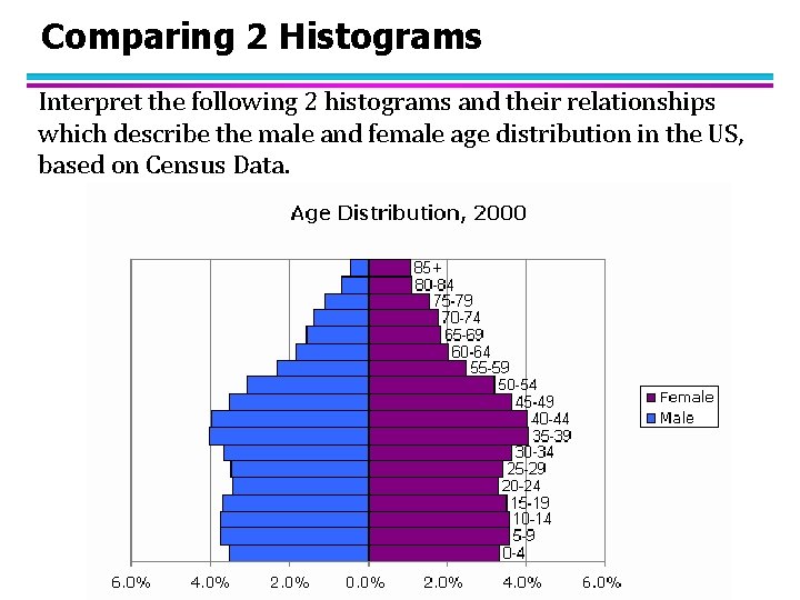
Comparing 2 Histograms Interpret the following 2 histograms and their relationships which describe the male and female age distribution in the US, based on Census Data.

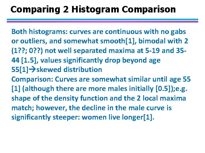
Comparing 2 Histogram Comparison Both histograms: curves are continuous with no gabs or outliers, and somewhat smooth[1], bimodal with 2 (1? ? ; 0? ? ) not well separated maxima at 5 -19 and 3544 [1. 5], values significantly drop beyond age 55[1] skewed distribution Comparison: Curves are somewhat similar until age 55 [1] (although there are more males initially [0. 5]); e. g. shape of the density function and the 2 local maxima match; however, the decline in the male curve is significantly steeper: women live longer[1].

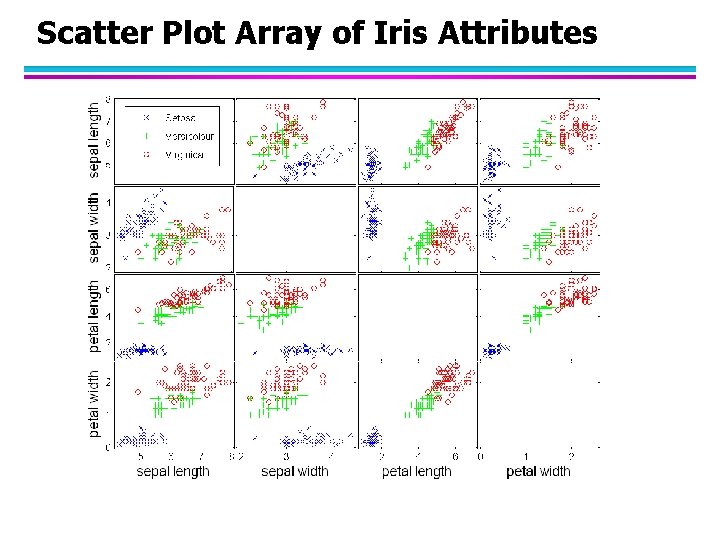
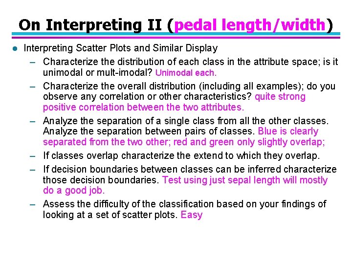
Scatter Plot Array of Iris Attributes

On Interpreting II (pedal length/width) l Interpreting Scatter Plots and Similar Display – Characterize the distribution of each class in the attribute space; is it unimodal or mult-imodal? Unimodal each. – Characterize the overall distribution (including all examples); do you observe any correlation or other characteristics? quite strong positive correlation between the two attributes. – Analyze the separation of a single class from all the other classes. Analyze the separation between pairs of classes. Blue is clearly separated from the two other; red and green only slightly overlap; – If classes overlap characterize the extend to which they overlap. – If decision boundaries between classes can be inferred characterize those decision boundaries. Test using just sepal length will mostly do a good job. – Assess the difficulty of the classification based on your findings of looking at a set of scatter plots. Easy

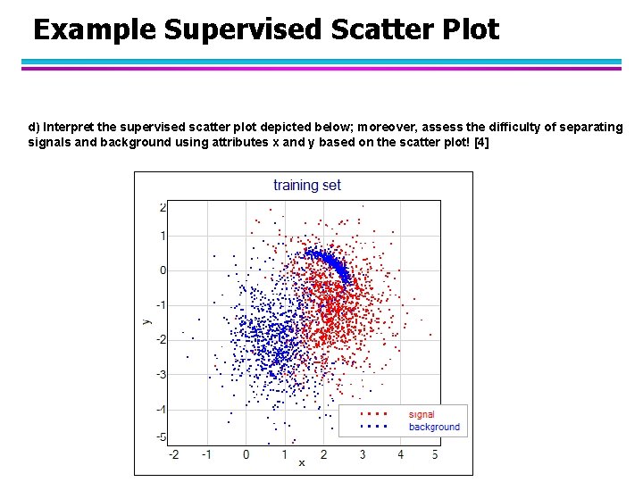
Example Supervised Scatter Plot d) Interpret the supervised scatter plot depicted below; moreover, assess the difficulty of separating signals and background using attributes x and y based on the scatter plot! [4]

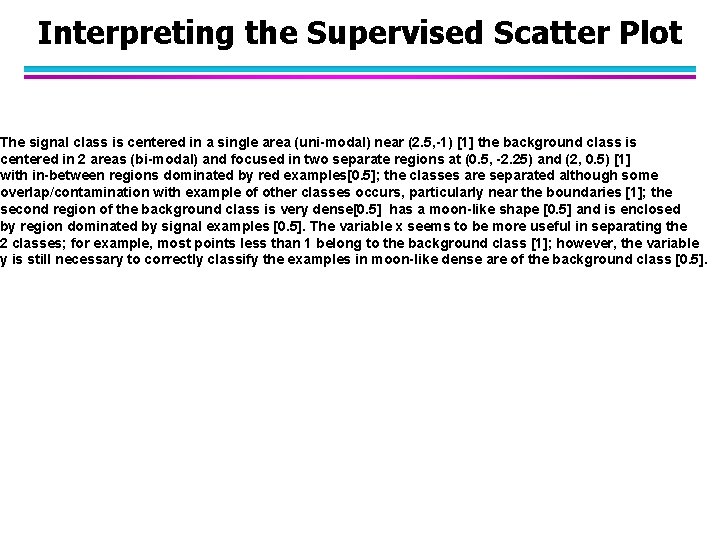
Interpreting the Supervised Scatter Plot The signal class is centered in a single area (uni-modal) near (2. 5, -1) [1] the background class is centered in 2 areas (bi-modal) and focused in two separate regions at (0. 5, -2. 25) and (2, 0. 5) [1] with in-between regions dominated by red examples[0. 5]; the classes are separated although some overlap/contamination with example of other classes occurs, particularly near the boundaries [1]; the second region of the background class is very dense[0. 5] has a moon-like shape [0. 5] and is enclosed by region dominated by signal examples [0. 5]. The variable x seems to be more useful in separating the 2 classes; for example, most points less than 1 belong to the background class [1]; however, the variable y is still necessary to correctly classify the examples in moon-like dense are of the background class [0. 5].

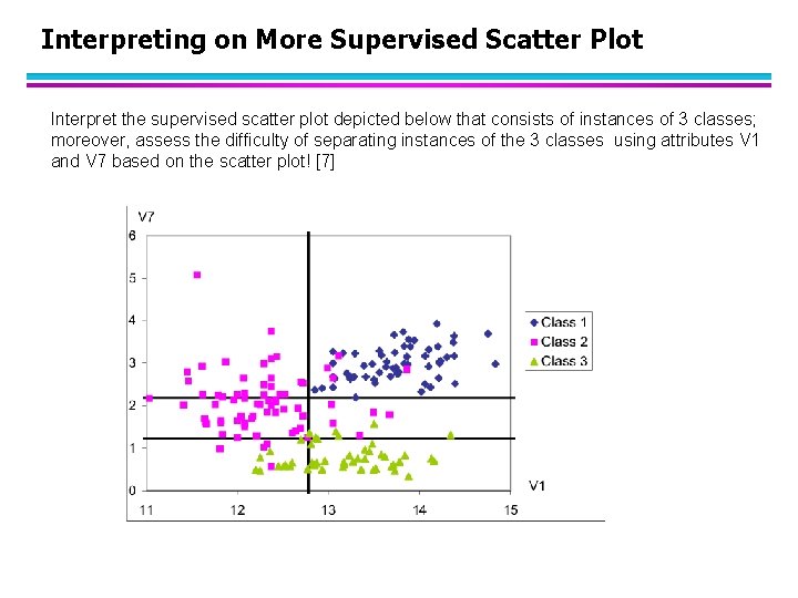
Interpreting on More Supervised Scatter Plot Interpret the supervised scatter plot depicted below that consists of instances of 3 classes; moreover, assess the difficulty of separating instances of the 3 classes using attributes V 1 and V 7 based on the scatter plot! [7]
![Interpretation Supervised Scatter Plot The distribution of all three classes is unimodal 2 with Interpretation Supervised Scatter Plot The distribution of all three classes is unimodal [2] with](https://slidetodoc.com/presentation_image_h/11112d7e7d2635a8e268d9c71816121d/image-14.jpg)
Interpretation Supervised Scatter Plot The distribution of all three classes is unimodal [2] with no major gaps in the data density [0. 5]. Attribute V 7 is useful to separate the green class from the other 2 classes[1]; if V 1 is less than 1. 2 objects mostly belong to the green class[0. 5]; Attribute V 1 is useful to separate the purple class from the blue class[1]; all the example whose V 1 value is above 12. 8 are blue[0. 5]; additionally using attribute V 7 requiring that instances whose attribute values for V 1 that lie in [1. 2, 2. 2] leads to a even clearer distinction between the two classes [0. 5]. Moreover, using the fact that the V 1 value is a higher than 12. 2 for instances of the green class, leads to a clearer separation of the green and purple class [0. 5] By combining those rules [0. 5], the classification task should not be too difficult as the examples are well separated although there a few exceptions. [1] If they describe where the instances of the red, green, and purple are concentrated with respect to the V 1/V 7 coordinate system: [0. 5] for each description of the location of the three classes

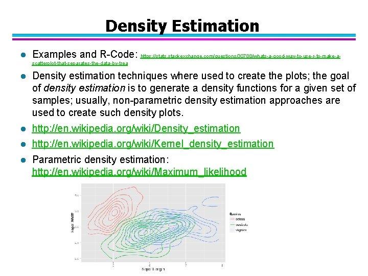
Density Estimation l Examples and R-Code: https: //stats. stackexchange. com/questions/30788/whats-a-good-way-to-use-r-to-make-ascatterplot-that-separates-the-data-by-trea l Density estimation techniques where used to create the plots; the goal of density estimation is to generate a density functions for a given set of samples; usually, non-parametric density estimation approaches are used to create such density plots. l http: //en. wikipedia. org/wiki/Density_estimation l http: //en. wikipedia. org/wiki/Kernel_density_estimation l Parametric density estimation: http: //en. wikipedia. org/wiki/Maximum_likelihood