MULTIMEDIA MAKING IT WORK TEXT PART 1 Instructor
- Slides: 38

MULTIMEDIA: MAKING IT WORK TEXT – PART 1 Instructor: Raneem Qaddoura 2016/2017

OVERVIEW • The Power of Meaning • About Fonts and Faces • Using Text in Multimedia Instructor: Raneem Qaddoura 2016/2017

INTRODUCTION • In some past ages it was a capital offense to read unless you belonged to the proper social class • Today, text and the ability to read it are doorways to power and knowledge. Reading and writing are expected and necessary skills within most modern cultures. • Since the explosion of the Internet and the World Wide Web, text has become more important than ever. • The native language of the Web is HTML (Hypertext Markup Language), originally designed to display simple text documents on computer screens. • Academic papers, magazine articles, complex instruction manuals, and even the contents of entire books are now available for reading with a web browser. Instructor: Raneem Qaddoura 2016/2017

THE POWER OF MEANING • Even a single word may be cloaked in many meanings • Accuracy and conciseness in the specific words you choose. • Concentrate text by cleaning lengthy text into few words heavy with meaning. • Advertising wordsmiths render the meaning of entire product lines into an evocative single word, logo, or tag line. • it’s important to design labels for title screens, menus, and buttons or tabs using words that have the most precise and powerful meanings to express what you need to say • GO BACK! is more powerful than Previous • Quit is more powerful than Close. • TERRIFIC! may work better than That Answer Was Correct Instructor: Raneem Qaddoura 2016/2017

THE POWER OF MEANING • Experiment with the words you plan to use by letting others try them. • If you have the budget, set up a focus group to have potential users experience your words. • Watch them work. See if users flinch, balk, or click the Help button in confusion. • See if they can even find the Help button. • Words & Symbols are vital elements of multimedia menus, navigation systems, keyword lists, and content • They deliver the most widely understood meaning to the greatest number of people—accurately and in detail. Instructor: Raneem Qaddoura 2016/2017

THE POWER AND IRREGULARITY OF ENGLISH • A study by the British Council estimated that one billion people spoke English by the beginning of the second millennium as a first, second, or “foreign” language. • English is the official or joint official language of more than 75 countries • More than two-thirds of the world’s scientists read English, and three-quarters of the world’s mail is written in English • It is estimated that 80 percent of the world’s information that is stored on computers is written in English Instructor: Raneem Qaddoura 2016/2017

THE POWER AND IRREGULARITY OF ENGLISH • people around the world find English relatively easy, with one huge exception: English has the worst spelling of any language using the Latin alphabet!” • The most recent changes in English spelling have been driven by technology limits as SMS (Short Message Service) text messages commonly used by social networking sites such as Twitter and Facebook. • users speaking many languages quickly developed word shortcuts to pack the most meaning into the fewest characters • Net. Lingo (www. netlingo. com) maintains a list of almost two thousand English acronyms and instant messaging jargon words • XOXO (hugs & kisses), U (you), and NME (enemy) Instructor: Raneem Qaddoura 2016/2017

ABOUT FONTS AND FACES • A font is a collection of characters of a single size and style belonging to a particular typeface family. • Times 12 -point italic • A typeface is a family of graphic characters that usually includes many type sizes and styles. • Helvetica, Times, and Courier. • Typical font styles are boldface and italic. Your computer software may add other style attributes, such as underlining and outlining of characters. Instructor: Raneem Qaddoura 2016/2017

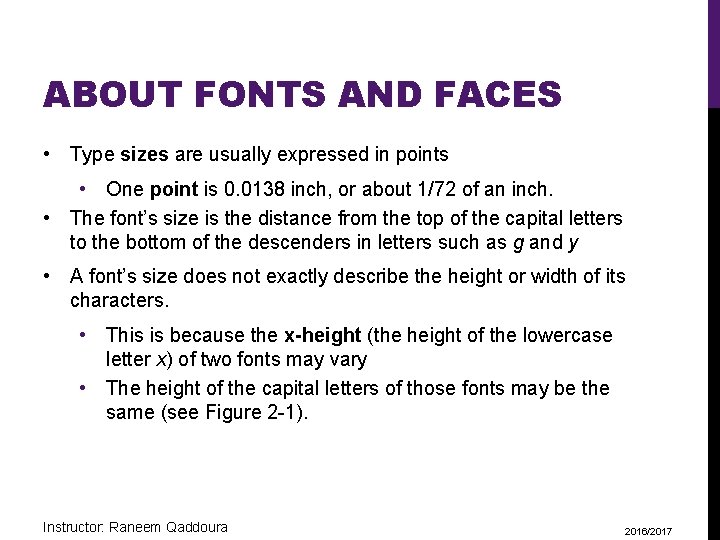
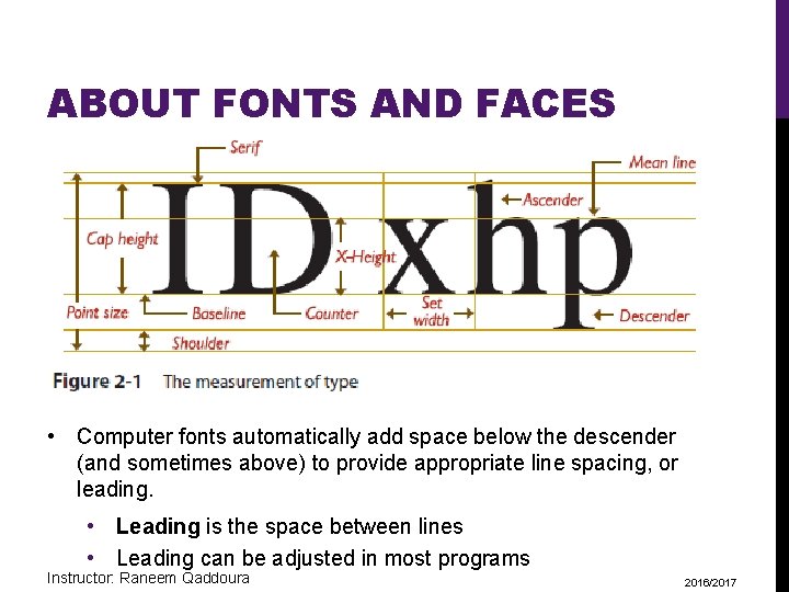
ABOUT FONTS AND FACES • Type sizes are usually expressed in points • One point is 0. 0138 inch, or about 1/72 of an inch. • The font’s size is the distance from the top of the capital letters to the bottom of the descenders in letters such as g and y • A font’s size does not exactly describe the height or width of its characters. • This is because the x-height (the height of the lowercase letter x) of two fonts may vary • The height of the capital letters of those fonts may be the same (see Figure 2 -1). Instructor: Raneem Qaddoura 2016/2017

ABOUT FONTS AND FACES • Computer fonts automatically add space below the descender (and sometimes above) to provide appropriate line spacing, or leading. • Leading is the space between lines • Leading can be adjusted in most programs Instructor: Raneem Qaddoura 2016/2017

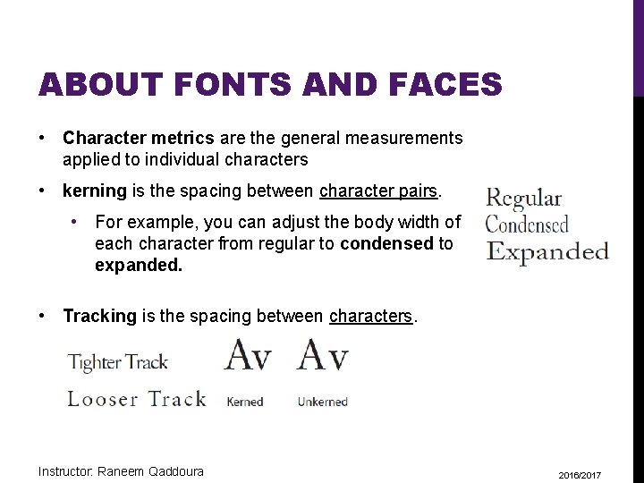
ABOUT FONTS AND FACES • Character metrics are the general measurements applied to individual characters • kerning is the spacing between character pairs. • For example, you can adjust the body width of each character from regular to condensed to expanded. • Tracking is the spacing between characters. Instructor: Raneem Qaddoura 2016/2017

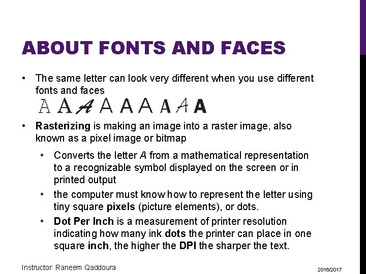
ABOUT FONTS AND FACES • The same letter can look very different when you use different fonts and faces • Rasterizing is making an image into a raster image, also known as a pixel image or bitmap • Converts the letter A from a mathematical representation to a recognizable symbol displayed on the screen or in printed output • the computer must know how to represent the letter using tiny square pixels (picture elements), or dots. • Dot Per Inch is a measurement of printer resolution indicating how many ink dots the printer can place in one square inch, the higher the DPI the sharper the text. Instructor: Raneem Qaddoura 2016/2017

CASES • A capitalized letter is referred to as uppercase. • A small letter is referred to as lowercase. • Placing an uppercase letter in the middle of a word is referred to as intercap (ex: set. Name) • Studies have shown that words and sentences with mixed upper- and lowercase letters are easier to read than words or sentences in all caps (uppercase). • Uppercase can make your message appear important or urgent, use this carefully; in online messaging it’s known as “SHOUTING” or “YELLING” and can be annoying, if not offensive. Instructor: Raneem Qaddoura 2016/2017

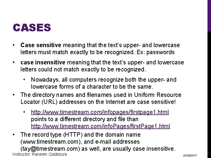
CASES • Case sensitive meaning that the text’s upper- and lowercase letters must match exactly to be recognized. Ex: passwords • case insensitive meaning that the text’s upper- and lowercase letters could not match exactly to be recognized. • Nowadays, all computers recognize both the upper- and lowercase forms of a character to be the same. • The directory names and filenames used in Uniform Resource Locator (URL) addresses on the Internet are case sensitive! • http: //www. timestream. com/infopages/firstpage 1. html points to a different directory and file than http: //www. timestream. com/info. Pages/first. Page 1. html • The record type (HTTP) and the domain name (www. timestream. com), and e-mail addresses (tay@timestream. com) as well, are usually case insensitive. Instructor: Raneem Qaddoura 2016/2017

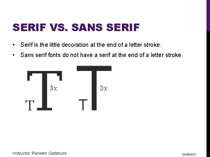
SERIF VS. SANS SERIF • Serif is the little decoration at the end of a letter stroke. • Sans serif fonts do not have a serif at the end of a letter stroke. Instructor: Raneem Qaddoura 2016/2017

SERIF VS. SANS SERIF • Serif fonts are used for body text because the serifs are said to help guide the reader’s eye along the line of text. • Sans serif • These fonts are used for headlines and bold statements. • It can be argued that sans serif fonts are far more legible and attractive when used in the small sizes of a text • The Times font at 9 -point size may look too busy and actually be difficult and tiring to read. • sans is French meaning “without”. • Times, New Century Schoolbook, Bookman, and Palatino are examples of serif fonts. Helvetica, Verdana, Arial, Optima, and Avant Garde are sans serif Instructor: Raneem Qaddoura 2016/2017

USING TEXT IN MULTIMEDIA • The text elements used in multimedia are: • Titles and headlines (what it’s all about) • Menus (where to go) • Navigation (how to get there) • Content (what you see when you get there). • In designing your navigation system, bring the user to a particular destination with as few actions and as short a wait as possible • If the user never needs the Help button to get there or never has to click the Back button when at a dead end, you’re doing everything right! Instructor: Raneem Qaddoura 2016/2017

DESIGNING WITH TEXT • From a design perspective, your choice of font size and the number of headlines you place on a particular screen must be related both to the complexity of your message and to its venue • Strike a balance in your interactive project or web site • Too little text on a screen requires annoying page turns and unnecessary mouse clicks and waits • Too much text can make the screen seem overcrowded and unpleasant. • Creating presentation slides for public speaking support • use bulleted points in large fonts and few words with lots of white space Instructor: Raneem Qaddoura 2016/2017

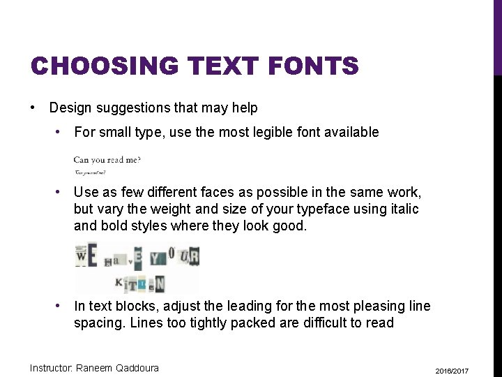
CHOOSING TEXT FONTS • Design suggestions that may help • For small type, use the most legible font available • Use as few different faces as possible in the same work, but vary the weight and size of your typeface using italic and bold styles where they look good. • In text blocks, adjust the leading for the most pleasing line spacing. Lines too tightly packed are difficult to read Instructor: Raneem Qaddoura 2016/2017

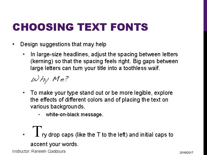
CHOOSING TEXT FONTS • Design suggestions that may help • In large-size headlines, adjust the spacing between letters (kerning) so that the spacing feels right. Big gaps between large letters can turn your title into a toothless waif. • To make your type stand out or be more legible, explore the effects of different colors and of placing the text on various backgrounds. • • T white-on-black message. ry drop caps (like the T to the left) and initial caps to accent your words. Instructor: Raneem Qaddoura 2016/2017

CHOOSING TEXT FONTS • If you are using centered type in a text block, keep the number of lines and their width to a minimum. • Pick the fonts that seem right to you for getting your message across, then double-check your choice against other opinions. Learn to accept criticism. • Use meaningful words or phrases for links and menu items. • Text links normally stand out by color and underlining. Use link colors consistently throughout a site. • Bold or emphasize text to highlight ideas or concepts, but do not make text look like a link or a button when it is not. • On a web page, put vital text elements and menus in the top 320 pixels. Studies of surfer habits have discovered that only 10 to 15 percent of surfers ever scroll any page. Instructor: Raneem Qaddoura 2016/2017

CHOOSING TEXT FONTS Installed Fonts • Before you can use a font, it must be recognized by the computer’s operating system • If you want to use fonts other than those installed with your basic operating system, you will need to install them • When you install applications, fonts are often added to your collection. • The most commonly reported fonts available on Windows computers are Tahoma, Microsoft Sans Serif, Verdana, and Courier New. On Macs expect Helvetica, Lucida Grande, and Courier Instructor: Raneem Qaddoura 2016/2017

CHOOSING TEXT FONTS Installed Fonts • Use of Cascading Style Sheets (CSS), preferred over the deprecated HTML <font> tag, allows you to be quite precise about font faces, sizes, and other attributes • In a font-family list, you can include the names of both Windows and Macintosh fonts; if a font is not found on the local computer, the browser’s preference-specified default font will be used. • h 1 {font-family: Helvetica, Arial, Verdana, sans-serif; } Instructor: Raneem Qaddoura 2016/2017

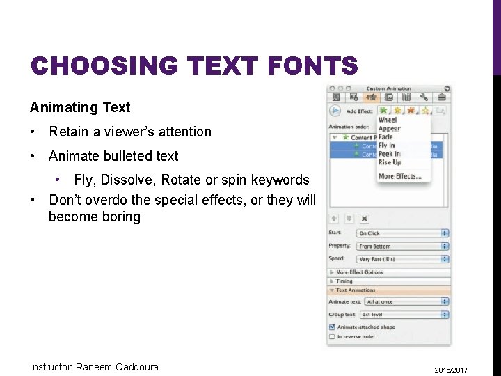
CHOOSING TEXT FONTS Animating Text • Retain a viewer’s attention • Animate bulleted text • Fly, Dissolve, Rotate or spin keywords • Don’t overdo the special effects, or they will become boring Instructor: Raneem Qaddoura 2016/2017

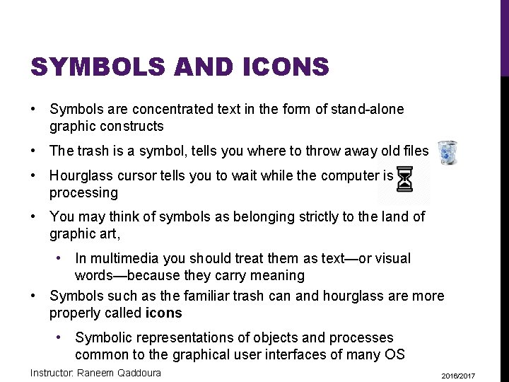
SYMBOLS AND ICONS • Symbols are concentrated text in the form of stand-alone graphic constructs • The trash is a symbol, tells you where to throw away old files • Hourglass cursor tells you to wait while the computer is processing • You may think of symbols as belonging strictly to the land of graphic art, • In multimedia you should treat them as text—or visual words—because they carry meaning • Symbols such as the familiar trash can and hourglass are more properly called icons • Symbolic representations of objects and processes common to the graphical user interfaces of many OS Instructor: Raneem Qaddoura 2016/2017

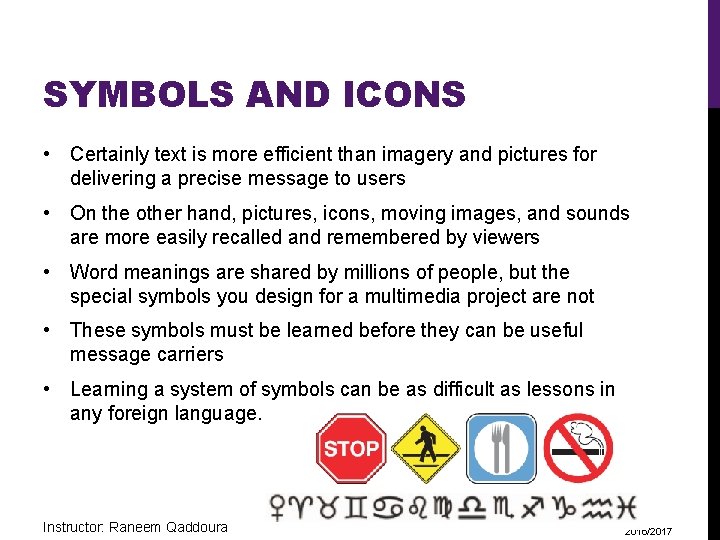
SYMBOLS AND ICONS • Certainly text is more efficient than imagery and pictures for delivering a precise message to users • On the other hand, pictures, icons, moving images, and sounds are more easily recalled and remembered by viewers • Word meanings are shared by millions of people, but the special symbols you design for a multimedia project are not • These symbols must be learned before they can be useful message carriers • Learning a system of symbols can be as difficult as lessons in any foreign language. Instructor: Raneem Qaddoura 2016/2017

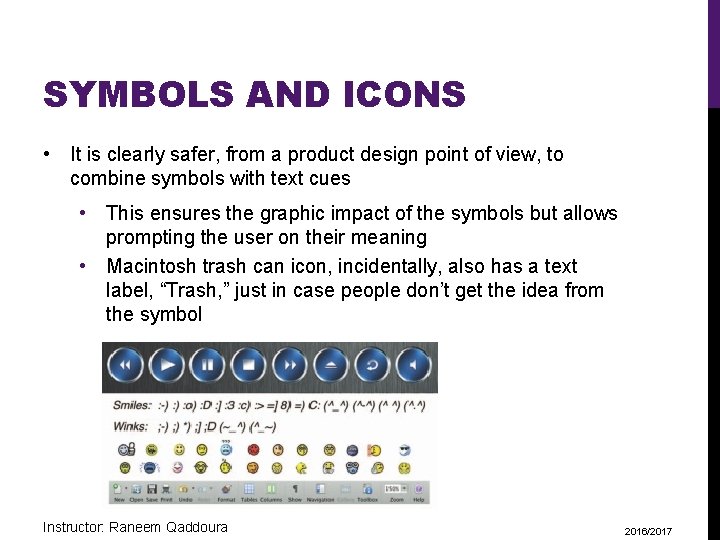
SYMBOLS AND ICONS • It is clearly safer, from a product design point of view, to combine symbols with text cues • This ensures the graphic impact of the symbols but allows prompting the user on their meaning • Macintosh trash can icon, incidentally, also has a text label, “Trash, ” just in case people don’t get the idea from the symbol Instructor: Raneem Qaddoura 2016/2017

MENUS FOR NAVIGATION • The simplest menus consist of text lists of topics • Users choose a topic, click it, and go there • For example, if there are three words on a computer screen • typical response from the user, without prompting, is to click one of these words to evoke activity • Sometimes menu items are surrounded by boxes or made to look like push buttons • Shortening text in menus • Play Video is often shortened to Video • Press to Quit is often shortened to Quit • When users must click up and down through many layers of menus to reach their goal Instructor: Raneem Qaddoura 2016/2017

MENUS FOR NAVIGATION • On the Web, designers typically place on every page at least a Main Menu of links • Offers the user a handhold and mechanism for returning to the beginning. • Often they will also place a list called “breadcrumbs” • Ex: Home > Store > Home & Garden > Patio & Grilling > Gas Grills & Accessories > Gas Grills > Burners Instructor: Raneem Qaddoura 2016/2017

BUTTONS FOR INTERACTION • buttons are the objects, such as blocks of text, a pretty blue triangle, or a photograph • Makes things happen when they are clicked. • Properties such as highlighting or other visual or sound effects to indicate that you hit the target • On the Web, text and graphic art may be buttons • The rules for proper selection of text and fonts in your projects apply to buttons as well as other elements • The automatic button-making tools supplied with multimedia and HTML page authoring systems are useful • By using common button styles, shapes, borders, and highlights, you increase the probability that users will know what to do with them—especially when they are also labeled Instructor: Raneem Qaddoura 2016/2017

BUTTONS FOR INTERACTION • In most authoring platforms, it is easy to make your own buttons from bitmaps or drawn objects • when the mouse button is up or down over an object, you can quickly replace one bitmap with another highlighted or colored version of the bitmap to show that the button has been “pushed” or that the mouse is hovering over it • You can also implement these graphic image rollovers on web pages, using Java. Script to replace the image when there is a Mouse Over or hover event • Destination address (URL) is displayed in the status bar of the browser when the mouse is over a linked image or text • Users know first if the mouse is over an active button • Users know where that button will take them if they click Instructor: Raneem Qaddoura 2016/2017

FIELDS FOR READING • Experiments have shown that reading text on a computer screen is slower and more difficult than reading the same text in hard-copy or book form • many users, it seems, would rather print out their reports and e -mail messages and read them on paper than page through screens of text. • Reading hard copy is still more comfortable. • People read text on a computer screen they blink only 3 to 5 times per minute • People blink 20 to 25 times per minute when reading text on paper • This reduced eye movement may cause dryness, fatigue, and possibly damage to the eyes Instructor: Raneem Qaddoura 2016/2017

FIELDS FOR READING • try to present to the user only a few paragraphs of text per page • Use a font that is easy to read rather than a prettier font that is illegible • Try to display whole paragraphs on the screen Instructor: Raneem Qaddoura 2016/2017

PORTRAIT VS. LANDSCAPE • The taller-than-wide orientation used for printed documents is called portrait • The wider-than-tall orientation normal to monitors is called Landscape • Four possible solutions for text taller than what will fit • Scrolling. This is used by web browsers. • Put the text into a single field or graphic image in a project window. This is used by Adobe’s popular Acrobat Reader for displaying PDF files • Break the text into fields that fit on monitor-sized pages, and design control buttons to flip through these pages • Design for a special monitor that is taller than it is wide (portrait). This is used in commercial Ads Instructor: Raneem Qaddoura 2016/2017

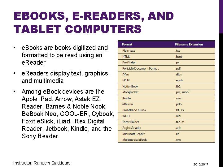
EBOOKS, E-READERS, AND TABLET COMPUTERS • e. Books are books digitized and formatted to be read using an e. Reader • e. Readers display text, graphics, and multimedia • Among e. Book devices are the Apple i. Pad, Arrow, Astak EZ Reader, Barnes & Noble Nook, Be. Book Neo, COOL-ER, Cybook, Foxit e. Slick, i. Liad, i. Rex Digital Reader, Jetbook, Kindle, and the Sony Reader. Instructor: Raneem Qaddoura 2016/2017

EBOOKS, E-READERS, AND TABLET COMPUTERS • The e-Ink screen is a technology for “electronic paper, ” designed to imitate the appearance of ordinary ink on paper • e-Ink displays can be used in direct sunlight and boast a long battery life Instructor: Raneem Qaddoura 2016/2017

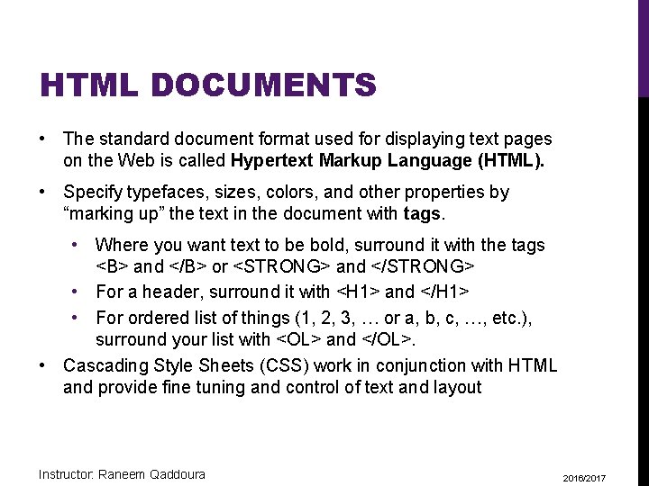
HTML DOCUMENTS • The standard document format used for displaying text pages on the Web is called Hypertext Markup Language (HTML). • Specify typefaces, sizes, colors, and other properties by “marking up” the text in the document with tags. • Where you want text to be bold, surround it with the tags <B> and </B> or <STRONG> and </STRONG> • For a header, surround it with <H 1> and </H 1> • For ordered list of things (1, 2, 3, … or a, b, c, …, etc. ), surround your list with <OL> and </OL>. • Cascading Style Sheets (CSS) work in conjunction with HTML and provide fine tuning and control of text and layout Instructor: Raneem Qaddoura 2016/2017

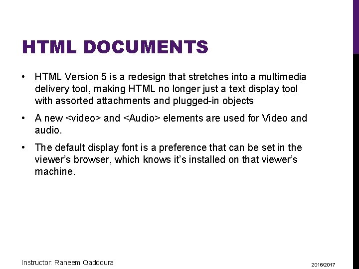
HTML DOCUMENTS • HTML Version 5 is a redesign that stretches into a multimedia delivery tool, making HTML no longer just a text display tool with assorted attachments and plugged-in objects • A new <video> and <Audio> elements are used for Video and audio. • The default display font is a preference that can be set in the viewer’s browser, which knows it’s installed on that viewer’s machine. Instructor: Raneem Qaddoura 2016/2017