More in misleading stats diagrams LOGIC REASONING AND


- Slides: 27

More in misleading stats (& diagrams) LOGIC, REASONING, AND PERSUASION

Today’s class Misleading ways of presenting info: what we have learned Other things to watch out for Recap of unit 2

The Problem of Statistical Illiteracy There is a widespread problem with people being unable to correctly interpret statistical or probabilistic information that they encounter in areas such as - Medical decision-making (risk estimates, benefits of various treatments and screenings) Science reporting in newspapers Results of various tests (for disease, drugs, DNA, etc. ) Deciding on policies for health, the environment, education, etc. This problem affects everyone (doctors and policy-makers included); don’t reply on authority figures to be better at assessing risks than you!

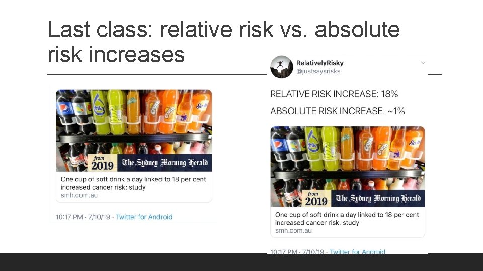
Last class: relative risk vs. absolute risk increases

Misleading info about relative risks is all over! Twitter page: Relatively Risky https: //twitter. com/justsaysrisks

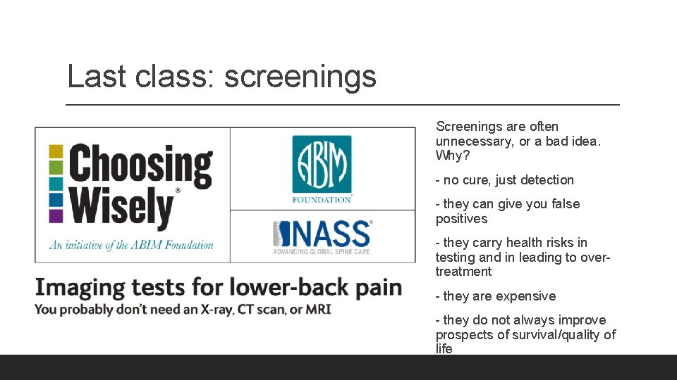
Last class: screenings Screenings are often unnecessary, or a bad idea. Why? - no cure, just detection - they can give you false positives - they carry health risks in testing and in leading to overtreatment - they are expensive - they do not always improve prospects of survival/quality of life

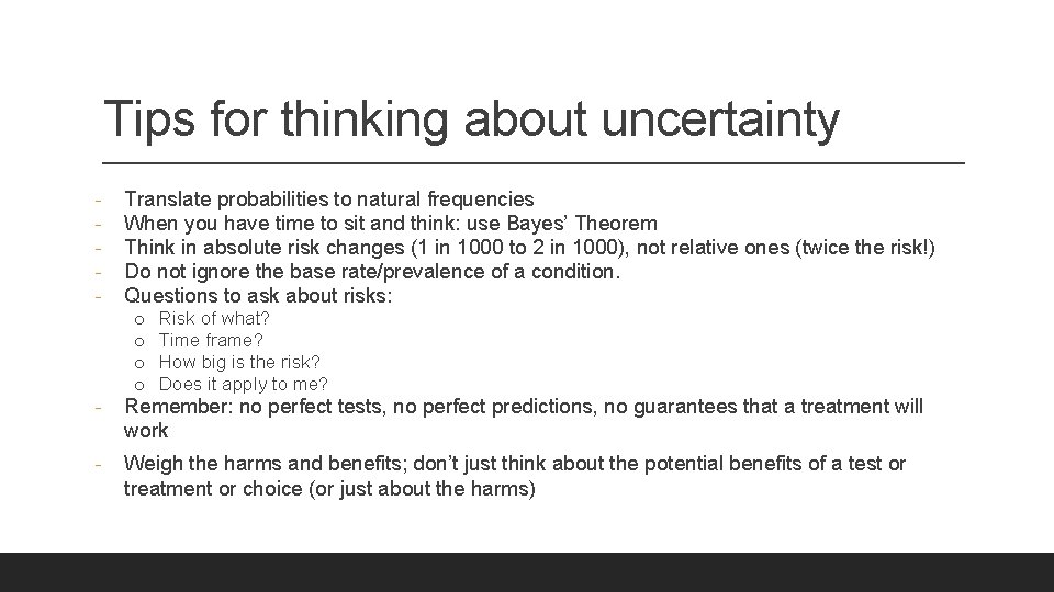
Tips for thinking about uncertainty - Translate probabilities to natural frequencies When you have time to sit and think: use Bayes’ Theorem Think in absolute risk changes (1 in 1000 to 2 in 1000), not relative ones (twice the risk!) Do not ignore the base rate/prevalence of a condition. Questions to ask about risks: o o Risk of what? Time frame? How big is the risk? Does it apply to me? - Remember: no perfect tests, no perfect predictions, no guarantees that a treatment will work - Weigh the harms and benefits; don’t just think about the potential benefits of a test or treatment or choice (or just about the harms)

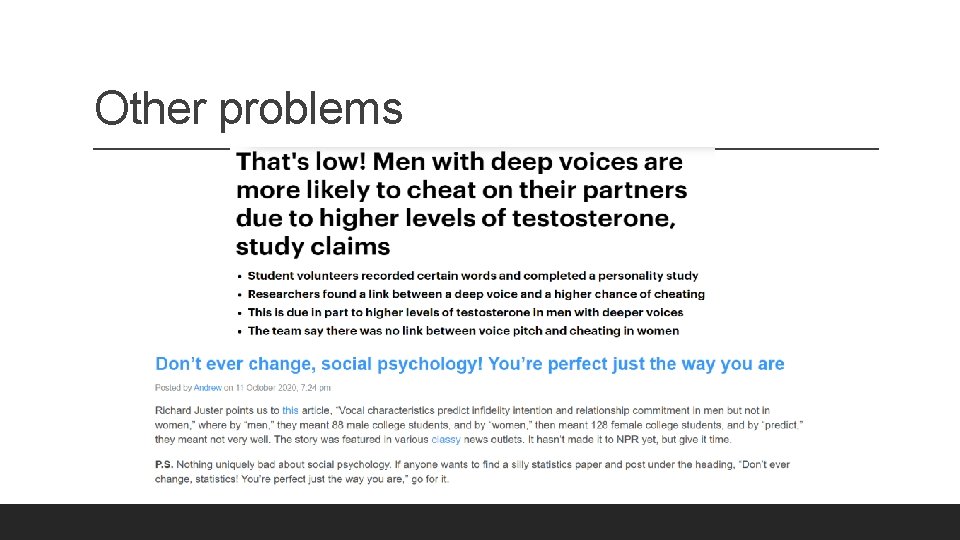
Other problems

Bad samples Generalizations/studies can go wrong when they: - pick a small sample ◦ Small samples are more likely to generate extreme results! ◦ Manipulative strategy: run lots of studies on small samples until you get a result you like. ◦ Example: studying what percentage of Rutgers students are in Frats by asking groups of 10 students. - pick a non-representative sample for what they are studying ◦ Example: studying what percentage of Rutgers students are in Frats by asking students outside Frat houses on College Av.

Misleading framing and reporting of results - Surveys asking “How awesome do you think this product is? ” - Not reporting margins of error – e. g. predicted to win for 52% probability of winning with 3% margin of error - Using “most” for 51%, “explains” for explains 5% of the effect, etc.

Now: more on misleading stats and visual displays

The Problem of Data Illiteracy People are not just bad at interpreting statistical information. We also struggle to interpret visual displays of statistical information, such as graphs, charts, and diagrams. The problem: visual displays produce an immediate impression that can easily be misleading.

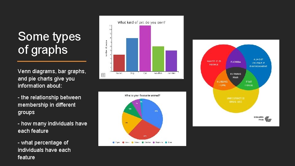
Some types of graphs Venn diagrams, bar graphs, and pie charts give you information about: - the relationship between membership in different groups - how many individuals have each feature - what percentage of individuals have each feature

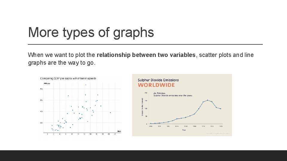
More types of graphs When we want to plot the relationship between two variables, scatter plots and line graphs are the way to go.

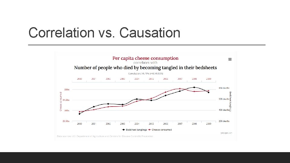
Correlation vs. Causation

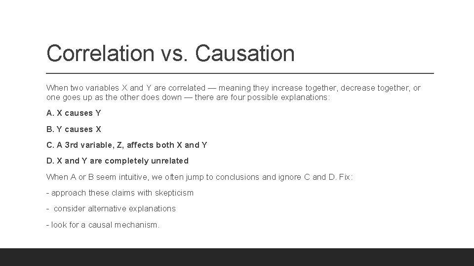
Correlation vs. Causation When two variables X and Y are correlated — meaning they increase together, decrease together, or one goes up as the other does down — there are four possible explanations: A. X causes Y B. Y causes X C. A 3 rd variable, Z, affects both X and Y D. X and Y are completely unrelated When A or B seem intuitive, we often jump to conclusions and ignore C and D. Fix: - approach these claims with skepticism - consider alternative explanations - look for a causal mechanism.

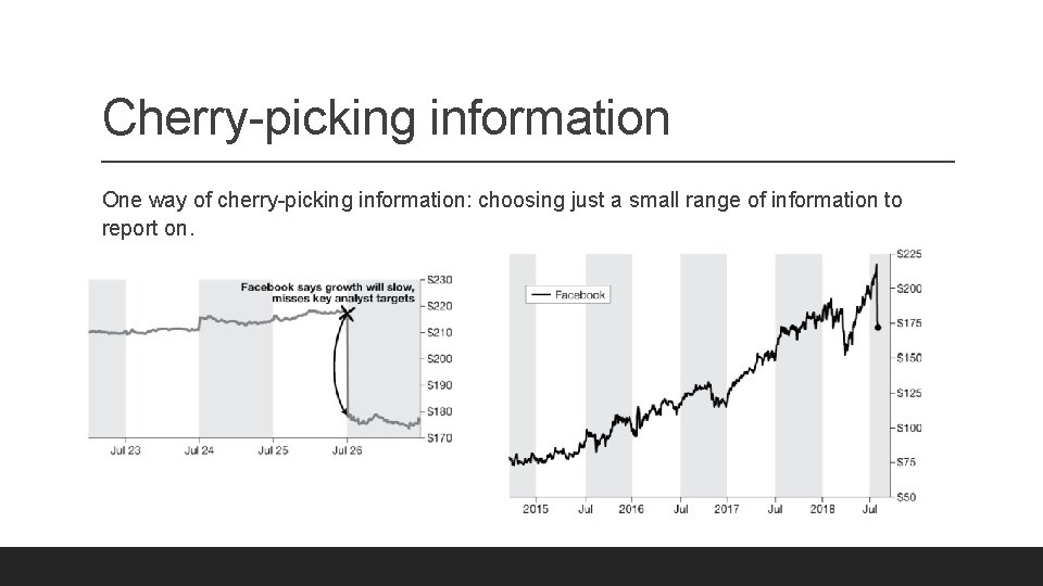
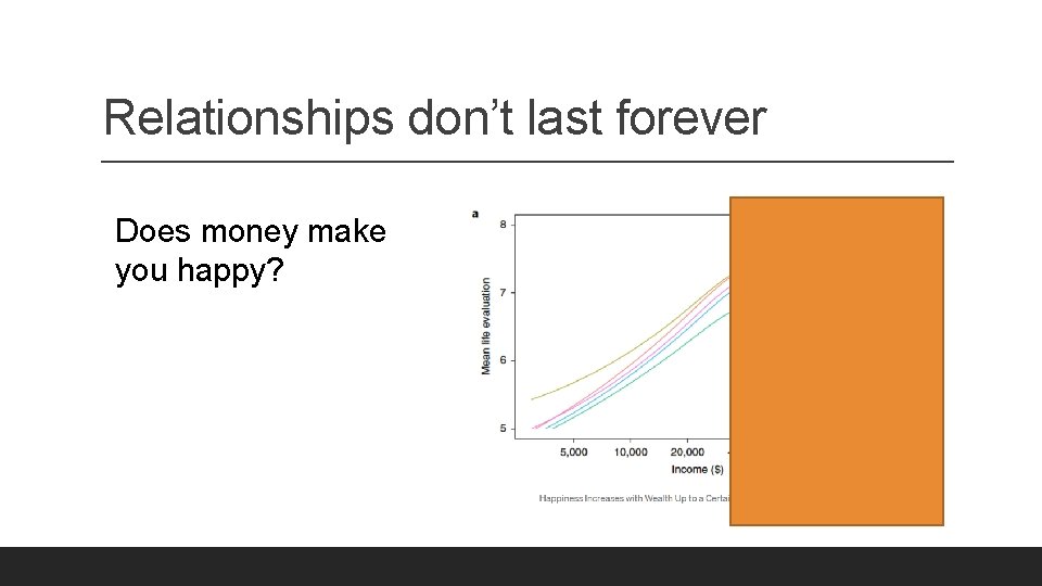
Cherry-picking information One way of cherry-picking information: choosing just a small range of information to report on.

Relationships don’t last forever Does money make you happy?

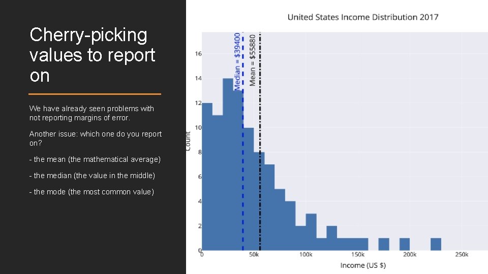
Cherry-picking values to report on We have already seen problems with not reporting margins of error. Another issue: which one do you report on? - the mean (the mathematical average) - the median (the value in the middle) - the mode (the most common value)

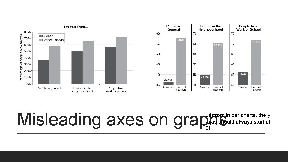
Misleading axes on graphs Lesson: in bar charts, the y -axis should always start at 0!

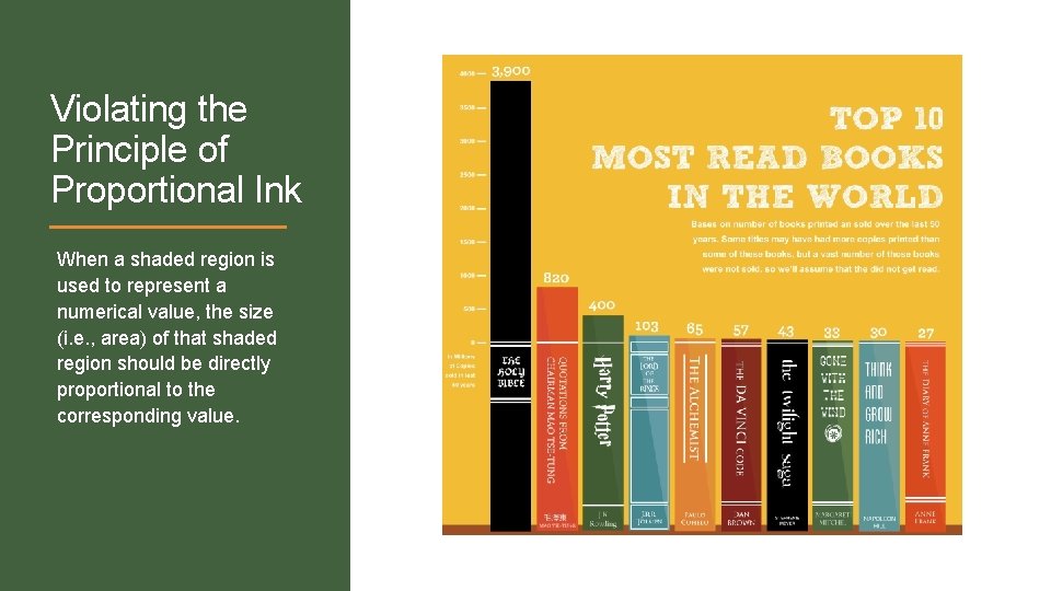
Violating the Principle of Proportional Ink When a shaded region is used to represent a numerical value, the size (i. e. , area) of that shaded region should be directly proportional to the corresponding value.

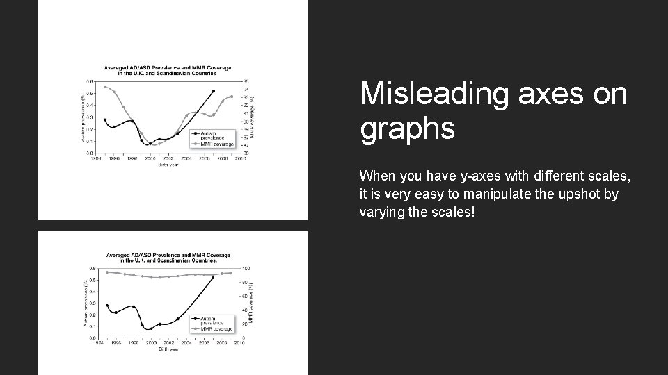
Misleading axes on graphs When you have y-axes with different scales, it is very easy to manipulate the upshot by varying the scales!

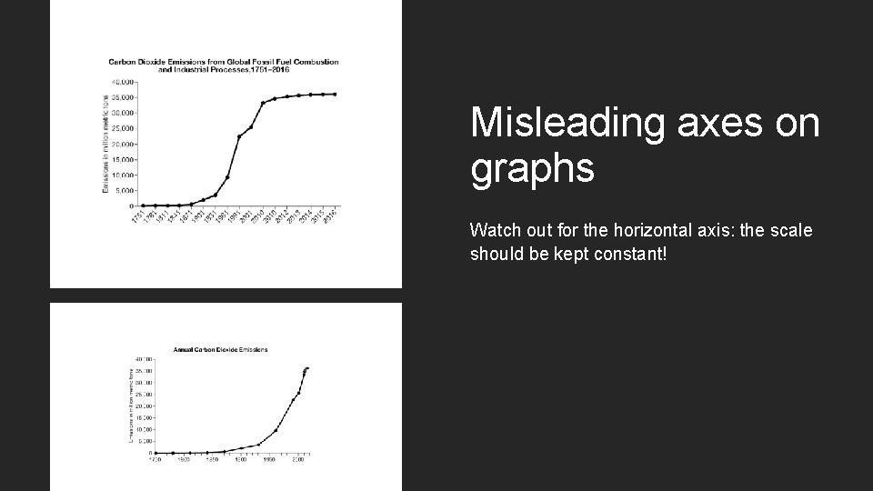
Misleading axes on graphs Watch out for the horizontal axis: the scale should be kept constant!

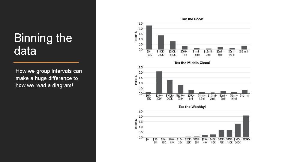
Binning the data How we group intervals can make a huge difference to how we read a diagram!

Things to watch out for - Correlation vs. Causation - Cherry-picked information ◦ no margins of error, ◦ small time-frames/only a portion of the data, ◦ mean vs. median Misleading axes on graphs: ◦ ◦ Bar graphs where the y-axis doesn’t start from 0 Violations of the Principle of Proportional Ink Changes in scale/intervals Bins of different sizes in bar graphs

Group activity Check out this page: https: //viz. wtf/ Pick 2 of the graphs (don’t be lazy and just go for the top ones; we want some variety). 1. Explain what are some of the problems with the 2 graphs you picked, 2. Give suggestions for how to improve it.

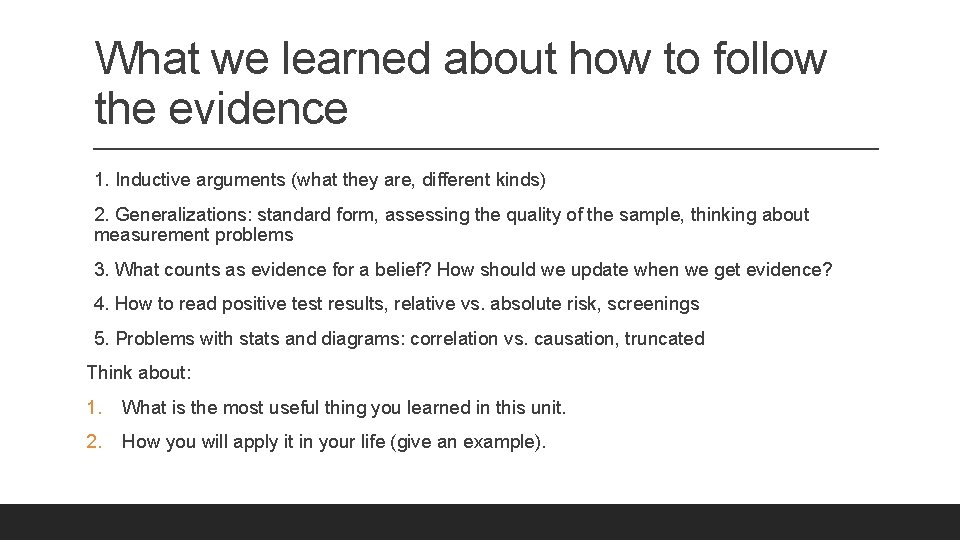
What we learned about how to follow the evidence 1. Inductive arguments (what they are, different kinds) 2. Generalizations: standard form, assessing the quality of the sample, thinking about measurement problems 3. What counts as evidence for a belief? How should we update when we get evidence? 4. How to read positive test results, relative vs. absolute risk, screenings 5. Problems with stats and diagrams: correlation vs. causation, truncated Think about: 1. What is the most useful thing you learned in this unit. 2. How you will apply it in your life (give an example).