Discovering Statistics 2 nd Edition Daniel T Larose
- Slides: 37

+ Discovering Statistics 2 nd Edition Daniel T. Larose Chapter 2: Describing Data Using Graphs and Tables Lecture Power. Point Slides

+ Chapter 2 Overview n 2. 1 Graphs and Tables for Categorical Data n 2. 2 Graphs and Tables for Quantitative Data n 2. 3 Further Graphs and Tables for Quantitative Data n 2. 4 Graphical Misrepresentations of Data 2

+ The Big Picture 3 Where we are coming from and where we are headed… ü In Chapter 1 we learned the basic concepts of statistics, such as population, sample, and types of variables, along with methods of collecting data. In Chapter 2 we learn about graphs and tables for summarizing qualitative and quantitative data, and we examine how to prevent our graphics from being misleading. ü ü In Chapter 3, we will learn how to describe a data set using numerical measures like statistics rather than graphs and tables.

+ 2. 1: Graphs and Tables for Categorical Data Objectives: Construct and interpret a frequency distribution and a relative frequency distribution for qualitative data. ü ü Construct and interpret bar graphs and Pareto charts. ü Construct and interpret pie charts. Construct crosstabulations to describe the relationship between two variables. ü Construct a clustered bar graph to describe the relationship between two variables. ü 4

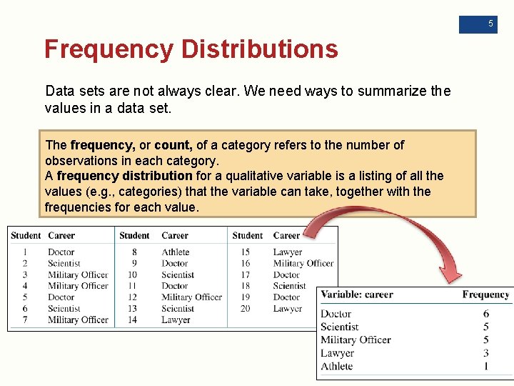
5 Frequency Distributions Data sets are not always clear. We need ways to summarize the values in a data set. The frequency, or count, of a category refers to the number of observations in each category. A frequency distribution for a qualitative variable is a listing of all the values (e. g. , categories) that the variable can take, together with the frequencies for each value.

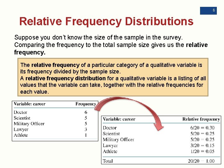
6 Relative Frequency Distributions Suppose you don’t know the size of the sample in the survey. Comparing the frequency to the total sample size gives us the relative frequency. The relative frequency of a particular category of a qualitative variable is its frequency divided by the sample size. A relative frequency distribution for a qualitative variable is a listing of all values that the variable can take, together with the relative frequencies for each value.

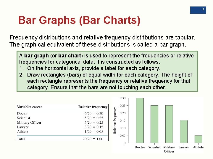
7 Bar Graphs (Bar Charts) Frequency distributions and relative frequency distributions are tabular. The graphical equivalent of these distributions is called a bar graph. A bar graph (or bar chart) is used to represent the frequencies or relative frequencies for categorical data. It is constructed as follows. 1. On the horizontal axis, provide a label for each category. 2. Draw rectangles (bars) of equal width for each category. The height of each rectangle represents the frequency or relative frequency for that category. Ensure that the bars are not touching each other.

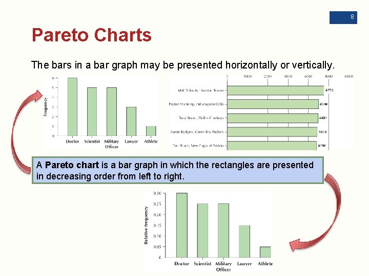
8 Pareto Charts The bars in a bar graph may be presented horizontally or vertically. A Pareto chart is a bar graph in which the rectangles are presented in decreasing order from left to right.

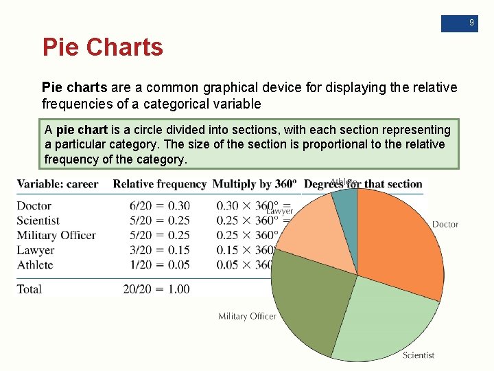
9 Pie Charts Pie charts are a common graphical device for displaying the relative frequencies of a categorical variable A pie chart is a circle divided into sections, with each section representing a particular category. The size of the section is proportional to the relative frequency of the category.

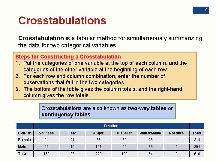
10 Crosstabulations Crosstabulation is a tabular method for simultaneously summarizing the data for two categorical variables. Steps for Constructing a Crosstabulation 1. Put the categories of one variable at the top of each column, and the categories of the other variable at the beginning of each row. 2. For each row and column combination, enter the number of observations that fall in the two categories. 3. The bottom of the table gives the column totals, and the right-hand column gives the row totals. Crosstabulations are also known as two-way tables or contingency tables. Emotion Gender Sadness Fear Anger Disbelief Vulnerability Not sure Total Female 94 21 87 80 28 4 314 Male 56 16 141 50 36 5 304 Total 150 37 228 130 64 9 618

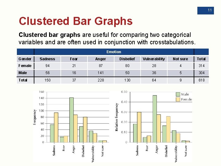
11 Clustered Bar Graphs Clustered bar graphs are useful for comparing two categorical variables and are often used in conjunction with crosstabulations. Emotion Gender Sadness Fear Anger Disbelief Vulnerability Not sure Total Female 94 21 87 80 28 4 314 Male 56 16 141 50 36 5 304 Total 150 37 228 130 64 9 618

+ 2. 2: Graphs and Tables for Quantitative Data Objectives: Construct and interpret a frequency distribution and a relative frequency distribution for discrete and continuous data. ü Use histograms and frequency polygons to summarize quantitative data. ü Construct and interpret stem-and-leaf displays and dotplots. ü Recognize distribution shape, symmetry, and skewness. ü 12

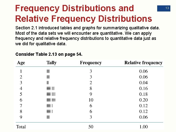
Frequency Distributions and Relative Frequency Distributions Section 2. 1 introduced tables and graphs for summarizing qualitative data. Most of the data sets we will encounter are quantitative. We can apply frequency and relative frequency distributions to quantitative data just as we did for qualitative data. Consider Table 2. 13 on page 54. 13

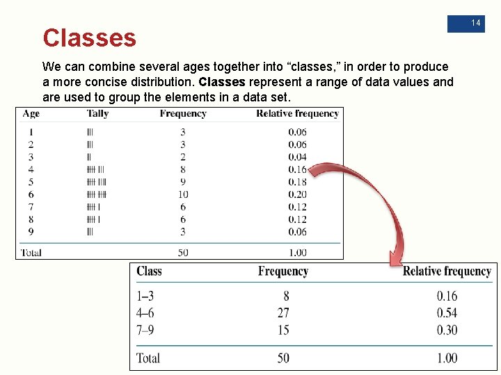
Classes We can combine several ages together into “classes, ” in order to produce a more concise distribution. Classes represent a range of data values and are used to group the elements in a data set. 14

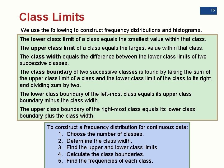
Class Limits 15 We use the following to construct frequency distributions and histograms. The lower class limit of a class equals the smallest value within that class. The upper class limit of a class equals the largest value within that class. The class width equals the difference between the lower class limits of two successive classes. The class boundary of two successive classes is found by taking the sum of the upper class limit of a class and the lower class limit of the class to its right, and dividing sum by two. The lower class boundary of the left-most class equals its upper class boundary minus the class width. The upper class boundary of the right-most class equals its lower class boundary plus the class width. To construct a frequency distribution for continuous data: 1. Choose the number of classes. 2. Determine the class width. 3. Find the upper and lower class limits. 4. Calculate the class boundaries. 5. Find the frequencies of each class.

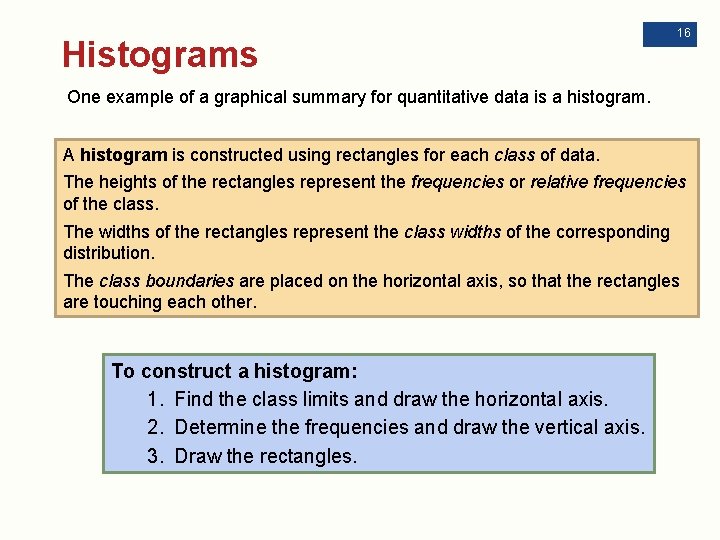
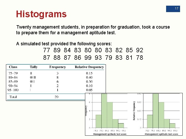
Histograms 16 One example of a graphical summary for quantitative data is a histogram. A histogram is constructed using rectangles for each class of data. The heights of the rectangles represent the frequencies or relative frequencies of the class. The widths of the rectangles represent the class widths of the corresponding distribution. The class boundaries are placed on the horizontal axis, so that the rectangles are touching each other. To construct a histogram: 1. Find the class limits and draw the horizontal axis. 2. Determine the frequencies and draw the vertical axis. 3. Draw the rectangles.

Histograms Twenty management students, in preparation for graduation, took a course to prepare them for a management aptitude test. A simulated test provided the following scores: 77 89 84 83 80 80 83 82 85 92 87 88 87 86 99 93 79 83 81 78 17

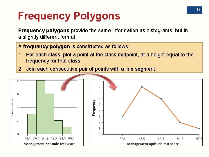
Frequency Polygons Frequency polygons provide the same information as histograms, but in a slightly different format. A frequency polygon is constructed as follows: 1. For each class, plot a point at the class midpoint, at a height equal to the frequency for that class. 2. Join each consecutive pair of points with a line segment. 18

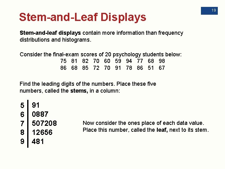
Stem-and-Leaf Displays Stem-and-leaf displays contain more information than frequency distributions and histograms. Consider the final-exam scores of 20 psychology students below: 75 81 82 70 60 59 94 77 68 98 86 68 85 72 70 91 78 86 51 67 Find the leading digits of the numbers. Place these five numbers, called the stems, in a column: 5 6 7 8 9 91 0887 507208 5 12656 1 481 Now consider the ones place of each data value. Place this number, called the leaf, next to its stem. 19

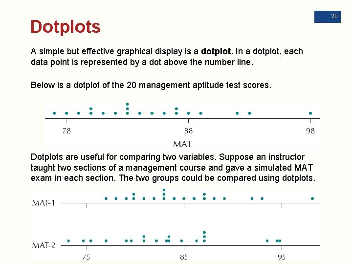
Dotplots A simple but effective graphical display is a dotplot. In a dotplot, each data point is represented by a dot above the number line. Below is a dotplot of the 20 management aptitude test scores. Dotplots are useful for comparing two variables. Suppose an instructor taught two sections of a management course and gave a simulated MAT exam in each section. The two groups could be compared using dotplots. 20

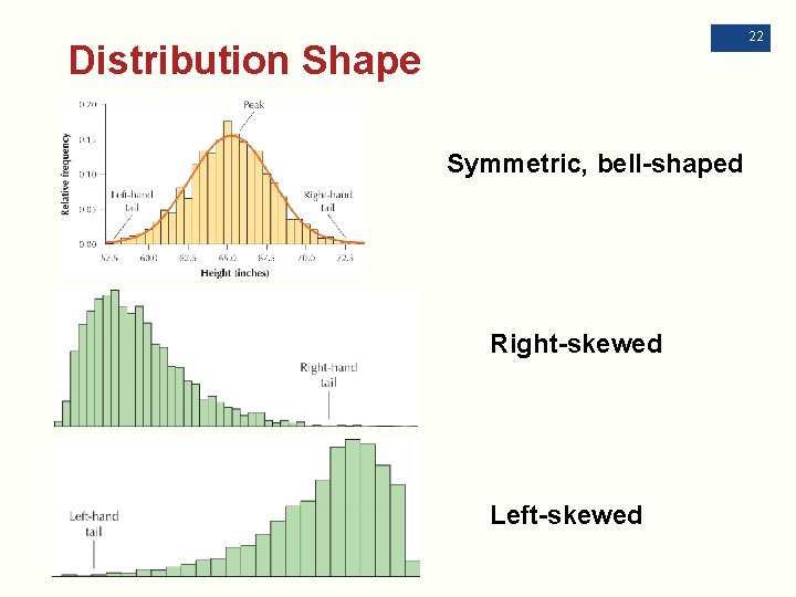
Distribution Shape Frequency distributions are tabular summaries of the set of values that a variable takes. The distribution of a variable is a table, graph, or formula that identifies the variable values and frequencies for all elements in the data set. The shape of a distribution is the overall form of a graphical summary, approximated by a smooth curve. A distribution is symmetric if there is a line (axis of symmetry) that splits the image in half so that one side is the mirror image of the other. A distribution is skewed if it has a longer “tail” on one side of the image. 21

22 Distribution Shape Symmetric, bell-shaped Right-skewed Left-skewed

+ 2. 3: Further Graphs and Tables for Quantitative Data Objectives: Build cumulative frequency distributions and cumulative relative frequency distributions. ü ü Create frequency ogives and relative frequency ogives. ü Construct and interpret time series graphs. 23

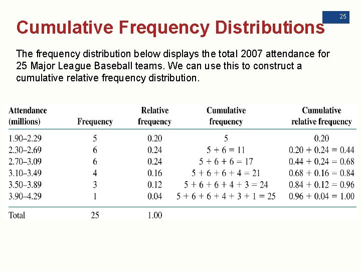
24 Cumulative Frequency Distributions Since quantitative data can be put in ascending order, we can keep track of the accumulated counts at or below a certain value using a cumulative frequency distribution or cumulative relative frequency distribution. For a discrete variable, a cumulative frequency distribution shows the total number of observations less than or equal to the category value. For a continuous variable, a cumulative frequency distribution shows the total number of observations less than or equal to the upper class limit. A cumulative relative frequency distribution shows the proportion of observations less than or equal to the category value (for a discrete variable) or the proportion of observations less than or equal to the upper class limit (for a continuous variable).

Cumulative Frequency Distributions The frequency distribution below displays the total 2007 attendance for 25 Major League Baseball teams. We can use this to construct a cumulative relative frequency distribution. 25

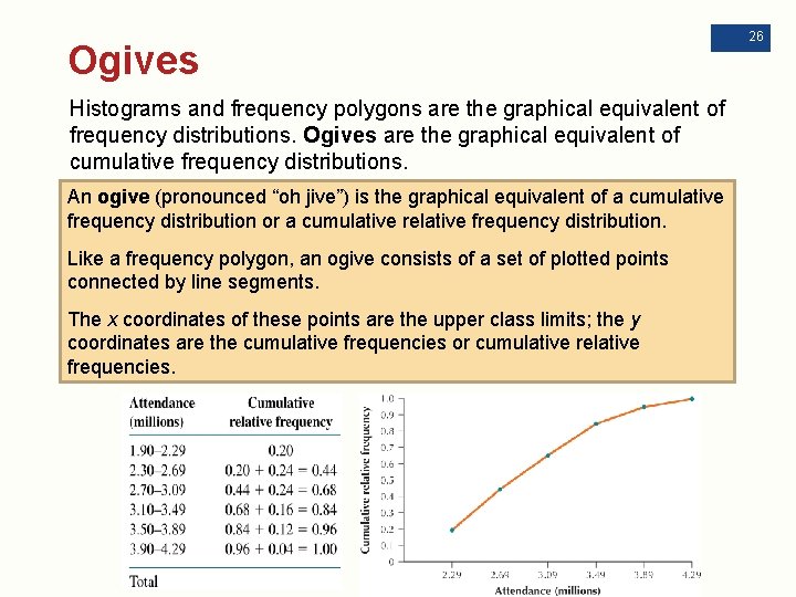
Ogives Histograms and frequency polygons are the graphical equivalent of frequency distributions. Ogives are the graphical equivalent of cumulative frequency distributions. An ogive (pronounced “oh jive”) is the graphical equivalent of a cumulative frequency distribution or a cumulative relative frequency distribution. Like a frequency polygon, an ogive consists of a set of plotted points connected by line segments. The x coordinates of these points are the upper class limits; the y coordinates are the cumulative frequencies or cumulative relative frequencies. 26

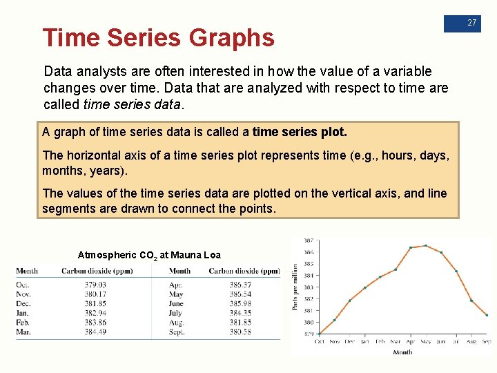
Time Series Graphs Data analysts are often interested in how the value of a variable changes over time. Data that are analyzed with respect to time are called time series data. A graph of time series data is called a time series plot. The horizontal axis of a time series plot represents time (e. g. , hours, days, months, years). The values of the time series data are plotted on the vertical axis, and line segments are drawn to connect the points. Atmospheric CO 2 at Mauna Loa 27

+ 2. 4: Graphical Misrepresentations of Data 28 Objectives: Understand what can make a graph misleading, confusing, or deceptive. ü In the Information Age, when our world is awash in data, it is important for citizens to understand how graphics may be misleading, confusing, or deceptive. Such an understanding enhances our statistical literacy and makes us less prone to be deceived by misleading graphics.

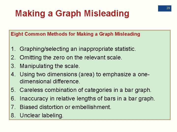
Making a Graph Misleading Eight Common Methods for Making a Graph Misleading 1. 2. 3. 4. 5. 6. 7. 8. Graphing/selecting an inappropriate statistic. Omitting the zero on the relevant scale. Manipulating the scale. Using two dimensions (area) to emphasize a onedimensional difference. Careless combination of categories in a bar graph. Inaccuracy in relative lengths of bars in a bar graph. Biased distortion or embellishment. Unclear labeling. 29

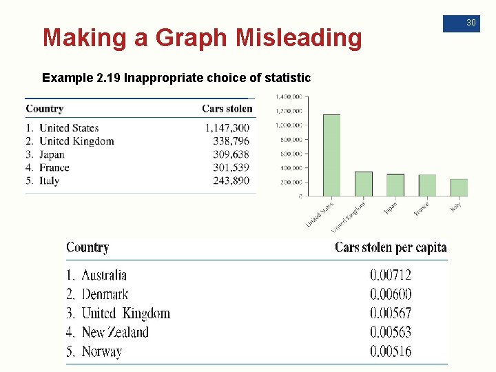
Making a Graph Misleading Example 2. 19 Inappropriate choice of statistic 30

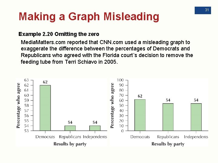
Making a Graph Misleading Example 2. 20 Omitting the zero Media. Matters. com reported that CNN. com used a misleading graph to exaggerate the difference between the percentages of Democrats and Republicans who agreed with the Florida court’s decision to remove the feeding tube from Terri Schiavo in 2005. 31

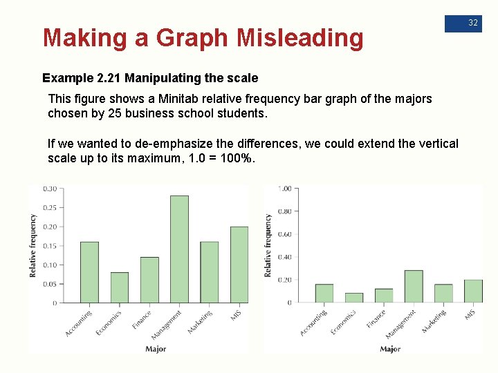
Making a Graph Misleading Example 2. 21 Manipulating the scale This figure shows a Minitab relative frequency bar graph of the majors chosen by 25 business school students. If we wanted to de-emphasize the differences, we could extend the vertical scale up to its maximum, 1. 0 = 100%. 32

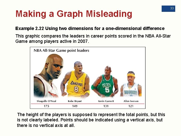
Making a Graph Misleading 33 Example 2. 22 Using two dimensions for a one-dimensional difference This graphic compares the leaders in career points scored in the NBA All-Star Game among players active in 2007. The height of the players is supposed to represent the total points, but this is not clearly labeled. Points should be indicated using a vertical axis, but there is no vertical axis at all.

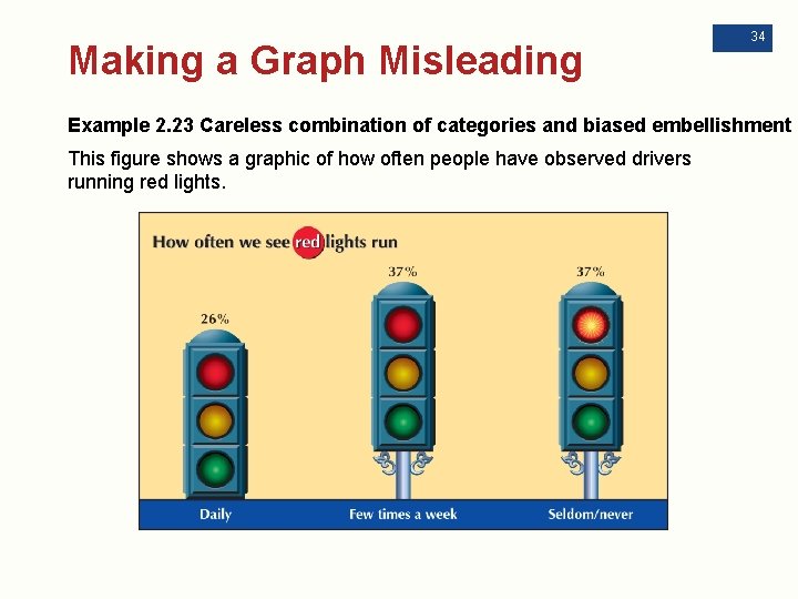
Making a Graph Misleading 34 Example 2. 23 Careless combination of categories and biased embellishment This figure shows a graphic of how often people have observed drivers running red lights.

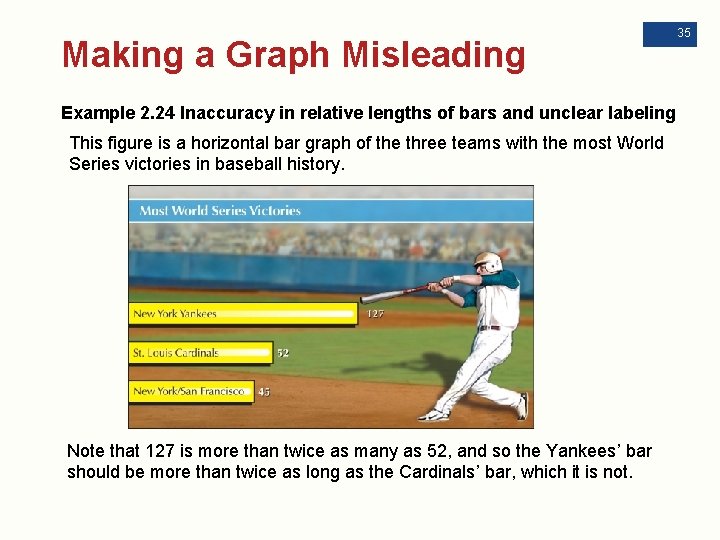
Making a Graph Misleading Example 2. 24 Inaccuracy in relative lengths of bars and unclear labeling This figure is a horizontal bar graph of the three teams with the most World Series victories in baseball history. Note that 127 is more than twice as many as 52, and so the Yankees’ bar should be more than twice as long as the Cardinals’ bar, which it is not. 35

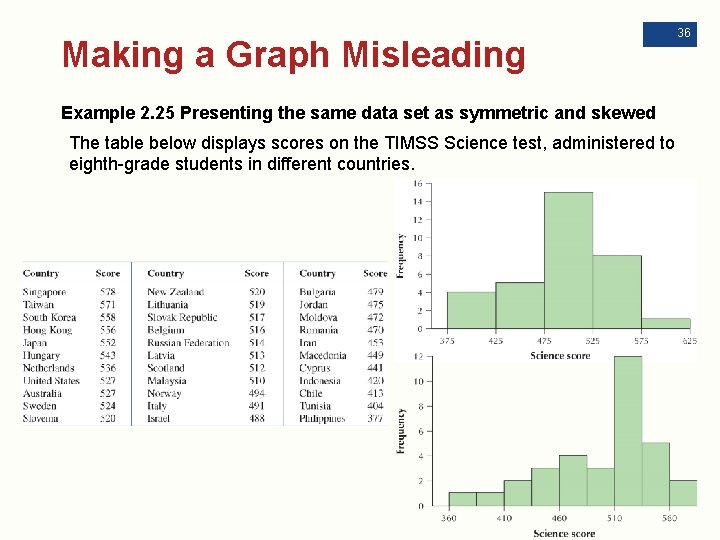
Making a Graph Misleading Example 2. 25 Presenting the same data set as symmetric and skewed The table below displays scores on the TIMSS Science test, administered to eighth-grade students in different countries. 36

+ Chapter 2 Overview n 2. 1 Graphs and Tables for Categorical Data n 2. 2 Graphs and Tables for Quantitative Data n 2. 3 Further Graphs and Tables for Quantitative Data n 2. 4 Graphical Misrepresentations of Data 37