Daily life Education economic life family religion How


 per capita, based on World Bank figures; if no")


 of the population of")

 Territory size shows the proportion of")


 is a composite statistic used to")


- Slides: 52
Daily life: Education, economic life, family, religion… How are they related?
What makes a people strong? The answer is in the book of Mormon: what practices made the Nephites a strong people. - They have strong values: They obey God, they are religious and spiritual. “they did walk after the commandments which they had received from their Lord and their God, continuing in fasting and prayer, and in meeting together oft both to pray and to hear the word of the Lord. ” 4 Nephi 12 -They have prosperity and equity. And the Lord did prosper them exceedingly in the land; yea, insomuch that they did build cities again where there had been cities burned. 4 Nephi 7 And they had all things common among them; therefore there were not rich and poor, bond and free, but they were all made free, and partakers of the heavenly gift. 4 Nephi 3 -They get married and have children. “And they were married, and given in marriage, and were blessed according to the multitude of the promises which the Lord had made unto them. ” 4 nephi 11 « [They] did multiply exceedingly fast » 4 Nephi 10 -They are strong and healthy. “And now, behold, it came to pass that the people of Nephi did wax strong, and did multiply exceedingly fast, and became an exceedingly fair and delightsome people. ” 4 Nephi 10
- They were educated. “I would like to say just a little bit more about Nephi's education. Lehi, himself, was a learned man, and he had the best education available in Jerusalem while Nephi was still in his youth. It was the privilege of a wealthy family to hire tutors and scholars to teach the children. The Book of “Mormon tells us that Nephi's father taught him in "all the learning of the Jews" (1 Nephi 1: 2)” Noel B Reynolds “And it came to pass that he had three sons; and he called their names Mosiah, and Helorum, and Helaman. And he caused that they should be taught in all the language of his fathers, that thereby they might become men of understanding; and that they might know concerning the prophecies which had been spoken by the mouths of their fathers, which were delivered them by the hand of the Lord. ” (Mosiah 1: 2) - They strived to live in freedom and peace. “And it came to pass in the thirty and sixth year, the people were all converted unto the Lord, upon all the face of the land, both Nephites and Lamanites, and there were no contentions and disputations among them, and every man did deal justly one with another. 3 And they had all things common among them; therefore there were not rich and poor, bond and free, but they were all made free, and partakers of the heavenly gift. ” 4 Nephi 2 -3 -Last but not least, as a result of all of these factors, they were one: despite their differences, they had a common purpose, and common values. “There were no robbers, nor murderers, neither were there Lamanites, nor any manner of -ites; but they were in one, the children of Christ, and heirs to the kingdom of God. ” (4 Nephi 1: 17) « E Pluribus Unum » !
Now, let’s look at the world…
http: //www. worldmapper. org/textindex/text_wealth. html http: //www. viewsoftheworld. net/ http: //www. indexmundi. com/
Population map http: //www. worldmapper. org/imagemaps/imagemap 2. html
Economic life Voir: Poverty: http: //en. wikipedia. org/wiki/Poverty Median income: http: //en. wikipedia. org/wiki/Median_household_income
GDP Wealth Territory size shows the proportion of worldwide wealth, that is Gross Domestic Product based on exchange rates with the US$, that is found there. This wealth map shows which territories have the greatest wealth when Gross Domestic Product (GDP) is compared using currency exchange rates. This indicates international purchasing power - what someone’s money would be worth if they wanted to spend it in another territory. See also: http: //www. indexmundi. com/map/? v=67
Wealth Year 2015 The projected wealth of China in 2015 could mean it producing 27% of all the wealth in the world, if the economic trends established between 1975 and 2002 continue for another 13 years. In year 1 of the current era China produced 26% of the wealth in the world, but very slowly declined to generating only 5% of the world total in 1960.
Countries by 2012 GDP (PPP) per capita, based on World Bank figures; if no IMF/World Bank figure was available for a country, the CIA figure was used. List of countries by GDP (PPP) per capita: http: //en. wikipedia. org/wiki/List_of_countries_by_GDP_(PPP)_per_capita
http: //www. viewsoftheworld. net/wp-content/uploads/2010/11/GDPGrowth 2010 -2015. jpg
The richest tenth The lowest earnings person of the richest tenth of population are in the United Republic of Tanzania. It is 1% of the earnings person of the richest tenth in Luxembourg, the other extreme. The United States has the highest total earnings of the richest tenth, followed by China, followed by India. The richest tenth in the United States earn 1. 5 times more than their equivalent in China, and more than 4 times more than their equivalent anywhere else. The richest tenth of population living in South Africa earn almost 3 times more than the richest tenth of the population of any other territory in Africa. "There are the rich people in every country. The US is just a bit more extravagant about it. " Heidi Hendricks, 2006 Territory size shows the earnings of the richest tenth of the population living there, as a proportion of the earnings of the richest tenth living in all territories.
Living on $50 to $100 per day The majority (61%) of the population of Japan live in households which rely on between US$50 and US$100, in purchasing power parity (PPP). North America, Western Europe and Japan are particularly large on this map because large numbers of people live on PPP US$50 -100 a day. Southern Asia and Central Africa have almost completely disappeared. Indonesia, Viet Nam, Cambodia, Lao People’s Democratic Republic, Myanmar, Timor-Leste and much of Southeastern Africa are not visible. This is because very few people there live on PPP US$50 -100 a day. Territory size shows the proportion of all people that rely on US$ 50 -100 purchasing power parity a day worldwide, that live there.
Human Poverty Territory size shows the proportion of the world population living in poverty living there (calculated by multiplying population by one of two poverty indices). Poverty is not just a financial state. Being poor affects life in many ways. The human poverty index uses indicators that capture non-financial elements of poverty, such as life expectancy, adult literacy, water quality, and children that are underweight. The 30 territories of the Organisation for Economic Cooperation and Development use a different index which includes income and long-term unemployment; and not water quality or underweight children. This implies that the poor in richer territories are materially better off. The highest human poverty index scores are in Central Africa, the lowest are in Japan.
The Wretched Dollar (up to $1 a day) Territory size shows the proportion of all people living on less than or equal to US$1 in purchasing power parity a day. The first Millennium Development Goal is to halve, between 1990 and 2015, the proportion of people who live on the equivalent of US$1 a day, or less. In 2002, an estimated 17% of the world population lived on this amount. They lived on less than or equal to what, to be precise, US$1. 08 would have bought in the United States in 1993. In over twenty territories more than a third of the population lives on less than US$1 a day. All but two of these territories are in Africa. The largest population living on US$1 a day is in Southern Asia, most of whom live in India.
Gallup's worldwide income data offer a new look at commonly agreed on poverty thresholds. These measures include the proportion of a population living on $1. 25 per day or less (the average poverty line for the world's poorest 10 to 20 countries) and the proportion living on $2 per day or less (the average of the national poverty lines for developing countries). Poverty estimates reported in Gallup's database adopt these definitions based on self-reported per-capita household income data gathered between 2006 and 2012 and expressed in international dollars (calculated using the World Bank's individual consumption PPP conversion factor). http: //www. gallup. com/poll/166565/one-five-worldwide-living-extreme-poverty. aspx
World map of Gini coefficient for 2007/2008. The Gini coefficient is a measure of statistical dispersion most prominently used as a measure of inequality of income distribution or inequality of wealth distribution. It is defined as a ratio with values between 0 and 1: A low Gini coefficient indicates more equal income or wealth distribution, while a high Gini coefficient indicates more unequal distribution. 0 corresponds to perfect equality (everyone having exactly the same income) and 1 corresponds to perfect inequality (where one person has all the income, while everyone else has zero income).
http: //www. photius. com/rankings/economy/distribution_of_family_income_gini_inde x_2011_0. html
2014 http: //en. wikipedia. org/wiki/Poverty#mediaviewer/File: 2014_Gini_Index_World_Map, _income
Unemployment rates in major countries: http: //www. indexmundi. com/map/? t=0&v=2229&r=xx&l=en
Public debt percent gdp world map 2010 2015: http: //www. economist. com/content/global_debt_clock http: //en. wikipedia. org/wiki/List_of_sovereign_states_by_public_debt https: //www. cia. gov/library/publications/the-world-factbook/rankorder/2186 rank. html http: //en. wikipedia. org/wiki/List_of_sovereign_states_by_public_debt
http: //www. viewsoftheworld. net/? p=1766
2015: Map of countries by foreign currency reserves and gold minus external debt based on 2010 data from CIA Factbook. http: //www. indexmundi. com/map/? t=0&v=144&r=xx&l=en
http: //www. indexmundi. com/g/r. aspx? v=144
Countries’ debt : External debt : http: //en. wikipedia. org/wiki/List_of_countries_by_external_debt Public debt: http: //en. wikipedia. org/wiki/List_of_sovereign_states_by_public_debt https: //www. cia. gov/library/publications/the-world-factbook/rankorder/2186 rank. html Public and private debt: https: //www. cia. gov/library/publications/the-world-factbook/rankorder/2079 rank. html
World Map Index of perception of corruption 2010 http: //en. wikipedia. org/wiki/Corruption_Perce ptions_Index
Education
Secondary Education Territory size shows the proportion of people worldwide enrolled in secondary education, who live there. In China on average 89% get a secondary education, but in India it is only 49%. Figures in Africa are even lower: 45% in Northern Africa, 25% in Southeastern Africa and 13% in Central Africa. The lowest is 5% in Niger. What is compulsory in some territories is a rarity in others. The biggest population of secondary students is in China, where a quarter of all the secondary students in the world live.
Tertiary Education Territory size shows the proportion of people worldwide enrolled in tertiary education, who live there. Tertiary education is university education and post secondary vocational training. Worldwide about 105 million students were enrolled in tertiary education in 2002. The highest percentage of the student aged population enrolled is in Finland is 3. 6 times the world average, with 140 times the chance of a tertiary education than in Mozambique. Most territories are visible on this map. Those territories that have such low numbers of people going into tertiary education that they are hardly distinguishable are mainly in Central Africa. India is at half the world average tertiary enrolment; China nearer two thirds; only 4 of 24 Middle Eastern territories are significantly below it.
Tertiary Education Spending Territory size shows the proportion of all spending on tertiary education worldwide that is spent there, when measured in purchasing power parity US$. Of all spending on tertiary education, when measured in US$ adjusted for local purchasing power, 61% occurs within North America and Western Europe. At the other extreme, the total tertiary education spending in all of Central Africa and Southeastern Africa was 1. 5% of the total worldwide spend. Tertiary education includes the training required for jobs such as being a doctor, an engineer or a scientist. Investing in tertiary education can therefore benefit society more widely. For pupils to reach tertiary education they must first attend primary and secondary schools.
UN education index for 2009 High, medium and low See also rankings: http: //en. wikipedia. org/wiki/Education_Index 2011 update : http: //www. prosperity. com/education. aspx
The PISA results: https: //www. oecd. org/pisa/ 2009 report: http: //www. oecd. org/pisa/46660259. pdf 2003 -2009 -2012 results: http: //en. wikipedia. org/wiki/Programme_for_International_Student_Assessment The Bacherlor’s degree in Europe/France: -Les sujets du bac 2012: http: //www. bankexam. fr/actualite/article/225 -sujet-bac-corrige-2012 -gratuit-toutesles-corrections-du-bac-2012 -apres-les-epreuves
Health
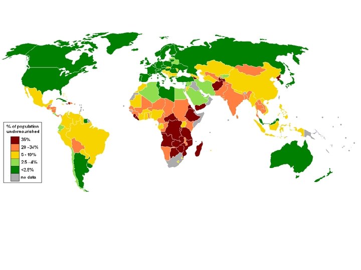
Undernourishment in 2000 Territory size shows the proportion of all undernourished people worldwide, that live there. Over the ten year period from 1990 to 2000, the number of people in the world that lived on an inadequate amount of food increased from 840 million to 858 million. Due to the population increases over this period, the percentage of the population that is undernourished simultaneously decreased from 16% to 14%. Of all the people living in Central Africa, over 60% are undernourished. The Democratic Republic of Congo has the highest levels of undernourishment: 3 in every 4 people there are undernourished.
Public Health Spending Territory size shows the proportion of worldwide spending on public health services that is spent there. This spending is measured in purchasing power parity. Public health spending is all government spending on health care, plus money from grants, social insurance and non-governmental organisations. Public health spending reduces, or even eliminates, the direct cost of health care to an individual. The highest public health care spending person is in the regions of Western Europe, North America and Japan. Luxembourg, Norway and Iceland are the territories with the highest person spending. As this map of spending is adjusted for purchasing power parity, the size of a territory compares more directly what can actually be funded by this spending. However costs will still vary.
Private Health Spending Territory size shows the proportion of worldwide private spending on health services that is spent there. This spending is measured in purchasing power parity. Private spending on health care is when individuals or corporations pay directly. Spending person in the region with highest expenditure was 100 times greater than in the region with the lowest spending. These regions are North America and Central Africa respectively. Level of spending on private health care is related to the ability to pay, not the need for health care. The lowest total spending is in territories that appear smallest on the map. Total spending is generally lowest where there is a small population. Some of the lowest spenders on private health care person are islands and territories in poorer regions.
Diabetes Prevalence Territory size shows the proportion of all people over 15 in the world living with diabetes who live there. There are two types of diabetes mellitus, related to insulin which regulates our blood sugar levels. Having type 1 diabetes means that you are unable to produce enough insulin, so you need to inject insulin to survive. The more common type 2 diabetes is when insulin cannot be used properly by the body - this type can often be managed through diet and tablets. It can occur during pregnancy. The highest diabetes prevalence is in North America. Of the total North American cases, 4% are in Canada, 33% are in Mexico, and 62% are in the United States. The largest population of diabetics in 2001 was in India: 56 million people.
Infant mortality Territory size shows the proportion of infant deaths worldwide that occurred there in 2002. Infant deaths are deaths of babies during their first year of life. The territory with the most infant deaths was India, at 1. 7 million, or 24% of the world total. In India, for every 100 babies born alive, almost 7 die in the following 12 months. In 22 territories the rate is over 1 infant death for every 10 live births. All of these 22 territories are in Africa. The highest infant mortality rate is in Sierra Leone where 16. 5 babies die, of every 100 born alive.
Study the article: Myth-the us has the best healthcare in the world WHO rankings: http: //en. wikipedia. org/wiki/World_Health_Organization_ranking_of_health_syst
Population density by country in 2006 http: //en. wikipedia. org/wiki/World_population
As a conclusion… The Human Development Index (HDI) is a composite statistic used to rank countries by level of "human development", taken as a synonym of the older term standards of living, and distinguish "very high human development", "medium human development", and "low human development" countries. The Human Development Index (HDI) is a comparative measure of life expectancy, literacy, education and standards of living for countries worldwide. It is a standard means of measuring well-being, especially child welfare. It is used to distinguish whether the country is a developed, a developing or an under-developed country, and also to measure the impact of economic policies on quality of life.
Family life
Mariage rate per country: http: //www. nationmaster. com/graph/peo_mar_rat-people-marriage-rate Divorce rate per country: http: //www. nationmaster. com/graph/peo_div_rat-people-divorce-rate Source: Organization for Economic Cooperation and Development, Paris, France
OECD survey on marriage: http: //www. oecd. org/els/family/SF_3_1_Marriage_and_divorce OECD survey on births outside of marriage: https: //www. oecd. org/els/family/SF_2_4_Share_births_outside_marriage. pdf Other numbers: http: //www. oecd. org/els/family/database. htm
Fertility rates through the world: Numbers: https: //www. cia. gov/library/publications/the-world-factbook/rankorder/2127 rank. html http: //www. nationmaster. com/graph/peo_bir_rat-people-birth-rate&date=2011 http: //www. oecd. org/els/family/SF_2_1_Fertility_rates. pdf
David Rockeller on population control: http: //www. youtube. com/watch? v=Clq. Uc. Scwnn 8 Thomas Malthus: “Population, when unchecked, increases in a geometrical ratio, Subsistence, increases only in an arithmetical ratio. ” A drop in fertily rate, a threat for the future economy of a country? http: //www. usatoday. com/story/news/nation/2013/02/12/us-births-decline/1880231/ Elder Russell M Nelson: https: //www. lds. org/general-conference/1985/04/reverence-forlife? lang=eng Another excuse some use to justify abortion relates to population control. Many in developing nations unknowingly ascribe their lack of prosperity to overpopulation. While they grovel in ignorance of God and his commandments, they may worship objects of their own creation (or nothing at all), while unsuccessfully attempting to limit their population by the rampant practice of abortion. They live in squalor, oblivious to the divine teaching—stated in the scriptures not once, but thirty-four times—that people will prosper in the land only if they obey the commandments of God. 10
Kenya’s population
Religion