CHAPTER 8 Fluid Navigation Designing the User Interface
- Slides: 55

CHAPTER 8: Fluid Navigation Designing the User Interface: Strategies for Effective Human-Computer Interaction Sixth Edition Ben Shneiderman, Catherine Plaisant, Maxine S. Cohen, Steven M. Jacobs, and Niklas Elmqvist in collaboration with Addison Wesley Nicholas Diakopoulos is an imprint of Slides edited by: Amberly Wang, Ben Estela, Terra Williams, © 2017 Pearson Education, Inc. , Hoboken, NJ. All rights. Freshour reserved. Alexis Diaz, & Brandon

Fluid Navigation Topics 1. Introduction 2. Navigation by selection 3. Small displays 4. Content Organization 5. Audio menus 6. Form fill-in and dialog boxes 1 -2 © 2017 Pearson Education, Inc. , Hoboken, NJ. All rights reserved. 2

1. Introduction*** Websites provide access to all kinds of information and tasks to perform - users are dependent on interface navigation to find what they’re looking for. • research shows 70% of people rely on navigation vs search • can be the difference between quick and easy transactions vs. empty shopping carts 1 -3 © 2017 Pearson Education, Inc. , Hoboken, NJ. All rights reserved. 3

Introduction (continued) • Navigation – Enables users to know where they are and to steer themselves to their intended destination – is about getting work done or having fun through a series of actions, much like sailors who steer their boat to a harbor – Is key to: • successfully operating interactive applications, such as installing a mobile app, completing an online survey, or purchasing a flight (task navigation) • finding information on a website or browsing social media (web navigation) • finding the action needed in a desktop application (command menu navigation) 1 -4 © 2017 Pearson Education, Inc. , Hoboken, NJ. All rights reserved. 4

Introduction (continued) • Navigation – Note that even if a designer uses slick graphical menus, elegant form fill-in, or well known gestures there is no guarantee that the interface will be appealing and easy to use – Effective interfaces emerge only after careful consideration of and testing for numerous design issues, such as: • • task-related organization phrasing of items sequence of items graphic layout and design responsive design to adapt to various sizes of devices shortcuts for knowledgeable frequent users online help and error correction (Bailly, G. , Lecolinet, E. , Nigay, L. , Visual menu techniques (2015) in preparation) © 2017 Pearson Education, Inc. , Hoboken, NJ. All rights reserved. 1 -5 5

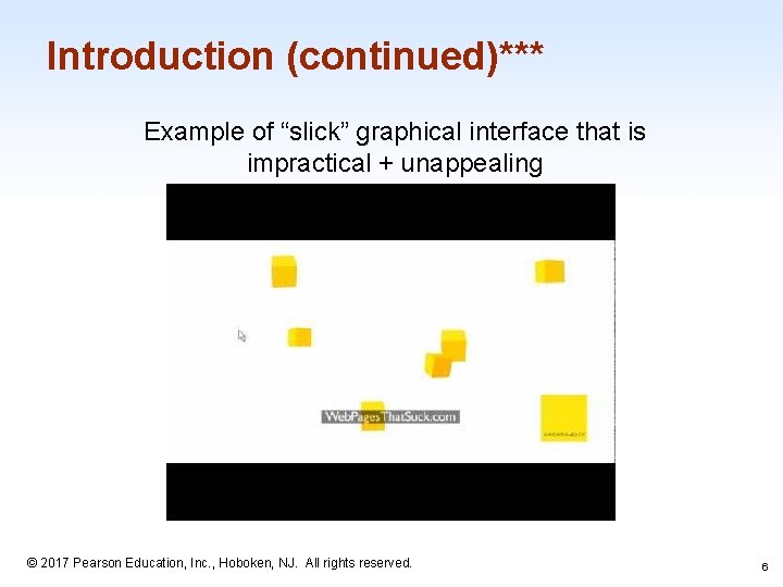
Introduction (continued)*** Example of “slick” graphical interface that is impractical + unappealing 1 -6 © 2017 Pearson Education, Inc. , Hoboken, NJ. All rights reserved. 6

Introduction (concluded) “The goal for designers is to enable fluid navigation that allows users to gracefully and confidently get to where they want to go, explore novel possible routes, and backtrack when necessary” - DTUI, 272 1 -7 © 2017 Pearson Education, Inc. , Hoboken, NJ. All rights reserved. 7

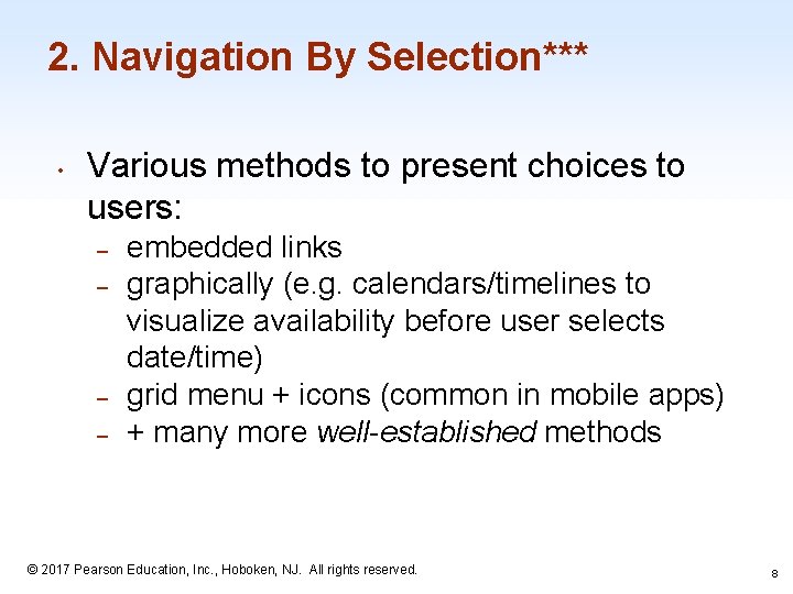
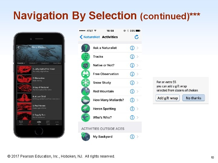
2. Navigation By Selection*** • Various methods to present choices to users: – – embedded links graphically (e. g. calendars/timelines to visualize availability before user selects date/time) grid menu + icons (common in mobile apps) + many more well-established methods 1 -8 © 2017 Pearson Education, Inc. , Hoboken, NJ. All rights reserved. 8

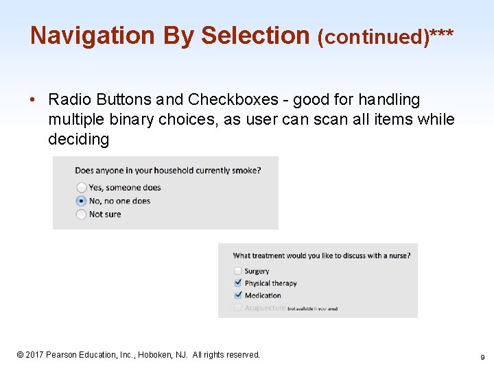
Navigation By Selection (continued)*** • Radio Buttons and Checkboxes - good for handling multiple binary choices, as user can scan all items while deciding 1 -9 © 2017 Pearson Education, Inc. , Hoboken, NJ. All rights reserved. 9

Navigation By Selection (continued)*** 1 -10 © 2017 Pearson Education, Inc. , Hoboken, NJ. All rights reserved. 10

Navigation By Selection (continued)*** • Menu bars, pop-up menus, toolbars, palettes and ribbons – typically found at the top of each application – positional constancy strong principle (e. g. gray out unavailable items for selection rather than remove from list, maintain order of File, Edit, View, and Help in menu bar) 1 -11 © 2017 Pearson Education, Inc. , Hoboken, NJ. All rights reserved. 11

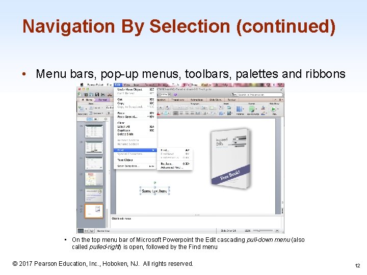
Navigation By Selection (continued) • Menu bars, pop-up menus, toolbars, palettes and ribbons • On the top menu bar of Microsoft Powerpoint the Edit cascading pull-down menu (also called pulled-right) is open, followed by the Find menu © 2017 Pearson Education, Inc. , Hoboken, NJ. All rights reserved. 1 -12 12

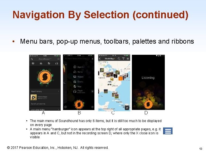
Navigation By Selection (continued) • Menu bars, pop-up menus, toolbars, palettes and ribbons A B C D • The main menu of Soundhound has only 6 items, but it is still too much to be displayed on every page • A main menu “hamburger” icon appears at the top right of all appropriate pages, e. g. it appears in A and C, but not in the recording screen D, where only the X close icon is visible © 2017 Pearson Education, Inc. , Hoboken, NJ. All rights reserved. 1 -13 13

Navigation By Selection (continued) Examples of common gestures and their effect: • Tap: select • Long press: varied, from magnified cursor (i. OS) to showing a tooltip (Windows 8) • Double tap: varied, e. g. zoom (i. OS) • Small swipe: varied, e. g. move location or order of objects, reveal a delete button • Large swipe: usually scroll • Rapid swipe or fling: fast scroll with inertia • Pinch and spread: zoom in and out • Variation with two or more fingers: varied effects © 2017 Pearson Education, Inc. , Hoboken, NJ. All rights reserved. 1 -14 14

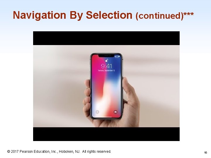
Navigation by Selection (continued)*** Gestures can speed interaction, but they are hard to discover. The same gestures on different objects (background, edge of screen, item) can perform different actions. • Consistent application of gestures remains an issue • important to ensure easy reversal of actions 1 -15 © 2017 Pearson Education, Inc. , Hoboken, NJ. All rights reserved. 15

Navigation By Selection (continued)*** 1 -16 © 2017 Pearson Education, Inc. , Hoboken, NJ. All rights reserved. 16

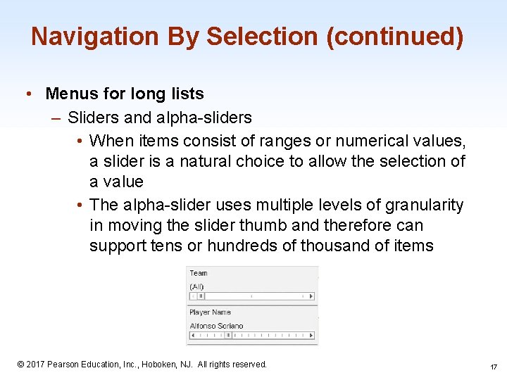
Navigation By Selection (continued) • Menus for long lists – Sliders and alpha-sliders • When items consist of ranges or numerical values, a slider is a natural choice to allow the selection of a value • The alpha-slider uses multiple levels of granularity in moving the slider thumb and therefore can support tens or hundreds of thousand of items 1 -17 © 2017 Pearson Education, Inc. , Hoboken, NJ. All rights reserved. 17

Navigation By Selection (continued)*** Linear vs Simultaneous Presentation • pizza-ordering interface might include a linear sequence of menus for users to choose size, toppings, and sides • installation wizards • simultaneous menus present multiple filters on a screen to enter choices in any order 1 -18 © 2017 Pearson Education, Inc. , Hoboken, NJ. All rights reserved. 18

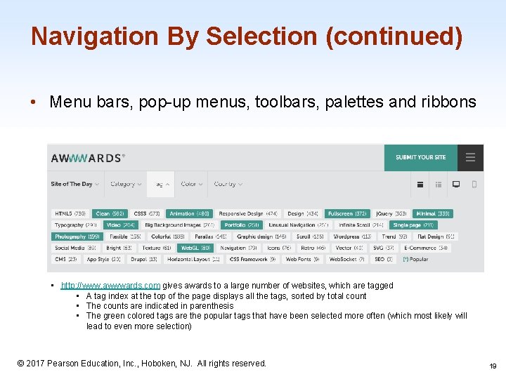
Navigation By Selection (continued) • Menu bars, pop-up menus, toolbars, palettes and ribbons • http: //www. awwwards. com gives awards to a large number of websites, which are tagged • A tag index at the top of the page displays all the tags, sorted by total count • The counts are indicated in parenthesis • The green colored tags are the popular tags that have been selected more often (which most likely will lead to even more selection) 1 -19 © 2017 Pearson Education, Inc. , Hoboken, NJ. All rights reserved. 19

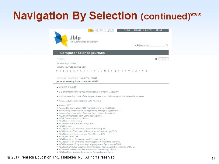
Navigation By Selection (continued)*** • text-only large 2 D menus aren’t always bad – – compact text menus allow users to rapidly scan hundreds of choices without dizzying effect of reorientation good for websites with little competition or sites whose success comes from access to lower-level pages through search 1 -20 © 2017 Pearson Education, Inc. , Hoboken, NJ. All rights reserved. 20

Navigation By Selection (continued)*** 1 -21 © 2017 Pearson Education, Inc. , Hoboken, NJ. All rights reserved. 21

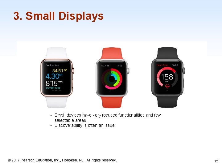
3. Small Displays • Small devices have very focused functionalities and few selectable areas. • Discoverability is often an issue 1 -22 © 2017 Pearson Education, Inc. , Hoboken, NJ. All rights reserved. 22

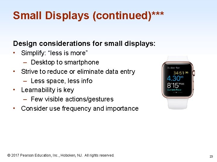
Small Displays (continued)*** Design considerations for small displays: • Simplify: “less is more” – Desktop to smartphone • Strive to reduce or eliminate data entry – Less space, less info • Learnability is key – Few visible actions/gestures • Consider use frequency and importance 1 -23 © 2017 Pearson Education, Inc. , Hoboken, NJ. All rights reserved. 23

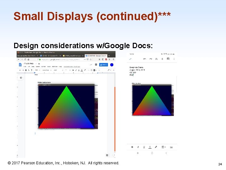
Small Displays (continued)*** Design considerations w/Google Docs: 1 -24 © 2017 Pearson Education, Inc. , Hoboken, NJ. All rights reserved. 24

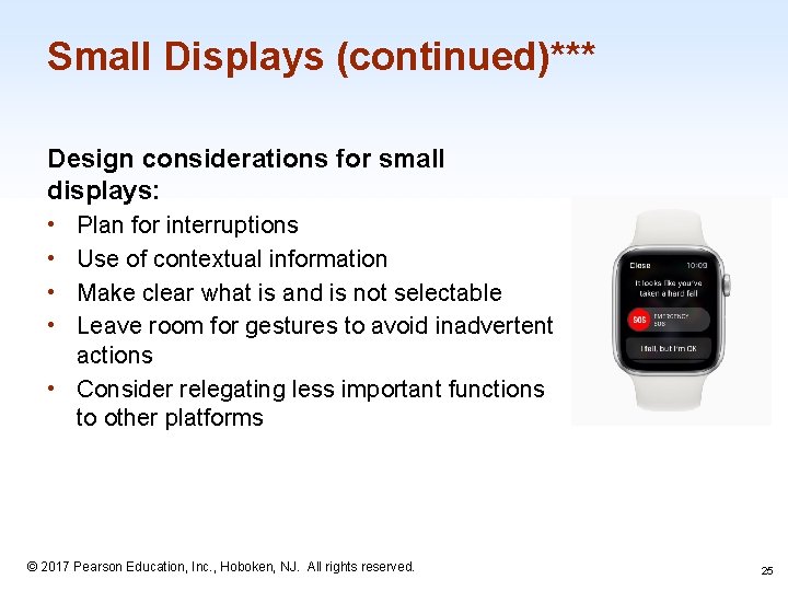
Small Displays (continued)*** Design considerations for small displays: Plan for interruptions Use of contextual information Make clear what is and is not selectable Leave room for gestures to avoid inadvertent actions • Consider relegating less important functions to other platforms • • 1 -25 © 2017 Pearson Education, Inc. , Hoboken, NJ. All rights reserved. 25

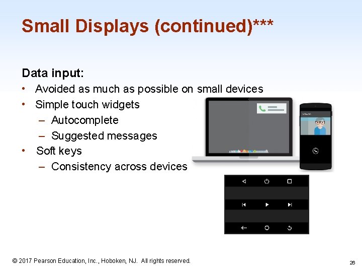
Small Displays (continued)*** Data input: • Avoided as much as possible on small devices • Simple touch widgets – Autocomplete – Suggested messages • Soft keys – Consistency across devices 1 -26 © 2017 Pearson Education, Inc. , Hoboken, NJ. All rights reserved. 26

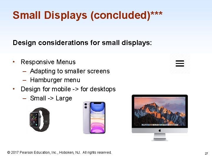
Small Displays (concluded)*** Design considerations for small displays: • Responsive Menus – Adapting to smaller screens – Hamburger menu • Design for mobile -> for desktops – Small -> Large 1 -27 © 2017 Pearson Education, Inc. , Hoboken, NJ. All rights reserved. 27

4. Content Organization • Organizing menus in a meaningful structure results in faster selection time and higher user satisfaction • Approaches: – Linear sequence (e. g. in a wizard or survey) – Hierarchical structure that is natural and comprehensible (e. g. a store split into departments) – Network structure when choices may be reachable by more than one path (e. g. websites) 1 -28 © 2017 Pearson Education, Inc. , Hoboken, NJ. All rights reserved. 28

Content Organization (continued) • Content organization design: – Tree-structure: designers can form categories of similar items, e. g. online grocery markets divided into produce, meat, dairy, etc. further divided into vegetables, fruit, etc. for produce, and milk, cheese, etc. for dairy – Breadth versus depth: the depth (number of levels) of a menu tree depends in part on the breadth (number of items per level) – Networks: choices may be reachable by more than one path, e. g. websites for online shopping that provide access to banking information from both the personal profile and the checkout section of a link structure 1 -29 © 2017 Pearson Education, Inc. , Hoboken, NJ. All rights reserved. 29

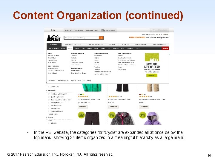
Content Organization (continued) • In the REI website, the categories for “Cycle” are expanded all at once below the top menu, showing 34 items organized in a meaningful hierarchy as a large menu 1 -30 © 2017 Pearson Education, Inc. , Hoboken, NJ. All rights reserved. 30

Content Organization (continued) • Rules forming menu trees: – Use task semantics to organize menus – Limit the number of levels (i. e. prefer broad–shallow to narrow– deep) – Create groups of logically similar items: e. g. Level 1: countries, Level 2: states, Level 3: cities – Form groups that cover all possibilities: e. g. Age ranges: [0– 9] [10 – 19] [20– 29] and [>= 30] – Make sure that items are non-overlapping: e. g. use “Concerts” and “Sports. ” over “Entertainment” and “Events” – Arrange items in each branch by natural sequence (not alphabetically) or group related items – Keep ordering of items fixed (or possibly duplicate frequent items 1 -31 in dedicated section of the menu) © 2017 Pearson Education, Inc. , Hoboken, NJ. All rights reserved. 31

***Content Organization (continued) • Additional considerations for content organization design include: – Sequence: order in which items are presented – Phrasing: how to title categories – Layout: design of the page 1 -32 © 2017 Pearson Education, Inc. , Hoboken, NJ. All rights reserved. 32

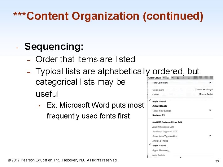
***Content Organization (continued) • Sequencing: – – Order that items are listed Typical lists are alphabetically ordered, but categorical lists may be useful • Ex. Microsoft Word puts most frequently used fonts first 1 -33 © 2017 Pearson Education, Inc. , Hoboken, NJ. All rights reserved. 33

***Content Organization (continued) • Phrasing: – Use familiar and consistent terminology • Ex. using the word “cart” for a shopping website – Ensure that items are distinct from one another • Ex. use “Bike Tours” and “Cruises” rather than “Slow Tours” and “Leisurely Voyages” – Use consistent and concise phrasing • Ex. use “Animals” rather than “Information about Animals” – Bring the keyword to the fore • Ex. use “Size of Font” rather than “Set the font size” 1 -34 © 2017 Pearson Education, Inc. , Hoboken, NJ. All rights reserved. 34

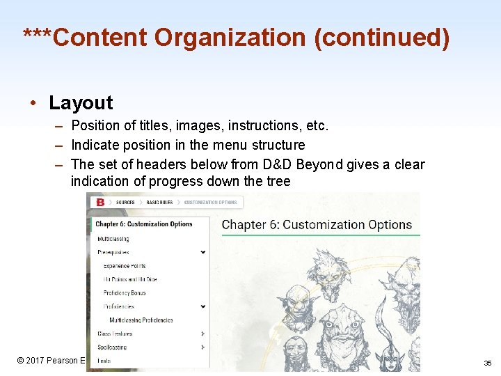
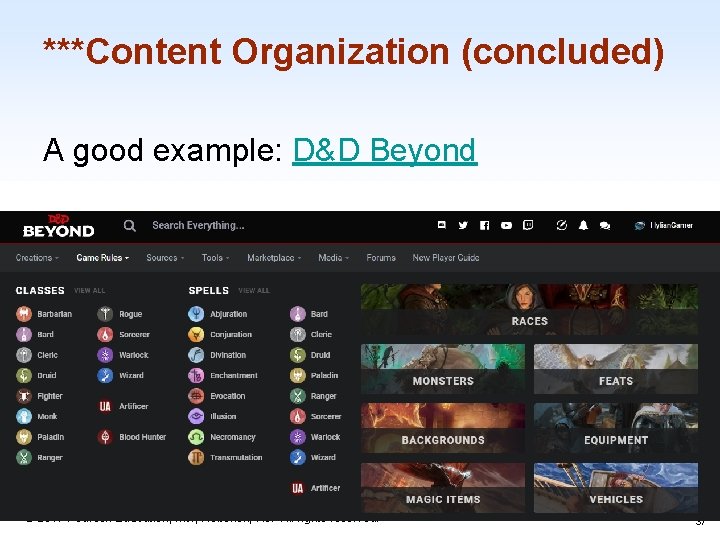
***Content Organization (continued) • Layout – Position of titles, images, instructions, etc. – Indicate position in the menu structure – The set of headers below from D&D Beyond gives a clear indication of progress down the tree 1 -35 © 2017 Pearson Education, Inc. , Hoboken, NJ. All rights reserved. 35

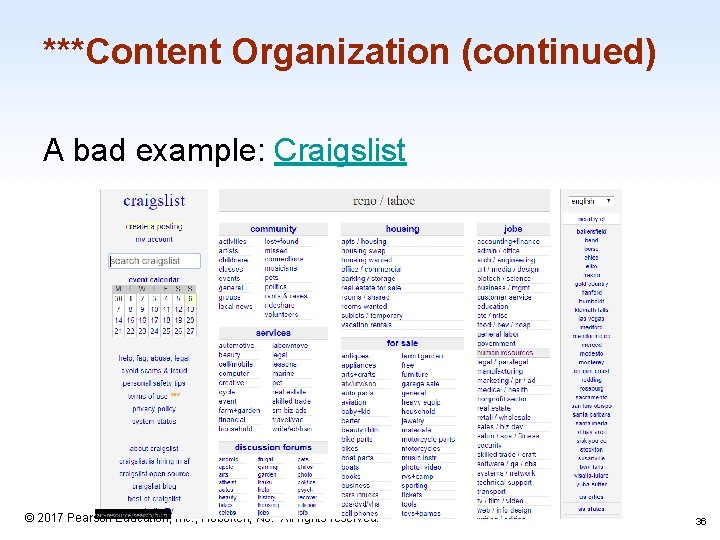
***Content Organization (continued) A bad example: Craigslist 1 -36 © 2017 Pearson Education, Inc. , Hoboken, NJ. All rights reserved. 36

***Content Organization (concluded) A good example: D&D Beyond 1 -37 © 2017 Pearson Education, Inc. , Hoboken, NJ. All rights reserved. 37

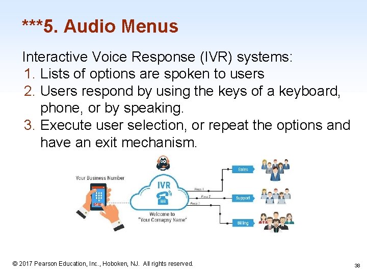
***5. Audio Menus Interactive Voice Response (IVR) systems: 1. Lists of options are spoken to users 2. Users respond by using the keys of a keyboard, phone, or by speaking. 3. Execute user selection, or repeat the options and have an exit mechanism. 1 -38 © 2017 Pearson Education, Inc. , Hoboken, NJ. All rights reserved. 38

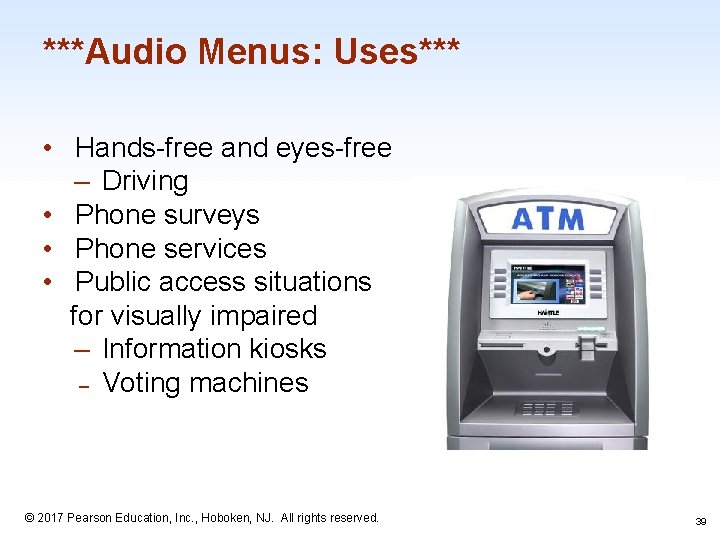
***Audio Menus: Uses*** • Hands-free and eyes-free – Driving • Phone surveys • Phone services • Public access situations for visually impaired – Information kiosks – Voting machines 1 -39 © 2017 Pearson Education, Inc. , Hoboken, NJ. All rights reserved. 39

***Audio Menus: Video*** Louis Rossmann 1 -40 © 2017 Pearson Education, Inc. , Hoboken, NJ. All rights reserved. 40

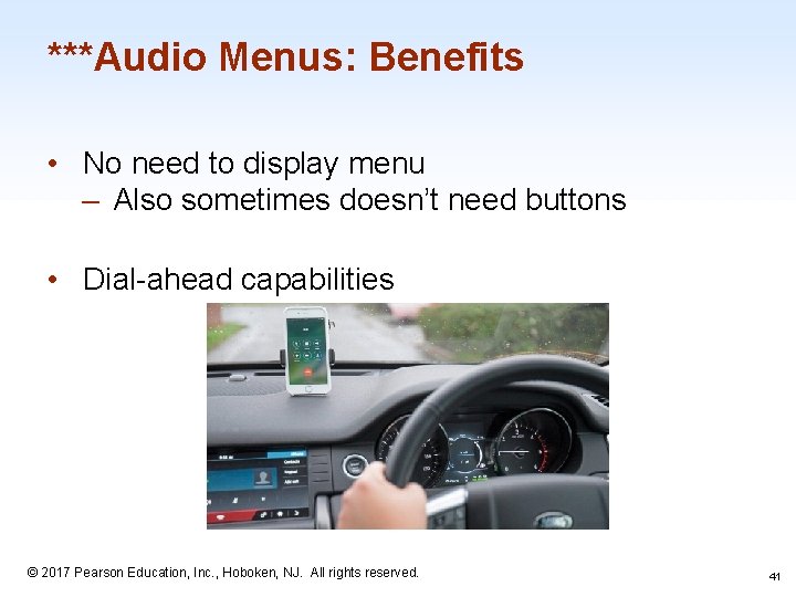
***Audio Menus: Benefits • No need to display menu – Also sometimes doesn’t need buttons • Dial-ahead capabilities 1 -41 © 2017 Pearson Education, Inc. , Hoboken, NJ. All rights reserved. 41

***Audio Menus: Downsides • • Memorization Confirmation step after selection Lack of clarity Might have too many options 1 -42 © 2017 Pearson Education, Inc. , Hoboken, NJ. All rights reserved. 42

***Audio Menus: Good Audio Menus Four key parts of a good audio menu: 1. 2. 3. 4. Know the user’s goals Common selections are said first Keep it simple. 3 -4 options is best Avoid the following phrase: “Listen carefully, as our menu options have recently changed” 1 -43 © 2017 Pearson Education, Inc. , Hoboken, NJ. All rights reserved. 43

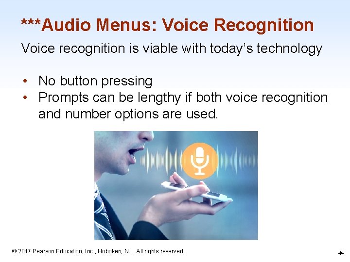
***Audio Menus: Voice Recognition Voice recognition is viable with today’s technology • No button pressing • Prompts can be lengthy if both voice recognition and number options are used. 1 -44 © 2017 Pearson Education, Inc. , Hoboken, NJ. All rights reserved. 44

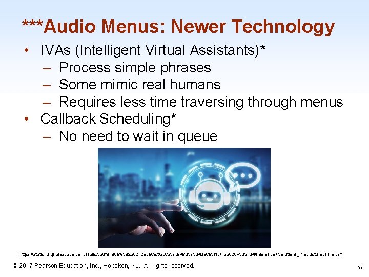
***Audio Menus: Newer Technology • IVAs (Intelligent Virtual Assistants)* – Process simple phrases – Some mimic real humans – Requires less time traversing through menus • Callback Scheduling* – No need to wait in queue *https: //static 1. squarespace. com/static/5 a 8 f 9198 f 79392 a 0212 ecb 6 e/t/5 c 663 ddd 4785 d 3840 e 6 b 3 f 1 b/1550204385104/Inference+Solutions_Product. Brochure. pdf © 2017 Pearson Education, Inc. , Hoboken, NJ. All rights reserved. 1 -45 45

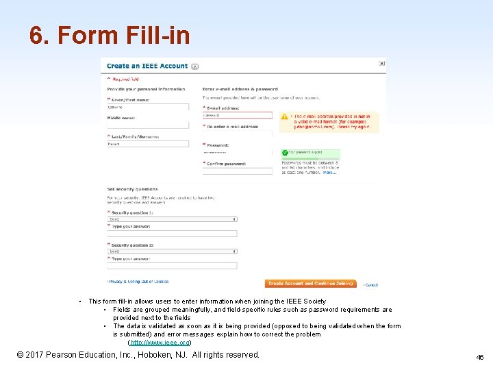
6. Form Fill-in • This form fill-in allows users to enter information when joining the IEEE Society • Fields are grouped meaningfully, and field-specific rules such as password requirements are provided next to the fields • The data is validated as soon as it is being provided (opposed to being validated when the form is submitted) and error messages explain how to correct the problem (http: //www. ieee. org) © 2017 Pearson Education, Inc. , Hoboken, NJ. All rights reserved. 1 -46 46

Data Entry with Form Fill-in • Form Fill-in – Appropriate when many fields of data must be entered: • Full complement of information is visible to user • Display resembles familiar paper forms • Few instructions are required for many types of entries – Users must be familiar with: • Keyboards • Use of TAB key or mouse to move the cursor • Error correction methods • Field-label meanings • Permissible field contents • Use of the ENTER and/or RETURN key 1 -47 © 2017 Pearson Education, Inc. , Hoboken, NJ. All rights reserved. 47

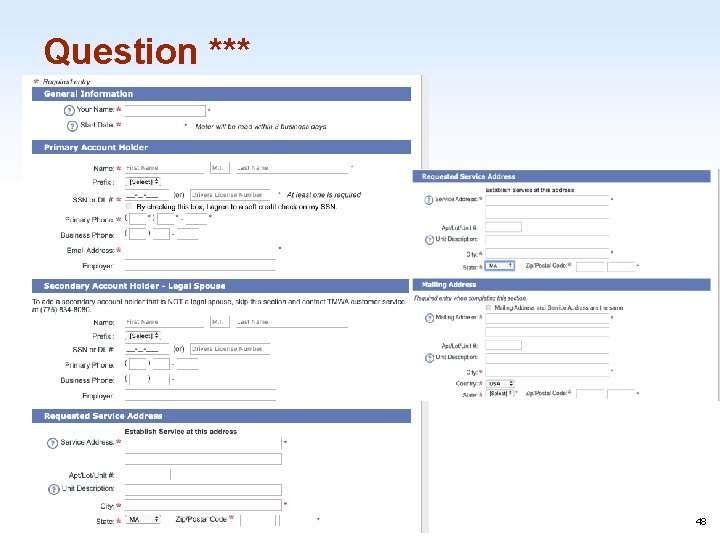
Question *** 1 -48 © 2017 Pearson Education, Inc. , Hoboken, NJ. All rights reserved. 48

Rules of Thumb for Forms *** ● ● ● Provide feedback and validation Avoid duplicate fields Group similar fields Collect only the necessary information Don’t use custom input formats 1 -49 © 2017 Pearson Education, Inc. , Hoboken, NJ. All rights reserved. 49

Consequences of Bad Forms*** • • Can lead to user confusion Users won’t complete the form Inaccurate data Lost revenue 1 -50 © 2017 Pearson Education, Inc. , Hoboken, NJ. All rights reserved. 50

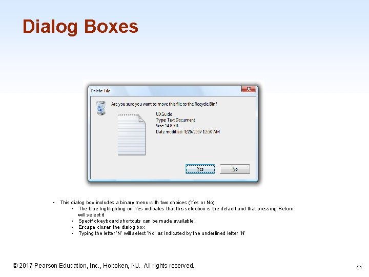
Dialog Boxes • This dialog box includes a binary menu with two choices (Yes or No) • The blue highlighting on Yes indicates that this selection is the default and that pressing Return will select it • Specific keyboard shortcuts can be made available • Escape closes the dialog box • Typing the letter ‘N’ will select ‘No’ as indicated by the underlined letter ‘N’ 1 -51 © 2017 Pearson Education, Inc. , Hoboken, NJ. All rights reserved. 51

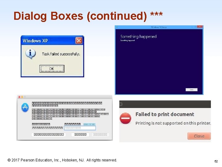
Dialog Boxes (continued) *** 1 -52 © 2017 Pearson Education, Inc. , Hoboken, NJ. All rights reserved. 52

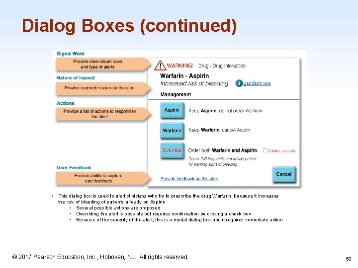
Dialog Boxes (continued) • This dialog box is used to alert clinicians who try to prescribe the drug Warfarin, because it increases the risk of bleeding of patients already on Aspirin • Several possible actions are proposed • Overriding the alert is possible but requires confirmation by clicking a check box • Because of the severity of the alert, this is a modal dialog box and it requires immediate action 1 -53 © 2017 Pearson Education, Inc. , Hoboken, NJ. All rights reserved. 53

Data Entry with Dialog Boxes • Dialog Boxes – Combination of menu and form fill-in techniques – Internal layout guidelines: • • Meaningful title, consistent style Top-left to bottom-right sequencing Clustering and emphasis Consistent layouts (margins, grid, white space, lines, boxes) Consistent terminology, fonts, capitalization, justification Standard buttons (OK, Cancel) Error prevention by direct manipulation 1 -54 © 2017 Pearson Education, Inc. , Hoboken, NJ. All rights reserved. 54

Data Entry with Dialog Boxes (concluded) • Dialog Boxes – External Relationship • Smooth appearance and disappearance • Distinguishable but small boundary • Size small enough to reduce overlap problems • Display close to appropriate items • No overlap of required items • Easy to make disappear • Clear how to complete/cancel 1 -55 © 2017 Pearson Education, Inc. , Hoboken, NJ. All rights reserved. 6 -55