typography LOGO D E S I G N


- Slides: 36
& typography LOGO D E S I G N
This presentation should only be viewed AFTER the presentation on Typography. You will already need to know about type families; fonts to avoid; typography principles; kerning, leading, tracking; concordance, conflicting and contrasting type; and fundamental design elements and principles.
What is a brand?
What is a brand? o “A brand is a simple mental model that collectively represents what people feel, think and say about a product, service or company, and where meaning is established over time through consistent positive experiences and engagements” (Elizabeth Talerman, Nucleus Branding).
What is a logo?
What is a logo? o A logo is a graphic representation of a company name, trademark, abbreviation, etc. , often uniquely designed for ready recognition.
Which program can be used to create logos? A. Photoshop B. Illustrator C. In. Design D. Any of the above
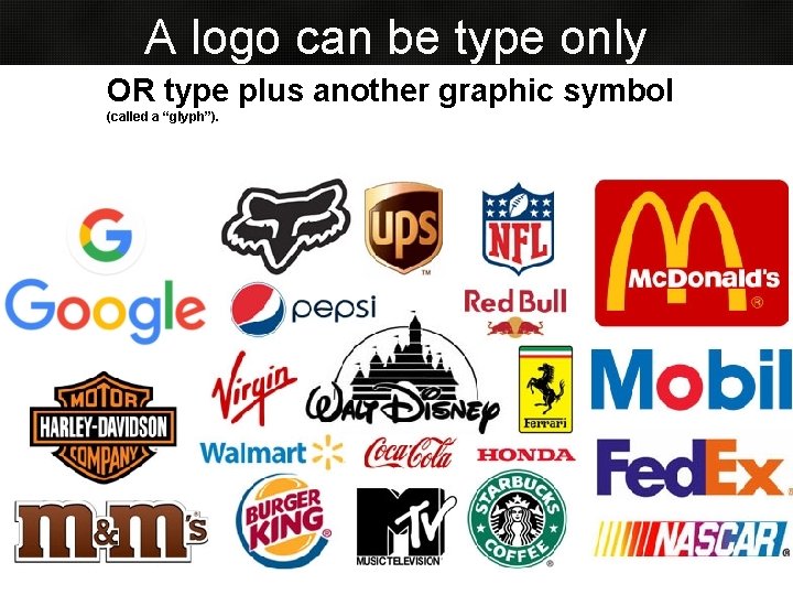
A logo can be type only OR type plus another graphic symbol (called a “glyph”).
Logos are “sacred ground. ”
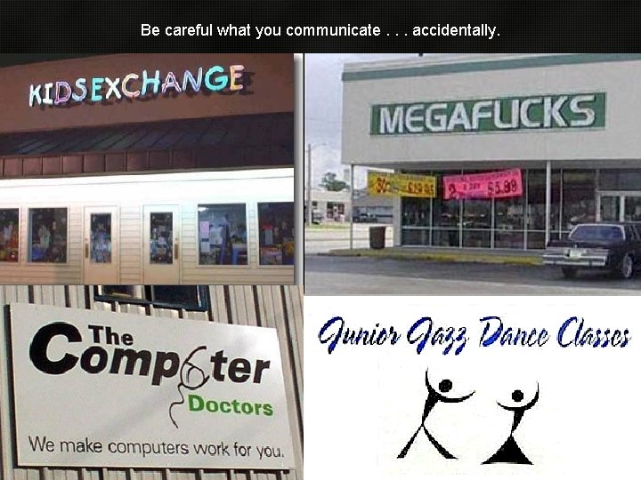
Be careful what you communicate. . . accidentally.
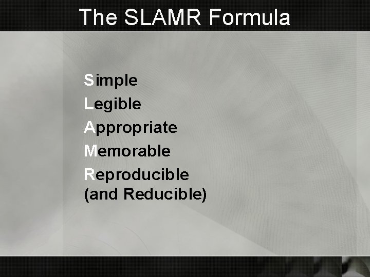
The SLAMR Formula Simple Legible Appropriate Memorable Reproducible (and Reducible)
S = Simple o The most recognized logos in the world are very simple, yet distinctive. That’s the challenge.
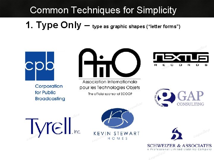
Common Techniques for Simplicity 1. Type Only – type as graphic shapes (“letter forms”)
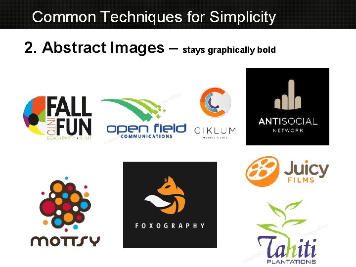
Common Techniques for Simplicity 2. Abstract Images – stays graphically bold
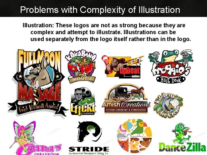
Problems with Complexity of Illustration: These logos are not as strong because they are complex and attempt to illustrate. Illustrations can be used separately from the logo itself rather than in the logo.
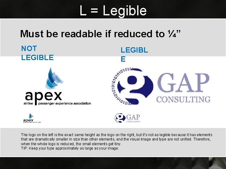
L = Legible Must be readable if reduced to ¼” NOT LEGIBLE LEGIBL E The logo on the left is the exact same height as the logo on the right, but it’s not as legible because it has elements that are dramatically smaller in size than other elements, and the visual image and type are not unified. Therefore, when the whole logo is reduced, the small elements get tiny. TIP: Keep your type approximately as large as your image.
This logo is not legible when reduced to ¼”. It’s also outdated, muddy, and busy.
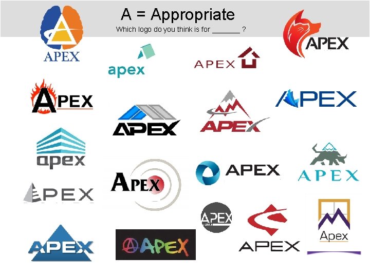
A = Appropriate Which logo do you think is for _______ ?
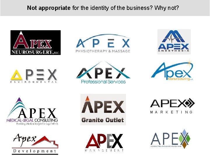
Not appropriate for the identity of the business? Why not? M A R K E T I N G
M = Memorable o Simple logos must still be memorable, unique o Do you recognize this logo?
M = Memorable o Simple logos must still be memorable, unique
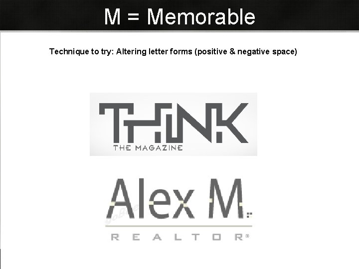
M = Memorable Technique to try: Altering letter forms (positive & negative space)
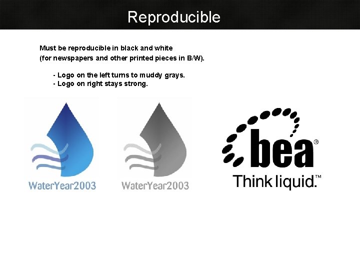
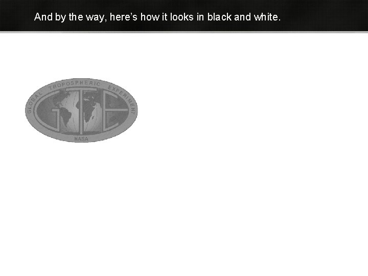
Reproducible Must be reproducible in black and white (for newspapers and other printed pieces in B/W). - Logo on the left turns to muddy grays. - Logo on right stays strong.
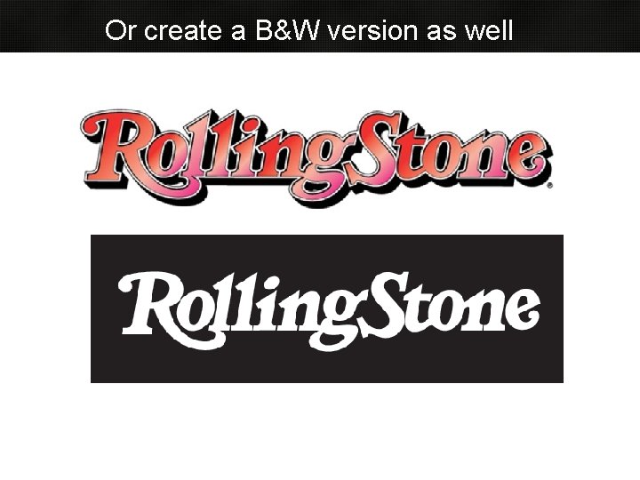
Or create a B&W version as well
Final Concepts
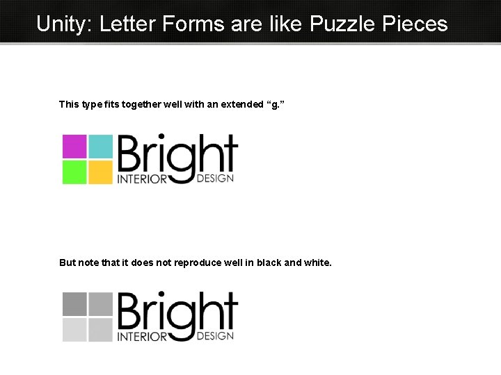
Unity: Letter Forms are like Puzzle Pieces This type fits together well with an extended “g. ” But note that it does not reproduce well in black and white.
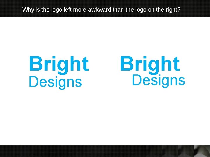
Why is the logo left more awkward than the logo on the right? Bright Designs
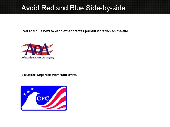
Avoid Red and Blue Side-by-side Red and blue next to each other creates painful vibration on the eye. Solution: Separate them with white.
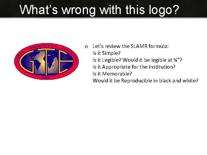
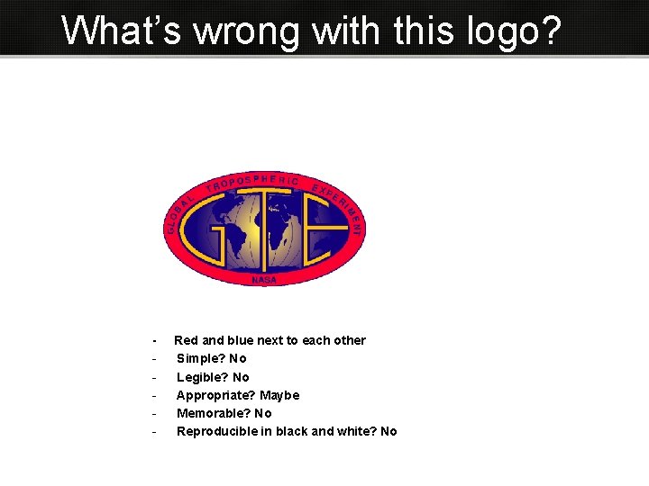
What’s wrong with this logo? o Let’s review the SLAMR formula: Is it Simple? Is it Legible? Would it be legible at ¼”? Is it Appropriate for the institution? Is it Memorable? Would it be Reproducible in black and white?
And by the way, here’s how it looks in black and white.
What’s wrong with these? Instituto de Estudos Orientais
QUESTIONS? © 2007 Juliet Davis
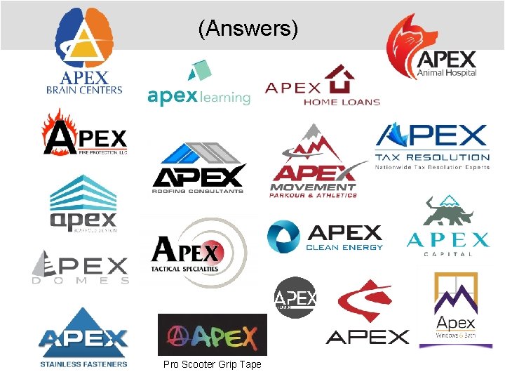
(Answers) Pro Scooter Grip Tape
What’s wrong with this logo? - Red and blue next to each other Simple? No Legible? No Appropriate? Maybe Memorable? No Reproducible in black and white? No
Old Slide