
Typography ANATOMY AND USAGE OF TYPE FOR GRAPHIC


- Slides: 30
Typography ANATOMY AND USAGE OF TYPE FOR GRAPHIC DESIGNERS
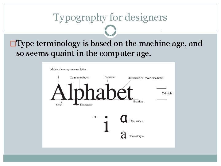
Typography for designers �Type terminology is based on the machine age, and so seems quaint in the computer age.
Typography for designers �Type is measured in points and picas. � 12 points (pts)=1 pica (p); 6 picas=1 inch. �Display type is generally measured in units of 6 or 12 pts. �“Agate” type is very small, about 5 pt. Other body type is between 7 and 12 pts. �Display type is 14, 18, 24, 30, 36, 48 pts. Etc.
Typography for designers �Type is measured on the amount of space it sits on, the “stamp. ” �Type of the same point size can be larger or smaller depending on its x-height.
Typography for designers �A “font” is strictly speaking one size, one style of type, like a typewriter keyboard. �A typeface is all possible permutations of one font, as designed by a type designer.
Typography for designers �Leading (“ledding”) is the amount of space between each line of type. �Expressed in points: 12 pt type with 3 pts of leading between each line is called “twelve on fifteen, ” 12/15. �Type with no leading, such as 12/12, is “set solid. ” But it still has space between each line, due to size of the (now imaginary) stamp.
Typography for designers �Kerning is adjusting the amount of space between letters. (Strictly speaking, kerning is reducing space; letter spacing is increasing. ) Applies mostly to display text. �Tracking is the spacing between letters in body text.
Typography for designers We can separate typefaces into six broad categories or “races”: �Roman �Sans serif �Egyptian (slab serif) �Script �Blackletter �Novelty
Typography for designers �Roman (spelled with lower case “r”) dates from the beginning of printed books (“incunabula, ” before 1500) �As a serif style, it is still extensively used today.
Typography for designers Roman is so important that it is separated into three categories: �Old style �Transitional �Modern
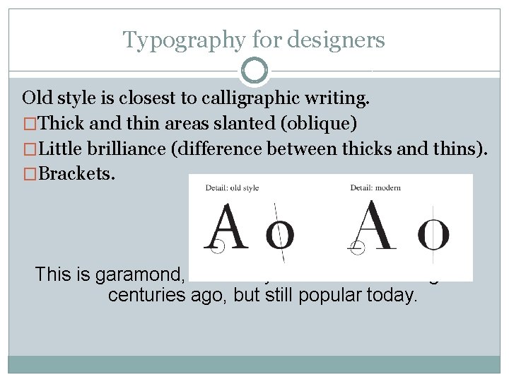
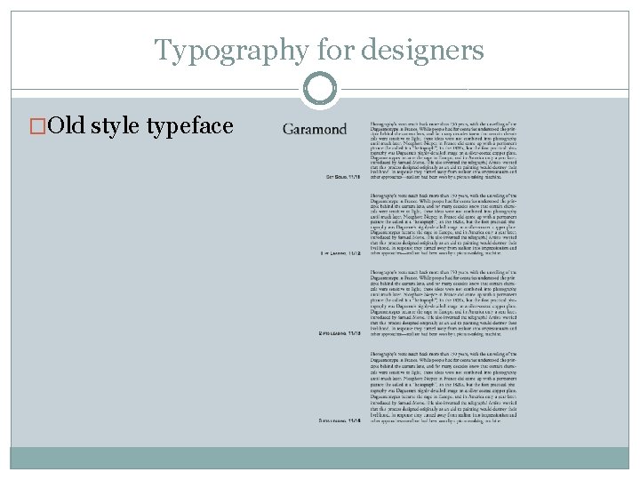
Typography for designers Old style is closest to calligraphic writing. �Thick and thin areas slanted (oblique) �Little brilliance (difference between thicks and thins). �Brackets. This is garamond, an old style roman face designed centuries ago, but still popular today.
Typography for designers �Roman transitional is less slanted, more brilliant, and less obvious brackets. It dates from 1700 s-early 1800 s. Baskerville is a typical transitional typeface commonly used today.
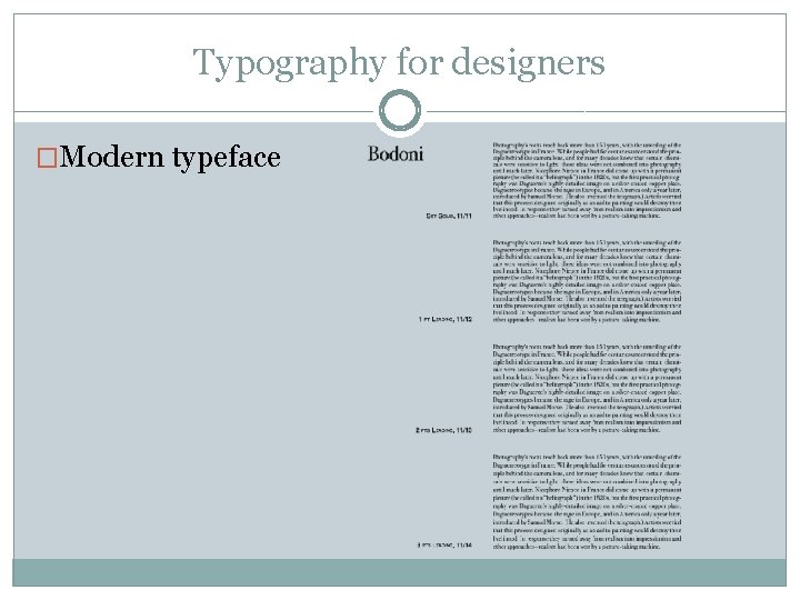
Typography for designers �Roman modern reflects machine-age ability to create metal type with no slant, strong brilliance, and no brackets. It dates from 1700 s as well. Bodoni is a commonly used modern roman typeface.
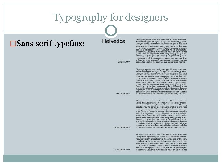
Typography for designers �Sans serif typefaces, or “sans, ” date from the early 1800 s, but became popular mostly in the last century. �“Form follows function, ” Bauhaus popularized sans. Helvetica is a popular sans serif style designed in the 1950 s. It is so widespread that it’s featured in a film, “Helvetica. ”
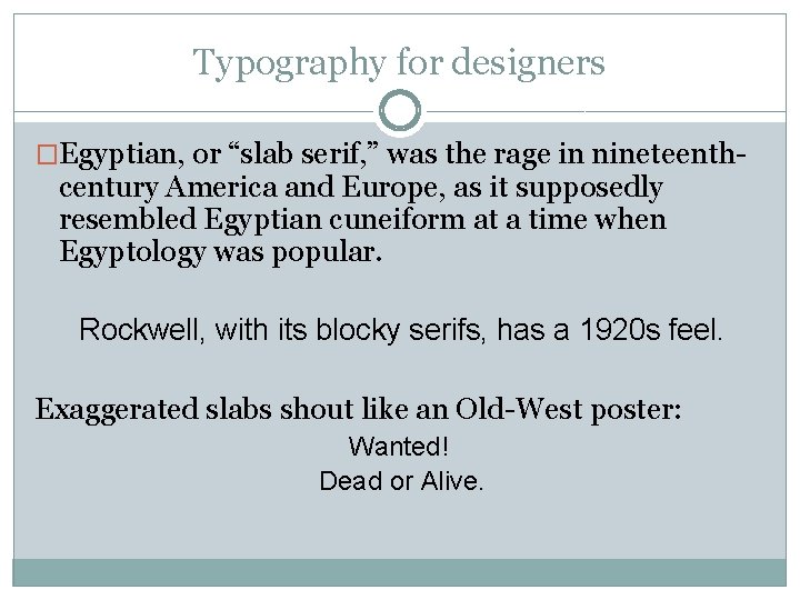
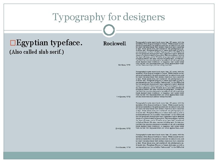
Typography for designers �Egyptian, or “slab serif, ” was the rage in nineteenth- century America and Europe, as it supposedly resembled Egyptian cuneiform at a time when Egyptology was popular. Rockwell, with its blocky serifs, has a 1920 s feel. Exaggerated slabs shout like an Old-West poster: Wanted! Dead or Alive.
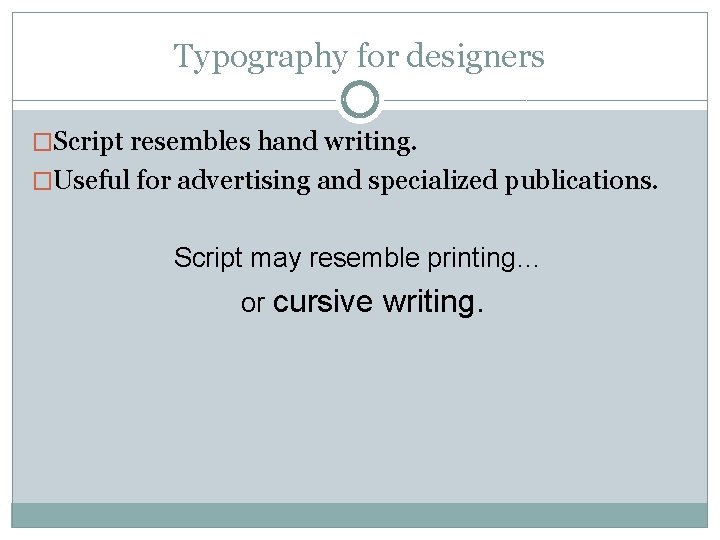
Typography for designers �Script resembles hand writing. �Useful for advertising and specialized publications. Script may resemble printing… or cursive writing.
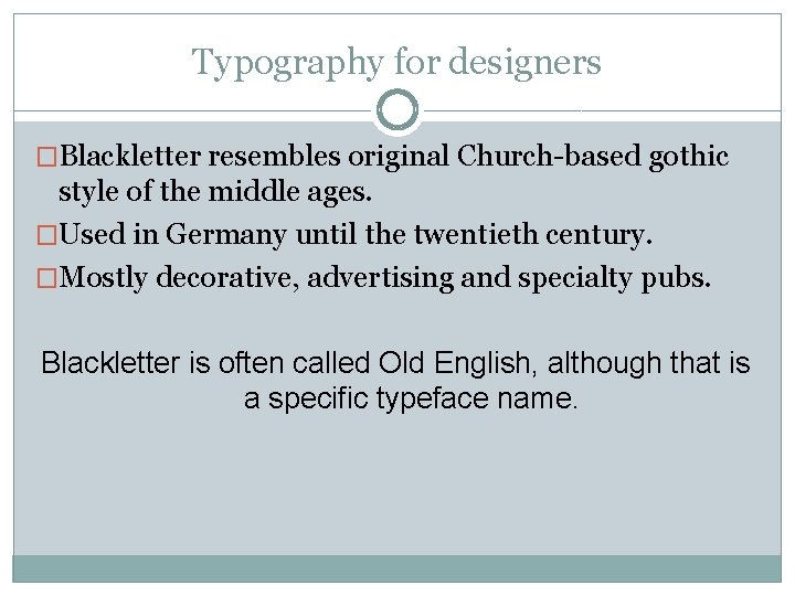
Typography for designers �Blackletter resembles original Church-based gothic style of the middle ages. �Used in Germany until the twentieth century. �Mostly decorative, advertising and specialty pubs. Blackletter is often called Old English, although that is a specific typeface name.
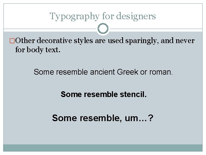
Typography for designers �Other decorative styles are used sparingly, and never for body text. Some resemble ancient Greek or roman. Some resemble stencil. Some resemble, um…?
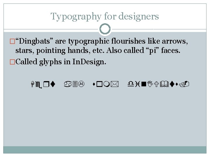
Typography for designers �“Dingbats” are typographic flourishes like arrows, stars, pointing hands, etc. Also called “pi” faces. �Called glyphs in In. Design. Hert a 3 L som* din. IU&ts.
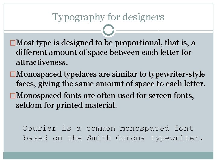
Typography for designers �Most type is designed to be proportional, that is, a different amount of space between each letter for attractiveness. �Monospaced typefaces are similar to typewriter-style faces, giving the same amount of space to each letter. �Monospaced fonts are often used for screen fonts, seldom for printed material. Courier is a common monospaced font based on the Smith Corona typewriter.
Typography for designers �Choosing body type and leading are critical to the personality and readability of your publication. �Old style type is nostalgic, eloquent, trustworthy, personal, traditional, sincere, informal. �Modern type is crisp, dressy, technical, modern, formal. �Sans serif type is contemporary and efficient. �Slab serif type is loud and persistent, not often used nowadays for body type. �Script, blackletter, fancy fonts are seldom body type.
Typography for designers �Old style typeface
Typography for designers �Modern typeface
Typography for designers �Sans serif typeface
Typography for designers �Egyptian typeface. (Also called slab serif. )
Typography for designers �Type choices also reflect historical usage and cultural tastes. �Cheltenham, a late-transitional face, was popular in the 1920 s, and so newspapers from that period are identified with “Roaring 20 s. ” �Bodoni was popular for headlines in the 1960 s. �Helvetica was popular in the 1970 s. �In choosing type, we need a sensitivity not only to our style of publication, but to zeitgeist—spirit of the day.
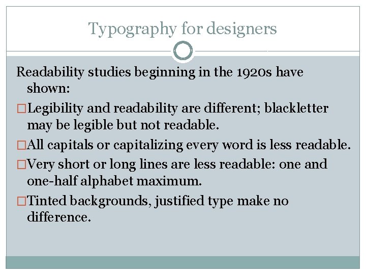
Typography for designers Readability studies beginning in the 1920 s have shown: �Legibility and readability are different; blackletter may be legible but not readable. �All capitals or capitalizing every word is less readable. �Very short or long lines are less readable: one and one-half alphabet maximum. �Tinted backgrounds, justified type make no difference.
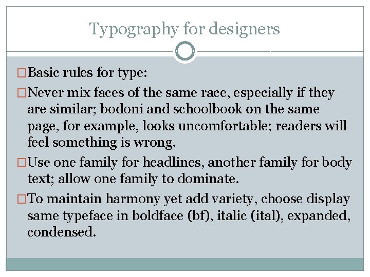
Typography for designers �Basic rules for type: �Never mix faces of the same race, especially if they are similar; bodoni and schoolbook on the same page, for example, looks uncomfortable; readers will feel something is wrong. �Use one family for headlines, another family for body text; allow one family to dominate. �To maintain harmony yet add variety, choose display same typeface in boldface (bf), italic (ital), expanded, condensed.
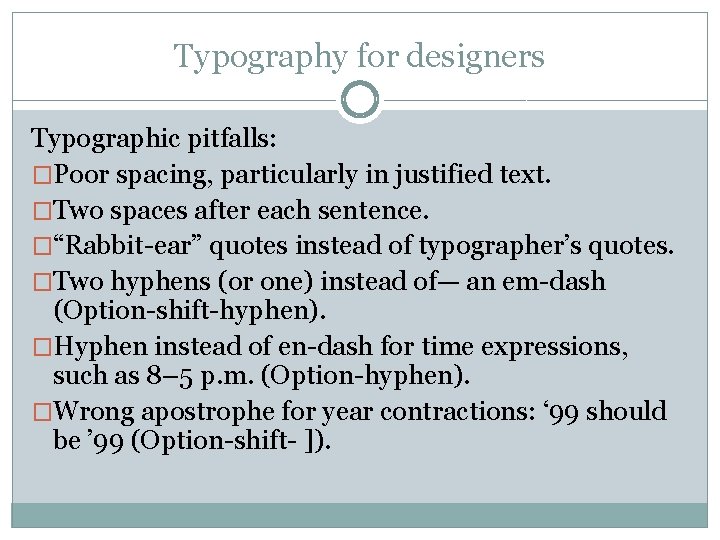
Typography for designers Typographic pitfalls: �Poor spacing, particularly in justified text. �Two spaces after each sentence. �“Rabbit-ear” quotes instead of typographer’s quotes. �Two hyphens (or one) instead of— an em-dash (Option-shift-hyphen). �Hyphen instead of en-dash for time expressions, such as 8– 5 p. m. (Option-hyphen). �Wrong apostrophe for year contractions: ‘ 99 should be ’ 99 (Option-shift- ]).
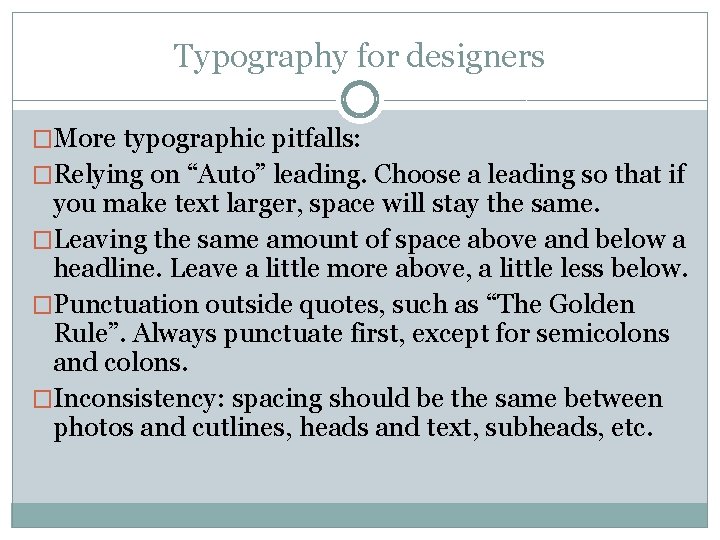
Typography for designers �More typographic pitfalls: �Relying on “Auto” leading. Choose a leading so that if you make text larger, space will stay the same. �Leaving the same amount of space above and below a headline. Leave a little more above, a little less below. �Punctuation outside quotes, such as “The Golden Rule”. Always punctuate first, except for semicolons and colons. �Inconsistency: spacing should be the same between photos and cutlines, heads and text, subheads, etc.