TL DR Leverage Data and Graphics To Make


![“[INFOGRAPHIC]” • Overused, Underwhelming • “[INFOGRAPHIC]” can be anything – Infographic != Data Visualization](https://slidetodoc.com/presentation_image_h/7c2f27e736ef79d786999d06f3d8ce91/image-4.jpg "“[INFOGRAPHIC]” • Overused, Underwhelming • “[INFOGRAPHIC]” can be anything – Infographic != Data Visualization")


 Original 1862:")


 – firm (name withheld) –")

")
 Affiliate (Others)")


?")


 a long text Link")


")


")
")


- Slides: 57
TL; DR: Leverage Data and Graphics To Make Your Long Stories Short Mike Sweeney, CPSM SMPS Virginia Annual Conference 2/24/2017
Happy Throwback Thursday! #tbt 2013
Happy Throwback Thursday! #tbt 2015
“[INFOGRAPHIC]” • Overused, Underwhelming • “[INFOGRAPHIC]” can be anything – Infographic != Data Visualization – Clickbait and “visual wallpaper” • They’re laborious to produce even when they fail • Not always worth the expense! (we’ll show you when)
Focus Of This Presentation • 2 case studies that show various problems and pitfalls • Specifically using infographics to market ideas, products, approaches • Not tool-centered, data-centered, or graphics-centered • Storytelling-centered
Context and Purpose Context: Who, Where, etc. Purpose: Why An Infographic? Original -> Redesign
Past Masters Three Famous Infographics And How They Got Made
“Figurative Map…Russian Campaign of 1812” Charles Joseph Minard, 1869 (This is the “Free Bird” of Infographics!)
“Coxcomb Diagrams” Florence Nightingale, 1869
Periodic Table Of The Elements Modern 1929: Deming (Merck & Co. ) Original 1862: De Chancourtois
“The properties of bodies are the properties of numbers. ” - A. E. B. De Chancourtois
“Coxcombs” F. Nightingale “Vis Tellurique” De Chancourtois “Free Bird!” C. J. Minard
Context, Purpose, and Passion • Minard – Remind France of the cost of its wars • Nightingale – Show that more soldiers were dying in hospital than in combat – Agitate for hospital funding • De Chancourtois – Demonstrate periodic function of known elements’ properties; present a system to guide search for new elements
Interlude #1: Data • With a partner, in 90 seconds: • Describe a problem you need to communicate visually – Who is your intended audience? (e. g. mgmt, team, public, client) – What data exists? – What format is the data in? – Is it complete or in progress?
Case 1: Show The Current State of A/E/C Marketing Ability How Do You Get An Entire Industry To Up Its Game?
Use An Infographic To: • Appeal to architects, marketers, and visual types • Show that A/E/C firms were slow or ineffective in marketing their projects on their website • Show the current state of normal • Show an alarming statistic • Show disproportionality and explain significance • Show all our data in an appealing way • Showcase the good actors, shame the bad actors – And encourage non-actors to participate!
Research Question How effective are A/E/C firms at marketing their newer work? To find out, Find information about recently completed and reported projects on member firm websites Source: Boston Society of Architects/AIA Chapter Letter Mar/Apr 132 projects : 42 member firms
Research Method – Variables • Recorded for each project – firm name – home page URL – type of firm – project name – project page URL (if present) – date website was reviewed – Project Status (category) – Did a project photograph appear in the publication? • Completed • Not Completed • Other • (Y/N)
Infographic Showed – Variables • Firm – Agility (…) – firm (name withheld) – type of firm discipline (color) – Firms relative to peers – Membership (2 categories) – Between • Core, Affiliate disciplines • Project – Between – Completion Status membership • (3 categories) groups – Online Status (Y/N)
Results – Projects • 132 projects : 42 member firms – 31 completed : 19 firms • 10 online : 7 firms
Results - Projects Online (All)
Results – Projects Online by Membership Type Core (Architecture) Affiliate (Others)
Infographic 1. 0
Infographic 1. 0
Results - Projects Online Completed Not Completed Other Online
Signal Quality – An Abstraction • Loosely based on proportion and count of Not Completed projects to all other statuses • Abstraction to Suggest (Incentive) a path to improvement • Introducing Signal Quality – Static – Low Signal – Medium Signal – Clear
Signal Quality by Group
Signal Quality by Company
Signal Quality by Company
Issues Encountered • Majority Bad Obscures Minority Good • Sizing hurt readability • Very small, very large numbers; all significant • No branding • Display conditions not known or chosen • Lengthy descriptions of categories, groupings, etc.
Redesign Resolved • Sizing and Siting • Focused attention on – Reporting Disproportionality – Differences in Quality (Agility) • Revealed two approaches to reporting/strategies
Infographic 2. 0
What Did The Infographic Achieve? • V 1. 0 -- Small Practice Owners (Architects)? – Healthy discussion, lively debate – “So What” – Lowering barrier didn’t change participation • V 2. 0 -- Chapter Letter Publisher (BSA) – Quantified their expectations about participation – Contract to bring this function from print to digital part of content strategy for website – Post implementation, print publication ceased
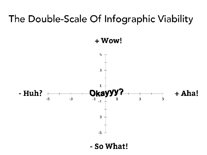
What Did The Infographic Achieve? 9 8 7 6 5 4 3 2 1 0 Huh? A-ha! Architects So What? ! BSA Wow!
Interlude #2: Story • With a partner, in 60 seconds: • With the problem you defined; – What is the story you need to tell? – What will your audience be hooked by? – What is their disposition toward you? – What should they take away? – How will they take action?
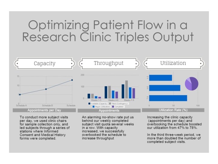
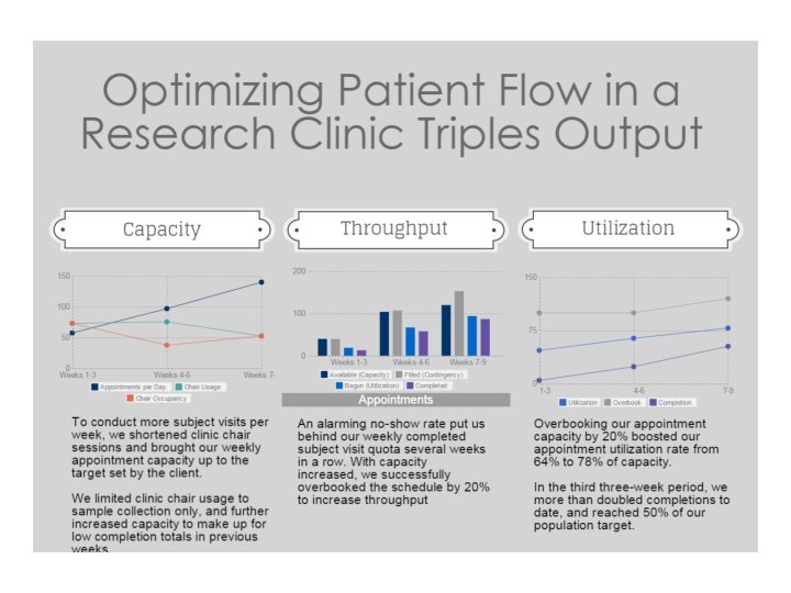
Case 2: Show Improvements Made On A Clinical Research Study How a 3 -chair dental research clinic saw 3 X its typical study population in a few weeks
Use an Infographic To • • Balance Out (or Reduce) a long text Link improved outcomes to process changes Show the severity of the challenge overcome Quantify Project Manager’s value-add to a nonindustry audience/reviewer • How a 3 -chair dental research clinic saw 3 X its typical study population in a few weeks
Abstracting The Data Appointments by Week 50 40 30 20 10 150 0 1 2 3 4 5 6 7 8 9 10 100 50 0 Weeks 1 -3 Weeks 4 -6 Weeks 7 -9 Clinic Capacity Available Schedule Capacity Clinic Capacity Utilized Completed
Optimizing Patient Flow To Triple Study Team Performance 180 160 140 120 100 80 60 40 To conduct more subject visits per day, we used clinic chairs for sample collection only, and led subjects through a series of stations where study paperwork was completed An alarming no-show rate put us behind our weekly completed appointment quota several weeks in a row. With capacity increased, we successfully overbooked the schedule to increase throughput These steps boosted our utilization from 47% to 78%. More subjects completed the protocol in the last three weeks than in the first six. 1. 2 X 78% 64% 47% 20 0 Weeks 1 -3 Weeks 4 -6 Clinic Capacity Available Schedule Capacity Clinic Capacity Utilized Completed Weeks 7 -9
Issues Encountered • • • Data contained too many anomalies Readability of text in siting Limitations of Tools Space constraints limited scope of infographic to only a portion of the entire case Missing data, disparate data; could not connect data together to present a case in numbers Numerals vs. object counts? How to show proportions, percent growth, percent difference Showing/highlighting statistics (KPIs) that were both dramatic and universal Portability and useful in multiple places
Revision: Success In 6 Lines! Appt. Length ~90 minutes Target Capacity 45 Appts/Wk Target Population 300 Subjects Chair Session Length (% of Appt Length) Booked Capacity (% of Target Capacity Chair Usage (% of Appt Length) Utilization (% of Actual Capacity) Actual Capacity (% of Target Capacity) Subjects Acquired (% of Target Population)
Redesign Resolved • Focus - Improving Clinic Operations • Showing Clearly Improving/Increasing Numbers • Focus reduced extraneous details from text narrative • Focuses, structures, and guides attention • Extensible • Issue: Sizing and siting affect readability
Interlude #3: Design • With a partner, in 60 seconds: • With the problem you defined; – Where will your audience view it? • List all known parameters – What will your audience be hooked by? – What is the most significant statistic, comparison, or relationship – and why? – Are there graphical languages or visual metaphors your audience will understand? – What are your data, story, design resources?
Sizing and Siting: The Two Banana Peels Of Infographic Design
Use Infographics For… • • Hero Image on Blog Thumbnail Image Social Share (Meme) Internal Presentation Branded Reference Guide Top Sheet/Cover Page Lead Magnet Process Map
Branded Reference Guide
Internal Presentation
Shareable (Meme)
Shareable (Meme)
Process Guide / Lead Magnet
Process Guide / Lead Magnet Directional Arrows For Clarity Gray triangles = email addresses Too literal design; Obscures relevant details to the message Pulley armature Is not a flow path Start
When To Use An Infographic? DO If: DON’T If: • You’re challenging conventional wisdom or “If-Then” logic • The data is behaving unexpectedly • You want to compare disparate data sets side-by-side • You want to establish that a pattern or relationship exists – or doesn’t • You want to show change or its lack • Traditional presentations don’t scale, require too much space, or don’t translate well to general audiences • You want to show everything • You don’t know what you’re trying to say with the infographic • A simple or short presentation is already possible • Data you’re trying to chart is close to each other (same table, database, etc. ) • You’re illustrating familiar or obvious information • You don’t know the display constraints • Your tools aren’t up to the task • You can say it in under 300 words
Resources • “Do You Really NEED An Infographic? ” – Full Report • “From ‘So What!’ To ‘Wow!’” – Article and Case Study • Checklist of Do’s and Don’ts – Available by email: info@designproductsystems. com • The Infographic Marketing Plan – Coming Soon!
Thank You! Mike Sweeney, CPSM info@Design. Product. Systems. com Linked. In In/michaelpsweeney Twitter @michaelpsweeney www. Design. Product. Systems. com