Graphic Design Oleh Lily Wulandari Graphic Design The





- Slides: 46

Graphic Design Oleh : Lily Wulandari

Graphic Design The “look & feel” portion of an interface What someone initially encounters - Conveys an impression, mood

Design Philosophy My personal preferences: 1 2 3 Economy of visual elements Less is more Clean, well organized

Graphic Design Principles 1 Metaphor 2 Clarity 3 Consistency 4 Alignment 5 Proximity 6 Contrast

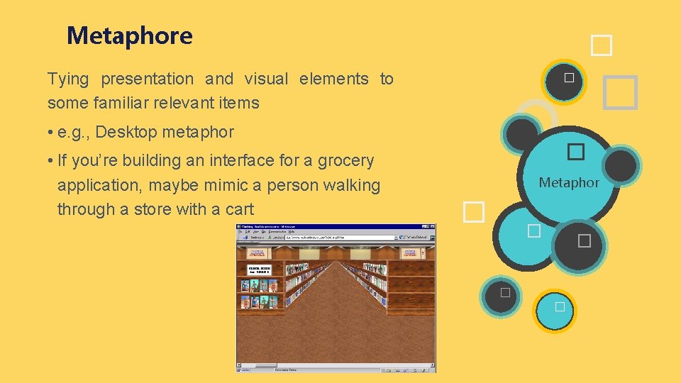
Metaphore � Tying presentation and visual elements to some familiar relevant items • e. g. , Desktop metaphor • If you’re building an interface for a grocery application, maybe mimic a person walking through a store with a cart � � � Metaphor � � �

Clarity Every element in an interface should have a reason for being there – Make that reason clear too! w White Space: • Leads the eye • Provides symmetry and balance through its use • Strengthens impact of message • Allows eye to rest between elements of activity a • Used to promote simplicity, elegance, class, refinement

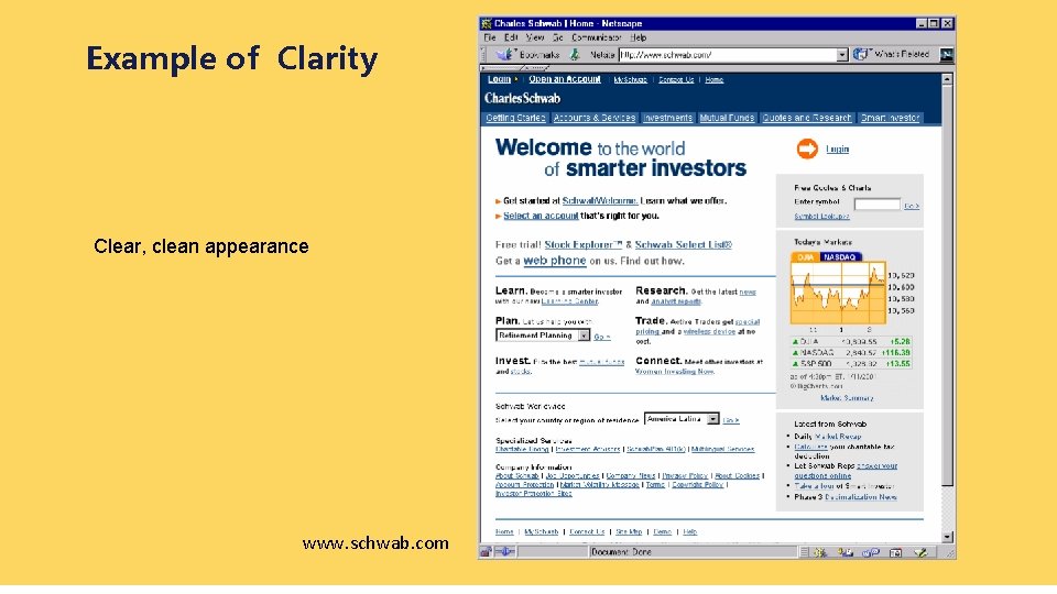
Example of Clarity Clear, clean appearance www. schwab. com

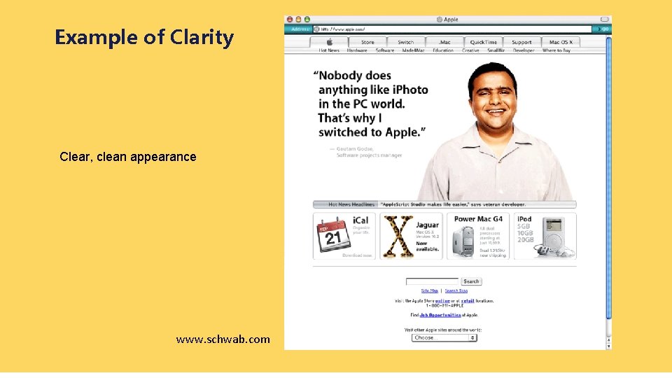
Example of Clarity Clear, clean appearance www. schwab. com

Consistency • In layout, color, images, typography, text, … icons, • Within screen, across screens • Stay within metaphor everywhere • Platform may have a style guide – Follow it!

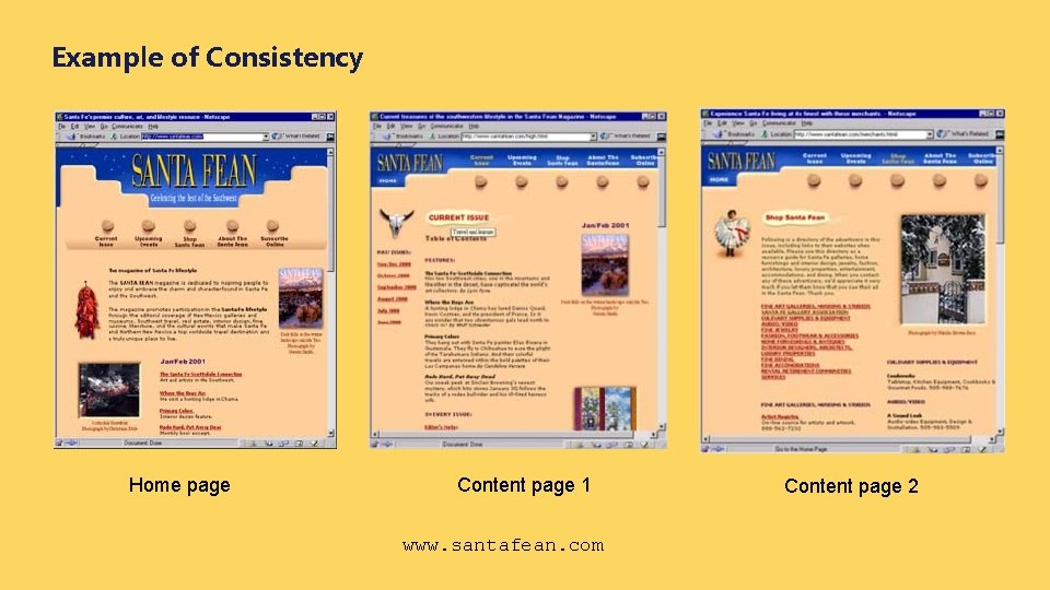
Example of Consistency Home page Content page 1 www. santafean. com Content page 2

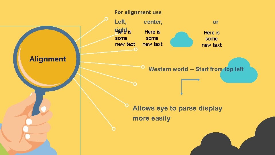
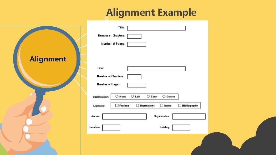
For alignment use Left, right Here is center, some new text Here is some new text or Here is some new text Alignment Western world – Start from top left Allows eye to parse display more easily

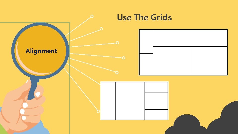
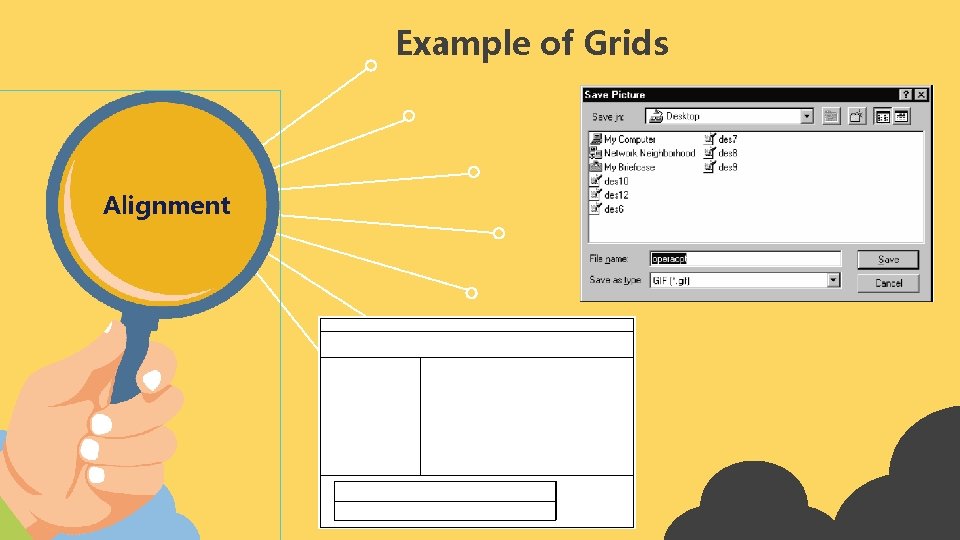
Grids Alignment • (Hidden) horizontal and vertical lines to help locate window components. • Align related things. • Group items logically. • Minimize number of controls, reduce clutter.

Use The Grids Alignment

Example of Grids Alignment

Alignment Example Alignment

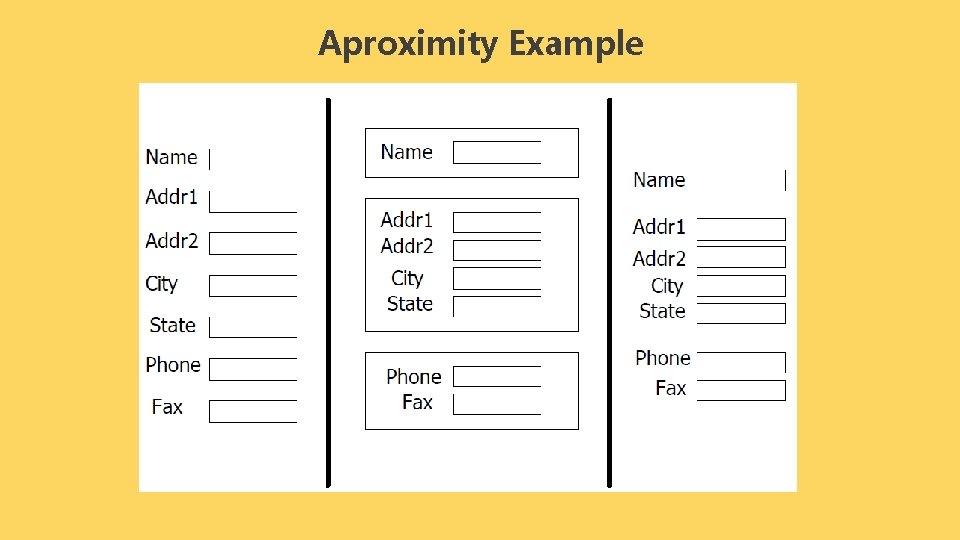
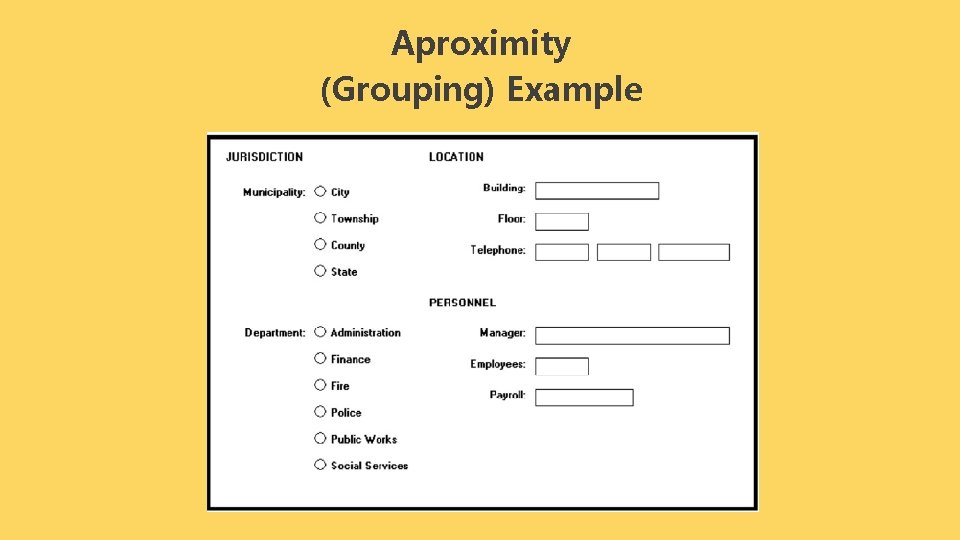
Proximity • Items close together appear to have a relationship. • Distance implies no relationship Time :

Aproximity Example

Aproximity (Grouping) Example

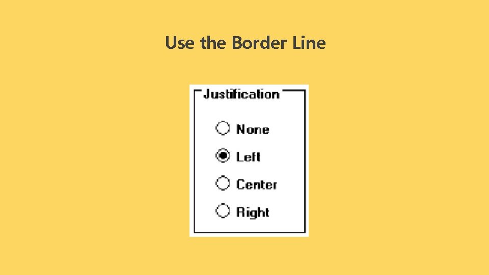
Use the Border Line

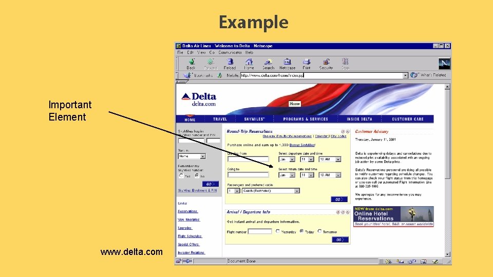
Contrast • Pulls you in • Guides your eyes around the interface • Supports skimming • Take advantage of contrast to add focus or to energize an interface • Can be used to distinguish active control • Can be used to set off most important item – Allow it to dominate • Ask yourself what is the most important item in the interface, highlight it • Use geometry to help sequencing

Example Important Element www. delta. com

Economy of Visual Elements 1 Less is more. 2 Minimize borders and heavy outlining, section boundaries (use whitespace) 3 Reduce clutter 4 Minimize the number of controls Coding Techniques • Blinking • It is suitable for attracting attention, but use as little as possible • Reverse Video, blod • Good for making something stand out • Again, use sparingly

PART ONE Typography

� Typography � � • Typography is an art and technique for organizing writing, writing design, and modifying written glyphs. • This writing arrangement involves: Typography ü Selection of typography ü Point size ü Line length, � � � ü Space bar (leading) ü Space adjustments between groups of letters (tracking) ü Adjustment of space between pairs of letters (kerning) � �

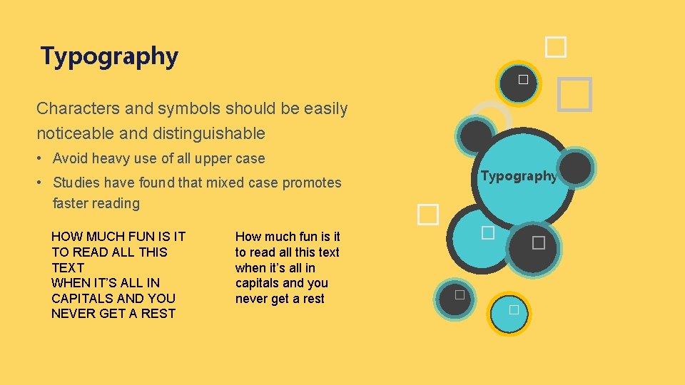
� Typography � � Characters and symbols should be easily noticeable and distinguishable • Avoid heavy use of all upper case • Studies have found that mixed case promotes faster reading HOW MUCH FUN IS IT TO READ ALL THIS TEXT WHEN IT’S ALL IN CAPITALS AND YOU NEVER GET A REST How much fun is it to read all this text when it’s all in capitals and you never get a rest Typography � � �

� Typography � � Readability : How easy is it to read a lot of text. • Associated with letter spacing, word spacing, leading that is too tight or loose, line spacing / vertical to separate lines of text to make it easier for readers and differentiating lines one from the previous or after. Typography � � �

� Typography � � Legibility : How easy is it to recognize a short burst of text. • Ensure that each individual character or glyph is unambiguous and can be distinguished from other characters in the font. • For example, the small letter h in the old italic style of writing is not legible in small size because the curved foot looks like the letter b. Typography � � �

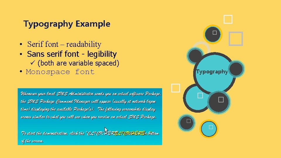
� Typography Example � � • Serif font – readability • Sans serif font - legibility ü (both are variable spaced) • Monospace font Typography � � �

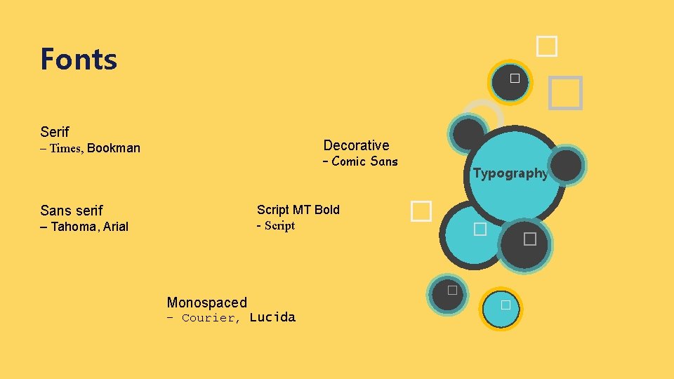
� Fonts � � Serif Decorative – Times, Bookman – Comic Sans Script MT Bold - Script Sans serif – Tahoma, Arial Monospaced – Courier, Lucida Typography � � �

� Guidelines Typography � � • Use serif for long, extended text; sans serif for “headlines” - Use 1 -2 fonts/typefaces (3 max) Typography - Use normal, italics, bold is OK - Never use bold, italics, capitals for large sections of text � � � - Use 1 -3 point sizes max - Be careful of text to background color issues � �

� Guidelines for Words � � • Do not use jargon, words, or unique terms that are only for the profession in the computer field, meaning different from outside the computer profession. • Don't use abbreviations or acronyms except those that are familiar. Typography � � • Use short and familiar words � • Use consistent words • Positive term • Don't chop words with hypernates � �

� Guidelines for Sentences � � • Short and simple • Directly and immediately can be used • Use affirmative (reinforcing) statements • In the order of temporal events Typography � � � • Structured sentences so that the main topic is at the beginning � �

Convention Guidelines � • Mnemonic key, is the letter of a command label / menu that is pressed to call the command, the letter that becomes the mnemonic key is underlined and is usually the first letter of the word. ü For example, for Save, which becomes a mnemonic key, is the letter S, so that Save is displayed. Typography � � • Button pressed at the same time � ü For example the shortcut key for Save is CTRL + S, undo is CTRL +Z • Field caption • Name given by the user or defined by the system. • Commands and actions. � � Use the convention to refer to the following: � �

PART TWO Color

Principles of Using Colors For accessibility • 8 percent of men and 0. 4 percent of women have color deficiency (partial or total color blindness). • Therefore color selection must be considered for those who have color deficiency For message perception in color: • Colors can have different meanings in different situations for different people. A color that is used in unexpected ways can cause confusion. • Differences in color connotations also exist between cultures. o For example red, in the United States is associated with danger, in Egypt with death, and in India with life o Incorrect use in different cultures can cause severe problems

Principles of Using Colors For indications of status, information and action: To show the necessary action, use warm colors. For example: red, orange, yellow To provide status or background information, use cool colors. For example: green, blue, purple To indicate status, use color: o Polite, normal or OK: green, blue or white. o Alert: yellow, orange, gold o Emergency or abnormal: red. The same color carries the same message.

Principles of Using Colors For emphasise • For practical attention or to emphasize elements, use bright or highlighted colors, such as red, blue. To not emphasize the element, use an underexposed color such as black. • Brightness perceptions of colors ranging from the least are white, yellow, green, blue, red. For message perception in color: • Don't use excessive colors, display colors no more than five colors at a time.

Principles of Using Colors Foreground • • Use colors that are in sharp contrast to the background color for text or data, use: ü Black ü Center of the spectrum of colors such as white, yellow, or green. Warm colors, more active colors ü Use colors that have the same saturation and lightness. ü To emphasize an element, use a highlight in the bright value of the background color: pure white or yellow

Principles of Using Colors Background • Use the background color to arrange a group of elements into a unified whole. • • Use colors that don't compete with the foreground. Use: ü Bright colored background with low intensity: off-white or gray light. ü Desaturated color ü Cold, dark colors like blue or black. ü Extreme spectral colors.

Color Association • Red hot, warning, aggression, love. • Pink female, cute, cotton candy. • Oranye autumn, warm, Halloween. • Yellow happy, caution, joy. • Brown warm, fall, dirt, earth. • Green lush, pastoral, envy. • Purple royal, sophisticated, Barney.

PART THREE ICON

ICON 01 02 03 Icons are often used to represent objects and actions where users can interact or can manipulate things. This type of icon may stand alone on the desktop or in a window, or grouped together in a toolbar. A secondary use of icons is to strengthen important information, such as a warning icon in the dialog message box.

ICON 04 Rogers (1989) provides an extended definition for types of icons: o Resemblance : an image that looks like the meaning. o Symbolic : an abstract image that represents something o Exemplar: picture that illustrates an example or characteristic of something o Arbitrary : an image is completely arbitrary in appearance which means it must be learned. o Analogy : physical or semantic images related to something.

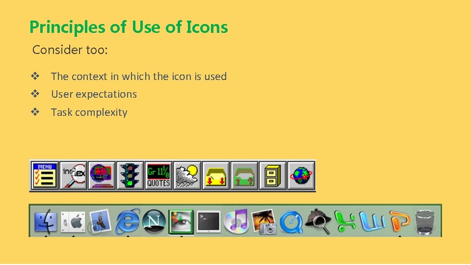
ICON 7 design principles for using icons: 1. Familiar : use familiar objects and are usually known to reduce learning time 2. Clear and legible : shape, structure, and information techniques provide a clear and unambiguous picture. 3. Simple : neat, simple, and not much decoration. 4. Consistent : the shape and structure of icons is consistent even though they are displayed in different sizes. 5. Direct : the meaning of a direct icon can be understood not only for concrete objects or actions but also adjectives, prepositions, and so on. For example for the concept of large, wide, etc. . 6. Efficient : in certain situations the use of icons cannot consume screen space beyond words. 7. Discriminable : the selected symbol must be visually distinguishable from other symbols.

Principles of Use of Icons Consider too: v The context in which the icon is used v User expectations v Task complexity

THANKS! Any Question?