10 IAT 102 Graphic Design 10 Review Early



- Slides: 33
10 IAT 102 Graphic Design
10 Review (Early Modern & New Typography) Swiss Style + New Typography Adrian Frutiger: Univers-Font Select project topic (vote)
08 IAT 102 Graphic Design
Early Modern Art the great experiment
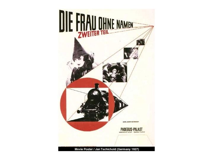
Jan Tschichold 1902 -1979 A Swiss national, he was a typographer, book designer, teacher and writer. Tschichold became a leading advocate of Modernist design: through his most noted work Die neue Typographie (The New Typography) This book was a manifesto of modern design, in which he condemned all fonts but sans-serif (called 'Grotesk' in Germany). He also favoured non-centered design (e. g. , on title pages), and codified many other Modernist design rules. Text and image source: Wikipedia
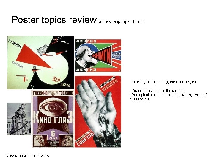
Poster topics review- a new language of form Futurists, Dada, De Stijl, the Bauhaus, etc. -Visual form becomes the content -Perceptual experience from the arrangement of these forms Russian Constructivists
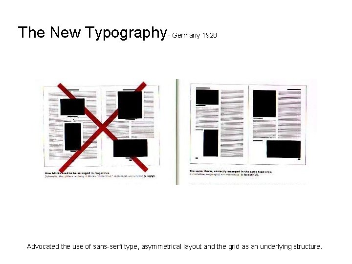
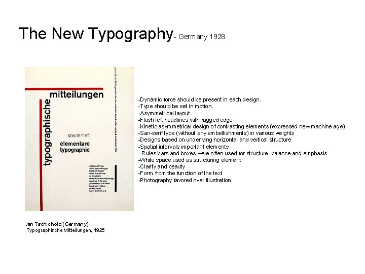
The New Typography- Germany 1928 Advocated the use of sans-serfi type, asymmetrical layout and the grid as an underlying structure.
The New Typography- Germany 1928 -Dynamic force should be present in each design. -Type should be set in motion. -Asymmetrical layout. -Flush left headlines with ragged edge -Kinetic asymmetrical design of contrasting elements (expressed new machine age) -San-serif type (without any embellishments) in various weights -Designs based on underlying horizontal and vertical structure -Spatial intervals important elements - Rules bars and boxes were often used for structure, balance and emphasis -White space used as structuring element -Clarity and beauty -Form from the function of the text -Photography favored over illustration Jan Tschichold (Germany): Typographische Mitteilungen, 1925
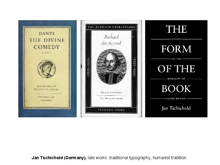
Jan Tschichold (Germany), late works: traditional typography, humanist tradition
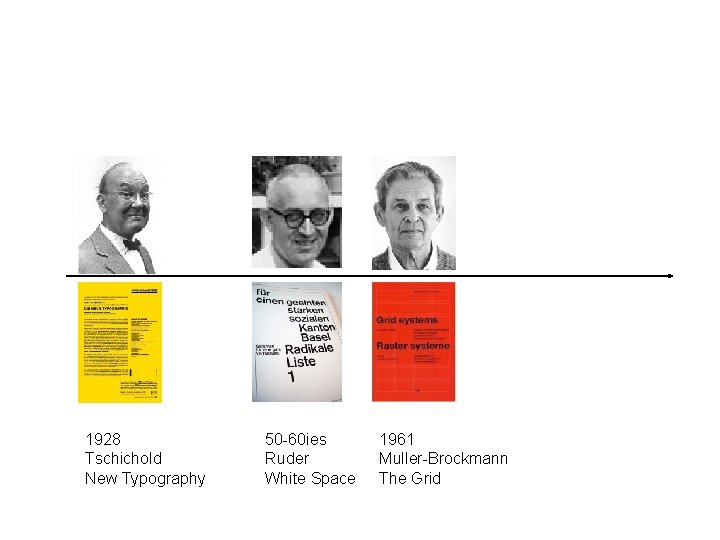
1928 Tschichold New Typography 50 -60 ies Ruder White Space 1961 Muller-Brockmann The Grid
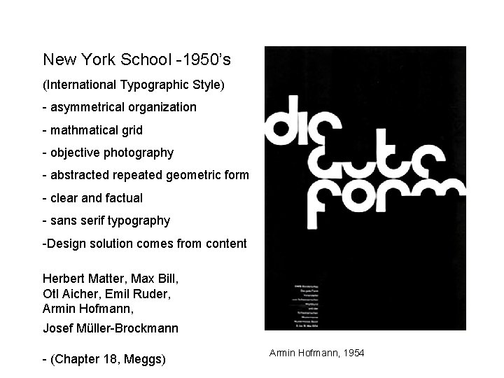
New York School -1950’s (International Typographic Style) - asymmetrical organization - mathmatical grid - objective photography - abstracted repeated geometric form - clear and factual - sans serif typography -Design solution comes from content Herbert Matter, Max Bill, Otl Aicher, Emil Ruder, Armin Hofmann, Josef Müller-Brockmann - (Chapter 18, Meggs) Armin Hofmann, 1954
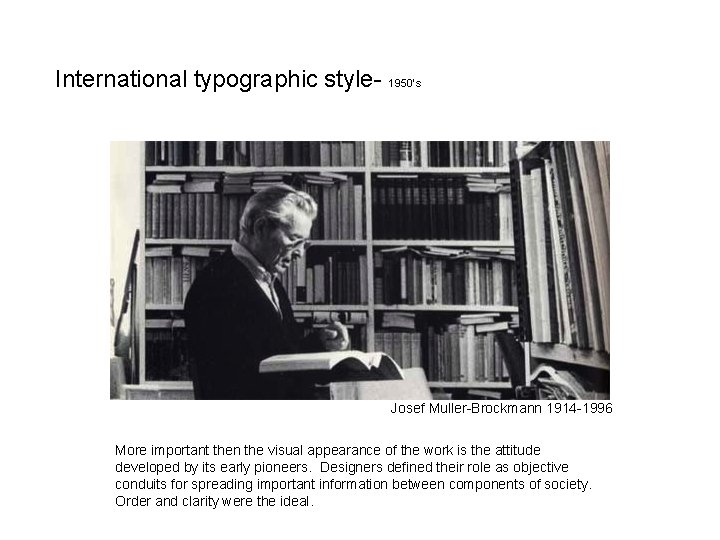
International typographic style- 1950’s Josef Muller-Brockmann 1914 -1996 More important then the visual appearance of the work is the attitude developed by its early pioneers. Designers defined their role as objective conduits for spreading important information between components of society. Order and clarity were the ideal.
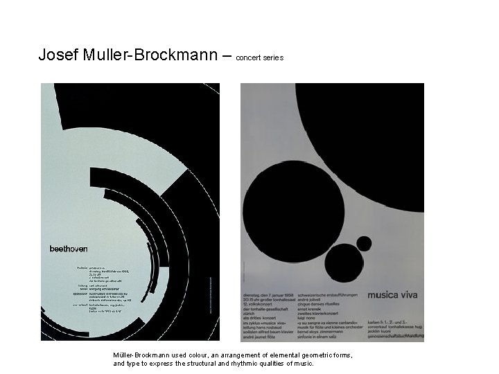
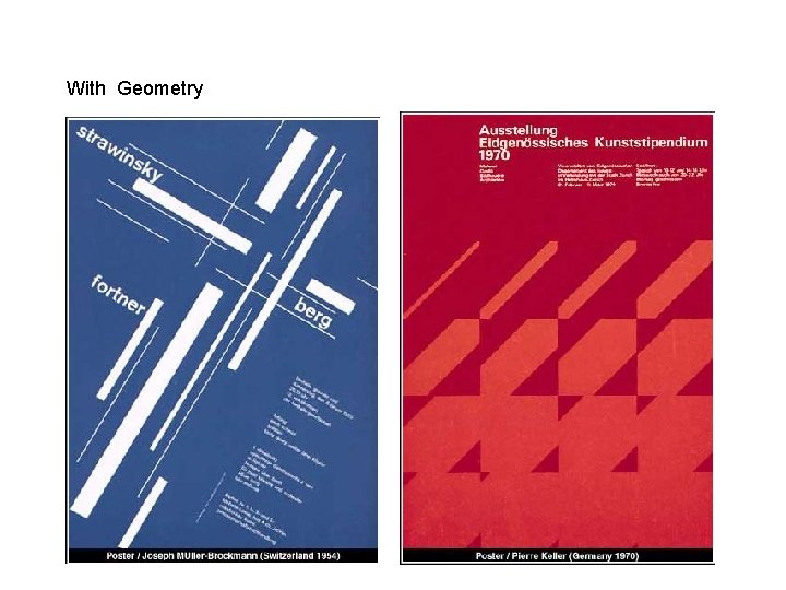
Josef Muller-Brockmann – concert series Müller-Brockmann used colour, an arrangement of elemental geometric forms, and type to express the structural and rhythmic qualities of music.
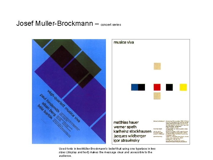
Josef Muller-Brockmann – concert series Used fonts in two. Müller-Brockmann's belief that using one typeface in two sizes (display and text) makes the message clear and accessible to the audience.
With Geometry
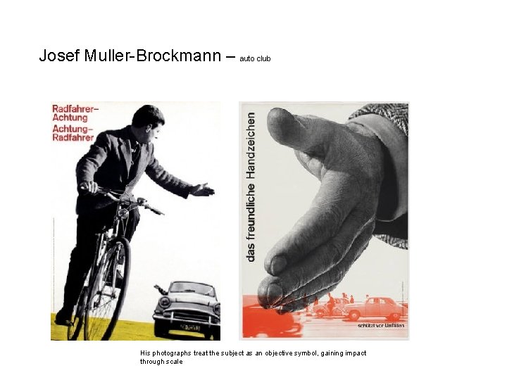
Josef Muller-Brockmann – auto club His photographs treat the subject as an objective symbol, gaining impact through scale
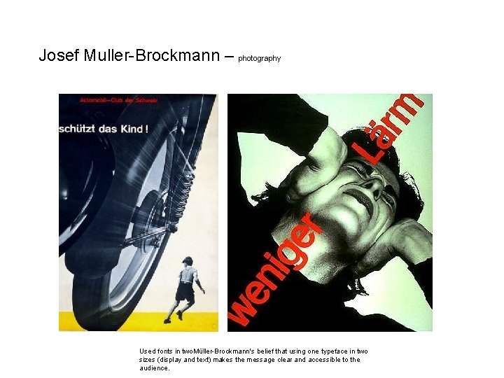
Josef Muller-Brockmann – photography Used fonts in two. Müller-Brockmann's belief that using one typeface in two sizes (display and text) makes the message clear and accessible to the audience.
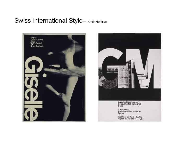
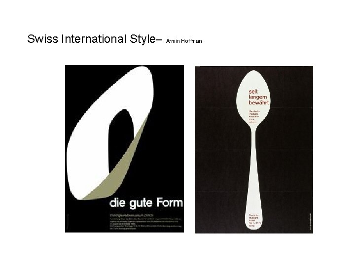
Swiss International Style– Armin Hoffman
Swiss International Style– Armin Hoffman
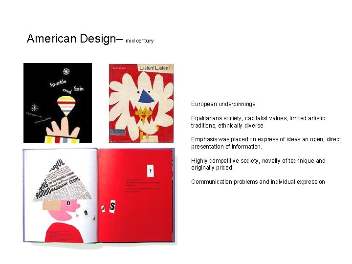
American Design– mid century European underpinnings Egalitarians society, capitalist values, limited artistic traditions, ethnically diverse Emphasis was placed on express of ideas an open, direct presentation of information. Highly competitive society, novelty of technique and originally priced. Communication problems and individual expression
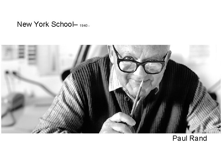
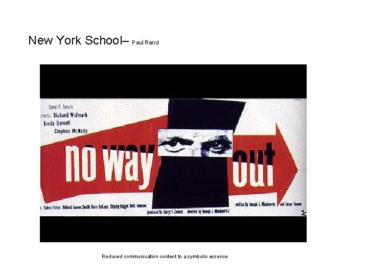
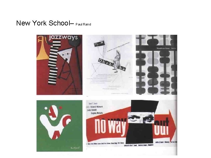
New York School– 1940 - Paul Rand
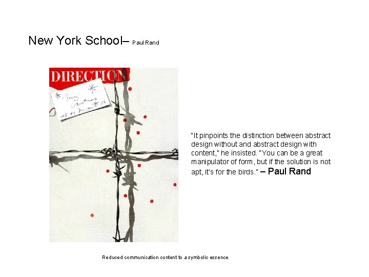
New York School– Paul Rand “It pinpoints the distinction between abstract design without and abstract design with content, ” he insisted. “You can be a great manipulator of form, but if the solution is not apt, it’s for the birds. ” – Paul Rand Reduced communication content to a symbolic essence
New York School– Paul Rand Reduced communication content to a symbolic essence
New York School– Paul Rand
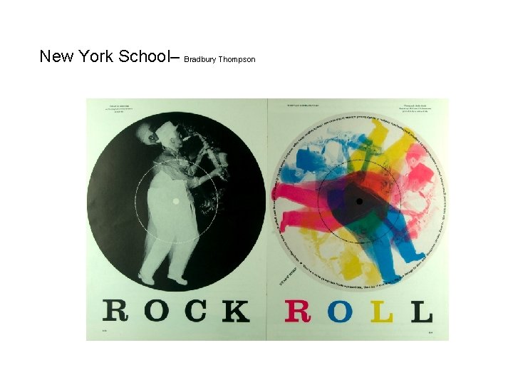
New York School– Bradbury Thompson
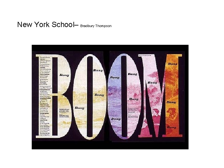
New York School– Bradbury Thompson
i-clickers– Swiss international style Identify a key difference between New Typography and Swiss International Style. A. Mathematical grids B. Asymmetrical layout C. Designers defined their role as objective conduits for spreading society. D. San-serif font E. Direct communication of idea
i-clickers– Swiss international style Identify a key difference between New Typography and Swiss International Style. A. Mathematical grids B. Asymmetrical layout C. Designers defined their role as objective conduits for spreading society. D. San-serif font E. Direct communication of idea
i-clickers– Swiss international style Identify a key difference between Swiss International Style New York School. A. B. C. D. E. Mathematical grids Asymmetrical layout San-serif font Individual expression Use of white space
i-clickers– Swiss international style Identify a key difference between Swiss International Style New York School. A. B. C. D. E. Mathematical grids Asymmetrical layout San-serif font Individual expression Use of white space
i-clickers– Swiss international style Project topic. A. B. C. D. E. Movies Biographies Novels Famous places Technology (old and new)
fin