
02 IAT 102 Graphic Design Letter Spacing The
- Slides: 17
02 IAT 102 Graphic Design
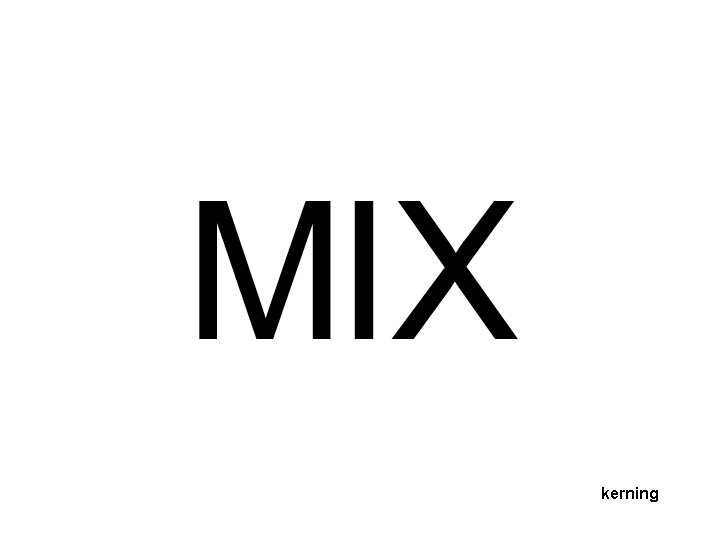
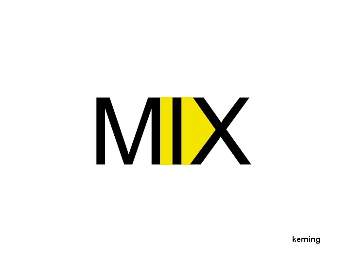
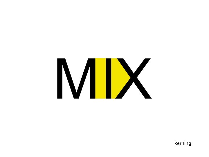
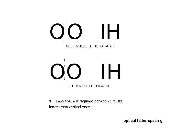
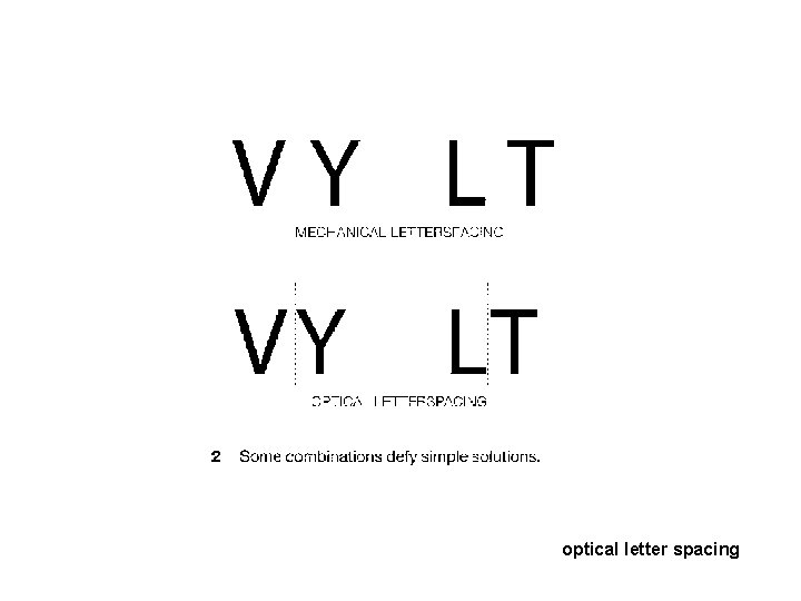
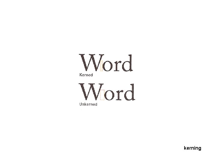
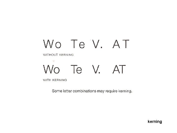
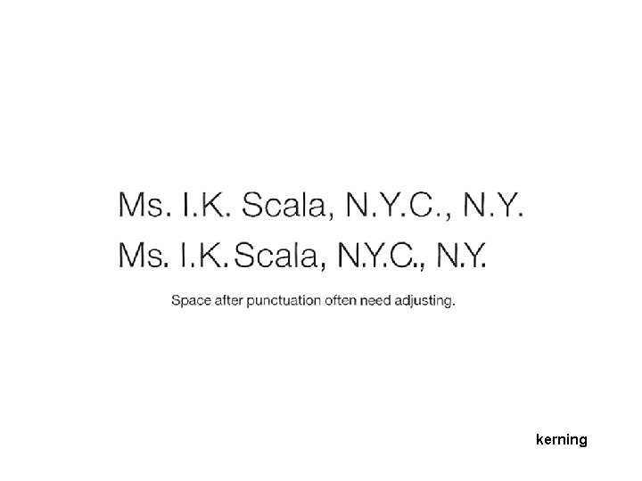
Letter Spacing The goal of this assignment is for you to study the technique of letterspacing or kerning. Letterspacing is the distance between letters on the same baseline. It is also called kerning. Designers use this technique when dealing with large size, or isolated type (magazine headers, logo and logotype design, etc).
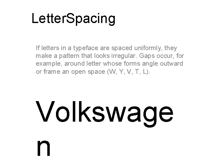
Letter. Spacing If letters in a typeface are spaced uniformly, they make a pattern that looks irregular. Gaps occur, for example, around letter whose forms angle outward or frame an open space (W, Y, V, T, L). Volkswage n
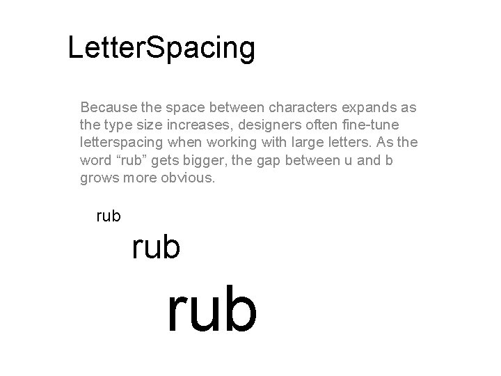
Letter. Spacing Because the space between characters expands as the type size increases, designers often fine-tune letterspacing when working with large letters. As the word “rub” gets bigger, the gap between u and b grows more obvious. rub rub
kerning
kerning
kerning
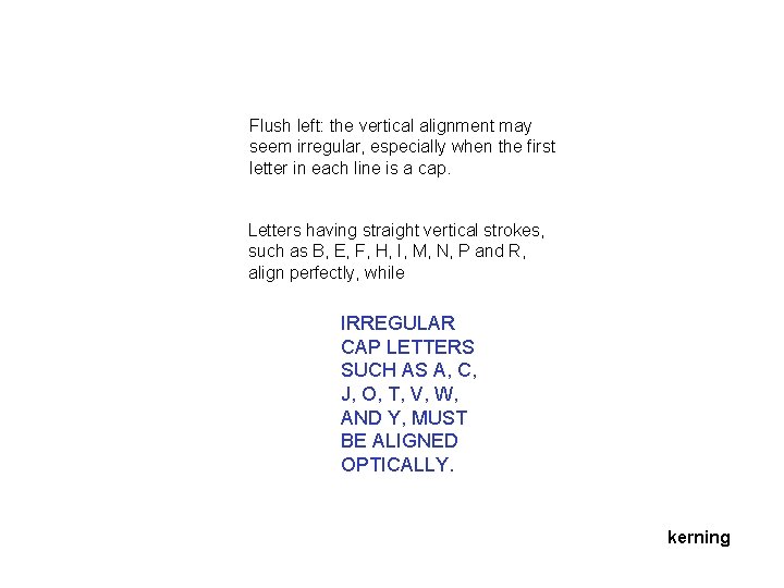
Flush left: the vertical alignment may seem irregular, especially when the first letter in each line is a cap. Letters having straight vertical strokes, such as B, E, F, H, I, M, N, P and R, align perfectly, while IRREGULAR CAP LETTERS SUCH AS A, C, J, O, T, V, W, AND Y, MUST BE ALIGNED OPTICALLY. kerning
optical letter spacing
optical letter spacing
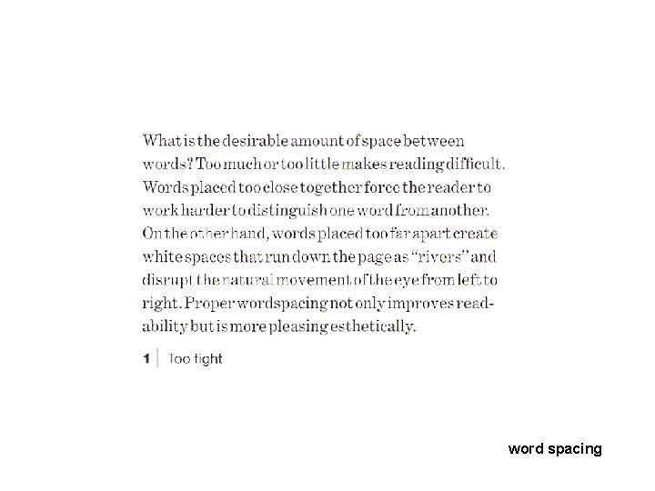
word spacing
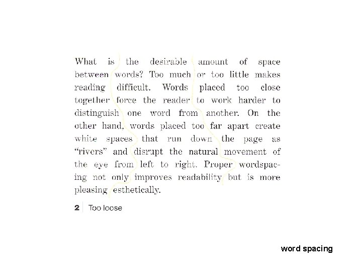
word spacing
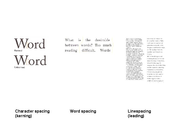
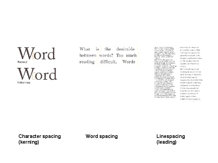
Character spacing (kerning) Word spacing Linespacing (leading)
kerning
kerning
kerning
Character spacing (kerning) Word spacing Linespacing (leading)