Visual Design Principles Next Page Menu Introduction Visuals
- Slides: 66

Visual Design Principles Next Page

Menu Introduction Visuals Text Graphics Audio Conclusion Reference Quit * Dummy text are used to illustrate layout of information Layout

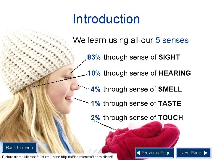
Introduction We learn using all our 5 senses 83% through sense of SIGHT 10% through sense of HEARING 4% through sense of SMELL 1% through sense of TASTE 2% through sense of TOUCH Back to menu Picture from : Microsoft Office Online http: //office. microsoft. com/clipart/ Previous Page Next Page

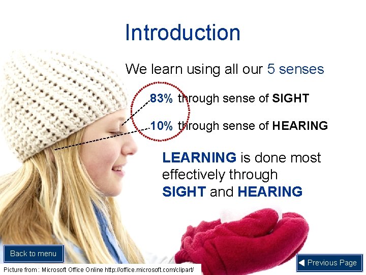
Introduction We learn using all our 5 senses 83% through sense of SIGHT 10% through sense of HEARING LEARNING is done most effectively through SIGHT and HEARING Back to menu Picture from : Microsoft Office Online http: //office. microsoft. com/clipart/ Previous Page

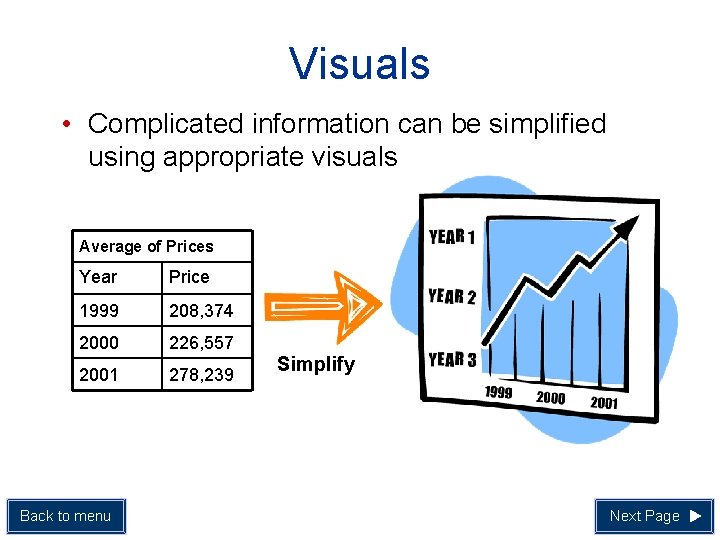
Visuals • Complicated information can be simplified using appropriate visuals Average of Prices Year Price 1999 208, 374 2000 226, 557 2001 278, 239 Back to menu Simplify Next Page

Text • There are 6 main guidelines in using appropriate lettering or text 1. 2. 3. 4. 5. 6. Lettering Style Number of Lettering Styles Use of Capitals Lettering Colour Lettering Size Spacing between lines Back to menu Previous Page Next Page

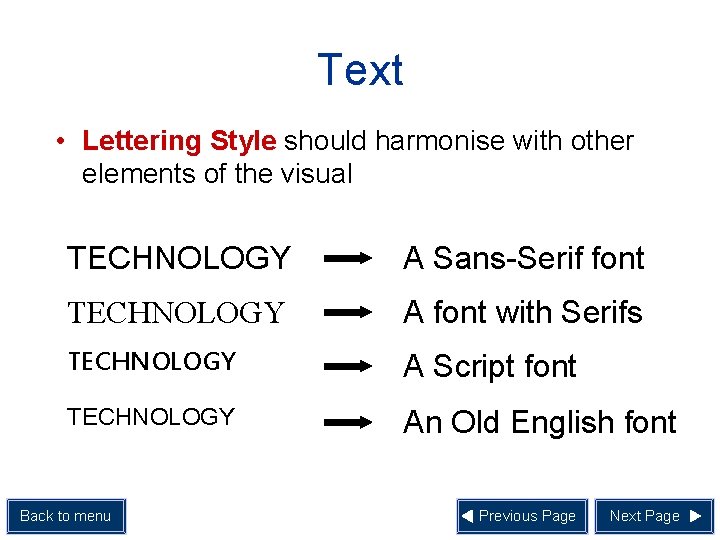
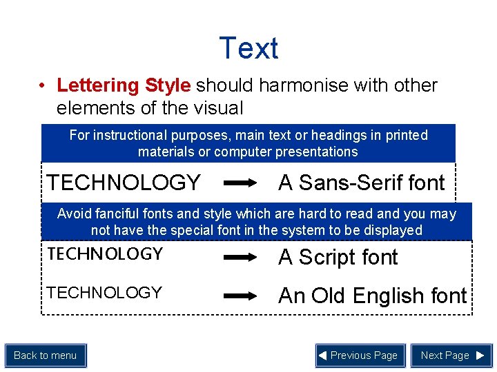
Text • Lettering Style should harmonise with other elements of the visual TECHNOLOGY A Sans-Serif font TECHNOLOGY A font with Serifs TECHNOLOGY A Script font TECHNOLOGY An Old English font Back to menu Previous Page Next Page

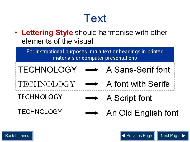
Text • Lettering Style should harmonise with other elements of the visual For instructional purposes, main text or headings in printed materials or computer presentations TECHNOLOGY A Sans-Serif font TECHNOLOGY A font with Serifs TECHNOLOGY A Script font TECHNOLOGY An Old English font Back to menu Previous Page Next Page

Text • Lettering Style should harmonise with other elements of the visual For instructional purposes, main text or headings in printed materials or computer presentations TECHNOLOGY A Sans-Serif font Avoid fanciful fonts and style which are hard to read and you may TECHNOLOGY A font with Serifs not have the special font in the system to be displayed TECHNOLOGY A Script font TECHNOLOGY An Old English font Back to menu Previous Page Next Page

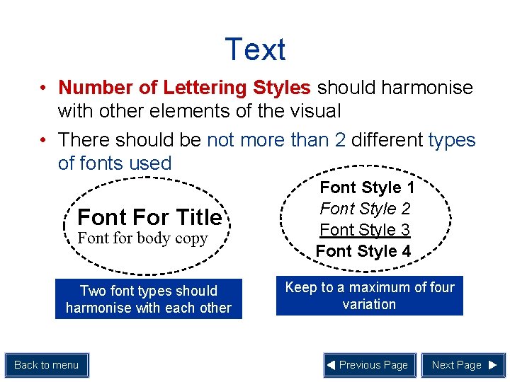
Text • Number of Lettering Styles should harmonise with other elements of the visual • There should be not more than 2 different types of fonts used Font For Title Font Style 1 Font Style 2 Font Style 3 Font Style 4 Two font types should harmonise with each other Keep to a maximum of four variation Font for body copy Back to menu Previous Page Next Page

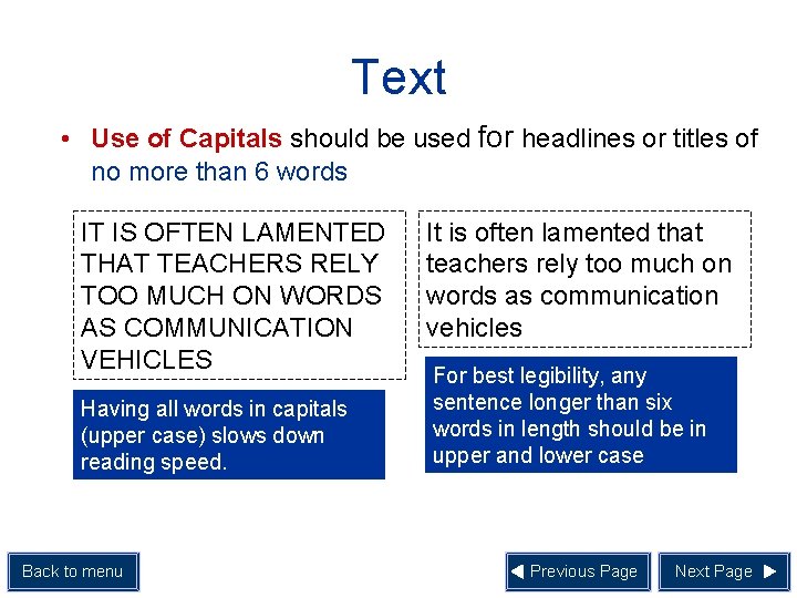
Text • Use of Capitals should be used for headlines or titles of no more than 6 words IT IS OFTEN LAMENTED THAT TEACHERS RELY TOO MUCH ON WORDS AS COMMUNICATION VEHICLES Having all words in capitals (upper case) slows down reading speed. Back to menu It is often lamented that teachers rely too much on words as communication vehicles For best legibility, any sentence longer than six words in length should be in upper and lower case Previous Page Next Page

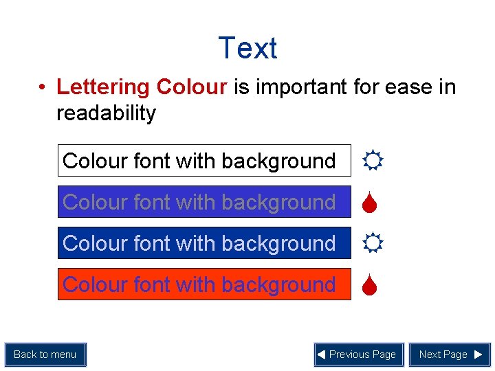
Text • Lettering Colour is important for ease in readability Colour font with background Back to menu R S Previous Page Next Page

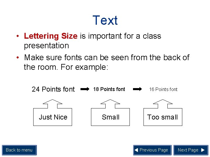
Text • Lettering Size is important for a class presentation • Make sure fonts can be seen from the back of the room. For example: 24 Points font 18 Points font Just Nice Small Back to menu 16 Points font Too small Previous Page Next Page

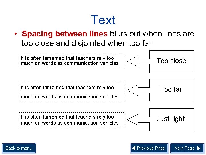
Text • Spacing between lines blurs out when lines are too close and disjointed when too far It is often lamented that teachers rely too much on words as communication vehicles It is often lamented that teachers rely too Too close Too far much on words as communication vehicles It is often lamented that teachers rely too much on words as communication vehicles Back to menu Just right Previous Page Next Page

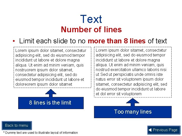
Text Number of lines • Limit each slide to no more than 8 lines of text Lorem ipsum dolor sitamet, consectetur adipisicing elit, sed do eiusmod tempor incididunt ut labore et dolore magna aliqua. Ut enim ad minim veniam, quis nostruorem ipsum dolor sitamet, consectetur adipisicing elit, sed do eiusmod tempor incididunt ut labore et doloreorem ipsum dolor sitamet Lorem ipsum dolor sitamet, consectetur adipisicing elit, sed do eiusmod tempor incididunt ut labore et dolore magna aliqua. Ut enim ad minim veniam, quis nostrud exercitation ullamco laboris nisi ut Sed ut perspiciatis unde omnis iste natus error sit voluptorem ipsum dolor sitamet, consectetur adipisicing elit, sed do eiusmod tempor incididunt ut labore et dol error sit voluptorem 8 lines is the limit Too many lines Back to menu * Dummy text are used to illustrate layout of information Previous Page

Graphics • Graphics refer to pictures and illustrations which can be used in your visuals • It can be in the form of static or dynamic (moving) display. Back to menu Next Page

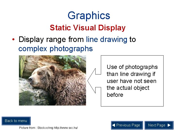
Graphics Static Visual Display • Display range from line drawing to complex photographs Use of photographs than line drawing if user have not seen the actual object before Back to menu Picture from : Stock. xchng http: //www. sxc. hu/ Previous Page Next Page

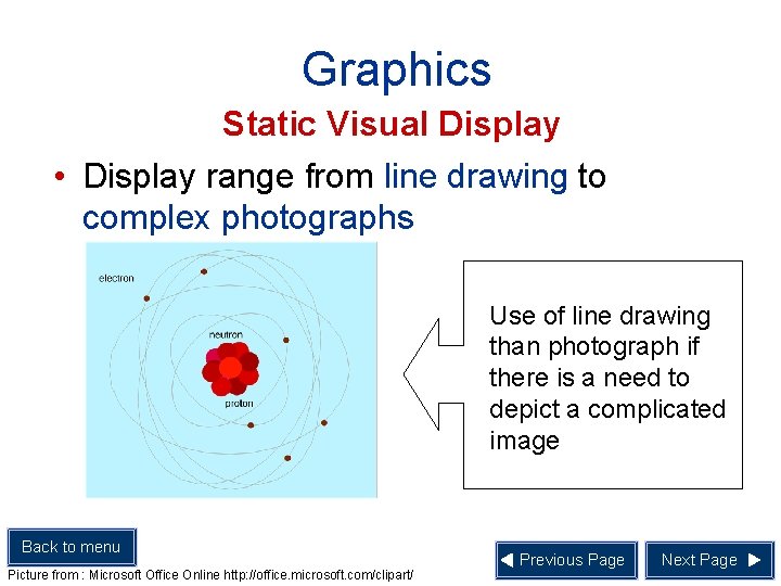
Graphics Static Visual Display • Display range from line drawing to complex photographs Use of line drawing than photograph if there is a need to depict a complicated image Back to menu Picture from : Microsoft Office Online http: //office. microsoft. com/clipart/ Previous Page Next Page

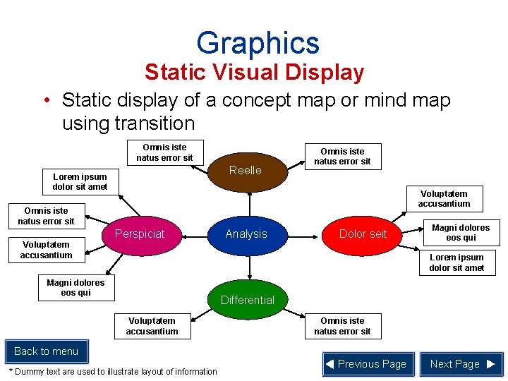
Graphics Static Visual Display • Static display of a concept map or mind map using transition Omnis iste natus error sit Reelle Lorem ipsum dolor sit amet Omnis iste natus error sit Voluptatem accusantium Perspiciat Analysis Dolor seit Magni dolores eos qui Lorem ipsum dolor sit amet Magni dolores eos qui Differential Voluptatem accusantium Omnis iste natus error sit Back to menu * Dummy text are used to illustrate layout of information Previous Page Next Page

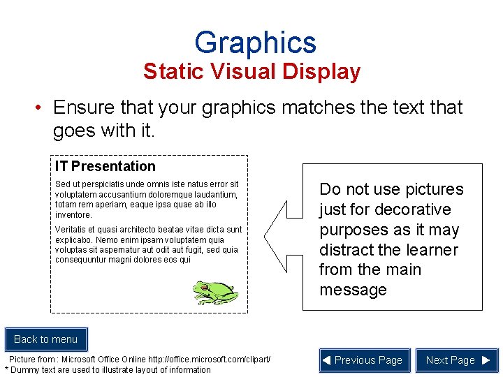
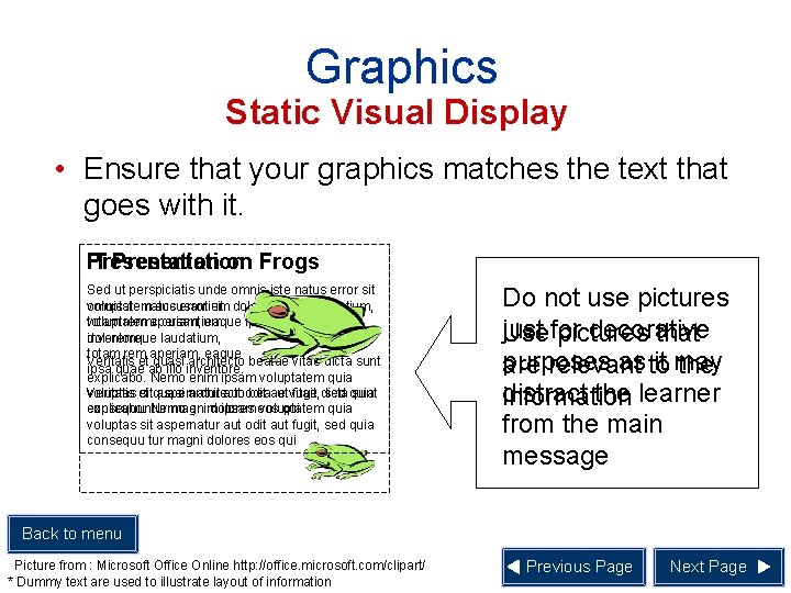
Graphics Static Visual Display • Ensure that your graphics matches the text that goes with it. IT Presentation Sed ut perspiciatis unde omnis iste natus error sit voluptatem accusantium doloremque laudantium, totam rem aperiam, eaque ipsa quae ab illo inventore. Veritatis et quasi architecto beatae vitae dicta sunt explicabo. Nemo enim ipsam voluptatem quia voluptas sit aspernatur aut odit aut fugit, sed quia consequuntur magni dolores eos qui Do not use pictures just for decorative purposes as it may distract the learner from the main message Back to menu Picture from : Microsoft Office Online http: //office. microsoft. com/clipart/ * Dummy text are used to illustrate layout of information Previous Page Next Page

Graphics Static Visual Display • Ensure that your graphics matches the text that goes with it. IT Presentation on Frogs Sed ut perspiciatis unde omnis iste natus error sit voluptatem omnisste natus accusantium error sit doloremque laudantium, totam rem aperiam, voluptatemc cusantium eaque ipsa quae ab illo inventore. laudatium, doloremque totam rem aperiam, eaque Veritatis et quasi architecto beatae vitae dicta sunt ipsa quae ab illo inventore. explicabo. Nemo enim ipsam voluptatem quia voluptas et Veritatis sitquasi aspernatur architecto aut odit beaae aut vitae fugit, dicta sed quia sunt consequuntur explicabo. Nemo magni enim dolores ipsam eos voluptatem quia voluptas sit aspernatur aut odit aut fugit, sed quia consequu tur magni dolores eos qui Do not use pictures just decorative Use for pictures that purposes as to it may are relevant the distract the learner information from the main message Back to menu Picture from : Microsoft Office Online http: //office. microsoft. com/clipart/ * Dummy text are used to illustrate layout of information Previous Page Next Page

Graphics Dynamic Visual Displays • Dynamic visual displays include animation and video • Guidelines for choosing animation and video: 1. 2. 3. 4. Back to menu Replay Feature Clarity Support Learning Simplicity Previous Page Next Page

Graphics Dynamic Visual Displays 1. Replay Feature Consider providing a replay feature for the students to repeat the animation or video Back to menu Video from : Foto. Search http: //www. fotosearch. com/ Previous Page Next Page

Graphics Dynamic Visual Displays 2. Clarity Ensure that the visual quality of the animation or video is good. There will be little educational value if images are not focused Back to menu Video from : Foto. Search http: //www. fotosearch. com/ Previous Page Next Page

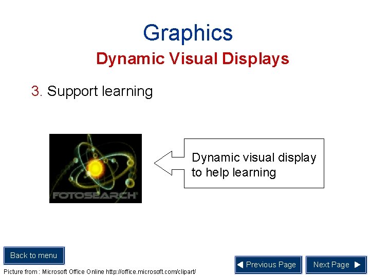
Graphics Dynamic Visual Displays 3. Support learning Dynamic visual display to help learning Back to menu Picture from : Microsoft Office Online http: //office. microsoft. com/clipart/ Previous Page Next Page

Graphics Dynamic Visual Displays Dynamic visual display that do not assist in learning Back to menu Picture from : Microsoft Office Online http: //office. microsoft. com/clipart/ Previous Page Next Page

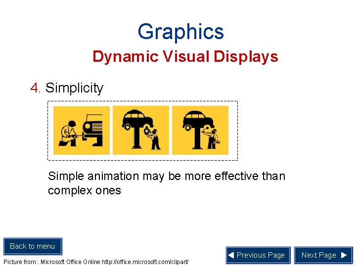
Graphics Dynamic Visual Displays 4. Simplicity Simple animation may be more effective than complex ones Back to menu Picture from : Microsoft Office Online http: //office. microsoft. com/clipart/ Previous Page Next Page

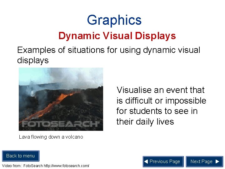
Graphics Dynamic Visual Displays Examples of situations for using dynamic visual displays Visualise an event that is difficult or impossible for students to see in their daily lives Lava flowing down a volcano Back to menu Video from : Foto. Search http: //www. fotosearch. com/ Previous Page Next Page

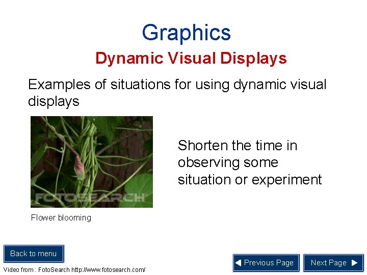
Graphics Dynamic Visual Displays Examples of situations for using dynamic visual displays Shorten the time in observing some situation or experiment Flower blooming Back to menu Video from : Foto. Search http: //www. fotosearch. com/ Previous Page Next Page

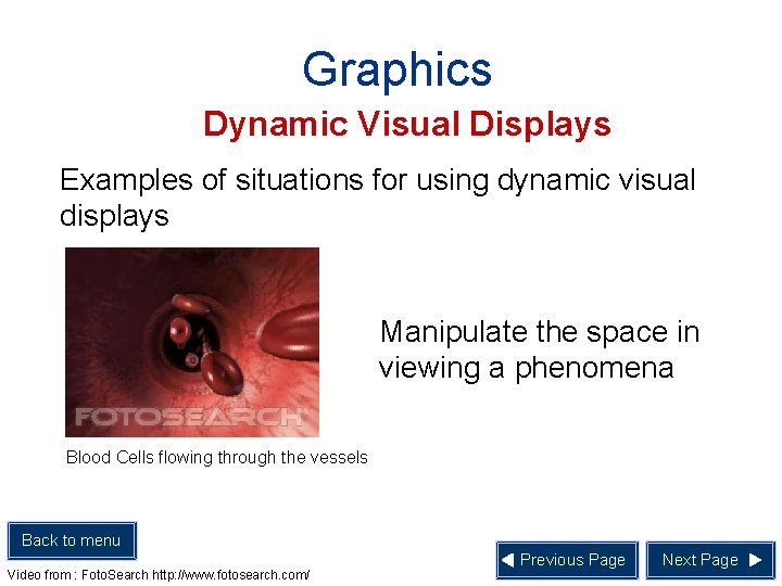
Graphics Dynamic Visual Displays Examples of situations for using dynamic visual displays Manipulate the space in viewing a phenomena Blood Cells flowing through the vessels Back to menu Video from : Foto. Search http: //www. fotosearch. com/ Previous Page Next Page

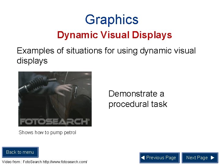
Graphics Dynamic Visual Displays Examples of situations for using dynamic visual displays Demonstrate a procedural task Shows how to pump petrol Back to menu Video from : Foto. Search http: //www. fotosearch. com/ Previous Page Next Page

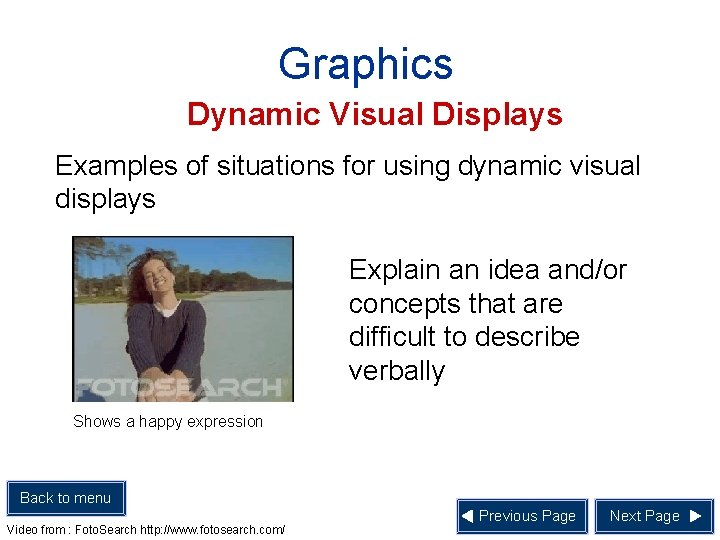
Graphics Dynamic Visual Displays Examples of situations for using dynamic visual displays Explain an idea and/or concepts that are difficult to describe verbally Shows a happy expression Back to menu Video from : Foto. Search http: //www. fotosearch. com/ Previous Page Next Page

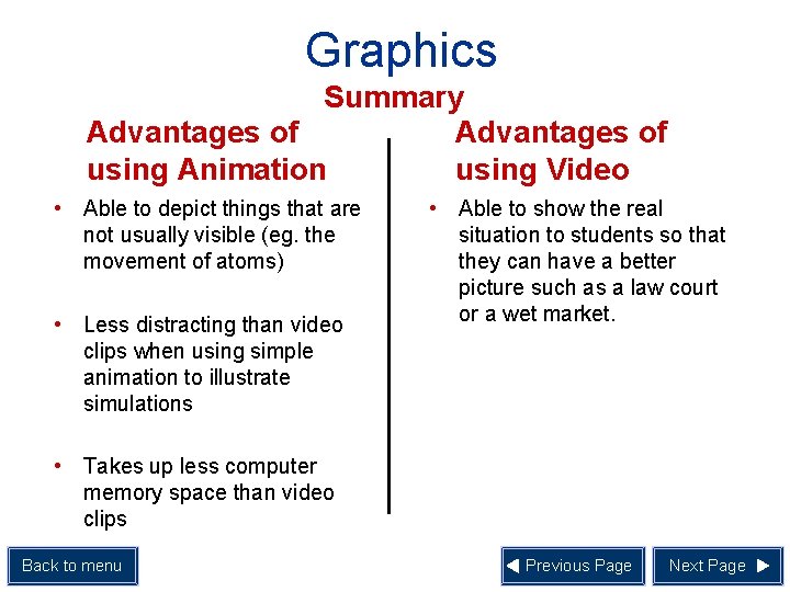
Graphics Summary Advantages of using Animation using Video • Able to depict things that are not usually visible (eg. the movement of atoms) • Less distracting than video clips when using simple animation to illustrate simulations • Able to show the real situation to students so that they can have a better picture such as a law court or a wet market. • Takes up less computer memory space than video clips Back to menu Previous Page Next Page

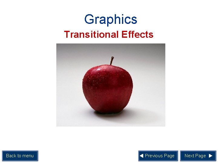
Graphics Transitional Effects • Transitional effect refers to the visual effect which occurs when moving from one screen display to another Back to menu Previous Page Next Page

Graphics Transitional Effects Back to menu Previous Page Next Page

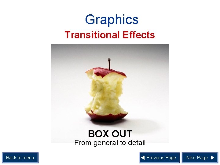
Graphics Transitional Effects BOX OUT From general to detail Back to menu Previous Page Next Page

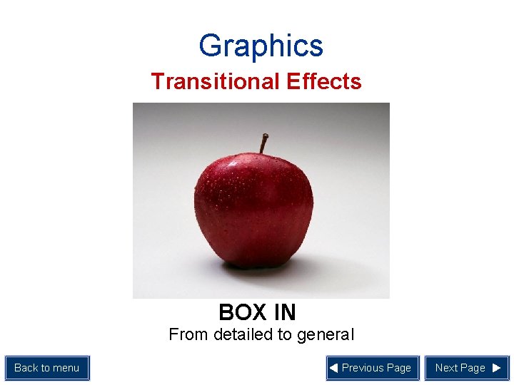
Graphics Transitional Effects BOX IN From detailed to general Back to menu Previous Page Next Page

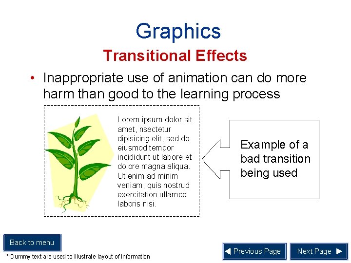
Graphics Transitional Effects • Inappropriate use of animation can do more harm than good to the learning process Lorem ipsum dolor sit amet, nsectetur dipisicing elit, sed do eiusmod tempor incididunt ut labore et dolore magna aliqua. Ut enim ad minim veniam, quis nostrud exercitation ullamco laboris nisi. Example of a bad transition being used Back to menu * Dummy text are used to illustrate layout of information Previous Page Next Page

Graphics Use of Colour • There are two consideration to keep in mind when using of colours: 1. Colour scheme 2. Colour appeal Back to menu Previous Page Next Page

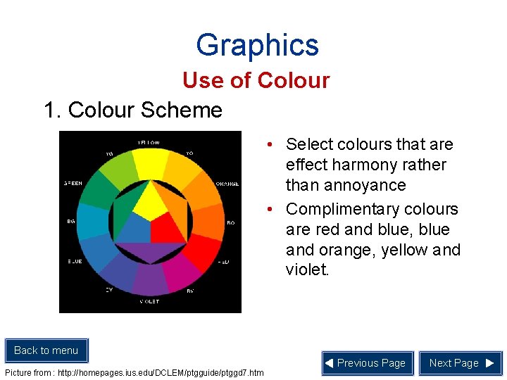
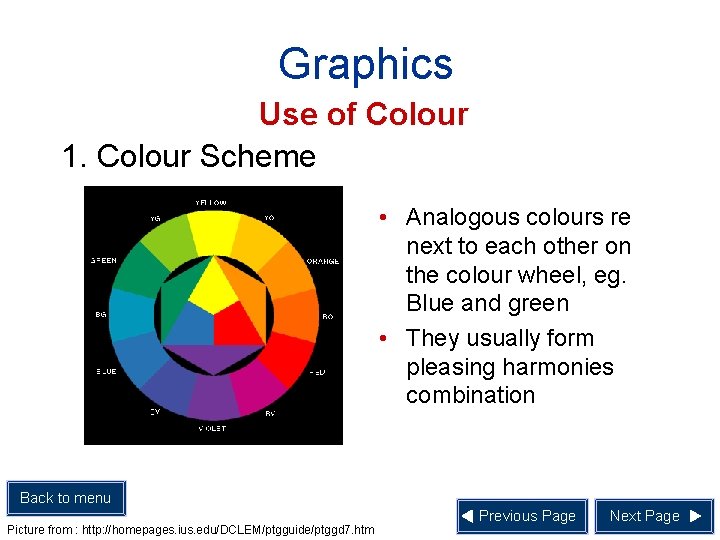
Graphics Use of Colour 1. Colour Scheme • Select colours that are effect harmony rather than annoyance • Complimentary colours are red and blue, blue and orange, yellow and violet. Back to menu Picture from : http: //homepages. ius. edu/DCLEM/ptgguide/ptggd 7. htm Previous Page Next Page

Graphics Use of Colour 1. Colour Scheme • Analogous colours re next to each other on the colour wheel, eg. Blue and green • They usually form pleasing harmonies combination Back to menu Picture from : http: //homepages. ius. edu/DCLEM/ptgguide/ptggd 7. htm Previous Page Next Page

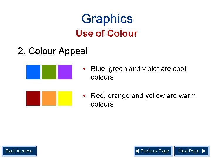
Graphics Use of Colour 2. Colour Appeal • Blue, green and violet are cool colours • Red, orange and yellow are warm colours Back to menu Previous Page Next Page

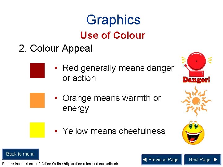
Graphics Use of Colour 2. Colour Appeal • Red generally means danger or action • Orange means warmth or energy • Yellow means cheefulness Back to menu Picture from : Microsoft Office Online http: //office. microsoft. com/clipart/ Previous Page Next Page

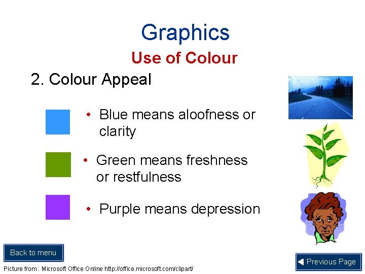
Graphics Use of Colour 2. Colour Appeal • Blue means aloofness or clarity • Green means freshness or restfulness • Purple means depression Back to menu Picture from : Microsoft Office Online http: //office. microsoft. com/clipart/ Previous Page

Layout • Layout of a visual depends on the following factors: 1. Alignment of the graphic and text elements 2. Shape 3. Balance 4. Style Back to menu Next Page

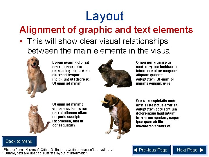
Layout Alignment of graphic and text elements • This will show clear visual relationships between the main elements in the visual Lorem ipsum dolor sit amet, consectetur adipisicing elit, sed do eiusmod tempor incididunt ut labore et. Ut enim ad minim Q non numquam eius modi tempora incidunt ut labore et dolore magnam aliquam quaerat voluptatem. Ut enim ad minima veniam, quis nostrum exercitationem ullam corporis suscipit laboriosam, nisi ut consequatur? Sed ut perspiciatis unde omnis iste natus error sit voluptatem accusantium doloremque laudantium, totam rem aperiam, eaque ipsa quae ab illo inventore veritatis et Back to menu Picture from : Microsoft Office Online http: //office. microsoft. com/clipart/ * Dummy text are used to illustrate layout of information Previous Page Next Page

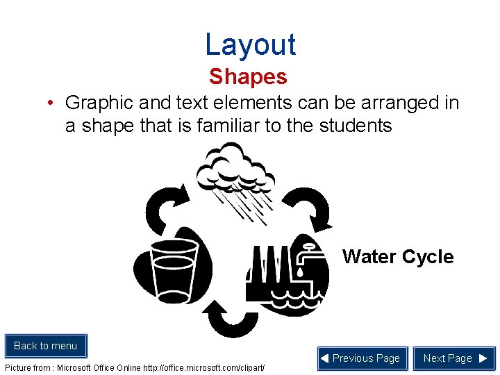
Layout Shapes • Graphic and text elements can be arranged in a shape that is familiar to the students Water Cycle Back to menu Picture from : Microsoft Office Online http: //office. microsoft. com/clipart/ Previous Page Next Page

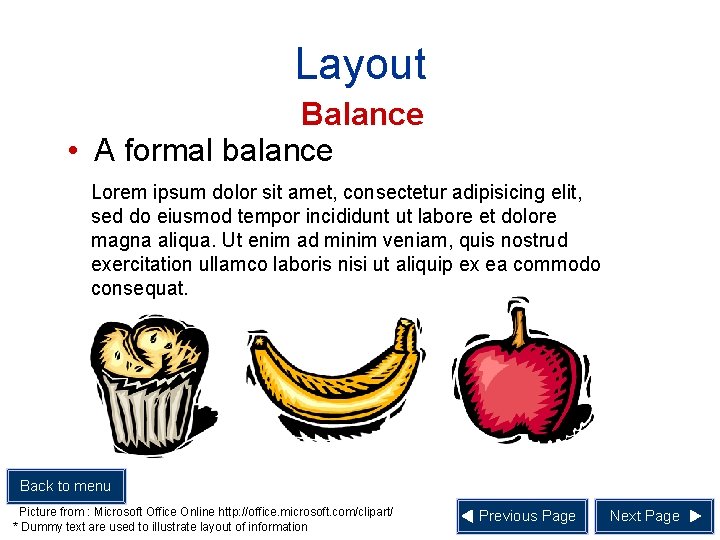
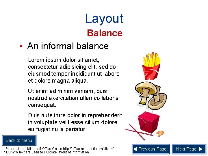
Layout Balance • There are two kinds of balance – formal and informal • A formal balance occurs when the left half of the visual is a mirror image of the right half • Informal balance is asymmetrical, and the elements create a balance without being static Back to menu Picture from : Microsoft Office Online http: //office. microsoft. com/clipart/ Previous Page Next Page

Layout Balance • A formal balance Lorem ipsum dolor sit amet, consectetur adipisicing elit, sed do eiusmod tempor incididunt ut labore et dolore magna aliqua. Ut enim ad minim veniam, quis nostrud exercitation ullamco laboris nisi ut aliquip ex ea commodo consequat. Back to menu Picture from : Microsoft Office Online http: //office. microsoft. com/clipart/ * Dummy text are used to illustrate layout of information Previous Page Next Page

Layout Balance • An informal balance Lorem ipsum dolor sit amet, consectetur adipisicing elit, sed do eiusmod tempor incididunt ut labore et dolore magna aliqua. Ut enim ad minim veniam, quis nostrud exercitation ullamco laboris consequat. Duis aute irure dolor in reprehenderit in voluptate velit esse cillum dolore eu fugiat nulla pariatur. Back to menu Picture from : Microsoft Office Online http: //office. microsoft. com/clipart/ * Dummy text are used to illustrate layout of information Previous Page Next Page

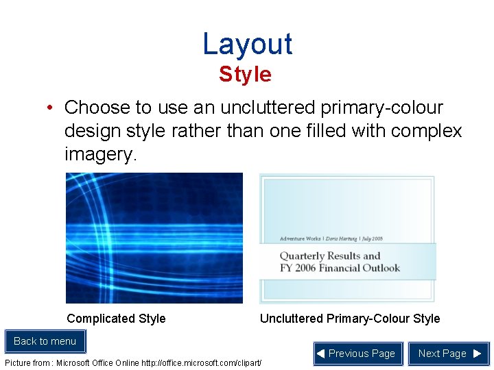
Layout Style • Choose to use an uncluttered primary-colour design style rather than one filled with complex imagery. Complicated Style Uncluttered Primary-Colour Style Back to menu Picture from : Microsoft Office Online http: //office. microsoft. com/clipart/ Previous Page Next Page

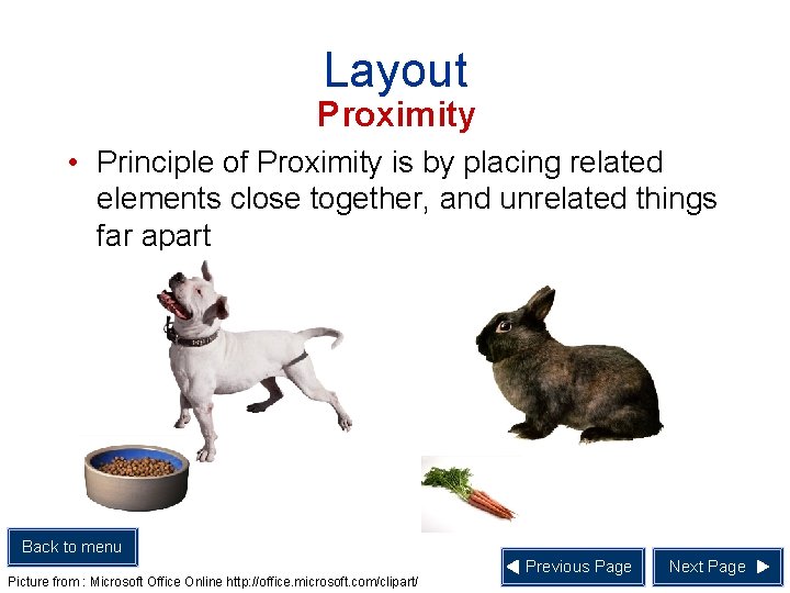
Layout Proximity • Principle of Proximity is by placing related elements close together, and unrelated things far apart Back to menu Picture from : Microsoft Office Online http: //office. microsoft. com/clipart/ Previous Page Next Page

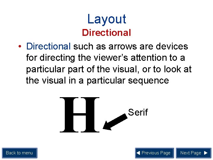
Layout Directional • Directional such as arrows are devices for directing the viewer’s attention to a particular part of the visual, or to look at the visual in a particular sequence H Back to menu Serif Previous Page Next Page

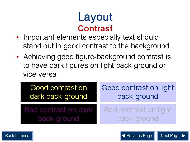
Layout Contrast • Important elements especially text should stand out in good contrast to the background • Achieving good figure-background contrast is to have dark figures on light back-ground or vice versa Good contrast on dark back-ground Good contrast on light back-ground Bad contrast on dark back-ground Bad contrast on light back-ground Back to menu Previous Page Next Page

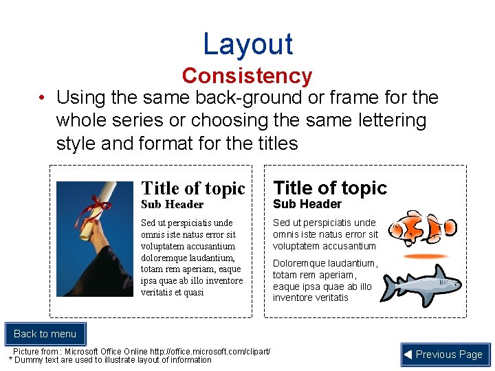
Layout Consistency • Using the same back-ground or frame for the whole series or choosing the same lettering style and format for the titles Title of topic Sed ut perspiciatis unde omnis iste natus error sit voluptatem accusantium doloremque laudantium, totam rem aperiam, eaque ipsa quae ab illo inventore veritatis et quasi Sed ut perspiciatis unde omnis iste natus error sit voluptatem accusantium Sub Header Doloremque laudantium, totam rem aperiam, eaque ipsa quae ab illo inventore veritatis Back to menu Picture from : Microsoft Office Online http: //office. microsoft. com/clipart/ * Dummy text are used to illustrate layout of information Previous Page

Audio • There are three major types of audio use: 1. Music 2. Narration 3. Sound Effects Back to menu Next Page

Audio • Audio can be used to: 1. Draw attention 2. Complement visual material on screen 3. Support reading of text on screen Back to menu Previous Page Next Page

Audio • Audio can be used to: • • • Back to menu Minimise amount of information that presented on screen Announce some event Motivate student Previous Page Next Page

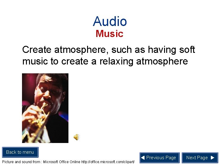
Audio Music Create atmosphere, such as having soft music to create a relaxing atmosphere Back to menu Picture and sound from : Microsoft Office Online http: //office. microsoft. com/clipart/ Previous Page Next Page

Audio Narration 1. Provide instructions especially for younger students 2. Develop students’ reading skills 3. Develop students’ listening skills 4. Complement still pictures 5. Provide feedback when the users, such as young children, are not proficient in reading yet Back to menu Previous Page Next Page

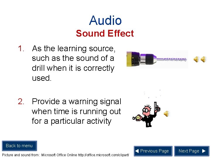
Audio Sound Effect 1. As the learning source, such as the sound of a drill when it is correctly used. 2. Provide a warning signal when time is running out for a particular activity Back to menu Picture and sound from : Microsoft Office Online http: //office. microsoft. com/clipart/ Previous Page Next Page

Audio Summary • Guidelines to using Audio 1. Learner-control feature • Provide features such as turn on, turn off and replay Back to menu Sound from : Microsoft Office Online http: //office. microsoft. com/clipart/ Previous Page Next Page

Audio Summary • Guidelines to using Audio 2. Clarity Ensure that the audio quality is good enough 3. Audio Quality Pace of the audio should not be too fast or too slow. 4. Comprehensibility Teachers should avoid using difficult vocabulary in their narration Back to menu Previous Page

Conclusion • Visuals containing appropriate balance of pictures, words, effects and/or audio helps bring across the instructional message more effectively Back to menu Next Page

Reference • Wong, A. F. L. , Cheung, W. S. (1999). Using IT for Lesson Presentations. In Tan, S. L. & Wong, A. F. L. (Eds. ), Teaching and Learning with Technology-An Asia-Pacific Perspective (pp. 118 -132). Singapore: Prentice Hall. Back to menu Next Page

End of Presentation Thank you Back to menu