Typefaces Choices in Design There are many choices



- Slides: 54

Typefaces

Choices in Design There are many choices in design, and each must be made with the reader in mind. In publication, design involves three areas of choice: • format: the shape and size of the publication • type: the shape and size of the characters that form the words of the layout the arrangement of these characters plus • illustrations and any message or other elements on the page(s).

Each of these elements is a tool to help communicate the author’s message to the readers. • • • The choices include paper color page size binding typeface(s) layout style type sizes type area spacing margins heading styles grid pattern Often, the choices are limited. But usually some choice can be made.

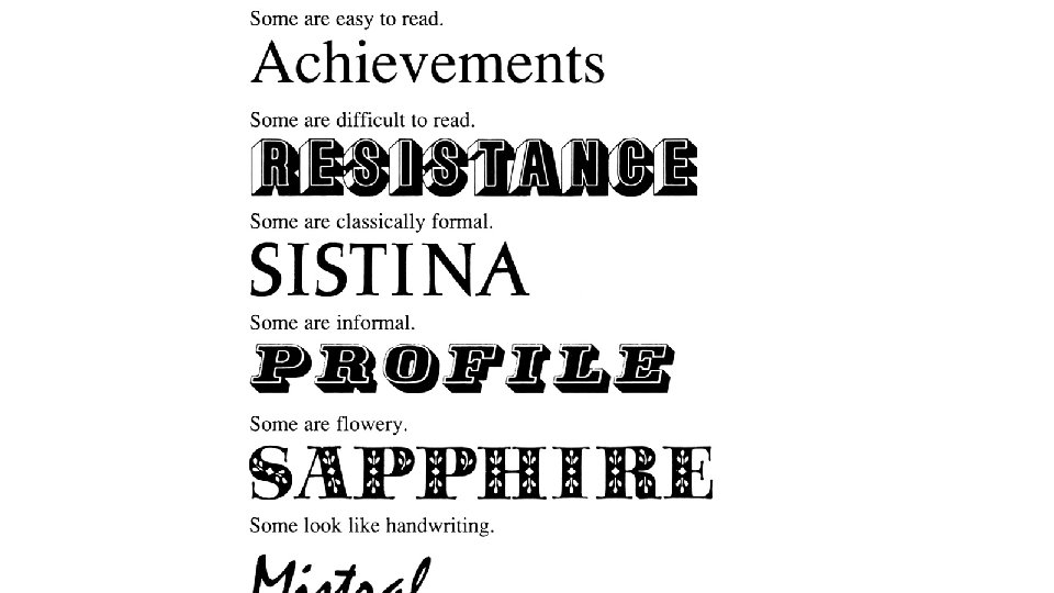
Typefaces and type measures The letters of the Latin alphabet come in thousands of designs.


• The variety is enormous. • Other forms of alphabet or ideograms (Hindi, Arabic, Chinese, and so on) may have fewer varieties but still have distinctly different forms. • Even if an alphabet is unfamiliar, the differences in form can be clear to see.

Comparing typefaces • The design and use of letterforms in printing is a special subject called typography. • To master it takes many years. • Editors do not need such detailed knowledge. It helps, however, to know a few simple ways to compare letterforms. Then you can see whether a particular letterform is suitable for a particular publication. • The choice of typeface can make a publication easy or difficult to read. It also establishes the visual voice of the publication. It sets the emotional tone.

• In printing, letterforms are divided into typefaces, which are something like species in the natural sciences. • A typeface is an alphabet with specific characteristics by which it can be distinguished from any other typeface. • Sometimes the differences are so small that only specialists can recognize them easily. But few editors in the developing world have wide choices in typefaces. It is usually enough to be able to recognize broad differences.

• Typefaces can be divided, at the simplest level, by function and by form.

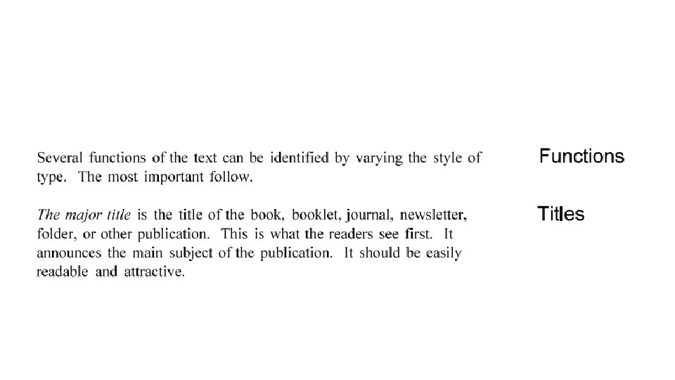
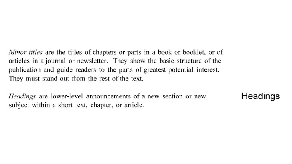
Function • Some typefaces are best for the text of a publication. This material will be read continuously, often for dozens of pages at a time. Type used in this way is often called text or body type. It is not usually large in size. • Typefaces are also used for titles, headings, and large announcements. This material will be read in bursts of a few words at a time. It is usually larger than the general text of the publication. It is called display type. The headings in the margin of this publication are set in display type; the titles of the modules and units are set in a larger display type. • In any publication, text and display type may be different sizes of the same type. Or, with care, one face can be used for the text and another for display.

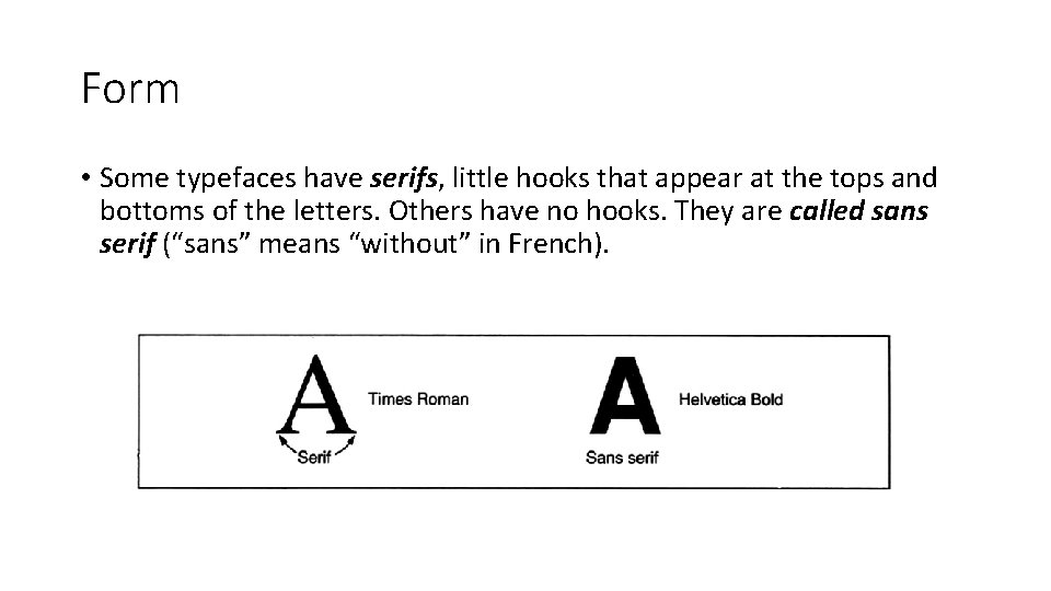
Form • Some typefaces have serifs, little hooks that appear at the tops and bottoms of the letters. Others have no hooks. They are called sans serif (“sans” means “without” in French).

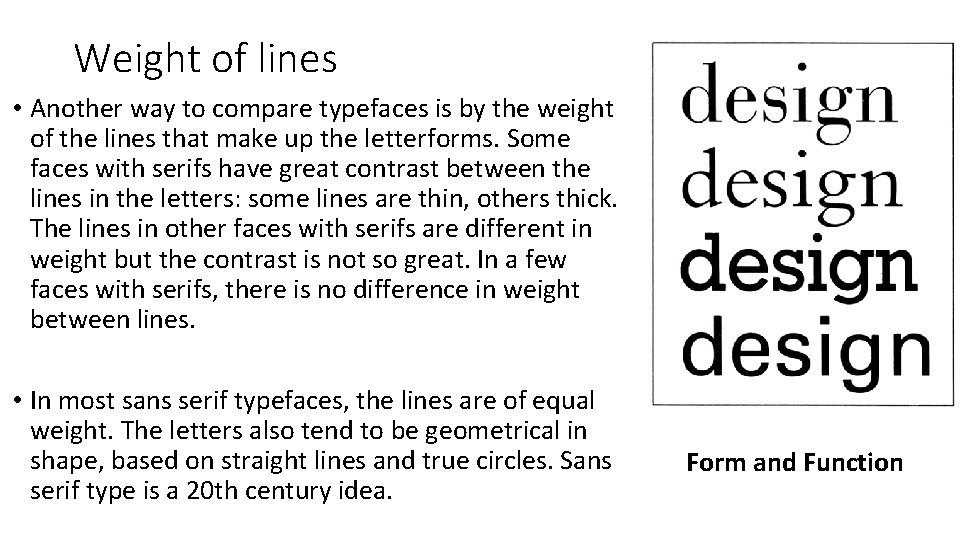
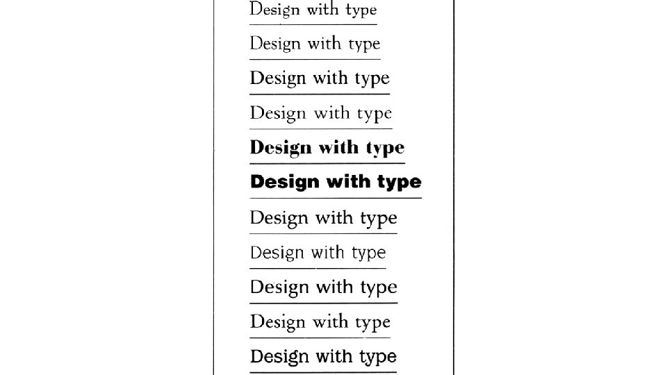
Weight of lines • Another way to compare typefaces is by the weight of the lines that make up the letterforms. Some faces with serifs have great contrast between the lines in the letters: some lines are thin, others thick. The lines in other faces with serifs are different in weight but the contrast is not so great. In a few faces with serifs, there is no difference in weight between lines. • In most sans serif typefaces, the lines are of equal weight. The letters also tend to be geometrical in shape, based on straight lines and true circles. Sans serif type is a 20 th century idea. Form and Function

• Type with serifs can be used for either text or display. So can sans serif type.

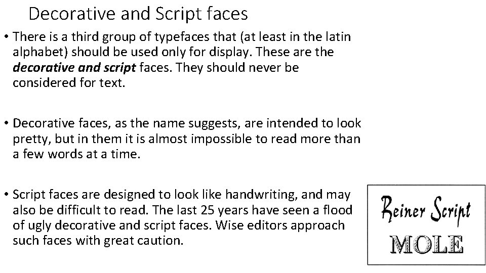
Decorative and Script faces • There is a third group of typefaces that (at least in the latin alphabet) should be used only for display. These are the decorative and script faces. They should never be considered for text. • Decorative faces, as the name suggests, are intended to look pretty, but in them it is almost impossible to read more than a few words at a time. • Script faces are designed to look like handwriting, and may also be difficult to read. The last 25 years have seen a flood of ugly decorative and script faces. Wise editors approach such faces with great caution.

Within any single typeface, there can be a great number of sizes and shapes of characters. A complete range of characters in one size of one typeface is called a font. A font may include the following kinds of characters: • capital letters, also called uppercase letters • small letters, also called lowercase letters • numbers, also called figures • punctuation marks • special symbols • small capitals (or level small capitals), which look like capitals but are only as high as the lower-case x • ligatures, or combined letters, such as fl or æ

• Not all these characters are available in all typefaces. In most they come in two forms: • roman characters (the normal, upright kind in which most text is • italic characters (sloped forward, looking a little like writing).

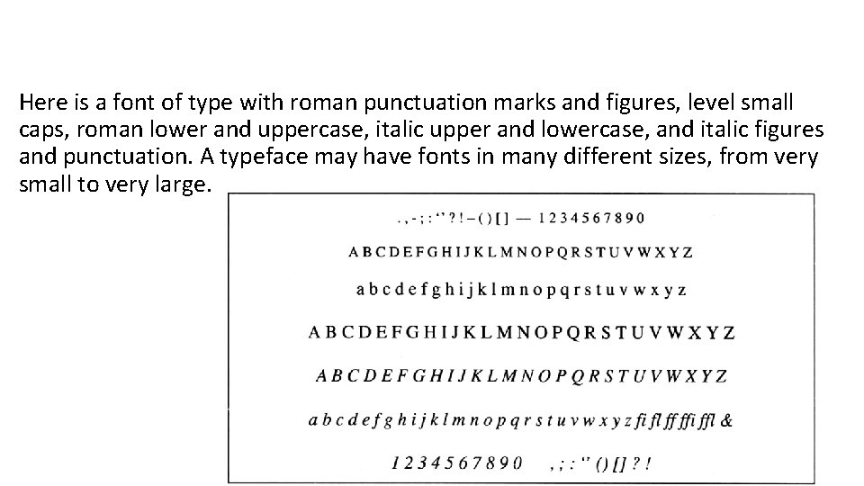
Here is a font of type with roman punctuation marks and figures, level small caps, roman lower and uppercase, italic upper and lowercase, and italic figures and punctuation. A typeface may have fonts in many different sizes, from very small to very large.

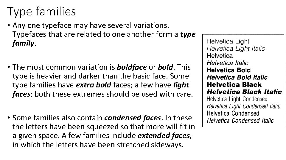
Type families • Any one typeface may have several variations. Typefaces that are related to one another form a type family. • The most common variation is boldface or bold. This type is heavier and darker than the basic face. Some type families have extra bold faces; a few have light faces; both these extremes should be used with care. • Some families also contain condensed faces. In these the letters have been squeezed so that more will fit in a given space. A few families include extended faces, in which the letters have been stretched sideways.

Type measures • Type is measured in special units. Editors have to know them to communicate with printers. They may sound complex. They are not. • Different systems for measuring type exist in different parts of the world, just as different systems exist for measuring land (kilometers and hectares in some countries, miles and acres in other). The French measure type in ciceros; the Chinese use gohs. • The following system is probably the most widely used. It has three units of measurement: the point, the pica, and the em.

Points The point (pt) is the smallest unit. One point is 0. 01384 of an inch or 0. 3515 mm. For practical purposes, we can say there are 72 points in an inch or 28. 5 points in a centimeter.

Points • Points are used to measure the size of type. The size of a typeface is basically the distance from the highest point to the lowest point in the alphabet: for example, the distance between the top of a b and the bottom of a y. A small space is allowed at top and bottom so that the letters in two lines won’t touch. In 12 pt type, the total distance is 12 points. • Points are also used to measure small distances in space between lines or characters in type.

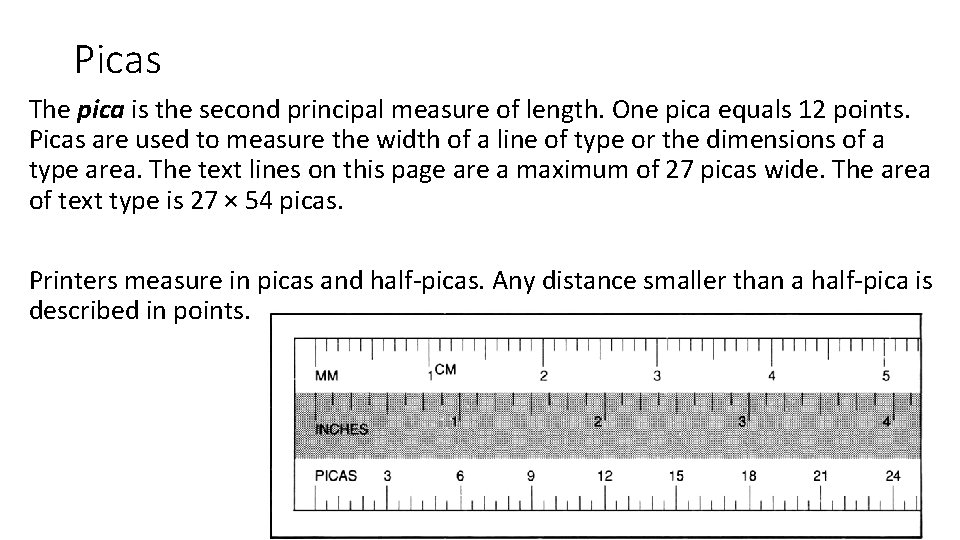
Picas The pica is the second principal measure of length. One pica equals 12 points. Picas are used to measure the width of a line of type or the dimensions of a type area. The text lines on this page are a maximum of 27 picas wide. The area of text type is 27 × 54 picas. Printers measure in picas and half-picas. Any distance smaller than a half-pica is described in points.

Ems Picas and points are measures of linear distance. An em is a measure of area. It is not a fixed size. It is an area equal to the square of the size of type being used. A 10 pt em is 10 x 10 pt. A 14 pt em is 14 x 14 pt. Ems are used to measure space in typesetting. For example, the first line in a paragraph may be indented 1 or 2 ems. Or a paragraph quoted from another work may be indented 1 em on either side. Half an em is an en. (Here is something more to watch, however. You may hear printers talk about an em when they really mean 12 points. In that case they are referring to a pica or a pica em. )

Summary Point: linear measure 72 pts = 1 in. 28. 5 pts = 1 cm used to measure type size used to measure small distances Pica: linear measure 1 pica = 12 pts used to measure line widths used to measure type areas Em area measure 1 em = the type size squared used to measure space in a line En area measure 2 ens = 1 em used to measure space in a line

Easy reading: the typeface If a text, especially a text of any length is going to be easy to read. It must meet three conditions. • The reader's eye must be able to move smoothly along the individual • The reader's eye must be able to move smoothly from line to line • The reader must be able to recognize individual letters and words easily.

• Several things make a printed text easy or difficult to read. The first is the typeface. • Some typefaces are easy to read, others difficult, just as one persona's, handwriting may be easy to read another's not. • Editors often have little choice in typefaces. Type is expensive, and many printers can afford only a small variety. Here are some guidelines in choosing the best face from what is available, and in making the best use of it.

Weight • Typefaces that are unusually light or heavy in weight may be more difficult to read than typefaces that are more normal in weight. • Use boldface sparingly. An author or editor may want an entire paragraph in bold to give it emphasis. The paragraph will certainly stand out on the page, but the result may be the opposite of what is intended. If reading is difficult, the content is not absorbed as easily. • Some typefaces look beautiful in display because they have strong contrast between lines in the individual letter. In texts, they may be almost impossible to read. The strong vertical lines act like stakes preventing the reader's eye from moving along the line easily.

• Design is the art of assembling diverse elements into an organized unit. Typography starts with the letter and builds from there.

Italic • Many people think that a long stretch of text set entirely in italic is also difficult to read. This may be just because we are not used to reading italic. Some italic faces are in fact easy to read. Many others are not particularly readable, especially some that are made within a computer simply by slanting the regular roman face. • Authors and editors sometimes use italic to give emphasis to one or more paragraphs, or to identify a long quotation as coming from another source. Wise editors do so cautiously, making sure that the italic in the text face being used is easy to read in long stretches. • Italic is useful for emphasizing a few words at a time in a text that is otherwise in roman face. The italic blends well with the rest of the type. (A page with scattered words in boldface can look like a person with measles. )

Serifs • Typographers argue strongly about this, but many experiments suggest that sans serif type is not as easy to read as type with serifs. The serifs extend the letters horizontally and tie them together, so that the eye moves easily along the line. Sans serif letters, in contrast, are more isolated individually; the eye does not move as easily from one letter to the next. • The clean, modern look of sans serif type is often desirable. Sans serif works well as lettering in graphs, charts, maps, diagrams, and other illustrations. It can also be effective in text that is meant to be read in small units of up to 200 or 300 words; for example, in a booklet with many illustrations, each with a small amount of accompanying text. Many people feel, however. that sans serif is undesirable in a text that stretches continuously over many pages, especially if the paragraphs are long or the message complicated.

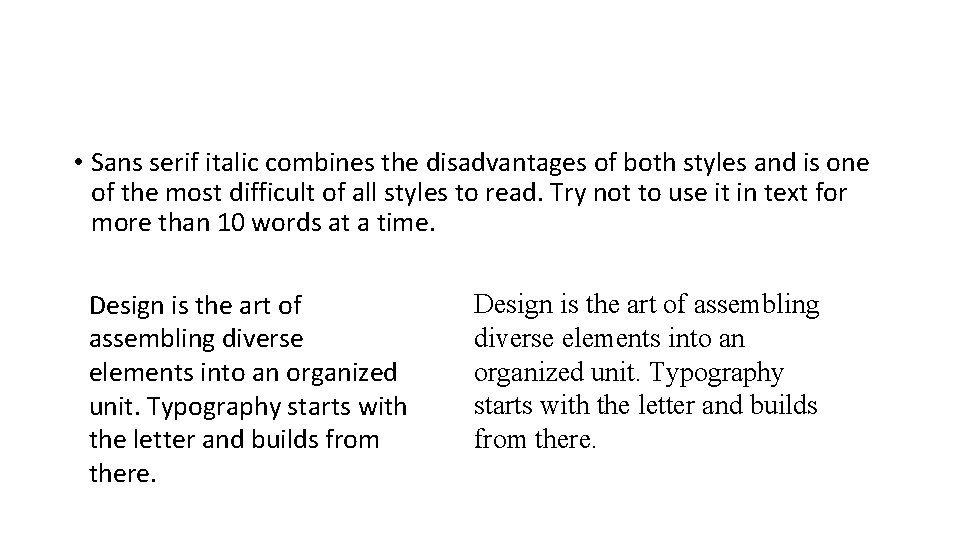
• Sans serif italic combines the disadvantages of both styles and is one of the most difficult of all styles to read. Try not to use it in text for more than 10 words at a time. Design is the art of assembling diverse elements into an organized unit. Typography starts with the letter and builds from there.

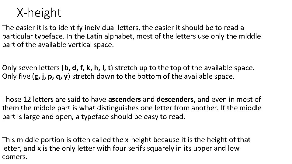
X-height The easier it is to identify individual letters, the easier it should be to read a particular typeface. In the Latin alphabet, most of the letters use only the middle part of the available vertical space. Only seven letters (b, d, f, k, h, l, t) stretch up to the top of the available space. Only five (g, j, p, q, y) stretch down to the bottom of the available space. Those 12 letters are said to have ascenders and descenders, and even in most of them the middle part is what distinguishes one letter from another. If the middle part is large and open, a typeface should be easy to read. This middle portion is often called the x-height because it is the height of that letter, and x is the only letter with four serifs squarely in its upper and low comers.

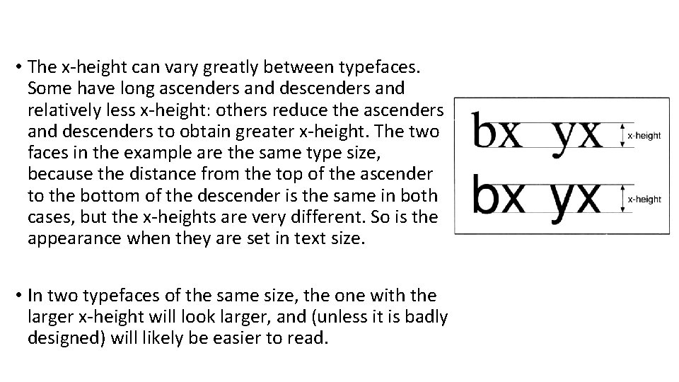
• The x-height can vary greatly between typefaces. Some have long ascenders and descenders and relatively less x-height: others reduce the ascenders and descenders to obtain greater x-height. The two faces in the example are the same type size, because the distance from the top of the ascender to the bottom of the descender is the same in both cases, but the x-heights are very different. So is the appearance when they are set in text size. • In two typefaces of the same size, the one with the larger x-height will look larger, and (unless it is badly designed) will likely be easier to read.

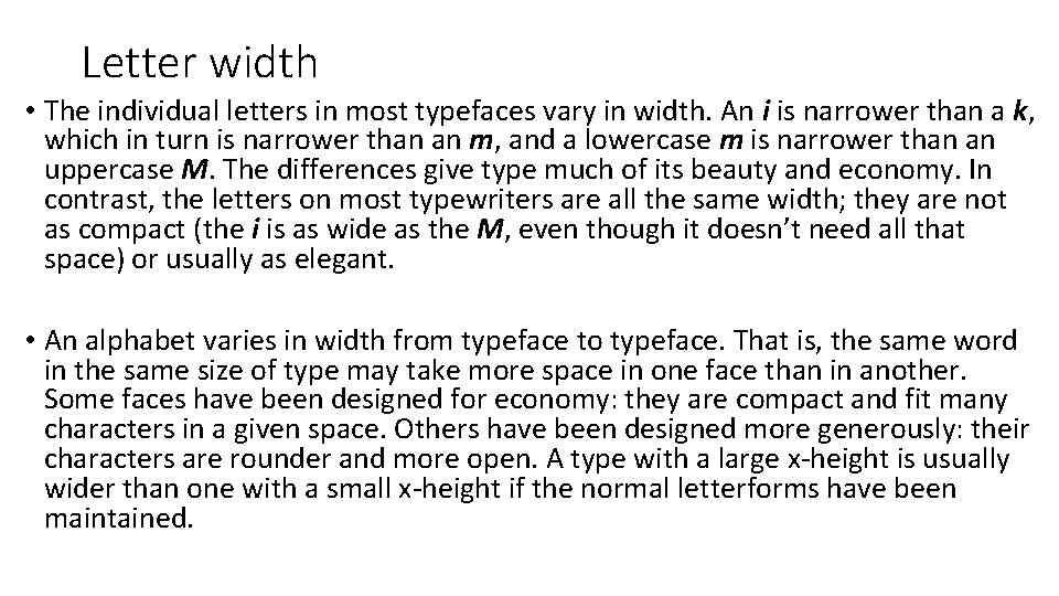
Letter width • The individual letters in most typefaces vary in width. An i is narrower than a k, which in turn is narrower than an m, and a lowercase m is narrower than an uppercase M. The differences give type much of its beauty and economy. In contrast, the letters on most typewriters are all the same width; they are not as compact (the i is as wide as the M, even though it doesn’t need all that space) or usually as elegant. • An alphabet varies in width from typeface to typeface. That is, the same word in the same size of type may take more space in one face than in another. Some faces have been designed for economy: they are compact and fit many characters in a given space. Others have been designed more generously: their characters are rounder and more open. A type with a large x-height is usually wider than one with a small x-height if the normal letterforms have been maintained.


• The difference in width of letterform may not be obvious. but it can have considerable impact. If there is a large amount of text, a more compact face can Save several pages of printing. If the typeface is chosen carefully, the loss in readability will be small. • Extremes in this area should be avoided for text. Condensed faces are suitable for display type, but would be difficult to read in text. Extended faces are wasteful.

Read 7. 5 Easy reading: Other variables • Size of type • Length of lines • Space between words • Justified or unjustified • Uppercase and lowercase • Contrast

• Size of type • Length of lines • Space between words • Justified or unjustified • Uppercase and lowercase • Contrast

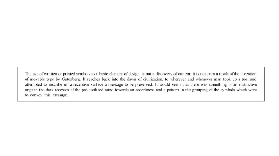
Size of type • The best size to use will depend on he average reader’s age, education, and eyesight. • For adults, 11 or 12 pt type is easy to read • Publications about specialized subjects are often set in 10 pt • Type smaller that 10 pt should be avoided except for short sections of text. Tables can be set in type smaller that 10 pt. So can the captions below pictures, text within illustrations, quoted extracts from other publications, and notes. • 9 pt can be used instead of 10 pt or 11 pt instead of 12 pt without losing readibilty because the typeface has a large x-height


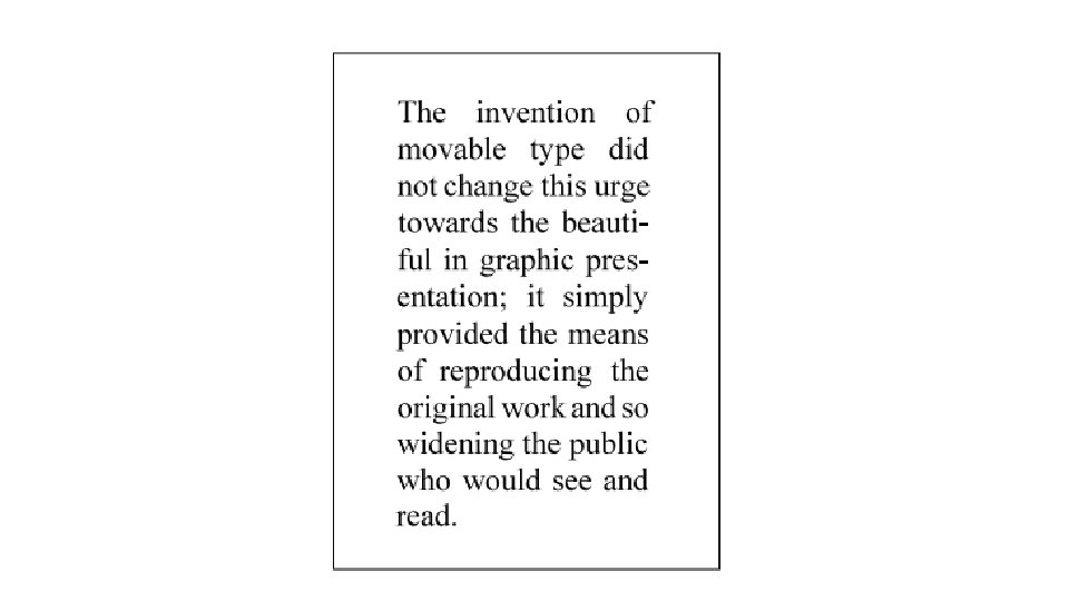
Length of lines • If the lines of type are too long, readers may lose their way. They may have difficulty finding the beginning of the first line: they may skip a line or repeat what they have just read. They may get tired from too much eye motion. • What is the best length? • Varies with the type being used. It varies with the design of the face. • 52 characters/ 65 or even 75 characters • In pages with two or three columns of type, lines will be less than 52 characters long. With narrow columns, the reader’s eye has to move less.


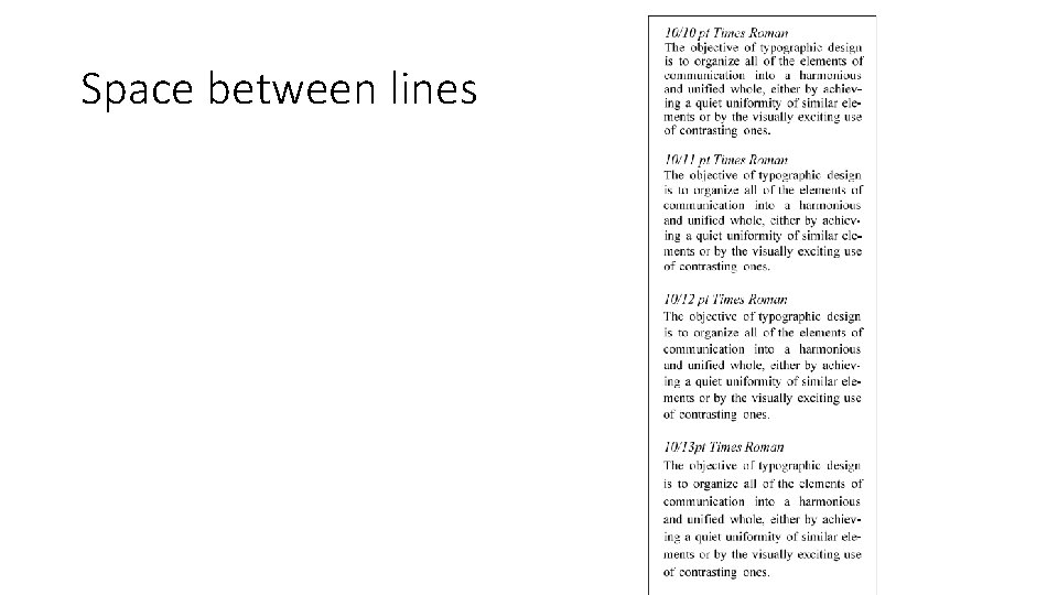
Space between lines

Space between words • There must be enough space between words so that the reader can tell one word from another without trouble. • On the other hand, there must not be so much space that the reader has trouble moving smoothly from word to word along the line.

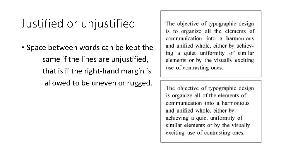
Justified or unjustified • Space between words can be kept the same if the lines are unjustified, that is if the right-hand margin is allowed to be uneven or rugged.

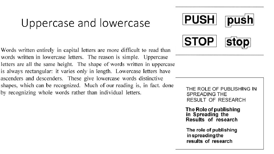
Uppercase and lowercase

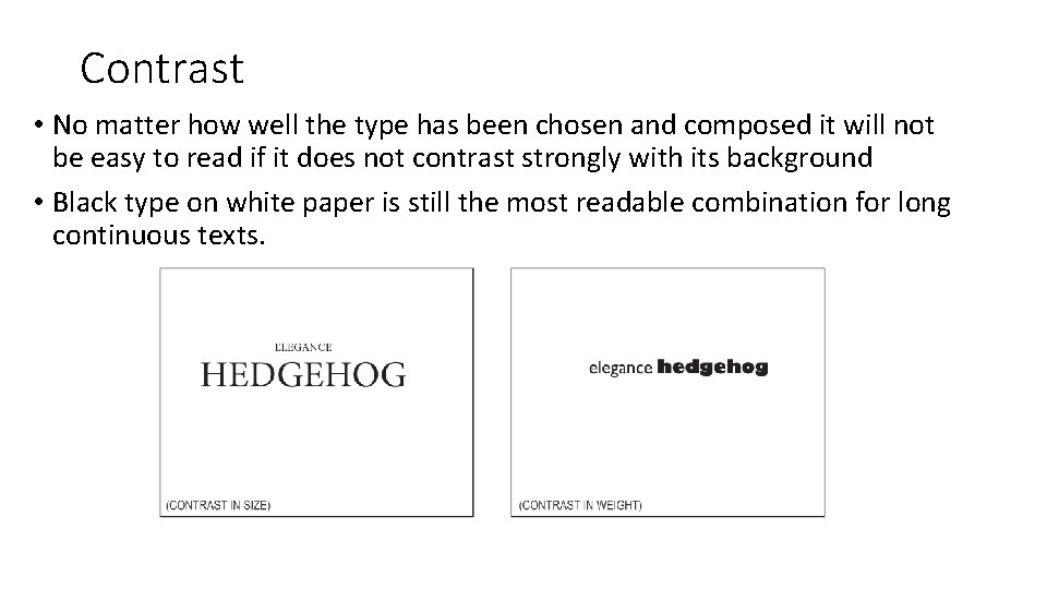
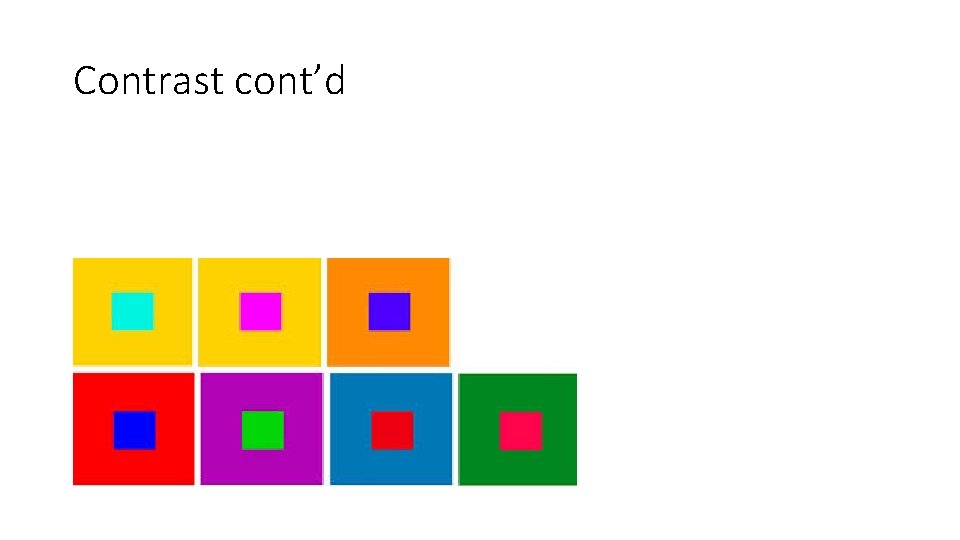
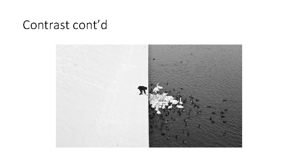
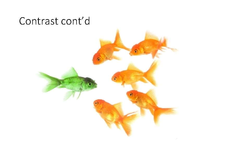
Contrast • No matter how well the type has been chosen and composed it will not be easy to read if it does not contrast strongly with its background • Black type on white paper is still the most readable combination for long continuous texts.

Contrast cont’d

Contrast cont’d

Contrast cont’d

Contrast cont’d

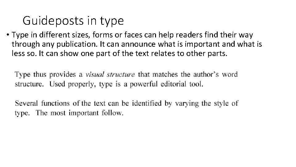
Guideposts in type • Type in different sizes, forms or faces can help readers find their way through any publication. It can announce what is important and what is less so. It can show one part of the text relates to other parts.
