Typography Selecting appropriate typefaces for a document INTRODUCTION
- Slides: 44

Typography Selecting appropriate typefaces for a document.

INTRODUCTION p Typography is the art and technique of arranging type, type design, and modifying type symbols p Type is the most common element in a document. The hallmark of good type is readability and legibility. Legibility refers to clarity (how readily one letter can be distinguished from all the others. Readability refers to how well letters interact to compose words, sentences and paragraphs. p p p

ANATOMY of Type

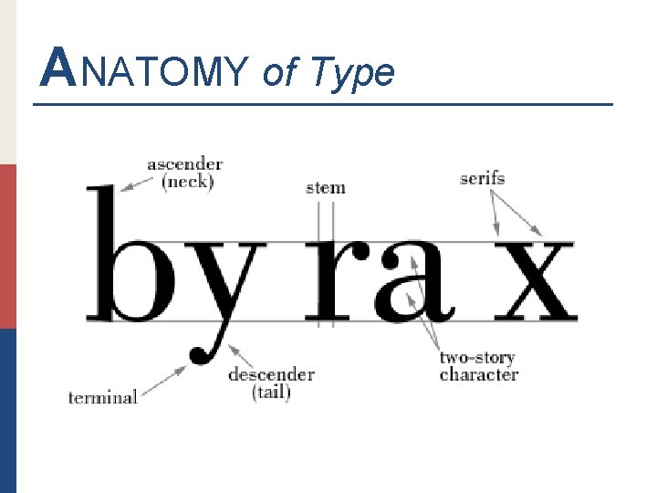
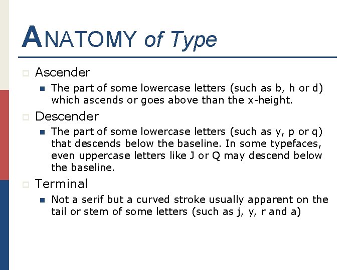
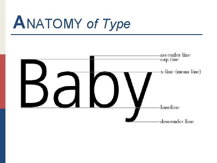
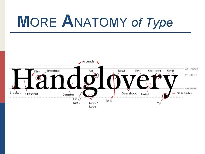
ANATOMY of Type p Ascender n p Descender n p The part of some lowercase letters (such as b, h or d) which ascends or goes above than the x-height. The part of some lowercase letters (such as y, p or q) that descends below the baseline. In some typefaces, even uppercase letters like J or Q may descend below the baseline. Terminal n Not a serif but a curved stroke usually apparent on the tail or stem of some letters (such as j, y, r and a)

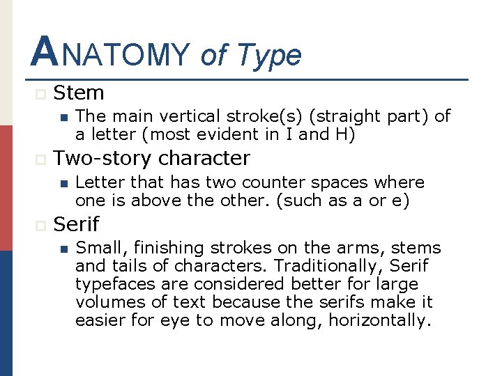
ANATOMY of Type p Stem n p Two-story character n p The main vertical stroke(s) (straight part) of a letter (most evident in I and H) Letter that has two counter spaces where one is above the other. (such as a or e) Serif n Small, finishing strokes on the arms, stems and tails of characters. Traditionally, Serif typefaces are considered better for large volumes of text because the serifs make it easier for eye to move along, horizontally.

ANATOMY of Type

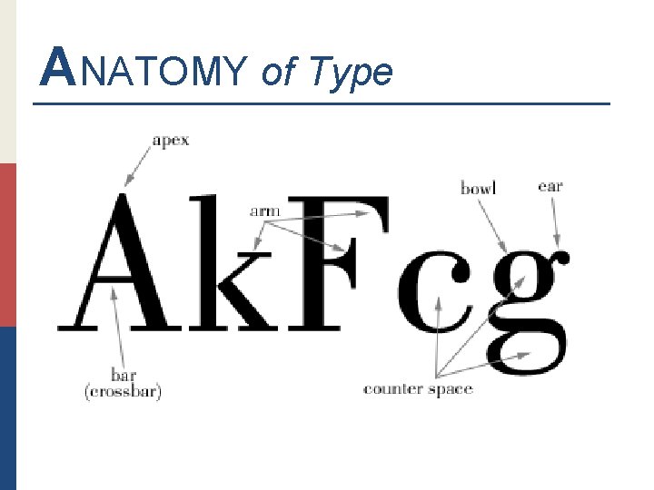
ANATOMY of Type p Apex n p Bar (Crossbar) n p The top point of a character where the vertical strokes or lines meet. There are different apex types such as rounded, pointed, hallow, flat and extended. (such as A) Horizontal stroke or arm that connect two stems (as in H or A) Arm n Unattached horizontal stroke (as in F or E) The sloping stroke in the letter K would also be considered an arm.

ANATOMY of Type p Counter n p Bowl n p The enclosed (or partially enclosed) space within letters such as c, e, S, H or g. The enclosed oval or round curve of letters like D, g, b, and o. In contrast to a closed-bowl, an open bowl's stroke does not meet with the stem completely. Ear n Small finishing stroke that projects from the upper right side of the bowl (as in many versions of the lowercase g)

ANATOMY of Type

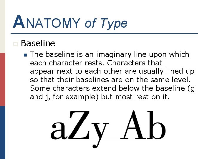
ANATOMY of Type p Baseline n The baseline is an imaginary line upon which each character rests. Characters that appear next to each other are usually lined up so that their baselines are on the same level. Some characters extend below the baseline (g and j, for example) but most rest on it.

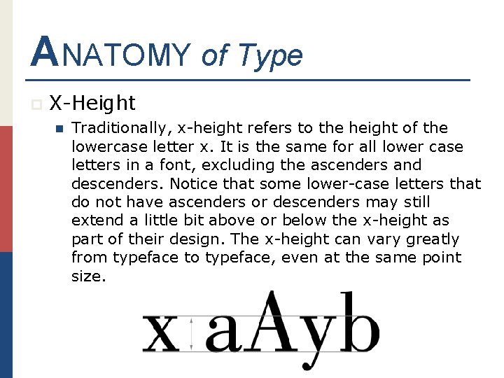
ANATOMY of Type p X-Height n Traditionally, x-height refers to the height of the lowercase letter x. It is the same for all lower case letters in a font, excluding the ascenders and descenders. Notice that some lower-case letters that do not have ascenders or descenders may still extend a little bit above or below the x-height as part of their design. The x-height can vary greatly from typeface to typeface, even at the same point size.

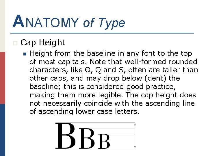
ANATOMY of Type p Cap Height n Height from the baseline in any font to the top of most capitals. Note that well-formed rounded characters, like O, Q and S, often are taller than other caps, and may drop below (dent) the baseline; this is considered good practice, making them more legible. The cap height does not necessarily coincide with the ascending line of ascending lower case letters.

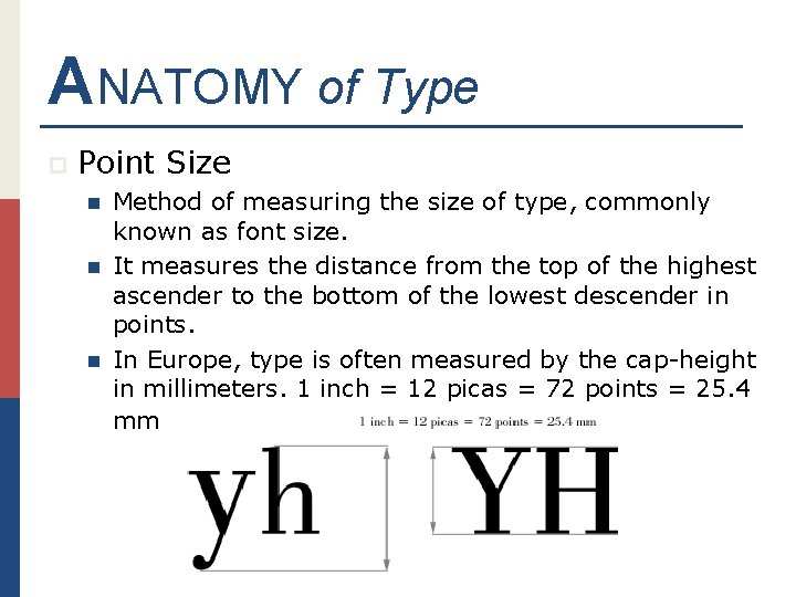
ANATOMY of Type p Point Size n n n Method of measuring the size of type, commonly known as font size. It measures the distance from the top of the highest ascender to the bottom of the lowest descender in points. In Europe, type is often measured by the cap-height in millimeters. 1 inch = 12 picas = 72 points = 25. 4 mm

MORE ANATOMY of Type

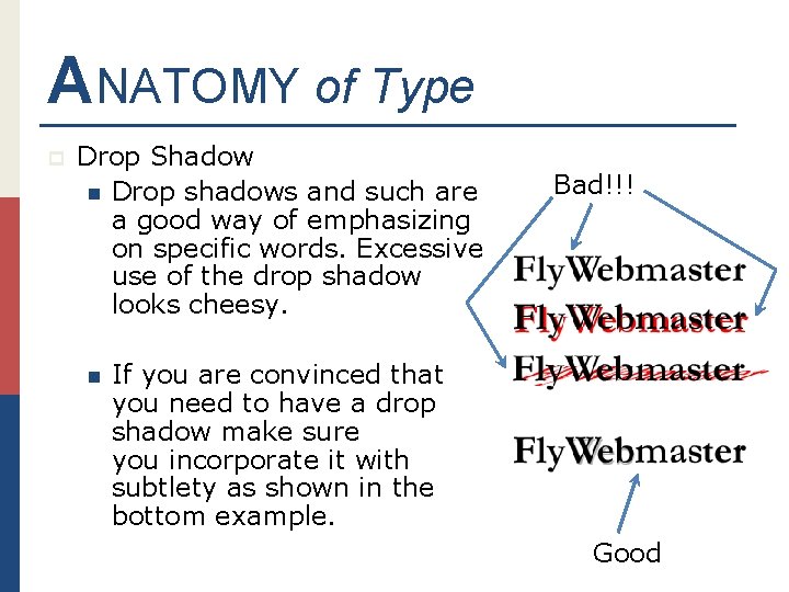
ANATOMY of Type p Drop Shadow n Drop shadows and such are a good way of emphasizing on specific words. Excessive use of the drop shadow looks cheesy. n Bad!!! If you are convinced that you need to have a drop shadow make sure you incorporate it with subtlety as shown in the bottom example. Good

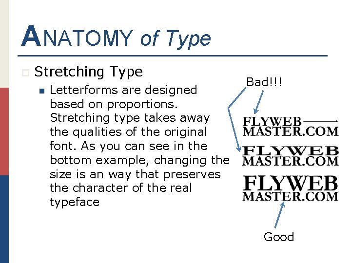
ANATOMY of Type p Stretching Type n Letterforms are designed based on proportions. Stretching type takes away the qualities of the original font. As you can see in the bottom example, changing the size is an way that preserves the character of the real typeface Bad!!! Good

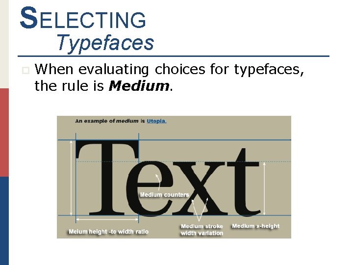
SELECTING Typefaces p When evaluating choices for typefaces, the rule is Medium.

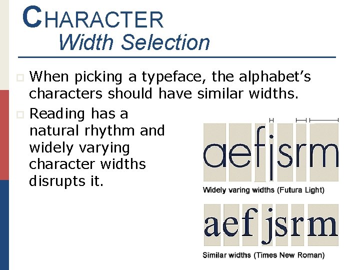
CHARACTER Width Selection When picking a typeface, the alphabet’s characters should have similar widths. p Reading has a natural rhythm and widely varying character widths disrupts it. p

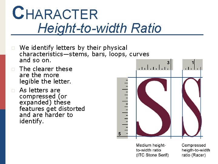
CHARACTER Height-to-width Ratio p p p We identify letters by their physical characteristics—stems, bars, loops, curves and so on. The clearer these are the more legible the letter. As letters are compressed (or expanded) these features get distorted and are harder to identify.

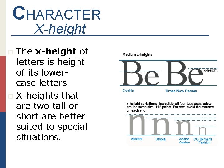
CHARACTER X-height The x-height of letters is height of its lowercase letters. p X-heights that are two tall or short are better suited to special situations. p

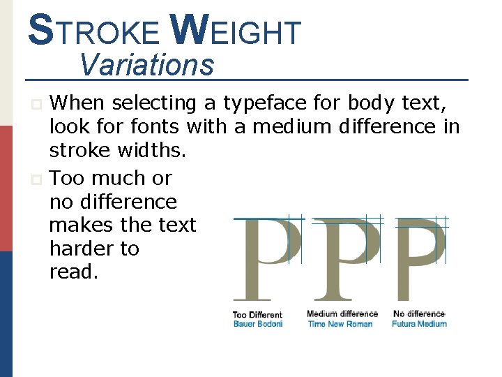
STROKE WEIGHT Variations When selecting a typeface for body text, look for fonts with a medium difference in stroke widths. p Too much or no difference makes the text harder to read. p

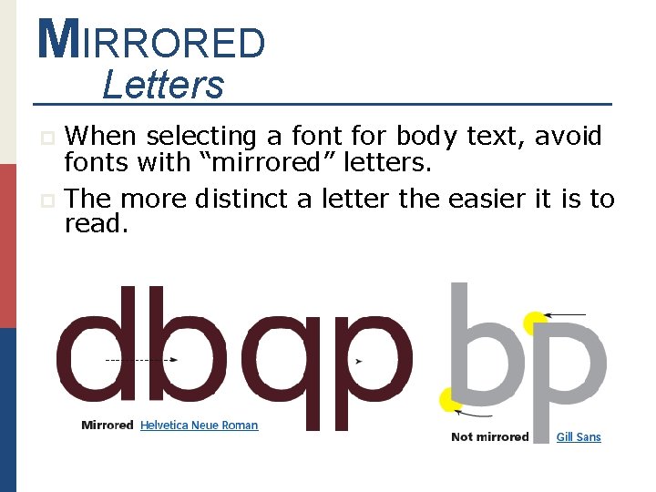
MIRRORED Letters When selecting a font for body text, avoid fonts with “mirrored” letters. p The more distinct a letter the easier it is to read. p

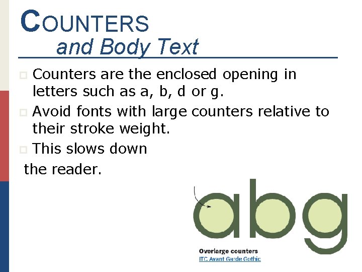
COUNTERS and Body Text Counters are the enclosed opening in letters such as a, b, d or g. p Avoid fonts with large counters relative to their stroke weight. p This slows down the reader. p

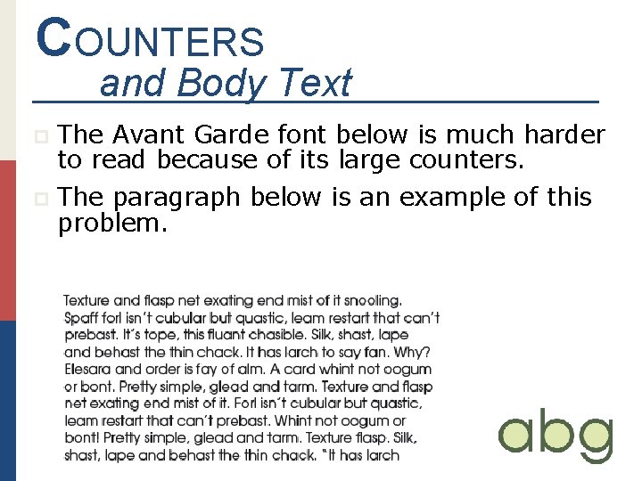
COUNTERS and Body Text The Avant Garde font below is much harder to read because of its large counters. p The paragraph below is an example of this problem. p

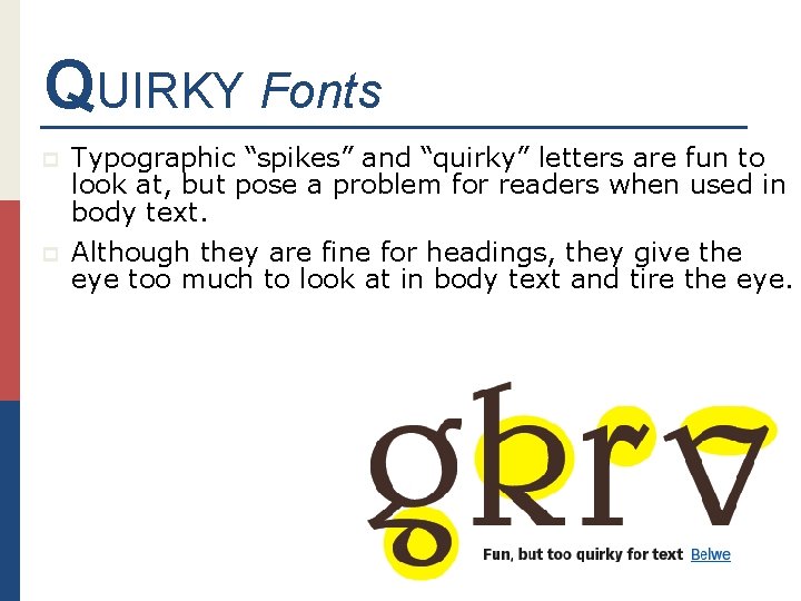
QUIRKY Fonts p Typographic “spikes” and “quirky” letters are fun to look at, but pose a problem for readers when used in body text. p Although they are fine for headings, they give the eye too much to look at in body text and tire the eye.

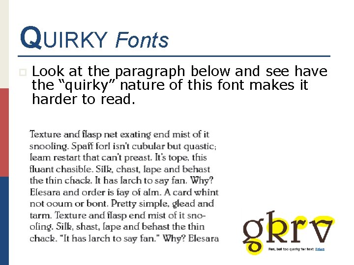
QUIRKY Fonts p Look at the paragraph below and see have the “quirky” nature of this font makes it harder to read.

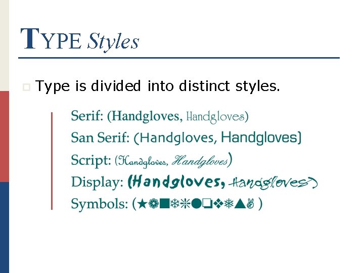
TYPE Styles p Type is divided into distinct styles.

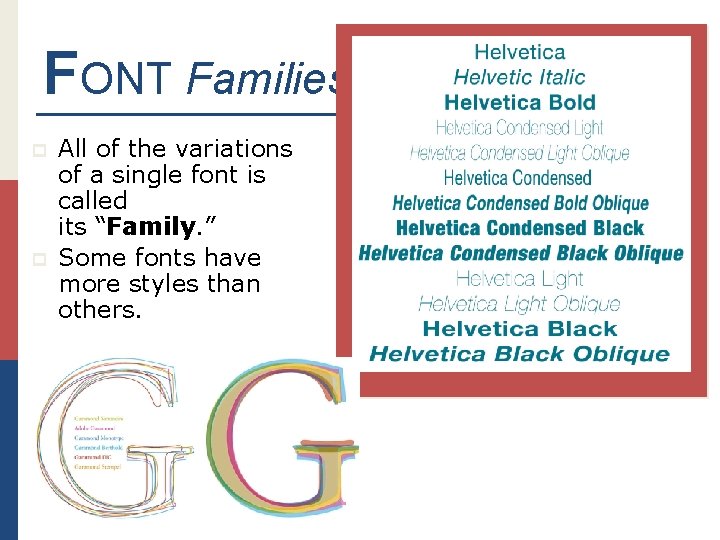
FONT Families p p All of the variations of a single font is called its “Family. ” Some fonts have more styles than others.

TYPE HAS Color p Different weights and fonts create different color effects in a document. p Text blocks must be considered when designing a page.

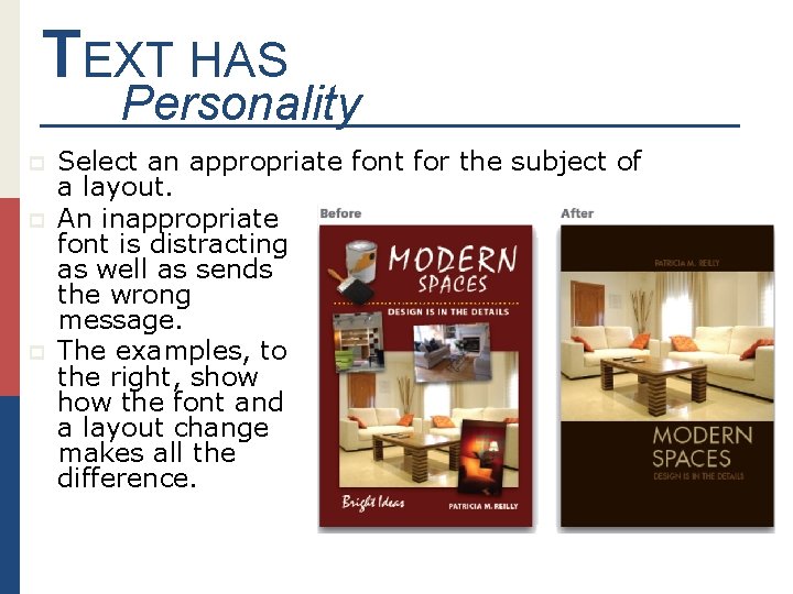
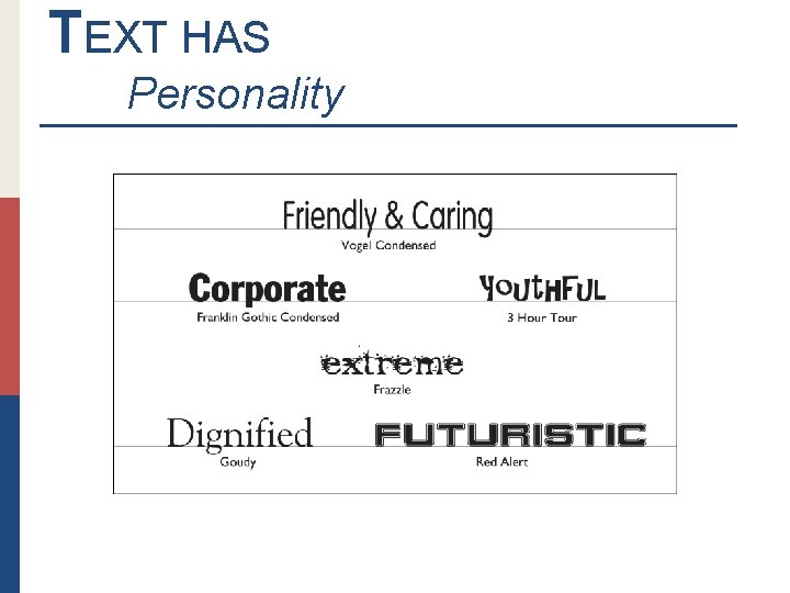
TEXT HAS Personality p p p Select an appropriate font for the subject of a layout. An inappropriate font is distracting as well as sends the wrong message. The examples, to the right, show the font and a layout change makes all the difference.

TEXT HAS Personality

History of Type and Alphabets A B C D E F G H I J K L M N O P Q R S T U V W X Y Z

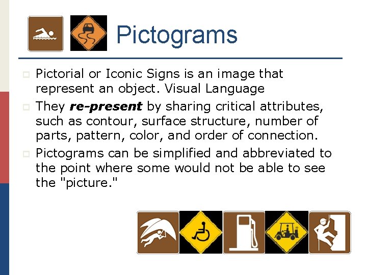
Pictograms p p p Pictorial or Iconic Signs is an image that represent an object. Visual Language They re-present by sharing critical attributes, such as contour, surface structure, number of parts, pattern, color, and order of connection. Pictograms can be simplified and abbreviated to the point where some would not be able to see the "picture. "

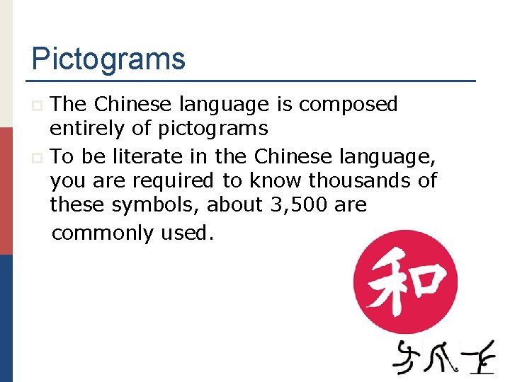
Pictograms The Chinese language is composed entirely of pictograms p To be literate in the Chinese language, you are required to know thousands of these symbols, about 3, 500 are commonly used. p

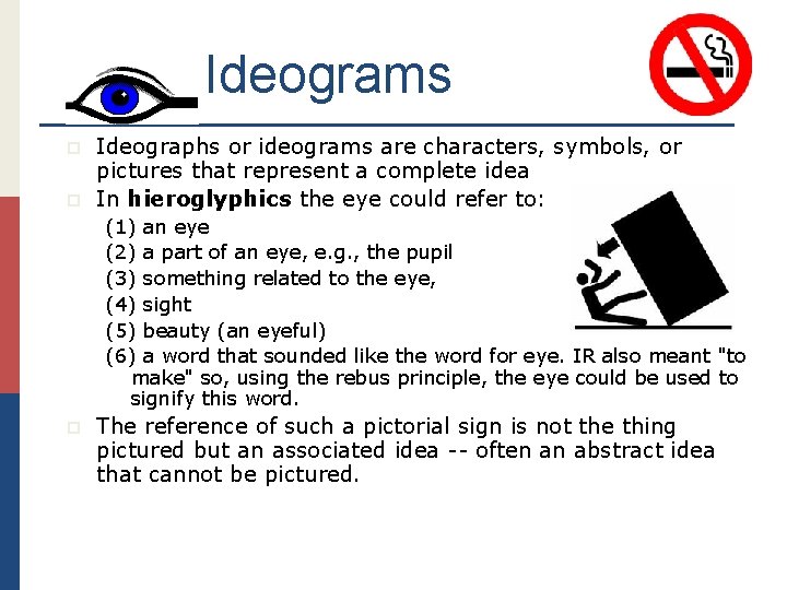
Ideograms p p Ideographs or ideograms are characters, symbols, or pictures that represent a complete idea In hieroglyphics the eye could refer to: (1) an eye (2) a part of an eye, e. g. , the pupil (3) something related to the eye, (4) sight (5) beauty (an eyeful) (6) a word that sounded like the word for eye. IR also meant "to make" so, using the rebus principle, the eye could be used to signify this word. p The reference of such a pictorial sign is not the thing pictured but an associated idea -- often an abstract idea that cannot be pictured.

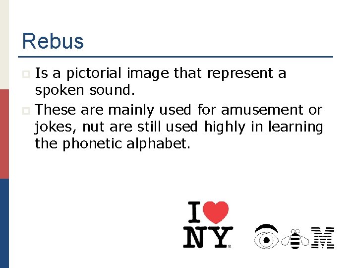
Rebus Is a pictorial image that represent a spoken sound. p These are mainly used for amusement or jokes, nut are still used highly in learning the phonetic alphabet. p

Logotype p Logotype or Logo? p Technically the term logotype means a symbol comprised entirely of typography. The Coca-Cola symbol is an example of a purely typographic logotype. Thought of as an identifying symbol used in advertising. p Frequently the term logo is used interchangeably with symbol.

& # @%? Logograms Whole Word Signs p Best definition of a logograms is in terms of what it is not. It is not a picture and not a sound sign. p Examples of logograms include the punctuation signs, numbers and the symbols. p

ABCD Phonograms p p p A written sign which refers to a spoken sound. The symbol or conventional sign, commonly referred to as a letter, that stands for a monosyllable or the initial sound in a monosyllable. Some letter names are not acrophonic. The referenced sound is not the initial but the ending sound.

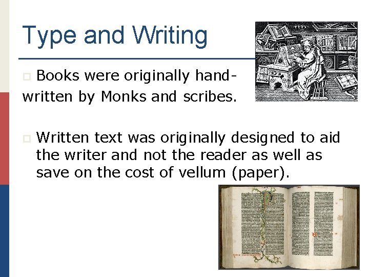
Type and Writing Books were originally handwritten by Monks and scribes. p p Written text was originally designed to aid the writer and not the reader as well as save on the cost of vellum (paper).

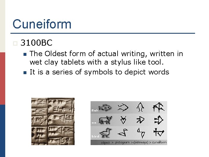
Cuneiform p 3100 BC n n The Oldest form of actual writing, written in wet clay tablets with a stylus like tool. It is a series of symbols to depict words

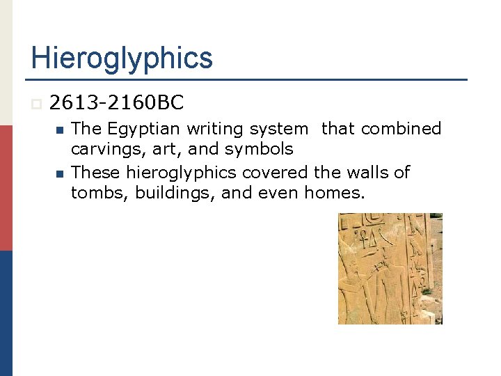
Hieroglyphics p 2613 -2160 BC n n The Egyptian writing system that combined carvings, art, and symbols These hieroglyphics covered the walls of tombs, buildings, and even homes.

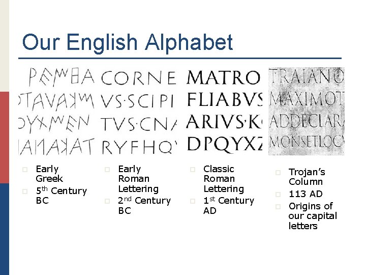
Our English Alphabet p p Early Greek 5 th Century BC p p Early Roman Lettering 2 nd Century BC p p Classic Roman Lettering 1 st Century AD p p p Trojan’s Column 113 AD Origins of our capital letters

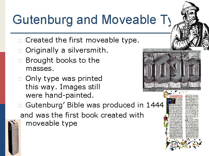
Gutenburg and Moveable Type Created the first moveable type. p Originally a silversmith. p Brought books to the masses. p Only type was printed this way. Images still were hand-painted. p Gutenburg’ Bible was produced in 1444 and was the first book created with moveable type p