Packaging Project Packaging No matter how good your
- Slides: 29


Packaging Project

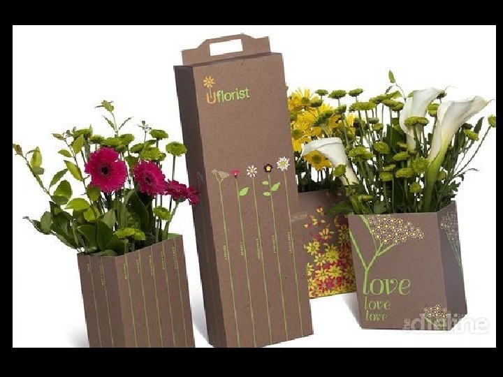
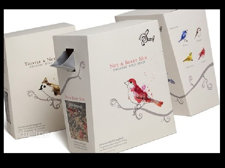
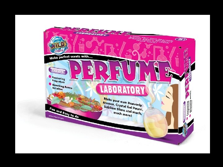
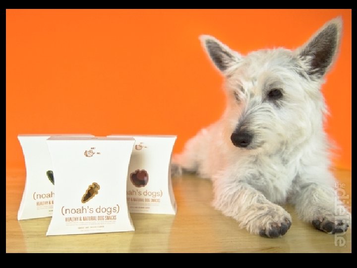
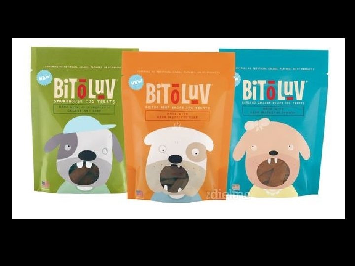
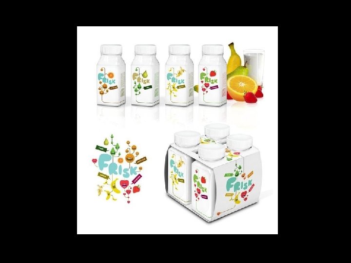
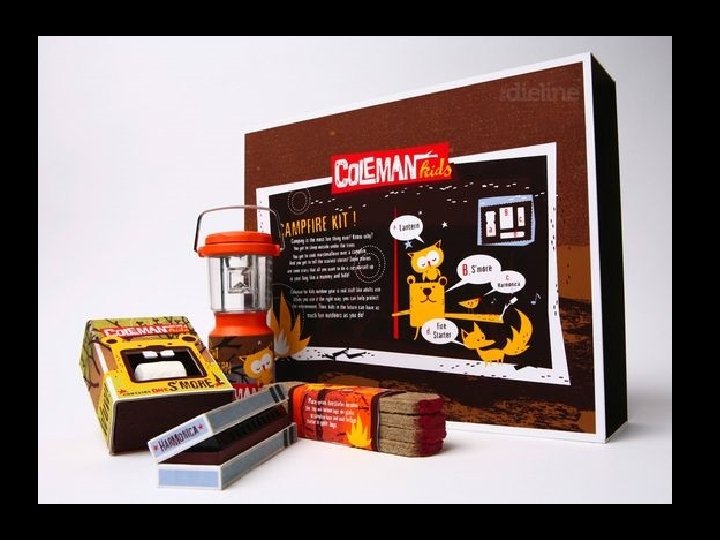
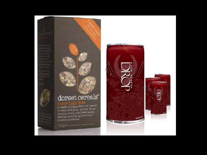
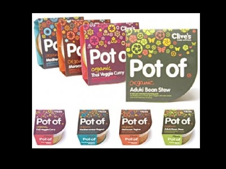
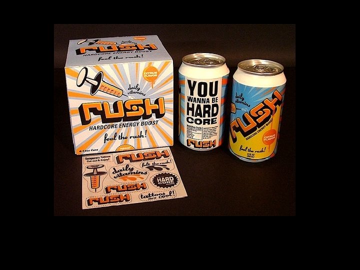
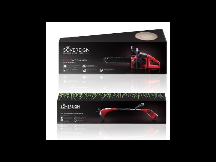
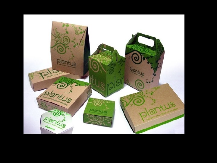
Packaging • No matter how good your product is, if it doesn't stand out on the shelf you sales will be affected. • A good packaging design will capture your target audiences attention and will make them pick your product up off the shelf, instead the competitors. • If the package gives all the information in a clear concise way, it can determine if the consumer will purchase the product or not.


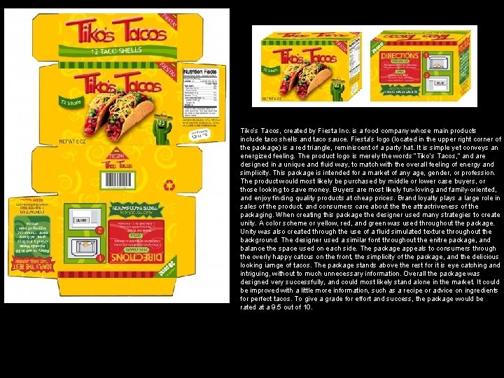
Tiko’s Tacos, created by Fiesta Inc. is a food company whose main products include taco shells and taco sauce. Fiesta’s logo (located in the upper right corner of the package) is a red triangle, reminiscent of a party hat. It is simple yet conveys an energized feeling. The product logo is merely the words “Tiko’s Tacos, ” and are designed in a unique and fluid way, to match with the overall feeling of energy and simplicity. This package is intended for a market of any age, gender, or profession. The product would most likely be purchased by middle or lower case buyers, or those looking to save money. Buyers are most likely fun-loving and family-oriented, and enjoy finding quality products at cheap prices. Brand loyalty plays a large role in sales of the product, and consumers care about the attractriveness of the packaging. When creating this package the designer used many strategies to create unity. A color scheme or yellow, red, and green was used throughout the package. Unity was also created through the use of a fluid simulated texture throughout the background. The designer used a similar font throughout the enitre package, and balance the space used on each side. The package appeals to consumers through the overly happy catcus on the front, the simplicity of the package, and the delicious looking iamge of tacos. The package stands above the rest for it is eye catching and intriguing, without to much unnecessary information. Overall the package was designed very successfully, and could most likely stand alone in the market. It could be improved with a little more information, such as a recipe or advice on ingredients for perfect tacos. To give a grade for effort and success, the package would be rated at a 9. 5 out of 10.

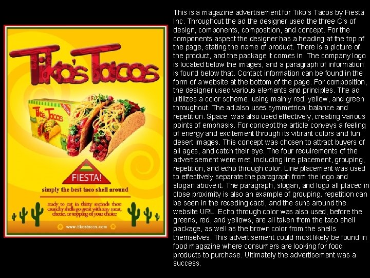
This is a magazine advertisement for Tiko’s Tacos by Fiesta Inc. Throughout the ad the designer used the three C’s of design, components, composition, and concept. For the components aspect the designer has a heading at the top of the page, stating the name of product. There is a picture of the product, and the package it comes in. The company logo is located below the images, and a paragraph of information is found below that. Contact information can be found in the form of a website at the bottom of the page. For composition, the designer used various elements and principles. The ad ultilizes a color scheme, using mainly red, yellow, and green throughout. The ad also uses symmetrical balance and repetition. Space was also used effectively, creating various points of emphasis. For concept the article conveys a feeling of energy and excitement through its vibrant colors and fun desert images. This concept was chosen to attract buyers of all ages, and catch their eye. The four requirements of the advertisement were met, including line placement, grouping, repetition, and echo through color. Line placement was used to effectively separate the paragraph from the logo and slogan above it. The paragraph, slogan, and logo all placed in close proximity is also an example of grouping. repetition can be seen in the receding cacti, and the suns around the website URL. Echo through color was also used, before the greens, red, and yellows, are all taken from the taco shell package, as well as the brown color from the shells themselves. This advertisement could most likely be found in food magazine where consumers are looking for food products to purchase. Ultimately the advertisement was a success.

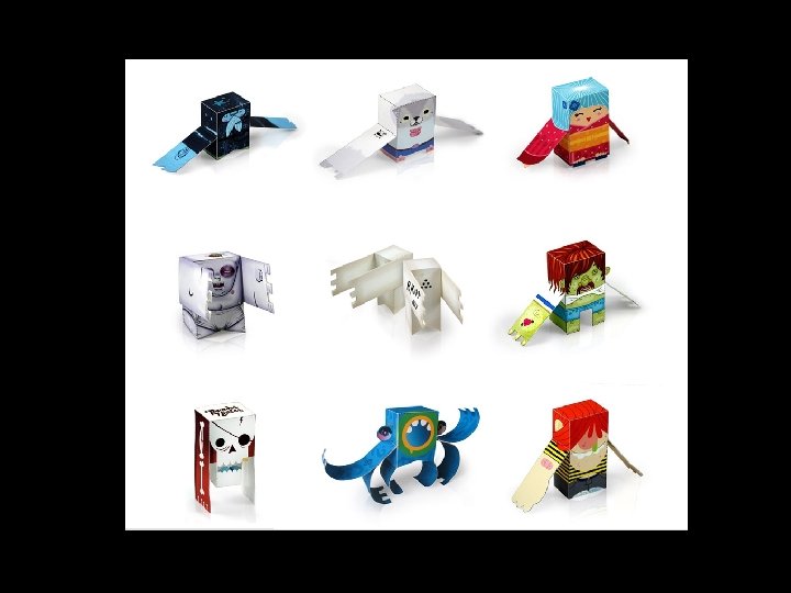
Choose from any of these boxes: • Food • Toy • Tool • Home décor • Makeup • Perfume • Open to suggestions…

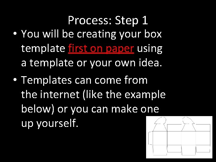
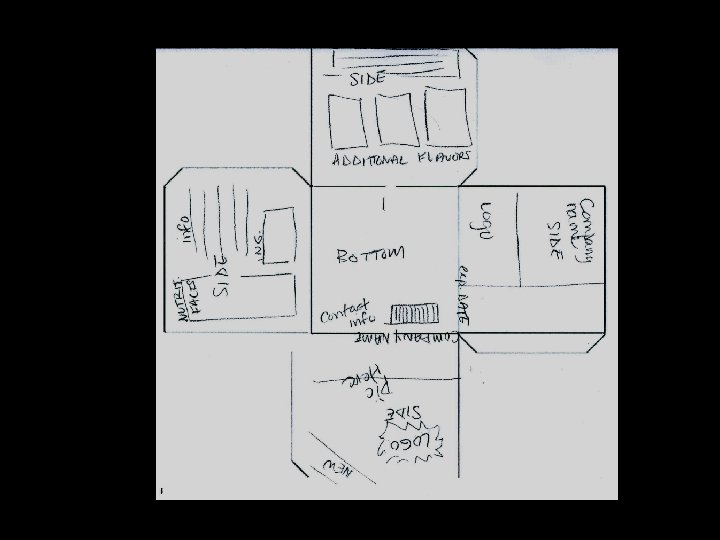
Process: Step 1 • You will be creating your box template first on paper using a template or your own idea. • Templates can come from the internet (like the example below) or you can make one up yourself.


Process: Step 2 • Create an 8” x 10” doc in Photoshop and paste in. • Enlarge as big as you can holding down the shift key.

Process: Step 3 • You will add all colored background sections, graphics and pictures using Photoshop. • This is when you will add effects to make it eye catching and interesting. • Organize the space effectively.

Box Requirements • • • • Food Package Non perishable items Exp date Nutritional facts Ingredients Flavor Directions Contact info Recycle pictures Paragraph Games to play on box (cereal) Bar code Quantity, size Company logo Product logo Other ideas: recipes, coupon, box tops, healthy living ideas… • • • Quantity Size Scent? Directions Warnings? (medicine) Contact info Recycle Bar code Paragraph pictures Materials made with Other ideas: different products made company, coupons…

Process: Step 4 • Lastly, all text will be added using Illustrator. • The final box will be printed on thick paper and assembled.

TURN IN YOUR EXIT PASSES