Effective Graphic Design Adapted from The NonDesigners Design
- Slides: 28
Effective Graphic Design Adapted from The Non-Designer’s Design Book By Robin Williams
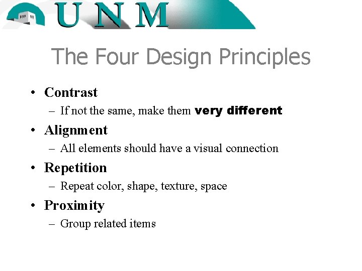
The Four Design Principles • Contrast – If not the same, make them very different • Alignment – All elements should have a visual connection • Repetition – Repeat color, shape, texture, space • Proximity – Group related items
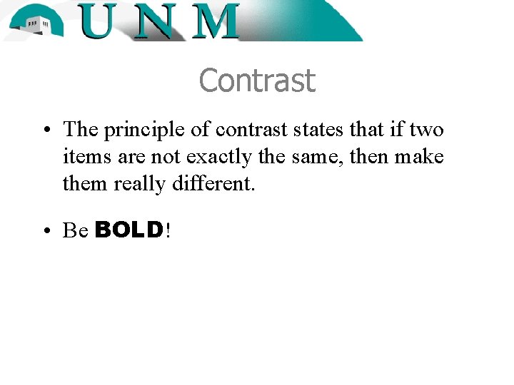
Contrast • The principle of contrast states that if two items are not exactly the same, then make them really different. • Be BOLD!
How To Create Contrast • Large type and small type (size) • Thin line and thick line (weight) • Combinations of fonts • Color
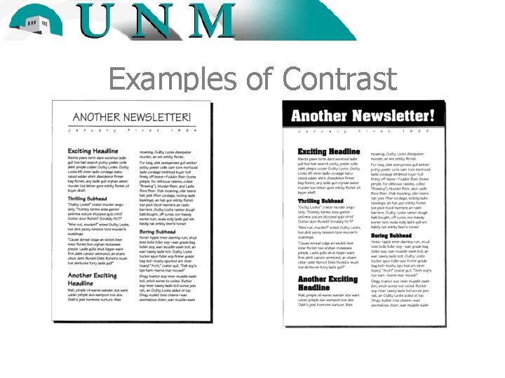
Examples of Contrast
Contrast – What To Avoid • Don’t be a wimp – do it with strength.
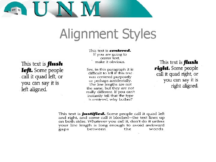
Alignment • The principle of alignment states that nothing should be placed on the page arbitrarily. • Every item should have a visual connection with something else.
Alignment Styles
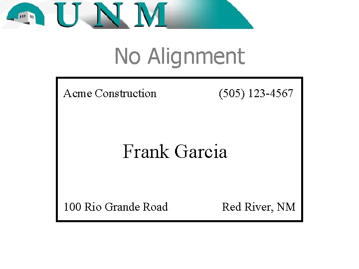
No Alignment Acme Construction (505) 123 -4567 Frank Garcia 100 Rio Grande Road Red River, NM
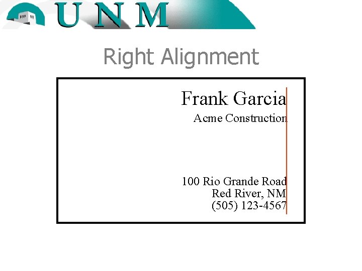
Right Alignment Frank Garcia Acme Construction 100 Rio Grande Road Red River, NM (505) 123 -4567
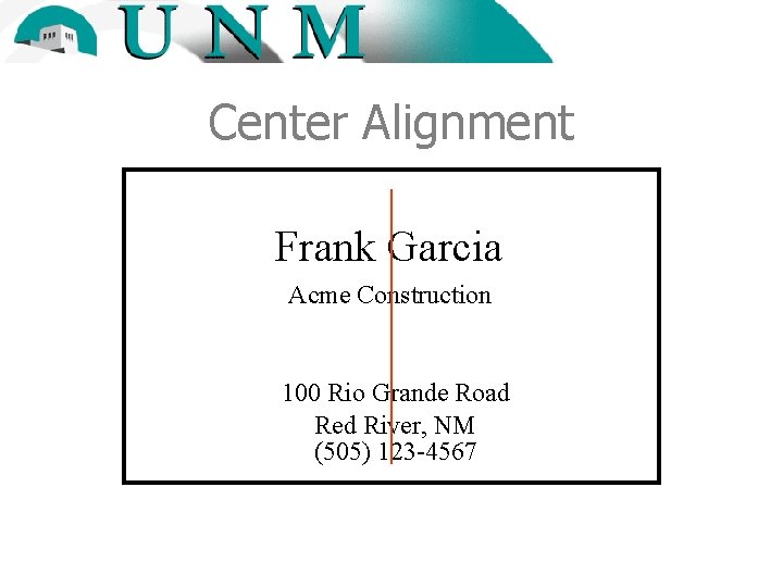
Center Alignment Frank Garcia Acme Construction 100 Rio Grande Road Red River, NM (505) 123 -4567
Alignment – What To Avoid • Avoid using more than one text alignment on a page. – Don’t center some text and right align other text. • Break the center alignment habit. – Formal / sedate / dull.
Repetition • The principle of repetition states that you repeat some aspect of the design throughout the entire piece. • The repeated item could be a font, line, particular bullet, color, image, or format.
Repetition Frank Garcia Acme Construction 100 Rio Grande Road Red River, NM (505) 123 -4567
Repetition – What To Avoid • Avoid repeating an element so much that it becomes annoying or distracting.
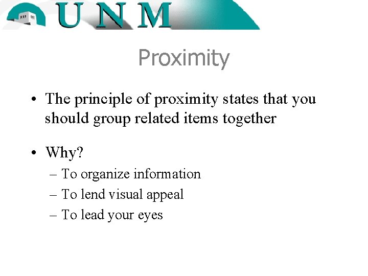
Proximity • The principle of proximity states that you should group related items together • Why? – To organize information – To lend visual appeal – To lead your eyes
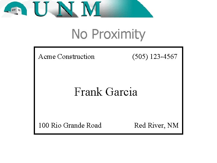
No Proximity Acme Construction (505) 123 -4567 Frank Garcia 100 Rio Grande Road Red River, NM
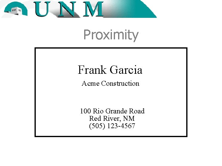
Proximity Frank Garcia Acme Construction 100 Rio Grande Road Red River, NM (505) 123 -4567
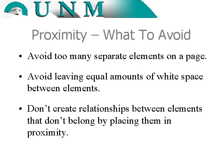
Proximity – What To Avoid • Avoid too many separate elements on a page. • Avoid leaving equal amounts of white space between elements. • Don’t create relationships between elements that don’t belong by placing them in proximity.
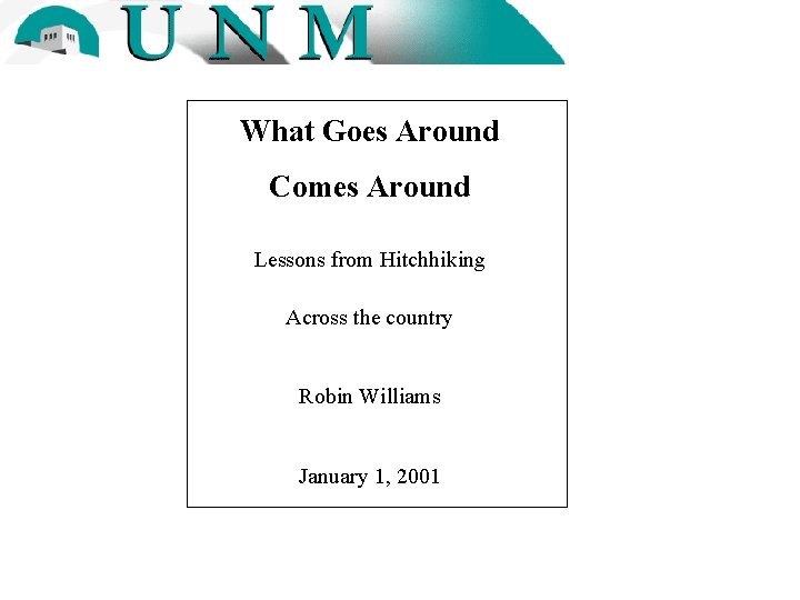
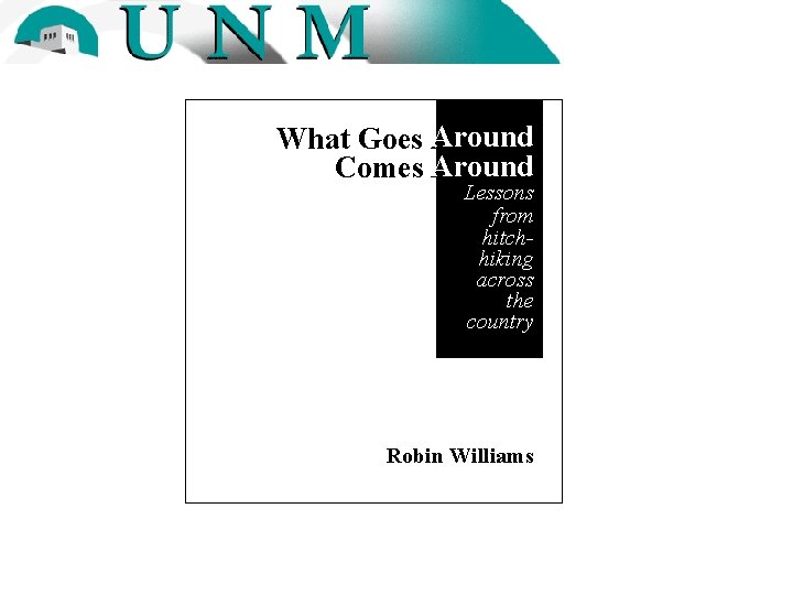
What Goes Around Comes Around Lessons from Hitchhiking Across the country Robin Williams January 1, 2001
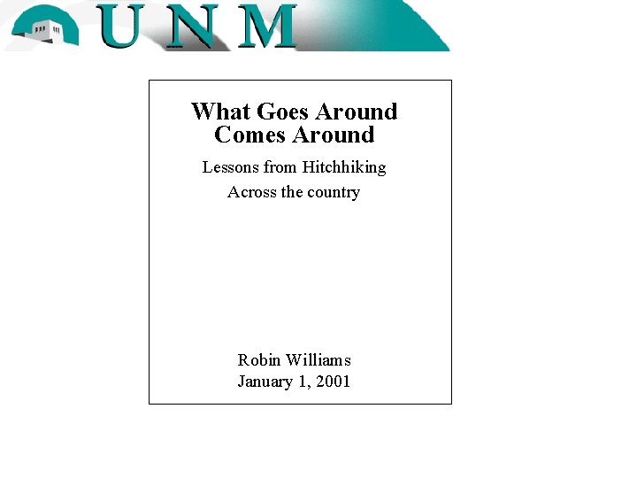
What Goes Around Comes Around Lessons from Hitchhiking Across the country Robin Williams January 1, 2001
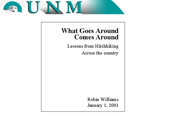
What Goes Around Comes Around Lessons from Hitchhiking Across the country Robin Williams January 1, 2001
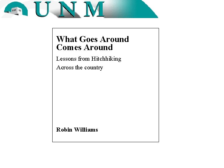
What Goes Around Comes Around Lessons from Hitchhiking Across the country Robin Williams
What Goes Around Comes Around Lessons from hitchhiking across the country Robin Williams
Font Style for Primary • Comic Sans is an effective font for use with primary kids. Can you tell why? • Look at the letter a. In most fonts, the letter a is not written in the form we teach kids in handwriting.
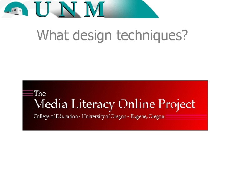
What design techniques?
Rule 166 • When using presentation software: – One main idea or concept • 6 points • 6 words
References The Non-Designer’s Design Book By Robin Williams CARP Website