CERNER MILLENNIUM Power Chart Desktop Orientation In this
- Slides: 27

CERNER MILLENNIUM Power. Chart Desktop Orientation In this lesson we’ll orient you to the components of the Power. Chart desktop, & show to open a patient’s chart. This has been prepared for Millennium code level 2015. 01. 15 & m. Page 6. 0. Subsequent updates may display cosmetic & functional changes. Use the keyboard or mouse to advance.

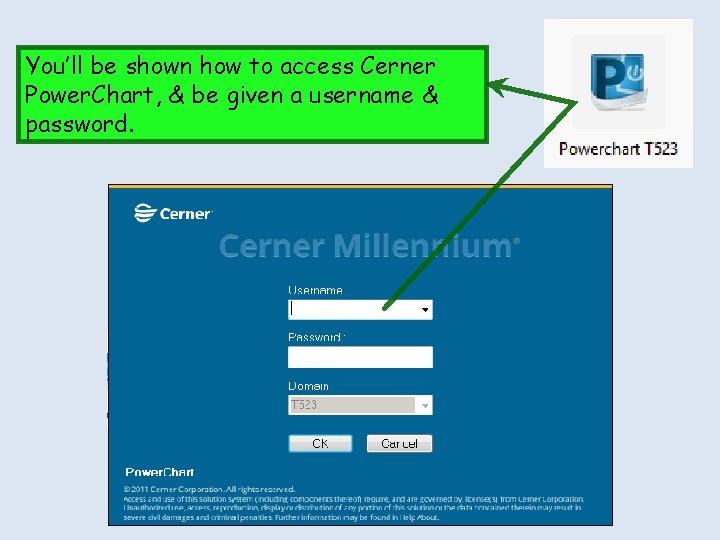
You’ll be shown how to access Cerner Power. Chart, & be given a username & password.

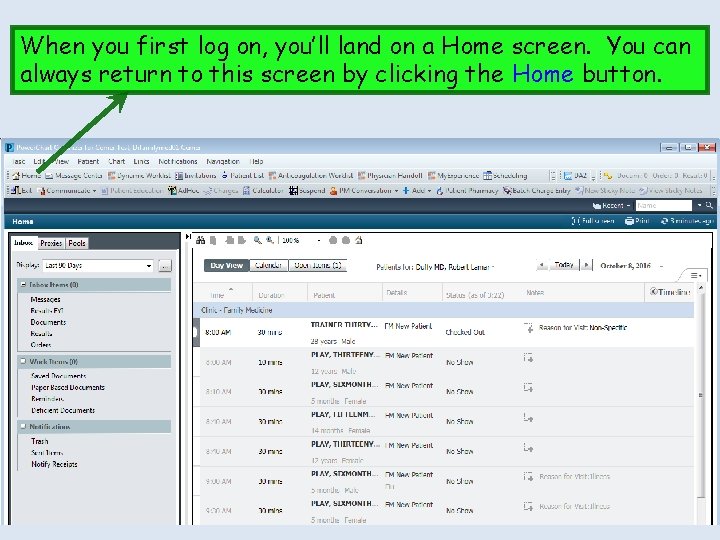
When you first log on, you’ll land on a Home screen. You can always return to this screen by clicking the Home button.

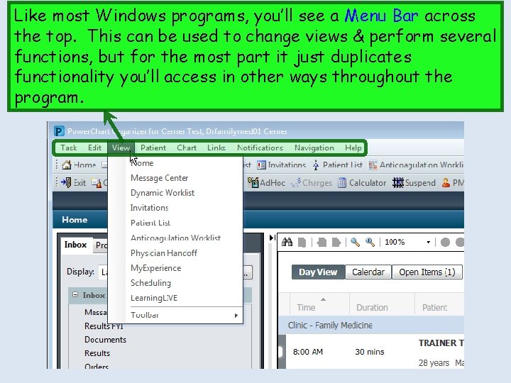
Like most Windows programs, you’ll see a Menu Bar across the top. This can be used to change views & perform several functions, but for the most part it just duplicates functionality you’ll access in other ways throughout the program.

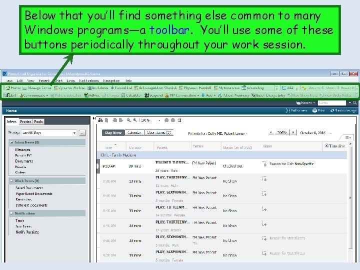
Below that you’ll find something else common to many Windows programs—a toolbar. You’ll use some of these buttons periodically throughout your work session.

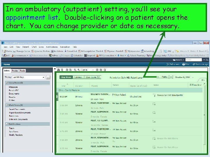
In an ambulatory (outpatient) setting, you’ll see your appointment list. Double-clicking on a patient opens the chart. You can change provider or date as necessary.

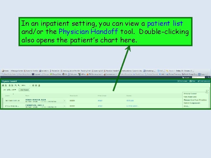
In an inpatient setting, you can view a patient list and/or the Physician Handoff tool. Double-clicking also opens the patient’s chart here.

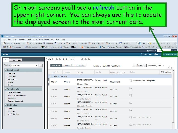
On most screens you’ll see a refresh button in the upper right corner. You can always use this to update the displayed screen to the most current data.

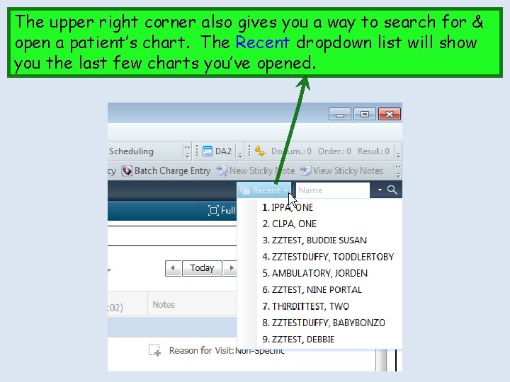
The upper right corner also gives you a way to search for & open a patient’s chart. The Recent dropdown list will show you the last few charts you’ve opened.

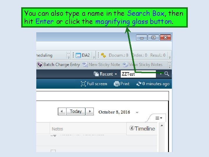
You can also type a name in the Search Box, then hit Enter or click the magnifying glass button.

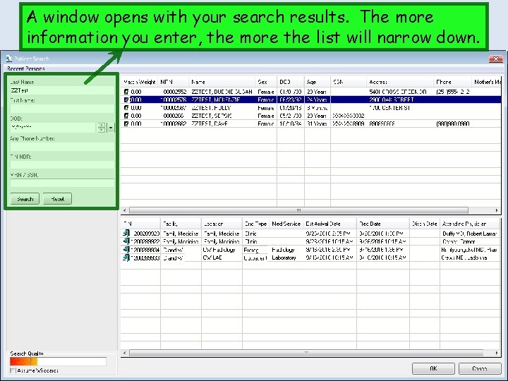
A window opens with your search results. The more information you enter, the more the list will narrow down.

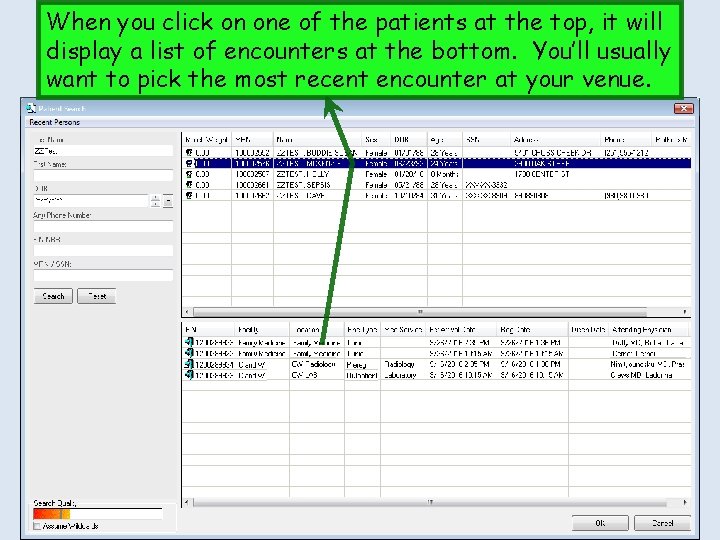
When you click on one of the patients at the top, it will display a list of encounters at the bottom. You’ll usually want to pick the most recent encounter at your venue.

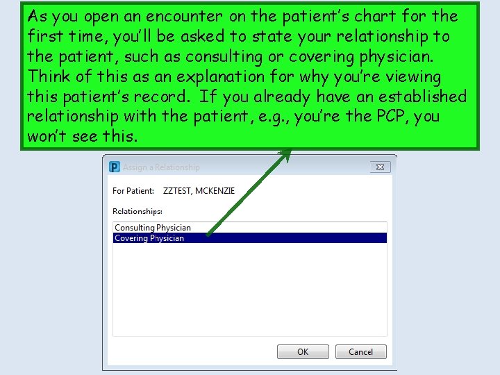
As you open an encounter on the patient’s chart for the first time, you’ll be asked to state your relationship to the patient, such as consulting or covering physician. Think of this as an explanation for why you’re viewing this patient’s record. If you already have an established relationship with the patient, e. g. , you’re the PCP, you won’t see this.

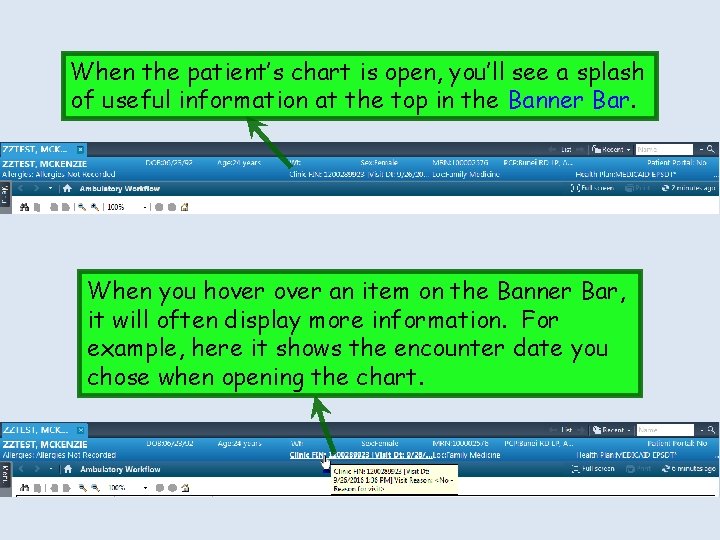
When the patient’s chart is open, you’ll see a splash of useful information at the top in the Banner Bar. When you hover an item on the Banner Bar, it will often display more information. For example, here it shows the encounter date you chose when opening the chart.

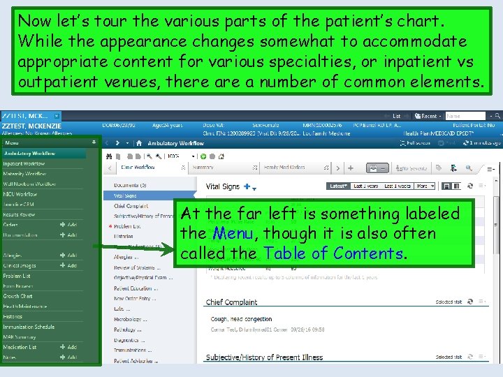
Now let’s tour the various parts of the patient’s chart. While the appearance changes somewhat to accommodate appropriate content for various specialties, or inpatient vs outpatient venues, there a number of common elements. At the far left is something labeled the Menu, though it is also often called the Table of Contents.

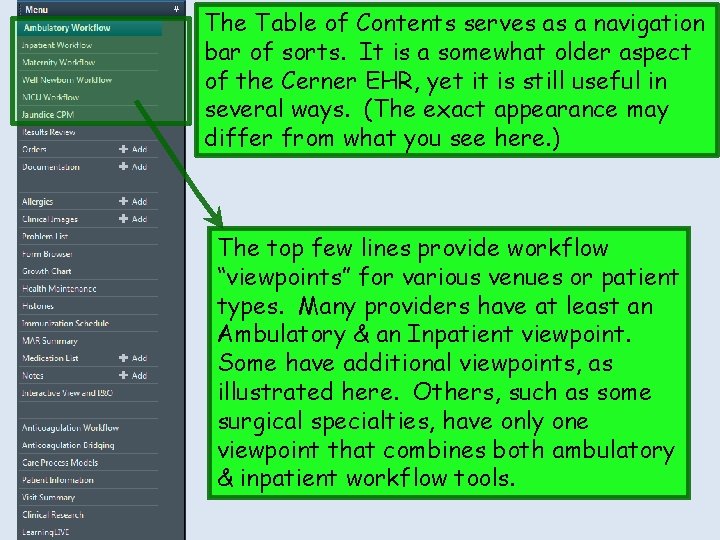
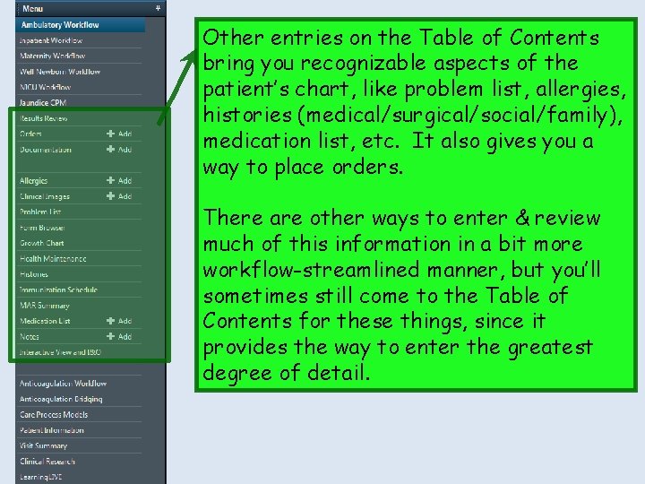
The Table of Contents serves as a navigation bar of sorts. It is a somewhat older aspect of the Cerner EHR, yet it is still useful in several ways. (The exact appearance may differ from what you see here. ) The top few lines provide workflow “viewpoints” for various venues or patient types. Many providers have at least an Ambulatory & an Inpatient viewpoint. Some have additional viewpoints, as illustrated here. Others, such as some surgical specialties, have only one viewpoint that combines both ambulatory & inpatient workflow tools.

Other entries on the Table of Contents bring you recognizable aspects of the patient’s chart, like problem list, allergies, histories (medical/surgical/social/family), medication list, etc. It also gives you a way to place orders. There are other ways to enter & review much of this information in a bit more workflow-streamlined manner, but you’ll sometimes still come to the Table of Contents for these things, since it provides the way to enter the greatest degree of detail.

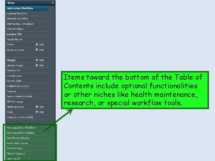
Items toward the bottom of the Table of Contents include optional functionalities or other niches like health maintenance, research, or special workflow tools.

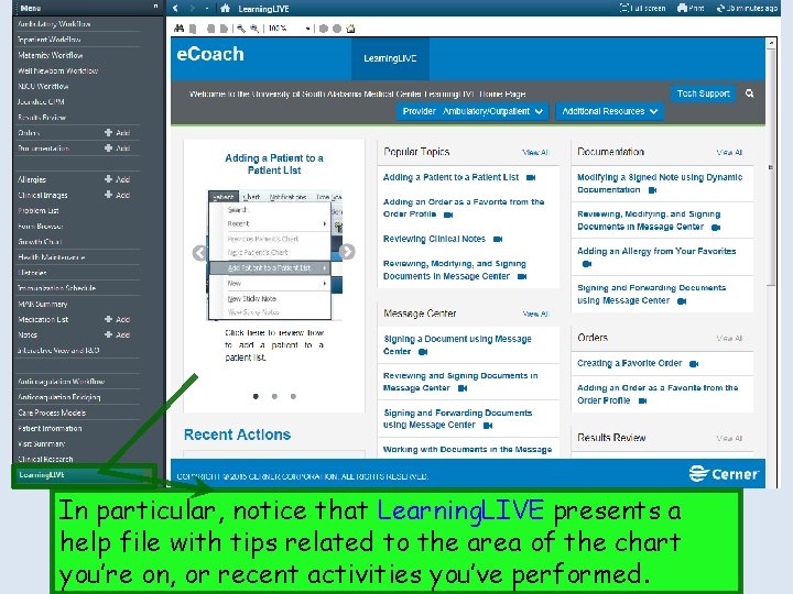
Items toward the bottom of the Table of Contents fill some other niches or optional functionalities, like health maintenance, research, or special workflow tools. In particular, notice that Learning. LIVE presents a help file with tips related to the area of the chart you’re on, or recent activities you’ve performed.

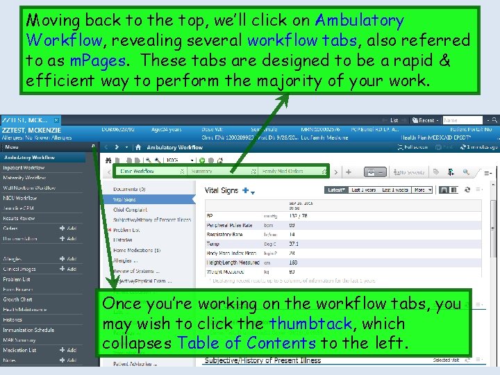
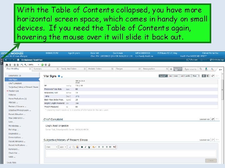
Moving back to the top, we’ll click on Ambulatory Workflow, revealing several workflow tabs, also referred to as m. Pages. These tabs are designed to be a rapid & efficient way to perform the majority of your work. Once you’re working on the workflow tabs, you may wish to click the thumbtack, which collapses Table of Contents to the left.

With the Table of Contents collapsed, you have more horizontal screen space, which comes in handy on small devices. If you need the Table of Contents again, hovering the mouse over it will slide it back out.

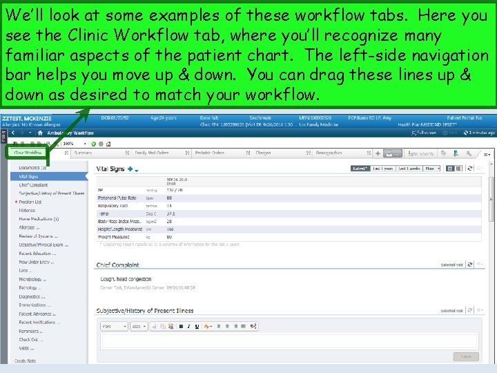
We’ll look at some examples of these workflow tabs. Here you see the Clinic Workflow tab, where you’ll recognize many familiar aspects of the patient chart. The left-side navigation bar helps you move up & down. You can drag these lines up & down as desired to match your workflow.

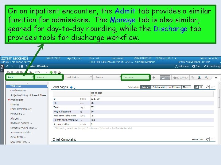
On an inpatient encounter, the Admit tab provides a similar function for admissions. The Manage tab is also similar, geared for day-to-day rounding, while the Discharge tab provides tools for discharge workflow.

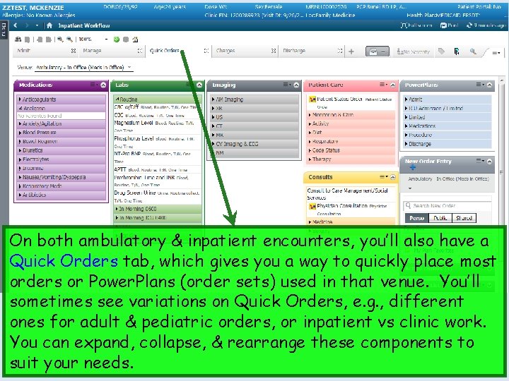
On both ambulatory & inpatient encounters, you’ll also have a Quick Orders tab, which gives you a way to quickly place most orders or Power. Plans (order sets) used in that venue. You’ll sometimes see variations on Quick Orders, e. g. , different ones for adult & pediatric orders, or inpatient vs clinic work. You can expand, collapse, & rearrange these components to suit your needs.

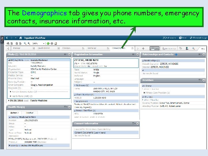
The Demographics tab gives you phone numbers, emergency contacts, insurance information, etc.

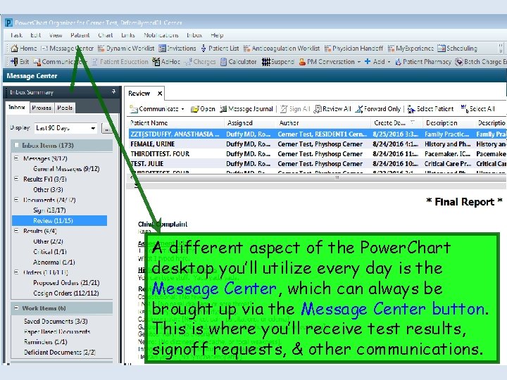
A different aspect of the Power. Chart desktop you’ll utilize every day is the Message Center, which can always be brought up via the Message Center button. This is where you’ll receive test results, signoff requests, & other communications.

We’ll review each of these parts of the Power. Chart desktop in more detail in other lessons.