Automated SPC Strategy SPC techniques for monitoring realtime


 first to examine the")


- Slides: 27
Automated SPC Strategy SPC techniques for monitoring real-time data Curriculum Development of Master’s Degree Program in Industrial Engineering for Thailand Sustainable Smart Industry
Outlines • Individual control chart • I-MR chart • Memory control chart • MA chart • EWMA chart • CUSUM chart [Ref] Technical Note. “PREDICTIVE STATISTICAL PROCESS CONTROL”. An update on datadriven CNC machining at L&S Machine Company.
I-MR Chart • Suitable for monitoring the stability over time of mean and variation of a process with continuous data that are individual observations not in subgroups For example, a hospital administrator wants to determine whether the time to perform outpatient hernia surgery is stable and whether the variation in surgery times is stable. Because the data are not collected in subgroups, the administrator uses an I-MR chart to monitor the mean and variation of the surgery times. • The points vary randomly around the center line and are within the control limits. • No trends or patterns are present. • The amount of time to perform hernia surgery and the variation in times are stable.
I-MR Chart • In many applications of the individual control chart, we use the moving average of two successive observations as the basis of estimating the process variability. That is, moving range of n = 2 observations is used, and the moving range (MR) is defined as where i = 2, 3, …
Control Limits
Example of I-MR Chart A quality engineer monitors the manufacture of liquid detergent and wants to assess whether the process is in control. The engineer measures the p. H of 25 consecutive batches of detergent. The engineer creates an I-MR chart to monitor the detergent process. 1. 2. 3. 4. 5. Open the sample data, Detergentp. H. MTW. Choose Stat > Control Charts > Variables Charts for Individuals > I-MR. In Variables, enter p. H. Click I-MR Options. On the Tests tab, select 1 point > K standard deviations from center line (Test 1) and K points in a row on same side of center line. (If you are not sure which tests apply in your specific situation, use Tests 1 and 2) 6. Click OK in each dialog box.
Interpret the results Interpret the Moving Range chart (MR chart) first to examine the process variation. None of the points are outside the control limits and the points display a random pattern. Thus, the process variation is in control, and the quality engineer can examine the process center on the Individuals chart (I chart). One observation failed Test 1 on the I chart because the observation is more than 3 standard deviations above the center line. I-MR Chart of p. H Test Results for I Chart of p. H TEST 1. One point more than 3. 00 standard deviations from center line. Test Failed at points: 8 * WARNING * If graph is updated with new data, the results above may no longer be correct.
Memory Control Charts • Shewhart charts (e. g. X-bar, R, S, P, NP, U, C, I, MR, Z, and DNOM) plotted at any given period, reflects only the sample information for that period. • Shewhart control charts are referred to as memoryless control charts. • This memoryless feature renders Shewhart control charts relatively less effective in the detection of smaller process shifts (say, < 1. 5σ). • To overcome performance deficiencies of Shewhart control charts in detecting small shifts, some charts with memory have been developed. • In contrast to the Shewhart scheme, the plotted statistic of memory control charts incorporates both present and past sample information.
Moving Average Chart • Use Moving Average Chart to monitor the unweighted moving averages when you want to detect small shifts in the process mean. • The observations can be individual measurements or subgroup means. Use this control chart to monitor process stability over time so that you can identify and correct instabilities in a process. • For example, a manufacturer of plastic pipes wants to monitor small shifts in the diameter of the pipes. The manufacturer collects a subgroup of 3 pipes every hour for 35 hours. The points vary randomly around the center line and are within the control limits. No trends or patterns are present. The diameter of plastic pipes is stable across the 35 subgroups.
Example of Moving Average Chart • A quality engineer from a plastic manufacturing company would like to make sure his batch process stays in control. The engineer measures the concentration of pigment of each batch for all 35 batches. 1. Open the sample data, Pigment. Concentration. MTW. 2. Choose Stat > Control Charts > Time-Weighted Charts > Moving Average. 3. From the drop-down list, select All observations for a chart are in one column, enter Pigment. 4. In Subgroup sizes, enter 1. 5. Click OK.
Interpret the results Batch 28 is above the upper control limit. The engineer should investigate why the concentration of pigment for this batch is more than what is expected. Test Results for Moving Average Chart of Pigment TEST 1. One point more than 3. 00 standard deviations from center line. Test Failed at points: 28 * WARNING * If graph is updated with new data, the results above may no longer be correct.
EWMA Chart • Use EWMA Chart to detect small shifts in the process mean, without influence by low and high values. • The EWMA chart monitors exponentially weighted moving averages, which remove the influence of low and high values. • The observations can be individual measurements or subgroup means. • An advantage of EWMA charts is that they are not greatly influenced by low or high values.
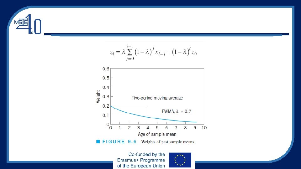
Theory of EWMA Chart The EWMA is
Control Limits of EWMA Chart Where, Steady-state control limits
Notes on EWMA chart • Note that if λ = 1, the EWMA statistic becomes the momoryless statistic for the Shewhart scheme because the values of the EWMA statistic are exactly equal to the individual observations xi. Since Shewhart schemes work better in the detection of large shifts, it stands to reason that detection of small shifts is associated with λ values on the other side of the spectrum, that is, λ closer to 0 than to 1. • To compute the first value (EWMA 1), a value for EWMA 0 is required. If the intent is to monitor the process for departures away from some target value μ 0, then EWMA 0 is set equal to μ 0. Without a specified target value, standard practice is to initialize EWMA 0 = x bar. • Suppose n > 1. Simply replace xi with x bar i. The starting value is either μ 0, if specified or the grand mean xbar bar.
Example of EWMA Chart • A quality engineer from a plastic manufacturing company would like to make sure his batch process stays in control. The engineer measures the concentration of pigment of each batch for all 35 batches. 1. Open the sample data, Pigment. Concentration. MTW. 2. Choose Stat > Control Charts > Time-Weighted Charts > EWMA. 3. From the drop-down list, select All observations for a chart are in one column, enter Pigment. 4. In Subgroup sizes, enter 1. 5. Click OK.
Interpret the results For the pigment data, no points are out of control. However, the process level shifts starting at subgroup 26. The engineer should examine the process for special-cause variation.
CUSUM chart • Use CUSUM Chart to detect small shifts in your process. • The CUSUM chart plots the cumulative sums (CUSUMs) of the deviations of each sample value from the target value. • Because the CUSUM chart is cumulative, even minor drifting in the process mean will cause steadily increasing (or decreasing) cumulative deviation values. • The observations can be individual measurements or subgroup means. • For more details, see Montgomery, D. C. (2007). Introduction to statistical quality control. John Wiley & Sons.
CUSUM chart • For example, a manufacturer of centrifuge rotors wants to monitor the deviations from the target diameter of all rotors produced during a week. • The diameters must be close to the target because even small shifts cause problems. • The points appear to vary randomly around the center line and are within the control limits, with the exception of one point. • No trends or patterns are shown. • The variability in the rotor diameter appears to be stable, but the out-of-control point should be investigated.
The Cumulative Sum Control Chart
The Tabular CUSUM
Example of Tabular CUSUM Graph
Example of CUSUM Chart • A quality engineer at a plant that assembles automobile engines monitors the movement of crankshafts in the engines. In an operating engine, parts of the crankshaft move up and down a certain distance from the baseline position. The engineer took five measurements per day from September 28 through October 15 and then 10 per day from October 18 through 25. • The quality engineer creates a CUSUM chart to monitor small shifts in the movement of the crankshafts. 1. 2. 3. 4. 5. Open the sample data, Crankshaft. Movement. MTW. Choose Stat > Control Charts > Time-Weighted Charts > CUSUM. From the drop-down list, select All observations for a chart are in one column, and enter A to B Distance. In Subgroup sizes, enter Date. Click OK.
Interpret the results • This example shows a tabular CUSUM: the upper CUSUM detects upward shifts in the level of the process and the lower CUSUM detects downward shifts. • The upper CUSUM line shows that subgroups 4 through 10 fall outside the upper control limit, suggesting small shifts above the target. Test Results for CUSUM Chart of A to B Distance TEST. One point beyond control limits. Test Failed at points: 4, 5, 6, 7, 8, 9, 10 * WARNING * If graph is updated with new data, the results above may no longer be correct.
More on CUSUMs • CUSUMs are often used to determine if a process has shifted off a specified target because it is easy to calculate the required adjustment • One-sided CUSUMs are often useful • CUSUMs can also be used to monitor variability • CUSUMs are available for other sample statistics (ranges, standard deviations, counts, proportions) • Rational subgroups and CUSUMs
Curriculum Development of Master’s Degree Program in Industrial Engineering for Thailand Sustainable Smart Industry