android id android layoutwidth android layoutheight fillparent matchparent


find. View. By. Id(R. id. spn.")
,這 裡我們指定使用String型態的物件。 Array. Adapter<String> adap. Sex.")
和on. Nothing. Selected()二個方法 private Spinner.")
![用xml檔案定義自己的選單格式 String[] s. Sex. List = new String[] {"男", "女"}; Array. Adapter<String> adap. Sex.](https://slidetodoc.com/presentation_image_h/fda3221e98e998067ae10cb4ba06aacc/image-19.jpg "用xml檔案定義自己的選單格式 String[] s. Sex. List = new String[] {\"男\", \"女\"}; Array. Adapter<String> adap. Sex.")

方法 從專案的資源類別R中取出項目清單陣列,並建立一 個Array. Adapter物件,但是該Array. Adapter物件的處 理型態必須改成Char. Sequence: Array.")


- Slides: 39
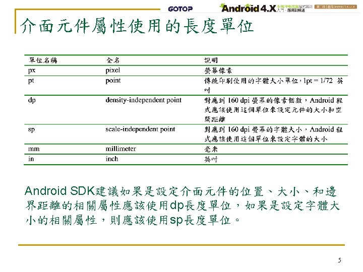
常用的介面元件屬性 屬性名稱 設定值 使用說明 android: id 元件的名稱 設定該介面元件的名稱 android: layout_width android: layout_height fill_parent, match_parent, wrap_content 設定元件的寬和高,fill_parent是舊的 屬性值 android: text 元件中的文字 顯示在元件中的文字 android: input. Type Text, number, date, time, … 輸入的資料類型 android: background 顏色(6個16進位數字,例如FF 0000) 儲存在drawable資料夾中的圖形 設定元件的底色或底圖,顏色以#開頭 android: text. Size 數值和sp長度單位 設定文字大小 android: text. Color 顏色 設定文字顏色,顏色以#開頭 android: password true, false 用暗碼顯示防止被他人窺視,新版的程 式改成用input. Type屬性控制 android: auto. Link web, email, phone, map, all 自動偵測字串中的超連結資料 android: hint 元件中的提示文字 當Edit. Text元件中沒有輸入任何資料時所 顯示的字串 android: layout_margin. XXX 數值和dp長度單位 設定元件四周的間隔距離 android: padding. XXX 數值和dp長度單位 設定元件內部的文字和邊的距離 android: gravity center_hotizontal, center_vertical, center 元件中的物件的對齊方式 android: layout_gravity center_hotizontal, center_vertical, center 元件相對於外框的對齊方式 4
match_parent和wrap_content的 match_parent和fill_parent的效果是一樣的,二者都是填滿 差別 元件所在的外框,wrap_content則是依照元件中的文字長度 或高度來決定元件的寬或高。 <Edit. Text android: layout_width="fill_parent" android: layout_height="wrap_content" android: text="Edit. Text 1" /> <Edit. Text android: layout_width="wrap_content" android: layout_height="fill_parent" android: text="Edit. Text 2" /> 6
android: input. Type範例 <Edit. Text android: layout_width="fill_parent" android: layout_height="wrap_content" android: text="" android: input. Type="text" /> <Edit. Text android: layout_width="fill_parent" android: layout_height="wrap_content" android: text="" android: input. Type="number" /> <Edit. Text android: layout_width="fill_parent" android: layout_height="wrap_content" android: text="" android: input. Type="date" /> <Edit. Text android: layout_width="fill_parent" android: layout_height="wrap_content" android: text="" android: input. Type="time" /> 用來限制輸入的字元種類,如果 設定成text就能夠輸入任何字元, 如果設定成number就只能輸入數 字,當設定成date時可以輸入數 字和斜線’/’字元,當設定成time時 則可以輸入數字和分號’: ’字元以 及pam等3個英文字母 7
控制文字大小、顏色和底色 <Edit. Text android: layout_width="fill_parent" android: layout_height="wrap_content" android: text="預設的文字大小" /> <Edit. Text android: layout_width="fill_parent" android: layout_height="wrap_content" android: text="10 sp文字" android: text. Size="10 sp" /> <Edit. Text android: layout_width="fill_parent" android: layout_height="wrap_content" android: text="20 sp綠色文字" android: text. Size="20 sp" android: text. Color="#00 FF 00" /> <Edit. Text android: layout_width="fill_parent" android: layout_height="wrap_content" android: text="30 sp綠色文字,黑色底色 " android: text. Size="30 sp" android: text. Color="#00 FF 00" android: background="#000000" /> 使用android: text. Size、 android: text. Color、 android: background來改變文字 的大小、顏色,以及元件的底 色 8
控制元件四周的間隔距離以及元件內部的文字和邊 的距離 <Edit. Text android: layout_width="fill_parent" android: layout_height="wrap_content" android: text="預設的間隔" /> <Edit. Text android: layout_width="fill_parent" android: layout_height="wrap_content" android: text="設定padding=20 dp" android: padding="20 dp" /> <Edit. Text android: layout_width="fill_parent" android: layout_height="wrap_content" android: text="再設定margin=20 dp" android: padding="20 dp" android: layout_margin="20 dp" /> <Edit. Text android: layout_width="fill_parent" android: layout_height="wrap_content" android: text="只設定左右margin=30 dp" android: layout_margin. Left="30 dp" android: layout_margin. Right="30 dp" /> 使用margin相關屬性來增加元 件和外框之間的距離,以及使 用padding相關屬性來增加元件 內的文字和元件邊框的距離 9
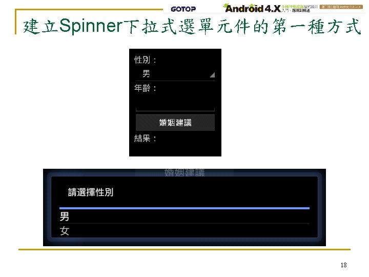
建立Spinner下拉式選單元件的第一種方式 Step 1. 在專案介面佈局檔res/layout/main. xml中建立一個Spinner 介面元件如以下 <Spinner android: id="@+id/spn. Sex“ android: layout_width="match_parent" android: layout_height="wrap_content" android: draw. Selector. On. Top="true“ android: prompt="@string/spn. Sex. Prompt“ android: spinner. Mode="dialog" 這個Spinner元件的名稱叫做spn. Sex,當使用者點選它時 就會出現一個名稱叫做spn. Sex. Prompt的提示字串(該字 串的值定義在res/values/strings. xml中)。 android: spinner. Mode屬性則是設定選項清單的顯示方式, dialog的方式是以對話盒的型態出現,另一種dropdown 的方式則是將選項清單列於Spinner元件的下方。 13
建立Spinner下拉式選單元件的第一種方式 Step 2. 取得前一個步驟所建立的Spinner元件 Spinner spn. Sex = (Spinner)find. View. By. Id(R. id. spn. Sex); Step 3. 把要顯示的選項清單宣告成一個String型態的陣列 String[] s. Sex. List = new String[] {"男", "女"}; 14
建立Spinner下拉式選單元件的第一種方式 Step 4. 建立一個Array. Adapter類別的物件,將前一個步驟的 清單陣列輸入該物件並指定使用Spinner格式。 Array. Adapter是一個泛型類別(generic class),這 裡我們指定使用String型態的物件。 Array. Adapter<String> adap. Sex. List = new Array. Adapter<String>( this, android. R. layout. simple_spinner_item, s. Sex. List); adap. Sex. List. set. Drop. Down. View. Resource( android. R. layout. simple_spinner_dropdown_item); Step 5. 將上一個步驟建立的Array. Adapter物件設定給前面建 立的Spinner元件 spn. Sex. set. Adapter(adap. Sex. List); 15
建立Spinner下拉式選單元件的第一種方式 Step 6. 建立Spinner的On. Item. Selected. Listener並完成其中 的on. Item. Selected()和on. Nothing. Selected()二個方法 private Spinner. On. Item. Selected. Listener spn. Sex. Item. Sel. Lis = new Spinner. On. Item. Selected. Listener () { public void on. Item. Selected(Adapter. View parent, View v, int position, long id) { s. Sex = parent. get. Selected. Item(). to. String(); } public void on. Nothing. Selected(Adapter. View parent) { } }; Step 7. 把上一個步驟建立的On. Item. Selected. Listener物件設 定成為Spinner元件的事件處理程序。 16
用xml檔案定義自己的選單格式 String[] s. Sex. List = new String[] {"男", "女"}; Array. Adapter<String> adap. Sex. List = new Array. Adapter<String>( this, android. R. layout. simple_spinner_item, s. Sex. List); adap. Sex. List. set. Drop. Down. View. Resource(R. layout. spinner_layout); 以上的程式碼中用底線標示的部分就是使用我們自己專案中 的選單格式定義檔res/layout/R. layout. spinner_layout. xml, 該檔的內容如下,其中只有一個Text. View元件,也就是說每 一個選項都會用該Text. View元件的格式來顯示。 <? xml version="1. 0" encoding="utf-8"? > <Text. View xmlns: android="http: //schemas. android. com/apk/res/android" android: layout_width="match_parent" android: layout_height="wrap_content" android: text. Size="20 sp" /> 19
建立Spinner下拉式選單元件的第二種方式 Step 3. 把選項清單陣列以<string-array>標籤的格式宣告在 res/values/strings. xml檔案中如下: <? xml version="1. 0" encoding="utf-8"? > <resources> <string> …</string> … <string-array name="spn. Sex. List“> <item>男</item> <item>女</item> </string-array> </resources> 21
建立Spinner下拉式選單元件的第二種方式 Step 4. 使用Array. Adapter類別的create. From. Resource()方法 從專案的資源類別R中取出項目清單陣列,並建立一 個Array. Adapter物件,但是該Array. Adapter物件的處 理型態必須改成Char. Sequence: Array. Adapter<Char. Sequence> adap. Sex. List = Array. Adapter. create. From. Resource( this, R. array. spn. Sex. List, android. R. layout. simple_spinner_item); 我們同樣可以使用自行定義的xml檔案來建立自己的 選單格式。 這二個方法的執行結果完全一樣。 22
單元13 使用Radio. Group和 Radio. Button元件建立單 選清單 23
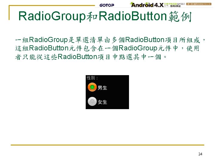
使用Radio. Group和Radio. Button的步驟 Step 1. 在res/layout資料夾下的介面佈局檔中利用 Radio. Group標籤和Radio. Button標籤建立好選項清 單 <Radio. Group android: id=“@+id/rad. GSex” android: layout_width="fill_parent“ android: layout_height="wrap_content“ android: orientation="vertical” android: checked. Button="@+id/rad. Male“> <Radio. Button android: id="@+id/rad. Male” android: text="男生” /> <Radio. Button android: id="@+id/rad. Female” android: text="女生” /> </Radio. Group> 25
使用Radio. Group和Radio. Button的步驟 Step 2. Radio. Group選項清單的操作都會搭配一個Button元 件,當按下該Button之後,程式才會讀取使用者點 選的項目,只要呼叫Radio. Group元件的 get. Checked. Radio. Button. Id()方法就會傳回目前被使 用者選取的項目id名稱 int i. Checked. Rad. Btn = rad. GSex. get. Checked. Radio. Button. Id(); switch (i. Checked. Rad. Btn) { case R. id. rad. Male: // 選擇這個選項所執行的程式碼 … case R. id. rad. Female: // 選擇這個選項所執行的程式碼 … } 26
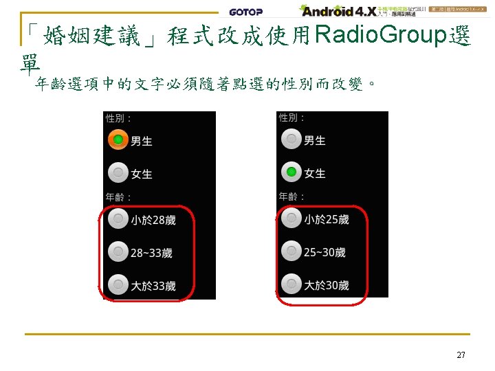
「婚姻建議」程式改成使用Radio. Group選 單字串資源檔: <? xml version="1. 0" encoding="utf-8"? > <resources> <string name="app_name">婚姻建議</string> <string name="prompt. Sex">性別:</string> <string name="prompt. Age">年齡:</string> <string name="prompt. Btn. Do. Sug">婚姻建議</string> <string name="sug. Result">結果:</string> <string name="sug. Not. Hurry">還不急。</string> <string name="sug. Get. Married">趕快結婚!</string> <string name="sug. Find. Couple">開始找對象。</string> <string name="male">男生</string> <string name="female">女生</string> <string name="male. Age. Rng 1">小於 28歲</string> <string name="male. Age. Rng 2">28~33歲</string> <string name="male. Age. Rng 3">大於 33歲</string> <string name="female. Age. Rng 1">小於 25歲</string> <string name="female. Age. Rng 2">25~30歲</string> <string name="female. Age. Rng 3">大於 30歲</string> </resources> 29
「婚姻建議」程式改成使用Radio. Group選 介面佈局檔: <Text. View 單 <? xml version="1. 0" encoding="utf-8"? > … /> <Linear. Layout … … > <Text. View … /> <Radio. Group android: id="@+id/rad. GSex" android: layout_width="fill_parent" android: layout_height="wrap_content" android: orientation="vertical" android: checked. Button="@+id/rad. Male"> <Radio. Button android: id="@+id/rad. Male" android: text="@string/male" /> <Radio. Button android: id="@+id/rad. Female" android: text="@string/female" /> </Radio. Group> <Radio. Group android: id="@+id/rad. GAge" android: layout_width="fill_parent" android: layout_height="wrap_content" android: orientation="vertical” android: checked. Button="@+id/rad. Age. Rng 1"> <Radio. Button android: id="@+id/rad. Btn. Age. Rng 1" android: text="@string/male. Age. Rng 1" /> <Radio. Button android: id="@+id/rad. Btn. Age. Rng 2" android: text="@string/male. Age. Rng 2" /> … </Radio. Group> <Button android: id="@+id/btn. Do. Sug”… /> <Text. View android: id="@+id/txt. Result“…/> 30 </Linear. Layout>
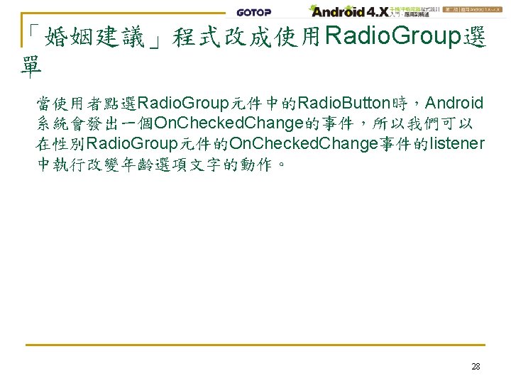
「婚姻建議」程式改成使用Radio. Group選 程式檔: private Radio. Group. 單 public class Main extends Activity { On. Checked. Change. Listener … public void on. Create(Bundle saved. Instance. State) { … setup. View. Component(); } rad. GSex. On. Che. Chan. Lis = new Radio. Group. On. Checked. Change. L istener () { public void on. Checked. Changed( Radio. Group group, int checked. Id) { … } }; private void setup. View. Component() { // 從資源類別R中取得介面元件 … // 設定事件listener btn. Do. Sug. set. On. Click. Listener( btn. Do. Sug. On. Click); rad. GSex. set. On. Checked. Change. Listener( rad. GSex. On. Che. Chan. Lis); } private Button. On. Click. Listener btn. Do. Sug. On. Click = new Button. On. Click. Listener() { public void on. Click(View v) { … } }; } 31
單元14 Check. Box多選清單和 Scroll. View捲軸 33
Check. Box多選清單 如果程式需要提供使用者可以複選的選項清單,就可以使用 Check. Box介面元件。 <Linear. Layout … > <Check. Box android: id="@+id/chb. Item 1" android: layout_width="fill_parent" android: layout_height="wrap_content" android: text="項目 1的名稱" /> <Check. Box android: id="@+id/chb. Item 2" android: layout_width="fill_parent" android: layout_height="wrap_content" android: text="項目 2的名稱" /> … <Button … /> </Linear. Layout> 34
Scroll. View 如果程式包含的選項太多以致超出手機螢幕的範圍,可以在 介面佈局檔的<Linear. Layout>標籤前面加上<Scroll. View>標 籤,也就是用<Scroll. View>標籤將<Linear. Layout>標籤包起來。 <Scroll. View xmlns: android="http: //schemas. android. com/apk/res/android" android: layout_width="fill_parent" android: layout_height="fill_parent" > <Linear. Layout … </Linear. Layout> </Scroll. View> 36
「興趣選擇」範例程式 字串資源檔: <? xml version="1. 0" encoding="utf-8"? > <resources> <string name="app_name">選擇興趣</string> <string name="music">音樂 </string> <string name="sing">唱歌 </string> <string name="dance">跳舞 </string> <string name="travel">旅行 </string> <string name="reading">閱讀 </string> <string name="writing">寫作 </string> <string name="climbing">爬山 </string> <string name="swim">游泳 </string> <string name="exercise">運動 </string> <string name="fitness">健身 </string> <string name="prompt. Sel. OK">確定</string> <string name="hob. List">您的興趣:</string> </resources> 37
「興趣選擇」範例程式 介面佈局檔: <? xml version="1. 0" encoding="utf-8"? > <Scroll. View … > <Linear. Layout … > <Check. Box android: id="@+id/chb. Music" android: layout_width="fill_parent" android: layout_height="wrap_content" android: text. Size="30 sp" android: text="@string/music" /> <Check. Box android: id="@+id/chb. Sing" android: layout_width="fill_parent" android: layout_height="wrap_content" android: text. Size="30 sp" android: text="@string/sing" /> <Check. Box android: id="@+id/chb. Dance" android: layout_width="fill_parent" android: layout_height="wrap_content" android: text. Size="30 sp" android: text="@string/dance" /> … <Button android: id="@+id/btn. Sel. OK" android: layout_width="fill_parent" android: layout_height="wrap_content" android: text="@string/prompt. Sel. OK" /> <Text. View android: id="@+id/txt. Hob. List" android: layout_width="fill_parent" android: layout_height="wrap_content" android: text="@string/hob. List" /> </Linear. Layout> 38 </Scroll. View>
「興趣選擇」範例程式 程式碼: public class Hobby. Sel extends Activity { private Check. Box chb. Music, chb. Sing, chb. Dance, … private Button btn. Sel. OK; private Text. View txt. Hob. List; public void on. Create(Bundle saved. Instance. State) { … setup. View. Component(); } private void setup. View. Component() { // 從資源類別R中取得介面元件 … } private Button. On. Click. Listener btn. Sel. OKOn. Click = new Button. On. Click. Listener() { public void on. Click(View v) { String s = get. String(R. string. hob. List); if (chb. Music. is. Checked()) s += chb. Music. get. Text(). to. String(); if (chb. Sing. is. Checked()) s += chb. Sing. get. Text(). to. String(); … txt. Hob. List. set. Text(s); } }; } 39