2 Polynomial and Rational Functions Copyright Cengage Learning

- Slides: 22

2 Polynomial and Rational Functions Copyright © Cengage Learning. All rights reserved.

2. 8 Quadratic Models Copyright © Cengage Learning. All rights reserved.

What You Should Learn • Classify scatter plots. • Use scatter plots and a graphing utility to find quadratic models for data. • Choose a model that best fits a set of data. 3

Classifying Scatter Plots 4

Classifying Scatter Plots In real life, many relationships between two variables are parabolic. A scatter plot can be used to give you an idea of which type of model will best fit a set of data. 5

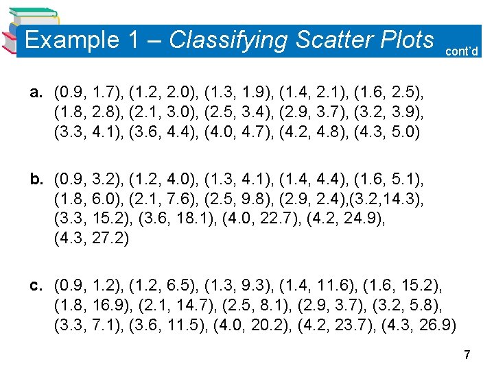
Example 1 – Classifying Scatter Plots Decide whether each set of data could be better modeled by a linear model, y = ax + b a quadratic model, y = ax 2 + bx + c or neither. 6

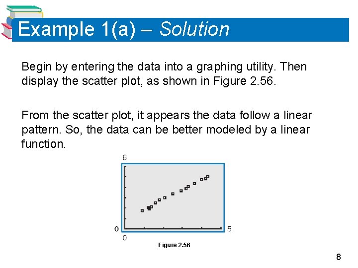
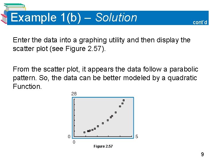
Example 1 – Classifying Scatter Plots cont’d a. (0. 9, 1. 7), (1. 2, 2. 0), (1. 3, 1. 9), (1. 4, 2. 1), (1. 6, 2. 5), (1. 8, 2. 8), (2. 1, 3. 0), (2. 5, 3. 4), (2. 9, 3. 7), (3. 2, 3. 9), (3. 3, 4. 1), (3. 6, 4. 4), (4. 0, 4. 7), (4. 2, 4. 8), (4. 3, 5. 0) b. (0. 9, 3. 2), (1. 2, 4. 0), (1. 3, 4. 1), (1. 4, 4. 4), (1. 6, 5. 1), (1. 8, 6. 0), (2. 1, 7. 6), (2. 5, 9. 8), (2. 9, 2. 4), (3. 2, 14. 3), (3. 3, 15. 2), (3. 6, 18. 1), (4. 0, 22. 7), (4. 2, 24. 9), (4. 3, 27. 2) c. (0. 9, 1. 2), (1. 2, 6. 5), (1. 3, 9. 3), (1. 4, 11. 6), (1. 6, 15. 2), (1. 8, 16. 9), (2. 1, 14. 7), (2. 5, 8. 1), (2. 9, 3. 7), (3. 2, 5. 8), (3. 3, 7. 1), (3. 6, 11. 5), (4. 0, 20. 2), (4. 2, 23. 7), (4. 3, 26. 9) 7

Example 1(a) – Solution Begin by entering the data into a graphing utility. Then display the scatter plot, as shown in Figure 2. 56. From the scatter plot, it appears the data follow a linear pattern. So, the data can be better modeled by a linear function. Figure 2. 56 8

Example 1(b) – Solution cont’d Enter the data into a graphing utility and then display the scatter plot (see Figure 2. 57). From the scatter plot, it appears the data follow a parabolic pattern. So, the data can be better modeled by a quadratic Function. Figure 2. 57 9

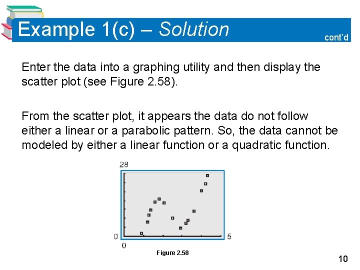
Example 1(c) – Solution cont’d Enter the data into a graphing utility and then display the scatter plot (see Figure 2. 58). From the scatter plot, it appears the data do not follow either a linear or a parabolic pattern. So, the data cannot be modeled by either a linear function or a quadratic function. Figure 2. 58 10

Fitting a Quadratic Model to Data 11

Fitting a Quadratic Model to Data You can use a procedure to find a model for nonlinear data. Once you have used a scatter plot to determine the type of model that would best fit a set of data, there are several ways that you can actually find the model. Each method is best used with a computer or calculator, rather than with and calculations. 12

Example 2 – Fitting a Quadratic Model to Data A study was done to compare the speed x (in miles per hour) with the mileage y (in miles per gallon) of an automobile. The results are shown in the table. a. Use a graphing utility to create a scatter plot of the data. b. Use the regression feature of the graphing utility to find model that best fits the data. c. Approximate the speed at which the mileage is the greatest. 13

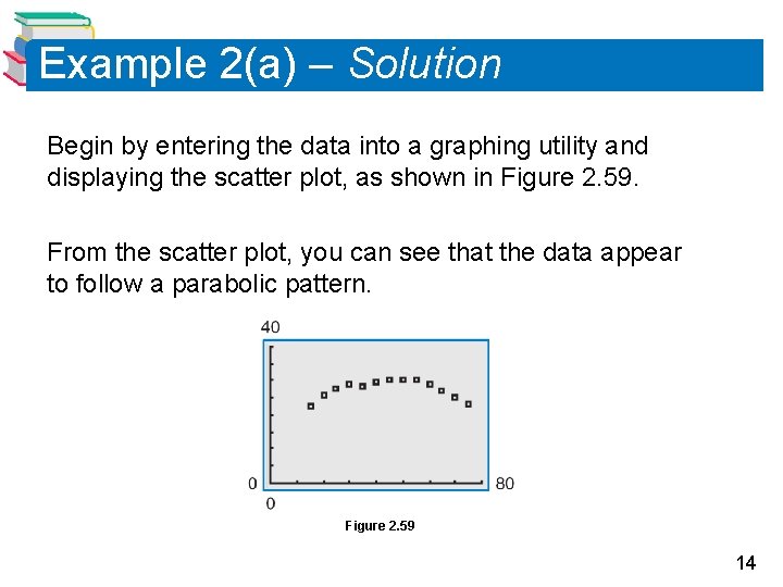
Example 2(a) – Solution Begin by entering the data into a graphing utility and displaying the scatter plot, as shown in Figure 2. 59. From the scatter plot, you can see that the data appear to follow a parabolic pattern. Figure 2. 59 14

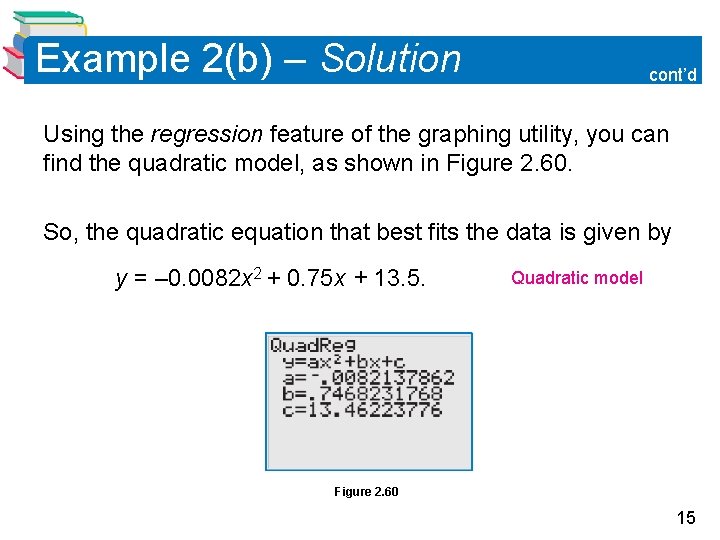
Example 2(b) – Solution cont’d Using the regression feature of the graphing utility, you can find the quadratic model, as shown in Figure 2. 60. So, the quadratic equation that best fits the data is given by y = – 0. 0082 x 2 + 0. 75 x + 13. 5. Quadratic model Figure 2. 60 15

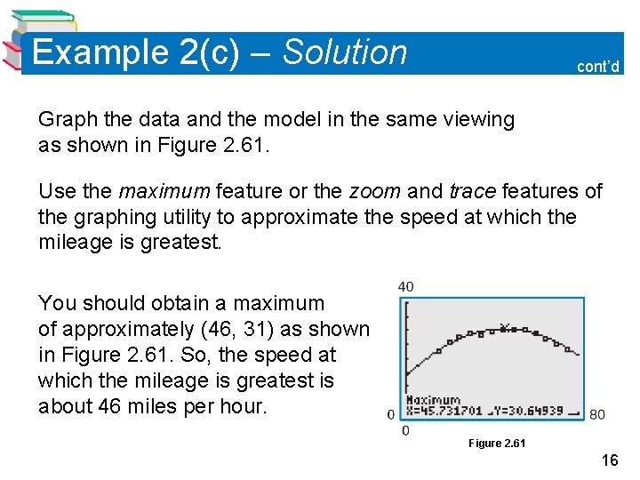
Example 2(c) – Solution cont’d Graph the data and the model in the same viewing as shown in Figure 2. 61. Use the maximum feature or the zoom and trace features of the graphing utility to approximate the speed at which the mileage is greatest. You should obtain a maximum of approximately (46, 31) as shown in Figure 2. 61. So, the speed at which the mileage is greatest is about 46 miles per hour. Figure 2. 61 16

Choosing a Model 17

Choosing a Model Sometimes it is not easy to distinguish from a scatter plot which type of model will best fit the data. You should first find several models for the data, using the Library of Parent Functions, and then choose the model that best fits the data by comparing the y-values of each model with the actual y-values. 18

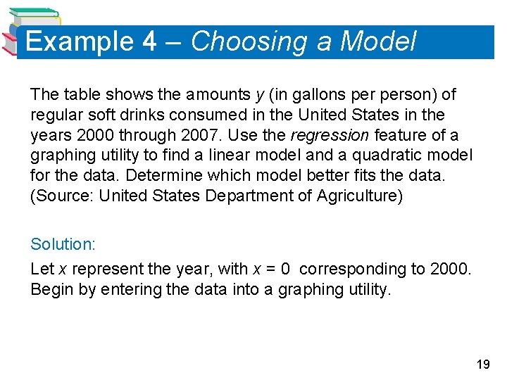
Example 4 – Choosing a Model The table shows the amounts y (in gallons person) of regular soft drinks consumed in the United States in the years 2000 through 2007. Use the regression feature of a graphing utility to find a linear model and a quadratic model for the data. Determine which model better fits the data. (Source: United States Department of Agriculture) Solution: Let x represent the year, with x = 0 corresponding to 2000. Begin by entering the data into a graphing utility. 19

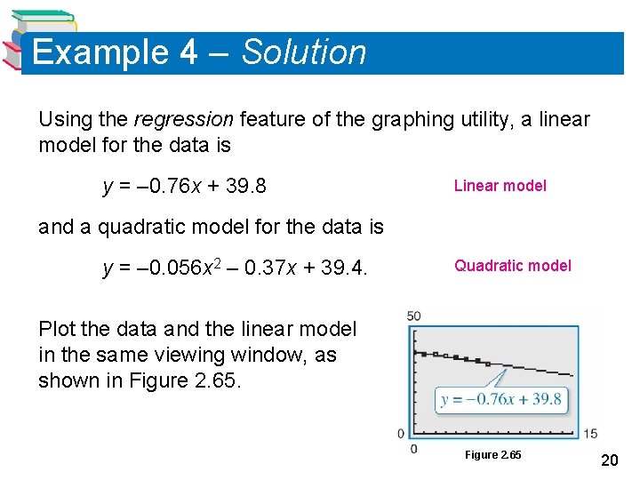
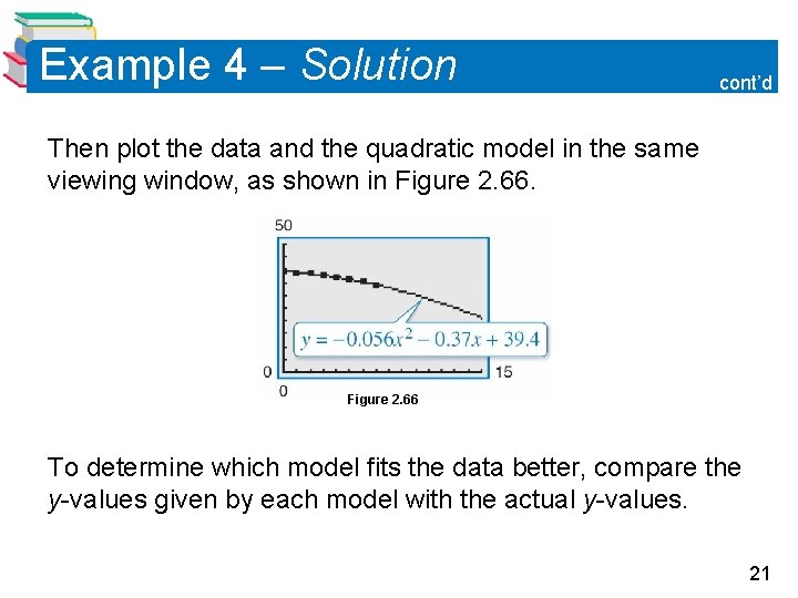
Example 4 – Solution Using the regression feature of the graphing utility, a linear model for the data is y = – 0. 76 x + 39. 8 Linear model and a quadratic model for the data is y = – 0. 056 x 2 – 0. 37 x + 39. 4. Quadratic model Plot the data and the linear model in the same viewing window, as shown in Figure 2. 65 20

Example 4 – Solution cont’d Then plot the data and the quadratic model in the same viewing window, as shown in Figure 2. 66 To determine which model fits the data better, compare the y-values given by each model with the actual y-values. 21

Example 4 – Solution cont’d The model whose y-values are closest to the actual values is the better fit. In this case, the better-fitting model is the quadratic model. 22