Year 9 Skills Year 9 Geog Skills No

- Slides: 31

Year 9 Skills

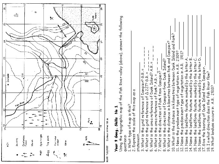
Year 9 Geog. Skills No 1 Using the topographic map of the Fish River valley (above), answer the following questions: 1. What type of map is this? ________________ 2. Express the scale of this map as a statement. ________________ 3. What is the grid reference of Dampier? G. R. = _ _ _ 4. What is the grid reference of Δ 227? G. R. = _ _ _ 5. What is the area reference of Dunk Island? A. R. = _ _ 6. What is the area reference of Park? A. R. = _ _ 7. What is the direction of Park from Dampier? _______ 8. What is the direction of Dampier from Dunk Island? ______ 9. What is the distance in kilometres between Park and Dampier? ______ 10. What is the distance in kilometres between Dunk Island Park? ______ 11. Name the predominant type of vegetation in A. R. 2309? ______ 12. Name the predominant type of vegetation in A. R. 1911? ______ 13. Name the landform feature marked by the letter A. _________ 14. Name the landform feature marked by the letter B. _________ 15. Name the landform feature marked by the letter C. _________ 16. Name the landform feature marked by the letter D. _________ 17. Give the bearing of Dunk Island from Dampier. ____ 18. I n what direction does the Fish River flow? _____ 19. What landuse occurs in A. R. 2510? ____________

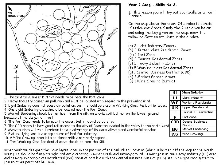
Year 9 Geog. Skills No 2. In this lesson you will try out your skills as a Town Planner. On the Map above there are 24 circles to denote ‑Settlement Areas. Study the Rules given below and using the Key given on the Map, mark the following Settlement Units in the circles. (a) 2 Light Industry Zones. (b) 3 Better‑class Residential Zones (c) 1 Port Zone (d) 3 Tourist‑Residential Zones (e) 2 Heavy Industry Zones (f) 5 Working‑class Residential Zones (g) 1 Central Business District (CBD) (h) 2 Market Garden Areas (i) 1 Wine Growing District HI LI WR UR T P CBD I. The Central Business District needs to be near the Port Zone. 2. Heavy Industry causes air pollution and must be located with regard to the prevailing wind. 3: Light Industry does not cause air pollution, but it should be close to Working Class Residential areas. 4. One Light Industry area should be located near the Port Zone. 5. Market Gardening should be furthest from the city on alluvial soil, but not on the lowest ground because of the danger of frost. 6. The Port Zone needs to be near the ocean, but in a protected site. 7. The CBD needs to have good rail access to the city of Branston located in the valley to the north‑west. MG 8. Many tourists will visit Newtown to take advantage of its warm climate and wonderful benches. 9. Flat low‑lying land is a cheap source of land for industry. WG 10. A Wine Growing area is to be placed with a northerly aspect. 11. Two Working Class Residential areas should be near the CBD. Heavy Industry Light Industry Working Residential Upper Residential Tourist & Residential Port Zone Central Business District Market Gardening Wine Growing When you have designed the Town layout, draw in the position of the rail link to Branston (which is located off the Map to the North West). It should be fairly straight and avoid crossing Summer Creek and swampy ground. It must join up one Heavy Industry (HI) area and as many Working-class Residential (WR) areas as possible with the Central Business District (CBD). Put in a major road system to join up other parts of the Town.

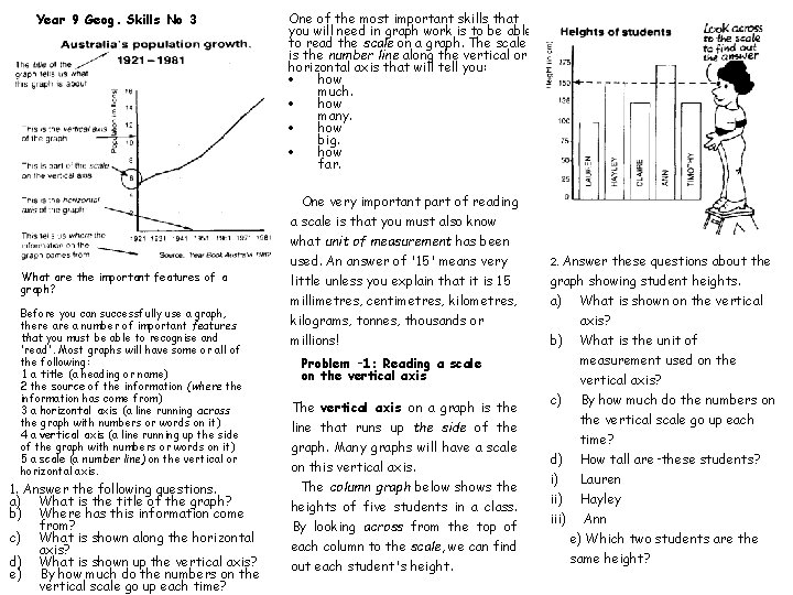
Year 9 Geog. Skills No 3 What are the important features of a graph? Before you can successfully use a graph, there a number of important features that you must be able to recognise and 'read'. Most graphs will have some or all of the following: 1 a title (a heading or name) 2 the source of the information (where the information has come from) 3 a horizontal axis (a line running across the graph with numbers or words on it) 4 a vertical axis (a line running up the side of the graph with numbers or words on it) 5 a scale (a number line) on the vertical or horizontal axis. 1. Answer the following questions. a) What is the title of the graph? b) Where has this information come from? c) What is shown along the horizontal axis? d) What is shown up the vertical axis? e) By how much do the numbers on the vertical scale go up each time? One of the most important skills that you will need in graph work is to be able to read the scale on a graph. The scale is the number line along the vertical or horizontal axis that will tell you: how much. how many. how big. how far. One very important part of reading a scale is that you must also know what unit of measurement has been used. An answer of '15' means very little unless you explain that it is 15 millimetres, centimetres, kilograms, tonnes, thousands or millions! Problem ‑ 1: Reading a scale on the vertical axis The vertical axis on a graph is the line that runs up the side of the graph. Many graphs will have a scale on this vertical axis. The column graph below shows the heights of five students in a class. By looking across from the top of each column to the scale, we can find out each student's height. 2. Answer these questions about the graph showing student heights. a) What is shown on the vertical axis? b) What is the unit of measurement used on the vertical axis? c) By how much do the numbers on the vertical scale go up each time? d) How tall are‑these students? i) Lauren ii) Hayley iii) Ann e) Which two students are the same height?

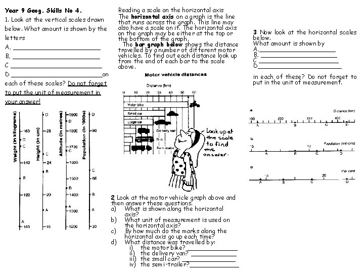
Year 9 Geog. Skills No 4. 1. Look at the vertical scales drawn below. What amount is shown by the letters A, ____________ B, ____________ C ____________ D ____________on each of these scales? Do not forget to put the unit of measurement in your answer! Reading a scale on the horizontal axis The horizontal axis on a graph is the line that runs across the graph. This line may also have a scale on it. The horizontal axis on the graph may be either at the top or the bottom of the graph. The bar graph below shows the distance travelled by a number of different motor vehicles. To find out each distance look up from the end of each bar to the scale above. 3 Now look at the horizontal scales below. What amount is shown by A, __________ B, __________ C ___________ D___________ in each of these? Do not forget to put in the unit of measurement. 2 Look at the motor vehicle graph above and then answer these questions. a) What is shown along the horizontal axis? b) What unit of measurement is used on the horizontal axis? c) By how much do the marks along the horizontal axis go up each time? d) What distance was travelled by: i) the motor bike? _______ ii) the delivery van? ______ iii) the small car? _______ iv) the semi‑trailer? _______

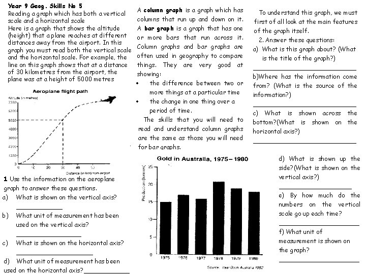
Year 9 Geog. Skills No 5 Reading a graph which has both a vertical scale and a horizontal scale Here is a graph that shows the altitude (height) that a plane reaches at different distances away from the airport. In this graph you must read both the vertical scale and the horizontal scale. For example, the line on this graph shows that at a distance of 30 kilometres from the airport, the plane was at a height of 5000 metres . 1 Use the information on the aeroplane graph to answer these questions. a) What is shown on the vertical axis? ______ b) What unit of measurement has been used on the vertical axis? _________ c) What is shown on the horizontal axis? __________ d) What unit of measurement has been used on the horizontal axis? ______ A column graph is a graph which has columns that run up and down on it. A bar graph is a graph that has one or more bars that run across it. Column graphs and bar graphs are often used in geography to compare things. They are very good at showing: the difference between two or more things at a particular time the change in one thing over a period of time. The skills that you will need to read and understand column graphs are the same as those you will need for bar graphs. To understand this graph, we must first of all look at the main features of the graph itself. 2. Answer these questions: a) What is this graph about? (What is the title of the graph? ) ______________ b)Where has the information come from? (What is the source of the information? ) ______________ c) What is shown across the bottom? (What is shown on the horizontal axis? ) ______________ d) What is shown up the side? (What is shown on the vertical axis? ) __________ e) By how much do the numbers on the vertical scale go up each time? ___________ f) What unit of measurement is shown on the graph? ___________

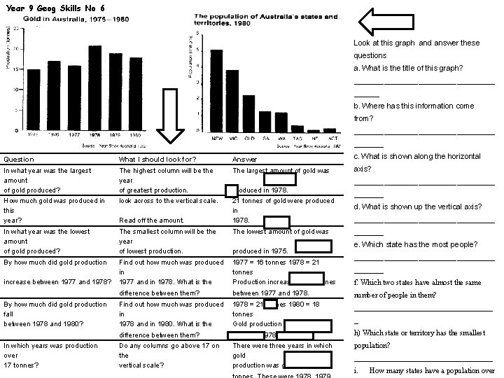
Year 9 Geog Skills No 6 Look at this graph and answer these questions a. What is the title of this graph? _________________ b. Where has this information come from? _________________ Question What I should look for? Answer c. What is shown along the horizontal In what year was the largest amount of gold produced? The highest column will be the year of greatest production. The largest amount of gold was axis? How much gold was produced in this year? look across to the vertical scale. 21 tonnes of gold were produced in 1978. In what year was the lowest amount of gold produced? The smallest column will be the year of lowest production. The lowest amount of gold was By how much did gold production Find out how much was produced in 1977 and in 1978. What is the 1977 = 16 tonnes 1978 = 21 tonnes Production increased by 5 tonnes difference between them? between 1977 and 1978. number of people in them? Find out how much was produced in 1978 and in 1980. What is the 1978 = 21 tonnes 1980 = 18 tonnes Gold production fell by 3 tonnes __________________ difference between them? between 1978 and 1980. h) Which state or territory has the smallest Do any columns go above 17 on the vertical scale? There were three years in which gold production was greater than 17 population? increase between 1977 and 1978? By how much did gold production fall between 1978 and 1980? In which years was production over 17 tonnes? Read off the amount. produced in 1978. produced in 1975. _________________ d. What is shown up the vertical axis? _________________ e. Which state has the most people? _________________ f. Which two states have almost the same _ __________________ i. How many states have a population over

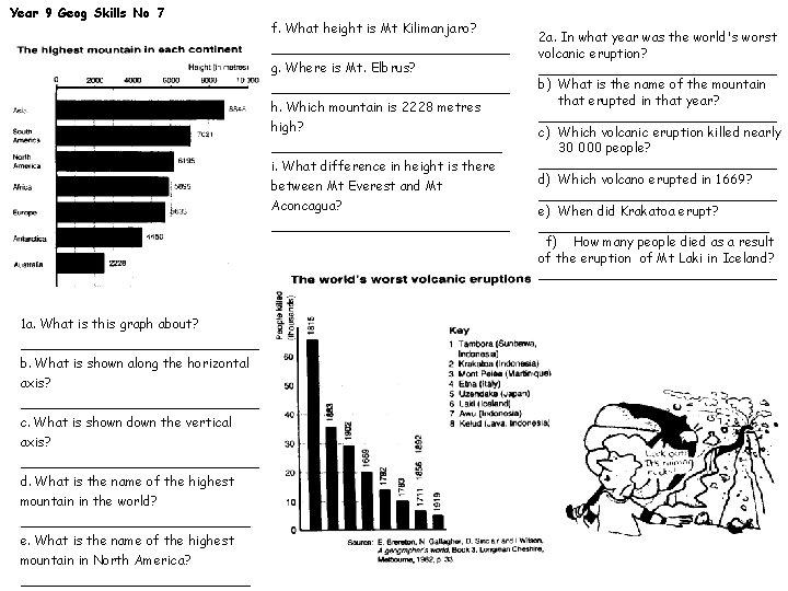
Year 9 Geog Skills No 7 f. What height is Mt Kilimanjaro? _______________ g. Where is Mt. Elbrus? _______________ h. Which mountain is 2228 metres high? ______________ i. What difference in height is there between Mt Everest and Mt Aconcagua? _______________ 1 a. What is this graph about? _______________ b. What is shown along the horizontal axis? _______________ c. What is shown down the vertical axis? _______________ d. What is the name of the highest mountain in the world? ______________ e. What is the name of the highest mountain in North America? ______________ 2 a. In what year was the world's worst volcanic eruption? _______________ b) What is the name of the mountain that erupted in that year? _______________ c) Which volcanic eruption killed nearly 30 000 people? _______________ d) Which volcano erupted in 1669? _______________ e) When did Krakatoa erupt? ______________ f) How many people died as a result of the eruption of Mt Laki in Iceland? _______________

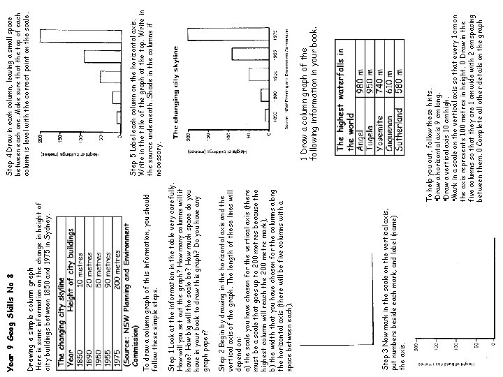
Step 3 Now mark in the scale on the vertical axis, put numbers beside each mark, and label (name) the axis. 1 Draw a column graph of the following information in your book. Step 5 Label each column on the horizontal axis. Write in the title of the graph at the top. Write in the source underneath. Shade in the columns if necessary. Step 4 Draw in each column, leaving a small space between each one. Make sure that the top of each column is level with the correct point on the scale. To help you out, follow these hints. • Draw a horizontal axis 9 cm long. • Draw a vertical axis 10 cm high. • Mark in a scale on the vertical axis so that every 1 cm on the axis represents 100 metres in height. 0 Draw in the five columns so that they are 1 cm wide with 2 cm spacing between them. 0 Complete all other details on the graph Step 2 Begin by drawing in the horizontal axis and the vertical axis of the graph. The length of these lines will depend on: a) the scale you have chosen for the vertical axis (there must be a scale that goes up to 200 metres because the highest column will reach the 200 metre mark), b) the width that you have chosen for the columns along the horizontal axis (there will be five columns with a space between each). Step 1 Look at the information in the table very carefully. How will you set out the graph? How many columns will it have? How big will the scale be? How much space do you have in your book to draw this graph? Do you have any graph paper? To draw a column graph of this information, you should follow these simple steps. Drawing a simple column graph Here is some information on the change in height of city buildings between 1850 and 1975 in Sydney. Year 9 Geog Skills No 8

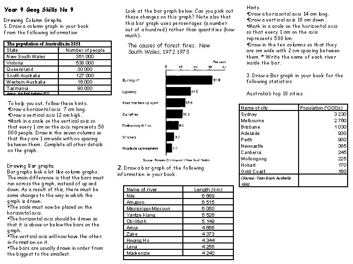
Year 9 Geog Skills No 9 Drawing Column Graphs 1. Draw a column graph in your book from the following information The population of Australia in 1851 State Number of people New South Wales 351 000 Victoria 538 000 Queensland 30 000 South Australia 127 000 Western Australia 16 000 Tasmania 90 000 Look at the bar graph below. Can you pick out these changes on this graph? Note also that this bar graph uses percentages (a number out of a hundred) rather than quantities (how much). The causes of forest fires. New South Wales, 1972 1973 3. Draw a Bar graph in your book for the following statistics Australia’s top 10 cities (Source- Year Book Australia 1987) To help you out, follow these hints. • Draw a horizontal axis 7 cm long. • Draw a vertical axis 12 cm high. • Mark in a scale on the vertical axis so that every 1 cm on the axis represents 50 000 people. Draw in the seven columns so that they are 1 cm wide with no spacing between them. Complete all other details on the graph. Drawing Bar graphs look a lot like column graphs. The main difference is that the bars must run across the graph, instead of up and down. As a result of this, there must be some changes to the way in which the graph is drawn. • The scale must now be placed on the horizontal axis. • The horizontal axis should be drawn so that it is above or below the bars on the graph. • The vertical axis will now have the other in-formation on it. • The bars are usually drawn in order from the biggest to the smallest. Hints • Draw a horizontal axis 14 cm long. • Draw a vertical axis 10 cm down. • Mark in a scale on the horizontal axis so that every 1 cm on the axis represents 500 km. • Draw in the ten columns so that they are cm wide with 2 cm spacing between them. * Write the name of each river inside the bar. 2. Draw a bar graph of the following information in your book. Name of river Nile Amazon Mississippi-Missouri Yantze Kiang Ob-Irtysh Amur Zaire Hwang Ho Lena Mackenzie Name of city Sydney Melbourne Brisbane Adelaide Perth Newcastle Canberra Wollongong Hobart Gold Coast (Source: Year Book Australia Length (km) 6 669 6 515 6 050 5 526 5 149 4 666 4 373 4 344 4 256 4 240 1982 Population ('OOOs) 3 230 2 760 1 030 900 385 245 225 170 160

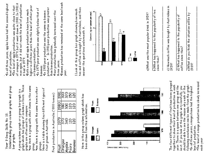
The four different types of fruit have been grouped together to show their level of production in each year. There is a space between one group and the next. If you look at the graph very carefully, you should be able to see the reason why each of the following conclusions can be made from the graph: • In all three years, oranges have had the highest level of production. • The level of orange production has slowly increased each year Here is the group column graph which has been drawn from this information. Fruit production in Australia ('000 tonnes) A group column graph or a group bar graph is a graph which has groups of columns or bars. These graphs are often used to compare: • one item in a group with other items in the same group. • one item in a group with the same item in other groups. Here is a table showing four different types of fruit grown in Australia. Year 9 Geog Skills No 10. Understanding group column graphs and group bar graphs c) How much coffee was bought by Australians in 1959? __________________ d) What has happened to the popularity of coffee since then? __________________ e)What do you think the situation will be by 1989? __________________ a)What was the most popular drink in 1959? __________________ b)What has happened to the popularity of tea since then? __________________ 1 Look at this group bar graph showing how much tea and coffee is bought by Australians, and then answer the questions underneath it. . • In all three years, apples have had the second highest level of production. • The level of apple production was quite close to that of oranges in 1979, but it went down in 1980. In 1981 it rose again, but it did not reach the level of production it had in 1979. • Both orange and apple production have been much higher in all three years than the level of either pear or banana production. • In 1979 pear production was slightly below that of bananas. • In 1980 pear production was the same as banana production. • In 1981 pear production was greater than banana production. • Pear production has gradually increased over the three years. • Banana production has remained at the same level each year.

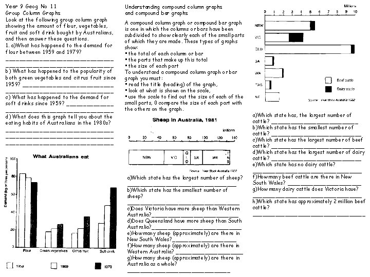
Year 9 Geog No 11 Group Column Graphs Look at the following group column graph showing the amount of flour, vegetables, fruit and soft drink bought by Australians, and then answer these questions. 1. a)What has happened to the demand for flour between 1959 and 1979? ________________________________ b) What has happened to the popularity of both green vegetables and citrus fruit since 1959? ________________________________ c) What has happened to the demand for soft drinks since 1959? _______________________ d) What does this graph tell you about the eating habits of Australians in the 1980 s? ________________________________ Understanding compound column graphs and compound bar graphs A compound column graph or compound bar graph is one in which the columns or bars have been subdivided to show clearly each of the small parts of which they are made. These types of graphs show: • the total of each column or bar • the parts that make up this total • the size of each part To understand a compound column graph or bar graph you must: • read the title (heading) of the graph, • look at what is shown on the scale, • use the scale to find out the size of each of the small parts, 0 compare the size of each part with the others on the graph. a)Which state has the largest number of sheep? _________________ b)Which state has the smallest number of sheep? __________________ c)Does Victoria have more sheep than Western Australia? ______________ d)Does Queensland have more sheep than South Australia? ______________ e)How many sheep (approximately) are there in New South Wales? __________ f)How many sheep (approximately) are there in Western Australia? ___________ g)How many sheep (approximately) are there in Australia as a whole? ________________ a)Which state has, the largest number of cattle? ______________ b)Which state has the smallest number of cattle? ______________ c)Which state has the largest number of beef cattle? _______________ d)Which state has the largest number of dairy cattle? ______________ e)Which state has no dairy cattle? _________________ f)How many beef cattle are there in New South Wales? ____________ g)How many dairy cattle does Victoria have? _________________ h)Which state has approximately 2 million beef cattle? __________________

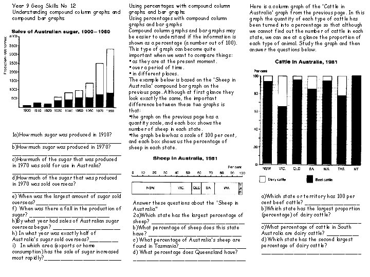
Year 9 Geog Skills No 12 Understanding compound column graphs and compound bar graphs 1 a)How much sugar was produced in 1910? _________________ b)How much sugar was produced in 1970? _________________ c)How much of the sugar that was produced in 1970 was sold for use in Australia? _________________ d)How much of the sugar that was produced in 1970 was sold overseas? _________________ e) When was the largest amount of sugar sold overseas? ___________ f) When was there a fall in the production of sugar? _____________ h)By what year had sales of Australian sugar overseas begun? ___________ h) In what year was exactly half of Australia's sugar sold overseas? _____ i) In which area (exports or home consumption) has the sale of sugar increased most rapidly? ____________ Using percentages with compound column graphs and bar graphs Compound column graphs and bar graphs may be easier to understand if the information is shown as a percentage (a number out of 100). This type of graph can become quite important when we want to compare things: • as they are at the present moment. • over a period of time. • in different places. The example below is based on the 'Sheep in Australia' compound bar graph on the previous page. Although at first glance they look exactly the same, the important difference between these two graphs is that: • the graph on the previous page has a quantity scale, and each box shows the number of sheep in each state. • the graph below has a scale of 100 per cent, and each box shows us the percentage of sheep in each state. Answer these questions about the 'Sheep in Australia” 2 a)Which state has the largest percentage of sheep? _______________ b)What percentage of sheep does this state have? _______________ c) What percentage of Australia's sheep are found in Tasmania? ___________ d) What percentage does Queensland have? __________________ Here is a column graph of the 'Cattle in Australia' graph from the previous page. In this graph the quantity of each type of cattle has been turned into a percentage so that although we cannot find out the number of cattle in each state, we can see at a glance the proportion of each type of animal. Study the graph and then answer the questions below. a)Which state or territory has 100 per cent beef cattle? _________ b)Which state has the largest proportion (percentage) of dairy cattle? ________________ c)What percentage of cattle in South Australia are dairy cattle? _____ d) Which state has the second largest percentage of dairy cattle? ________________

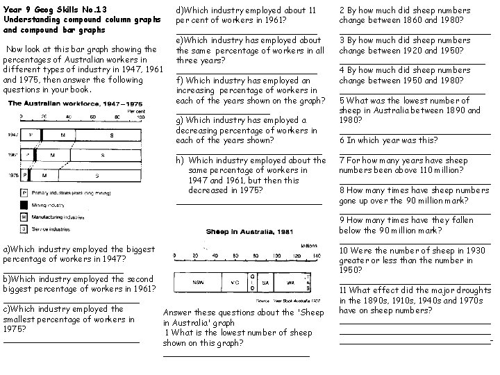
Year 9 Geog Skills No. 13 Understanding compound column graphs and compound bar graphs Now look at this bar graph showing the percentages of Australian workers in different types of industry in 1947, 1961 and 1975, then answer the following questions in your book. d)Which industry employed about 11 per cent of workers in 1961? ______________ e)Which industry has employed about the same percentage of workers in all three years? ______________ f) Which industry has employed an increasing percentage of workers in each of the years shown on the graph? _________ g) Which industry has employed a decreasing percentage of workers in each of the years shown? ______________ h) Which industry employed about the same percentage of workers in 1947 and 1961, but then this decreased in 1975? ______________ a)Which industry employed the biggest percentage of workers in 1947? ____________ b)Which industry employed the second biggest percentage of workers in 1961? _____________ c)Which industry employed the Answer these questions about the 'Sheep smallest percentage of workers in in Australia' graph 1975? 1 What is the lowest number of sheep _____________ shown on this graph? ______________ 2 By how much did sheep numbers change between 1860 and 1980? _______________ 3 By how much did sheep numbers change between 1920 and 1950? ______________ 4 By how much did sheep numbers change between 1950 and 1980? ______________ 5 What was the lowest number of sheep in Australia between 1890 and 1980? _______________ 6 In which year was this? _______________ 7 For how many years have sheep numbers been above 110 million? _______________ 8 How many times have sheep numbers gone up over the 90 million mark? _______________ 9 How many times have they fallen below the 90 million mark? _______________ 10 Were the number of sheep in 1930 greater or less than the number in 1950? _______________ 11 What effect did the major droughts in the 1890 s, 1910 s, 1940 s and 1970 s have on sheep numbers? _____________________________-

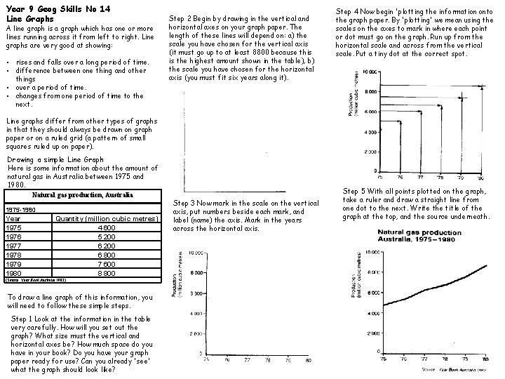
Year 9 Geog Skills No 14 Line Graphs A line graph is a graph which has one or more lines running across it from left to right. Line graphs are very good at showing: • rises and falls over a long period of time. • difference between one thing and other things • over a period of time. • changes from one period of time to the next. Step 2 Begin by drawing in the vertical and horizontal axes on your graph paper. The length of these lines will depend on: a) the scale you have chosen for the vertical axis (it must go up to at least 8800 because this is the highest amount shown in the table), b) the scale you have chosen for the horizontal axis (you must fit six years along it). Step 4 Now begin 'plotting the information onto the graph paper. By 'plotting' we mean using the scales on the axes to mark in where each point or dot must go on the graph. Run up from the horizontal scale and across from the vertical scale. Put a tiny dot at the correct spot. Line graphs differ from other types of graphs in that they should always be drawn on graph paper or on a ruled grid (a pattern of small squares ruled up on paper). Drawing a simple Line Graph Here is some information about the amount of natural gas in Australia between 1975 and 1980. Natural gas production, Australia 1975 -1980 Year 1975 1976 1977 1978 1979 1980 Quantity (million cubic metres) 4 600 5 200 6 800 7 600 8 800 (Source: Year Book Australia 1982) To draw a line graph of this information, you will need to follow these simple steps. Step 1 Look at the information in the table very carefully. How will you set out the graph? What size must the vertical and horizontal axes be? How much space do you have in your book? Do you have your graph paper ready for use? Can you already 'see' what the graph should look like? Step 3 Now mark in the scale on the vertical axis, put numbers beside each mark, and label (name) the axis. Mark in the years across the horizontal axis. Step 5 With all points plotted on the graph, take a ruler and draw a straight line from one dot to the next. Write the title of the graph at the top, and the source underneath.

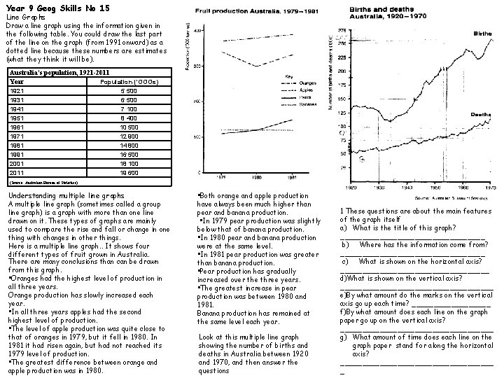
Year 9 Geog Skills No 15 Line Graphs Draw a line graph using the information given in the following table. You could draw the last part of the line on the graph (from 1991 onward) as a dotted line because these numbers are estimates (what they think it will be). Australia's population, 1921 -2011 Year Population ('OOOs) 1921 1931 1941 1951 1961 1971 1981 1991 2001 2011 5 500 6 500 7 100 8 400 10 500 12 900 14 800 16 500 18 100 19 600 (Source: Australian Bureau of Statistics) Understanding multiple line graphs A multiple line graph (sometimes called a group line graph) is a graph with more than one line drawn on it. These types of graphs are mainly used to compare the rise and fall or change in one thing with changes in other things. Here is a multiple line graph. . It shows four different types of fruit grown in Australia. There are many conclusions than can be drawn from this graph. • Oranges had the highest level of production in all three years. Orange production has slowly increased each year. • In all three years apples had the second highest level of production. • The level of apple production was quite close to that of oranges in 1979, but it fell in 1980. In 1981 it had risen again, but had not reached its 1979 level of production. • The greatest difference between orange and apple production was in 1980. • Both orange and apple production have always been much higher than pear and banana production. • In 1979 pear production was slightly below that of banana production. • In 1980 pear and banana production were at the same level. • In 1981 pear production was greater than banana production. • Pear production has gradually increased over the three years. • The greatest increase in pear production was between 1980 and 1981. Banana production has remained at the same level each year. Look at this multiple line graph showing the number of births and deaths in Australia between 1920 and 1970, and then answer the questions 1 These questions are about the main features of the graph itself a) What is the title of this graph? _________________ b) Where has the information come from? _________________ c) What is shown on the horizontal axis? _________________ d)What is shown on the vertical axis? __________________ e)By what amount do the marks on the vertical axis go up each time? _________ f)By what amount does each line on the graph paper go up on the vertical axis? __________________ g) What amount of time does each line on the graph paper stand for along the horizontal axis? __________________ _

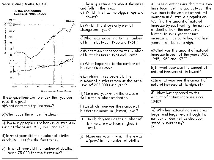
Year 9 Geog Skills No 16 3 These questions are about the rises and falls in the lines. a) Which line has the biggest ups and downs? ______________ b) Which line shows only a small change each year? ______________ c)What was happening to the number of births between 1955 and 1961 ? ______________ d)What then happened to the number of births between 1961 and 1965? ______________ e) What happened to the number of births after 1965? ______________ e)In which three years did the number of births remain at the same level of 202 000 each year? ______________ f)Name one year when there was a These questions are to check that you can fall in the number of deaths. read this graph. ______________ a)What does the top line show? h) In which year was the number of _________________ births at a minimum (lowest) level? b)What does the other line show? _________________________________ i) In which year was the number of c)How many people were born in Australia in births at a maximum (highest) each of the years 1930, 1940 and 1950? level. _________________ d)In what year did the number of births j) Name one year in which there was reach 150 000 for the first time? a 'peak' in the number of births. _________________ e) In what year did the number of deaths reach 75 000 for the first time? _________________ 4 These questions are about the two lines together. The gap between the two lines is the amount of natural increase in Australia's population. We find the amount of natural increase by subtracting the number of deaths from the number of births. In some years natural increase will be quite low, in other years it will be quite high. a)What was the amount of natural increase in each of the years 1920, 1945, 1960 and 1970? ______________ b)In what year was the amount of natural increase at its lowest? ______________ c)In what year was the amount of natural increase at its highest? ______________ d) What has happened to the amount of naturai ncrease since 1940? ______________ e) Why has natural increase grown larger and larger even though the number of deaths has also been steadily increasing? l? ______________

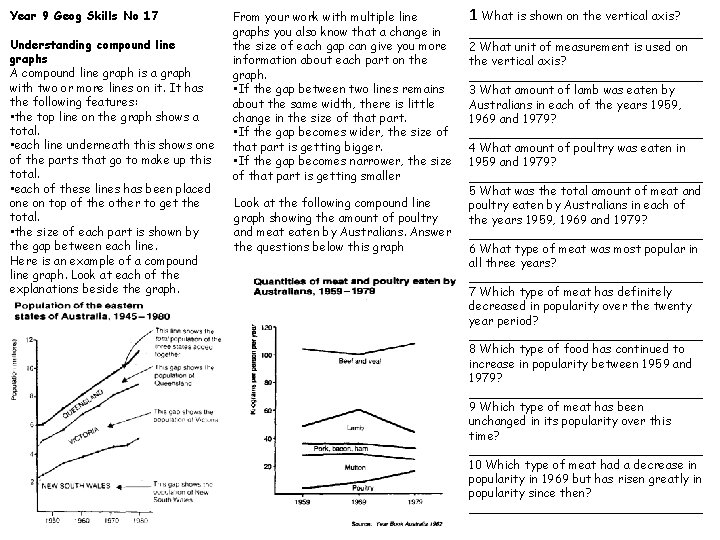
Year 9 Geog Skills No 17 Understanding compound line graphs A compound line graph is a graph with two or more lines on it. It has the following features: • the top line on the graph shows a total. • each line underneath this shows one of the parts that go to make up this total. • each of these lines has been placed one on top of the other to get the total. • the size of each part is shown by the gap between each line. Here is an example of a compound line graph. Look at each of the explanations beside the graph. From your work with multiple line graphs you also know that a change in the size of each gap can give you more information about each part on the graph. • If the gap between two lines remains about the same width, there is little change in the size of that part. • If the gap becomes wider, the size of that part is getting bigger. • If the gap becomes narrower, the size of that part is getting smaller Look at the following compound line graph showing the amount of poultry and meat eaten by Australians. Answer the questions below this graph 1 What is shown on the vertical axis? ________________ 2 What unit of measurement is used on the vertical axis? ________________ 3 What amount of lamb was eaten by Australians in each of the years 1959, 1969 and 1979? ________________ 4 What amount of poultry was eaten in 1959 and 1979? ________________ 5 What was the total amount of meat and poultry eaten by Australians in each of the years 1959, 1969 and 1979? ________________ 6 What type of meat was most popular in all three years? ________________ 7 Which type of meat has definitely decreased in popularity over the twenty year period? ________________ 8 Which type of food has continued to increase in popularity between 1959 and 1979? ________________ 9 Which type of meat has been unchanged in its popularity over this time? ________________ 10 Which type of meat had a decrease in popularity in 1969 but has risen greatly in popularity since then? ________________

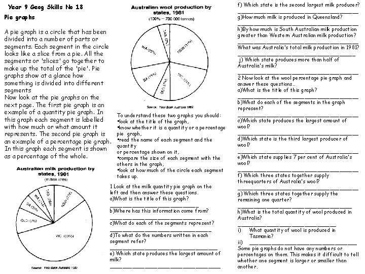
Year 9 Geog Skills No 18 Pie graphs A pie graph is a circle that has been divided into a number of parts or segments. Each segment in the circle looks like a slice from a pie. All the segments or 'slices' go together to make up the total of the 'pie'. Pie graphs show at a glance how something is divided into different segments Now look at the pie graphs on the next page. The first pie graph is an example of a quantity pie graph. In this graph each segment is labelled with how much or what amount it represents. The second pie graph is an example of a percentage pie graph. In this graph each segment is shown as a percentage of the whole. To understand these two graphs you should: • look at the title of the graph, • know whether it is a quantity or a percentage pie graph, • read the name of each segment and the quantity or percentage shown on it, • compare the size of each segment with the others in the graph, • look at how much of the circle each segment takes up. 1 Look at the milk quantity pie graph on the left and then answer these questions. a)What is the title of this graph? ______________ b)Where has this information come from? _______________ c)What do each of the segments represent? ________________ d)To what do the numbers written in each segment refer? _________________ e) Which state produces the largest amount of milk? __________________ f) Which state is the second largest milk producer? ___________________ g)How much milk is produced in Queensland? ___________________ h)By how much is South Australian milk production greater than Western Australian milk production? ___________________ What was Australia's total milk production in 1981? ___________________ j) Which state produces more than half of Australia's milk? ___________________ 2 Now look at the wool percentage pie graph and answer these questions. . a)What is the title of this graph? ___________________ b)What do each of the segments in the graph represent? ___________________ c)Which state produces the largest amount of wool? ___________________ d)Which state is the third largest producer of wool? ___________________ e)Which state supplies 7 per cent of Australia's wool? ___________________ f) Which three states together supply threequarters of Australia's wool? ___________________ g) Which three states together supply the remaining one quarter? __________________ h)What is the total quantity of wool produced in Australia? ________________ i) What quantity of wool is produced in Tasmania? ii) _________________ Some pie graphs do not have any numbers or percentages on them. This makes it difficult to tell whether one segment is larger or smaller than another.

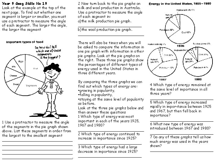
Year 9 Geog Skills No 19 Look at the example at the top of the next page. To find out whether one segment is larger or smaller, you must use a protractor to measure the angle of each segment. The larger the angle, the larger the segment 2 Now turn back to the pie graphs on milk and wool production in Australia. Use a protractor to measure the angle of each segment in: a)the milk production pie graph. ______________ b)the wool production pie graph. _______________ There will also be times when you will be asked to compare the information in one pie graph with information in other pie graphs. Look at the pie graphs on the right. These three pie graphs show the percentages of different types of energy used in the United States in three different years. 1 Use a protractor to measure the angle of the segments in the pie graph shown above. List these segments in order from the largest to the smallest segment _______________________________ ________________. By comparing the three graphs we can find out which types of energy are: • growing in popularity, • falling in popularity, • staying at the same level of popularity as before. Look at the three pie graphs below and then answer these questions 1 Which type of energy was most important in each of the years 1925, 1967 and 1980? _______________ 2 Which type of energy continued to increase in importance since 1925? ______________ 3 Which type of energy had a large decrease in importance since 1925? ______________ 4 Which type of energy remained at the same level of importance in all three years? ______________ 5 Which type of energy increased rapidly in impor¬tance between 1925 and 1967, but then fell back in importance? ______________ 6 What new type of energy was introduced between 1967 and 1980? ______________ 7 Do any of these graphs tell us how much energy was used in the years shown? ______________

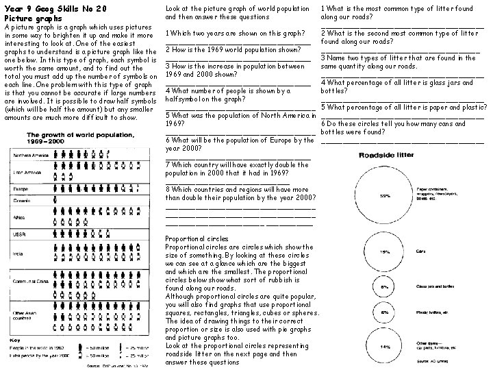
Year 9 Geog Skills No 20 Picture graphs A picture graph is a graph which uses pictures in some way to brighten it up and make it more interesting to look at. One of the easiest graphs to understand is a picture graph like the one below. In this type of graph, each symbol is worth the same amount, and to find out the total you must add up the number of symbols on each line. One problem with this type of graph is that you cannot be accurate if large numbers are involved. It is possible to draw half symbols (which will be half the amount) but any smaller amounts are much more difficult to show. Look at the picture graph of world population and then answer these questions 1 Which two years are shown on this graph? _________________ 2 How is the 1969 world population shown? _________________ 3 How is the increase in population between 1969 and 2000 shown? _________________ 4 What number of people is shown by a halfsymbol on the graph? __________________ 5 What was the population of North America in 1969? __________________ 6 What will be the population of Europe by the year 2000? _________________ 7 Which country will have exactly double the population in 2000 that it had in 1969? _______________ 8 Which countries and regions will have more than double their population by the year 2000? ___________________________________ ______ Proportional circles are circles which show the size of something. By looking at these circles we can see at a glance which are the biggest and which are the smallest. The proportional circles below show what sort of rubbish is found along our roads. Although proportional circles are quite popular, you will also find graphs that use proportional squares, rectangles, triangles, cubes or spheres. The idea of drawing things to their correct proportion or size is also used with pie graphs and picture graphs too. Look at the proportional circles representing roadside litter on the next page and then answer these questions 1 What is the most common type of litter found along our roads? ___________________ 2 What is the second most common type of litter found along our roads? ___________________ 3 Name two types of litter that are found in the same quantity along our roads. ___________________ 4 What percentage of all litter is glass jars and bottles? ___________________ 5 What percentage of all litter is paper and plastic? ___________________ 6 Do these circles tell you how many cans and bottles were found? ___________________

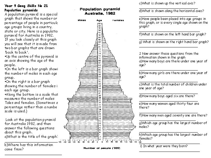
Year 9 Geog Skills No 21 Population pyramids A population pyramid is a special graph that shows the number or percentage of people in particular age groups living in a country, state or city. Here is a population pyramid for Australia in 1982. If you look closely at this graph you will see that it is made from two bar graphs that are drawn 'back to back'. • Up the centre of the pyramid is an axis showing the age of the people. • On the left is a bar graph showing the number of males in each age group. • On the right is a bar graph showing the number of females in each age group. • Along the bottom is a scale that measures the number of males Tales and females. (Sometimes a percentage rather than a number scale is used. ) Look at the population pyramid for Australia 1982, and then answer the following questions about this graph. a)What is the title of the graph? _____________ b)Where has this information come from? _____________ c)What is shown up the vertical axis? _______________ d)What is shown along the horizontal axes? _______________ e)Have people been placed into age groups in this graph, or is every single age shown on the graph? _______________ f)What is shown on the left hand bar graph? _______________ g) What is shown on the right hand bar graph? _______________ 2 Now answer these questions from the information shown in the graph a)How many boys are there under one year of age? _______________ b)How many girls are there under one year of age? _______________ c)What is the total number of children under one year of age? _______________ d)How many boys aged six are there? _______________ e)How many women aged thirty four are there? _______________ f)How many men aged seventy one are there? ______________ g)Which age group has the largest number of males? _______________ h)Which age group has the largest number of females? _______________ i) In what year were they born? _______________

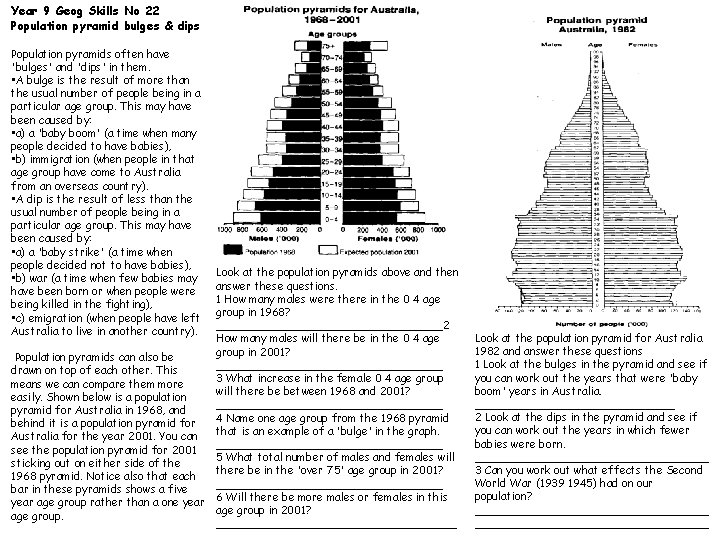
Year 9 Geog Skills No 22 Population pyramid bulges & dips Population pyramids often have 'bulges' and 'dips' in them. • A bulge is the result of more than the usual number of people being in a particular age group. This may have been caused by: • a) a 'baby boom' (a time when many people decided to have babies), • b) immigration (when people in that age group have come to Australia from an overseas country). • A dip is the result of less than the usual number of people being in a particular age group. This may have been caused by: • a) a 'baby strike' (a time when people decided not to have babies), • b) war (a time when few babies may have been born or when people were being killed in the fighting), • c) emigration (when people have left Australia to live in another country). Look at the population pyramids above and then answer these questions. 1 How many males were there in the 0 4 age group in 1968? _________________2 How many males will there be in the 0 4 age group in 2001? Population pyramids can also be _________________ drawn on top of each other. This 3 What increase in the female 0 4 age group means we can compare them more will there be between 1968 and 2001? easily. Shown below is a population _________________ pyramid for Australia in 1968, and 4 Name one age group from the 1968 pyramid behind it is a population pyramid for that is an example of a 'bulge' in the graph. Australia for the year 2001. You can _________________ see the population pyramid for 2001 5 What total number of males and females will sticking out on either side of there be in the 'over 75' age group in 2001? 1968 pyramid. Notice also that each _________________ bar in these pyramids shows a five 6 Will there be more males or females in this year age group rather than a one year age group in 2001? age group. __________________ Look at the population pyramid for Australia 1982 and answer these questions 1 Look at the bulges in the pyramid and see if you can work out the years that were 'baby boom' years in Australia. _______________ 2 Look at the dips in the pyramid and see if you can work out the years in which fewer babies were born. _________________ 3 Can you work out what effects the Second World War (1939 1945) had on our population? __________________________________

Year 9 Geog Skills No 23 1. The name of lines running east to west on World maps and In atlases. . a. hachures b. latitude c. longitude d. prime 2. The first three numbers of a six figure grid reference are called: a. northings b. southings c. eastings d. westings 3. A four figure reference is used to show a. direction b. area c. distance d. elevation 4. The line of longitude from which all other lines of longitude are measure is: a. prime meridian b. equator C tropic d. date line 5. A map key contains: a. colours b. symbols C explanations d. all of the above 6. The line of latitude from which all other lines of latitude are measured: a. prime meridian b. equator c. tropic d. none of the above 7. This point on the earth's surface is 90 degrees south of the equator: a. tropic of cancer b. arctic circle C Antarctic circle d. south pole 8. These marks are drawn on maps to show highland areas: a. circles b. arrows C hachures d. all of the above 9. Distance on maps is most accurately determined by the use of: a. dots b. a compass c. a sharp pencil d. a straight-edged piece of paper and scale 10. The compass points other than north, south, east and west are known as; a. cardinal b. intermediate C primary d. circular 11. When pin pointing a feature on a topographic map it is best to use: a. 4 numbers b. latitude c. Latitude aid longitude d. 6 numbers 12. When measuring a distance off a map it is best to use: a. the scale and a straight edged piece of paper. b. the scale c. dividers d. the scale and a protractor 13. With the scale l : 100 000, this shows that one centimetre represents: a. 1 kilometre b. 1 00 metres c. 10 metres d. 10 kilometres 14. The equator divides the earth into: a. 1 hemisphere b. 2 hemispheres c 4 hemispheres d. one day and the next 15. The point oh the earth's surface 90 degrees north of the equator. a. Greenwich b. Arctic Circle C North Pole d. Tropic of Capricorn 16. This ocean lies off the west coast of Western Australia a. Pacific b. Atlantic c. Southern d. Indian 17 This sea lies off the east coast of N. S. W. : a. Tasman b. Arafura c. Coral d. Timor 18. The capital of Australia is a. The A. C. T. b. Canberra c. Sydney d. Melbourne 19. The direction that Brisbane is from the Central Coast : a. south west b. north c. east d. south 20. Contour lines join places of: a. equal height above sea level b. equal distance c. equal height above the sea floor d. equal air pressure

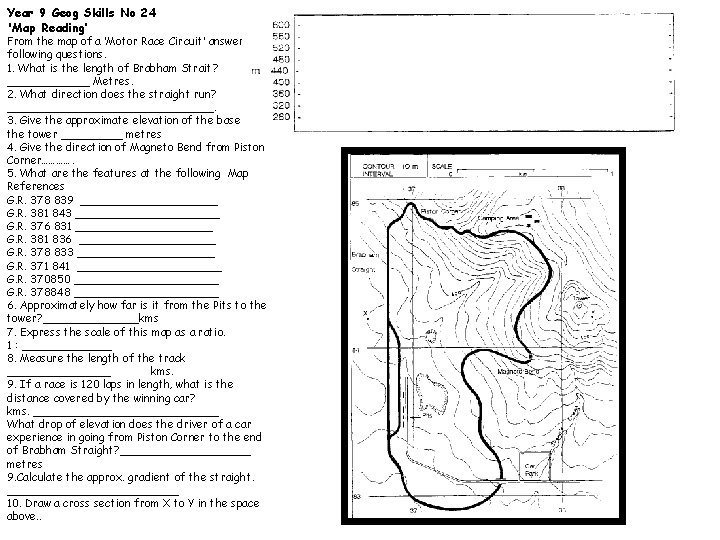
Year 9 Geog Skills No 24 'Map Reading’ From the map of a ‘Motor Race Circuit’ answer the following questions. 1. What is the length of Brabham Strait? ______ Metres. 2. What direction does the straight run? _______________. 3. Give the approximate elevation of the base of the tower _____ metres 4. Give the direction of Magneto Bend from Piston Corner…………. 5. What are the features at the following Map References G. R. 378 839 __________ G. R. 381 843 ___________ G. R. 376 831 __________ G. R. 381 836 __________ G. R. 378 833 __________ G. R. 371 841 ___________ G. R. 370850 ___________ G. R. 378848 ___________ 6. Approximately how far is it from the Pits to the tower? _______kms 7. Express the scale of this map as a ratio. 1 : _______ 8. Measure the length of the track ________ kms. 9. If a race is 120 laps in length, what is the distance covered by the winning car? kms. ______________ What drop of elevation does the driver of a car experience in going from Piston Corner to the end of Brabham Straight? __________ metres 9. Calculate the approx. gradient of the straight. _____________ 10. Draw a cross section from X to Y in the space above. .

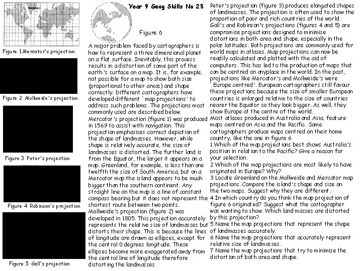
Peter's projection (figure 3) produces elongated shapes of landmasses. The projection is often used to show the proportion of poor and rich countries of the world. Gall's and Robinson's projections (figures 4 and 5) are compromise projections designed to minimise Figure 6 distortions in both area and shape, especially in the polar latitudes. Both projections are commonly used for A major problem faced by cartographers is world maps in atlases. Map projections can now be how to represent a three dimensional planet readily calculated and plotted with the aid of on a flat surface. Inevitably, this process computers. This has led to the production of maps that results in a distortion of some part of the earth's surface on a map. It is, for example, can be centred on anyplace in the world. In the past, projections like Mercator's and Mollweide's were not possible for a map to show both size `Europe centred'. European cartographers still favour (proportional to other areas) and shape these projections because the size of smaller European correctly. Different cartographers have countries is enlarged relative to the size of countries developed different `map projections' to address such problems. The projections most nearer the Equator so they look bigger. As well, they show Europe at the centre of the world. commonly used are described below. Mercator's projection (figure 1) was produced Most atlases produced in Australia and Asia, feature maps centred on Asia and the Pacific. Some in 1569 to assist with navigation. This cartographers produce maps centred on their home projection emphasises correct depiction of country, like the one in figure 6 the shape of landmasses. However, while 1 Which of the map projections best shows Australia's shape is relatively accurate, the size of position in relation to the Pacific? Give a reason for landmasses is distorted. The further land is from the Equator, the larger it appears on a your selection. map. Greenland, for example, is less than one 2 Which of the map projections are most likely to have originated in Europe? Why? twelfth the size of South America, but on a Mercator map the island appears to be much 3 Locate Greenland on the Mollweide and Mercator map projections. Compare the island's shape and size on bigger than the southern continent. Any straight line on the map is a line of constant the two maps. Suggest why they are different. compass bearing but it does not represent the 4 In which country do you think the map projection of figure 6 originated? Suggest what the cartographer shortest route between two points. was wanting to show. Which land masses are distorted Mollweide's projection (figure 2) was developed in 1805. This projection accurately by this projection? represents the relative size of landmasses but 5 Name the map projections that represent the shape distorts their shape. This is because the lines of landmasses accurately. of longitude are drawn as ellipses, except for 6 Name the map projections that accurately represent relative size of landmasses. the central 0 degrees longitude. These ellipses become more exaggerated away from 7 Name the map projections that try to minimise the distortion of both area and shape. the central line of longitude therefore distorting the landmasses Year 9 Geog Skills No 25 Figure 1 Mercator's projection Figure 2 Mollweide's projection Figure 3 Peter's projection Figure 4 Robinson's projection Figure 5 Gall's projection

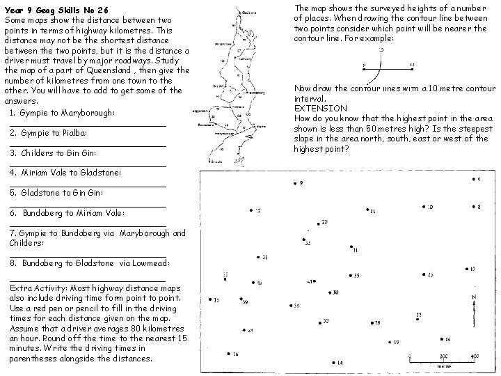
Year 9 Geog Skills No 26 Some maps show the distance between two points in terms of highway kilometres. This distance may not be the shortest distance between the two points, but it is the distance a driver must travel by major roadways. Study the map of a part of Queensland , then give the number of kilometres from one town to the other. You will have to add to get some of the answers. 1. Gympie to Maryborough: _______________ 2. Gympie to Pialba: _______________ 3. Childers to Gin: _______________ 4. Miriam Vale to Gladstone: _______________ 5. Gladstone to Gin: _______________ 6. Bundaberg to Miriam Vale: _______________ 7. Gympie to Bundaberg via Maryborough and Childers: _______________ 8. Bundaberg to Gladstone via Lowmead: _____________ Extra Activity: Most highway distance maps also include driving time form point to point. Use a red pen or pencil to fill in the driving times for each distance given on the map. Assume that a driver averages 80 kilometres an hour. Round off the time to the nearest 15 minutes. Write the driving times in parentheses alongside the distances. The map shows the surveyed heights of a number of places. When drawing the contour line between two points consider which point will be nearer the contour line. For example: Now draw the contour lines with a 10 metre contour interval. EXTENSION How do you know that the highest point in the area shown is less than 50 metres high? Is the steepest slope in the area north, south, east or west of the highest point?

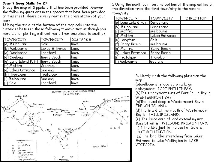
Year 9 Geog Skills No 27 Study the map of Gippsland that has been provided. Answer the following questions in the spaces that have been provided on this sheet. Please be very neat in the presentation of your work. 1. Using the scale at the bottom of the map calculate the distances between these following towns/cities as though you were a pilot plotting a direct route from one place to another TOWN/CITY (a) Melbourne (b) Melbourne (c) Dandenong (d) Geelong (e) Long Island Point (f) Maffra (g) Lakes Entrance (h) Traralgon (i) Melbourne (j) Sale TOWN/CITY Sale Lakes Entrance Longford Barry Beach Warragul Geelong Trafalgar Geelong Longford. DISTANCE kms. 2. Using the north point on , the bottom of the map estimate the direction from the first town/city to the second town/city. TOWN/CITY DIRECTION (a) Long Island Point Dandenong (b) Melbourne Dandenong (c) Maffra Melbourne (d) Maffra Lakes Entrance (e) Longford Sale (f) Barry Beach Melbourne (g) Maffra Barry Beach (h) Lakes Entrance Barry Beach (i) Trafalgar Traralgon (j) Melbourne Geelong 3. Neatly mark the following places on the map. (a)Melbourne is located on a large embayment PORT PHILLIP BAY. (b)The embayment east of Fort Phillip Bay is WESTERNPORT BAY. (c)The island deep in Westernport Bay is FRENCH ISLAND. (d)The island at the mouth of Westernport Bay is PHILLIP ISLAND. (e) The large area of land extending into Bass Strait is WILSONS PROMONTORY. (f) The lake just to the east of Sale is LAKE WELLINGTON. (g) The long lake stretching from Lakes Entrance to Lake Wellington is LAKE VICTORIA.

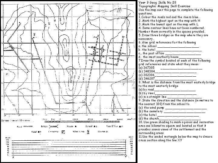
N Year 9 Geog Skills No 28 Topograghic Mapping Skill Exercise Use the map over the page to complete the following questions. 1. Colour the roads red and the rivers blue. 2. Mark the highest spot on the map with H 3. Mark the lowest spot on the map with L. 4. Some contour lines have not been numbered. Number them correctly in the spaces provided. 5. Draw three bridges on the map where they are necessary. 6. Give grid references for the following a. the school ___________ b. the hotel ____________ c, . the post office __________ d. the most southerly house______ 7. Draw the symbol located at each of the following grid references and state what they mean: (a) 367305 ___________ (b) 348304___________ (c) 302306___________ (d) 346287___________ 8. What is the distance from the most easterly bridge to the most westerly bridge (a) by road___________ (b) by river___________ (c) in a straight line _________ 9. State the direction and the distance (in metres to the nearest 100) from the school to (a) the wind pump ___________ (b) the cemetery ___________ (c) the hotel ___________ (d) the church___________ 10. Use green shading to mark a picnic and recreation area one kilometre square and located so that it provides scenic views of the settlement and the surrounding areas 11. Use the scaled rectangle below the map to draw a cross section along the line XY

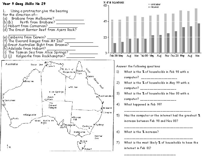
Year 9 Geog Skills No 29 1. Using a protractor give the bearing for the direction of: (a) Brisbane from Melbourne? _______ (b) Perth from Brisbane? _______ (c) Hobart from Carnarvon? _______ (d) The Great Barrier Reef from Ayers Rock? _______ (e) Canberra from Darwin? _______ (f) The Everard Ranges from Mt Isa? _______ (g) Great Australian Bight from Broome? _______ (h) Adelaide from Hobart? _______ (i) The Tasman Sea from Alice Springs? _______ (j) Kalgoorlie from Rockhampton? _______ Answer the following questions 1) What is the % of households in Feb 98 with a computer? __________ 2) What is the % of households in May 99 with a computer? __________ 3) What is the % of households in Nov 00 with a computer? __________ 4) What happened in Feb 99? __________________ 5) Has the computer or the internet had the greatest % increase between Feb 98 and Nov 00? __________________ 6) What is the % increase? __________________ 7) What is the most likely % of households to have the internet in Feb 01? ______________

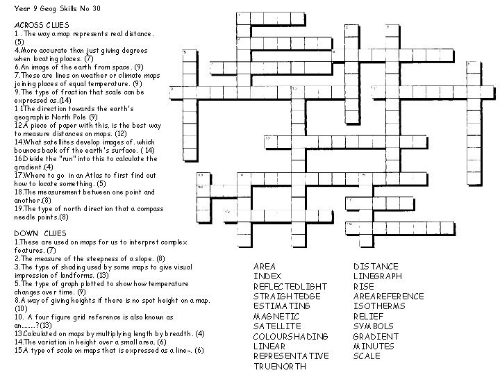
Year 9 Geog Skills No 30 ACROSS CLUES 1. The way a map represents real distance. (5) 4. More accurate than just giving degrees when locating places. (7) 6. An image of the earth from space. (9) 7. These are lines on weather or climate maps joining places of equal temperature. (9) 9. The type of fraction that scale can be expressed as. (14) 1 1 The direction towards the earth's geographic North Pole (9) 12. A piece of paper with this, is the best way to measure distances on maps. (12) 14. What satellites develop images of. which bounces back off the earth's surface. ( 14) 16. Divide the "run" into this to calculate the gradient. (4) 17. Where to go in an Atlas to first find out how to locate something. (5) 18. The measurement between one point and another. (8) 19. The type of north direction that a compass needle points. (8) DOWN CLUES 1. These are used on maps for us to interpret complex features. (7) 2. The measure of the steepness of a slope. (8) 3. The type of shading used by some maps to give visual impression of landforms. (13) 5. The type of graph plotted to show temperature changes over time. (9) 8. A way of giving heights if there is no spot height on a map. (10) 10. A four figure grid reference is also known as an………? (13) 13. Calculated on maps by multiplying length by breadth. (4) 14. The variation in height over a small area. (6) 15. A type of scale on maps that is expressed as a line¬. (6) AREA INDEX REFLECTEDLIGHT STRAIGHTEDGE ESTIMATING MAGNETIC SATELLITE COLOURSHADING LINEAR REPRESENTATIVE TRUENORTH DISTANCE LINEGRAPH RISE AREAREFERENCE ISOTHERMS RELIEF SYMBOLS GRADIENT MINUTES SCALE