Types of Fonts Many letters within fonts are


- Slides: 16
Types of Fonts
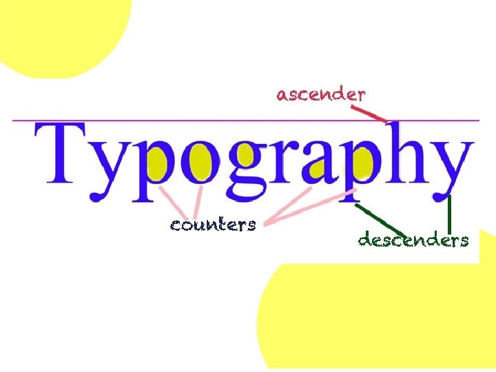
Many letters within fonts are made up of: • Counters • The centers or empty spaces inside letters such as “e”, “g” and “o” • Ascenders • The parts of letters that dip down below the baseline, such as “p”, ”g” and “y” • Descenders • The parts of letters that rise above the baseline, such as “d”, “f” and “h”
Fonts can be categorized into groups based on these characteristics: • Stroke • The width of the lines that make up letters • Stress • The angle at which the stroke changes to thick or thin within a counter • Serifs • The little tails at the end of letters
Stroke
Stress A diagonal stress crosses a counter from the thinnest part of the stroke at the top of the letter to the thinnest part at the bottom. When a letter has a consistent stroke weight, there is no stress A straight stress crosses a counter at the thinnest stroke at top and bottom, making a straight vertical line.
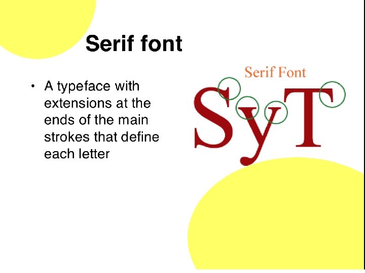
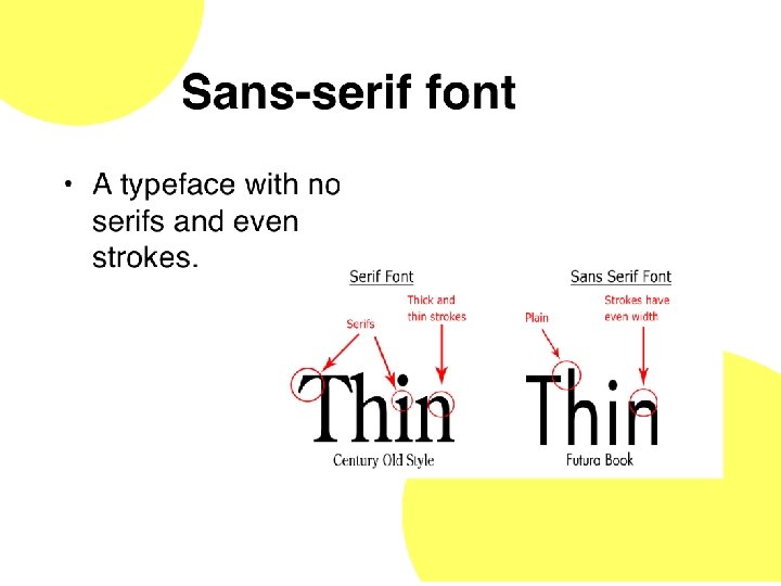
Serifs A straight line that meets the serif without curving is a non-bracketed serif. Bracketed Review: serif - the Sans serif letters bracket is a have no serifs. curved or wedge-like connection between the stem and serif.
Oldstyle • Fonts that have bracketed serifs, angled stress, and strokes that move gently from thick to thin. –Most frequently used for long text passages –Most readable types of fonts
Modern • Modern fonts - have a sharp contrast between thick and thin strokes, unbracketed serifs, and vertical stress.
Slab Serif - very little difference between strokes, heavy serif, and vertical stress.
Sans Serif Sans serif fonts - have no serifs; the strokes are quite even. Because of the evenness of the strokes, there is no visible stress.
Script fonts - based on hand lettering with a calligraphy or brush pen. – some connect, some don’t connect, some are hand printed, and some are traditional calligraphy.
Decorative fonts - fun, distinctive and often convey emotions through their letterforms. There is a decorative font for just about every feeling. These are very powerful fonts that should be used sparingly.
Monospace A proportional typeface contains glyphs of varying widths, while a monospaced (non-proportional or fixed-width) typeface uses a single standard width for all glyphs in the font. Monospaced typefaces function better for some purposes because their glyphs line up in neat, regular columns. –typewriters –Programming and text-only computer displays