Microsoft Excel Using Excel to Graph Data Juliana




- Slides: 13

Microsoft Excel Using Excel to Graph Data Juliana Yam November 14, 2006

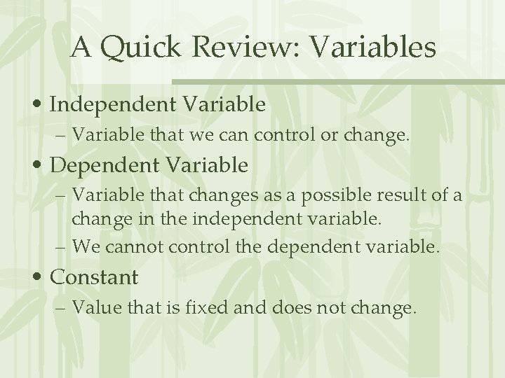
A Quick Review: Variables • Independent Variable – Variable that we can control or change. • Dependent Variable – Variable that changes as a possible result of a change in the independent variable. – We cannot control the dependent variable. • Constant – Value that is fixed and does not change.

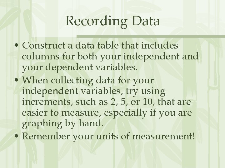
Recording Data • Construct a data table that includes columns for both your independent and your dependent variables. • When collecting data for your independent variables, try using increments, such as 2, 5, or 10, that are easier to measure, especially if you are graphing by hand. • Remember your units of measurement!

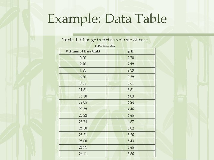
Example: Data Table 1: Change in p. H as volume of base increases. Volume of Base (m. L) p. H 0. 00 2. 78 2. 90 2. 99 4. 21 3. 19 6. 30 3. 39 9. 05 3. 61 11. 81 3. 81 15. 10 4. 03 18. 05 4. 24 20. 59 4. 46 22. 32 4. 65 23. 74 4. 87 24. 50 5. 02 25. 21 5. 26 25. 60 5. 43 25. 91 5. 65 26. 11 5. 86

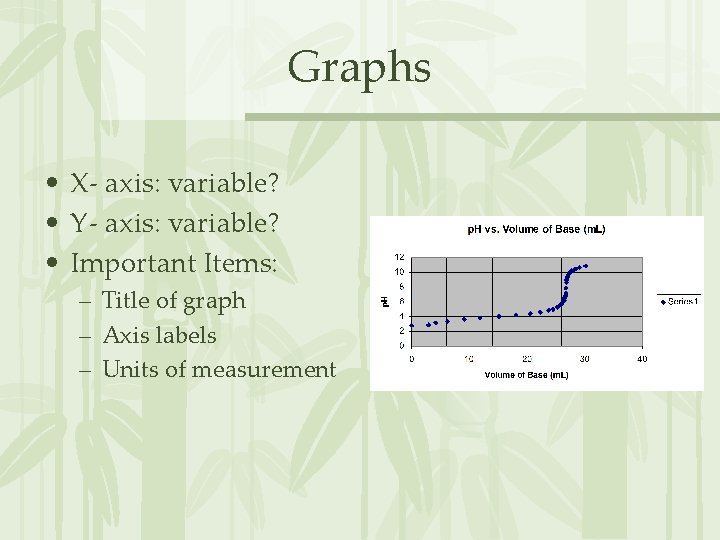
Graphs • X- axis: variable? • Y- axis: variable? • Important Items: – Title of graph – Axis labels – Units of measurement

How can we use Excel? • First, we need to collect some data! Population Growth: Rabbits and Foxes Once you reach this website, please read the short introduction that is given. Once you have finished reading, click on the link for “Part A: Rabbits & Hunters. ”

Before You Begin Collecting Data… • Construct your data table first! (Use a sheet of notebook paper first. You can create a table in Microsoft Word later on. ) – What is your independent variable? – What is your dependent variable? – What are your constants? – What is the title for your data table? • Once you have your data table established, you can begin collecting data.

Now, on to Excel… • Open a blank Excel spreadsheet. • In column A, enter the data that you want for your X-axis. This will be data for your independent variable. • In column B, enter the data that you want for your Y-axis. This will be data for your dependent variable.

Excel, continued • Once you have entered all of your data, use your cursor to drag and highlight all data in both columns. • Next, keeping your data highlighted, move your cursor and click on the “Chart Wizard” icon, or click on “Tools” and then click on “Chart”.

• Click on “XY (scatter plot)” and click “next. ” • A picture of your graph should appear. Click “next” again. • On the next window, you can enter the title of your graph, as well as label your x and y axes. You will also want to click on the “gridlines” tab and make sure both the major and minor gridlines for your axes are selected. • Click “next” once you have finished formatting your graph.

• On the final window, make sure “as object in sheet 1” is selected, then click next, and your graph should appear next to your data! • If you need a “best fit” line for your graph, click on one of the data points, right click, and select “add trend line. ” • You can print your graph as well – simply make sure your chart only is selected on the print window before printing. • Once your graphs and data tables are complete, you can begin analyzing your results!

Additional Comments • XY scatter plot may be the type of graph a majority of you will use, especially if you are collecting data that is continuous or occurs over time. • However, there may be times when you will want to use a bar graph, especially if you are collecting data that focuses more on comparisons (such as the number of people who eat a certain type of candy bar). • You can use Excel for these types of graphs as well; just make sure you select a column or bar graph instead of an XY scatter plot.

Any Questions?