Introduction to GUI in Graphical User Interface 3

- Slides: 23

Introduction to GUI in Graphical User Interface 3 Nouf Almunyif 1

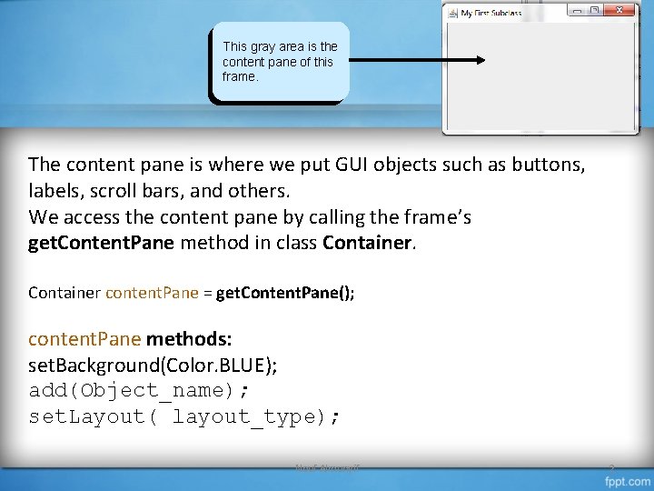
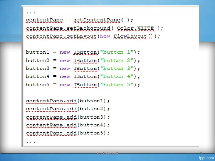
This gray area is the content pane of this frame. The content pane is where we put GUI objects such as buttons, labels, scroll bars, and others. We access the content pane by calling the frame’s get. Content. Pane method in class Container content. Pane = get. Content. Pane(); content. Pane methods: set. Background(Color. BLUE); add(Object_name); set. Layout( layout_type); Nouf Almunyif 2

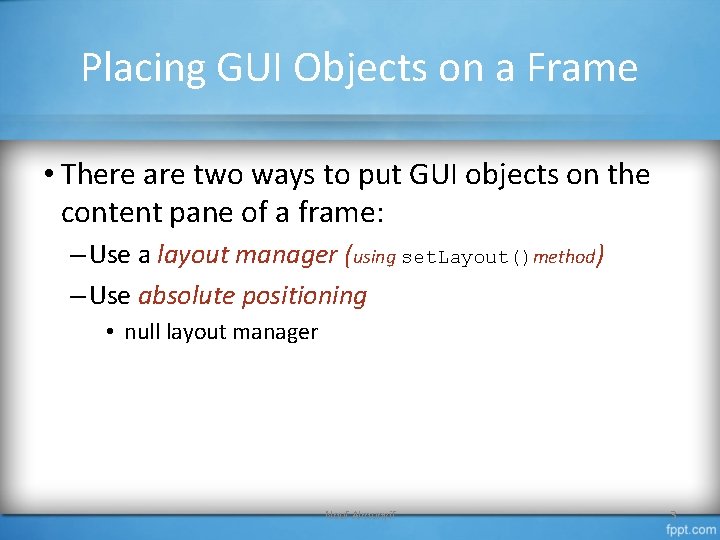
Placing GUI Objects on a Frame • There are two ways to put GUI objects on the content pane of a frame: – Use a layout manager (using set. Layout()method) – Use absolute positioning • null layout manager Nouf Almunyif 3

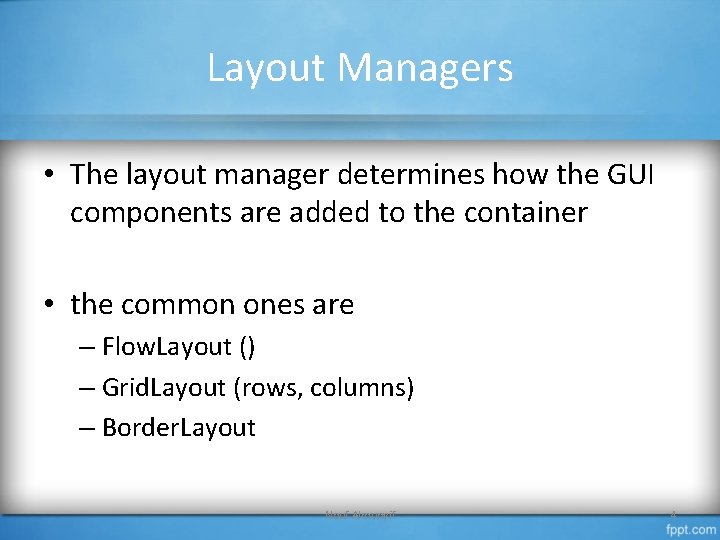
Layout Managers • The layout manager determines how the GUI components are added to the container • the common ones are – Flow. Layout () – Grid. Layout (rows, columns) – Border. Layout Nouf Almunyif 4

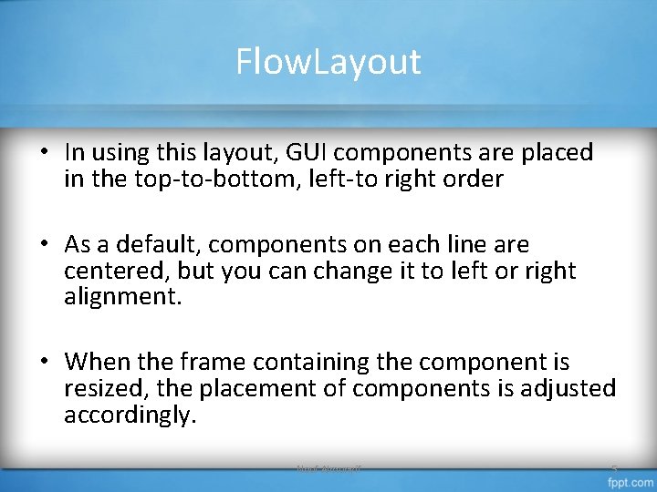
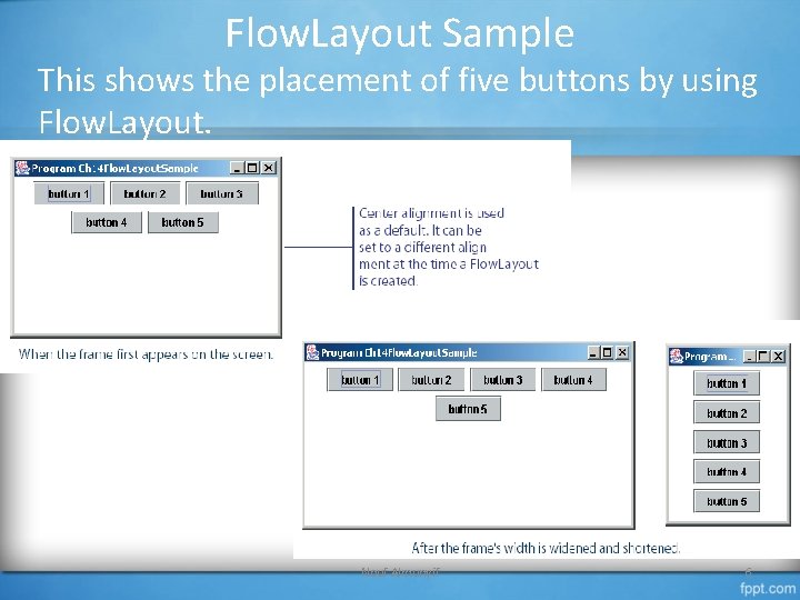
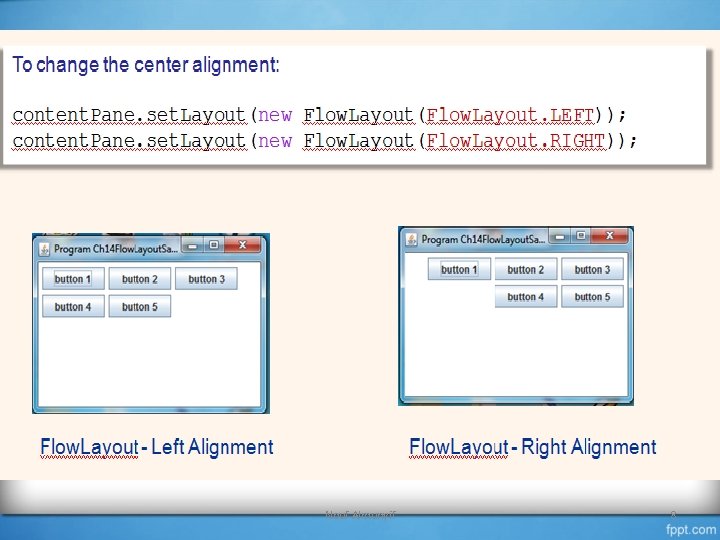
Flow. Layout • In using this layout, GUI components are placed in the top-to-bottom, left-to right order • As a default, components on each line are centered, but you can change it to left or right alignment. • When the frame containing the component is resized, the placement of components is adjusted accordingly. Nouf Almunyif 5

Flow. Layout Sample This shows the placement of five buttons by using Flow. Layout. Nouf Almunyif 6

Nouf Almunyif 7

Nouf Almunyif 8

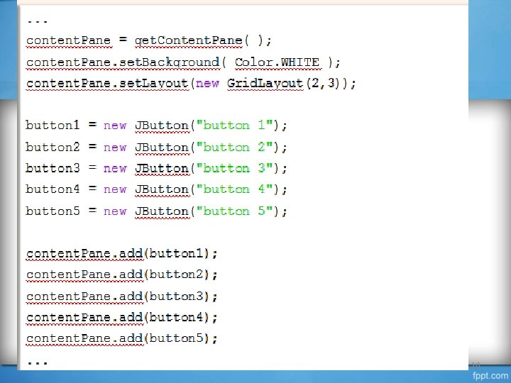
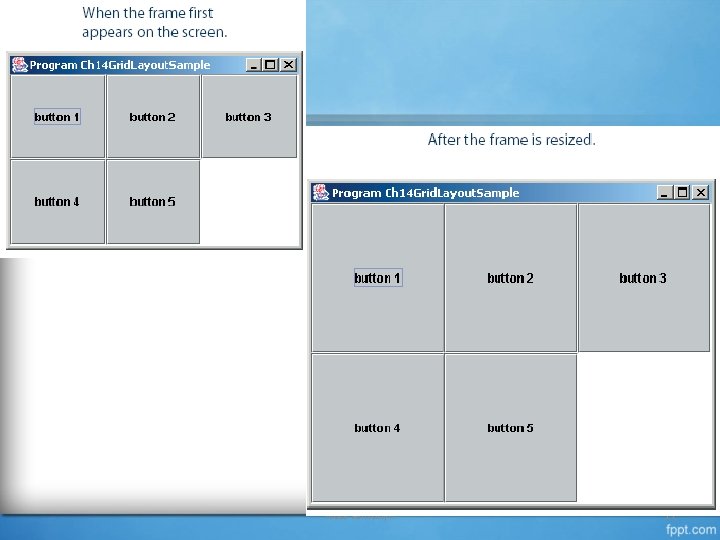
Grid. Layout • This layout manager places. GUI components on equal-size N by M grids. • Components are placed in top-to-bottom, leftto-right order. • The number of rows and columns remains the same after the frame is resized, but the width and height of each region will change. Nouf Almunyif 9

Nouf Almunyif 10

Nouf Almunyif 11

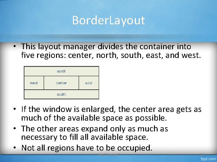
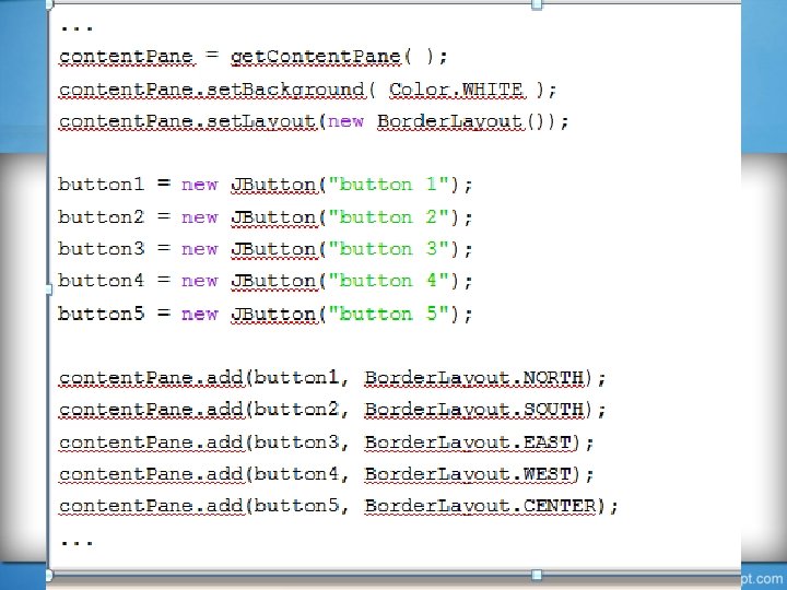
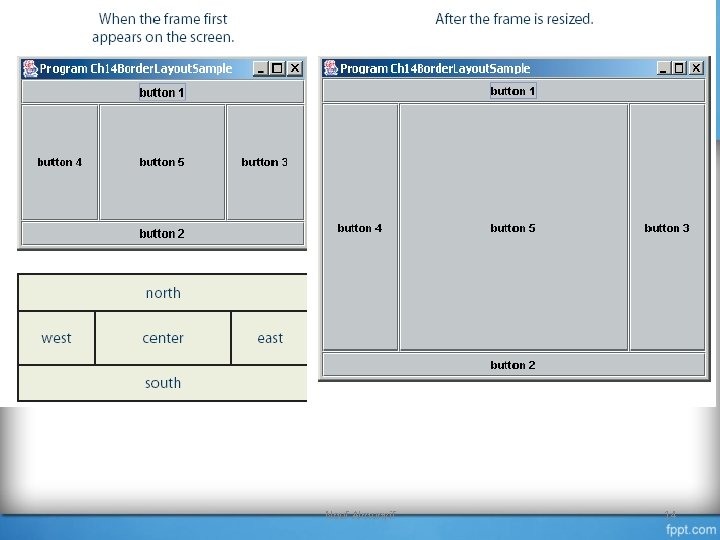
Border. Layout • This layout manager divides the container into five regions: center, north, south, east, and west. • If the window is enlarged, the center area gets as much of the available space as possible. • The other areas expand only as much as necessary to fill available space. • Not all regions have to be occupied. Nouf Almunyif 12

Nouf Almunyif 13

Nouf Almunyif 14

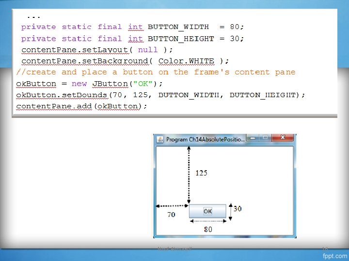
Absolute Positioning • Here we do not use any layout manager. • We place the GUI objects on the frame’s content pane by explicitly specifying their position and size. • This is called absolute positioning Nouf Almunyif 15

Nouf Almunyif 16

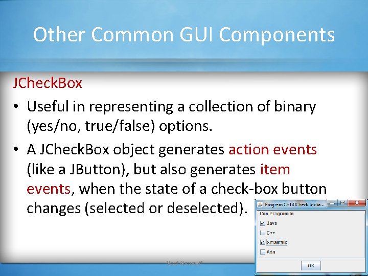
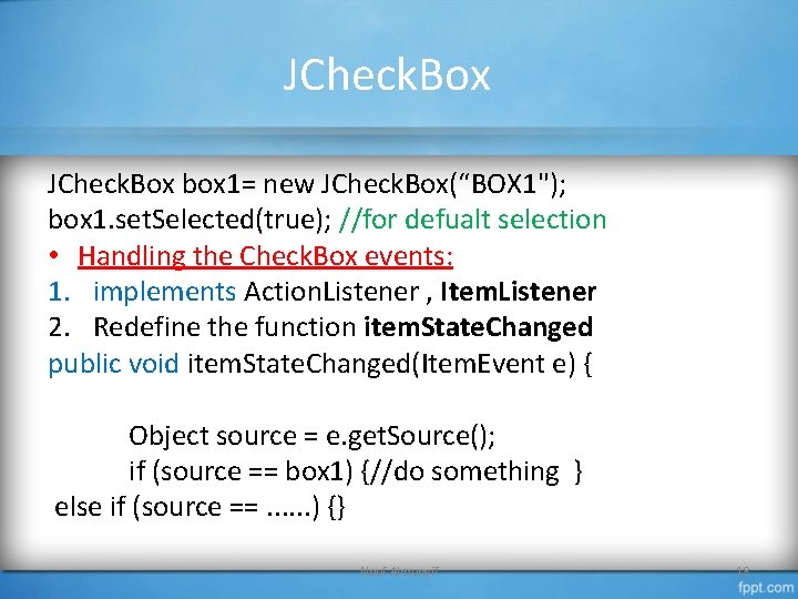
Other Common GUI Components JCheck. Box • Useful in representing a collection of binary (yes/no, true/false) options. • A JCheck. Box object generates action events (like a JButton), but also generates item events, when the state of a check-box button changes (selected or deselected). Nouf Almunyif 17

JCheck. Box box 1= new JCheck. Box(“BOX 1"); box 1. set. Selected(true); //for defualt selection • Handling the Check. Box events: 1. implements Action. Listener , Item. Listener 2. Redefine the function item. State. Changed public void item. State. Changed(Item. Event e) { Object source = e. get. Source(); if (source == box 1) {//do something } else if (source ==. . . ) {} Nouf Almunyif 18

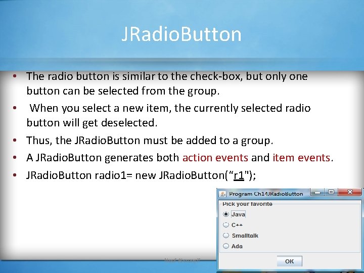
JRadio. Button • The radio button is similar to the check-box, but only one button can be selected from the group. • When you select a new item, the currently selected radio button will get deselected. • Thus, the JRadio. Button must be added to a group. • A JRadio. Button generates both action events and item events. • JRadio. Button radio 1= new JRadio. Button(“r 1"); Nouf Almunyif 19

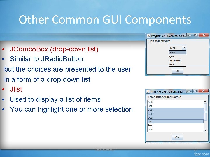
Other Common GUI Components • JCombo. Box (drop-down list) • Similar to JRadio. Button, but the choices are presented to the user in a form of a drop-down list • Jlist • Used to display a list of items • You can highlight one or more selection Nouf Almunyif 20

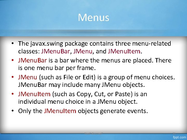
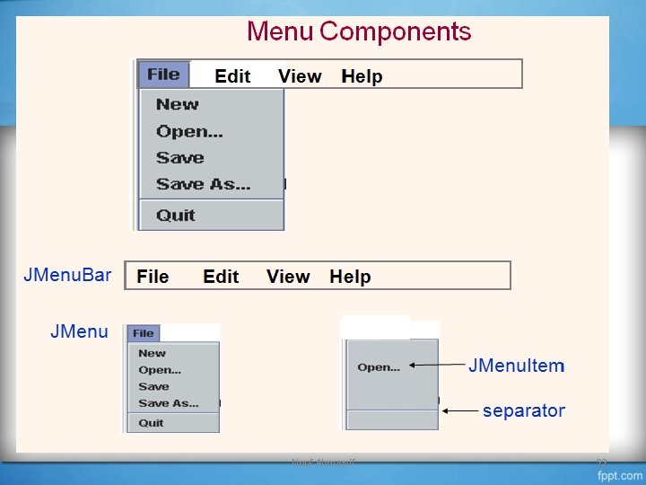
Menus • The javax. swing package contains three menu-related classes: JMenu. Bar, JMenu, and JMenu. Item. • JMenu. Bar is a bar where the menus are placed. There is one menu bar per frame. • JMenu (such as File or Edit) is a group of menu choices. JMenu. Bar may include many JMenu objects. • JMenu. Item (such as Copy, Cut, or Paste) is an individual menu choice in a JMenu object. • Only the JMenu. Item objects generate events. Nouf Almunyif 21

Nouf Almunyif 22

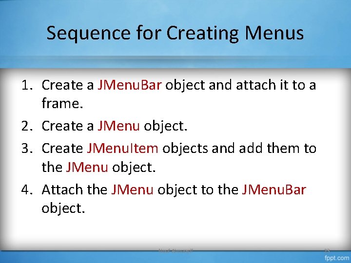
Sequence for Creating Menus 1. Create a JMenu. Bar object and attach it to a frame. 2. Create a JMenu object. 3. Create JMenu. Item objects and add them to the JMenu object. 4. Attach the JMenu object to the JMenu. Bar object. Nouf Almunyif 23