Chapter 7 Focusing on Users and Their Tasks
- Slides: 48

Chapter 7: Focusing on Users and Their Tasks Should Take: 50 -70 minutes

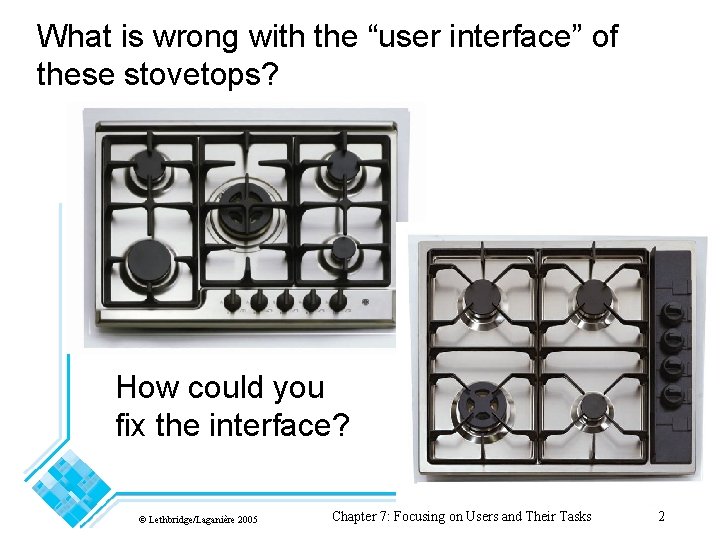
What is wrong with the “user interface” of these stovetops? How could you fix the interface? © Lethbridge/Laganière 2005 Chapter 7: Focusing on Users and Their Tasks 2

7. 1 User Centred Design Software development should focus on the needs of users • Understand your users • Design software based on an understanding of the users’ tasks • Ensure users are involved in decision making processes • Design the user interface following guidelines for good usability • Have users work with and give their feedback about prototypes, on-line help and draft user manuals © Lethbridge/Laganière 2005 Chapter 7: Focusing on Users and Their Tasks 3

The importance of focusing on users • Reduced training and support costs • Reduced time to learn the system • Greater efficiency of use • Reduced costs by only developing features that are needed • Reduced costs associated with changing the system later • Better prioritizing of work for iterative development • Greater attractiveness of the system, so users will be more willing to buy and use it © Lethbridge/Laganière 2005 Chapter 7: Focusing on Users and Their Tasks 4

Your Experiences Think about some interfaces you have used, or your kid sister/brother or you grandparents. (could be an ATM machine, a kiosk, etc… not necessarily just a piece of software for a computer) Which ones have you or they loved and why? Which ones have you or they hated and why? © Lethbridge/Laganière 2005 Chapter 7: Focusing on Users and Their Tasks 5

A sample User Interface: http: //www. csd. uwo. ca/~lreid/cs 2212 User. Interfaces. html © Lethbridge/Laganière 2005 Chapter 7: Focusing on Users and Their Tasks 6

7. 2 Characteristics of Users Software engineers must develop an understanding of the users • Goals for using the system • Potential patterns of use • Demographics age, educational background, can you think of others? ________ • Knowledge of the domain and of computers • Physical ability • Psychological traits and emotional feelings © Lethbridge/Laganière 2005 Chapter 7: Focusing on Users and Their Tasks 7

7. 3 Basics of User Interface Design • User interface design should be done in conjunction with other software engineering activities. • Do use case analysis to help define the tasks that the UI must help the user perform. • Do iterative UI prototyping to address the use cases. • Results of prototyping will enable you to finalize the requirements. © Lethbridge/Laganière 2005 Chapter 7: Focusing on Users and Their Tasks 8

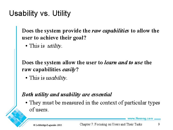
Usability vs. Utility Does the system provide the raw capabilities to allow the user to achieve their goal? • This is utility. Does the system allow the user to learn and to use the raw capabilities easily? • This is usability. Both utility and usability are essential • They must be measured in the context of particular types of users. © Lethbridge/Laganière 2005 Chapter 7: Focusing on Users and Their Tasks 9

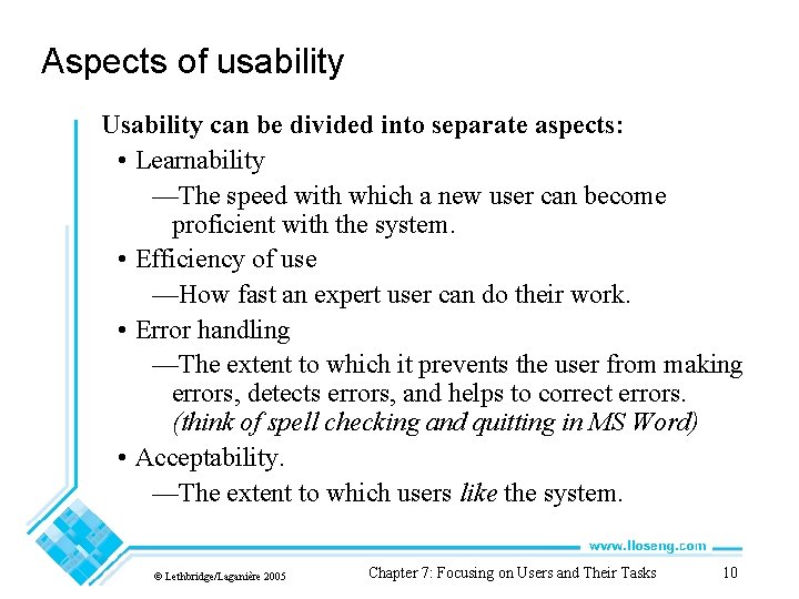
Aspects of usability Usability can be divided into separate aspects: • Learnability —The speed with which a new user can become proficient with the system. • Efficiency of use —How fast an expert user can do their work. • Error handling —The extent to which it prevents the user from making errors, detects errors, and helps to correct errors. (think of spell checking and quitting in MS Word) • Acceptability. —The extent to which users like the system. © Lethbridge/Laganière 2005 Chapter 7: Focusing on Users and Their Tasks 10

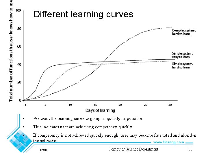
Different learning curves • We want the learning curve to go up as quickly as possible • This indicates user are achieving competency quickly • If competency is not achieved quickly enough, user may become frustrated and abandon the software UWO Computer Science Department 11

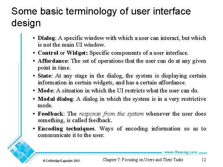
Some basic terminology of user interface design • Dialog: A specific window with which a user can interact, but which is not the main UI window. • Control or Widget: Specific components of a user interface. • Affordance: The set of operations that the user can do at any given point in time. • State: At any stage in the dialog, the system is displaying certain information in certain widgets, and has a certain affordance. • Mode: A situation in which the UI restricts what the user can do. • Modal dialog: A dialog in which the system is in a very restrictive mode. • Feedback: The response from the system whenever the user does something, is called feedback. • Encoding techniques. Ways of encoding information so as to communicate it to the user. © Lethbridge/Laganière 2005 Chapter 7: Focusing on Users and Their Tasks 12

Your Experiences Can you think of ways, that, software interfaces you have used, have handled the following situations: 1. What you can to do next? 2. What you should do next? 3. What you can NOT do from this screen 4. If you are about to do something dangerous or undoable 5. Where to find common activities such as print or save? 6. How to get help © Lethbridge/Laganière 2005 Chapter 7: Focusing on Users and Their Tasks 13

7. 4 Usability Principles 1. Do not rely on usability guidelines – always test with users. • Usability guidelines have exceptions; you can only be confident that a UI is good if you test it successfully with users. 2: Base UI designs on users’ tasks. • Perform use case analysis to structure the UI. 3: Ensure that the sequences of actions to achieve a task are as simple as possible. • Reduce the amount of reading and manipulation the user has to do. • Ensure the user does not have to navigate anywhere to do subsequent steps of a task. © Lethbridge/Laganière 2005 Chapter 7: Focusing on Users and Their Tasks 14

Usability Principles 4: Ensure that the user always knows what he or she can and should do next. • Ensure that the user can see what commands are available and are not available. • Make the most important commands stand out. 5: Provide good feedback including effective error messages. • Inform users of the progress of operations and of their location as they navigate. • When something goes wrong explain the situation in adequate detail and help the user to resolve the problem. © Lethbridge/Laganière 2005 Chapter 7: Focusing on Users and Their Tasks 15

Usability Principles 6: Ensure that the user can always get out, go back or undo an action. • Ensure that all operations can be undone. • Ensure it is easy to navigate back to where the user came from. 7: Ensure that response time is adequate. • Users are very sensitive to slow response time —They compare your system to others. • Keep response time less than a second for most operations. • Warn users of longer delays and inform them of progress. © Lethbridge/Laganière 2005 Chapter 7: Focusing on Users and Their Tasks 16

Usability Principles 8: Use understandable encoding techniques. • Choose encoding techniques with care. • Use labels to ensure all encoding techniques are fully understood by users. 9: Ensure that the UI’s appearance is uncluttered. • Avoid displaying too much information. • Organize the information effectively. © Lethbridge/Laganière 2005 Chapter 7: Focusing on Users and Their Tasks 17

Usability Principles 10: Consider the needs of different groups of users. • Accommodate people from different locales and people with disabilities. • Ensure that the system is usable by both beginners and experts. 11: Provide all necessary help. • Organize help well. • Integrate help with the application. • Ensure that the help is accurate. © Lethbridge/Laganière 2005 Chapter 7: Focusing on Users and Their Tasks 18

Usability Principles 12. Be consistent. • Use similar layouts and graphic designs throughout your application. • Follow look-and-feel standards. • Consider mimicking other applications. © Lethbridge/Laganière 2005 Chapter 7: Focusing on Users and Their Tasks 19

Some encoding techniques • Text and fonts • Icons • Photographs • Diagrams and abstract graphics • Colours • Grouping and bordering • Spoken words • Music • Other sounds • Animations and video • Flashing © Lethbridge/Laganière 2005 Chapter 7: Focusing on Users and Their Tasks 20

© Lethbridge/Laganière 2005 Chapter 7: Focusing on Users and Their Tasks 21

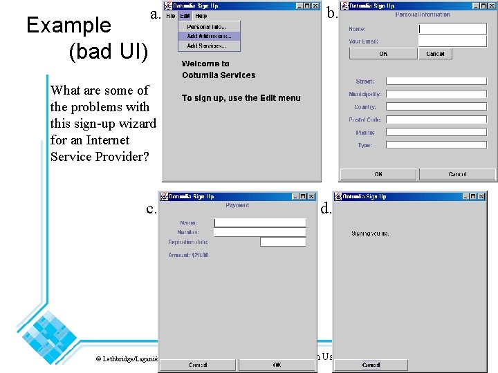
Example (bad UI) a. b. What are some of the problems with this sign-up wizard for an Internet Service Provider? c. © Lethbridge/Laganière 2005 d. Chapter 7: Focusing on Users and Their Tasks 22

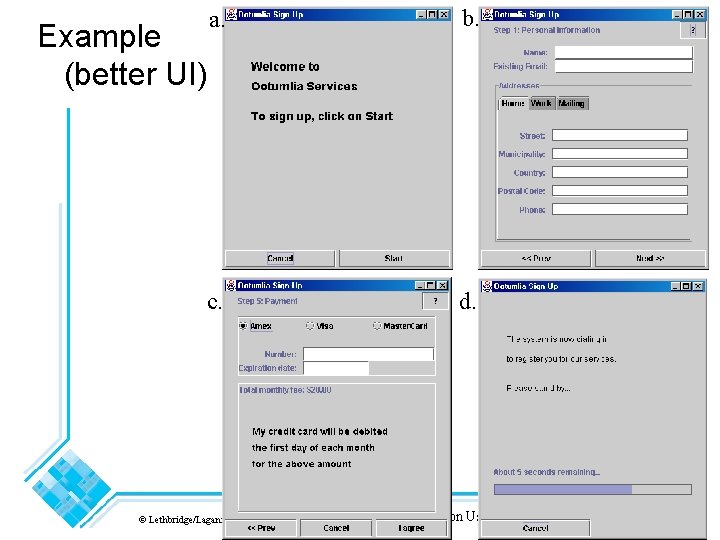
a. b. c. d. Example (better UI) © Lethbridge/Laganière 2005 Chapter 7: Focusing on Users and Their Tasks 23

7. 5 Evaluating User Interfaces Heuristic evaluation 1. Pick some use cases to evaluate. 2. For each window, page or dialog that appears during the execution of the use case —Study it in detail to look for possible usability defects. 3. When you discover a usability defect write down the following information: —A short description of the defect. —Your ideas for how the defect might be fixed. © Lethbridge/Laganière 2005 Chapter 7: Focusing on Users and Their Tasks 24

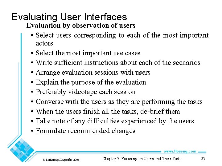
Evaluating User Interfaces Evaluation by observation of users • Select users corresponding to each of the most important actors • Select the most important use cases • Write sufficient instructions about each of the scenarios • Arrange evaluation sessions with users • Explain the purpose of the evaluation • Preferably videotape each session • Converse with the users as they are performing the tasks • When the users finish all the tasks, de-brief them • Take note of any difficulties experienced by the users • Formulate recommended changes © Lethbridge/Laganière 2005 Chapter 7: Focusing on Users and Their Tasks 25

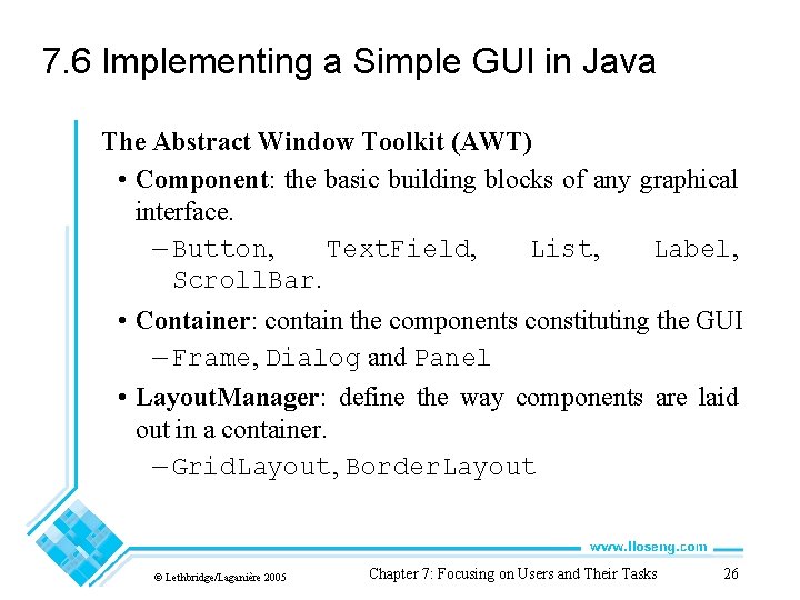
7. 6 Implementing a Simple GUI in Java The Abstract Window Toolkit (AWT) • Component: the basic building blocks of any graphical interface. — Button, Text. Field, List, Label, Scroll. Bar. • Container: contain the components constituting the GUI — Frame, Dialog and Panel • Layout. Manager: define the way components are laid out in a container. — Grid. Layout, Border. Layout © Lethbridge/Laganière 2005 Chapter 7: Focusing on Users and Their Tasks 26

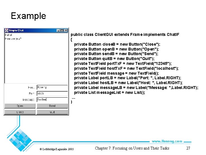
Example public class Client. GUI extends Frame implements Chat. IF { private Button close. B = new Button("Close"); private Button open. B = new Button("Open"); private Button send. B = new Button("Send"); private Button quit. B = new Button("Quit"); private Text. Field port. Tx. F = new Text. Field("12345"); private Text. Field host. Tx. F = new Text. Field("localhost"); private Text. Field message = new Text. Field(); private Label port. LB = new Label("Port: ", Label. RIGHT); private Label host. LB = new Label("Host: ", Label. RIGHT); private Label message. LB = new Label("Message: ", Label. RIGHT); private List message. List = new List(); . . . } © Lethbridge/Laganière 2005 Chapter 7: Focusing on Users and Their Tasks 27

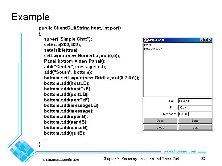
Example public Client. GUI(String host, int port) { super("Simple Chat"); set. Size(300, 400); set. Visible(true); set. Layout(new Border. Layout(5, 5)); Panel bottom = new Panel(); add("Center", message. List); add("South", bottom); bottom. set. Layout(new Grid. Layout(5, 2, 5, 5)); bottom. add(host. LB); bottom. add(host. Tx. F); bottom. add(port. LB); bottom. add(port. Tx. F); bottom. add(message. LB); bottom. add(message); bottom. add(open. B); bottom. add(send. B); bottom. add(close. B); bottom. add(quit. B); . . . } © Lethbridge/Laganière 2005 Chapter 7: Focusing on Users and Their Tasks 28

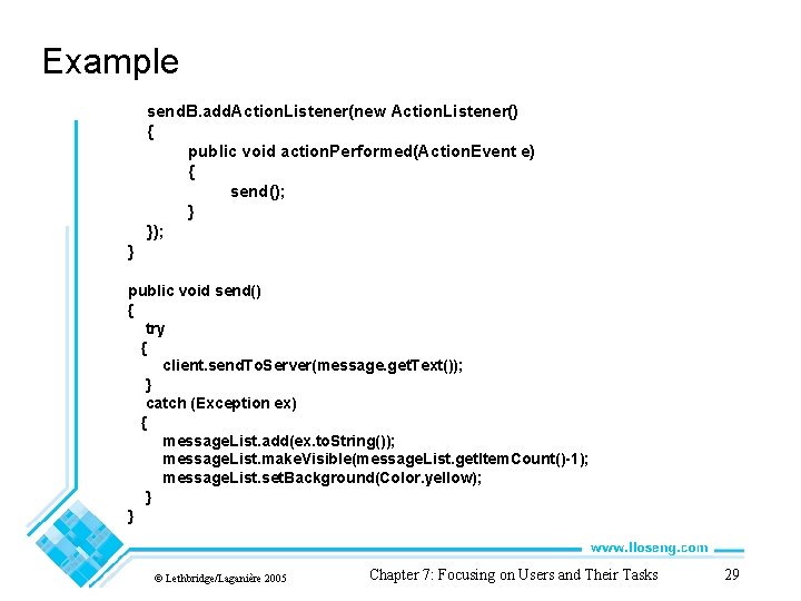
Example send. B. add. Action. Listener(new Action. Listener() { public void action. Performed(Action. Event e) { send(); } }); } public void send() { try { client. send. To. Server(message. get. Text()); } catch (Exception ex) { message. List. add(ex. to. String()); message. List. make. Visible(message. List. get. Item. Count()-1); message. List. set. Background(Color. yellow); } } © Lethbridge/Laganière 2005 Chapter 7: Focusing on Users and Their Tasks 29

User Interface Hall of Shame: http: //hallofshame. gp. co. at/index. php? file=shame. htm&mode=origi nal Java API for the Swing Class: http: //java. sun. com/javase/6/docs/api/ (in the top left corner: Packages, click on javax. swing) Excellent Java GUI coding site with good examples: http: //docs. oracle. com/javase/tutorial/uiswing/components/componentlist. ht ml UWO Computer Science 30

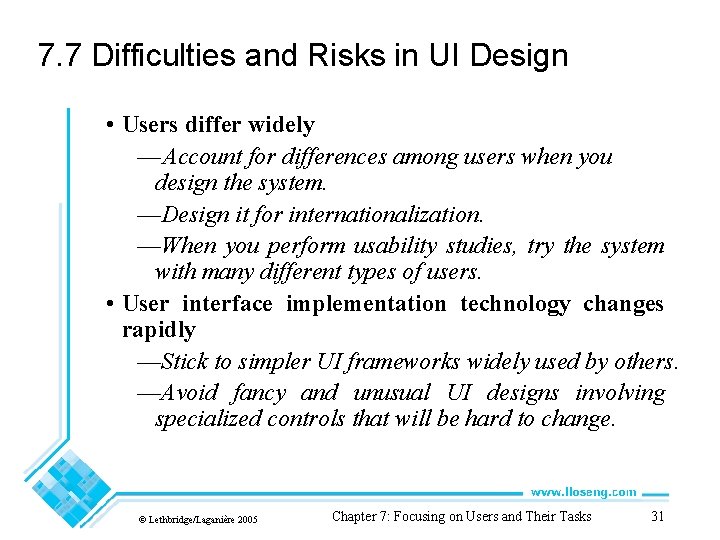
7. 7 Difficulties and Risks in UI Design • Users differ widely — Account for differences among users when you design the system. —Design it for internationalization. —When you perform usability studies, try the system with many different types of users. • User interface implementation technology changes rapidly —Stick to simpler UI frameworks widely used by others. —Avoid fancy and unusual UI designs involving specialized controls that will be hard to change. © Lethbridge/Laganière 2005 Chapter 7: Focusing on Users and Their Tasks 31

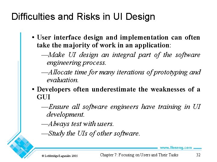
Difficulties and Risks in UI Design • User interface design and implementation can often take the majority of work in an application: —Make UI design an integral part of the software engineering process. —Allocate time for many iterations of prototyping and evaluation. • Developers often underestimate the weaknesses of a GUI —Ensure all software engineers have training in UI development. —Always test with users. —Study the UIs of other software. © Lethbridge/Laganière 2005 Chapter 7: Focusing on Users and Their Tasks 32

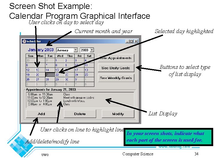
Screen Shots • Give a reader/implementer an idea of the “look” of the system • Can be done with graphics, just ASCII text, hand-drawn, etc. • Generally a static screen shot by itself not very informative • Designer may know what everything on screen means • Reader does not necessarily know • Thus, have to describe what the reader is seeing in text accompanying screen shot UWO Computer Science 33

Screen Shot Example: Calendar Program Graphical Interface User clicks on day to select day Current month and year Selected day highlighted Buttons to select type of list display List Display User clicks on line to highlight line Add/delete/modify line UWO In your screen shots, indicate what each part of the screen is used for. Computer Science 34

Video Triumph of the Nerds Who/where came up with very first GUI? Bill Gates or Stephen Jobs or someone else? http: //www. youtube. com/watch? v=Khj. Vid. OFq. Bo © Lethbridge/Laganière 2005 Chapter 7: Focusing on Users and Their Tasks 35

Text vs. Graphical User Interface Text used to be the only mode of interaction with computers In early 1980 s • Computers became fast enough to do fast graphics • Designers at Xerox produced Star computer (1981) ($16, 000) —Introduced desktop metaphor, used windows —Apple built on these ideas in Macintosh (1984) —Windows, icons, menus, pointers (WIMP) became standard vocabulary —Idea of a graphical user interface (GUI) was born Advantages of GUIs • All controls visible or easily accessible —Hence, better for novice or intermittent user • Designer can use visual and tactile metaphors —Examples: Screen = desktop in Macintosh, mouse = spray can in Paint applications —Helps user build up a correct user model quickly UWO Computer Science 36

But Text Interfaces are Useful Too • Level of difficulty of using text vs. graphical interfaces • Can be about the same for expert users • Text interfaces can be used without hands leaving keyboard • Hence, Windows “power users” prefer to use keyboard commands over menus and icons for many things; e. g. copy and paste • In many places, text is necessary or far superior; e. g. • Specifying formula for cell on spreadsheet • Selecting a pattern of file names —E. g. *UI*. ps for all file names containing string UI and ending in. ps • Thus, many GUIs have to use text in some places • Text interfaces are often easier to program • A bad GUI is worse than a good text interface • A GUI can still hinder the user from achieving their goals UWO Computer Science 37

Help the User by being Consistent Famous example of inconsistency • How do we eject a floppy disk on a Macintosh? • First version of interface (1984): —Select “eject”; causes disk icon to be grayed out —Drag grayed-out icon in trash if not needed • Second version: —Just drag disk to trash! —Inconsistent – looks like we are throwing away all data on disk Another example from hypothetical system: • Command “d” means display in one context, delete in another. • Postini at Western • Could easily lead to user deleting things they wanted to display • Also, if command syntax not consistent throughout, system will seem unpredictable: e. g. in pine: page up/down commands are mode dependent Moral: without a consistent interface: • Users find it hard to build up correct user model • Users can make errors of intention UWO Computer Science 38

Text Interfaces Choose Good Command Names DO NOT use numbers as command names • They are hard to remember • Hard to find in lists • Easy to make mistakes when typing • Just generally extremely irritating to the user Don’t use meaningless letters either • E. g. a= move forward; b=move back; c=add Use command names which indicate what commands do! E. g. • Forward = move forward • Backward = move backward • Add = add When might you use number? • When choosing among items of the same type • e. g. selecting a particular appointment in a list UWO Computer Science 39

Let the User Control Things! Always let the user be the one choosing what happens next Example of a bad system: to enter appointment: • • • User: System: User: System: add Enter start time. 11: 00 Enter finish time (realizes start time was wrong, presses enter) Invalid time entered. Enter finish time 11: 30 Enter description • … In above example, user has no control over what happens next for a short time • User must enter meaningless answers to questions • User becomes frustrated • System is hindering user from doing what they want Note, this loss of control can happen in a GUI too • Example: system pops up sequence of confusing boxes UWO Computer Science 40

User Control Better: let the user enter all information themselves, on the command line • Text example: add 10 am 11 am Board Meeting • Graphical example, box with controls for the three inputs (start time, end time, description) —Controls for times can be either input fields or more graphical • Both allow user to select inputs on their own time • Text example allows them to edit line before entering If the system must ask the user a question: • Let the user “cancel out” or “select default” in some natural way —E. g. typing “return”, clicking “Cancel” button • Give example of legal and sensible (default) input value • Example: see example of text user case —User just enters start time for appointment —Can easily select 1 hour appointment or enter more info to change length UWO Computer Science 41

Give Meaningful Feedback Basically two kinds of feedback: immediate and state feedback: • Immediate: Reaction at the time the user does something —Examples: - GUI button acting like it has been pushed - Text response confirming action has been completed —Without immediate feedback, user can’t tell whether what they have done has worked • State: tells the user what state the system is in. —Examples: - Different screen layout when in “weekly goals” mode - Paint program cursor taking different shape when user selects different icon —Helps user maintain accurate model of status of system. UWO Computer Science 42

Feedback Example: Processing Delays Assume that: • User does some action • System has to do a lot of processing before getting back to the user. System might just do nothing when user does action • User wouldn’t be able to tell whether it’s processing or if their action “didn’t work” One solution for text interfaces: • Print prompt (e. g. >) whenever ready for command • Until user sees prompt, user knows system is processing • Could also display message indicating a delay Loading, please wait … One solution for graphical interfaces: • Make a change indicating passage of time —Cursor becomes hourglass, icon shows falling stars, displays a percent done bar, etc. • Change back when processing done UWO Computer Science 43

React Well to Errors There are many ways (good and bad) that a system can react to errors Example error (in day planner system): • User tries to move past last valid day of calendar Examples of good reactions: • Helpful messages: e. g. “Cannot move past last day” —Allows the user to see what they did wrong —Decreases the severity of the error • Helpful suggestion: e. g. “See your systems administrator to extend timeline of calendar” —May help user achieve real goals —May help user learn • Use auditory feedback where appropriate (e. g. beep) —Good if user recognizes that this means something like “You’ve tried to go past the boundaries” UWO Computer Science 44

Errors Example: Bad Reactions Bad examples: • Useless message; e. g. Traversal error 42 – huh? ? —Uses obscure jargon, code numbers —Gives no indication of what went wrong —User can’t tell if error is severe or not —User doesn’t learn much • No response —Difficult for user to understand what happened —frustration • System crash —Obviously not a good thing • Incorrect non-crash behaviour; e. g. moving to year 0 —User might not see that something has gone wrong —System might go on for a while, then crash —User has no chance to learn what went wrong —System has prevented user from doing what they want • This last reaction is possibly the worst • Good reactions take more programming, but are much easier on the users UWO Computer Science 45

Help User Avoid Errors Ask for verification of any nontrivial destructive action • E. g. the commonly-used box saying “File has been changed. Save file? ” —Makes sure that user doesn’t inadvertently throw away important data However, don’t ask when the action is easy to fix if wrong; e. g. “Are you sure you want to add this appointment? ” • User can delete appointment later easily enough • Thus, message just slows user down Permit easy reversal of actions if possible; e. g. • UNDO or reverse action • Complementary commands; e. g. add and delete UWO Computer Science 46

Evaluating User Interfaces Produce detailed screen shots Produce detailed use cases Keeping in mind design guidelines, ask yourself: • Does the interface help the user achieve their goals? • Does it avoid hindering the user? • Does it make errors more avoidable, less serious? • Does it help the user learn? • Does it encourage a consistent user model? If we can answer yes to all of these, interface will be useful Alternative to screenshots and use cases: a prototype for the customer to try out • Mock up of final product • Simulates look and feel of the user interface • Brings many complex interaction problems to light • Still time to redesign based on customer reaction UWO Computer Science 47

Examples Here are 3 examples of the user interfaces for the administrative mode from a former cs 212 project. The project description was: The software to be developed is to mimic some of the functionalities of a University in a given term. In particular, the software will allow administrators to manage (add/update/delete) courses, students and instructors. Instructors could also run the software to manage student grades, while students could use the software to add/drop courses. The command to run the program in admin mode is: java Registrar –admin Code is stored in cs 212 Examples under Group. A, Group. B and Group. C http: //www. csd. uwo. ca/~lreid/cs 2212 User. Interfaces. html © Lethbridge/Laganière 2005 Chapter 7: Focusing on Users and Their Tasks 48