Assignment 2 Research Design Report Research topic Critique
![• Knight, K. (2011). Planning And Implementing Website Navigation - Smashing Magazine. [online] • Knight, K. (2011). Planning And Implementing Website Navigation - Smashing Magazine. [online]](https://slidetodoc.com/presentation_image_h2/aad1f17947b32edc564224daf966a0ae/image-44.jpg)
![• Small Business - Chron. com, (2014). Most Attention-Grabbing Colors. [online] Available at: • Small Business - Chron. com, (2014). Most Attention-Grabbing Colors. [online] Available at:](https://slidetodoc.com/presentation_image_h2/aad1f17947b32edc564224daf966a0ae/image-45.jpg)
- Slides: 45

Assignment 2: Research Design Report Research topic: Critique and review on various articles Group Name: IM CSCNC Chong Kah Lok (Team Leader) – 0319175 Siow Li Ling – 0320133 Chan Chik Yin – 1001 F 75291 Nicole Wee Tze Yin – 1007 K 73271 Teo Ching Mei - 0309189 1

Article 1: Don’t Bore Your Visitors Keep Them Thinking How to make a website interesting but not too confusing? 2

Article 1: Don’t Bore Your Visitors Keep Them Thinking Based on the article, we agreed on the following statements: • Humans like to relate things and have the ability to create what is not in there in order to recognize an object. • The human mind can make connections between things which keeps an individual interested. 3

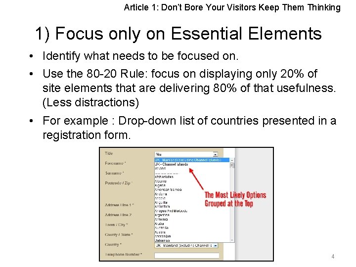
Article 1: Don’t Bore Your Visitors Keep Them Thinking 1) Focus only on Essential Elements • Identify what needs to be focused on. • Use the 80 -20 Rule: focus on displaying only 20% of site elements that are delivering 80% of that usefulness. (Less distractions) • For example : Drop-down list of countries presented in a registration form. 4

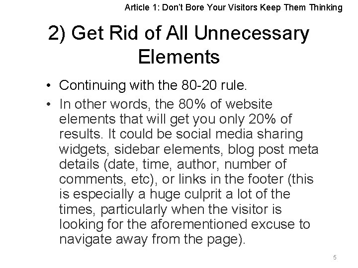
Article 1: Don’t Bore Your Visitors Keep Them Thinking 2) Get Rid of All Unnecessary Elements • Continuing with the 80 -20 rule. • In other words, the 80% of website elements that will get you only 20% of results. It could be social media sharing widgets, sidebar elements, blog post meta details (date, time, author, number of comments, etc), or links in the footer (this is especially a huge culprit a lot of the times, particularly when the visitor is looking for the aforementioned excuse to navigate away from the page). 5

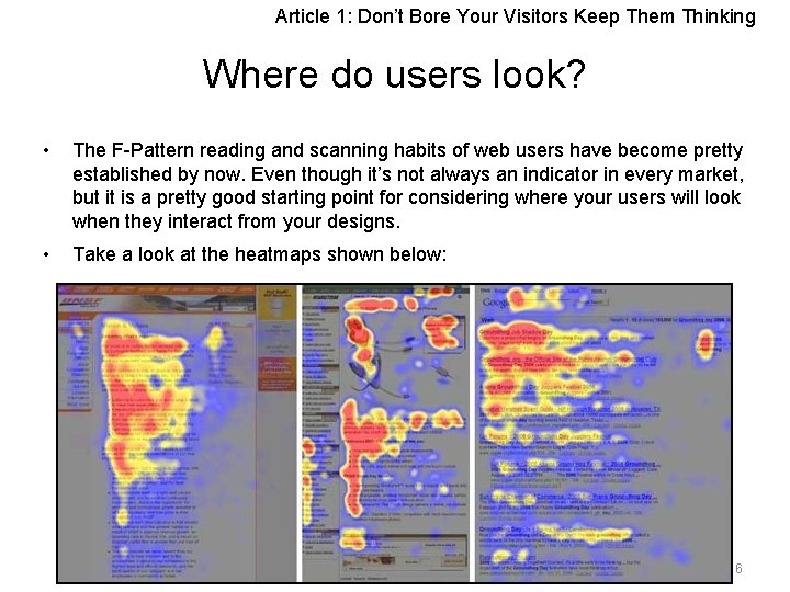
Article 1: Don’t Bore Your Visitors Keep Them Thinking Where do users look? • The F-Pattern reading and scanning habits of web users have become pretty established by now. Even though it’s not always an indicator in every market, but it is a pretty good starting point for considering where your users will look when they interact from your designs. • Take a look at the heatmaps shown below: 6

Article 1: Don’t Bore Your Visitors Keep Them Thinking • Assuming this is a good indicator of where the user’s eyes focused, this supports the concept of the 80/20 rule. • The most intense areas on the map could represent the 20% of the page that the user’s eyes interact with 80% of the time. • From that knowledge, as designers, we can make decisions that will help enhance and optimize the areas that the user is going to be habitually drawn to. • Of course, the design will often be the determining factor of where the user looks, so this suggestion should just be a basic guide and not necessarily a dogmatic way of deciding what falls under the 20%. 7

Article 1: Don’t Bore Your Visitors Keep Them Thinking 3) Reduce Number of Pages • Trim the page count. • Mindset of visitors -“What are the key things would I want to do on this site? ” or “Find out what is my stuff about. ” • Make sure the site facilitates what is necessary and nothing more. • If visitors are overwhelmed by too much choices, they will end up choosing nothing. 8

Article 1: Don’t Bore Your Visitors Keep Them Thinking 4. Get More Content Above The Fold • Majority of people spend most of their time above the fold on web pages (What shows up on the screen but never scrolling down. ) • Put main contents above the fold. • Example: shortening the header’s height • This involves nothing more than changing the header’s "height" value in your stylesheet (typically style. css or stylesheet. css). stylesheet. css 9

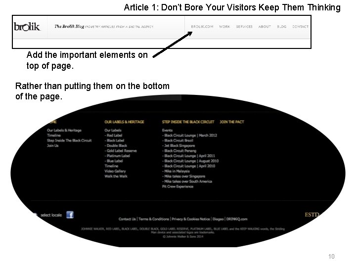
Article 1: Don’t Bore Your Visitors Keep Them Thinking Add the important elements on top of page. Rather than putting them on the bottom of the page. 10

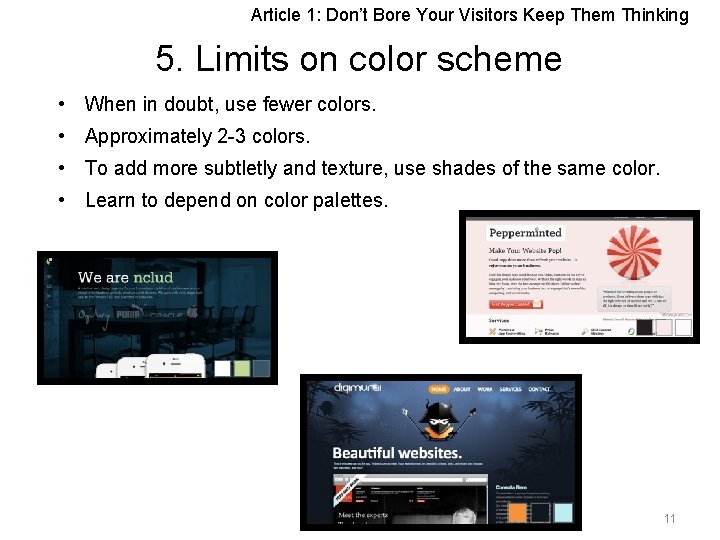
Article 1: Don’t Bore Your Visitors Keep Them Thinking 5. Limits on color scheme • When in doubt, use fewer colors. • Approximately 2 -3 colors. • To add more subtletly and texture, use shades of the same color. • Learn to depend on color palettes. 11

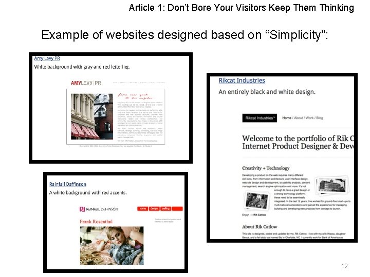
Article 1: Don’t Bore Your Visitors Keep Them Thinking Example of websites designed based on “Simplicity”: 12

Article 1: Don’t Bore Your Visitors Keep Them Thinking Recommendation It’s all about “Simplicity”!: • Makes the website look sleek. • Reduce navigation confusion. • Helps achieve desired goals & results. (I. e. , more signups, subscribers and sales) 13

Article 2: Navigation 14

Article 2: Navigation 1) Button • We agree with the article attesting to navigation should answer the following questions: Where am I? Where can I go from here? Where was I already? 15

Article 2: Navigation Thus when designing navigation buttons, its construction is highly essential. When doing this, one should always ask the question: Ø Can the users relate the labels in the navigation design? Ø Are the words visually separated enough not to be confused with each other? 16

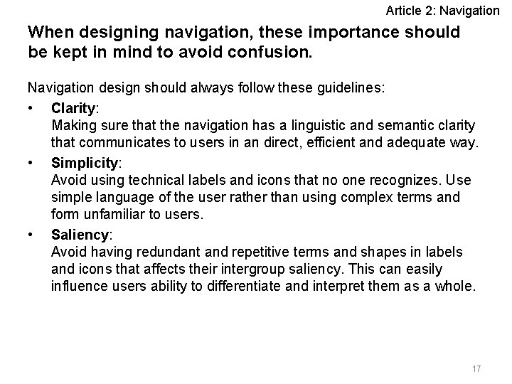
Article 2: Navigation When designing navigation, these importance should be kept in mind to avoid confusion. Navigation design should always follow these guidelines: • Clarity: Making sure that the navigation has a linguistic and semantic clarity that communicates to users in an direct, efficient and adequate way. • Simplicity: Avoid using technical labels and icons that no one recognizes. Use simple language of the user rather than using complex terms and form unfamiliar to users. • Saliency: Avoid having redundant and repetitive terms and shapes in labels and icons that affects their intergroup saliency. This can easily influence users ability to differentiate and interpret them as a whole. 17

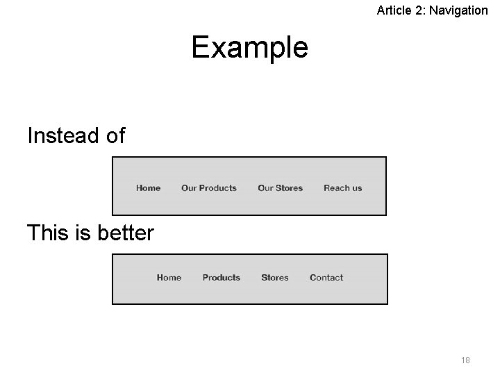
Article 2: Navigation Example Instead of This is better 18

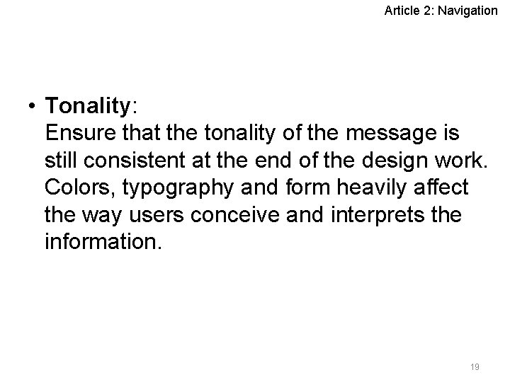
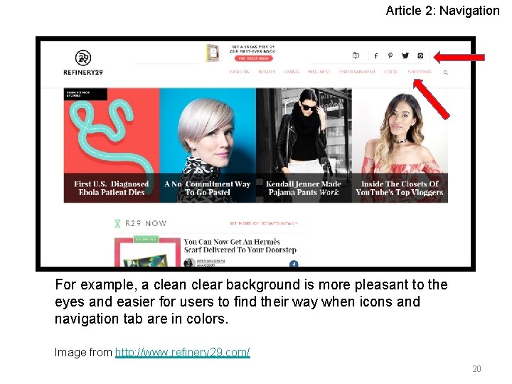
Article 2: Navigation • Tonality: Ensure that the tonality of the message is still consistent at the end of the design work. Colors, typography and form heavily affect the way users conceive and interprets the information. 19

Article 2: Navigation For example, a clean clear background is more pleasant to the eyes and easier for users to find their way when icons and navigation tab are in colors. Image from http: //www. refinery 29. com/ 20

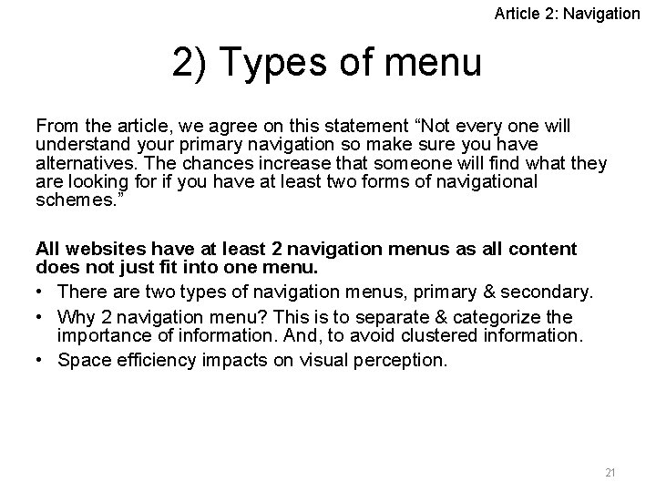
Article 2: Navigation 2) Types of menu From the article, we agree on this statement “Not every one will understand your primary navigation so make sure you have alternatives. The chances increase that someone will find what they are looking for if you have at least two forms of navigational schemes. ” All websites have at least 2 navigation menus as all content does not just fit into one menu. • There are two types of navigation menus, primary & secondary. • Why 2 navigation menu? This is to separate & categorize the importance of information. And, to avoid clustered information. • Space efficiency impacts on visual perception. 21

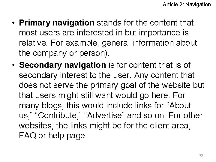
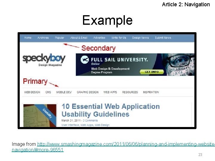
Article 2: Navigation • Primary navigation stands for the content that most users are interested in but importance is relative. For example, general information about the company or person). • Secondary navigation is for content that is of secondary interest to the user. Any content that does not serve the primary goal of the website but that users might still want would go here. For many blogs, this would include links for “About us, ” “Contribute, ” “Advertise” and so on. For other websites, the links might be for the client area, FAQ or help page. 22

Article 2: Navigation Example Image from http: //www. smashingmagazine. com/2011/06/06/planning-and-implementing-websitenavigation/#more-96551 23

Article 3: Don’t Make Them Wait 24

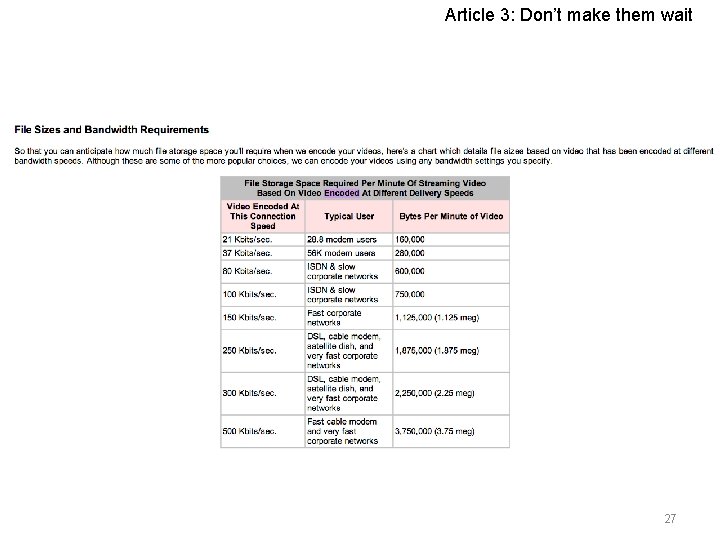
Article 3: Don’t make them wait 1) Speed • We agree to the statement which is mentioned in the article, “many websites are trying to portray themselves as if they were a TV network. They put top-notch graphics and sound into their web page. ” • The reason is because normal internet users don’t have extreme high speed broadband connections that could support and load such great graphics and sounds. • According to an article we found online, it stated that they support with the statement above and it also agree that the standard modem connection is 28. 8 and 56 k, which is supported what the article mentioned. 25

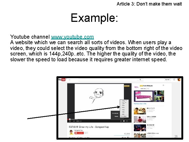
Article 3: Don’t make them wait Example: Youtube channel www. youtube. com A website which we can search all sorts of videos. When users play a video, they could select the video quality from the bottom right of the video screen, which is 144 p, 240 p. . etc. The higher the quality of the video, the slower the speed to load because it requires greater internet speed. 26

Article 3: Don’t make them wait 27

Article 3: Don’t make them wait 2) Size • We agree to the statement which is stated in the article that “your webpage be no larger then 50 K. I would shoot for less than 30 K”. The reason is because the larger the size of the webpage, the harder the speed in order to load the page fluently. 28

Article 3: Don’t make them wait Ways to achieve smaller size of webpage • Graphic and image size must be smaller than 4 k 6 k. • For graphics designs, try using solid colors instead of gradient color. – Because gradient color occupies more spaces. • Use design more, graphics less. – Graphics tend to use up more spaces and users will have difficulties in viewing the webpage. 29

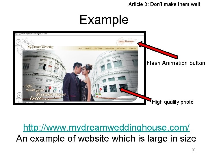
Article 3: Don’t make them wait Example Flash Animation button High quality photo http: //www. mydreamweddinghouse. com/ An example of website which is large in size 30

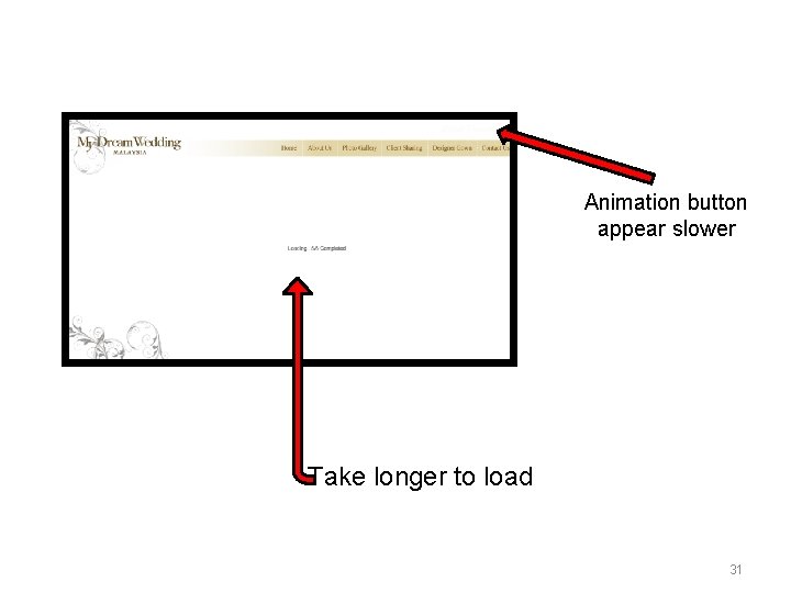
Animation button appear slower Take longer to load 31

Article 3: Don’t make them wait Recommendation Size of a webpage and the speed of the webpage loading has a great relation. The reason is that most of the internet users are normal home users and we don’t get extreme high speed broadband connections. Therefore, having too many complicated websites with multiple colors and great sizes of images will reduce the speed of loading the website. This will also leads to the annoyance of an user. 32

Article 4: Find Out What Colors Will Cause Your Visitors to Hate You 33

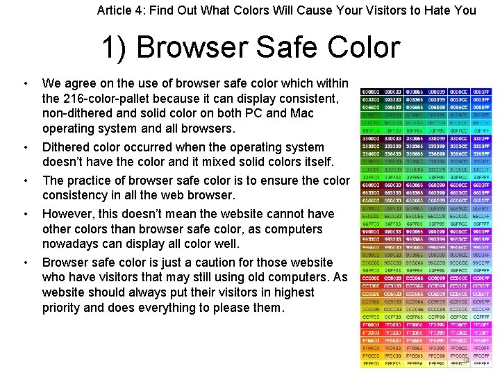
Article 4: Find Out What Colors Will Cause Your Visitors to Hate You 1) Browser Safe Color • • • We agree on the use of browser safe color which within the 216 -color-pallet because it can display consistent, non-dithered and solid color on both PC and Mac operating system and all browsers. Dithered color occurred when the operating system doesn’t have the color and it mixed solid colors itself. The practice of browser safe color is to ensure the color consistency in all the web browser. However, this doesn’t mean the website cannot have other colors than browser safe color, as computers nowadays can display all color well. Browser safe color is just a caution for those website who have visitors that may still using old computers. As website should always put their visitors in highest priority and does everything to please them. 34

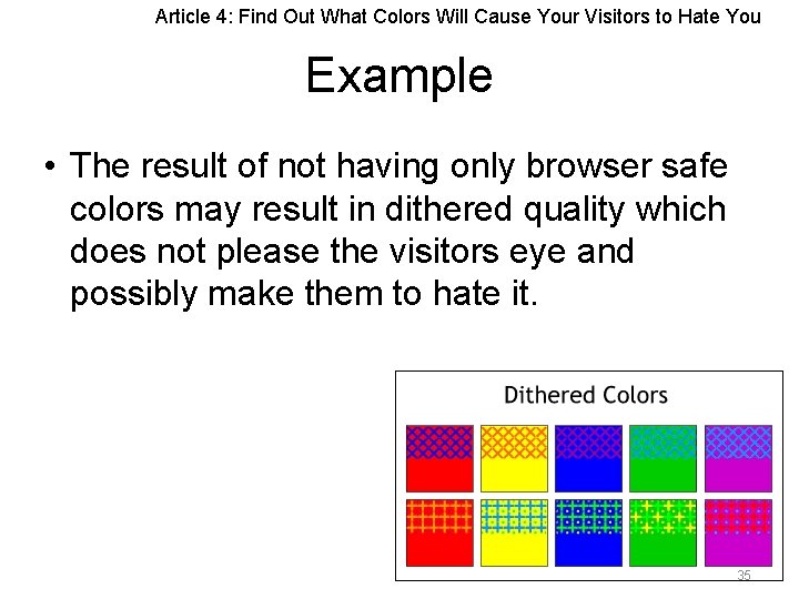
Article 4: Find Out What Colors Will Cause Your Visitors to Hate You Example • The result of not having only browser safe colors may result in dithered quality which does not please the visitors eye and possibly make them to hate it. 35

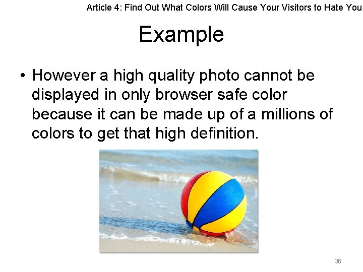
Article 4: Find Out What Colors Will Cause Your Visitors to Hate You Example • However a high quality photo cannot be displayed in only browser safe color because it can be made up of a millions of colors to get that high definition. 36

Article 4: Find Out What Colors Will Cause Your Visitors to Hate You Recommendation • Using only browser safe color to ensure the consistency of the color in all web browser. The con is that, there are limited graphic can be include, not even a single highdefinition photograph. Besides, it doesn’t provide the “reality” feeling as limited color is allowed and the website may looks cheesy. • Our advise is that we should practice the use of browser safe color on the text and background color of the website accompany with proper photograph or graphic (includes both browser safe and non browser safe color) to enhance the attractiveness of the website as most of the browsers and operating system nowadays can display color well. • Therefore we can minimized the hatred feeling of the visitor by giving them consistent color on the content and background which doesn’t lack of wonderful and realistic images. 37

Article 4: Find Out What Colors Will Cause Your Visitors to Hate You 2) Choices of color We agree on the use of color to serve different purposes as mentioned in the article, such as, use attention grabbing colors wisely because it can possibly make your visitors to hate you for feeling uncomfortable watching it; use browser safe color to get consistent colors in all web browsers. • In the article, it also discussed about the use of attention grabbing colors which includes bright red, yellow or orange and neon colors. • We agree on the statement that use only attention grabbing colors on the part where you want your visitors to focus on. • Furthermore, different colors have different mood representation such as red represents love, passion, danger and joy. Green represents natural, health and harmony. It is to advise to pick the right colors to suit your website theme and also its content. 38

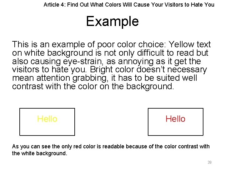
Article 4: Find Out What Colors Will Cause Your Visitors to Hate You Example This is an example of poor color choice: Yellow text on white background is not only difficult to read but also causing eye-strain, as annoying as it get the visitors to hate you. Bright color doesn’t necessary mean attention grabbing, it has to be suited well contrast with the color on the background. Hello As you can see the only red color is readable because of the color contrast with the white background. 39

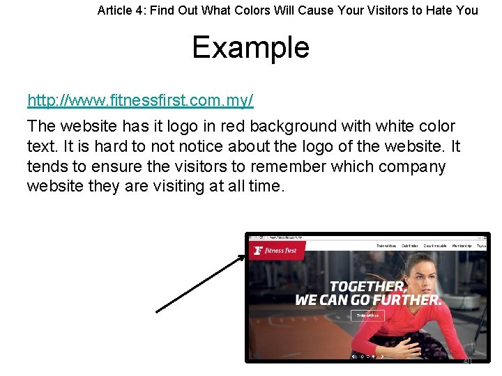
Article 4: Find Out What Colors Will Cause Your Visitors to Hate You Example http: //www. fitnessfirst. com. my/ The website has it logo in red background with white color text. It is hard to notice about the logo of the website. It tends to ensure the visitors to remember which company website they are visiting at all time. 40

Article 4: Find Out What Colors Will Cause Your Visitors to Hate You Recommendation • It is very important in choosing the color. First, it symbolize the mood of the website. It also represent theme of the website. • The use of colors also act as differentiation, for instance the button colors, it lets the visitors to know that is clickable. • Based on our opinion, we think that the use of colors should match the style of the website. • Also, the use of attention grabbing color and non attention grabbing color to decide on where the visitors should focus and notice. • A proper use of color will definitely make the visitors to like your website and stay longer. In other way, poor choices of color, for instance the use of attention grabbing color all over the website causes visitors eye fatigued and will not watch and stay longer, most likely they will hate the website. 41

Conclusion Based on the 4 articles reviewed, it can be concluded that a great website must be user friendly, 4 basic principles: • Easy to use • Easy to load • Easy for viewer’s eye • Easy to understand Last but not least, it doesn’t lack of attractive and creative design while maintaining its user friendliness. 42

References • Colorcombos. com, (2014). The Color Red Is The Best Choice When You Want Attention. [online] Available at: http: //www. colorcombos. com/color-red-article. html [Accessed 10 Oct. 2014]. • Cybertechmedia. com, (2014). Streaming Video Production For Intranets and The Internet. [online] Available at: http: //www. cybertechmedia. com/compare. html [Accessed 10 Oct. 2014]. • Dotparagon. com, (2014). Browser. Safe. Colors - dot. Paragon. [online] Available at: http: //www. dotparagon. com/resources/color. html [Accessed 10 Oct. 2014]. • Eye. Quant Blog, (2013). Capturing User Attention with Color. [online] Available at: http: //blog. eyequant. com/2013/06/27/capturing-user-attention-with-color/ [Accessed 10 Oct. 2014]. • Fitnessfirst. com. my, (2014). Fitness First Malaysia. [online] Available at: http: //www. fitnessfirst. com. my/ [Accessed 10 Oct. 2014]. • Hongkiat. com, (2014). 5 Tips to Simplify Your Web Design. [online] Available at: http: //www. hongkiat. com/blog/5 -tips-to-simplify-your-web-design/ [Accessed 10 Oct. 2014]. 43
![Knight K 2011 Planning And Implementing Website Navigation Smashing Magazine online • Knight, K. (2011). Planning And Implementing Website Navigation - Smashing Magazine. [online]](https://slidetodoc.com/presentation_image_h2/aad1f17947b32edc564224daf966a0ae/image-44.jpg)
• Knight, K. (2011). Planning And Implementing Website Navigation - Smashing Magazine. [online] Smashing Magazine. Available at: http: //www. smashingmagazine. com/2011/06/06/planning-and-implementing-websitenavigation/#more-96551 �[Accessed 10 Oct. 2014]. • Mydreamweddinghouse. com, (2014). My Dream Wedding Malaysia. [online] Available at: http: //www. mydreamweddinghouse. com/ [Accessed 10 Oct. 2014]. • Pepfx. com, (2014). Psychology of colors and Website Design - The Right Colors - Web Design Articles. [online] Available at: http: //www. pepfx. com/articles/web_design/webdesign_colors. php [Accessed 10 Oct. 2014]. • Refinery 29. com, (2014). [online] Available at: http: //www. refinery 29. com/ [Accessed 10 Oct. 2014]. • Silfver, P. and Silfver, P. (2012). The Elements Of Navigation - Smashing Magazine. [online] Smashing Magazine. Available at: http: //www. smashingmagazine. com/2012/03/20/the-elements-of-navigation/ [Accessed 10 Oct. 2014]. • Site. Point, (2011). GIF, JPG and PNG - What's the Difference? . [online] Available at: http: //www. sitepoint. com/gif-jpg-png-whats-difference/ [Accessed 10 Oct. 2014]. • Skillcrush, (2014). Are People Leaving Your Site Because of Design Overload? . [online] Available at: http: //skillcrush. com/2014/02/06/tips-simplifying-web-design/ [Accessed 10 Oct. 2014]. 44
![Small Business Chron com 2014 Most AttentionGrabbing Colors online Available at • Small Business - Chron. com, (2014). Most Attention-Grabbing Colors. [online] Available at:](https://slidetodoc.com/presentation_image_h2/aad1f17947b32edc564224daf966a0ae/image-45.jpg)
• Small Business - Chron. com, (2014). Most Attention-Grabbing Colors. [online] Available at: http: //smallbusiness. chron. com/attentiongrabbing-colors-74162. html [Accessed 10 Oct. 2014]. • The Effect of Color in Web Page Design. (2014). [online] Available at: http: //www. edb. utexas. edu/minliu/multimedia/The%20 Effect%20 of%20 Color. pdf [Accessed 10 Oct. 2014]. • W 3 schools. com, (2014). HTML Colors. [online] Available at: http: //www. w 3 schools. com/html_colors. asp [Accessed 10 Oct. 2014]. 45