User Interface Design ECE 417617 Elements of Software
- Slides: 26

User Interface Design ECE 417/617: Elements of Software Engineering Stan Birchfield Clemson University

References Joel Spolsky, User Interface Design for Programmers abridged version available at http: //www. joelonsoftware. com

Why study user interfaces? • Good UIs are critical to success • UI programming is – easy (sophisticated algorithms not required) – straightforward (can immediately correct mistakes) – fun (results are immediately visible) – rational (apply simple rules) • UI design is not graphic design

Cardinal axiom • “A user interface is well-designed when the program behaves exactly how the user thought it would. ” – Joel Spolsky – user is happy = user in control = S/W correctly interprets user’s actions – loss of control depression, frustration (“Learned Helplessness” [Seligman]) • All the other rules are just corollaries

User and program models • User model: User’s idea of what’s happening • Program model: Program’s idea of what’s happening (i. e. , what’s actually happening) • Successful UI when program model corresponds to user model – Speak user’s language – Follow real-world conventions, make information appear in natural and logical order – Use metaphors from real world

Example • Pictures in documents are – embedded in word processor (e. g. , Word) – not embedded in HTML • With WYSIWYG HTML editor (e. g. , Front. Page), what do you do? – change user model (describe in manual, explain with popup dialog box) – change program model (make copy of picture in subfolder)

How do you get the user model? • Ask the users! • The 50 -cent usability test – Usually 5 -6 people is enough, will start to see consensus – Don’t need formal usability lab, or “people off the street” – Just sketch or prototype and ask your neighbor

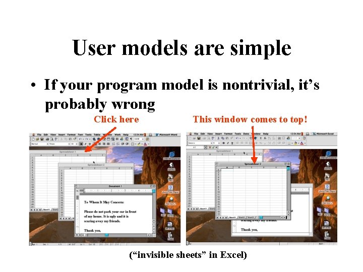
User models are simple • If your program model is nontrivial, it’s probably wrong Click here This window comes to top! (“invisible sheets” in Excel)

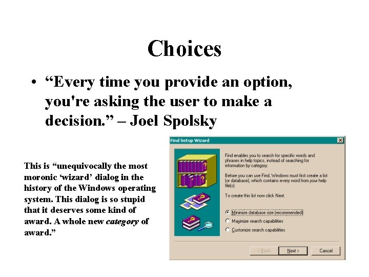
Choices • “Every time you provide an option, you're asking the user to make a decision. ” – Joel Spolsky This is “unequivocally the most moronic ‘wizard’ dialog in the history of the Windows operating system. This dialog is so stupid that it deserves some kind of award. A whole new category of award. ”

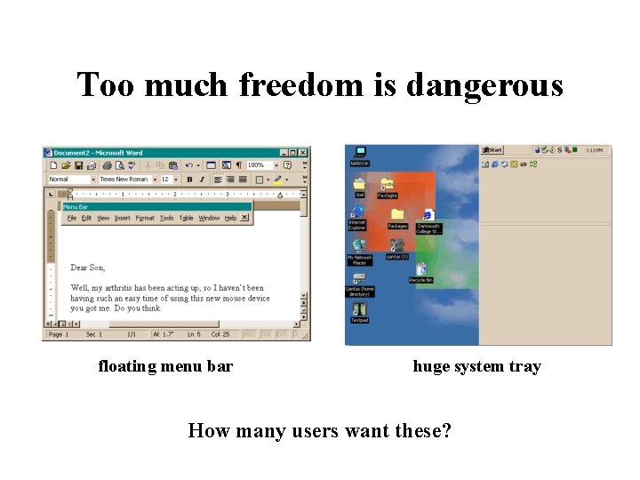
Too much freedom is dangerous floating menu bar huge system tray How many users want these?

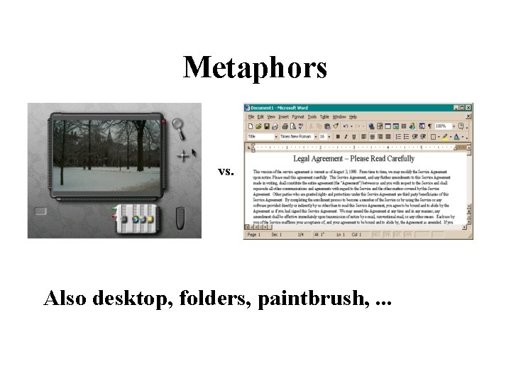
Metaphors vs. Also desktop, folders, paintbrush, . . .

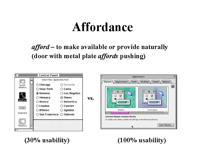
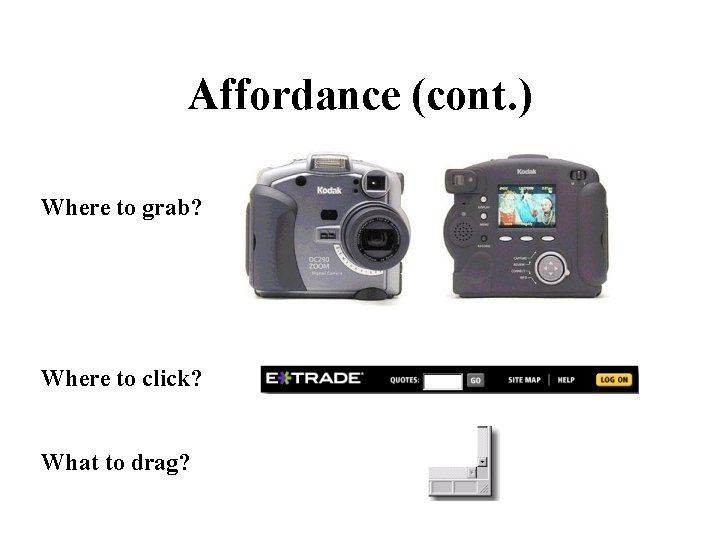
Affordance afford – to make available or provide naturally (door with metal plate affords pushing) vs. (30% usability) (100% usability)

Affordance (cont. ) Where to grab? Where to click? What to drag?

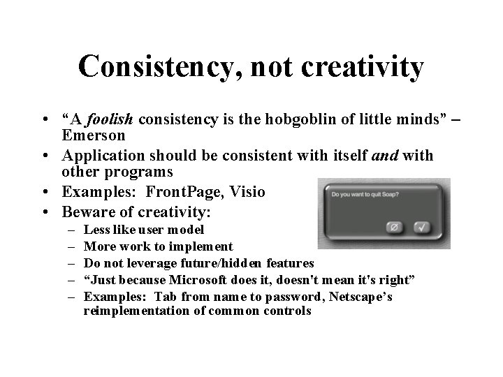
Consistency, not creativity • “A foolish consistency is the hobgoblin of little minds” – Emerson • Application should be consistent with itself and with other programs • Examples: Front. Page, Visio • Beware of creativity: – – – Less like user model More work to implement Do not leverage future/hidden features “Just because Microsoft does it, doesn't mean it's right” Examples: Tab from name to password, Netscape’s reimplementation of common controls

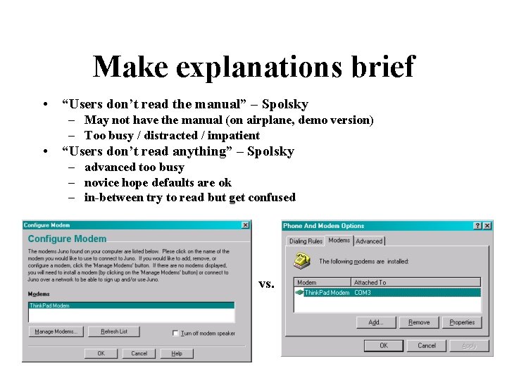
Make explanations brief • “Users don’t read the manual” – Spolsky – May not have the manual (on airplane, demo version) – Too busy / distracted / impatient • “Users don’t read anything” – Spolsky – advanced too busy – novice hope defaults are ok – in-between try to read but get confused vs.

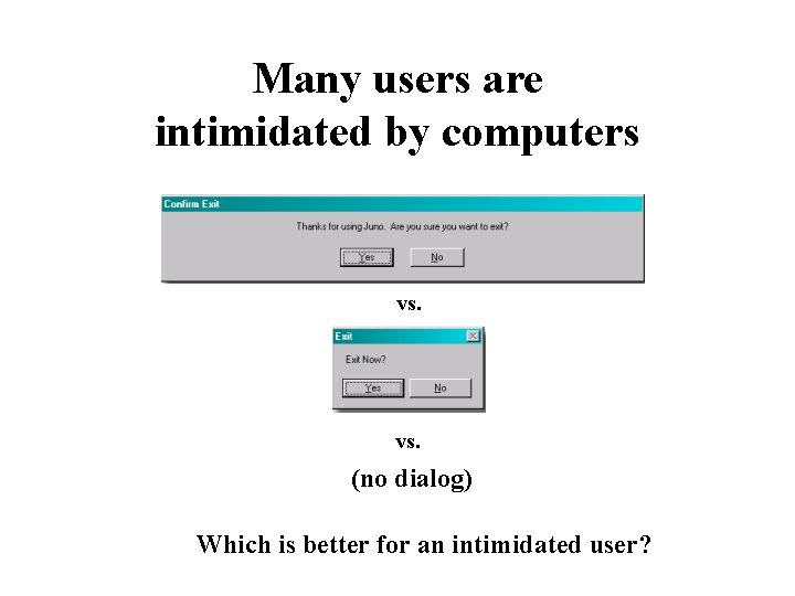
Many users are intimidated by computers vs. (no dialog) Which is better for an intimidated user?

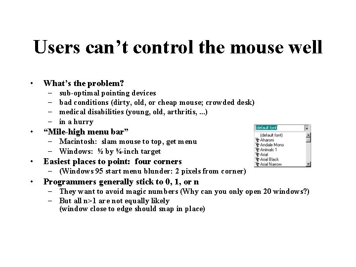
Users can’t control the mouse well • What’s the problem? – – • sub-optimal pointing devices bad conditions (dirty, old, or cheap mouse; crowded desk) medical disabilities (young, old, arthritis, . . . ) in a hurry “Mile-high menu bar” – Macintosh: slam mouse to top, get menu – Windows: ½ by ¼-inch target • Easiest places to point: four corners – (Windows 95 start menu blunder: 2 pixels from corner) • Programmers generally stick to 0, 1, or n – They want to avoid magic numbers (Why can you only open 20 windows? ) – But all n>1 are not equally likely (window close to edge should snap in place)

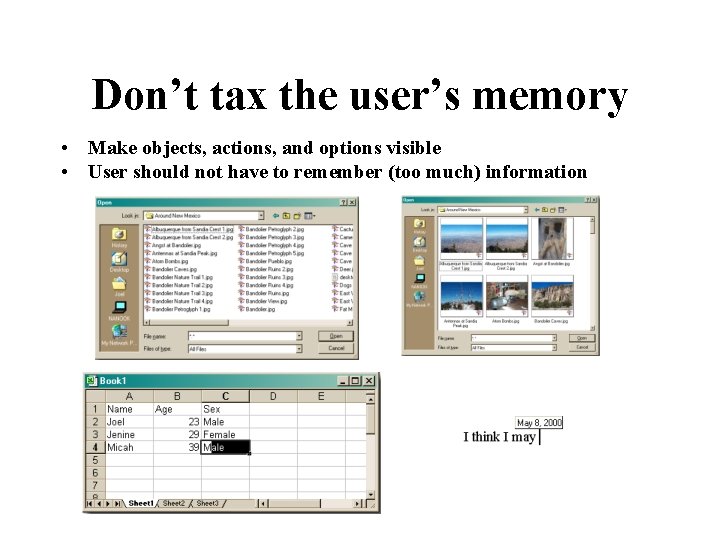
Don’t tax the user’s memory • Make objects, actions, and options visible • User should not have to remember (too much) information

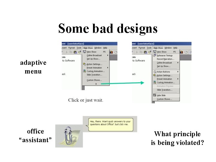
Some bad designs adaptive menu office “assistant” What principle is being violated?

The bell curve • Users lie on a bell curve – – 98% can use a TV 70% can use Windows 15% can use Linux 1% can program • Users are not dolts • But, the easier you make the program, the more people can use it (10% more usable 50% more users)

Activity-based UI • Two ways of designing UI: – What features should be there? • Greeting card example: add text, add picture, get predesigned card from library, send by email, print – What activities will users do? • Greeting card example: birthday greeting, party invitation, anniversary greeting (leads to unexpected features: remind to send next year) • Example: – Excel was designed for financial number-crunching, but many use it for lists – Improv was to be “killer app” for Ne. XT • great for complicated multi-dimensional financial models • painful for lists

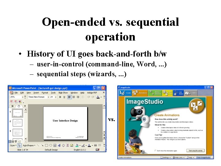
Open-ended vs. sequential operation • History of UI goes back-and-forth b/w – user-in-control (command-line, Word, . . . ) – sequential steps (wizards, . . . ) vs.

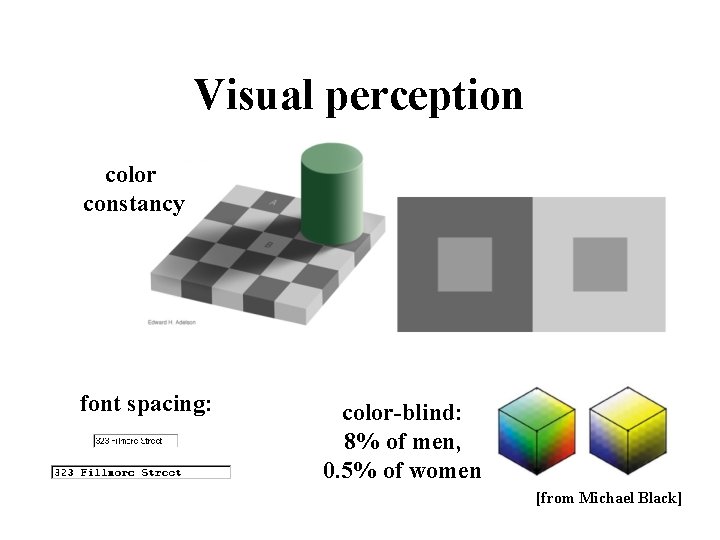
Visual perception color constancy font spacing: color-blind: 8% of men, 0. 5% of women [from Michael Black]

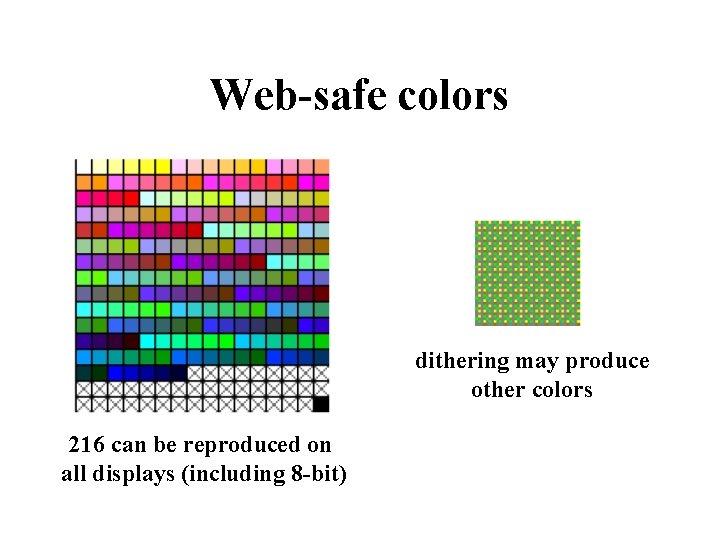
Web-safe colors dithering may produce other colors 216 can be reproduced on all displays (including 8 -bit)

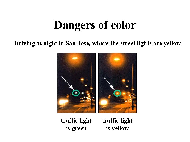
Dangers of color Driving at night in San Jose, where the street lights are yellow traffic light is green traffic light is yellow

Beyond WIMP • WIMP (windows, icons, menus, pointers) • WYSIWYG is WYSIAYG • Importance of language – grouping, conditionals, referring to objects not immediately visible or future – support novice and power-user – provide concrete and abstract ways of manipulation – keyboard shortcuts / macros • Shared control – Delegation of routine or complex tasks to computer