St Thomas Secondary School Kuantan Pahang Malaysia THE



- Slides: 16

St Thomas Secondary School, Kuantan, Pahang, Malaysia THE SUN TIMES – THE GLOBAL SUN TEMPERATURE PROJECT FINAL REPORT

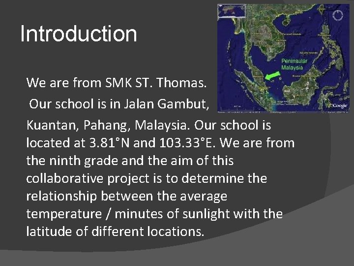
Introduction We are from SMK ST. Thomas. Our school is in Jalan Gambut, Kuantan, Pahang, Malaysia. Our school is located at 3. 81°N and 103. 33°E. We are from the ninth grade and the aim of this collaborative project is to determine the relationship between the average temperature / minutes of sunlight with the latitude of different locations.

Our school’s picture gallery

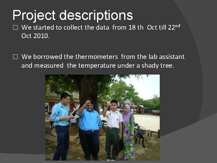
Project descriptions � We started to collect the data from 18 th Oct till 22 nd Oct 2010. � We borrowed thermometers from the lab assistant and measured the temperature under a shady tree.

Project descriptions � During this collaborative project, we discussed and corresponded with other participating schools in the discussion area/forum. We exchanged idea and during these processes, we got to know each others’ cultures as well as how to carry out the project.

Project descriptions (continued) � We took the temperature every 10 minutes, starting from 12. 30 p. m. until 1. 00 p. m. We added the average readings of the temperature from 12. 30 p. m. until 1. 00 p. m. , then we divided the average readings to get an overall average reading. We repeated these steps for the next five days. After the five-day period, we added up the average temperature of the five days and divided it to get a overall average temperature reading.

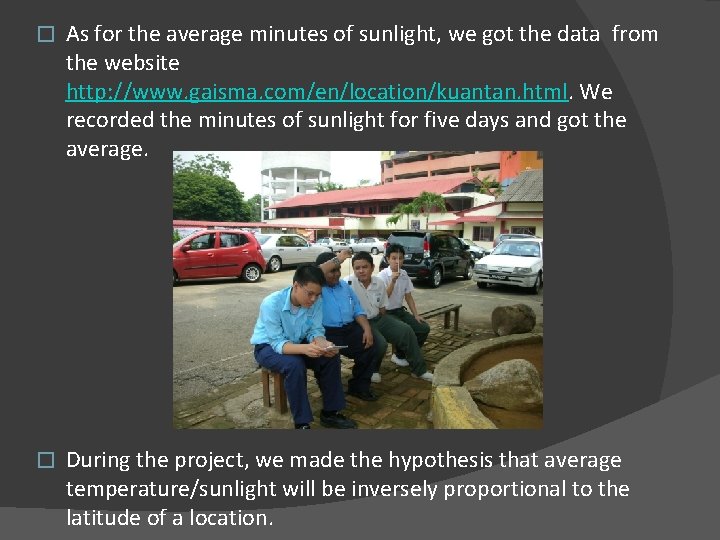
� As for the average minutes of sunlight, we got the data from the website http: //www. gaisma. com/en/location/kuantan. html. We recorded the minutes of sunlight for five days and got the average. � During the project, we made the hypothesis that average temperature/sunlight will be inversely proportional to the latitude of a location.

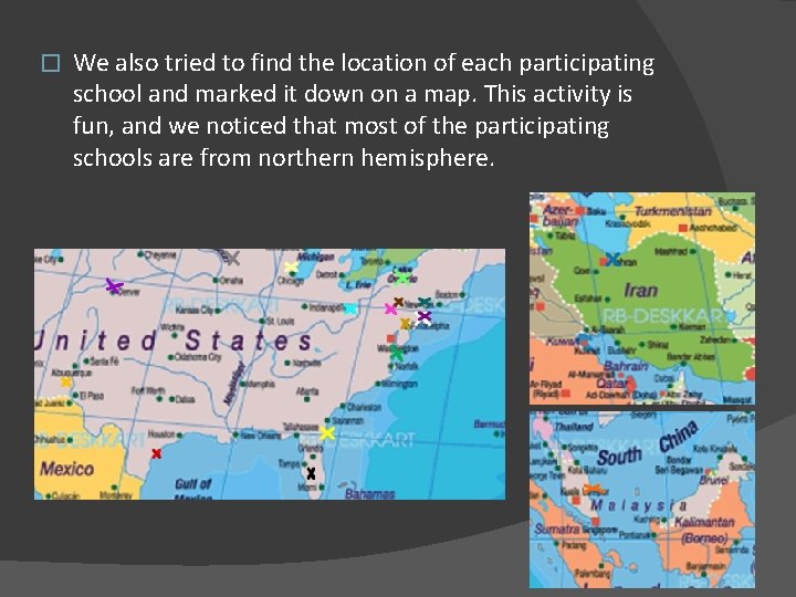
� We also tried to find the location of each participating school and marked it down on a map. This activity is fun, and we noticed that most of the participating schools are from northern hemisphere.

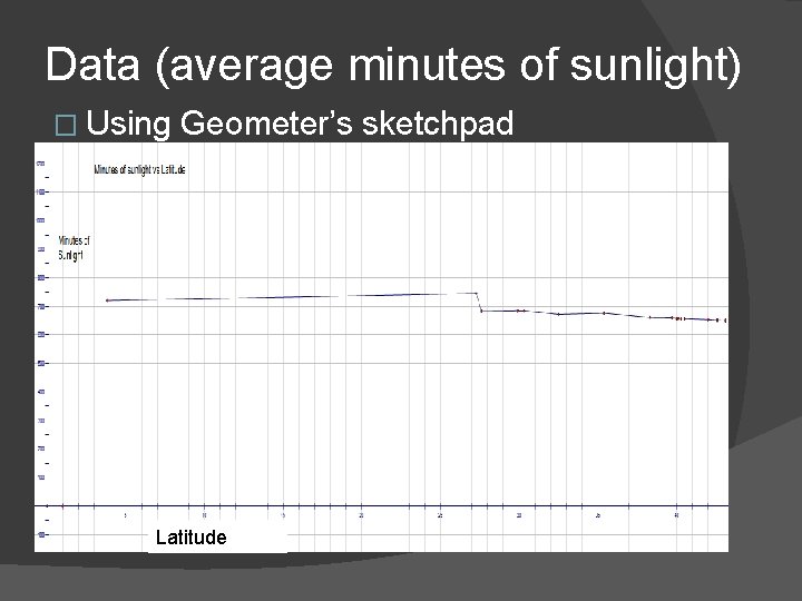
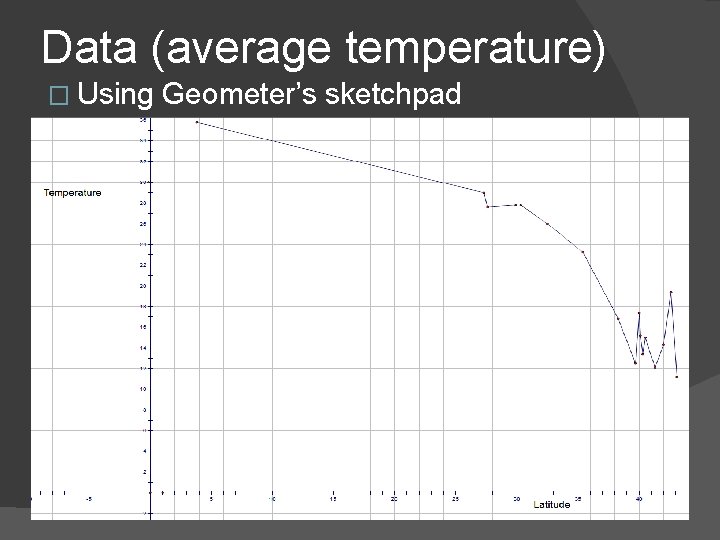
We did face some difficulties during the project. Firstly, our area rain occasionally, especially in the morning. Therefore, we cannot get an accurate reading of the average temperature. � During the project too, our area was hazy and this may cause some error in the data. � We submitted the data as schedule. We downloaded all the data from various countries and plotted a line graph of temperature vs latitude and minutes of sunlight vs latitude. �

Data (average minutes of sunlight) � Using Geometer’s sketchpad Latitude

Data (average temperature) � Using Geometer’s sketchpad

Conclusions From the data, we found that the closer we are from the Equator, the higher the minutes of sunlight and the higher the temperature. This is because the closer we are from the equator, the closer we are from the sun’s orbit. � The graph of temperature versus latitude is not linear as well as the graph of temperature versus minutes of sunlight, also not linear. � The temperature and the minutes of sunlight does not decrease steadily when the latitude is increased. That is, they are not inversely proportional to each other. Thus, our hypothesis is wrong. �

Additional thoughts Something new that we learned from this collaborative project is that the average minutes of daylight and average temperature does not decreases steadily as latitude increases. � The first graph shows when the values of latitude increases, the minutes of sunlight decreases. This is because the sun rays shine directly at the equator. This is because it is the nearest part of the earth to the sun. So, as the location moving towards the north and south pole, the average minutes of sunlight will be decreasing as it is getting further and further away from the sun. �

Additional thoughts � The second graph also shows when the values of latitude increases, the average temperature decreases. This is because the amount of sunshine received in the countries with lower latitudes are countries situated nearer to equator and countries with higher latitudes are far away from equator.

Additional thoughts � We also learned that the Earth tilts at 23. 5° and takes 365 ¼ days to circle around the sun. As the Earth circles around the Sun, the North Hemisphere will have less exposition to sunlight during the winter solistice. This explains why the South Hemisphere experienced summer solistice during this period. Since Malaysia is very near to the Equator as compare to other participating schools (countries) , the data shows that Malaysia has the highest average temperature.

We also learned that countries near the Equator are always exposed to sunlight all year long, and do not have four seasons experienced by other countries that are far from the Equator. Besides that, we also learned how to use GSP to plot the line graph. � In the future, we will like to participate in this project again and compare data from more schools from various countries. In this way, we can learn more about other countries and how latitude affects the average temperature and minutes of daylight in other countries. �