Some principles of graphical excellence Kaye E Marion
- Slides: 37

Some principles of graphical excellence Kaye E. Marion Norca Consulting Pty Ltd Principle reference: Tufte, E. R. (1983), The visual display of quantitative information, Cheshire Press, Conn. © Kaye E. Marion Email: k. marion@rmit. edu. au 1

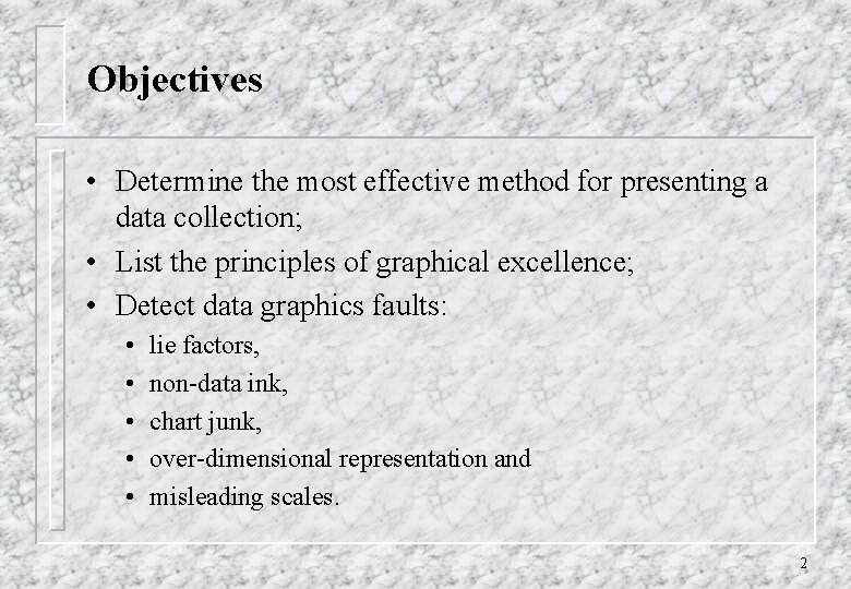
Objectives • Determine the most effective method for presenting a data collection; • List the principles of graphical excellence; • Detect data graphics faults: • • • lie factors, non-data ink, chart junk, over-dimensional representation and misleading scales. 2

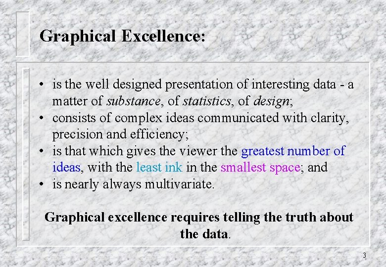
Graphical Excellence: • is the well designed presentation of interesting data - a matter of substance, of statistics, of design; • consists of complex ideas communicated with clarity, precision and efficiency; • is that which gives the viewer the greatest number of ideas, with the least ink in the smallest space; and • is nearly always multivariate. Graphical excellence requires telling the truth about the data. 3

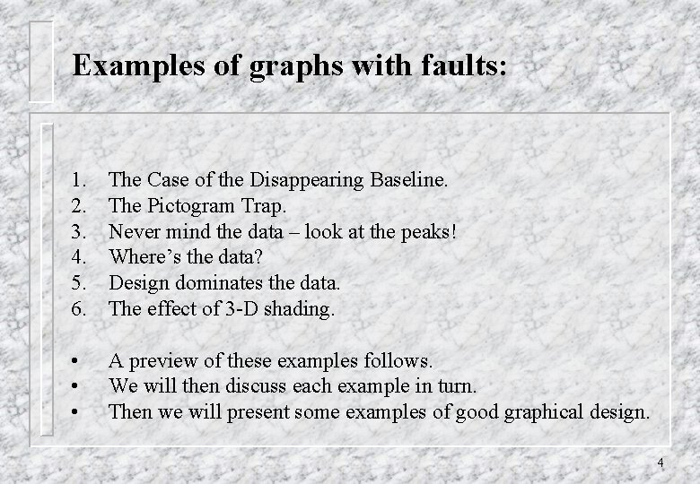
Examples of graphs with faults: 1. 2. 3. 4. 5. 6. The Case of the Disappearing Baseline. The Pictogram Trap. Never mind the data – look at the peaks! Where’s the data? Design dominates the data. The effect of 3 -D shading. • • • A preview of these examples follows. We will then discuss each example in turn. Then we will present some examples of good graphical design. 4

Example 1 5

Example 2 6

Example 3 7

Example 4 8

Example 5 9

Example 6 10

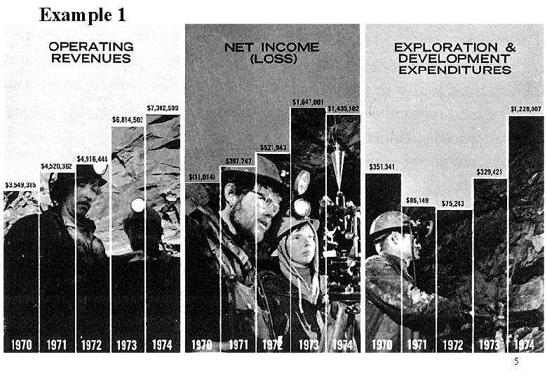
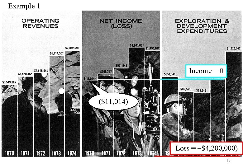
Graphical Integrity 1. Clear, detailed and thorough labelling should be used to defeat graphical distortion and ambiguity. Example 1: The Case of the Disappearing Baseline, Day Mines Inc. , 1974 Annual report (Reported in Tufte, E. (1983), p. 54. ) There is no vertical scale. This is not a serious problem with Operating Revenues (which range from $3, 549, 385 to $7, 382, 599) and Exploration and Development Expenditures (range from $351, 341 to $1, 226, 007). But with the Net Income, the graph appears to show increasing positive income levels. However, magnifying the first number reveals that it is negative, $11, 014 in 1970 representing a loss. The deception occurs because the bars begin at the bottom, approximately minus $4, 200, 000 instead of at zero. 11

Example 1 Income = 0 ($11, 014) Loss = $4, 200, 000) 12

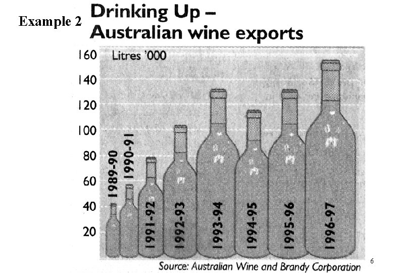
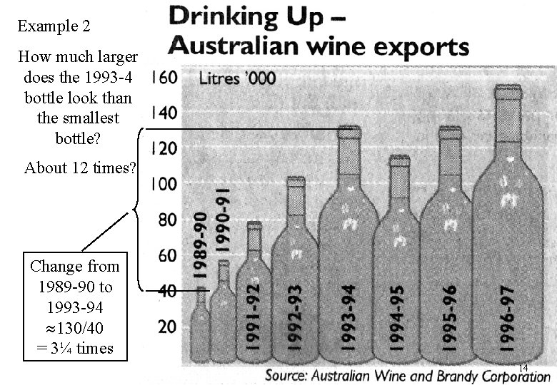
Graphical Integrity 2. The representation of numbers, as physically measured on the surface of the graphic itself should be proportional to the numerical quantities represented. The use of pictograms often leads to mistakes. Frequently a picture is used to represent a bar with the height representing the true effect and the picture is ‘scaled up’ for another measurement for comparison. Example 2: Drinking up - Australian wine exports, The Age, 27 April 1998. 13

Example 2 How much larger does the 1993 -4 bottle look than the smallest bottle? About 12 times? Change from 1989 -90 to 1993 -94 130/40 = 3¼ times 14

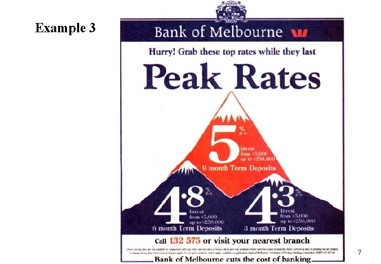
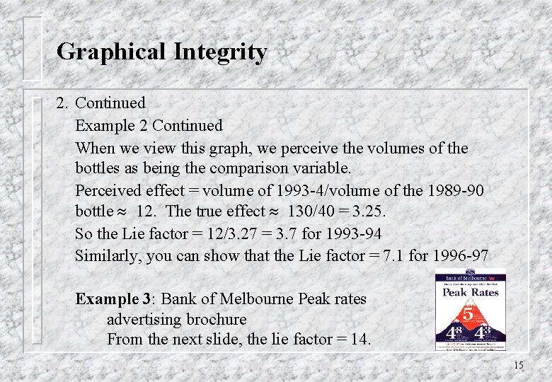
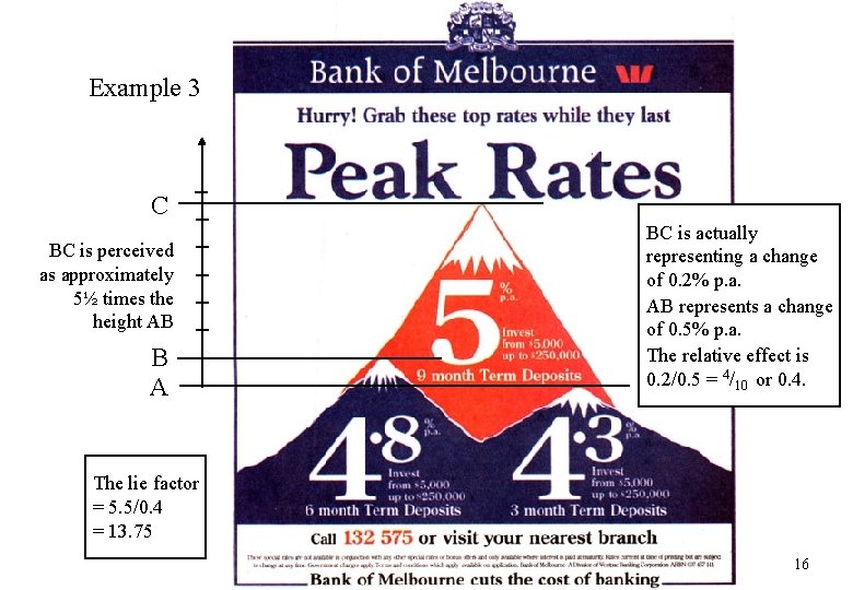
Graphical Integrity 2. Continued Example 2 Continued When we view this graph, we perceive the volumes of the bottles as being the comparison variable. Perceived effect = volume of 1993 -4/volume of the 1989 -90 bottle 12. The true effect 130/40 = 3. 25. So the Lie factor = 12/3. 27 = 3. 7 for 1993 -94 Similarly, you can show that the Lie factor = 7. 1 for 1996 -97 Example 3: Bank of Melbourne Peak rates advertising brochure From the next slide, the lie factor = 14. 15

Example 3 C BC is perceived as approximately 5½ times the height AB B A BC is actually representing a change of 0. 2% p. a. AB represents a change of 0. 5% p. a. The relative effect is 0. 2/0. 5 = 4/10 or 0. 4. The lie factor = 5. 5/0. 4 = 13. 75 16

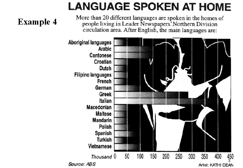
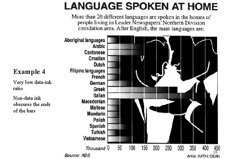
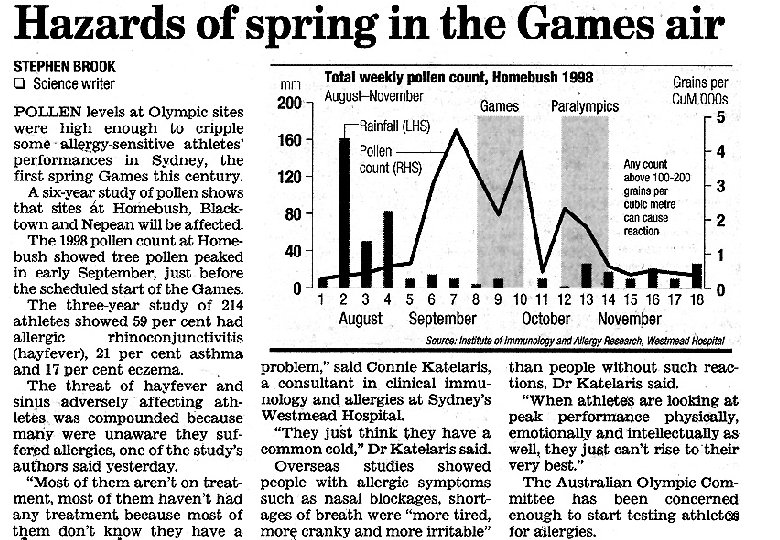
Graphical Integrity 3. Show data variation, not design variation. Example 4: Language spoken at home, from the Brunswick Sentinel, August 1, 1994. In this example there is so much design detail, that one can hardly see where the data bars end. This graph has a very low data – ink ratio, where we define One should only add material to a graph if it carries information and enhances understanding. In example 8, vertical shading is used effectively to highlight when the 2000 olympic and para-olympic games were scheduled. 17

Example 4 Very low data-ink ratio Non-data ink obscures the ends of the bars 18

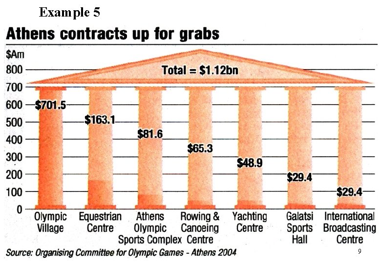
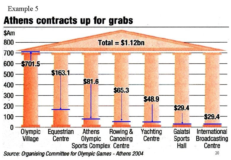
Graphical Integrity 4. Avoid chart junk (vibrations, grids and the big banana). Example 5 Athens’ Olympics contract amounts Add source In this ‘graph’ the observations are nearly totally obscured by the columns. The data values are given on the graph, but they are spaced evenly on the vertical scale and mask where the true values lie. And the amounts spent on the Sport’s Hall and Broadcasting Centre are identical but the former looks higher. (Pressing the Pg Up and Pg Dn buttons you can alternate between the basic graph and the bars and arrows highlighting the actual observations. ) See Tufte for other examples of chart junk with sample vibrations, grids and an explanation of the big banana. 5. In time series displays of money, deflated and standardised units are nearly always better than nominal units. 19

Example 5 20

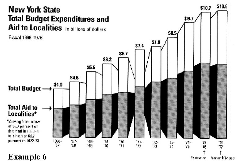
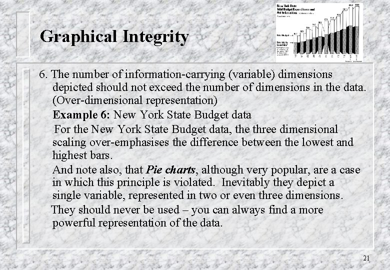
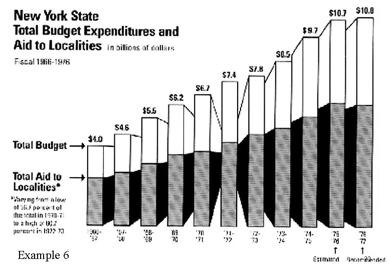
Graphical Integrity 6. The number of information-carrying (variable) dimensions depicted should not exceed the number of dimensions in the data. (Over-dimensional representation) Example 6: New York State Budget data For the New York State Budget data, the three dimensional scaling over-emphasises the difference between the lowest and highest bars. And note also, that Pie charts, although very popular, are a case in which this principle is violated. Inevitably they depict a single variable, represented in two or even three dimensions. They should never be used – you can always find a more powerful representation of the data. 21

Example 6 22

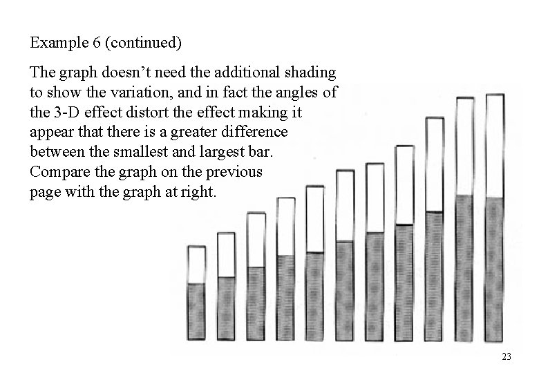
Example 6 (continued) The graph doesn’t need the additional shading to show the variation, and in fact the angles of the 3 -D effect distort the effect making it appear that there is a greater difference between the smallest and largest bar. Compare the graph on the previous page with the graph at right. 23

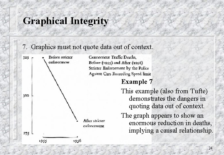
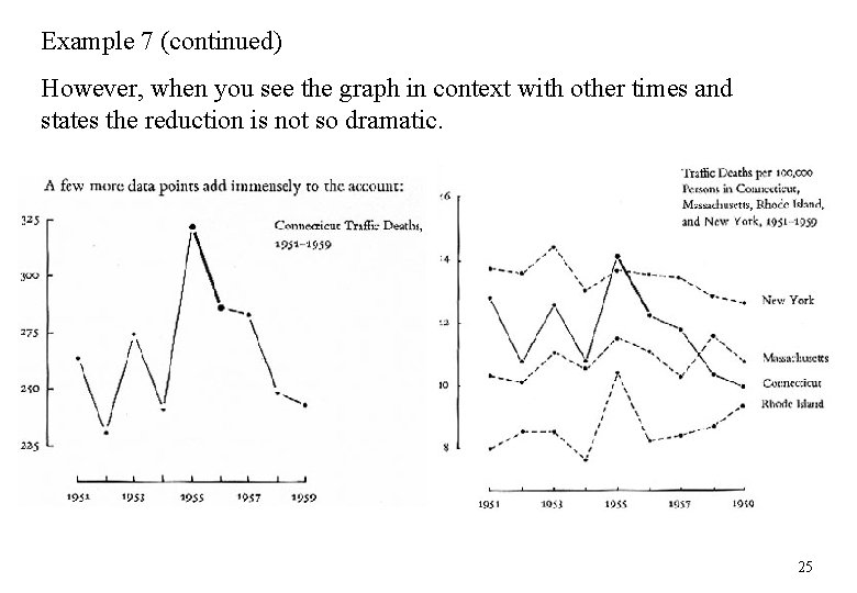
Graphical Integrity 7. Graphics must not quote data out of context. Example 7 This example (also from Tufte) demonstrates the dangers in quoting data out of context. The graph appears to show an enormous reduction in deaths, implying a causal relationship. 24

Example 7 (continued) However, when you see the graph in context with other times and states the reduction is not so dramatic. 25

Choice of scale 8. The scale should be chosen to correctly represent the data. Graphs can look totally different just because of your choice of scale. Data from the Australian stock exchange show a huge change in the BHP share price over one day. The effect is less dramatic when on the same scale as previous prices. 26

BHP share prices Comparison of the day’s price changes (intra-day) with the daily changes over the past year (daily graph) shows a moderate slope. Intra-day graph Daily price changes 22 September 2000 27

Most packages don’t help • This is the default graph that appears in Power. Point • What improvements can you suggest? • See a later chart for one suggestion. 28

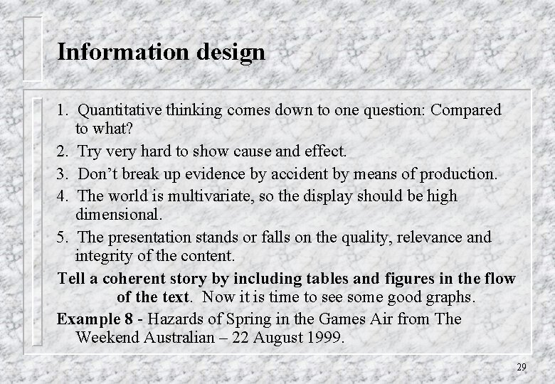
Information design 1. Quantitative thinking comes down to one question: Compared to what? 2. Try very hard to show cause and effect. 3. Don’t break up evidence by accident by means of production. 4. The world is multivariate, so the display should be high dimensional. 5. The presentation stands or falls on the quality, relevance and integrity of the content. Tell a coherent story by including tables and figures in the flow of the text. Now it is time to see some good graphs. Example 8 - Hazards of Spring in the Games Air from The Weekend Australian – 22 August 1999. 29

30

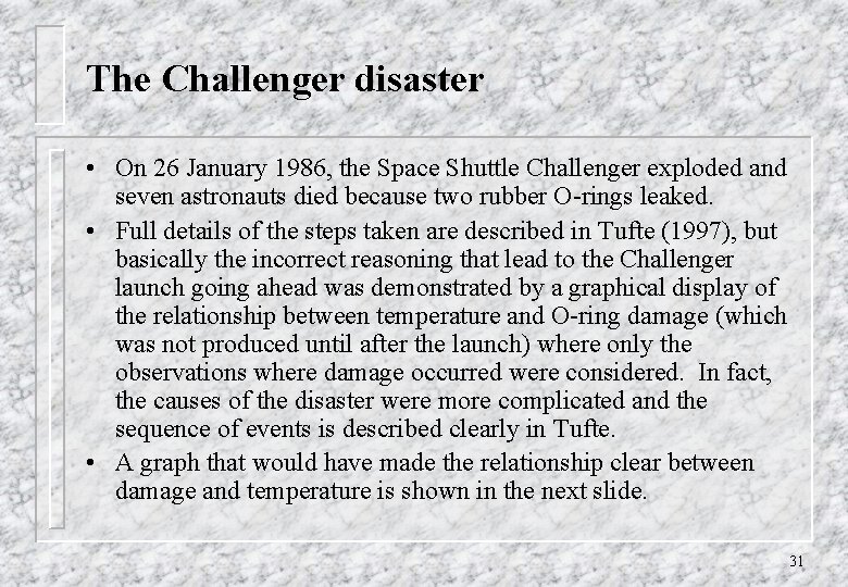
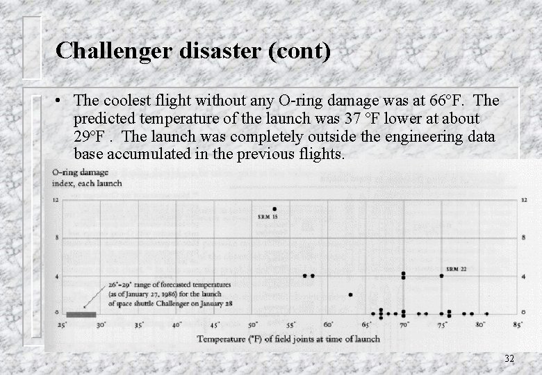
The Challenger disaster • On 26 January 1986, the Space Shuttle Challenger exploded and seven astronauts died because two rubber O-rings leaked. • Full details of the steps taken are described in Tufte (1997), but basically the incorrect reasoning that lead to the Challenger launch going ahead was demonstrated by a graphical display of the relationship between temperature and O-ring damage (which was not produced until after the launch) where only the observations where damage occurred were considered. In fact, the causes of the disaster were more complicated and the sequence of events is described clearly in Tufte. • A graph that would have made the relationship clear between damage and temperature is shown in the next slide. 31

Challenger disaster (cont) • The coolest flight without any O-ring damage was at 66ºF. The predicted temperature of the launch was 37 ºF lower at about 29ºF. The launch was completely outside the engineering data base accumulated in the previous flights. 32

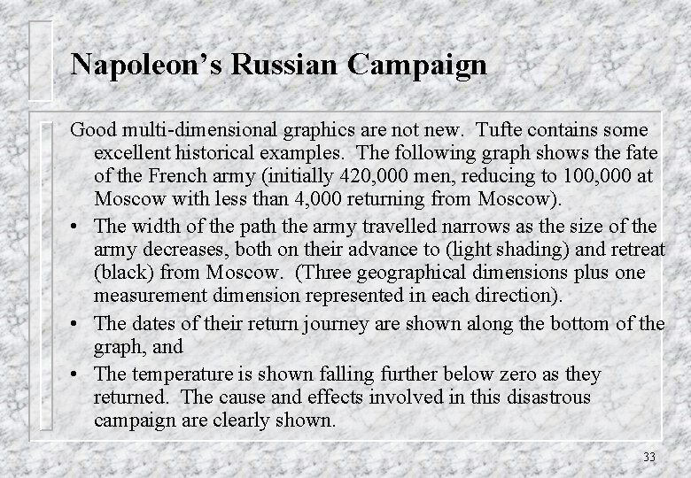
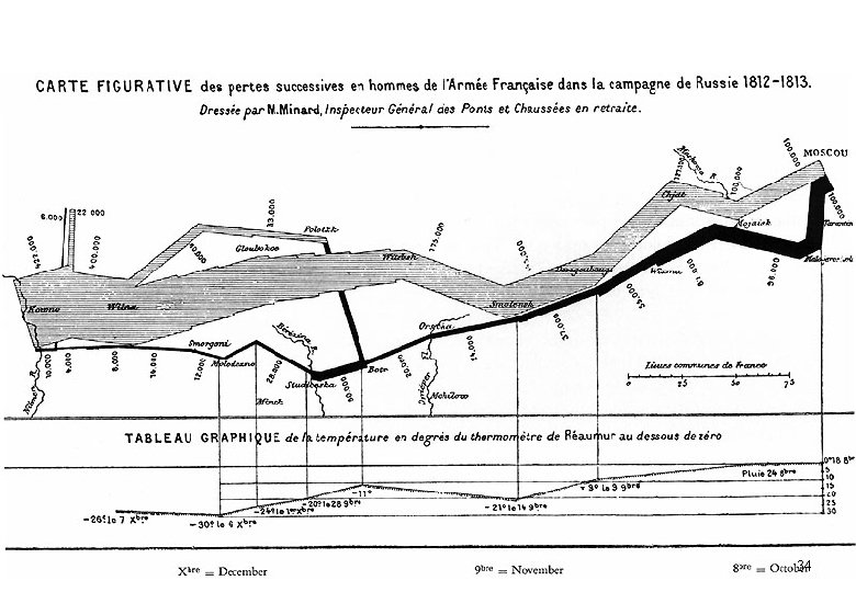
Napoleon’s Russian Campaign Good multi-dimensional graphics are not new. Tufte contains some excellent historical examples. The following graph shows the fate of the French army (initially 420, 000 men, reducing to 100, 000 at Moscow with less than 4, 000 returning from Moscow). • The width of the path the army travelled narrows as the size of the army decreases, both on their advance to (light shading) and retreat (black) from Moscow. (Three geographical dimensions plus one measurement dimension represented in each direction). • The dates of their return journey are shown along the bottom of the graph, and • The temperature is shown falling further below zero as they returned. The cause and effects involved in this disastrous campaign are clearly shown. 33

34

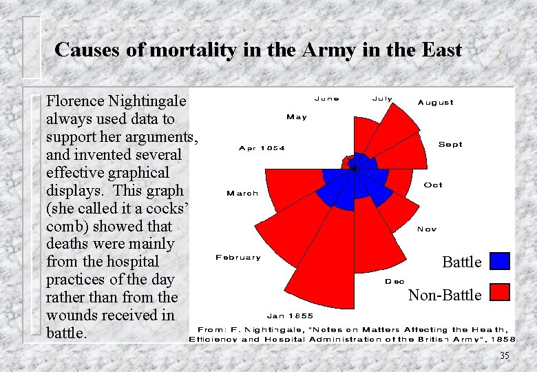
Causes of mortality in the Army in the East Florence Nightingale always used data to support her arguments, and invented several effective graphical displays. This graph (she called it a cocks’ comb) showed that deaths were mainly from the hospital practices of the day rather than from the wounds received in battle. Battle Non-Battle 35

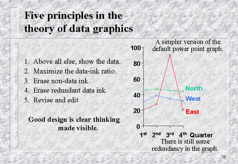
Five principles in theory of data graphics 100 1. 2. 3. 4. 5. Above all else, show the data. Maximize the data-ink ratio. Erase non-data ink. Erase redundant data ink. Revise and edit 80 60 40 20 Good design is clear thinking made visible. A simpler version of the default power point graph. North West East 0 1 st 2 nd 3 rd 4 th Quarter There is still some redundancy in the graph. 36

References Tufte, E. R. (1983), The visual display of quantitative information, Cheshire Press, Conn. Tufte, E. R. (1990), Envisioning information, Cheshire Press, Conn. Tufte, E. R. (1997), Visual Explanations, Cheshire Press, Conn. 37