SOFTWARE DESIGN AND ARCHITECTURE LECTURE 17 Review Interface


 next to the title of")


- Slides: 38
SOFTWARE DESIGN AND ARCHITECTURE LECTURE 17
Review • • Interface Design Styles of interfaces Design Considerations Evaluation of Design
Outline • User interface Design principles • Design Guidelines
User Interface Design Principles • Affinity: – Bring objects to life through good visual design • Assistance: – Provide proactive assistance • Availability: – Make all objects available at any time • Encouragement: – Make actions predictable and reversible • Familiarity: – Build on the user’s prior knowledge • Obviousness: – Make objects and controls visible and intuitive
User Interface Design Principles • Personalization: – Enable the user to customize an interface • Safety: – Keep the user out of trouble • Satisfaction: – Create a feeling of progress and achievement • Simplicity: – Do not compromise usability for functionality • Support: – Place the user in control • Versatility: – Support alternate interaction techniques.
Affinity: Bring objects to life through good visual design • The visual design in a user interface aims to embody all aspects of the UIA principles. – It should support the user model and communicate its functions without ambiguities. – It should be seen as an integral part of the entire design process.
Affinity: Bring objects to life through good visual design • Design Principles to achieve affinity: • Subtractive design – Eliminate any visual element that does not contribute directly to the intended visual communication. • Visual hierarchy – Establish a visual hierarchy of the user’s tasks in the order of importance. • Affordance – the user can easily determine the action to be taken with the object. • Visual scheme – Design a visual scheme that maps to the User’s Model and enables the user to customize the interface
Assistance: Provide proactive assistance • Help the user perform a variety of tasks. • Provide assistance in the forms of captions, hints, or system help. • The assistance information should be simple, concise, and task-oriented to allow the user to complete a task with relative ease and efficiency. • It should also be flexible.
Availability: Make all objects available at any time • Enable the user to use all objects within a view in any sequence and at any time. – For example, the Open dialog in the Windows platforms allows the user to access all objects in the view of an open object. • Avoid using modes in which actions of an interface are no longer available or cause unexpected results. – For example, menu-driven systems use the modal dialog box, such as Print and Save As, for the user to request command parameters, but this modal dialog tends to lock the user out of the system. The user must complete or cancel the modal dialog to return to the system, creating tremendous inconvenience.
Encouragement: Make actions predictable and reversible • Ensure that an action produces the expected results. – Try to understand the expectations, tasks, and goals of the user. • All user actions, including the seemingly trivial deselection should be reversible. • Avoid bundling actions together. The user may not anticipate the impact of bundled actions. – If the user chooses to cancel a request for sending a note, only cancel the Send request; do not delete the note.
Familiarity: Build on the user’s prior knowledge • Allow the user to build on prior knowledge of the system. • The user does not have to learn different techniques to perform similar tasks. • Employ visual designs and interaction techniques in an interface to represent and reinforce the user’s experience with other systems for the same platform or environment.
Obviousness: Make objects and controls visible and intuitive • v Use realistic representations in the interface. – Trash cans and telephones are good examples of realistic representations. • Make the controls of the system clearly visible and their functions easily identifiable. • Use visual or textual cues to help users understand functions, remember relationships, and recognize the current state of the system.
Personalization: Enable the user to customize an interface • Enable the user to tailor the interface to individual needs and desires. – No two users are exactly alike; users vary in terms of their background, interest, motivation, level of experience, and physical ability. • Customization helps the user feel more comfortable with an interface. • Personalizing an interface can also lead to higher productivity and user satisfaction. – For example, allowing users to change default values can save them time and hassle when accessing frequently-used functions.
Personalization: Enable the user to customize an interface • In an environment where multiple users share a single computer, enable each user to create his or her own ″system personality″ and make it easy to reset the system. • In an environment where a single user uses multiple computers, make the personalized information portable; the user can ″carry that personality″ from one system to another.
Safety: Keep the user out of trouble • An interface should provide visual cues, reminders, lists of choices, and other aids, either automatically or on request. • Contextual help and agents can deliver supplemental assistance. • Help information should be simple, concise, and taskoriented. • Do not require the user to memorize information that the system already knows, such as previous settings, file names, and other interface details. – Provide such information, if available, through the system.
Safety: Keep the user out of trouble • Enable two-way communication between the user and the system. – For instance, a spelling checker, as designed in some systems, highlights potentially misspelled words while the user works on the document. • This allows the user to either correct a spelling error or continue the work.
Satisfaction: Create a feeling of progress and achievement • Allow the user to make uninterrupted progress and enjoy a sense of accomplishment. – Report the results of actions immediately; any delay intrudes on the user’s tasks and erodes his or her confidence in the system. – For example, when the user chooses a new font, the font change to all applicable text should take place instantaneously. The user can then decide whether or not to retain the change. • Preview the results of an action so that the user can evaluate them. • Communicate to the user in the event that the results of a refresh cannot be immediately displayed. – For example, most Web browsers display a completion percentage in the information area so that the user knows the status of the pageloading progress.
Simplicity: Do not compromise usability for functionality • Keep the interface simple and straightforward. • Make sure that basic functions are apparent to the user and advanced functions are easy to learn. • Minimize the number of objects and actions in an interface, but enable the user to accomplish everyday tasks. • Organize the functions for easy access and use. Avoid designing an interface cluttered with functions. • A well-organized interface fades into the background allows the user to work efficiently.
Support: Place the user in control • Give the user control over the system. Enable the user to apply self-defined procedures to accomplish tasks. • Make obvious the current state of the system and the actions for the user to perform.
Versatility: Support alternate interaction techniques • Enable the user to choose an interaction method appropriate for a specific situation. – For example, a microphone with voice-recognition software can be helpful for a fast text entry or in a hands-free environment, and pen input is helpful for people who sketch. • Enable the user to switch between methods to accomplish a single interaction. – For example, allow the user to swipe-select with the mouse and adjust the selection with the keyboard. • Do not require the user to alternate between input devices to accomplish a single step or a series of related steps in a task.
DESIGN GUIDELINES
Design guidelines • This section describes specific UI guidelines for designing the following features of a user interface: • Controls • Predefined actions • Data transfer • Message handling • User assistance • Windows and layouts • Portfolio • Accessibility
Design Guidelines – Implementing Controls • Provide a visual indication for a field that requires a user-specified value and a default value whenever possible. • • Provide a visual indication for a field with an invalid user-specified value. – Use hint text to describe the range of valid values for the field. • Use a CAPTION, such as a label, a column heading, or a window title, of the associated object or property to identify each control or group of controls. • Instantaneously update a control when the value it represents changes. – For example, if both a slider and an entry field are provided to represent the same numerical value, immediately change the slider to represent the new value in the entry field.
Design Guidelines – Implementing Controls • Use the controls provided by the operating environment rather than creating new ones. • Do not change the function, interaction technique, or appearance of a control provided by the operating environment.
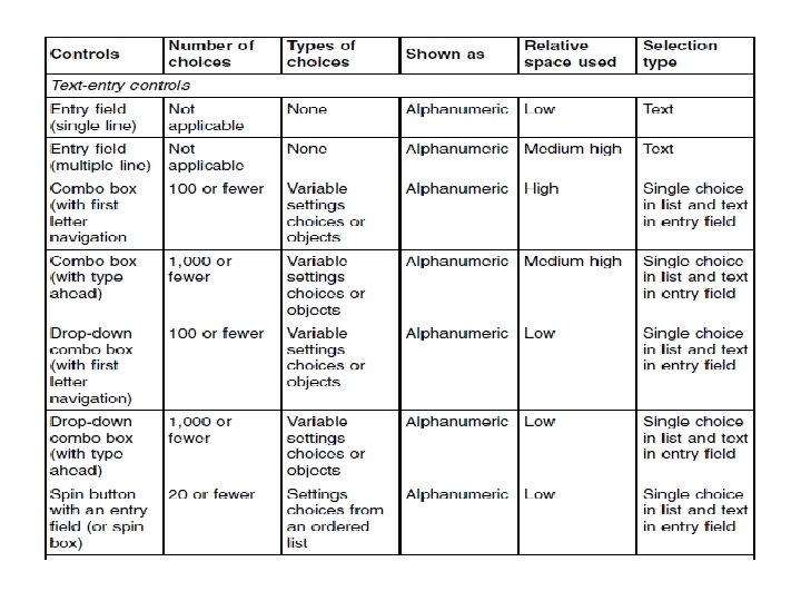
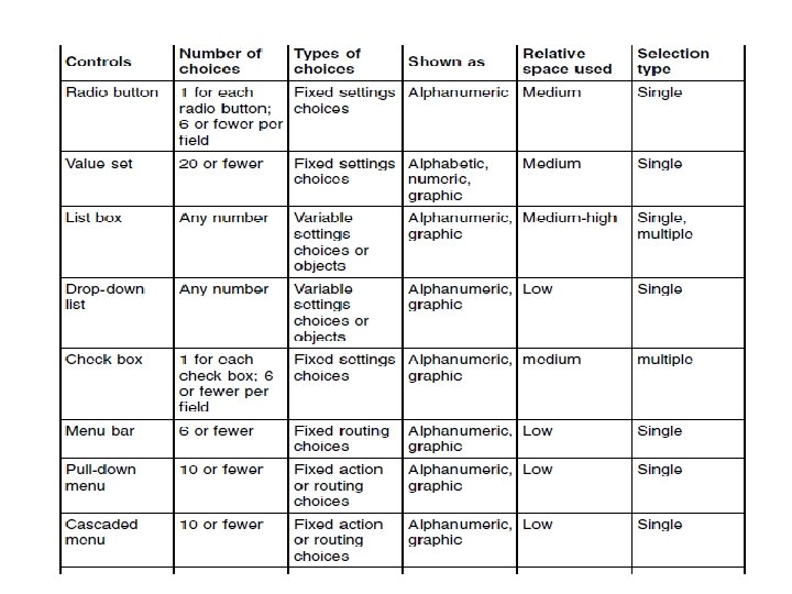
CONTROL RECOMMENDATIONS
WINDOWS AND LAYOUTS
Windows and layouts • A window is a visible area with defined boundaries within a screen • Size and lay out a window so that the user does not have to scroll to see its entirety. • Position the most important information in the left side of a resizable window for prominent display. • Place controls of less frequent use out of the view if the initial size of an action window is not large enough to display all the controls.
Windows and layouts • Provide the user with the option to scale or clip the scalable content within a resizable window. • Follow platform-specific conventions for the alignment and order of push buttons. – For example, left-align push buttons in a browser-based application at the bottom of the page or window. • Place push buttons at the bottom of the window if they affect the entire window. • Place a push button next to a component that is adjusted by, or associated with, the action of the push button. – For example, reset button
Windows and layouts • Avoid using a push button to change the size of a window; instead, allow the user to resize the window using the size borders or the Maximize push button. • Enable the user to adjust the size of each column in a window, as appropriate. For example, provide column borders for the user to resize a column. • Ensure that the width of a column, if not adjustable, is slightly greater than the length of the column heading or items.
Windows and layouts • Use white space and indentation to group controls. • Use a group box only when a group heading or white space does not visually distinguish groups of fields in a window. • Place a status area, if provided, between the title bar or the menu bar, if available, and the rest of the window. – For example, place a status area below the menu bar and above column headings in a window.
Windows and layouts • Place the cursor on the default push button when the user presses the Tab or Backtab key to move the cursor to a group of push buttons. • Move the cursor between the fields, from left to right and top to bottom, in the window when the user presses the Tab key. • Move the cursor between the fields, from right to left and bottom to top, in the window when the user presses the Backtab key.
Windows and layouts • Always provide product identification information. • Include the product identification at the top left of the navigation area in browser-based applications • Use the following fonts or font families for textual elements on a Web page: Arial or Helvetica, usually the default sans-serif font of a system, for messages and navigation and orientation elements, such as labels and titles. • When providing graphical user interfaces on such platforms as Windows, use the fonts • selected by the user in the control panel. • Provide a Task bar on the bottom of the console and a Window menu on the Menu bar if the console supports multiple active tasks at the same time.
Windows and layouts • List or display of all active tasks on the Task bar and the Window menu on the Menu bar in the order as each task is opened. • Truncate each task title and add an ellipsis (. . . ) as more tasks are listed on the Task bar. • Display the full title of each task as the user moves the mouse over each truncated task title. • Enable the user to easily switch between tasks by clicking on a task on the Task bar or selecting from the Window menu on the Menu bar.
Windows and layouts • Provide a Close shortcut (x) next to the title of each task on the Task bar. • Provide a Close all tasks option on the Window menu or on the Task bar. – Provide a confirmation dialog before closing all active tasks. • Do not place document links in the caption or other text between the fields of a form in browser-based applications. – Placing a document link in the caption of a form, for example, may cause the Tab or Shift-Tab key to behave in an unexpected manner.
Summary • User interface Design principles • Design Guidelines