Scatterplots and Correlation Section 3 1 Part 1


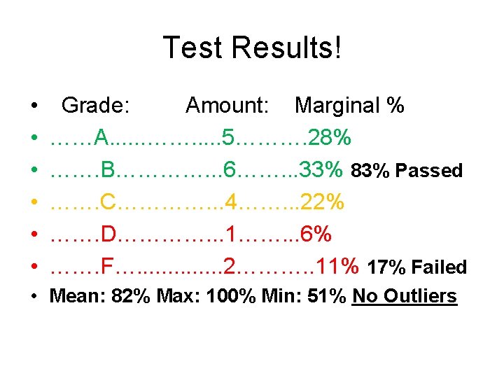
 • • • Ch. 1 Test A")

- Slides: 14
Scatterplots and Correlation Section 3. 1 Part 1 of 2 Reference Text: The Practice of Statistics, Fourth Edition. Starnes, Yates, Moore
Starter 3. 1 Seven different families drove to their vacation destinations. The table below shows the distance they drove (in miles) and the time it took them (in hours). Represent the data graphically and write a description of the data. Distance 400 411 247 385 229 217 325 Time 6. 5 7 4. 1 6. 5 3. 8 5. 4
Today’s Objectives • Identify variables as explanatory or response variables • (honestly…it’s a fancy way to label independent and dependent variables) • Given a two-variable data set, construct and interpret a scatterplot • Describe an association in terms of: (your new best friend, just like C. U. S. S) • Linear or not (does it look linear or not? !) • Relationship: weak, moderate, strong (are the data points all over the place? ) • Direction: pos or neg (slope!)
Scatterplots • The association between two quantitative variables can be shown on one graph by plotting data points as ordered pairs on axes. Such a graph is called a scatterplot. • Scatter plots do not have connected points • If it seems that one variable is a response to the other, then plot that variable on the y axis. It is called the response variable (dependent variable). • The x axis then has the explanatory variable. (independent variable) • A way to remember: “Depending on what you say to me, will determine my response to you”
Describing Associations • Four main concepts make up the description of an association between two variables: linear, relationship, direction, and Context. – Linear or not (form): is a description of the shape of the graph • A straight line is typical, but not the only shape possible. – Relationship (strength): is a description of how clearly the data follow the form stated. • The starter had a fairly strong linear pattern; more random dots would have been weaker. – Direction: is positive or negative and agrees with the slope of the line • In positive associations, an increase in the explanatory variable leads to an increase in the response variable – Context: Always report your answers in context of the problem! Communication is HUGE factor in AP Stats • In positive associations, an increase in the explanatory variable leads to an increase in the response variable
Describing Associations • Four main concepts make up the description of an association between two variables: linear, relationship, direction, and Context. – Linear or not (form): • “this scatter plot does not show a linear pattern” • “ there seems to be a somewhat linear pattern in the graph, (that is, the overall pattern follows a straight line)” • “the form of the relationship is linear. That is, the overall pattern follows a straight line from lower left to upper right” – Relationship (strength): • The overall relationship in the graph is Strong: COMPARE THE TWO VARIABLES • The overall relationship in the graph is Moderately Weak: COMPARE THE TWO VARIABLES • The overall relationship in the graph is Weak: COMPARE THE TWO VARIABLES
Describing Associations • Four main concepts make up the description of an association between two variables: linear, relationship, direction, and Context. – Direction: • Positive: The overall pattern moved from lower left to upper right • Negative: The overall pattern moved from upper left to lower right – Context: Always report your answers in context of the problem! Communication is HUGE factor in AP Stats
The Sanchez Household Natural Gas Usage Data • Each month for 16 months, the Sanchez family recorded how cold was the weather (in degree-days) and how much natural gas they used (in 100’s of cubic feet) to warm their house. • Which variable should go on the x axis? – Do cold days cause gas usage, or does gas usage cause cold days(!)? Month Degree. Days Gas Usage Nov 24 6. 3 Dec 51 10. 9 Jan 43 8. 9 Feb 33 7. 5 Mar 26 5. 3 Apr 13 4. 0 May 4 1. 7 Jun 0 1. 2 Jul 0 1. 2 Aug 1 1. 2 Sep 6 2. 1 Oct 12 3. 1 Nov 30 6. 4 Dec 32 7. 2 Jan 52 11. 0 Feb 30 6. 9
Describing the Association • Since cold days cause gas usage, degree-days is the explanatory variable and goes on the x axis. • Gas usage responds to degree-days, so it is the response variable and goes on the y axis. 1) Set up a scatterplot and display the graph. 2)Write a description of the association addressing linear, relationship, direction, and Context.
SAT Activity • Write your most recent SAT math and verbal scores on a slip of paper and drop in the box as I pass through the room. – NO NAMES PLEASE!! – Clearly state which is math, which is verbal. • Using graph paper, put math on the horizontal axis and verbal on the vertical. – Scales should run from 200 to 800 • As I call out the paired numbers, plot each point on your graph. • Write a description of the association between math and verbal scores.
Today’s Objectives • Identify variables as explanatory or response variables • Given a two-variable data set, construct and interpret a scatterplot • Describe an association in terms of: • Linear or not (does it look linear or not? !) • Relationship: weak, moderate, strong (are the data points all over the place? ) • Direction: pos or neg (slope!) • Context
Tracking AP Stats • 2014 -2015 (WHS) • • • Ch. 1 Test A 5 B 5 C 6 D 2 F 1 Ch. 2 Test A 5 B 6 C 4 D 1 F 2 Ch. 3 Test
Homework Worksheet/ TBA