HTML Organizing Page Content CSS for layout Examples


: Page reflow in browser window • Advantage: Design for")
 Layouts")
 Layout")


- Slides: 28
HTML – Organizing Page Content
CSS for layout Examples http: //www. shinybytes. com/newcss. html
Generic Elements Used to create a logical grouping of content or elements on the page Can be customized to describe content <div>…</div> Generic block-level element <span>…</span> Generic block-level element Name them using id or class Have no inherent presentation qualities of their own, but can use style sheets to format them -allows you to accurately describe content -creates a “hook” for adding style rules
HTML 5 Elements Well supported by current desktop and mobile browsers (known issues with IE 8 and earlier) <section>…</section> • May be used to divide pages into major sections | major thematic sections <section> <h 2>Typography Books</h 2> <ul> <li>…</li> </ul> </section> <article>…</article> • May be used for self-contained works that could stand alone or be reused in a different context <article> <h 1>Get To Know Helvetica</h 1> <section> <h 2>History of Helvetica</h 2> <p>…</p> </section> </article>
HTML 5 Elements Well supported by current desktop and mobile browsers (known issues with IE 8 and earlier) <aside>…</aside> • Related to the surrounding content <nav>…</nav> • Primary navigation links <header>…</header> • Introductory material for page, section, or article <footer>…</footer> • Footer for page, section, or article <address>…</address> • Contact information
CSS for layout Examples http: //www. shinybytes. com/newcss. html
CSS – Positioning & Layout
CSS Normal Flow • Normal Flow Top -> bottom | left -> right • Arranged in the order they appear in the code • make room for one another (objects affect the layout of the objects around them)
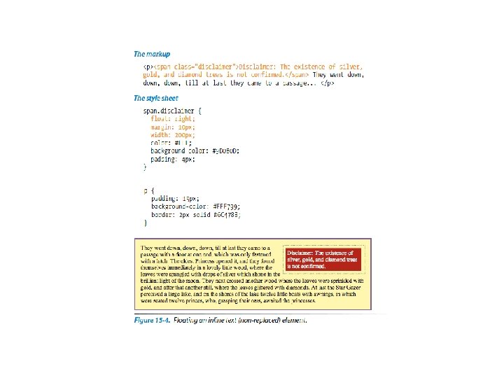
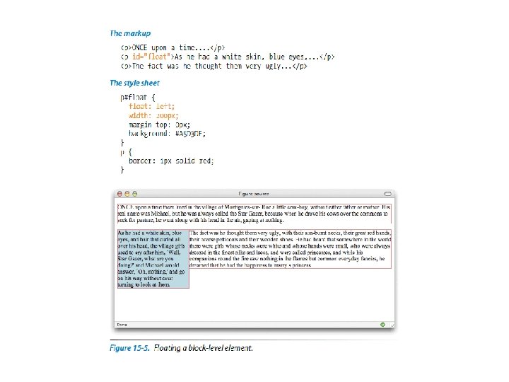
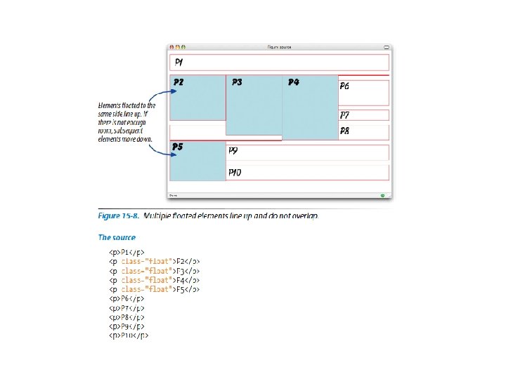
CSS Positioning Floating allows us to alter the normal position of an element by moving it to the leftmost or rightmost edge of its parent element Values: left | right | none • Ex: img {float: right; } Positions an element to the left or right allowing surrounding content to wrap around • Floating inline Elements • Must provide width & height values • Floating Block Elements • Must provide width & height values • Elements do not float higher than their reference in the source code
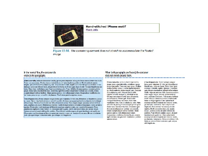
Float Removes object from normal document flow
CSS Positioning Clear The clear property allows us to turn floats off and return to normal document flow. Values: left | right | both | inherit | none • Ex: . element 1 {clear: right; } breaks down to the next line and returns to normal document flow. • Prevents elements from appearing next to a floated element • clear: left – nothing allowed to float to the left • clear: right – nothing allowed to float to the right • clear: both – nothing allowed to float to right or left
CSS Positioning Position Values: static | relative | absolute | fixed Static: elements positioned as in normal flow Relative: moves an element relative to its original position - space it would have occupied is preserved (empty space left behind) - overlap happens offset Values: top | right | bottom | left • Defines the distance the element should be moved • Ex: em { position: relative: top: 30 px: left: 60 px: }
CSS Positioning
CSS Positioning Position Values: static | relative | absolute | fixed Absolute: removes elements from normal document flow - Absolute position elements have NO influence on layout of surrounding elements - Positioned relative to its containing element - Space it would have occupied is closed - Overlap happens
CSS Positioning Containing Blocks If the positioned element is not contained within another positioned element it is placed relative to the html element (initial containing block)
CSS Positioning Containing Blocks If the positioned element is not contained within another positioned element it is placed relative to the html element (initial containing block) If element has an ancestor that has positioning set (relative, absolute, fixed) – it is placed relative to its containing block Relative positioning commonly used to a create positioning context for absolutely positioned elements
CSS Positioning Pixel measurements Percentage values
CSS Positioning Position Values: static | relative | absolute | fixed Fixed: element fixed in one position (does not scroll) - Similar to absolute positioning - Offset values are always relative to the browser window (viewport)
CSS Positioning Stacking Order • Absolutely positioned elements overlap • Elements stack in the order they appear in the source doc • Z-index (change the stacking order) • Higher the z-index – the higher the element will appear in the stack
CSS Page Layout Liquid (fluid): Page reflow in browser window • Advantage: Design for any monitor resolution • Disadvantage: may end up with long lines of text (uncomfortable to read) • www. w 3. org Fixed: Page stays a specific pixel width • Advantage: predictable layout, more control • Disadvantage: right edge may not be seen on smaller browsers • awkward leftover spacing on large screens • www. oreilly. com Elastic: layout expands and contracts with size of text (em based) • Advantage: provides consistent layout while allowing flexibility in text size • Disadvantage: images can’t be dynamically resized • www. csszengarden. com/? cssfile=/063. css Responsive • http: //www. burton. com/on/demandware. store/Sites-Burton_US-Site/default
CSS - Layout Fixed (pixel based) Layouts
CSS - Layout Fluid (percentage based) Layout
CSS - Layout Hybrid
Let’s see how this works…