HOMEPAGE AND TAGLINES HOMEPAGE Site identity and mission
- Slides: 24

HOMEPAGE AND TAGLINES

HOMEPAGE • Site identity and mission – tells what the site is and what it is for and if possible why I should be here and not on some other site • Site Hierarchy – give an overview of what the site has to offer – both content (what I can find here) and features (what can I do here) and how it is all organized. This is usually handled by the navigation • Search – most site will need a search box • Teases – homepage needs to entice like the cover of a magazine

HOMEPAGE • Content promos – spotlight the newest, best or most popular pieces of content. • Feature promos – invite me to explore additional sections of the site or try out features • Timely content – needs to have some content that gets updated frequently so that people will want to come back. Also google pays attention to sites that are updated • Deals – space allocated to whatever advertising, cross-promotion and co-branding deals that have been made • Shortcuts – frequently requested pieces of content (software updates) may deserve their own links on the home page • Registration –

THE HOME PAGE ALSO NEEDS TO MEET SOME ABSTRACT NEEDS • Show me what I am looking for – make it obvious how to get to whatever I want • And what I’m not looking for – at the same time, the homepage needs to expose me to some of the wonderful things the site has to offer that I might be interested in – even though I may not be looking for them right now • Show me where to start – • Establish credibility and trust – make a good impression

THE HOMEPAGE IS THE WATERFRONT PROPERTY OF THE WEB • Homepage gets significantly greater traffic than all other pages. • This is page most people will start on and possible the only page that some people see. • It is the most desirable real estate and there is limited space. • Everyone who has stake in the site will want some space on the homepage. • Lots of information wants to be “above the fold” on the homepage

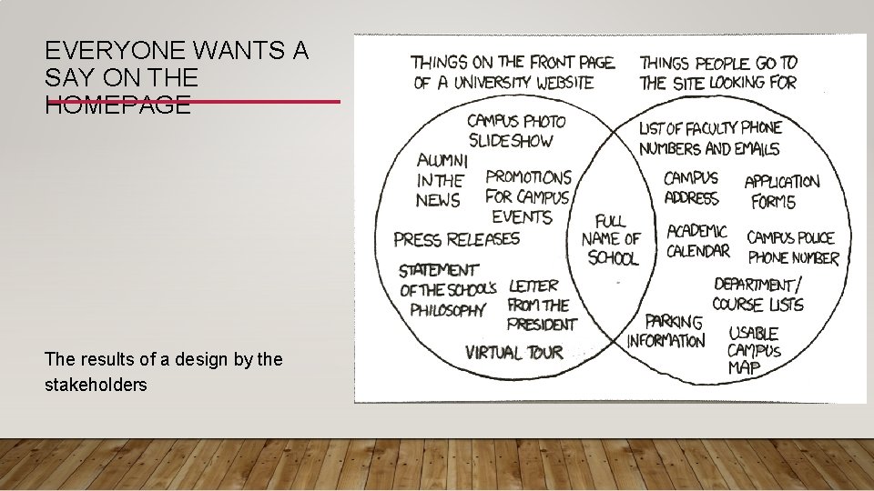
EVERYONE WANTS A SAY ON THE HOMEPAGE The results of a design by the stakeholders

DESIGNING THE HOMEPAGE • If the site is complex the homepage design cannot do it all – no matter how good the design. • Designing a homepage involves compromises

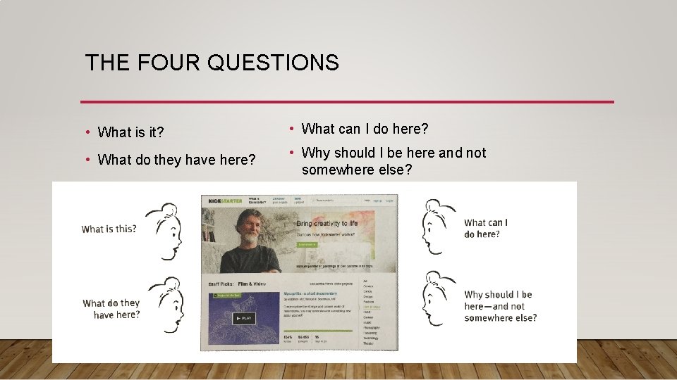
THE FOUR QUESTIONS • What is it? • What can I do here? • What do they have here? • Why should I be here and not somewhere else?

THE FIRST FEW SECONDS YOU SPEND ON THE WEB SITE/PAGE ARE CRITICAL • The user needs to be able to answer these questions at a glance, correctly and unambiguously, with little effort. • If viewer doesn’t get it easily and quickly they may be confused throughout the entire site or may leave before going any deeper • If the viewer gets it quickly it improves the chances of having a satisfying, successful experience. • We know from the experiment Attention Web Designers: You have 50 milliseconds to make a good first impression that a lot happens as soon as you open a page.

IN A FEW SECONDS YOU FORM A NUMBER OF GENERAL IMPRESSIONS • Does it look good? • Is there a lot of content of a little? • Are there clear regions on the page? • Which ones attract you? These initial impressions tended to be very similar to the impressions people had after they actually had a chance to spend time on the page

TOP FOUR PLAUSIBLE EXCUSES FOR NOT SPELLING OUT THE BIG PICTURE ON THE HOME PAGE • We don’t need to. It’s obvious • After people have seen the explanation once, they’ll find it annoying • Anybody who really needs our site will know what it is • That’s what our advertising is for

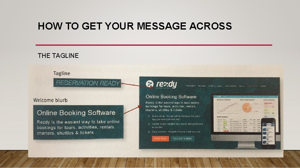
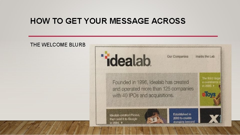
HOW TO GET YOUR MESSAGE ACROSS • The tagline • The Welcome Blurb • The “learn more” People may not use all or any of these elements, they may figure out your site on their own but these elements are here to help if they don’t.

HOW TO GET YOUR MESSAGE ACROSS THE TAGLINE

HOW TO GET YOUR MESSAGE ACROSS THE WELCOME BLURB

HOW TO GET YOUR MESSAGE ACROSS THE LEARN MORE

GUIDELINES FOR GETTING THE MESSAGE ACROSS • Use as much space as necessary • Don’t use more space than is necessary • Don’t use a mission statement as a welcome blurb • Test

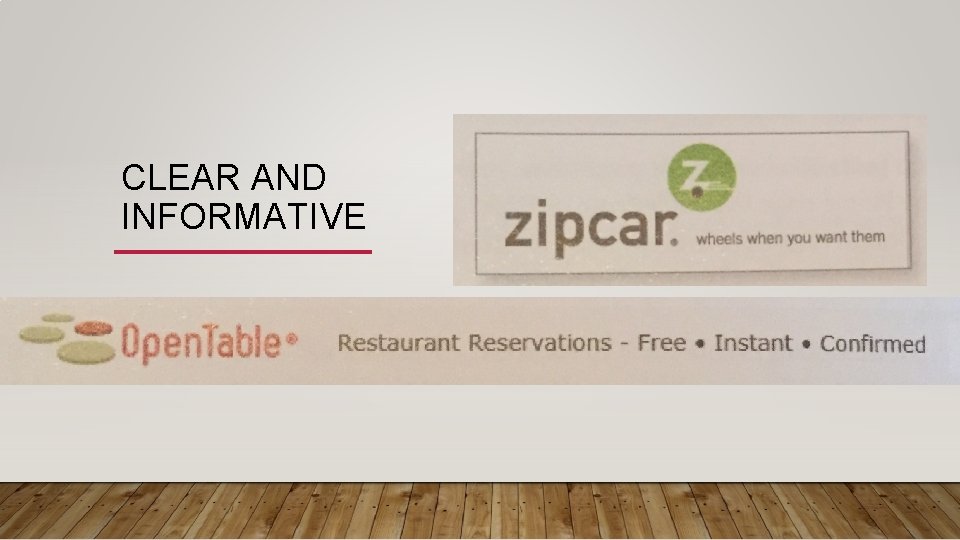
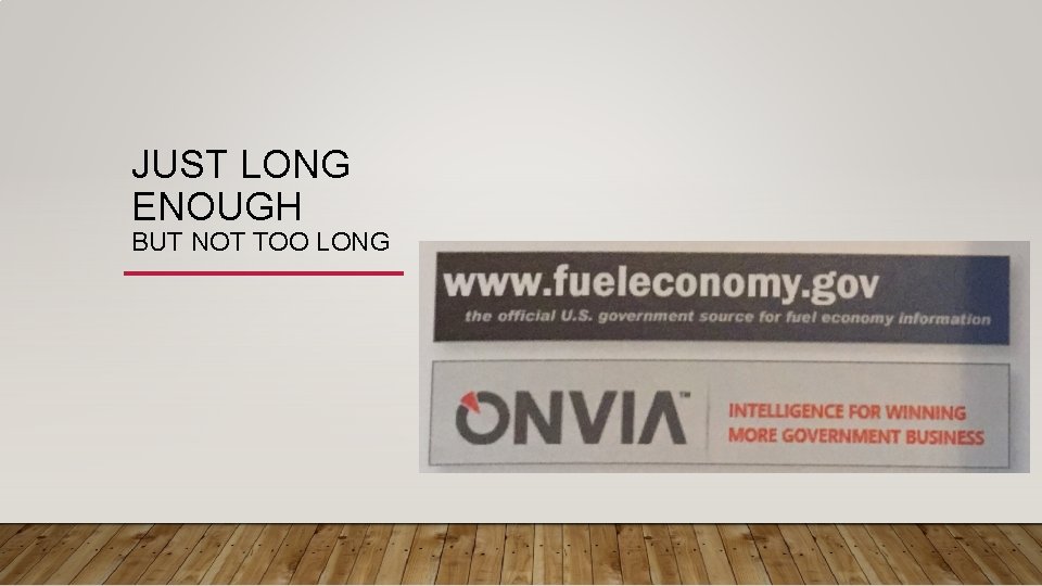
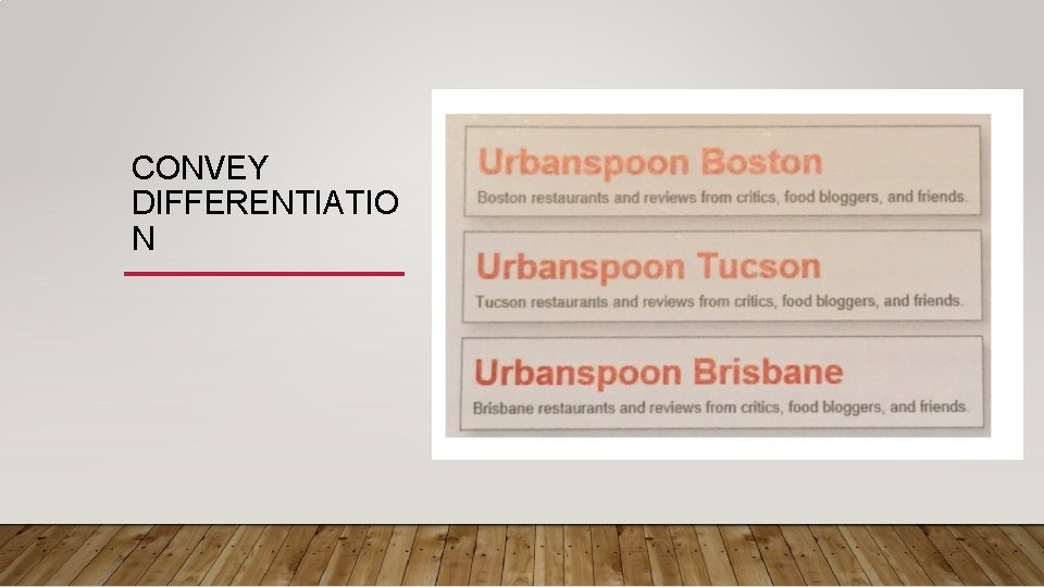
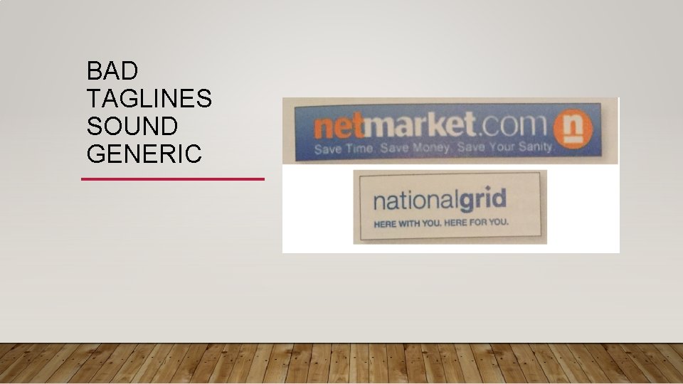
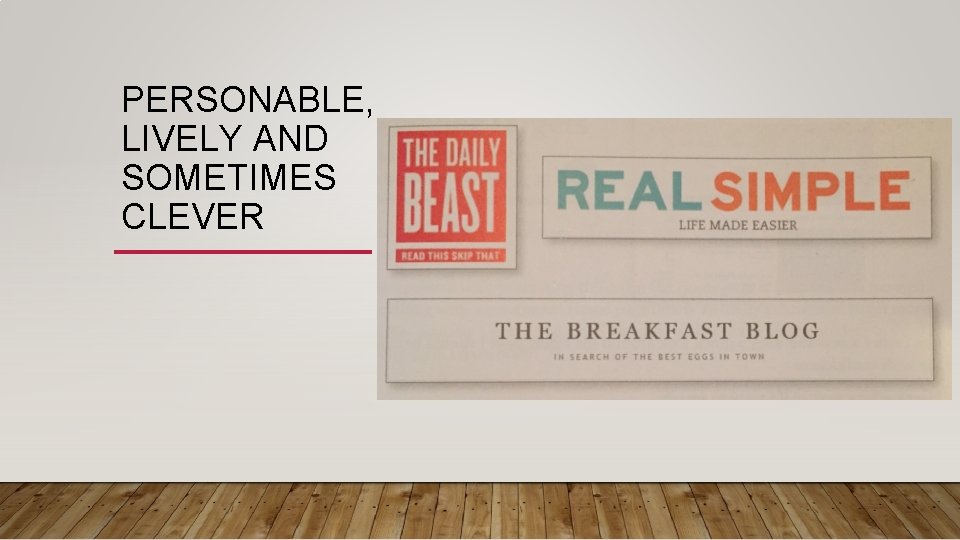
TAGLINES SOME ATTRIBUTES TO LOOK FOR WHEN CHOOSING A TAGLINE • Good taglines are clear and informative and explain exactly what your site or your organization does • Just long enough, but not too long. Six to eight words • Convey differentiation – is the one that no one else In the world could use except you • Bad taglines sound generic • Don’t confuse a tagline with a motto “ we bring good things to life” “you’re in good hands” A motto expresses a guiding principle, a goal or an ideal, but a tagline conveys a value proposition. • Personable, lively and sometimes clever.

CLEAR AND INFORMATIVE

JUST LONG ENOUGH BUT NOT TOO LONG

CONVEY DIFFERENTIATIO N

BAD TAGLINES SOUND GENERIC

PERSONABLE, LIVELY AND SOMETIMES CLEVER

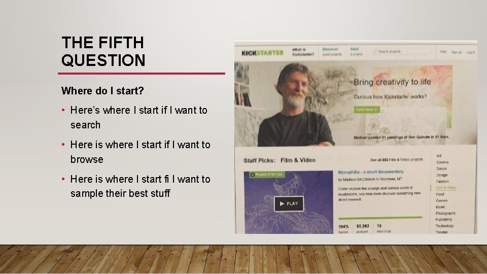
THE FIFTH QUESTION Where do I start? • Here’s where I start if I want to search • Here is where I start if I want to browse • Here is where I start fi I want to sample their best stuff

WHERE DO I START? • Sites that require a step by step process, the entry point should be obvious and leap out. If I have to register or sign in those places should be prominent • Make sure that entry points look like entry points (i. e. make the search box look like a search box) Label clearly • Don’t try to promote everything. If too many things are being promoted, the section that is being promoted gets a huge boost in traffic but the overall loss in effectiveness of the homepage as it gets more cluttered is shared by all sections.